
When you think of video game mascots, only a few can match the cultural footprint of Sonic the Hedgehog. He’s not just a character — he’s a legacy, a logo, a lifestyle. Bursting onto the scene in the early ’90s as Sega’s edgy response to Nintendo’s Mario, Sonic didn’t just play the game — he changed it.
Over the decades, Sonic’s brand identity has evolved in step with gaming culture, design trends, and Sega’s strategic pivots. From box art and title screens to movie posters and sneakers, Sonic’s logo and branding have remained central to how we experience him.
This is not just a history lesson. This is a case study in how to build, break, and revive a video game icon — through the power of design.
Act I: Speeding into the Market (1990–1991)
![]()
Sega had a problem in the late ’80s: Nintendo. With Mario reigning supreme, Sega needed a bold mascot to define the Genesis console and win Western hearts. Enter Sonic, the brainchild of Naoto Ohshima, Hirokazu Yasuhara, and Yuji Naka.
But the character alone wasn’t enough. The brand needed visual identity — and that came in the form of the first Sonic logo. It was loud, Americanized, and patriotic: red, white, and blue bubble letters, tailored for a U.S. audience Sega desperately wanted to capture.
Design Breakdown:
- Rounded, cartoonish typeface (playful but assertive)
- Strong primary colors, echoing arcade energy
- “Sonic the Hedgehog” tagline stacked and punchy
This wasn’t a logo designed to fade in the background. It screamed for attention — and it got it.
Act II: Brand with Attitude (1992–1995)
As the Sonic franchise exploded, Sega’s branding matured. Sonic the Hedgehog 2 introduced not just Tails, but also a more refined logo. Gone was the kiddie bubble font — in its place, sharper lines, faster angles, and a confident aura. Sonic wasn’t just cool — he had attitude.
Sega leaned heavily into this edge, building Sonic’s persona through:
- Marketing copy like “Blast Processing” and “Way past cool”
- TV commercials that mocked Nintendo
- Character art with Sonic’s trademark smirk, arms crossed
By the time Sonic CD and Sonic & Knuckles rolled out, the logo had started to incorporate elements like gold rings, speed lines, and italicized type — all reinforcing the same message: this character is fast, fearless, and fun.
The logo wasn’t static — it moved, just like Sonic.
Act III: The 3D Era and Brand Identity Crisis (1998–2006)
![]()
Sega’s Dreamcast era marked a turning point. The leap to 3D gaming introduced Sonic Adventure and with it, a whole new aesthetic. Sonic got a physical redesign: taller, sleeker, green eyes. And the logo followed suit.
Sonic Adventure’s logo used:
- Metallic, beveled typeface
- Gradient blue tones
- Lightning effects and high-tech polish
It was the late ’90s, and everyone wanted to look futuristic. But something was slipping — the consistency. Each game (Sonic Heroes, Shadow the Hedgehog, Sonic Riders) had its own identity. The logo shifted constantly. The fonts, the effects, the layouts — all over the place.
While Sonic’s games experimented with mechanics and tone, the brand started to blur. What exactly was the Sonic brand anymore?
And then came Sonic ’06.
Act IV: Rock Bottom & Reset (2006–2010)
The 2006 reboot of Sonic the Hedgehog was meant to be a cinematic relaunch. Instead, it became infamous for bugs, awkward storytelling, and a tone-deaf romantic subplot between a human and a hedgehog.
The logo? Stylish but soulless.
Slick silver font, digital shadows, a sterile vibe. It was beautiful in theory, forgettable in impact.
Fans didn’t just lose faith in the games — they started questioning the brand.
Sega needed a reset — and fast.
Act V: Nostalgia as a Brand Weapon (2011–2016)
In 2011, Sega played their strongest card: nostalgia. Sonic Generations celebrated 20 years of the blue blur by bringing classic Sonic and modern Sonic together in one timeline.
The branding was brilliant:
- Merged old-school bubble letters with modern vectors
- Used gold rings and checkerboard motifs from Green Hill Zone
- Marketing leaned into legacy, not reinvention
This was the beginning of Sonic’s brand redemption arc. The logo began to anchor again — fewer changes, more callbacks.
Sonic wasn’t trying to be cool anymore. He was embracing what made him legendary.
Act VI: Going Viral & Multimedia Expansion (2017–2020)
Sonic Mania (2017) was the brand’s renaissance. Created by indie developers and Sonic superfans, it paid homage to the Genesis era — and so did the branding.
Flat design. Bright color blocks. Pixel art flourishes. The logo screamed retro, but fresh.
At the same time, the Sonic Twitter account became a masterclass in Gen Z branding. Snarky, meme-literate, self-aware. Sonic became a digital-native character — and the logo’s simplicity made it shareable, meme-ready, and adaptable.
And then came the movies.
When Paramount’s Sonic the Hedgehog film first revealed a creepy, human-toothed Sonic, the backlash was instant. But the redesign saved the film — and with it, the brand.
The final movie logo? Clean sans-serif font, electric blue, and a subtle silhouette of Sonic. Safe, modern, and mass-market-friendly.
Act VII: The New Era of Unified Branding (2021–2025)

With Sonic now appearing in movies, games, Netflix shows, Lego sets, and streetwear, consistency matters more than ever.
Sega has refined a few core visual brand elements:
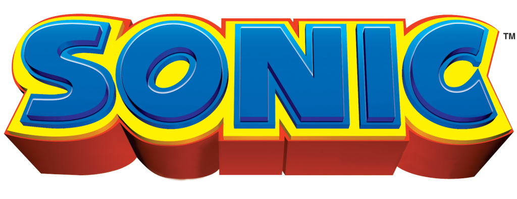
- Core palette: Blue, red, yellow, white
- Font styles: Modern geometric sans-serifs for general branding; retro arcade fonts for legacy callbacks
- Sonic silhouette: Now used almost like the Nike swoosh — instantly iconic
From Sonic Superstars to Sonic Prime, the visual identity is now cohesive across media. You recognize the brand before you read the name.
The Logo as Character: Why Sonic’s Branding Works
Sonic’s logo isn’t just type — it’s character. It reflects motion, edge, speed, and charm. Over time, it has managed to stay iconic by evolving without erasing its roots.
Here’s why it still works in 2025:
- Recognizability: That bold blue? Those spikes? Unmistakable.
- Versatility: The logo works on game covers, hoodies, TikTok clips, and cinema marquees.
- Adaptability: It scaled from 16-bit to 4K without losing meaning.
- Emotional pull: For Millennials, it’s childhood. For Gen Z, it’s meme culture. For both, it’s a brand that feels fun.
Lessons in Brand Longevity from the Blue Blur
Sonic’s branding journey is the story of a character who raced into pop culture and — despite crashes, glitches, and strange turns — never lost his spark. Here’s what brands can learn from Sonic:
- Design with emotion – Sonic’s appeal comes from more than visuals; it’s a feeling.
- Let legacy breathe – Don’t erase the past. Reintroduce it with relevance.
- Stay playfully consistent – You can evolve the look without breaking the soul.
- Embrace fan culture – Sonic thrived when Sega listened to its community.
Conclusion: More Than a Logo, It’s a Legacy
Sonic the Hedgehog’s logo and branding have become one of gaming’s most enduring identities. From bold bubble letters and golden rings to slick CGI logos and minimalist movie marks, Sonic’s visual journey mirrors the highs and lows of his franchise.
But through it all, one thing is clear: Sonic’s brand is built for the long run. Because whether he’s pixelated or photorealistic, the message remains the same — fast, fearless, fun.
And that’s the true power of great branding.