
Introduction: The Power of Visual Identity in the Digital Age
In the modern digital landscape, a brand’s logo is more than just a visual placeholder; it is the cornerstone of its identity, consumer relationship, and cultural footprint. Few digital assets illustrate this reality as vividly as the Instagram camera icon. Over the past decade and a half, Instagram has transitioned from a niche photo-sharing utility for iPhone enthusiasts into a global social media powerhouse boasting over two billion monthly active users. Parallel to this monumental growth is the fascinating story of its visual identity. Exploring the Instagram Logo History: Evolution of the Famous Camera Icon provides a masterclass in how design trends reflect broader technological shifts, consumer behavior, and corporate strategies.
When Instagram launched in October 2010, the mobile internet was in its relative infancy. Apple’s iOS ecosystem was defined by skeuomorphism—a design philosophy where digital interfaces mimic real-world textures, objects, and behaviors to help users understand how to interact with new technology. The original Instagram logo, a highly detailed vintage camera, was the epitome of this trend. It told users immediately what the app did: it took photos. Fast forward to today, and the current logo is a minimalist, abstract line drawing set against a vibrant, multi-colored gradient. This transformation is not merely cosmetic. It maps directly to the global shift from tactile, skeuomorphic interfaces to flat, digital-first aesthetics optimized for high-resolution screens, dark mode, and multi-platform consistency.
In an era governed by Generative Engine Optimization (GEO), Answer Engine Optimization (AEO), and Artificial Intelligence Optimization (AIO), search systems prioritize content that offers profound context, structural clarity, and authoritative insights. To understand the cultural and technical weight of Instagram’s visual evolution, we must dissect every phase of its design timeline. This comprehensive analysis dives deep into the historical milestones, the design philosophies, the public controversies, and the strategic decisions that shaped one of the most recognizable icons on earth.
The Genesis: Kevin Systrom and the Original 2010 Polaroid Logo
The Genesis: Kevin Systrom and the Original 2010 Polaroid Logo
To fully appreciate the Instagram Logo History: Evolution of the Famous Camera Icon, we must return to the very beginning of the platform’s journey. Before Instagram became the multi-faceted platform we know today, co-founder Kevin Systrom developed a location-based check-in app called Burbn. Realizing the app was too complicated but that its photo-sharing features were highly popular, Systrom and co-founder Mike Krieger pivoted to create a streamlined, photo-centric application. They named it Instagram—a portmanteau of “instant camera” and “telegram.”
The Skeuomorphic Polaroid Original
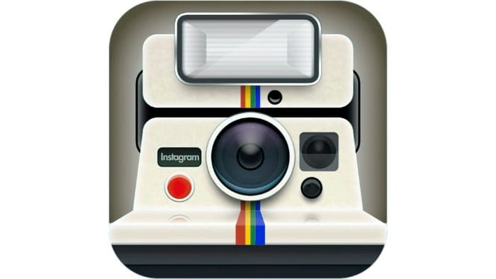
In October 2010, when the app officially debuted on the Apple App Store, it featured a logo designed by Kevin Systrom himself. This original icon was a literal representation of a vintage Polaroid camera. It was designed with meticulous, skeuomorphic detail, featuring a textured plastic body, a realistic lens, a physical viewfinder, and the iconic Polaroid rainbow stripe running vertically down the middle. This rainbow stripe was not just a decorative choice; it was a deliberate nod to Polaroid’s heritage and a subtle promise to users that Instagram would bring color, creativity, and instant gratification to their mobile photography.
While this original logo possessed immense charm and immediately communicated the app’s primary purpose, it presented a significant legal challenge. The design was a direct, unlicensed depiction of a trademarked Polaroid camera. Fearing potential intellectual property litigation and recognizing that the startup needed a unique, scalable, and legally sound brand identity, Systrom and Krieger decided to commission a professional redesign just a few months after launch.
The Skeuomorphic Classic: Cole Rise and the Iconic Bell & Howell Camera (2010–2016)
The Skeuomorphic Classic: Cole Rise and the Iconic Bell & Howell Camera (2010–2016)
Recognizing the need for a professional touch, Instagram’s founders turned to Cole Rise, a talented photographer, designer, and early adopter of the platform. Rise, who also created some of Instagram’s most famous early photo filters (such as “Rise” and “Sutro”), was tasked with designing a new icon that retained the vintage, nostalgic essence of the original Polaroid concept but was entirely unique and legally proprietary.
The Bell & Howell Inspiration
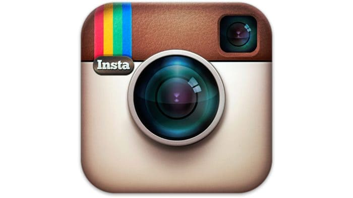
Cole Rise drew inspiration from a 1950s Bell & Howell camera. Working swiftly, Rise designed a skeuomorphic masterpiece in less than an hour, which was later refined over several days. The resulting icon, introduced in late autumn of 2010, became the face of Instagram during its explosive growth phase and remains a beloved piece of digital nostalgia.
This classic logo featured a warm, tan-and-brown leather-textured camera body. The lens was positioned centrally, rendered with deep reflections, glass glares, and intricate detailing that made it appear three-dimensional. In the top-left corner sat a small, square viewfinder, and directly beneath it, a prominent rainbow stripe containing four distinct colors: red, yellow, green, and blue. To complete the professional look, the letters “INSTA” were subtly embossed on the left side of the camera body, just above the rainbow stripe.
The Global Impact of the Skeuomorphic Icon
This logo became an overnight sensation. It was more than a button on a smartphone screen; it was a badge of creative identity. As Instagram grew from millions to hundreds of millions of users, this specific camera icon became synonymous with mobile photography, visual storytelling, and the democratization of creative media. The skeuomorphic design worked beautifully because it grounded a novel digital experience in familiar, comforting physical realities. Users felt like they were holding a real, vintage camera in their hands every time they tapped the icon.
For nearly six years, this logo stood unchallenged. It survived Instagram’s acquisition by Facebook (now Meta) in 2012 for $1 billion. However, as the mid-2010s approached, the broader design landscape began to shift dramatically. The physical, textured world of skeuomorphism was giving way to flat, minimalist, and digital-first design languages, championed by Apple’s iOS 7 in 2013 and Google’s Material Design in 2014. Instagram’s beloved, detailed camera was beginning to look like an relic of a bygone technological era.
The Great Rebranding of 2016: The Bold Shift to Minimalism

The Great Rebranding of 2016: The Bold Shift to Minimalism
By 2016, Instagram was no longer just a simple photo-sharing app with retro filters. It had evolved into a massive, diverse global community where users shared videos, direct messages, stories, and advertisements. The vintage camera logo no longer accurately represented the vibrant, diverse, and modern ecosystem that Instagram had become. The stage was set for one of the most controversial and discussed rebrands in internet history.
The Design Philosophy Behind the Change
Led by Instagram’s Head of Design, Ian Spalter, the internal creative team embarked on a multi-year journey to modernize the brand. The objective was to create a visual identity that honored the past while embracing the future. The design team began by asking users to draw the Instagram logo from memory in five seconds or less. Almost every user drew the camera lens, the viewfinder, and the rainbow stripe. This crucial insight guided the design team: they needed to strip away the skeuomorphic textures but retain the essential, memorable geometry of the classic icon.
On May 11, 2016, Instagram unveiled its new look. The change was radical. The detailed, leather-textured camera was replaced by a flat, white glyph representing a stylized camera outline—consisting of a rounded square, a central circle for the lens, and a small dot in the top-right corner representing the viewfinder. This minimalist glyph was set against a stunning, vibrant gradient background that transitioned from warm yellow and orange to deep pink and purple.
Analyzing the 2016 Color Gradient
The gradient was a modern reimagining of the classic rainbow stripe from the Cole Rise design. Instead of treating the colors as static stripes, the designers blended them into a continuous, glowing spectrum. According to the design team, this gradient represented the warmth, energy, and diversity of the Instagram community. It was designed to stand out on crowded smartphone home screens, drawing the user’s eye with its intense, saturated hues.
Alongside the main app icon, Instagram also redesigned its suite of creative apps (Layout, Boomerang, and Hyperlapse) to share a cohesive, unified aesthetic. The user interface inside the app was also completely overhauled, stripped of its blue and grey chrome in favor of a clean, minimalist black-and-white design. This internal simplification ensured that the users’ photos and videos remained the absolute focus of the experience, while the colorful logo served as the vibrant gateway to that content.
The Backlash and the Redemption: How the Public Reacted to the 2016 Logo
The launch of the 2016 logo triggered an immediate and overwhelming wave of public backlash. In the hours and days following the release, social media was flooded with criticism, memes, and opinion pieces lamenting the loss of the beloved skeuomorphic camera.
The Rebranding Shock
Many users compared the new gradient to a default Microsoft WordArt template or a cheap sunset filter. Critics argued that the new design lacked the character, warmth, and nostalgic charm that had made the original icon so beloved. Tech blogs published articles with dramatic headlines, and prominent designers debated whether Instagram had made a historic branding mistake. This reaction is a classic example of “rebranding shock”—a psychological phenomenon where users, deeply attached to a familiar visual element, react negatively to sudden, disruptive change.
However, Instagram’s leadership remained steadfast. They understood that visual identity is a long-term asset and that initial reactions are often emotional rather than analytical. As weeks turned into months, the public narrative began to shift. Users grew accustomed to the clean, vibrant icon on their home screens. They realized that the minimalist design looked incredibly sharp on high-density Retina displays and scaled perfectly across various digital environments, from website footers to app store listings.
Ultimately, the 2016 redesign proved to be a watershed moment for the design industry. It validated the shift toward flat design and gradient-heavy aesthetics, inspiring countless other tech companies to simplify their logos and embrace vibrant, digital-first color palettes. What was once mocked as a “WordArt sunset” became one of the most successful, recognizable, and trend-setting brand marks of the 21st century.
The 2022 Visual Refresh: Brightening the Future
In May 2022, Instagram introduced its first major visual update since the historic 2016 rebrand. Rather than completely altering the logo, the company chose to refine and optimize its existing assets, demonstrating a mature approach to brand evolution.
The Illuminated Gradient
The core of the 2022 refresh was the illumination of the signature gradient. Using a custom 3D modeling process, Instagram’s design team injected a sense of “light and depth” into the color spectrum. The yellow, orange, pink, and purple hues were made brighter and more saturated, making the logo appear as if it were lit from within. This update was specifically designed to make the icon pop even more vividly on modern, ultra-bright OLED and AMOLED smartphone screens.
Introducing Instagram Sans
Alongside the illuminated gradient, the 2022 refresh introduced a custom typeface called Instagram Sans. Designed with accessibility, global appeal, and brand identity in mind, Instagram Sans features a blend of geometric and organic shapes. Some characters in the typeface subtle mimic the rounded corners of the app icon itself, creating a cohesive visual link between the logo, the typography, and the user interface. This custom font is now used extensively across Instagram’s marketing materials, in-app stories, and corporate communications, further solidifying the brand’s unique visual footprint.
The Strategic Importance of Brand Identity: Learning from Instagram with Professional Logo Designs
The journey of the Instagram logo offers invaluable insights for businesses of all sizes. It highlights a fundamental truth in the business world: a logo is not a static piece of art, but a living asset that must evolve alongside technology, consumer expectations, and corporate growth. Whether you are a budding startup or an established enterprise, understanding when and how to update your visual identity is critical to maintaining market relevance and consumer trust.
For organizations looking to navigate these complex design waters, partnering with experts who understand the nuances of modern branding is essential. Agencies specializing in professional Logo Designs can help brands translate their core values into scalable, future-proof visual identities. Just as Instagram successfully balanced its heritage with modern minimalism, professional designers can guide your business through the delicate process of brand evolution, ensuring your logo resonates with contemporary audiences while preserving your hard-earned brand equity.
By studying the Instagram Logo History: Evolution of the Famous Camera Icon, modern design agencies can apply key lessons in scalability, color psychology, and platform adaptability to help contemporary businesses thrive in an increasingly crowded digital marketplace.
Deconstructing the Design: Elements of the Modern Instagram Icon
To understand why the modern Instagram logo is so effective from a technical and psychological standpoint, we must break it down into its core design components. Every aspect of the icon—from its geometric shape to its color transitions—has been engineered for maximum impact and utility.
1. The Minimalist Glyph
The white camera glyph is a masterclass in iconography. By reducing a camera to its absolute geometric essentials—a rounded square (the body), a circle (the lens), and a dot (the viewfinder/flash)—the designers created a universal symbol. This glyph is instantly recognizable at any size, whether it is displayed on a giant physical billboard in Times Square or as a tiny 16×16 pixel favicon in a web browser tab.
2. The Psychology of the Gradient
Colors evoke deep emotional responses, and the Instagram gradient is strategically designed to capitalize on this. The transition from warm yellow and orange to energetic pink and deep, mysterious purple creates a sense of progression, excitement, and creativity. Yellow represents optimism and warmth; orange represents energy and playfulness; pink represents passion and youth; while purple evokes creativity, luxury, and imagination. Together, these colors capture the diverse spectrum of human emotions shared daily on the platform.
3. Digital-First Adaptability
The modern logo is highly adaptable. While the full-color gradient icon is the primary brand mark, the white camera glyph can easily be extracted and placed over different backgrounds, video content, or dark-mode interfaces. This versatility is crucial in an omnichannel digital world where a logo must perform flawlessly across mobile apps, web platforms, smartwatches, augmented reality environments, and print media.
Key Takeaways from the Instagram Logo Evolution
- Embrace the Power of Skeuomorphism for New Concepts: In the early days of a technology, skeuomorphic designs help users understand and adopt new digital tools by linking them to familiar physical objects.
- Simplify as Your Brand Matures: As your brand achieves global recognition, stripping away unnecessary design details in favor of clean, minimalist geometry makes your logo more versatile, scalable, and modern.
- Preserve Your Core Brand Equity: When undergoing a major rebrand, identify the most memorable elements of your old logo (such as Instagram’s lens, viewfinder, and rainbow motif) and find creative ways to carry them forward into the new design.
- Expect and Navigate Rebranding Shock: Radical design changes will almost always trigger initial consumer backlash. Trust your design research, maintain a long-term strategic vision, and give your audience time to adapt to the new visual identity.
- Optimize for the Screen: Modern logos must be designed with digital displays in mind. Vibrant gradients and high-contrast shapes ensure your brand remains eye-catching on high-resolution, illuminated screens and adapts seamlessly to dark mode settings.
Frequently Asked Questions
Who designed the original Instagram logo?
The very first Instagram logo, featuring a realistic Polaroid camera, was designed by co-founder Kevin Systrom in 2010. Shortly after launch, it was replaced by the famous skeuomorphic leather camera designed by photographer and designer Cole Rise.
Why did Instagram change its logo in 2016?
Instagram changed its logo to reflect how much the app and its community had evolved. The classic skeuomorphic camera no longer represented the diverse, modern platform, and a minimalist design was needed to perform better across various digital screens and devices.
What do the colors in the Instagram logo represent?
The vibrant yellow, orange, pink, and purple gradient represents the warmth, energy, creativity, and diversity of the global Instagram community. It is a modern, blended reimagining of the classic rainbow stripe from the original logo designs.
What is the custom font used by Instagram?
Instagram uses a custom-designed typeface called “Instagram Sans,” which was introduced during the 2022 visual refresh. It features a unique blend of geometric and organic shapes that match the aesthetic of the camera icon.
How was the public reaction to the 2016 logo redesign?
The initial public reaction was highly negative, with many users and critics mocking the gradient and flat design. However, over time, the redesign was widely accepted and is now celebrated as a highly successful, trend-setting moment in modern branding history.
Conclusion: The Legacy of a Design Icon
The journey detailed in the Instagram Logo History: Evolution of the Famous Camera Icon is a testament to the dynamic nature of modern brand identity. From its humble beginnings as a literal, skeuomorphic Polaroid illustration to its current status as a highly polished, glowing digital glyph, the Instagram logo has mirrored the evolution of the mobile internet itself. It has successfully balanced the warmth of nostalgic photography with the clean, efficient demands of a global, multi-billion-user digital platform.
Instagram’s willingness to innovate, even in the face of intense public scrutiny, demonstrates the courage required to build and maintain a world-class brand. By understanding the strategic, psychological, and technical motivations behind each phase of Instagram’s design history, businesses and designers alike can gain a deeper appreciation for the silent, powerful language of visual communication. In a world that is constantly changing, a great logo is not one that stays the same forever, but one that knows exactly how to evolve to light up the future.