
Introduction
In the rapidly shifting landscape of global entertainment, few symbols possess the immediate recognizability, cultural resonance, and brand equity of the Sony PlayStation logo. For nearly three decades, this iconic emblem has stood as a beacon for interactive entertainment, representing the transition of video games from niche toy-store novelties to a dominant force in mainstream global culture. To understand the PlayStation Logo History: Evolution of the Iconic PS Symbol is to trace the history of modern industrial design, consumer psychology, and the transition from analog to digital media environments.
When Sony Computer Entertainment entered the home console market in the mid-1990s, they were not merely launching a piece of hardware; they were introducing a paradigm shift. At the time, the market was fiercely dominated by established giants Nintendo and Sega. Sony, a conglomerate renowned for transistor radios, Trinitron televisions, and Walkman portable audio players, had to establish an entirely new visual language that communicated cutting-edge technology, sophistication, and a departure from the child-centric marketing of its competitors. The visual identity created for this venture would need to be timeless, highly adaptable, and instantly memorable. Through a meticulous design process, Sony crafted a visual mark that has survived multiple console generations, structural corporate realignments, and radical changes in design trends.
Today, the PlayStation symbol is more than a corporate trademark; it is a cultural artifact. It evokes nostalgia in older gamers who grew up during the 32-bit era while remaining a sleek, aspirational icon for younger generations engaging with next-generation virtual reality and ultra-high-definition gaming. This comprehensive deep dive explores the origin, design mechanics, structural shifts, and cultural impact of the PlayStation logo, illustrating how a simple optical illusion became one of the most successful brand marks in human history.
The Birth of a Gaming Giant: Historical Context of the PlayStation
To fully appreciate the PlayStation Logo History: Evolution of the Iconic PS Symbol, we must first examine the dramatic corporate conflict that birthed the console. In the late 1980s and early 1990s, Sony was not an active participant in the video game console market. Instead, they acted as a component supplier. Ken Kutaragi, a visionary Sony engineer often dubbed “The Father of the PlayStation,” recognized the immense potential of interactive 3D graphics and pushed the company to develop a dedicated gaming machine.
This drive led to a joint venture with Nintendo to develop a CD-ROM drive add-on for the Super Nintendo Entertainment System (SNES), tentatively named the “Play Station” (with a space). However, at the 1991 Consumer Electronics Show (CES), just one day after Sony publicly announced the partnership, Nintendo publicly betrayed Sony by announcing a rival deal with Philips. This public humiliation galvanized Sony’s leadership. Out of a mixture of corporate pride, strategic necessity, and Kutaragi’s relentless ambition, Sony decided to pivot and develop an independent, fully proprietary 32-bit gaming console.
This background of corporate rivalry and technological ambition meant that the branding for the new console could not be subtle or derivative. It needed to represent a clean break from the past. Nintendo’s branding was soft, colorful, and friendly; Sega’s was edgy, aggressive, and highly kinetic. Sony needed a visual identity that positioned the PlayStation as an advanced consumer electronics device—something that would look natural in a modern living room next to high-end stereo equipment, rather than scattered across a playroom floor. The logo had to bridge the gap between high technology and accessible entertainment.
The Mastermind Behind the Emblem: Manabu Sakamoto’s Vision
With the hardware development of the console underway in the early 1990s, Sony turned to its internal creative directors to establish the visual identity. The task of designing the logo was handed to Manabu Sakamoto, an exceptionally talented graphic designer who had already established a reputation within Sony for his clean, functional, and forward-thinking aesthetic. Sakamoto understood that the PlayStation was not just another console; it was the herald of a new dimension in gaming: real-time 3D polygonal rendering.
Prior to the mid-90s, home video games were almost exclusively two-dimensional, relying on flat sprite sheets moving across horizontal and vertical axes. The PlayStation promised to immerse players in fully realized three-dimensional spaces, allowing for depth, rotation, and dynamic camera angles. Sakamoto wanted the logo to physically embody this technological leap. His design brief was centered on the concept of spatial depth, perspective, and the convergence of two distinct entities: the “P” for Play and the “S” for Station.
Sakamoto did not arrive at the final design easily. He created over dozens of conceptual drafts, experimenting with a wide variety of geometric configurations, color stories, and typographic treatments. Some early concepts featured abstract ribbons forming the letters, while others utilized circular enclosures, futuristic planetary rings, and sharp, hard-angled polygons. Many of these rejected designs focused heavily on the letters “P” and “S” but lacked the spatial interplay that would define the final product. Sakamoto continuously refined his ideas, seeking a perfect balance between simplicity, legibility, and conceptual depth. His perseverance paid off when he realized that instead of placing the letters side-by-side on a flat plane, he could manipulate their orientation in space to create a stunning optical illusion.
Anatomy of the Classic 1994 PlayStation Logo
The logo that Sakamoto eventually finalized in 1994 is a masterclass in visual semiotics and graphic design. To understand its enduring appeal, we must dissect its constituent elements: its form, its color palette, and its typography.
The Spatial Illusion of the ‘P’ and ‘S’
The core genius of the original PlayStation logo lies in its clever use of perspective. The letter “P” stands upright, rendered in a bold, solid, and vertically dominant form. In contrast, the letter “S” lies completely flat on the ground plane, stretched out horizontally beneath the “P” as if it were a physical shadow or a foundational platform. This arrangement creates an immediate sense of three-dimensional depth on a two-dimensional surface.
By making the “S” act as the base or shadow of the “P,” Sakamoto visually represented the core selling point of the console: 3D space. The viewer’s brain instantly processes the spatial relationship between the two letters, recognizing that one exists on the vertical axis while the other exists on the horizontal depth axis. This was a revolutionary way to communicate a technical feature (3D polygon graphics) through pure, abstract graphic design.
The Chromatic Harmony: Red, Yellow, Green, and Blue
While the form of the logo was highly sophisticated, the choice of colors injected a sense of vibrant, youthful energy. Sakamoto selected four primary and secondary colors: Red, Yellow, Green, and Blue. Each color was chosen with specific intent to create a balanced, high-contrast palette that popped against both light and dark backgrounds:
- Red: Positioned at the top loop of the “P,” red represented passion, energy, excitement, and the pioneering spirit of Sony’s new venture.
- Yellow: Gracing the stem of the “P,” yellow brought optimism, joy, warmth, and accessibility to the brand, ensuring it did not feel cold or overly industrial.
- Green: Anchoring the left curve of the “S,” green symbolized growth, freshness, innovation, and the start of a completely new era in interactive entertainment.
- Blue: Flowing through the tail-end of the “S,” blue communicated trust, stability, technological precision, and corporate reliability.
This specific combination of colors was highly strategic. During the mid-90s, many consumer electronics were housed in bland, grey, or beige plastic boxes. The inclusion of bright, primary colors in the logo signaled that while the PlayStation was a sophisticated machine, its primary purpose was to bring joy, excitement, and vibrant life into the home.
The Custom Typography
Beneath the colorful graphic emblem sat the custom “PlayStation” wordmark. Sakamoto designed a bespoke, geometric sans-serif typeface characterized by its clean lines, uniform line weight, and subtle modern details. The characters were widely spaced, giving the brand name room to breathe and projecting an aura of premium quality. The simplicity of the typography acted as a perfect anchor for the complex, colorful geometric symbol above it, ensuring that the overall composition remained balanced and professional.
Generational Shifts: How the PS Symbol Evolved Across Consoles
As the video game industry matured and technology progressed, Sony’s visual identity had to adapt to changing consumer tastes, hardware aesthetics, and digital media formats. The PlayStation Logo History: Evolution of the Iconic PS Symbol reveals a fascinating trajectory from colorful, playful complexity to sleek, minimalist maturity.
The Original PlayStation (PS1) Era: Colorful Revolution (1994–2000)

The Original PlayStation (PS1) Era: Colorful Revolution (1994–2000)
The original multi-colored logo reigned supreme during the late 90s. It was splashed across game packaging, television advertisements, print magazines, and, most famously, the console’s startup screen. When players powered on the original PlayStation, they were greeted by a stark white screen displaying the Sony Computer Entertainment logo, followed by a dramatic drop in audio frequency as a pitch-black screen materialized, showcasing the colorful PS symbol and the word “PlayStation” in bright white text. This startup sequence became a legendary sensory experience for millions of gamers worldwide, cementing the logo in the collective cultural consciousness.
During this era, the logo was utilized in its full-color glory. It was a time of rapid growth, and the colorful emblem perfectly matched the rebellious, counter-culture marketing campaigns that Sony used to capture the attention of teenagers and young adults. Sony positioned the PlayStation not just as a toy, but as a lifestyle brand, alongside skateboarding, alternative rock, and extreme sports.
The PlayStation 2 (PS2) Era: Sleek, Monolithic, and Blue (2000–2006)

The PlayStation 2 (PS2) Era: Sleek, Monolithic, and Blue (2000–2006)
In the year 2000, Sony launched the PlayStation 2, which would go on to become the best-selling video game console of all time. With this launch came a radical shift in the brand’s visual identity. The hardware of the PS2 was a dramatic departure from the grey, rounded design of the original console. It was a sleek, black, vertical monolith inspired by a prototype space exploration computer. To match this futuristic, sophisticated design, the branding underwent a significant evolution.
For the PS2, Sony introduced a new, abstract wordmark. The letters “PS2” were rendered in a blocky, futuristic font, often filled with a glowing blue gradient that represented the digital data flowing through the console’s revolutionary “Emotion Engine” processor. The classic multi-colored PS symbol was not retired, but its usage was significantly scaled back. On the console itself, the colorful emblem was placed on the disc tray, but with a brilliant design twist: the small logo could be manually rotated 90 degrees. This allowed the logo to remain upright whether the user positioned the console horizontally or vertically—a testament to Sony’s obsessive attention to detail and industrial design integration.
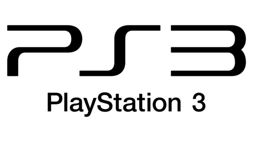
The PlayStation 3 (PS3) Era: The Bold “Spider-Man” Font and the 2009 Rebrand (2006–2013)
The PlayStation 3 (PS3) Era: The Bold “Spider-Man” Font and the 2009 Rebrand (2006–2013)
The launch of the PlayStation 3 in 2006 marked one of the most controversial chapters in the history of the brand’s visual identity. Seeking to position the PS3 as an ultra-premium, high-end home entertainment hub equipped with a Blu-ray player and cell broadband engine, Sony opted for a dramatic shift in typography. They adopted the sleek, curved, futuristic font used for the title branding of the Sony Pictures Spider-Man films directed by Sam Raimi.
This wordmark, spelled out as “PLAYSTATION 3” in all-caps across the side of the heavy, curved console, drew mixed reactions. Many critics felt it lacked a unique identity, relying too heavily on movie franchise synergy rather than establishing its own gaming heritage. The classic colorful PS symbol was almost entirely absent from the console’s physical shell, replaced by a silver, embossed version of the mark.
Recognizing the need to course-correct, Sony executed a massive mid-generation rebrand in 2009 with the launch of the “PS3 Slim.” They abandoned the Spider-Man typeface in favor of a much more elegant, rounded, and contemporary sans-serif wordmark: “PS3”. More importantly, this rebrand marked the triumphant return of the classic “PS” symbol to the forefront of the marketing materials. However, instead of the original four-color palette, the logo was now primarily used in a flat, minimalist monochrome format (either solid black or solid white). This shift aligned the brand with the burgeoning minimalist design trends of the late 2000s, prioritizing clean lines, scalability, and corporate sophistication.
The PlayStation 4 (PS4) Era: Refined Minimalism and Social Integration (2013–2020)

The PlayStation 4 (PS4) Era: Refined Minimalism and Social Integration (2013–2020)
When the PlayStation 4 was unveiled in 2013, Sony’s branding strategy had reached a state of highly refined maturity. The lessons of the past had been learned: consistency, simplicity, and immediate brand recognition were paramount. The PS4 utilized a sleek, angular console design, and the branding mirrored this sharp, modern aesthetic.
The logo for the PS4 era was a masterclass in modern corporate identity. Sony fully embraced the “flat design” movement, stripping away all gradients, shadows, and 3D bevels from the visual assets. The iconic “PS” symbol was used almost exclusively in monochrome, appearing on the console, the DualShock 4 controller, user interfaces, and global advertising campaigns. By presenting the logo in a singular, flat color (often white against a deep blue background), Sony created a highly versatile mark that could scale effortlessly from a tiny icon on a smartphone screen to a massive billboard in Times Square. The deep blue color, long associated with the PlayStation brand since the PS2 era, became the primary brand color, representing stability, immersion, and the endless depths of interactive entertainment.
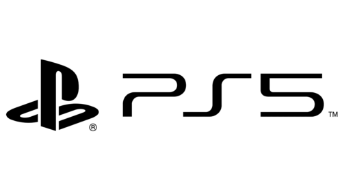
The PlayStation 5 (PS5) Era: Futuristic Duotone and Next-Gen Maturity (2020–Present)
The PlayStation 5 (PS5) Era: Futuristic Duotone and Next-Gen Maturity (2020–Present)
With the launch of the PlayStation 5 in 2020, Sony ventured into a bold new architectural aesthetic. The PS5 console is a towering, organic structure of curved white panels enveloping a sleek, black core, illuminated by soft blue ambient lighting. This dramatic shift from black to a high-contrast white-and-black duotone color scheme was immediately integrated into the console’s branding.
The PS5 logo continued the typographic legacy of the PS4, simply replacing the “4” with a “5” in the established custom typeface. However, the application of the iconic “PS” symbol evolved to match the console’s physical design. The logo is frequently rendered in a stark, high-contrast white on black, or embedded directly into the plastic of the console’s outer shells as a subtle, debossed physical texture. In a stroke of brilliant micro-branding, the textured grip on the DualSense controller and the console’s inner panels is actually composed of thousands of microscopic, raised versions of the classic PlayStation controller button symbols: the Triangle, Circle, Cross, and Square. This demonstrates how Sony has successfully transformed its basic brand iconography into functional, tactile elements of industrial design.
The Influence of Modern Logo Designs on Corporate Identity
When analyzing the trajectory of the PlayStation symbol, it becomes evident that Sony’s branding decisions did not occur in a vacuum. The evolution of the PlayStation mark reflects broader shifts in the global design landscape, where agencies specializing in professional Logo Designs have continuously pushed corporations toward minimalism, responsiveness, and emotional connection.
In the digital age, a logo can no longer exist solely as a static print on a box or a high-resolution render on a television screen. It must perform flawlessly across an array of digital environments, including mobile app icons, social media avatars, favicon files, virtual reality user interfaces, and digital store shelves. This multi-platform reality has forced modern brands to strip away complex details, gradients, and intricate color schemes in favor of flat, bold, and highly recognizable silhouettes.
The PlayStation logo is a prime example of a design that was so structurally sound from its inception that it survived this radical transition. Because Manabu Sakamoto focused on strong geometric forms and unique spatial relationships, the silhouette of the “PS” symbol remained immediately recognizable even when stripped of its iconic red, yellow, green, and blue colors. This adaptability is the ultimate hallmark of great corporate design—a quality that contemporary design studios strive to replicate when building visual identities for modern startups and established enterprises alike.
Key Takeaways from the PlayStation Logo Evolution
The journey of the PlayStation brand offers invaluable lessons for graphic designers, brand strategists, and business leaders. Below are the key takeaways from the evolution of this legendary symbol:
- Conceptual Depth Over Superficiality: The best logos communicate a core truth about the brand. By using perspective to create a 3D illusion, Sakamoto’s design visually communicated the console’s revolutionary 3D graphics capability without needing to explain it in words.
- The Power of Typography: Typographic choices can make or break a brand’s perception. The shift from the borrowed “Spider-Man” font of the early PS3 era back to a dedicated, clean, sans-serif typeface illustrates the importance of owning a unique, cohesive typographic voice.
- Adaptability and Scalability: A truly great logo must be versatile. The “PS” symbol transitioned seamlessly from a vibrant, multi-colored 3D asset in the 1990s to a flat, monochrome icon in the 2010s and 2020s without losing its core identity or consumer recognition.
- Consistency Builds Equity: Despite massive technological leaps and corporate restructuring across five console generations, Sony never abandoned the core “PS” symbol. This long-term consistency has built an immense reservoir of brand equity and consumer trust.
- Integration with Industrial Design: A logo should not feel like an afterthought slapped onto a product. From the rotatable logo on the PS2 disc tray to the microscopic textured symbols on the PS5 DualSense controller, PlayStation has masterfully woven its brand identity directly into the physical design of its hardware.
Frequently Asked Questions
Who designed the original PlayStation logo?
The original PlayStation logo was designed by Japanese graphic designer Manabu Sakamoto in 1994. Sakamoto also designed visual identities for several other high-profile Sony products and initiatives during his tenure at the company.
What do the colors of the original PlayStation logo represent?
The original logo featured Red, Yellow, Green, and Blue. These primary and secondary colors were chosen to represent passion (red), optimism (yellow), growth/innovation (green), and technological trust (blue). The vibrant palette also signaled that the console was a source of fun and excitement, contrasting with the dull grey tones of traditional consumer electronics of the era.
Why did Sony switch from the colorful logo to a monochrome design?
Sony transitioned to a monochrome logo to align with the global shift toward flat, minimalist design in the late 2000s. A single-color logo is highly versatile, looks premium on modern hardware, and scales perfectly across diverse digital platforms, such as mobile apps, websites, and high-definition user interfaces.
Can you rotate the logo on the physical PlayStation 2 console?
Yes, the small colorful PS logo located on the disc tray of the physical PlayStation 2 (and the PlayStation 3 Fat models) could be manually rotated 90 degrees. This allowed the logo to remain vertically or horizontally aligned depending on how the user chose to position the console on their entertainment center.
What is the “Spider-Man” font era of PlayStation?
The “Spider-Man” font era refers to the launch of the PlayStation 3 in 2006, when Sony used the same sleek, curved font for the console’s logo that was used for the title branding of the Sony Pictures Spider-Man films. This branding was retired in 2009 in favor of a more traditional, rounded sans-serif “PS3” typeface.
How does the PS5 utilize the PlayStation controller symbols in its design?
The PlayStation 5 features thousands of tiny, microscopic Triangle, Circle, Cross, and Square symbols molded directly into the plastic of the console’s inner plates and the grip of the DualSense controller. This creates a tactile, non-slip texture while serving as a subtle, highly creative form of micro-branding.
Conclusion
The PlayStation Logo History: Evolution of the Iconic PS Symbol is a testament to the power of thoughtful, visionary graphic design. What began as a bold, colorful experiment in 1994 has matured into an elegant, timeless symbol that commands instant recognition across the globe. By masterfully blending form, spatial perspective, and typography, Manabu Sakamoto created a visual mark that did not merely represent a product, but defined an entire era of human entertainment.
As we look to the future of interactive media—be it through cloud gaming, augmented reality, or immersive virtual worlds—the PlayStation symbol remains uniquely positioned to lead the charge. Its ability to adapt to changing artistic movements and technical requirements while maintaining its core identity proves that excellent design is permanent. The standing “P” and the lying “S” will undoubtedly continue to illuminate screens and capture the imaginations of millions of players around the world for generations to come, standing as an enduring icon of joy, adventure, and human ingenuity.