
Introduction to Subway Logo History: The Meaning Behind the Arrow Logo
In the highly competitive landscape of the global quick-service restaurant (QSR) industry, visual branding is not merely an aesthetic choice; it is a critical driver of consumer behavior, brand recall, and market positioning. Among the most recognizable visual trademarks in the world is the Subway logo. Instantly identifiable by its vibrant green and yellow hues and the iconic arrows extending from the first and last letters, this emblem has stood the test of time, guiding hungry consumers to sandwich counters across more than 100 countries. To understand the true weight of this brand asset, one must dive deep into the Subway Logo History: The Meaning Behind the Arrow Logo.
Research in consumer psychology indicates that humans can process visual icons in as little as 13 milliseconds, and a brand’s logo is often the very first point of contact between a business and its target demographic. While competitors like McDonald’s, Burger King, and Wendy’s have historically relied on warm, high-energy color palettes dominated by reds and yellows to stimulate appetite and urgency, Subway took a radically different path. By incorporating cool, refreshing greens and utilizing unique directional geometry, the brand carved out a distinct niche focused on freshness, customization, and speed. This comprehensive analysis explores how a single sandwich shop in Bridgeport, Connecticut, evolved its visual identity to become an international powerhouse, analyzing every design shift, symbolic nuance, and strategic rebranding effort along the way.
The Origin Story: From Pete’s Super Submarines to Subway
To fully grasp the evolution of the Subway brand mark, we must return to its humble beginnings in 1965. The brand was not born as “Subway,” nor did it initially feature its famous green-and-yellow color scheme. Instead, the venture began as “Pete’s Super Submarines” in Bridgeport, Connecticut. Founded by 17-year-old Fred DeLuca and family friend Dr. Peter Buck, the initial goal was simple: to fund DeLuca’s college education. Dr. Buck provided a starting investment of $1,000, which set in motion one of the most successful franchising stories in business history.
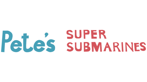
The original logo for Pete’s Super Submarines was a far cry from the sleek, minimalist emblem we see today. It featured a rustic, hand-drawn aesthetic designed to evoke a neighborhood deli feel. The typography was casual, and the layout was functional rather than strategic. There were no arrows, no balanced geometry, and no professional color theory applied. The focus was purely localized, aimed at drawing in nearby residents and students with the promise of large, fresh submarine sandwiches.
However, DeLuca and Buck quickly realized that the name “Pete’s Super Submarines” posed a significant marketing challenge. When advertised on local radio stations, listeners frequently misheard the name as “Pizza Marines.” This acoustic confusion severely hindered their advertising efficiency. Recognizing the need for a short, punchy, and highly memorable brand name, they officially rebranded the business to “Subway” in 1968. This pivotal shift marked the birth of the very first iteration of the modern Subway logo and introduced the design elements that would define the brand for decades to come.
Analyzing the Symbolic Meaning of the Arrows
With the transition to the name “Subway” in 1968, the brand introduced its most iconic visual asset: the arrows extending from the left side of the letter “S” and the right side of the letter “Y.” This was not a random design choice; it was a highly intentional piece of visual storytelling. To understand the Subway Logo History: The Meaning Behind the Arrow Logo, one must look at the dual meaning embedded within these simple geometric pointers.
The Concept of Entry and Exit
At its most literal level, the arrows representing the start and end of the word symbolize the entrance and exit of a subway transit system. The left-facing arrow on the ‘S’ represents the entry point, while the right-facing arrow on the ‘Y’ represents the exit. This clever metaphor perfectly aligned with the fast-paced, transit-inspired nature of the brand’s name. It communicated to customers that they could step into a Subway restaurant, customize their meal, and step out quickly—replicating the speed, efficiency, and accessibility of a metropolitan subway system.
Movement, Speed, and Forward Progress
Beyond the transit metaphor, arrows are powerful psychological symbols. In graphic design, arrows naturally draw the eye and imply movement, direction, and progress. By pointing in opposite directions, the arrows on the Subway logo create a sense of dynamic energy and continuous motion. They suggest that the brand is forward-thinking, agile, and always moving in the right direction. For a fast-food brand operating in a busy, modern world, conveying speed and convenience without sacrificing quality was a massive competitive advantage, and the arrow logo communicated this message sub-perceptually.
Customization and the “Your Way” Philosophy
Another layer of meaning behind the arrows lies in the concept of choice and customization. Subway’s primary value proposition has always been its assembly-line style of service, where customers walk along the counter and choose every single ingredient that goes into their sandwich. The outward-pointing arrows represent this freedom of choice, suggesting that customers can go in any direction they please when building their meals. It reinforces the brand’s long-standing slogan, “Eat Fresh,” by giving consumers literal and figurative direction over their nutritional choices.
Chronological Evolution of the Subway Logo (1965 – Present)
Over more than five decades, the Subway logo has undergone several major transformations. Each redesign was carefully calculated to reflect shifting consumer preferences, design trends, and corporate strategies. Below, we examine each phase of this visual evolution in detail.
Phase 1: 1965–1968 – The Pre-Arrow Era
Phase 1: 1965–1968 – The Pre-Arrow Era
As previously mentioned, this initial period was dominated by the “Pete’s Super Submarines” moniker. The branding was unpolished and local. The colors were basic, and the typography lacked a cohesive identity. This era was characterized by trial and error, as the founders worked to establish their business model before investing heavily in professional graphic design and brand positioning.
Phase 2: 1968–2002 – The Classic Yellow and White Arrow Logo
Phase 2: 1968–2002 – The Classic Yellow and White Arrow Logo
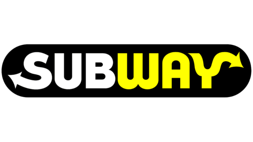
In 1968, the official Subway logo made its debut. This design featured a bold, hand-drawn, sans-serif typeface where the letters were slightly irregular and friendly. The “Sub” portion of the word was colored white, while the “way” portion was colored a bright, mustard yellow. This entire wordmark was set against a dark background, often dark green or black, to make the letters pop.
This design was revolutionary for the brand. It was the first time the entry and exit arrows were integrated into the ‘S’ and the ‘Y’. The contrast between the clean white and the warm yellow made the logo highly legible from a distance, which was essential for attracting drivers on busy highways. This logo remained virtually unchanged for over three decades, serving as the visual anchor during Subway’s massive domestic and international expansion throughout the 1970s, 80s, and 90s.
Phase 3: 2002–2016 – The Bold Green, Yellow, and White Era
Phase 3: 2002–2016 – The Bold Green, Yellow, and White Era
By the turn of the millennium, consumer attitudes toward fast food were shifting dramatically. Obesity rates were rising, and there was a growing demand for healthier, fresher dining options. Subway seized this opportunity to position itself as the healthy alternative to traditional deep-fried fast food, launching its famous “Eat Fresh” campaign.
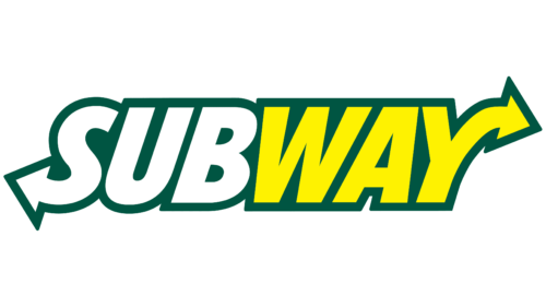
To reflect this new health-conscious identity, Subway introduced a major logo redesign in 2002. The new logo kept the iconic arrows but modernized the overall aesthetic. The letters were given a thick, dark green outline, and the font was italicized to imply speed, energy, and modern vitality. The “Sub” remained white, and the “way” remained yellow, but the colors were made brighter and more vibrant. This logo was designed to look clean, fresh, and dynamic, aligning perfectly with the brand’s promotion of low-fat menu items and fresh ingredients. It was during this era that Subway grew to surpass McDonald’s in terms of total global restaurant locations.
Phase 4: 2015–2016 – The Transitional Clean Look
Phase 4: 2015–2016 – The Transitional Clean Look
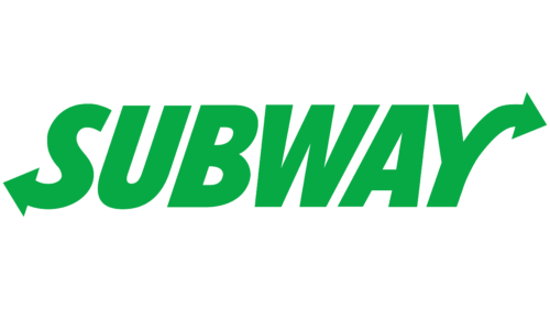
In late 2015, Subway briefly experimented with a simplified, single-color variation of its logo. This was a transitional phase where the brand stripped away the heavy green outlines and gradients, opting for a clean, flat green wordmark. While this design was short-lived, it signaled the brand’s intention to move away from the busy, three-dimensional design trends of the early 2000s and embrace the clean, flat design principles that were beginning to dominate the digital landscape.
Phase 5: 2016–Present – The Minimalist “Choice Mark” and Modern Redesign
Phase 5: 2016–Present – The Minimalist “Choice Mark” and Modern Redesign
In 2016, Subway unveiled its current visual identity, representing the most significant rebranding effort in modern company history. Developed in partnership with leading creative agencies, the new logo returned to a clean, flat, two-dimensional aesthetic. The heavy outlines and italicization of the 2002 logo were completely discarded.
The current logo features a bold, clean, upright sans-serif typeface. The word “Sub” is rendered in a bright, optimistic yellow, while “way” is displayed in a vibrant, rich green. The arrows on the ‘S’ and ‘Y’ remain central to the design, but they are now sleeker and more integrated into the letterforms. Alongside this main wordmark, Subway introduced the “Choice Mark”—a minimalist monogram featuring the letters ‘S’ and ‘Y’ merged into a single icon, with the green and yellow arrows pointing outward to form a subtle, circular motion. This monogram was specifically designed for digital utility, fitting perfectly into mobile app icons, social media profile pictures, and digital menu boards where a long wordmark would be illegible.
The Role of Professional Logo Designs in Brand Longevity
When analyzing the success of the Subway logo throughout history, it becomes clear that professional design is not a luxury; it is a fundamental business strategy. The ability of Subway’s visual identity to adapt to changing cultural landscapes while maintaining its core brand equity is a testament to the power of thoughtful design. This highlights why modern businesses, from startups to global enterprises, rely on professional Logo Designs to build trust, authority, and long-term brand equity.
A professionally crafted logo does more than look attractive; it solves complex communication problems. It takes a brand’s core values—such as Subway’s commitment to speed, fresh ingredients, and consumer choice—and translates them into simple, universally understood visual cues like arrows and color palettes. In an era where consumers are bombarded with thousands of marketing messages daily, a professionally designed logo provides a beacon of familiarity and trust. It ensures that whether a customer is looking at a massive billboard, a tiny smartphone screen, or a storefront from a block away, the brand’s identity remains consistent, powerful, and instantly recognizable.
Color Psychology in the Subway Logo Redesigns
Color is one of the most powerful tools in a graphic designer’s arsenal, capable of evoking specific emotions, physical reactions, and subconscious associations. The color palette of the Subway logo has played a massive role in the brand’s market positioning and consumer perception. Let us break down the psychology behind the green and yellow hues that have defined the brand for decades.
The Power of Green: Health, Freshness, and Vitality
Green is universally associated with nature, growth, health, and renewal. In the context of the food industry, green represents organic ingredients, vegetables, freshness, and sustainability. When Subway introduced green into its logo, it was a deliberate move to distance itself from the “greasy” reputation of traditional fast-food chains.
By filling their visual identity with green, Subway sub-perceptually communicates to consumers that their food is fresh, wholesome, and nutritious. It aligns with their “Eat Fresh” promise, making consumers feel better about their dining choices. In a world where consumers are increasingly health-conscious, the green in the Subway logo acts as a powerful trust signal, promising a guilt-free dining experience.
The Warmth of Yellow: Optimism, Energy, and Appetite
Yellow is the color of sunshine, optimism, joy, and energy. Psychologically, yellow is known to stimulate the nervous system and increase mental activity. In food branding, yellow is highly effective because it stimulates the appetite and creates a feeling of warmth, friendliness, and hospitality.
In the Subway logo, the bright yellow letters balance the cool, calming nature of the green. It adds a sense of fun, accessibility, and high-energy appeal to the brand. The yellow arrows draw attention and create excitement, making the storefronts look welcoming and inviting to passersby. Together, the green and yellow create a harmonious balance of health and happiness, a combination that has proven incredibly successful in attracting a diverse, global customer base.
Typography and Geometry of the Subway Emblem
While colors and symbols grab immediate attention, the underlying typography and geometry of a logo are what give it structural integrity and lasting legibility. The typography of the Subway logo has evolved from a friendly, slightly rustic hand-drawn style to a highly polished, geometric sans-serif typeface.
The Architecture of the Wordmark
The modern Subway wordmark is built on a strong, balanced grid system. The letters are bold and uppercase-adjacent, giving the brand a strong, authoritative presence. The thickness of the letterforms ensures that the logo remains highly legible even when scaled down to small sizes, such as on a business card or a mobile app icon.
The geometry of the letters is carefully crafted to lead the eye smoothly from left to right. The vertical lines of the letters are perfectly parallel, creating a sense of stability and reliability. The curves of the ‘S’, ‘U’, and ‘B’ are rounded and soft, preventing the logo from looking overly aggressive or corporate, and maintaining a welcoming, consumer-friendly vibe.
The Integration of the Arrows
The most challenging aspect of the Subway logo design is the integration of the arrows into the letters ‘S’ and ‘Y’. In poorly designed logos, adding external elements to letterforms can make the text look cluttered and difficult to read. However, Subway’s designers solved this beautifully by making the arrows natural extensions of the letters themselves.
The top curve of the ‘S’ flows seamlessly into a left-pointing arrow, while the right arm of the ‘Y’ extends naturally into a right-pointing arrow. This integration creates a sense of unity and cohesion. The arrows do not look like afterthoughts; they are fundamental parts of the letters. This seamless integration is a masterclass in minimalist design, showing how complex ideas can be communicated through simple, elegant adjustments to standard typography.
Key Takeaways from Subway’s Branding Strategy
- Consistency is Key: Despite multiple redesigns, Subway has kept its core visual identifiers—the yellow and green colors and the entry/exit arrows—for over 50 years, preserving invaluable brand equity.
- Adapt to Market Shifts: Subway’s transition to a green-heavy palette in 2002 was a direct, highly successful response to the rising global demand for healthier food options.
- Design for the Digital Age: The 2016 redesign stripped away complex gradients and outlines, prioritizing flat design and creating the “Choice Mark” monogram specifically optimized for mobile apps and digital screens.
- Leverage Symbolic Metaphors: The arrows in the Subway logo do double duty, representing the speed of a transit subway and the consumer’s freedom of culinary choice.
- Balance Color Psychology: By combining green (health, freshness) with yellow (optimism, appetite stimulation), Subway created a unique, balanced emotional connection with its audience that stands out from competitors.
Frequently Asked Questions
What is the meaning behind the arrows in the Subway logo?
The arrows on the ‘S’ and ‘Y’ in the Subway logo represent the entry and exit points of a subway transit system. This symbolizes speed, efficiency, and convenience. On a deeper level, the outward-pointing arrows represent consumer choice, customization, and the freedom to build your meal your way.
Who designed the original Subway logo?
The original Subway logo with the iconic arrows was introduced in 1968 when the brand renamed itself from “Pete’s Super Submarines” to “Subway.” It was developed under the direction of founders Fred DeLuca and Dr. Peter Buck as they sought a highly memorable, professional visual identity to support their franchising ambitions.
Why did Subway change its logo colors over time?
Subway shifted its color palette to incorporate deep green in 2002 to align with its new “Eat Fresh” health-focused marketing campaign. While the original logo relied heavily on yellow and white, the addition of green helped position the brand as a fresh, healthy, and organic alternative to traditional greasy fast-food chains.
What is the Subway “Choice Mark”?
The “Choice Mark” is a minimalist monogram introduced by Subway in 2016. It features the letters ‘S’ and ‘Y’ simplified and merged into a circular icon with the green and yellow arrows pointing outward. It was designed specifically for digital touchpoints, such as mobile apps, social media icons, and smartwatches, where the full wordmark would be too small to read.
How does the Subway logo use flat design?
In its 2016 redesign, Subway embraced flat design by removing the 3D gradients, shadows, and heavy dark green outlines of the 2002 logo. This created a clean, two-dimensional, minimalist look that improves legibility across digital platforms, speeds up load times on websites, and aligns with modern, clean design aesthetics.
Conclusion
The journey of the Subway logo from a local sandwich shop’s hand-drawn sign to one of the most recognizable corporate emblems in the world is a powerful testament to the impact of strategic brand identity. The history of the Subway logo shows how a brand can successfully navigate decades of cultural, technological, and economic change by staying true to its core visual assets while continuously refining its presentation.
The brilliant integration of the entry and exit arrows, combined with a masterful application of color psychology, has allowed Subway to communicate speed, convenience, health, and choice in a single, glanceable mark. As the brand continues to expand its digital footprint and adapt to a fast-changing retail environment, its iconic arrow logo remains a steady, trusted guidepost for millions of hungry consumers worldwide, proving that great design is indeed a timeless investment.