
Introduction
In the high-stakes arena of global luxury fashion, a visual identity serves as more than a mere trademark; it acts as an emotional conduit, a cultural signifier, and a declaration of artistic intent. While many heritage fashion houses opted for understated, minimalist typographic monograms during their inception, Gianni Versace took a radically different path. By anchoring his brand’s visual identity in classical mythology, he created a symbol that did not merely represent fashion, but rather commanded devotion. Understanding the Versace Logo History: Why the Medusa Became a Luxury Icon requires a deep dive into the intersections of ancient history, Italian heritage, psychoanalytic symbolism, and brilliant marketing strategy.
Today, the global luxury market is undergoing a profound visual transformation. As contemporary brands shift between “quiet luxury” minimalism and bold, expressive maximalism, the Versace Medusa stands as a monument to the enduring power of myth-driven branding. While competitors frequently update their visual identities to align with fleeting digital trends, Versace’s emblem remains largely unchanged, proving that a deeply narrative-driven logo can transcend generations. This comprehensive study explores how a mythological monster was transformed into the ultimate symbol of high-fashion opulence, tracing its origins from the ancient ruins of Reggio Calabria to the peak of modern pop-culture dominance.
The Genesis of Gianni Versace’s Vision: Magna Graecia and Calabrian Roots
To fully comprehend the Versace Logo History: Why the Medusa Became a Luxury Icon, one must first explore the geographical and cultural origins of its founder, Gianni Versace. Born in 1946 in Reggio Calabria, located in the southern tip of the Italian peninsula, Gianni grew up immersed in the living history of Magna Graecia (Greater Greece). This region of Southern Italy was extensively colonized by Greek settlers beginning in the 8th century BC, leaving behind a landscape rich with Hellenistic ruins, ancient temples, intricate mosaics, and classical artifacts.
The Influence of Childhood Playgrounds
As children, Gianni and his siblings, Santo and Donatella, played among the ancient Greco-Roman ruins of their hometown. It was on the floor of an ancient Roman villa in the area of San Giovanni in Persiceto where a young Gianni first laid eyes on a beautifully preserved mosaic of Medusa. This childhood memory left an indelible mark on his creative consciousness. To Gianni, these ruins were not dead history; they were a vibrant, tactile playground of myth and beauty that contrasted sharply with the industrial, post-war reconstruction of mid-20th-century Italy.
Southern Italian Baroque vs. Northern Minimalist Fashion
When Gianni moved to Milan in the 1970s to launch his fashion career, he brought this Southern Italian, Greco-Roman sensibility with him. Milanese fashion at the time was characterized by practical, understated, and highly structured designs—epitomized by the rising popularity of Giorgio Armani. Gianni’s aesthetic, heavily influenced by Calabrian Baroque architecture and Hellenistic drama, was a direct challenge to this northern minimalism. He envisioned fashion that was theatrical, unashamedly sensual, and deeply expressive. The selection of a mythological emblem was a strategic move to codify this rebellious, history-steeped creative philosophy into a singular visual mark.
The Chronological Evolution of the Versace Logo
The visual identity of the Versace brand did not emerge fully formed overnight. It underwent several deliberate iterations, evolving from a simple typographic layout into one of the most complex and recognizable emblems in the history of graphic design.
1978 – 1980: The Birth of a Legend
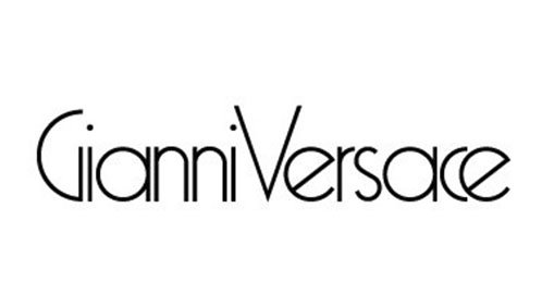
When Gianni Versace founded his namesake label in 1978, the initial logo was remarkably simple and clean. It featured a minimalist, avant-garde sans-serif wordmark: “Gianni Versace.” The characters were closely spaced, modern, and highly legible, reflecting the contemporary graphic design trends of the late 1970s. During these initial years, the brand relied on the sheer novelty of Gianni’s clothing designs—slashed leather, metal mesh, and vibrant prints—to establish its reputation, rather than a distinctive pictorial symbol.
1980 – 1990: Refined Typography and Global Expansion
1980 – 1990: Refined Typography and Global Expansion
As the brand gained international acclaim, the logo was refined to project a more sophisticated, luxury-oriented aesthetic. The typeface was updated to a elegant, spaced-out serif font that exuded classicism and elite status. The transition from sans-serif to serif during this decade was a calculated move to align the brand with traditional European luxury houses, even as Gianni’s runway collections continued to push the boundaries of taste, sexuality, and material innovation.
1993: The Coronation of the Medusa
1993: The Coronation of the Medusa
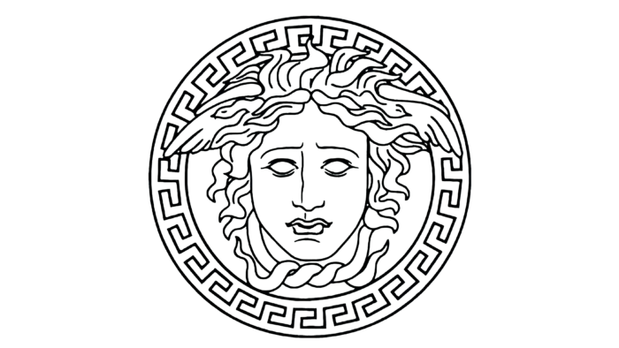
The year 1993 marked the most significant milestone in the Versace Logo History: Why the Medusa Became a Luxury Icon. Recognizing the need for a singular, iconic symbol that could be stamped onto metal hardware, cast into jewelry, printed on silk scarves, and recognized globally without the aid of text, Gianni unveiled the Medusa head emblem. Surrounded by a circular border of the Greek Key (meander) pattern, the Medusa became the official face of the house. This was not merely an addition to the brand; it was a complete visual overhaul that unified Gianni’s obsession with classical antiquity, high drama, and modern luxury.
1997 – Present: Continuity and Adaptation
1997 – Present: Continuity and Adaptation
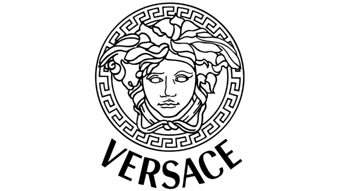
Following the tragic assassination of Gianni Versace in July 1997, his sister Donatella took over the creative direction of the house. While she modernized the collections to appeal to a new generation of digital consumers, she wisely chose to preserve the Medusa logo. The logo underwent minor refinements to optimize its legibility for digital screens and modern applications. The name “Gianni” was dropped, and the wordmark simply read “VERSACE” in a clean, high-contrast, custom sans-serif font, positioned beneath the circular Medusa emblem. This balance of typographic modernization and mythological continuity ensured that the brand’s core heritage remained intact through a period of immense corporate transition.
The Semiotics and Mythology of the Medusa
To understand the genius of the Versace logo, one must look beyond graphic design and analyze its semiotic and mythological underpinnings. Why did Gianni choose a creature from Greek mythology who was cursed to turn anyone who looked at her into stone?
The Classical Myth: From Victim to Monster
In classical mythology, Medusa was originally a mortal woman of extraordinary, breathtaking beauty, particularly renowned for her stunning hair. After being raped by Poseidon in the temple of Athena, the virgin goddess Athena, outraged by the desecration of her sacred space, punished Medusa by transforming her beautiful hair into venomous snakes and cursing her face so that anyone who gazed upon her would instantly turn to stone. She was eventually slain by the hero Perseus, who used her severed head as a weapon of ultimate power before presenting it to Athena to place on her shield (the Aegis).
Gianni’s Subversion: The Symbol of Inescapable Attraction
In a move of sheer branding genius, Gianni Versace completely subverted the traditional, monstrous interpretation of Medusa. He did not view her as a warning against hubris or a symbol of terror. Instead, he focused on her original attribute: her hypnotic, fatal beauty, and her power to permanently arrest the gaze of anyone who looked at her. Gianni famously remarked that he chose Medusa because “whoever falls in love with her can never flee from her.”
This concept of inescapable attraction is the holy grail of luxury branding. By aligning the Versace identity with Medusa, Gianni suggested that his designs possessed a similar hypnotic power. To wear Versace was to become a figure of mesmerizing, dangerous beauty—someone who commands the attention of the room, paralyzing onlookers with awe and desire. It transformed the act of purchasing luxury goods into an initiation into a mythical, empowering cult of beauty.
Anatomy of a Masterpiece: Deconstructing the Visual Elements
The Versace logo is a masterclass in complex, high-concept graphic design. Unlike modern minimalist logos that rely on extreme simplification, the Versace emblem is dense, intricate, and rich with symbolic geometry. Let us deconstruct its primary visual components:
1. The Portrait of Medusa
The central figure of the logo is not a terrifying, snake-haired monster, but a serene, classical, and highly stylized portrait. Modeled after the famous Hellenistic sculpture known as the Medusa Rondanini (which depicts Medusa as a beautiful, tragic woman rather than a grotesque beast), the face is characterized by perfect symmetry, almond-shaped eyes, full lips, and a calm, enigmatic expression. Her hair is depicted as flowing, wavy tresses that seamlessly blend into stylized, stylized serpents. This rendering emphasizes her divine, immortal beauty rather than her monstrous curse, striking a delicate balance between elegance and danger.
2. The Meander (Greek Key) Border
Encircling the portrait of Medusa is the Greek Key pattern, also known as a meander or *maandros*. This continuous, interlocking geometric line design is one of the most famous decorative motifs of ancient Greece. In classical art, the meander symbolized infinity, the eternal flow of life, and unity. For Versace, this border serves multiple strategic purposes:
- It frames the central portrait, giving the logo the appearance of an ancient medallion or coin.
- It reinforces the brand’s Greco-Roman heritage, providing an instant visual shorthand for classical luxury.
- It acts as a highly repeatable pattern that can be woven into fabric borders, printed on eyewear temples, and embossed on leather goods, serving as a secondary brand identifier.
3. Typographic Harmony
The word “VERSACE” is rendered in a custom, uppercase, geometric sans-serif typeface. The letterforms are wide, stable, and perfectly balanced, providing a modern, clean contrast to the highly detailed, organic curves of the central Medusa portrait. This juxtaposition of classical imagery and modern typography represents the very essence of the brand: a bridge between ancient heritage and contemporary high-fashion innovation.
4. Color Psychology: Gold, Black, and White
While the logo is often rendered in monochrome black and white for editorial and digital applications, its signature manifestation is in metallic gold on a black background.
- Gold: The ultimate color of royalty, divinity, wealth, and opulence. It evokes the gilded interiors of Baroque palaces, ancient treasures, and the radiant Mediterranean sun.
- Black: Represents authority, mystery, sophistication, and timeless elegance. It provides a stark, high-contrast backdrop that allows the gold Medusa to project forward with dramatic intensity.
Together, these colors communicate a narrative of absolute prestige, power, and unapologetic luxury.
How Heritage Brands Shape Modern Logo Designs
In the contemporary design landscape, the tension between historical preservation and digital-first modernization is a constant challenge for brands across all sectors. As businesses seek to establish digital credibility, many fall victim to “blandification”—the process of stripping away unique, heritage-rich logo elements in favor of sterile, geometric sans-serif typefaces. The Versace logo stands as a powerful counter-argument to this trend, demonstrating that complexity, storytelling, and historical depth can create a far more resilient and valuable brand asset than simple minimalism.
For modern graphic designers and branding agencies, the Versace logo history offers invaluable lessons in visual storytelling. A truly iconic logo does not merely identify a company; it encapsulates a philosophy, a culture, and an emotional promise. While minimalist designs are highly functional on small digital screens, they often lack the emotional resonance required to cultivate deep consumer loyalty. By studying how Gianni Versace integrated classical art with commercial design, contemporary agencies can learn to build visual identities that leverage historical motifs, cultural mythology, and geometric symbolism to create brands that are not only modern but timeless.
The Cultural Footprint: From High Fashion to Hip-Hop and Pop Culture
A major factor in why the Medusa became a luxury icon is its seamless integration into global pop culture. The Versace logo did not remain confined to the runways of Milan; it became a powerful cultural currency, adopted by subcultures, musicians, and artists worldwide as the ultimate symbol of success and self-assertion.
The Hip-Hop Renaissance and the “Versace-ism” Era
During the late 1980s and 1990s, the rising stars of American hip-hop culture adopted Versace as their uniform of choice. Artists like The Notorious B.I.G. (Christopher Wallace) and Tupac Shakur embraced the brand’s silk shirts, heavy gold chains, and Medusa-stamped sunglasses. For these artists, who had risen from poverty to extreme wealth, the bold, gilded, and unapologetic maximalism of Versace was the perfect visual representation of their triumph. The Medusa head, shining on a pair of sunglasses or a heavy gold ring, became a badge of honor, symbolizing that the wearer had made it to the very top of the world.
This cultural connection was immortalized in tracks like The Notorious B.I.G.’s “Hypnotize” and, decades later, the hip-hop trio Migos’ 2013 breakout hit “Versace.” The repetition of the brand’s name as a rhythmic mantra in modern music solidified the Medusa logo’s status as a universal synonym for opulence, ambition, and cultural dominance.
The Red Carpet and the “Supermodel” Phenomenon
Gianni Versace is widely credited with inventing the modern “Supermodel” phenomenon. By casting iconic figures like Naomi Campbell, Cindy Crawford, Linda Evangelista, and Christy Turlington in his runway shows and campaigns, he elevated models from anonymous coat hangers to global celebrities. The Medusa logo was always at the center of this cultural shift, emblazoned on the back of leather jackets, pinned onto safety-pin dresses (such as Elizabeth Hurley’s famous 1994 “That Dress”), and draped across the bodies of the world’s most beautiful women. This association with the peak of human beauty and celebrity power permanently cemented the Medusa as an aspirational icon of glamour.
The Psychology of Luxury Branding: Why Myth Beats Minimalism
In the academic study of luxury brand equity, researchers often analyze the emotional and psychological mechanisms that drive consumers to pay premium prices for branded goods. The Versace logo history provides an ideal case study for understanding how mythological branding creates a superior emotional connection compared to functional, minimalist branding.
The Luxury Brand Equity Pyramid
According to classic brand equity models, a brand’s value is built through a progression of consumer perceptions: from basic awareness, to functional performance, to emotional imagery, and finally, to brand resonance (deep, loyal relationships). Most standard logos operate at the base of this pyramid, focusing on clear identification and functional clarity.
The Versace Medusa, however, bypasses the functional stages and targets the emotional and self-expressive levels of the pyramid immediately. By utilizing a mythological figure associated with hypnotic beauty, power, and transformation, the logo taps into deep-seated human desires for status, seduction, and self-empowerment. The consumer is not merely buying a handbag; they are aligning themselves with the mythic power of the Gorgon, transforming their personal identity through association.
The Power of Narrative Transport
Narrative transport is a psychological phenomenon where an individual becomes so immersed in a story that their attitudes, beliefs, and behaviors change to align with the narrative. Versace’s use of the Medusa, the Greek Key, and classical mythology initiates a process of narrative transport. It invites the consumer into an opulent, dramatic world of Italian heritage, classical art, and high-fashion rebellion. This rich narrative depth makes the brand highly memorable, emotionally resonant, and virtually impossible for competitors to replicate through simple product quality or minimalist graphic design.
Key Takeaways
- Rooted in Heritage: The Versace logo was born from Gianni Versace’s childhood memories of playing among the ancient Greco-Roman ruins of Magna Graecia in Calabria, Italy.
- Subversion of Myth: Gianni brilliantly reinterpreted the myth of Medusa, focusing on her original, hypnotic beauty and her power to permanently arrest the gaze, turning her from a monster into a symbol of fatal, irresistible attraction.
- Intricate Geometry: The logo’s design is a complex composition featuring a symmetrical classical portrait of Medusa framed by the Greek Key (meander) border, symbolizing infinity, eternal flow, and classical luxury.
- Typographic Contrast: The custom, clean, geometric sans-serif wordmark “VERSACE” provides a modern, high-contrast balance to the organic, ornate details of the central mythological emblem.
- Cultural Currency: Through its embrace by 90s supermodels and hip-hop icons like The Notorious B.I.G., the Medusa logo transcended fashion to become a universal cultural symbol of success, luxury, and self-assertion.
- Resilience Against Trends: While modern luxury brands frequently simplify their visual identities, Versace’s commitment to its rich, complex, and narrative-driven logo has preserved its unique brand equity and timeless appeal.
Frequently Asked Questions
Why did Gianni Versace choose the Medusa for his logo?
Gianni Versace chose the Medusa because of her mythological power of absolute attraction. He wanted to create a brand that possessed a hypnotic, paralyzing beauty from which no one could escape. The selection was also a tribute to his childhood in Southern Italy, where he played among ancient Greco-Roman ruins and first saw Medusa depicted in classical floor mosaics.
When was the Medusa logo first introduced?
While the Versace brand was founded in 1978 with a simple typographic wordmark, the iconic Medusa head emblem was officially introduced as the central brand logo in 1993, unifying the house’s visual identity under a singular, recognizable mythological symbol.
What is the border around the Versace logo called?
The geometric border surrounding the Medusa head is called the Greek Key, or meander pattern. It is an ancient Greek decorative motif that symbolizes infinity, unity, and the eternal flow of life, reinforcing the brand’s classical Mediterranean heritage.
Did the Versace logo change after Gianni Versace’s death?
Following Gianni Versace’s tragic passing in 1997, his sister Donatella Versace took creative control of the house. She preserved the Medusa emblem but made subtle typographic refinements, dropping the first name “Gianni” and optimizing the “VERSACE” wordmark into a cleaner, modern, high-contrast sans-serif font for better digital legibility.
What does the Versace logo symbolize in luxury fashion?
In the luxury fashion industry, the Versace logo symbolizes unapologetic opulence, high-drama glamour, classical Italian heritage, and empowering sensuality. It represents a bold, maximalist alternative to minimalist luxury, promising consumers a transformative sense of power, confidence, and magnetic attraction.
Is the Medusa head logo used across all Versace product lines?
Yes, the Medusa head is the primary visual anchor for all of the brand’s diverse product lines, including Haute Couture (Atelier Versace), ready-to-wear fashion, fine jewelry, watches, eyewear, fragrances, home decor (Versace Home), and luxury hospitality (Palazzo Versace). Its highly adaptable design allows it to be cast in metal, woven into textiles, or printed on packaging with equal aesthetic impact.
Conclusion
The journey of the Versace logo is a testament to the power of artistic vision and the enduring strength of cultural mythology. By looking backward to the ancient ruins of his youth, Gianni Versace created a visual identity that was propelled forward into the future, establishing a brand that remains as vibrant, provocative, and desirable today as it was when it first shocked the fashion world in the late 20th century.
In a world of rapidly shifting trends, digital transformations, and corporate rebrandings, the Medusa stands tall, a golden monument to the philosophy that true luxury is not quiet, understated, or simple—it is loud, dramatic, historical, and deeply seductive. The Versace Logo History: Why the Medusa Became a Luxury Icon proves that when a designer builds a brand upon the foundation of timeless art, ancient myth, and authentic personal narrative, the resulting visual mark does not merely represent a business; it becomes immortal. As long as humanity remains captivated by beauty, power, and the thrill of attraction, the Medusa of Versace will continue to turn onlookers to stone, holding them captive in her golden, hypnotic gaze.