
Introduction: The Visual Evolution of a Global Media Titan
In the landscape of modern digital media, few visual identifiers are as universally recognized as the YouTube logo. Serving as the gateway to billions of hours of video content, the logo has evolved from a quirky, Web 2.0 startup badge into an iconic symbol of global communication, entertainment, and creator culture. As of today, YouTube is not merely a video-sharing platform; it is the world’s second-most visited website and a primary search engine, facilitating a massive portion of all global internet traffic.
Understanding the YouTube Logo History: Every Logo Since Launch requires more than a simple chronological list of image updates. It demands an exploration of the shifts in user interface design, the transition from desktop-centric web browsing to mobile-first ecosystems, and the evolution of display technologies. From the early days of bulky Cathode Ray Tube (CRT) televisions to the ultra-vibrant, high-contrast screens of modern OLED smartphones, YouTube’s visual identity has continuously adapted to remain legible, impactful, and expressive.
This deep-dive analysis offers an authoritative, design-centric exploration of every iteration of the YouTube logo from its inception in 2005 to its current unified brand identity. We will examine the design philosophies, color palettes, typographical choices, and strategic rebranding efforts that have shaped this digital landmark over nearly two decades.
The Pre-Launch and Founding Era (Late 2004 – Early 2005)
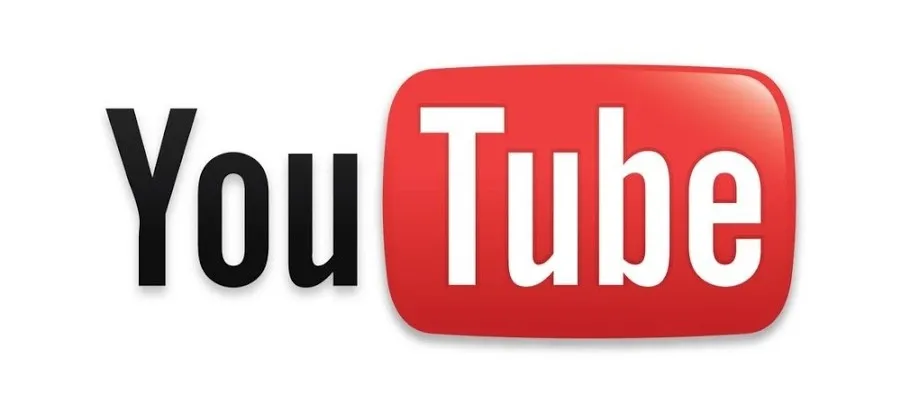
The YouTube logo history: 2005 to 2011
Before YouTube became a household name, it was a nascent concept developed by three former PayPal employees: Chad Hurley, Steve Chen, and Jawed Karim. Operating out of a small office in San Mateo, California, the founders recognized a profound gap in the consumer internet experience: the extreme difficulty of sharing and viewing video clips online. At the time, video files required specialized plugins, long download times, and proprietary media players.
Chad Hurley’s Design Influence
Unlike many tech startups where visual design is an afterthought left to external contractors, YouTube’s initial visual identity was crafted in-house by one of its co-founders. Chad Hurley, who had studied fine art and design at the Indiana University of Pennsylvania, took the lead in establishing the platform’s visual interface and its inaugural logo. Hurley’s design background ensured that the logo was developed with an eye toward simplicity, functional utility, and immediate conceptual clarity.
The Concept of the “Tube”
The core metaphor of the original logo was rooted in the word “Tube.” In mid-20th-century slang, particularly in North America, “the tube” or “boob tube” was a popular colloquialism for a television set. This term originated from the cathode-ray tubes that powered analog television receivers. By combining “You” (signifying user-generated content and personal agency) with “Tube” (signifying broadcast media), the founders created a powerful compound name. Hurley’s challenge was to translate this double-entendre into a clean, recognizable graphic mark.
The Classic Era (2005 – 2011): The Web 2.0 Pioneer
The Classic Era (2005 – 2011): The Web 2.0 Pioneer
On Valentine’s Day in 2005, the domain name “YouTube.com” was activated. Shortly thereafter, the platform’s first official logo was introduced to the public. This design would define the platform’s aesthetic for its first six years, a period marked by rapid user acquisition, viral video phenomena, and the monumental $1.65 billion acquisition of the company by Google in late 2006.
The 2005 Original Logo Design
The original 2005 logo was a classic representation of the “Web 2.0” design movement. This design era was characterized by an enthusiastic use of gradients, drop shadows, glossy finishes, and pseudo-three-dimensional depth, all meant to make digital interfaces feel tactile, friendly, and interactive to an audience still adapting to the high-speed web.
The logo was split into two distinct visual halves:
- “You”: Written in a bold, black, slightly condensed sans-serif typeface. This word sat directly on the background, emphasizing the personal, active role of the individual user.
- “Tube”: Written in white text and encased inside a rounded, rectangular red plate. This red plate was a direct visual representation of a classic television screen, complete with a subtle gradient that mimicked the curved, convex glass of a CRT monitor.
Typographical Analysis: Alternate Gothic No. 2
The typeface selected for the wordmark was Alternate Gothic No. 2, a classic sans-serif font originally designed by Morris Fuller Benton in 1903 for the American Type Founders (ATF). Alternate Gothic is characterized by its narrow, condensed proportions, strong vertical lines, and clean, geometric structures.
By utilizing this typeface, Hurley achieved several critical design objectives:
- Space Efficiency: The condensed nature of the font allowed the brand name to remain compact, which was vital for early web layouts where screen real estate was limited.
- Impact and Legibility: The heavy stroke weight ensured that the logo remained highly legible even when scaled down to small sizes on low-resolution monitors.
- Timeless Authority: Despite the trendy Web 2.0 container surrounding it, the underlying typography carried a sense of editorial authority and classic American industrial design.
Color Psychology of the Classic Logo
The color palette of the 2005 logo relied on a high-contrast triad of black, white, and red:
- Black (#000000): Communicated professionalism, clarity, and structural stability. It anchored the “You” portion of the logo, ensuring it was immediately readable against light backgrounds.
- White (#FFFFFF): Provided maximum contrast inside the red container, ensuring the “Tube” portion popped forward.
- Glossy Red (Gradient): Red was chosen for its high emotional resonance. It is a color associated with excitement, passion, urgency, and action (such as a physical “record” button on a video camera). The gradient shifted from a bright, cherry red at the top to a deeper, crimson shade at the bottom, topped with a soft white glare effect to simulate a reflective glass screen.
The 2011 Subtle Refinement
By 2011, the glossy, hyper-skeuomorphic trends of the mid-2000s were beginning to age. As flat design principles began to emerge across the tech industry, YouTube introduced its first major refinement to the original logo. While the structural layout remained identical, the glossy “glare” on the red television plate was significantly toned down, and the gradient was flattened into a more matte finish. This update marked the beginning of YouTube’s transition toward modern minimalist design standards.
The Transition Era (2011 – 2015): Flat Design and Mobile Optimization
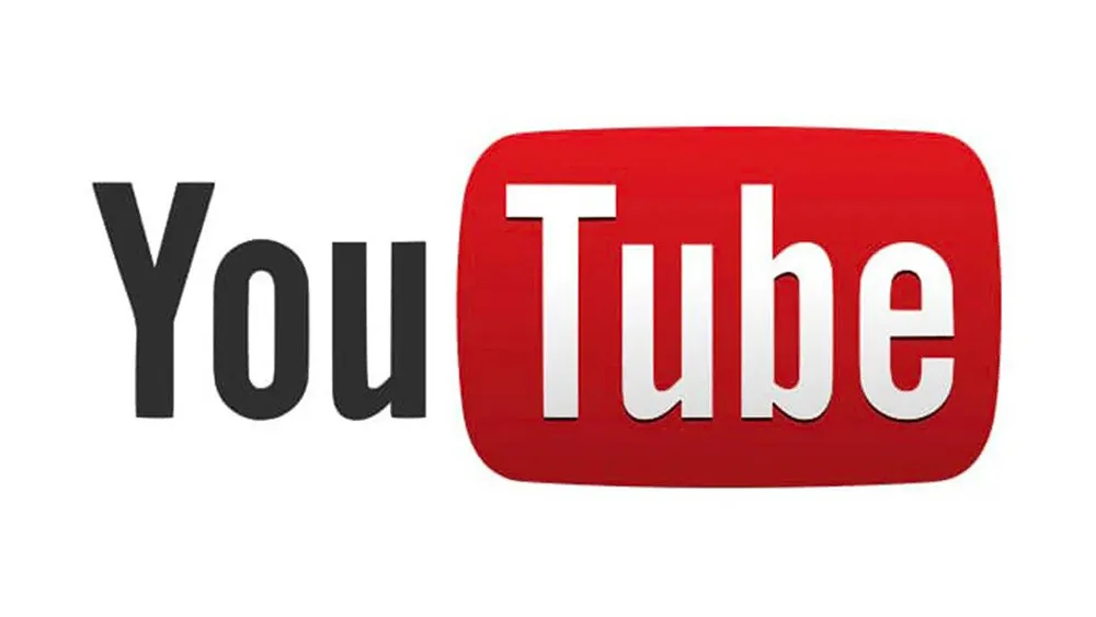
The Transition Era (2011 – 2015): Flat Design and Mobile Optimization
Between 2011 and 2015, the way users accessed the internet underwent a radical transformation. Smartphones and tablets quickly bypassed desktop computers as the primary devices for consumption. This shift forced software designers to prioritize responsive layouts, fast loading times, and icons that could scale down to tiny touchscreens without losing clarity.
The 2011 – 2013 Redesign: Darkening and Modernizing
In late 2011, alongside a major site-wide interface redesign known as “Cosmic Panda,” YouTube updated its logo to align with Google’s emerging aesthetic unified under the “Holoyolo” and early Material Design guidelines.
Key adjustments in this iteration included:
- A Deeper Red Plate: The bright, cherry-red gradient was replaced with a darker, richer, and more saturated burgundy-red tone. This gave the logo a more premium, cinematic quality.
- Shadow Reduction: The drop shadow beneath the red plate was softened and flattened, reducing the visual clutter around the logo.
- Refined Lettering: The spacing (kerning) between the letters was subtly optimized to improve readability on mobile screens.
The 2013 – 2015 Redesign: Embracing Complete Flatness
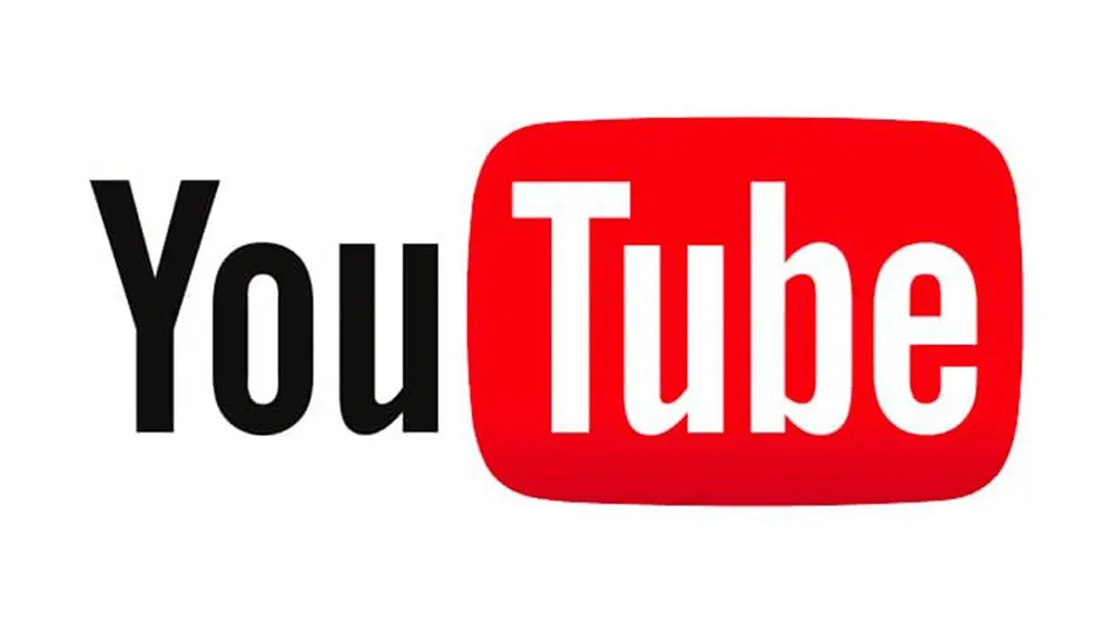
The 2013 – 2015 Redesign: Embracing Complete Flatness
In 2013, YouTube took a decisive step toward flat design. Skeuomorphism—the practice of making digital elements look like real-world physical objects—was officially abandoned.
This update stripped away the remaining gradients, shadows, and gloss:
- Solid Red Shape: The television container was transformed into a flat, solid red rounded rectangle with no gradients or bevels. The red shade was shifted to a clean, bright, corporate red (#E52117).
- Monochrome Adaptability: For the first time, the logo was designed to easily convert into a single-color silhouette (all-black or all-white) for use in various application headers, footers, and print materials.
- The Iconization of the Brand: As the YouTube mobile app grew in importance, the flat red plate with the white “Tube” text inside became a vital brand asset, acting as the app’s launch icon on millions of iOS and Android home screens.
The Modern Era (2017 – Present): The Unified Brand Identity
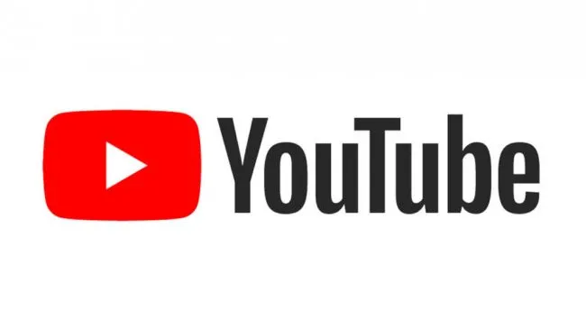
The Modern Era (2017 – Present): The Unified Brand Identity
In August 2017, YouTube underwent the most significant and comprehensive rebranding in its history. Conducted by YouTube’s in-house design team in collaboration with the renowned international brand agency Saffron, this rebrand was designed to address a critical structural issue: the original logo was no longer suited for the multi-platform, multi-device reality of the modern internet.
The Problem with the “Tube”
For twelve years, the word “Tube” had been trapped inside the red television box. While this worked well on desktop computers in 2005, it presented massive design challenges in 2017:
- The App Icon Disconnect: On a smartphone screen, a logo containing text is highly illegible. To compensate, YouTube had been using a simplified “Play Button” icon for its mobile app icon, while using the full “YouTube” wordmark on the website. This created a fractured brand identity.
- The Death of the CRT Television: The metaphor of the “Tube” (the television box) had become completely obsolete for younger generations of users who had never owned or even seen a CRT television set. The box had lost its cultural relevance.
The 2017 Solution: Unleashing the Play Button
The 2017 redesign solved these issues with an elegant, highly functional layout shift. The designers removed the word “Tube” from the red box and placed the entire word “YouTube” in clean, unified black lettering.
In place of the old television box, the designers introduced the iconic YouTube Play Button as the brand’s official symbol, placing it to the left of the wordmark.
This layout shift achieved several major strategic goals:
- A Unified Icon: The Play Button could now serve as both the standalone mobile app icon and the lead element of the full wordmark, unifying the brand’s identity across all touchpoints.
- Universal Symbolism: The “Play” triangle is a globally recognized symbol for video, media, and digital playback. It transcended language barriers and generational shifts far better than the “Tube” metaphor.
- Flexibility: The wordmark and the play icon could now be uncoupled. In tight spaces (like a mobile navigation bar or smart watch screen), the red play button could stand alone. On larger surfaces (like desktop headers, billboards, or smart TV interfaces), the full lockup could be displayed.
The Birth of “YouTube Sans”
Alongside the 2017 logo redesign, YouTube introduced its first proprietary, custom-designed typeface: YouTube Sans. Developed in partnership with type foundry URW++ and Saffron, YouTube Sans was designed to express the brand’s unique personality across all marketing assets, user interfaces, and sub-brands.
YouTube Sans is a highly versatile family of fonts that draws direct inspiration from the geometry of the Play Button icon:
- The Play Button Cut: The terminals (ends) of certain letters, such as the “Y”, “T”, and “h”, feature a subtle, angled cut that matches the exact angle of the triangle inside the Play Button.
- Friendly Curves: The rounded curves of the letters mirror the soft, organic corners of the red play icon, creating a cohesive visual language between typography and iconography.
- Optimized Screen Performance: Designed specifically for digital screens, YouTube Sans offers exceptional legibility at both massive headline scales and tiny UI caption sizes.
Color Evolution: The Switch to Pure Red (#FF0000)
As part of the 2017 rebrand, YouTube updated its core brand color to a custom, ultra-vibrant red known simply as “YouTube Red.” The hex code for this color was set to #FF0000—pure, absolute RGB red.
This was a highly calculated technical and aesthetic choice:
- OLED Screen Optimization: Modern OLED and AMOLED displays are capable of rendering incredibly deep blacks and intensely vibrant colors. By using pure #FF0000, YouTube’s logo takes full advantage of these advanced screen technologies, appearing exceptionally bright, crisp, and luminous.
- The Playhead Connection: This specific red matches the color of the video playhead—the dot that moves along the progress bar as a user watches a video on the platform. This creates a direct, functional connection between the brand logo and the core user experience.
Chronological Reference Table
The following table provides a concise, structured overview of the major phases of the YouTube logo, summarizing key design attributes for rapid reference and data retrieval.
| Years Active | Primary Logo Type | Core Typography | Key Color Hex Codes | Primary Design Characteristics |
| Web 2.0 Wordmark with CRT Container | Alternate Gothic No. 2 | Black (#000000) White (#FFFFFF) Gradient Red |
Skeuomorphic gloss, distinct “glare” on the red plate, dark drop shadows, high-contrast separation of “You” and “Tube”. | 2005 – 2011 |
| Refined Web 2.0 Wordmark | Alternate Gothic No. 2 (Modified) | Black (#000000) White (#FFFFFF) Dark Red Gradient |
Softened drop shadows, reduced glare on the red plate, darker and more saturated red tone for a cinematic feel. | 2011 – 2013 |
| Flat Wordmark | Alternate Gothic No. 2 (Modified) | Black (#282828) White (#FFFFFF) Flat Red (#E52117) |
Complete elimination of gradients and shadows. The red plate becomes a flat, solid shape. Introduction of off-black text for screen comfort. | 2013 – 2015 |
| Material-Aligned Wordmark | Alternate Gothic No. 2 (Modified) | Black (#282828) White (#FFFFFF) Bright Red (#FC0D1B) |
Subtle shifting of the red plate hue to align with Google’s Material Design guidelines. Pre-cursor to the major structural split. | 2015 – 2017 |
| Unified Play Button & Wordmark Lockup | YouTube Sans (Custom Typeface) | Black (#212121) Pure Red (#FF0000) White (#FFFFFF) |
The word “Tube” is freed from the box. The Play Button icon is placed to the left of the unified wordmark. Optimized for modern OLED displays. | 2017 – Present |
Sub-Brands, Ecosystem Expansion, and the “Yoodle”
As YouTube expanded from a singular video platform into a massive entertainment ecosystem, its visual identity had to scale to accommodate a wide variety of specialized sub-brands. The unified 2017 design system provided the perfect framework for this expansion, allowing YouTube to spin off new products while maintaining clear brand equity.
The Architecture of YouTube’s Sub-Brands
Each of YouTube’s sub-brands utilizes a consistent design architecture. The iconic red Play Button remains the constant anchor on the left, while the custom “YouTube Sans” typography is used on the right. To distinguish each service, the specific name of the sub-brand is appended in a clean, secondary position, or the icon itself is subtly modified:
- YouTube Premium: Originally launched as YouTube Red, this ad-free subscription service utilizes a sleek, minimalist aesthetic. In certain premium contexts, the classic red play button is rendered in a refined, metallic, or monochromatic format to denote its premium status.
- YouTube Music: This dedicated music streaming service features a distinct variation of the play button. The classic rounded triangle is encased inside a circular disc, evoking the shape of a vinyl record, CD, or speaker cone.
- YouTube TV: Designed as a cable-television replacement, this service’s logo features the classic play button shaped like a modern, wide-aspect-ratio television screen with stand legs, blending the old TV metaphor with modern streaming technology.
- YouTube Kids: Aimed at children and families, the YouTube Kids logo features a whimsical, hand-drawn, slightly tilted version of the Play Button. The edges are softer, the lines are organic, and the overall shape feels playful and kinetic.
- YouTube Shorts: To compete in the short-form vertical video market, YouTube introduced “Shorts.” Its logo features a stylized, double-loop play button that resembles both an “S” shape and a continuous loop, symbolizing endless vertical scrolling and rapid content consumption.
The Favicon Evolution
The browser tab icon (favicon) is one of the most frequently viewed brand elements on the web. YouTube’s favicon history mirrors its larger logo transitions:
- Early Favicon (2005-2011): A small, square version of the red TV plate with the white lowercase “yt” letters inside.
- Transition Favicon (2011-2017): The flat red square with the white “yt” letters, gradually simplified as resolutions improved.
- Modern Favicon (2017-Present): The standalone, bright red Play Button with the white triangle. This icon is so globally recognizable that it no longer requires any text to communicate the YouTube brand.
The “Yoodle” (YouTube Doodle)
Much like its parent company Google utilizes “Doodles” to celebrate holidays, historical figures, and major cultural events, YouTube frequently employs “Yoodles.” These are temporary, creative variations of the YouTube logo displayed on the homepage.
During a Yoodle event, the classic Play Button is integrated into custom animations, illustrations, or interactive games. This practice shows that despite its massive corporate scale, YouTube maintains a playful, culturally connected relationship with its global audience.
Design Theory, Grid Systems, and Technical Specifications
To truly understand the success of the modern YouTube logo, we must look at it through the lens of professional design theory, geometry, and technical execution. A great logo must be a masterclass in balance, mathematical harmony, and digital utility.
The Geometry of the Play Button
The modern YouTube Play Button icon is not a simple rectangle with rounded corners and a triangle slapped in the middle. It is a highly engineered geometric shape designed for visual comfort:
- The Outer Container: The red container is a “superellipse” (specifically, a shape resembling a Lamé curve). The corners are not perfect circular arcs; instead, they feature a smooth, gradual mathematical curvature that prevents the corners from looking harsh or “pinched” on high-resolution screens.
- The Inner Triangle: The white play triangle is an equilateral triangle with subtly rounded tips. It is positioned with absolute optical centering. Because triangles are visually heavier on their flat left side than their pointed right side, placing a triangle in the exact mathematical center of a container makes it look off-center to the human eye. The YouTube design team carefully offset the triangle slightly to the left to achieve perfect optical balance.
Spacing and Clear Space Rules
To maintain its visual integrity, the YouTube logo is always surrounded by a strict “clear space” boundary. This boundary prevents other graphic elements, text, or page edges from crowding the logo and diminishing its impact.
The standard clear space rule is calculated using the height of the Play Button icon (represented as ‘Y’). No external elements are permitted to enter a boundary of 0.5Y around the entire perimeter of the logo lockup.
Colorimetry and Screen Performance
The transition to the #FF0000 red color profile was highly strategic for digital-first media. In the RGB color space (used by digital screens), #FF0000 represents the absolute maximum output of the red subpixels. By utilizing this pure color, the logo achieves:
- Maximum Luminance: It glows with the highest possible brightness that a screen can physically emit.
- Energy Efficiency on OLEDs: While displaying pure white requires all three subpixels (Red, Green, Blue) to fire at 100%, displaying pure red only requires the red subpixel to fire, optimizing power consumption on mobile devices while maintaining visual pop.
The Cultural and Business Impact of the YouTube Logo
A logo is more than a design asset; it is a financial and cultural powerhouse. The evolution of the YouTube logo has directly influenced how creators build their businesses and how billions of consumers interact with digital media.
The Creator Economy and the Physical Play Button
One of the most brilliant marketing strategies in digital history is YouTube’s Creator Awards program (commonly referred to as YouTube Play Buttons). When creators reach specific subscriber milestones, YouTube ships them a physical, heavy metal plaque featuring the iconic play button logo:
- Silver Creator Award: For channels reaching 100,000 subscribers (made of nickel-plated cupronickel).
- Gold Creator Award: For channels reaching 1,000,000 subscribers (made of 24-karat gold-plated brass).
- Diamond Creator Award: For channels reaching 10,000,000 subscribers (made of silver-plated metal with a large inset crystal shaped like the play button).
- Red Diamond Creator Award: For channels reaching 100,000,000 subscribers (featuring a dark red baccarat crystal play button).
By physicalizing the logo and turning it into a prestigious trophy, YouTube transformed its brand mark into the ultimate status symbol for an entire generation of content creators. The logo is no longer just something you click; it is an achievement you hang on your wall.
Brand Equity and Trust Signals
In an era of digital misinformation and platform volatility, a recognizable logo acts as a vital trust signal. When users see the clean, official YouTube Play Button, they immediately expect a specific level of performance, video quality, and user interface familiarity. The consistency of this logo over the years has helped solidify YouTube’s position as a reliable, permanent pillar of the modern internet infrastructure.
Frequently Asked Questions
Who designed the original YouTube logo?
The original YouTube logo was designed in 2005 by Chad Hurley, one of the platform’s co-founders. Hurley, who had a background in fine art and graphic design, created the logo in-house during the platform’s initial development phase.
Why did YouTube change its logo in 2017?
YouTube changed its logo in 2017 to create a unified, flexible brand identity optimized for the mobile-first era. The update removed the word “Tube” from the red box and introduced the iconic Play Button icon to the left of the wordmark, allowing the icon to stand alone on small mobile screens and application icons.
What font does the current YouTube logo use?
The current YouTube logo uses a custom, proprietary typeface called YouTube Sans. Developed in collaboration with Saffron and URW++, this typeface features clean, geometric lines with subtle, angled cuts that mirror the geometry of the Play Button icon.
What is the official red color hex code for YouTube?
The official brand color for YouTube is pure RGB red, represented by the hex code #FF0000. This color was adopted during the 2017 rebrand to maximize brightness and visual impact on modern OLED and mobile displays.
What did the “Tube” in the original logo represent?
The “Tube” in the original logo was a slang reference to a television set, which historically operated using Cathode Ray Tubes (CRT). The rounded red rectangle surrounding the word “Tube” was designed to resemble the convex glass screen of an old-fashioned television.
Conclusion: A Legacy of Visual Adaptation
The journey of the YouTube logo from a simple, gradient-heavy startup badge to a globally recognized icon of digital culture is a testament to the power of adaptive design. Each phase of the YouTube Logo History: Every Logo Since Launch reflects a broader trend in visual technology, from the tactile, playful skeuomorphism of the early Web 2.0 days to the hyper-efficient, vibrant minimalism required by modern mobile screens.
By freeing the word “Tube” from its analog television container and embracing the universal symbol of the Play Button, YouTube created a timeless visual identity. It is a design system that honors the platform’s rich history while remaining perfectly positioned for the future of digital media, virtual reality, and beyond. For designers, marketers, and technology enthusiasts alike, the evolution of the YouTube logo stands as a premier example of how a brand can successfully navigate massive cultural and technological shifts without ever losing its core identity.