The Ubiquity of the Spark: An Introduction to Walmart’s Visual Identity
Few symbols in the global commercial landscape are as instantly recognizable as the Walmart logo. As the world’s largest retailer, Walmart’s visual identity is not merely a corporate trademark; it is a cultural signifier representing consumerism, supply chain dominance, and the economic fabric of rural and suburban America. For graphic designers, brand strategists, and business historians, the evolution of the Walmart logo offers a masterclass in corporate rebranding. It tells the story of a company transitioning from a regional discount store to a multinational conglomerate, and finally, to a digital-forward lifestyle brand.
The journey of the Walmart logo—from a simple printer-style font to the sophisticated “Spark” icon used today—mirrors the trajectory of modern retail history. Every typographic choice, color shift, and iconographic addition was a calculated move designed to influence consumer psychology. In this comprehensive analysis, we will deconstruct the Walmart logo history, examining the strategic reasoning behind each iteration and how these changes helped cement the brand’s identity in the minds of billions of shoppers.
The Pre-History: Walton’s 5 & 10 (1950–1962)
To understand the Walmart logo, one must first understand the aesthetic roots of its founder, Sam Walton. Before the “Walmart” name existed, Walton operated a Ben Franklin franchise in Bentonville, Arkansas, which he named “Walton’s 5 & 10.” The visual identity of this era was strictly utilitarian. The signage was dictated by the franchise agreements and the practical limitations of 1950s rural signage.
While not part of the official Walmart logo canon, this era established the fundamental principle of Walton’s branding philosophy: function over form. The signage was clear, legible, and unpretentious, designed to signal value rather than luxury. This “no-frills” aesthetic would become the DNA of the Walmart brand for the next four decades.
Phase 1: The Minimalist Beginning (1962–1964)
![]()
The 1962 logo featuring the word WALMART in a simple, sans-serif, blue printer-style font with wide spacingWhen Sam Walton opened the first official Walmart in Rogers, Arkansas, in 1962, the concept of “branding” was secondary to the concept of “bargains.” The inaugural logo reflected this priority. It was a study in absolute minimalism, consisting of the company name in a basic sans-serif typeface. There were no emblems, no distinct color palettes, and no tagline.
From a Logo design perspective, this logo was stark. The letters were capitalized and widely spaced, often appearing in a simple blue tone on the storefront. It communicated a clear message: this is a warehouse of goods. There is no money wasted on fancy design, which implies that the savings are passed on to the customer. This iteration was short-lived, serving as a placeholder while the company found its footing in the competitive discount market.
Phase 2: The Frontier Font and Americana (1964–1981)
The “Frontier” logo featuring the text WAL-MART in a blackened, western-style “cowboy” font inside a rectangle or circle.
In 1964, Walmart adopted a visual identity that would define its formative years. This era introduced the “Frontier” font, a distinctive, heavy-serif typeface that evoked the imagery of the Wild West. This logo is often referred to by design historians as the “Cowboy” logo. It featured the hyphenated name “WAL-MART” inside a circle or a rectangle, typically in black or dark blue.
Analyzing the “Frontier” Aesthetic
The choice of a Western-style font was not accidental. It tapped into the cultural psyche of the American South and Midwest. It signaled rugged individualism, the pioneering spirit, and a connection to the “common man.” By utilizing a font associated with general stores and saloons of the 19th century, Walmart subconsciously positioned itself as a friendly, local neighbor rather than a faceless corporation.
During this 17-year span, Walmart expanded aggressively across the United States. The Frontier logo became synonymous with the expansion of suburban retail. However, as the 1980s approached, the rugged, somewhat antiquated look of the Western font began to clash with the company’s growing need for a more polished, corporate image.
Phase 3: The Corporate Brown and Stability (1981–1992)
![]()
By 1981, Walmart was no longer a regional player; it was a retail titan. To reflect this maturity, the company executed a major rebrand. The whimsical Western font was discarded in favor of a robust, geometric sans-serif typeface. Interestingly, the company chose brown as the primary color for this era, a hue rarely used in modern retail branding.
The 1981 logo retained the hyphen but cleaned up the lines significantly. The letters were bold, blocky, and authoritative. Brown, in color psychology, represents stability, reliability, and earthiness. It suggested that Walmart was a grounded, dependable company. However, brown is also a color that lacks urgency and vibrancy. While this logo served the company during a decade of immense financial growth, it lacked the emotional connection required for a consumer-facing brand. It felt industrial—more suited for a logistics company than a family shopping destination.
Phase 4: The Star and the Navy Blue (1992–2008)
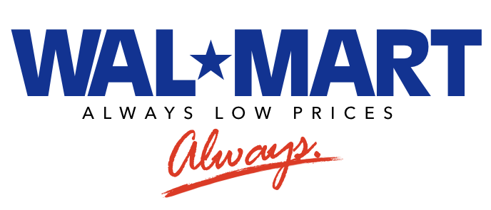
The 1992 rebrand is perhaps the most nostalgic for Generation X and Millennials. This era marked the transition from “Wal-Mart” the store to “WAL*MART” the global superpower. The most significant change in this design was the replacement of the standard hyphen with a five-pointed star. Additionally, the drab brown was replaced with a deep, authoritative navy blue.
The Symbolism of the Star
The star served a dual purpose. Visually, it acted as a dynamic separator that broke up the blocky text. Symbolically, it represented patriotism (aligning with the “Made in America” campaigns of the 90s) and excellence. It was during this era that the slogan “Always Low Prices. Always.” became inseparable from the visual identity.
The typeface used was a modified version of Helvetica—strong, legible, and ubiquitous. The navy blue conveyed trust, intelligence, and corporate power. However, as the 2000s progressed, this heavy, all-caps, dark blue logo began to feel aggressive. As Walmart faced criticism regarding labor practices and its impact on small businesses, the imposing, monolithic logo began to symbolize a “corporate giant” rather than a “friendly neighbor.” A drastic shift in brand personality was required.
Phase 5: The Spark of Innovation (2008–Present)
![]()
In 2008, Walmart unveiled the most radical transformation in its history. Designed by the renowned branding agency Lippincott, this new identity was a strategic pivot intended to soften the company’s image and appeal to a more affluent, socially conscious demographic.
The Shift to Lowercase
The most immediate change was the typography. The aggressive all-caps “WALMART” was replaced with title case “Walmart.” In typography, lowercase letters are perceived as friendlier, more accessible, and less shouting. The font is a custom geometric sans-serif, often compared to Myriad Pro, featuring rounded edges that suggest approachability.
The Color Palette Shift
The dark navy blue was lightened to a brighter, more vibrant shade of blue (Pantone 285 C). This lighter blue evokes feelings of freshness, cleanliness, and modernity. It moved the brand away from the “industrial” feel of the 90s toward a “tech-forward” and “lifestyle” aesthetic.
The Introduction of “The Spark”
The star was removed entirely, and the hyphen was abandoned. In their place, a new icon was introduced: The Spark. This yellow sunburst symbol, placed to the right of the text, consists of six yellow filaments. According to Walmart’s official brand guidelines, the Spark represents:
- Innovation: The constant search for new ideas.
- Inspiration: Sam Walton’s original vision.
- People: The associates and customers who make the company run.
The yellow color (Pantone 1235 C) introduces optimism, happiness, and warmth, balancing the cool professionalism of the blue.
Deconstructing the Design Elements
To fully appreciate the efficacy of the current Walmart logo, we must analyze the specific design elements that make it work in a digital and physical environment.
1. Typography: The “Bogle” Font
The current typeface is a custom font named “Bogle,” in honor of Bob Bogle, the company’s first president. It is a humanist sans-serif. Unlike the cold, mechanical lines of the 1981 logo, Bogle features subtle curves and open counters. This improves legibility on mobile screens—a crucial factor as Walmart competes with Amazon in the e-commerce space—while maintaining a human touch.
2. Color Psychology
Walmart’s mastery of color psychology is evident in the Blue and Yellow combination:
- Blue: Universally the most “trusted” color in corporate branding. It reduces anxiety and suggests fiscal responsibility.
- Yellow: The color of high energy and discounts. By using yellow only for the icon, Walmart draws the eye to the symbol of innovation without overwhelming the viewer with a “clearance sale” aesthetic.
3. Scalability and Adaptability
The 2008 logo was designed with the digital age in mind. The “Spark” works as a standalone app icon, a favicon, or a watermark. The wordmark remains legible even when scaled down to the size of a receipt footer. This versatility is essential for an omnichannel retailer that exists in brick-and-mortar stores, on delivery trucks, and on smartphone screens.
Strategic Branding: Why the Logo Changed
The evolution of Walmart’s logo is not just about aesthetics; it is a reflection of shifting business strategies. The change from the “Star” (1992) to the “Spark” (2008) coincided with a massive operational shift.
From “Cheap” to “Value”
The old logos screamed “Low Prices.” The heavy fonts and stark contrasts were reminiscent of discount flyers. The new logo whispers “Value.” It suggests that while the prices are low, the experience is high-quality. This was necessary to attract middle-class shoppers who might have previously shunned Walmart for Target.
Sustainability and Ethics
The 2008 rebrand launched alongside Walmart’s major sustainability initiatives. The organic shape of the Spark (resembling a flower or sun) and the lighter, sky-blue color palette visually aligned the company with environmental consciousness, helping to combat negative press regarding its environmental footprint.
Expert Insights: Lessons for Designers
What can modern graphic designers and brand specialists learn from the Walmart logo history? There are three key takeaways:
1. Simplicity is Timeless
Walmart never utilized complex crests, mascots, or intricate illustrations in its primary logo. The evolution has always moved toward simplification. In a world of visual clutter, the brand that communicates the fastest wins.
2. Typography Sets the Tone
The shift from uppercase to title case in 2008 completely altered the public perception of the brand’s personality. Designers must understand that the “voice” of a font is just as important as the words it spells.
3. Don’t Fear the Pivot
Walmart abandoned a logo (the Star/Navy Blue) that had been used for nearly two decades during its peak growth. This shows that brands should not be held hostage by nostalgia. If the market sentiment shifts, the visual identity must shift to meet it.
Frequently Asked Questions (FAQ)
What is the meaning behind the Walmart “Spark”?
The Spark represents the spark of inspiration that Sam Walton had when founding the company. The six rays of the spark symbolize the company’s values: Service to the Customer, Respect for the Individual, Striving for Excellence, and Acting with Integrity. It also visually resembles a sun or flower, projecting eco-friendliness and optimism.
Why did Walmart change its logo in 2008?
Walmart rebranded in 2008 to soften its corporate image. The previous logo, with its heavy block letters and dark colors, was seen as aggressive and industrial. The new logo was designed to make the brand appear more accessible, modern, and environmentally conscious, aligning with a shift in strategy from “Always Low Prices” to “Save Money. Live Better.”
What font is used in the Walmart logo?
The current logo uses a custom typeface called “Bogle,” named after Bob Bogle, Walmart’s first president. It is a modified geometric sans-serif font similar to Myriad Pro, characterized by its rounded, friendly appearance.
Did Walmart ever have a red logo?
No, Walmart’s primary branding has never been red. They have consistently adhered to blue and black/brown palettes. However, the “Spark” icon is yellow/orange. The confusion often arises because competitors like Target and K-Mart utilize red as their primary brand color.
When did Walmart stop using the hyphen in its name?
Legally, the company is still Wal-Mart Stores, Inc., but for branding and marketing purposes, the hyphen was dropped with the introduction of the 2008 logo. The star used in the 1992–2008 era served as a stylistic replacement for the hyphen.
Conclusion
The history of the Walmart logo is a chronicle of American retail evolution. It began as a utilitarian marker for a discount store, morphed into a rugged symbol of Western expansion, hardened into a corporate monolith, and finally blossomed into a symbol of modern, digital-friendly commerce.
For a company that deals in tangible goods, Walmart has shown a remarkable understanding of the intangible power of design. The transition to the “Spark” was not merely a cosmetic update; it was a declaration of a new era—one focused on sustainability, community, and a seamless customer experience. As Walmart continues to expand into healthcare, fintech, and advanced logistics, its visual identity stands ready: simple, adaptable, and instantly recognizable.