The Ubiquity of the Green Siren: An Introduction to Starbucks’ Visual Identity
In the pantheon of global corporate branding, few symbols are as instantly recognizable as the Starbucks Siren. She appears on millions of coffee cups daily, serving as a silent ambassador for the world’s largest coffeehouse chain. However, the clean, minimalist, and symmetrical green face we see today is the result of a complex evolutionary process spanning over five decades. The history of the Starbucks logo is not merely a timeline of graphic design changes; it is a masterclass in brand maturation, market adaptation, and the delicate balance between heritage and modernization.
For design professionals, marketing executives, and business historians, the evolution of the Starbucks logo offers a profound case study in visual identity. It demonstrates how a brand can shed its literal descriptors—removing the words “coffee” and “tea”—to rely entirely on symbol recognition. This deep dive explores the origins, the strategic pivots, and the aesthetic refinements that transformed a rustic, complex illustration into one of the most powerful icons in modern commerce.
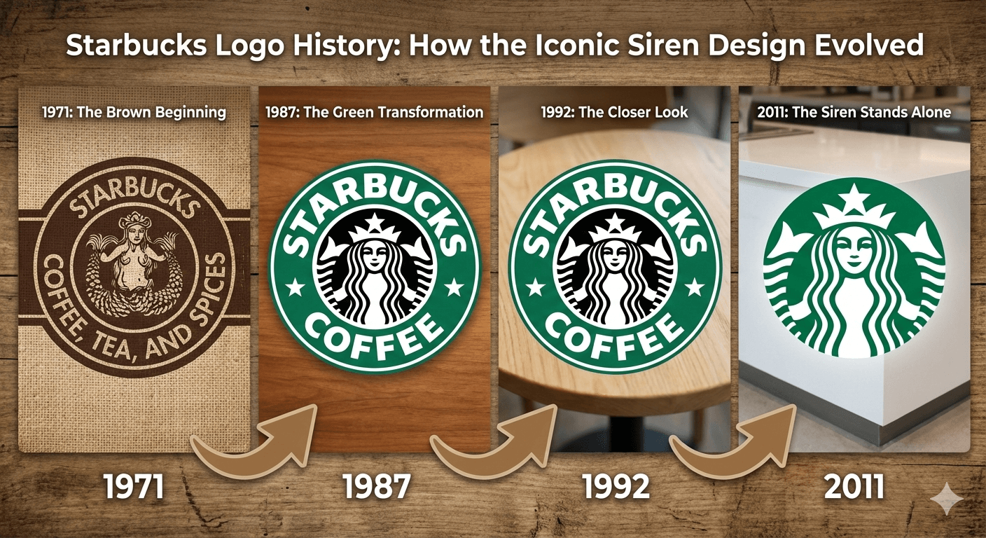
1971: The Brown Logo and the Norse Woodcut Origins
To understand the current logo design, one must examine the brand’s genesis. Starbucks was founded in 1971 in Seattle’s Pike Place Market by Jerry Baldwin, Zev Siegl, and Gordon Bowker. The founders were not seeking to create a global fast-food empire; they were intellectuals and coffee purists selling high-quality beans, tea, and spices. They needed a logo that reflected the maritime history of Seattle and the adventurous spirit of the coffee trade.
![]()
The Mythological Inspiration
The search for a logo led the founders to Terry Heckler, a corporate artist who scoured old marine books for inspiration. The team settled on a 16th-century Norse woodcut of a two-tailed mermaid, known in mythology as a Melusine or a Siren. In Greek mythology, Sirens were creatures who lured sailors to potential doom with their enchanting songs. For Starbucks, the metaphor was slightly adjusted: the Siren was meant to lure coffee lovers into the shop with the seductive aroma of fresh-roasted beans.
Design Characteristics of the 1971 Mark
The original logo was radically different from the modern iteration. Printed in a coffee-brown hue (Pantone 469), the design was intricate, rustic, and anatomically revealing. Key features included:
- The Twin Tails: The Siren held her split tail in each hand, emphasizing the “twin-tailed” nature of the Melusine.
- Bare Breasts: The original woodcut depicted the Siren topless, a detail that was retained in the first logo to maintain historical authenticity.
- Rough Texture: The linework was scratchy and illustrative, mimicking the texture of an actual woodcut or etching.
- Descriptive Text: The outer ring read “Starbucks – Coffee – Tea – Spices,” clearly delineating the business model, which originally focused on selling dry goods rather than brewed beverages.
This logo served the company well during its early years as a local retailer. It felt authentic, earthy, and connected to the maritime roots of the Pacific Northwest. However, as the brand prepared to scale, the complexity and nudity of the image would eventually pose challenges.
1987: The Il Giornale Merger and the Shift to Green
The most pivotal moment in Starbucks’ history occurred in 1987. Howard Schultz, who had previously served as the company’s director of retail operations and marketing, acquired Starbucks assets with the backing of local investors. Schultz had left Starbucks briefly to found his own coffee chain, Il Giornale, which focused on the Italian espresso bar experience.
Upon acquiring Starbucks, Schultz merged his Il Giornale brand with the Starbucks name. This merger necessitated a rebranding effort that would signal a new era—one focused on speed, brewed espresso beverages, and expansion.
![]()
The Introduction of Starbucks Green
The 1987 redesign was a deliberate fusion of the two companies. The original Starbucks brown was discarded in favor of the Il Giornale color palette: a bright, affirmative Kelly Green. This shift was significant in the psychology of color design:
- Brown represented the raw product (beans) and the past.
- Green represented freshness, growth, prosperity, and the future.
Sanitizing the Siren
As the company planned for broader American expansion, the topless nature of the original Siren became a liability. The design was cleaned up significantly:
- The Hair Drape: The Siren’s flowing hair was repositioned to drape over her chest, effectively censoring the nudity while retaining the flowing, aquatic aesthetic.
- Simplified Linework: The rough, woodcut texture was smoothed out. The illustration became more graphic and logo-like, suitable for printing on cups, signage, and merchandise.
- The Text Change: The words “Tea” and “Spices” were dropped. The outer ring now read simply “Starbucks Coffee,” flanked by two stars. These stars were a direct nod to the Il Giornale logo, bridging the gap between the two corporate identities.
This 1987 iteration marked the transition from a local roaster to a corporate entity. It was cleaner, bolder, and designed for high-visibility reproduction.
1992: The Public Offering and the Zoom-In
By the early 1990s, Starbucks was becoming a household name. The company went public in 1992 (NASDAQ: SBUX), fueling aggressive expansion across the United States. With this increased visibility came a need for further refinement of the visual identity. The third iteration of the logo was introduced to coincide with this period of explosive growth.
![]()
A Focus on the Face
The 1992 redesign was subtle yet impactful. The primary change was a dramatic crop of the Siren image. The designers zoomed in on the upper torso, effectively removing the lower body and the navel from view. This change accomplished several design goals:
- Intimacy: By focusing on the face, the logo became more personable and engaging. The Siren appeared to be looking directly at the consumer.
- Clarity: Removing the complex lower half of the split tail reduced visual noise. This made the logo more legible when resized for smaller applications, such as napkin corners or mobile screens (in the future).
- Mystery: With the tails pushed to the periphery, the “twin-tailed” aspect became less literal and more suggestive. Only the tips of the tails were visible on the sides, leaving the viewer to infer the rest of the form.
This version of the logo became the definitive image of the “Second Wave” coffee movement. It represented the era of the Frappuccino and the establishment of the “third place” (a social space between work and home).
2011: The 40th Anniversary and the Age of Minimalism
In 2011, marking the company’s 40th anniversary, Starbucks unveiled its most radical rebranding to date. Collaborating with the global branding firm Lippincott, the internal Starbucks design team executed a bold move: they removed the company name entirely.
![]()
Deconstructing the Brand
The 2011 redesign stripped away the outer ring, the stars, and the words “Starbucks Coffee.” The Siren was liberated from her container, now standing alone in a monochromatic green palette (Pantone 3425 C). This design choice placed Starbucks in an elite tier of brands—alongside Apple, Nike, and Target—that are recognizable solely by their symbol.
Why Remove the Name?
Howard Schultz, returning as CEO during this period, stated that the change was made to allow the brand to expand beyond coffee. By removing the word “Coffee,” the company signaled its intention to explore other markets, such as food, juices, and teas (via the Teavana acquisition), without being linguistically tied to a single product.
The “Imperfect” Face: A Design Masterstroke
During the 2011 redesign process, the team at Lippincott made a fascinating discovery. When they rendered the Siren’s face with perfect mathematical symmetry, she looked robotic and cold. To humanize her, they introduced a slight asymmetry.
If one looks closely at the current logo, the shadow on the right side of the Siren’s nose extends slightly lower than on the left. This imperceptible flaw breaks the “uncanny valley” effect, making the character feel warmer and more approachable. It is a testament to the high-level nuance involved in elite logo design.
Design Psychology: Why the Siren Works
The enduring success of the Starbucks logo can be attributed to several psychological and aesthetic principles that resonate with consumers on a subconscious level.
1. The Psychology of Green
In the context of food and beverage, green is a powerful signal. It implies freshness, organic origins, and health. Furthermore, in a retail environment dominated by red (fast food) and blue (technology/finance), the Starbucks green stands out as a calming, ethical choice. It aligns the brand with sustainability efforts, even as the company operates on a massive industrial scale.
2. The Circle as a Unifying Shape
Throughout all four iterations, the logo has remained circular. In design psychology, circles represent unity, community, and eternity. They lack the hard edges of squares or triangles, making the brand feel inclusive and welcoming. The circle also mimics the shape of the coffee cup rim and the table where customers gather, reinforcing the “third place” concept.
3. Anthropomorphism
Humans are hardwired to recognize faces. By centering the brand identity around a face—even a mythological one—Starbucks creates an emotional connection that abstract geometric logos cannot achieve. The Siren acts as a character, a patron saint of the coffee break, providing a sense of consistency across thousands of locations worldwide.
The Importance of Adaptive Branding in the Digital Age
The evolution of the Starbucks logo parallels the evolution of media consumption. The 1971 logo was designed for physical signage and large merchandise. The 2011 logo, however, was designed with a “mobile-first” mindset.
In the age of smartphone apps and social media avatars, logos must be scalable. The 1971 or even 1987 logos would become illegible smudges if reduced to the size of an app icon. The 2011 Siren, with its clean lines and lack of text, remains distinct and recognizable even at 16×16 pixels. This adaptability is crucial for modern SEO and digital marketing, where brand recognition often happens on a screen before it happens in a store.
Expert Insights: What Designers Can Learn
For graphic designers and brand strategists, the Starbucks trajectory offers three critical takeaways:
- Evolution over Revolution: Starbucks rarely changed everything at once. They kept the circle, they kept the Siren, and eventually, they kept the green. Changes were iterative, allowing customers to adjust without feeling alienated.
- Simplification is Strength: As a brand gains equity, it requires less explanation. The removal of text is the ultimate flex of brand power. Designers should aim for symbols that can eventually stand on their own.
- Respect the Heritage: Even in the ultra-modern 2011 version, the hair retains the wavy, woodcut-inspired quality of the 1971 original. Retaining these “DNA” elements ensures that the brand soul remains intact despite modernization.
Frequently Asked Questions (FAQ)
Is the Starbucks logo a mermaid or a siren?
Technically, she is a Siren. In Greek mythology, Sirens were often depicted as bird-women, but in medieval folklore and the Norse woodcut tradition Starbucks utilized, they were depicted as twin-tailed mermaids (Melusine). Starbucks officially refers to her as “The Siren.”
Why does the Starbucks Siren have two tails?
The twin tails are a remnant of the original 16th-century Norse woodcut inspiration. The split tail was a way for medieval artists to depict the mermaid’s aquatic nature while allowing for a symmetrical composition. In the modern logo, the tails are largely cropped out, but the tips are still visible at the sides of the Siren’s head.
Who designed the original Starbucks logo?
The original 1971 logo was designed by Terry Heckler, a corporate artist and friend of the founders. The 2011 redesign was a collaboration between the internal Starbucks global creative team and the branding agency Lippincott.
Why did Starbucks remove the words from their logo?
The removal of the text in 2011 signified that Starbucks had transcended the need for name recognition. It also allowed the brand to expand its product lines beyond coffee without being limited by the word “Coffee” in the logo. It streamlined the design for better digital application.
Is the Starbucks logo asymmetrical?
Yes, slightly. The 2011 redesign introduced a subtle asymmetry to the Siren’s face, specifically in the nose shadow, to make her appear more human and less like a computer-generated mask.
Conclusion
The history of the Starbucks logo is a journey from a literal, rustic depiction of maritime lore to a sophisticated, abstract symbol of global consumer culture. It reflects the company’s growth from a single storefront in Pike Place Market to a ubiquitous presence in our daily lives. By carefully pruning the design—removing the nudity, the brown color, the navel, and finally the text—Starbucks has distilled its identity down to its purest essence.
Today, the green Siren is more than just a logo; it is a cultural signifier of quality, consistency, and community. For business leaders and designers alike, the Siren serves as a reminder that a brand must be living, breathing, and willing to evolve to stay relevant in a changing world.