Few symbols in the world of fashion evoke the rugged spirit of Americana quite like the branding of Levi Strauss & Co. The history of the Levi’s logo is not merely a timeline of graphic design changes; it is a chronicle of American industrialism, the evolution of marketing, and the establishment of one of the world’s most enduring commercial identities. For over a century and a half, Levi’s has maintained a visual language that communicates durability, authenticity, and style. From the intricate “Two Horse” patch of the late 19th century to the modernist “Batwing” of the 1960s, the brand’s visual assets offer a masterclass in logo design and brand equity.
Understanding the Levi’s logo history requires dissecting several distinct trademark elements. Unlike many companies that rely on a single logomark, Levi’s employs a “house of brands” approach to its own identity, utilizing the Arcuate stitching, the Two Horse Patch, the Red Tab, and the Batwing logo simultaneously. Each of these elements serves a specific purpose in trademark protection and consumer recognition. This article provides an extensive deep dive into the evolution of these symbols, exploring how Levi Strauss & Co. built a denim empire through strategic visual design.
The Genesis of a Denim Giant: Early Branding (1853–1873)
To understand the logo, one must understand the product’s origin. Levi Strauss arrived in San Francisco in 1853 to open a dry goods wholesale business during the height of the California Gold Rush. However, the brand identity we recognize today did not materialize immediately. For the first two decades, the company operated as a standard wholesaler, supplying various goods to the American West.
The pivot point occurred in 1873. Levi Strauss and tailor Jacob Davis received a U.S. patent for an “Improvement in Fastening Pocket-Openings.” This innovation—the copper rivet—created stronger work pants for miners and laborers. This date, May 20, 1873, marks the birth of the blue jean. Initially, the branding was purely utilitarian. The focus was on the patent itself. Marketing materials from this era were text-heavy, focusing on the durability of the rivets and the quality of the denim. There was no “logo” in the modern sense, but the foundation for the brand’s core value proposition—strength—was being laid.
The Two Horse Patch: The First Graphic Icon (1886)
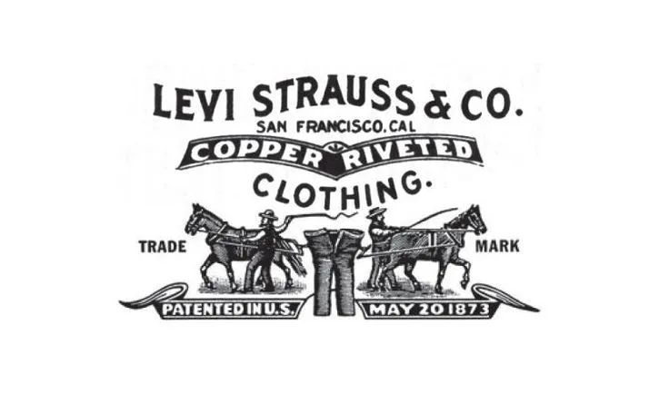
The first true logo for Levi’s was not a simplified symbol, but a complex narrative illustration known as the Two Horse Patch. Introduced in 1886, this leather patch (later changing to a heavy card stock known as Jacron) was stitched onto the back waistband of the “XX” waist overalls (the precursor to the 501 jean).
Visual Storytelling and Literacy
The design of the Two Horse Patch depicts two horses pulling a pair of jeans in opposite directions, attempting to tear them apart. This imagery was a stroke of marketing genius for the time. In the American West during the late 19th century, not all laborers and miners were literate, and many were immigrants who did not speak English as a first language. By using a graphic representation of the product’s strength, Levi’s ensured that its value proposition was universally understood regardless of language barriers.
Consumers would often walk into general stores and ask for “the pants with the two horses.” This early successful use of visual mnemonics solidified the company’s market position. The patch served a dual purpose: it was a guarantee of authenticity and a promise of quality. Even today, the Two Horse Patch remains a staple on Levi’s denim, virtually unchanged for over 135 years, making it one of the oldest continuously used trademarks in fashion history.
The Arcuate Stitching: The Oldest Apparel Trademark
While the Two Horse Patch is the most detailed historical logo, the Arcuate—the double-arched stitching on the back pockets—is likely the oldest. Used on the very first pairs of waist overalls in 1873, the Arcuate design predates the patch and the brand name usage on the garment itself.
There are many myths surrounding the meaning of the Arcuate. Some suggest it represents the wings of a bird, specifically a rocky mountain eagle, while others claim it acts as a nod to the Golden Gate Bridge (though the bridge was constructed decades after the stitching appeared). Levi Strauss & Co. admits that the original meaning was lost due to the destruction of company archives in the 1906 San Francisco earthquake and fire. Regardless of its origin, the Arcuate became a crucial brand identifier.
The Painted Arcuate of WWII
A fascinating chapter in Levi’s logo history occurred during World War II. The U.S. government imposed strict rationing on raw materials, including thread and metal. Levi’s was forced to remove the decorative Arcuate stitching to conserve thread for the war effort. Unwilling to lose this vital visual trademark, the company instructed factory workers to hand-paint the Arcuate design onto the back pockets of every pair of jeans. This dedication to visual consistency, even during global turmoil, underscores the immense value Levi’s placed on its brand identity.
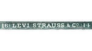
The Red Tab: A Stroke of Marketing Genius (1936)
By the 1930s, the patent for the copper rivet had expired, allowing competitors to flood the market with imitation blue jeans. Levi’s needed a way to differentiate its product from a distance. The Two Horse Patch was covered by a belt, and the Arcuate stitching was being mimicked by other manufacturers.
In 1936, Chris Lucier, the National Sales Manager for Levi’s, pitched a simple yet revolutionary idea: a small folded ribbon of red cloth sewn into the structural seam of the rear right pocket. The Red Tab was born. This tiny splash of color against the indigo denim was instantly recognizable. It allowed anyone to identify a pair of Levi’s on the street from ten yards away.
The “Big E” Era vs. The “Small e”
The typography on the Red Tab has undergone a significant evolution that acts as a primary dating method for vintage collectors.
- 1936–1971 (The Big E): From its inception until 1971, the word “LEVI’S” was written on the tab in all uppercase letters. Vintage denim enthusiasts refer to jeans from this era as “Big E” Levi’s. These items are highly coveted and command high prices in the vintage market.
- 1971–Present (The Small e): In 1971, as part of a broader corporate rebranding, the font was changed to a lowercase “e” (Levi’s). This marked the transition into the modern era of the brand.
Occasionally, consumers will find a Red Tab that features only the trademark symbol (®) without the word “Levi’s.” This is not a manufacturing error. To maintain legal trademark rights on the tab itself (the shape and placement), the company must produce a certain percentage of products with the “blank” tab to prove that the tab itself is the trademark, independent of the text.
The Batwing Logo: The Modern Corporate Identity (1967)
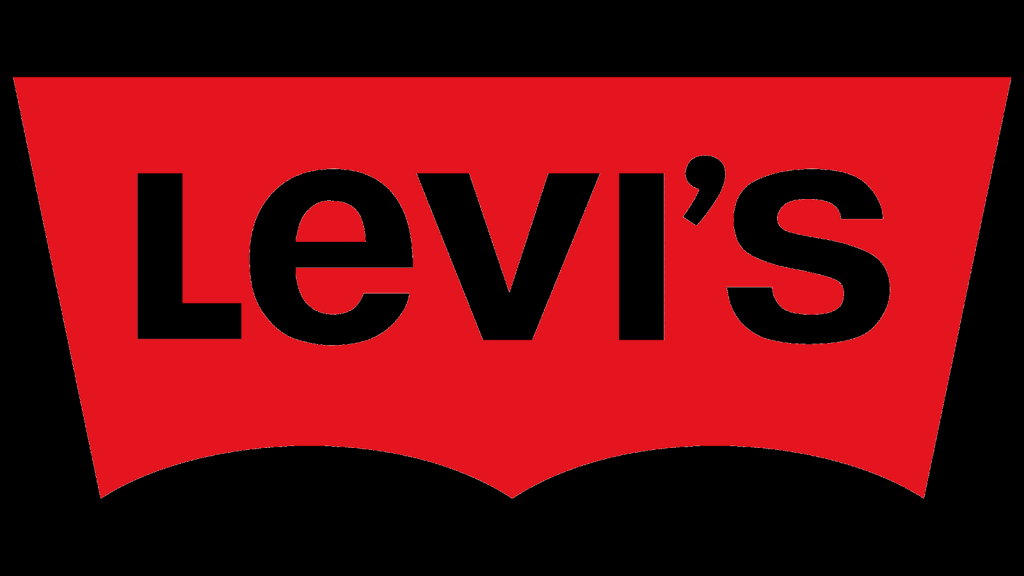
As Levi’s expanded globally in the mid-20th century, the company required a unified corporate logo that could appear on everything from hangtags to storefront signage. In 1967, Levi’s engaged the legendary design firm Landor Associates—founded by Walter Landor—to create a new brand identity system.
The result was the Batwing logo. This design is a masterpiece of minimalist, meaningful branding. The red shape is not arbitrary; it directly mimics the “gull-wing” shape of the Arcuate stitching found on the back pockets of the jeans. By extracting a physical design element of the product and converting it into a graphic symbol, Landor ensured an intrinsic connection between the logo and the garment.
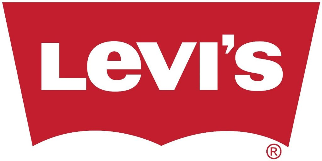
Typography and Color Psychology
The Batwing logo features the brand name in a bold, sans-serif white font set against a distinct hue of red (specifically, PMS 186 C).
- The Color Red: In color psychology, red represents energy, passion, action, and youth. For a brand that became the uniform of the teenage rebellion and the rock-and-roll movement, red was the only logical choice. It also provided maximum contrast against the blue of the denim.
- The Typography: The font used in the Batwing (and the post-1971 Red Tab) was a custom modification designed to be legible at very small sizes. The change to the lowercase “e” was intended to make the brand feel more approachable and casual, moving away from the rigid industrialism of the all-caps “LEVI’S.”
Levi’s Made & Crafted and Vintage Clothing Logos
In recent decades, Levi’s has segmented its market, creating distinct sub-brands that utilize variations of the logo history.
Levi’s Vintage Clothing (LVC): This high-end line reproduces historical fits. Consequently, LVC products utilize period-correct branding. If you buy a 1947 reproduction 501, it will feature the Big E tab and the vintage leather patch styling. This demonstrates how the company leverages its logo history as a product feature.
Levi’s Made & Crafted: This premium line uses a minimalist aesthetic. The logo is often rendered in blue or indigo, stepping away from the aggressive red to signal a more sophisticated, tailored approach to denim. The tab on these jeans is often blue with white text, or the stitching of the Arcuate is hidden inside the pocket (shadow stitching), revealing itself only as the denim fades.
Why the Levi’s Branding Strategy Succeeds
The longevity of the Levi’s logo suite can be attributed to consistency and adaptability. Unlike brands that radically redesign their logos every decade to chase trends, Levi’s has practiced evolution over revolution. The Batwing has existed for over 50 years. The Two Horse Patch has existed for over 130.
By maintaining multiple trademarks (the patch, the tab, the arcuate, and the batwing), Levi’s has created a “visual vernacular.” If one element is removed, the others sustain the brand identity. This redundancy is a powerful tool in intellectual property protection, making it incredibly difficult for counterfeiters to replicate the brand without infringing on multiple registered trademarks.
Expert Insights: The Logo as a Cultural Marker
From a design perspective, the Levi’s logo evolution mirrors the trajectory of American graphic design. The Two Horse Patch represents the Victorian era of dense, illustrative advertising where the product had to be explained visually. The Red Tab represents the functionalism of the 1930s—a purely practical solution to a business problem. The Batwing represents the International Typographic Style of the mid-century modern era—clean, geometric, and abstract.
Design experts often cite the 1967 Landor rebranding as one of the most successful in corporate history. It managed to modernize a heritage brand without alienating its core customer base. The Batwing logo bridged the gap between the cowboy workwear of the past and the casual fashion of the future.
Frequently Asked Questions (FAQ)
What is the difference between the “Big E” and “Small e” Levi’s logo?
The “Big E” refers to the Red Tab logo where “LEVI’S” is written in all uppercase letters. This was used on jeans produced before 1971. The “Small e” features the name as “Levi’s” and was introduced in 1971. Vintage collectors use this as a primary method for dating jeans; “Big E” jeans are generally rarer and more valuable.
Why are there two horses on the Levi’s patch?
The imagery of two horses pulling a pair of jeans in opposite directions was designed to demonstrate the incredible strength and durability of the riveted denim. It was created in 1886 to communicate the quality of the pants to a customer base that included many illiterate laborers and non-English speakers.
Why do some Levi’s Red Tabs have no writing on them?
Approximately one in every ten pairs of Levi’s features a Red Tab with only the registered trademark symbol (®) and no text. This is a deliberate legal strategy. By producing tabs with just the symbol, Levi’s protects the rights to the tab shape and placement itself, ensuring that competitors cannot use a plain red tab on their pockets.
What is the shape of the Levi’s logo called?
The red logo shape used by Levi’s is called the “Batwing.” It was designed by Landor Associates in 1967. The top curve of the Batwing mimics the shape of the Arcuate stitching found on the back pockets of Levi’s jeans.
Did Levi’s change their logo recently?
While the Batwing remains the core logo, Levi’s subtly updated it in recent years to be slightly flatter and cropped at the bottom. However, the most significant recent change was in 2011, when they removed the word “Strauss” from the corporate logo to focus purely on the name “Levi’s,” reflecting how consumers actually speak about the brand.
Conclusion
The history of the Levi’s logo is a testament to the power of consistent, strategic branding. Levi Strauss & Co. did not just invent the blue jean; they invented the visual language of denim. Through the illustrative promise of the Two Horse Patch, the distinctive visibility of the Red Tab, and the geometric modernism of the Batwing, Levi’s has built a brand identity that transcends language and culture.
Today, the Levi’s logo is recognized instantly in almost every country on Earth. It stands as a symbol of authentic American cool, rugged durability, and democratic fashion. For designers and marketers, the evolution of Levi’s branding offers a crucial lesson: great logos are not just drawn; they are engineered to tell a story, solve a problem, and endure the test of time.