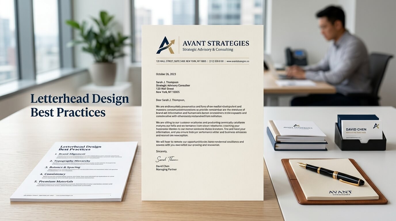
A letterhead may seem like a small part of business communication, especially in a world dominated by email, messaging platforms, and digital documents. Yet, a well-designed letterhead still plays an important role in establishing credibility and creating a consistent brand identity. Whenever a business sends an official letter, proposal, agreement, invoice, announcement, or printed document, the letterhead can influence how the recipient perceives the organization.
A strong letterhead does more than display a company logo at the top of a page. It combines branding, typography, spacing, information hierarchy, and practical usability into a single design. When these elements work together, even a simple business document can look polished and trustworthy. On the other hand, a cluttered or poorly designed letterhead can make an otherwise professional organization appear disorganized.
Good letterhead design is therefore about finding the right balance between visual identity and functionality. The design should represent the brand without distracting from the actual content of the document. It should also work across different formats, including printed pages, PDFs, digital correspondence, and other business materials.
Why Letterhead Design Still Matters
Letterhead Builds Professional Credibility
First impressions matter in business communication. A professionally designed letterhead immediately communicates that an organization takes its presentation seriously. When a recipient opens a formal document and sees a consistent logo, appropriate typography, clear contact details, and balanced spacing, the document feels more official.
This is particularly important for businesses that regularly communicate with clients, suppliers, partners, investors, government organizations, or other professional institutions. A letterhead can provide a visual sense of legitimacy before the recipient has even read the first paragraph.
The effect does not come from expensive graphics or complicated layouts. In many cases, simplicity creates a stronger impression. A clean header with a recognizable logo, carefully selected typeface, and relevant contact information can be more effective than a page filled with decorative elements.
It Strengthens Brand Consistency
Branding is not limited to a logo or website. Every customer touchpoint contributes to the overall identity of an organization. Business letters, official notices, proposals, and documents can all reinforce that identity.
A well-designed letterhead uses the same visual language as other brand materials. Colors, fonts, logo treatment, and spacing can be aligned with the organization’s website, business cards, brochures, and other communication materials. This creates familiarity and makes different documents feel as though they belong to the same company.
Consistency becomes particularly valuable as an organization grows. When multiple departments or employees create documents independently, a standardized letterhead helps maintain a unified appearance.
Start With a Clear Brand Identity
Understand the Brand Before Designing
One of the most important letterhead design best practices is to understand the brand before choosing visual elements. A technology company, law firm, creative studio, healthcare organization, and construction company may all require very different visual approaches.
The design should reflect the personality and professional expectations of the business. A creative agency might have more freedom to experiment with typography or color, while a legal or financial organization may benefit from a more restrained and traditional appearance.
The goal is not to make the letterhead visually impressive on its own. The goal is to make it feel appropriate for the organization using it.
Use the Existing Brand Guidelines
If a company already has brand guidelines, the letterhead should follow them rather than creating an unrelated visual identity. Existing guidelines may specify logo proportions, brand colors, fonts, spacing rules, and other design requirements.
Following these standards reduces inconsistency across marketing and communication materials. It also prevents common mistakes such as using different shades of the brand color or altering the logo in ways that weaken recognition.
Keep the Layout Simple and Organized
Avoid Overcrowding the Header
One of the most common letterhead mistakes is trying to place too much information at the top of the page. A header can quickly become crowded when designers include the logo, company slogan, phone numbers, email address, website, physical address, social media handles, registration information, and several decorative elements.
A letterhead should leave enough room for the actual document content. If the header takes up a large portion of the page, the reader has less usable space for the letter itself.
A clean design usually gives the logo and essential information enough breathing room. White space is not wasted space. It helps separate visual elements and makes the page easier to read.
Establish a Clear Visual Hierarchy
Visual hierarchy determines what the reader notices first, second, and third. The company logo may be the most recognizable element, while contact information can remain visually secondary.
Size, weight, alignment, spacing, and placement can all establish hierarchy. For example, the organization name can receive stronger emphasis while an email address or phone number can use a smaller type size.
A good letterhead should allow the reader to understand the organization and its basic contact information quickly without having to search around the page.
Choose Typography Carefully
Select Readable Fonts
Typography has a major influence on the personality of a letterhead. However, readability should always take priority over novelty.
Simple sans-serif or serif typefaces can work extremely well when used appropriately. The chosen font should remain legible in both printed and digital formats. Extremely decorative fonts may look interesting in a logo but can become difficult to read when used for contact details or body text.
The typography should also complement the rest of the brand identity. Using too many unrelated fonts can make the document feel inconsistent.
Create Consistent Type Relationships
A professional letterhead does not necessarily need several different typefaces. Often, one primary font family with different weights is enough.
The company name, contact details, headings, and document text should have clear relationships in size and weight. Consistency helps the entire page feel intentional.
Typography should also account for the actual content that will be added later. If employees will use the letterhead as a template, the body text needs enough space and should remain comfortable to read.
Use Color Strategically
Follow Brand Colors
Color can make a letterhead recognizable, but it should be used with restraint. The strongest approach is usually to incorporate one or two established brand colors rather than filling the page with multiple shades.
A colored line, logo detail, heading, or small accent can be enough to connect the letterhead to the brand. The rest of the page can remain neutral so the written content remains the focus.
Consider Printing Requirements
A letterhead that looks excellent on a high-resolution screen may not produce the same result when printed. Colors can appear differently on paper, and large areas of color can increase printing costs.
Before finalizing a design, it is useful to consider whether the organization will print documents frequently. Businesses that rely heavily on physical correspondence may benefit from a design that works effectively in both full color and grayscale.
Place Essential Information Where It Makes Sense
A letterhead should provide useful business information without becoming an information directory. The exact details will depend on the organization’s needs, but commonly relevant information can include the company name, logo, physical address, telephone number, email address, and website.
The most important consideration is placement. Contact information should be easy to find but should not compete with the document’s main content.
For example, a company might place the logo and name in the upper section while placing contact details in a footer. This creates a cleaner header and gives the page a balanced appearance.
Design for Different Document Types
Consider the First Page Separately
Not every page of a multi-page document needs the same letterhead treatment. The first page can contain the complete branded header, while subsequent pages can use a smaller header or simplified identifier.
This is particularly useful for contracts, reports, proposals, and long business letters. Repeating a large header on every page can waste space and make lengthy documents harder to read.
Create a Consistent Footer
The footer can be useful for information that does not need to dominate the page. Contact details, website information, legal notices, registration details, or page numbers can be placed here when appropriate.
The footer should remain visually subtle. Its purpose is to support the document rather than distract from it.
Make the Letterhead Work Digitally
Modern letterhead design needs to account for digital communication. Many official documents are now shared as PDFs rather than printed and mailed.
This means the design should remain sharp on screens and maintain its proportions when exported to PDF. Logos should have sufficient resolution, typography should render correctly, and the layout should not depend on physical printing effects.
Digital letterhead templates should also be easy for employees to use. A beautiful design that is difficult to edit can create more problems than it solves.
| Letterhead Element | Best Practice | Common Problem |
| Logo | Use a clear, correctly proportioned version | Stretching or distorting the logo |
| Company name | Give it clear visual emphasis | Making it too small or difficult to notice |
| Contact details | Keep them concise and readable | Adding excessive information |
| Typography | Use readable, brand-appropriate fonts | Using too many decorative fonts |
| Color | Follow established brand colors | Using excessive or inconsistent colors |
| White space | Leave room around major elements | Filling every area of the page |
| Footer | Keep secondary information subtle | Making the footer visually dominant |
| Body area | Preserve enough writing space | Using too much space for branding |
| Digital format | Ensure it works well as a PDF | Designing only for physical printing |
| Multiple pages | Use simplified headers where appropriate | Repeating a large header on every page |
Pay Attention to Margins and Spacing
Margins have a significant effect on how professional a letterhead feels. Even strong branding can look awkward when the logo is positioned too close to the edge or the body text begins immediately beneath the header.
Adequate spacing creates visual breathing room. It also makes the document easier to print because most printers have limitations around edge-to-edge printing.
Spacing should be consistent throughout the design. The distance between the logo and company name, the header and body area, and the footer and page edge should all feel deliberate.
Good spacing often goes unnoticed because it does not call attention to itself. However, poor spacing can immediately make a design feel unfinished.
Make the Design Scalable
A letterhead may be viewed on a desktop monitor, smartphone, printed sheet, or projected screen. The design should therefore remain recognizable at different sizes.
The logo should remain clear without becoming pixelated. Text should stay readable, and important information should not depend on extremely small type.
Vector-based logo files are generally useful for maintaining quality across different sizes. When creating digital templates, designers should also make sure that the document does not become distorted when exported or printed.
Consider Accessibility and Readability
Professional design should also consider the people who will read the document. Sufficient contrast between text and background is important, particularly for people with visual impairments.
Small text, low-contrast colors, complicated decorative backgrounds, and overly dense layouts can make documents difficult to read.
A good letterhead should support the content rather than create an additional barrier to it. The most attractive design is not necessarily the most effective if recipients struggle to read the information.
Avoid Common Letterhead Design Mistakes
Using Too Many Design Elements
A letterhead should not look like a poster. Large graphics, multiple borders, excessive patterns, icons, gradients, and decorative shapes can overwhelm the page.
The content of a formal business document should remain the central focus. Branding should support that content rather than compete with it.
Ignoring Alignment
Alignment creates order. When the logo, company name, contact details, and other elements appear randomly positioned, the design can feel unprofessional.
Whether a letterhead uses centered, left-aligned, right-aligned, or asymmetrical elements, the alignment should appear intentional and consistent.
Changing the Logo Incorrectly
Logos should never be stretched, compressed, rotated, or altered without a reason supported by the brand guidelines. Even minor distortions can make an established identity look inconsistent.
The logo should also have enough surrounding space so it does not visually collide with nearby text.
Adding Unnecessary Information
A letterhead does not need to contain every possible business detail. Including too much information reduces clarity and can make the design difficult to use.
The best approach is to determine what recipients genuinely need when viewing an official business document and prioritize those details.
Test the Letterhead Before Finalizing It
Review Printed Versions
Even if the letterhead is intended primarily for digital use, printing a test version can reveal problems that are not obvious on a screen.
Check whether the margins are comfortable, whether colors reproduce well, whether text is readable, and whether the document leaves enough room for actual correspondence.
Test Different Content Lengths
A template should work with both short and long letters. Designers should test different headings, paragraphs, signatures, and contact details to ensure the layout remains balanced.
A design that works perfectly with sample text may become awkward when real content is added.
Check Multiple File Formats
The final design may need to exist as a Word template, PDF, editable document, or another format. Each version should preserve the intended layout.
Testing these formats before distribution can prevent employees from accidentally changing the appearance of the letterhead when preparing official documents.
Create a Letterhead That Supports Long-Term Branding
A good letterhead should not depend entirely on temporary design trends. Trends can be useful sources of inspiration, but business stationery generally benefits from a visual style that remains recognizable over time.
This does not mean the design has to be boring. A strong use of typography, spacing, proportion, and brand color can create a distinctive appearance without relying on fashionable effects.
A timeless letterhead is also easier to integrate with future branding materials. If the company updates its website or creates new marketing materials later, a simple and structured letterhead can adapt more easily.
Why Professional Simplicity Often Works Best
The most effective letterhead designs often appear simple because every element has a clear purpose. The logo identifies the organization, typography establishes hierarchy, color reinforces branding, contact information provides practical value, and white space keeps the page readable.
This simplicity is not a lack of creativity. It is the result of making deliberate design decisions.
A successful letterhead should answer three questions quickly. Who sent this document? What organization do they represent? How can the recipient identify or contact that organization? Once those needs are met, additional decoration should be considered carefully.
Conclusion
Letterhead design remains an important part of professional business communication. A well-designed letterhead creates consistency, supports brand recognition, improves document credibility, and provides recipients with essential information in an organized format.
The strongest designs focus on simplicity, readability, appropriate typography, strategic color, balanced spacing, and practical usability. They also work across printed and digital formats instead of being created for only one environment.
Ultimately, effective letterhead design is about creating a professional foundation for communication. When branding and functionality are balanced properly, even a simple business letter can present a clear and consistent image of the organization behind it.
FAQ
Q. What should a professional letterhead include?
A professional letterhead commonly includes the company logo, organization name, and essential contact information such as an address, phone number, email address, or website. The exact details depend on the organization’s communication needs.
Q. What size should a letterhead be?
Letterhead size usually follows the standard paper size used by the organization. In the United States and some other regions, Letter size is common, while A4 is widely used internationally. The design should also include appropriate margins for printing.
Q. How many colors should a letterhead use?
There is no universal limit, but a restrained color palette usually creates a cleaner appearance. Using established brand colors consistently is generally more effective than introducing numerous unrelated colors.
Q. Should a letterhead have a footer?
A footer can be useful for secondary information such as contact details, website information, registration details, or page numbers. However, it should remain visually subtle so it does not compete with the document’s main content.
Q. Can a letterhead be used digitally?
Yes. Modern letterheads are frequently used in digital documents and PDFs. A digital letterhead should be designed with screen readability, file compatibility, image quality, and easy editing in mind.