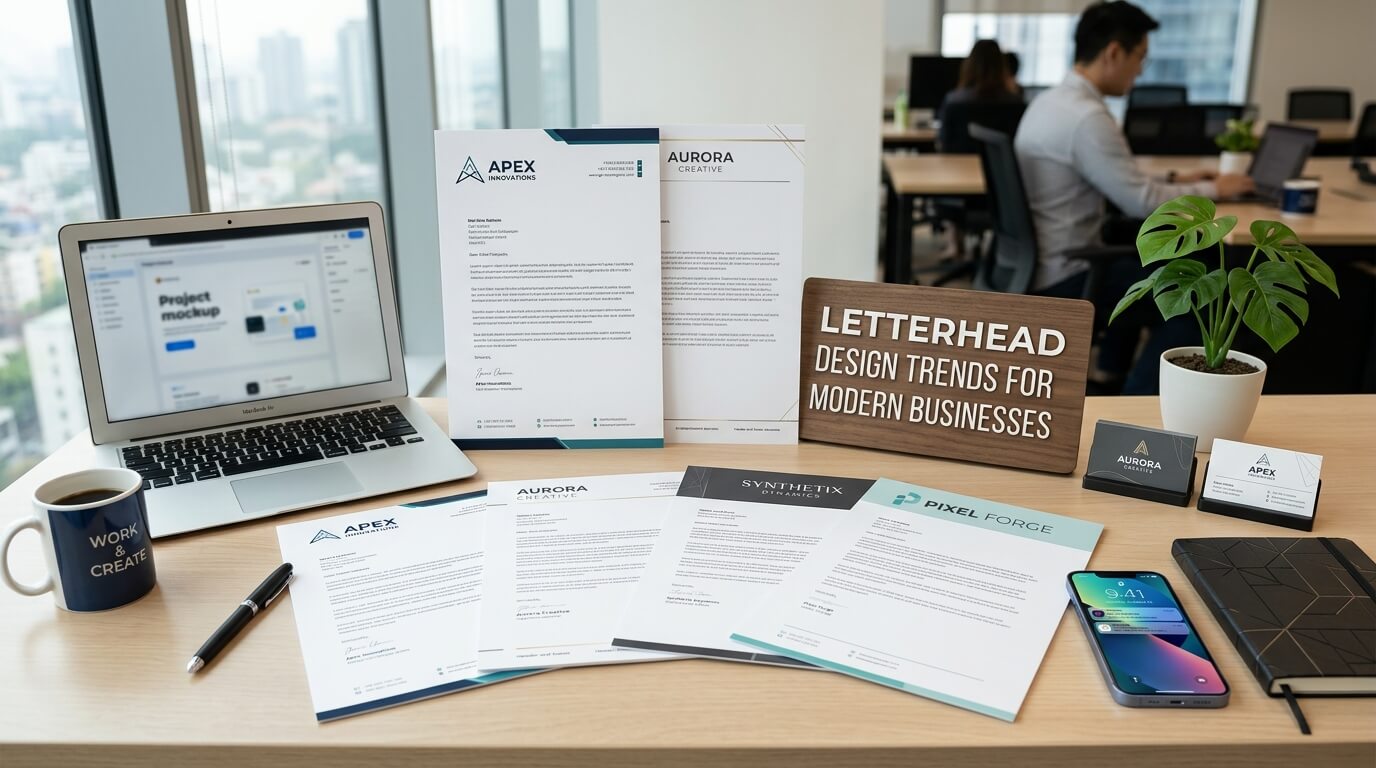
A letterhead may seem like a small part of a company’s overall branding, but it can have a surprisingly strong influence on how a business is perceived. Whenever a company sends a proposal, quotation, agreement, invoice, formal notice, business letter, or printed document, its letterhead becomes part of the communication. It provides context, reinforces brand identity, and can make even a simple document feel organized and professional.
Modern businesses are also changing the way they approach letterhead design. Traditional layouts that relied heavily on large logos, decorative borders, and excessive contact information are increasingly being replaced by cleaner, more purposeful designs. Today’s letterheads often combine minimalist layouts, strong typography, digital compatibility, brand consistency, and carefully selected visual details.
The goal is not simply to make a letterhead attractive. A successful modern letterhead should make business communication recognizable while keeping the actual content easy to read. It should work equally well on printed stationery and digital documents, adapt to different types of communication, and support the company’s broader visual identity.
Why Letterhead Design Still Matters for Modern Businesses
Letterhead as a Brand Touchpoint
Every customer interaction contributes to how a business is perceived. A website may be the first major touchpoint, but formal documents can reinforce that impression long after an initial meeting or online visit. A professionally designed letterhead creates visual consistency between business correspondence and other branded materials.
When the same colors, typography, logo treatment, spacing, and visual language appear across a company’s website, business cards, proposals, presentations, packaging, and documents, the brand feels more established. Letterhead therefore works as a quiet but important extension of the company identity.
This is especially valuable for professional service businesses. Legal firms, consulting companies, financial organizations, real estate businesses, technology companies, healthcare providers, agencies, and corporate organizations frequently communicate through formal documents. A thoughtfully designed letterhead can make these communications appear more deliberate and trustworthy.
The Shift From Decoration to Purpose
Older letterhead designs often attempted to communicate professionalism through visual complexity. Thick lines, multiple colors, elaborate borders, oversized logos, and large collections of contact details were common.
Modern design generally takes a different approach. Instead of asking how many visual elements can fit onto a page, designers are more likely to ask what information is actually necessary and how the design can help readers navigate the document.
This shift has made simplicity increasingly important. A clean letterhead does not necessarily look plain. It uses spacing, typography, alignment, proportions, and brand elements carefully so that every part has a reason to exist.
Minimalist Letterhead Designs Are Becoming More Popular
Clean Layouts With More White Space
Minimalism remains one of the most noticeable trends in modern letterhead design. A minimalist letterhead typically uses generous white space, restrained branding, and a clear information hierarchy.
White space gives the document room to breathe. It also ensures that the letterhead does not compete with the actual message. When a recipient opens a formal document, the content should remain the primary focus.
Instead of filling the top section with graphics, modern designs may place a relatively small logo in one corner, followed by essential company information. The rest of the page remains open for the letter or document content.
This approach is particularly effective for businesses that want to communicate professionalism, clarity, and confidence without relying on decorative elements.
Strategic Use of Brand Elements
Minimalism does not mean removing branding. It means using branding selectively. A logo, accent line, brand color, or distinctive typographic treatment can often communicate more effectively than several competing elements.
For example, a company might use a small logo at the top left, a thin brand-colored line across the page, and a subtle footer containing contact information. The result can feel modern while still providing strong brand recognition.
Bold Typography Is Reshaping Letterhead Design
Typography as a Branding Tool
Typography has become much more important in contemporary branding. Businesses increasingly recognize that typefaces can communicate personality just as effectively as colors or imagery.
A technology company might choose a clean geometric typeface, while a luxury consultancy could use an elegant serif font. A creative agency may select typography with more distinctive character.
Modern letterheads often use one primary typeface combined with a complementary secondary font. The key is consistency. Typography should establish hierarchy without making the page difficult to read.
Headings, names, addresses, dates, and body text can be differentiated through size, weight, spacing, or placement rather than through a large number of different fonts.
Oversized Typography and Subtle Statements
Some contemporary letterhead designs use larger typographic elements as visual statements. A company name or abbreviated brand identity may appear prominently along an edge or in the background.
However, this trend works best when handled carefully. Large typography should not interfere with the document’s readability or make the letterhead feel like a poster. When used subtly, it can create a distinctive visual identity without overwhelming formal communication.
Digital-First Letterhead Design
Designing for PDFs and Digital Documents
One of the biggest changes in business communication is the increasing use of digital documents. Many letters that once existed exclusively on paper are now created, signed, emailed, uploaded, or shared as PDFs.
This means modern letterhead needs to function digitally as well as physically. A design that looks attractive when printed may not necessarily work well on a computer screen or mobile device.
Digital letterheads should maintain sharp logo quality, readable typography, appropriate spacing, and predictable positioning across different screen sizes. Designers also need to consider how the letterhead behaves when documents are exported to PDF.
A modern business may therefore maintain both a print-ready letterhead and a digital template while ensuring that both versions follow the same brand guidelines.
Interactive and Functional Elements
Digital documents can also incorporate elements that are difficult or impossible to use effectively in traditional printed stationery. Depending on the purpose of the document, a digital letterhead may include clickable website addresses, email addresses, social profiles, or other relevant digital destinations.
These elements should still be used with restraint. A letterhead is primarily a formal communication framework, not a promotional webpage. Functional digital elements should make communication easier rather than distract from the document.
Responsive Thinking in Letterhead Design
Adapting to Different Document Formats
Modern businesses create documents in many formats. A letterhead may be used for a formal letter, proposal, contract, internal memo, certificate, or digital announcement.
This has encouraged designers to think about flexible systems instead of designing only one static page. A good letterhead system can maintain the company’s identity across different document types while allowing the layout to adapt to the content.
The header may become smaller on pages with extensive text, while a footer may carry more information on official documents. Multi-page documents may also use a simplified version of the letterhead after the first page.
Multi-Page Consistency
Long documents create another important design challenge. A strong first-page letterhead is not enough if the second and third pages suddenly look unrelated.
Modern letterhead systems often create clear rules for subsequent pages. The first page can feature stronger branding, while additional pages use a simpler header or footer. This creates continuity without consuming valuable space on every page.
Subtle Brand Colors Are Taking Center Stage
Moving Beyond Traditional Corporate Blue
Blue remains common in corporate branding, but modern businesses are experimenting with broader color palettes. Muted greens, warm neutrals, charcoal, terracotta, soft purple, deep navy, and understated earth tones can create distinctive identities.
Letterhead design is increasingly using these colors as accents rather than filling large sections of the page. A small colored line, logo detail, heading, or footer can be enough to connect the document to the brand.
The right approach depends heavily on the company. A financial institution may prefer restrained colors, while a creative studio can potentially use a more expressive palette.
Color and Professional Credibility
Color should also support readability. A visually attractive letterhead can become ineffective if text has insufficient contrast or important information is difficult to read.
Modern design therefore combines brand expression with accessibility and practical communication. The strongest letterheads typically use brand colors where they add identity while preserving high readability for essential information.
Geometric and Abstract Elements
Simple Shapes With Strong Visual Impact
Another trend is the use of subtle geometric forms. Circles, lines, grids, blocks, curves, and abstract shapes can provide visual personality without turning the document into a heavily illustrated composition.
These elements are particularly useful for modern companies that want their documents to feel contemporary. A small geometric detail can be repeated across stationery, presentations, packaging, and digital assets, creating a consistent visual system.
The important consideration is restraint. Decorative shapes should complement the information rather than compete with it.
Abstract Branding Instead of Literal Imagery
Businesses are also moving away from literal illustrations on formal letterheads. Instead of placing large images of buildings, products, people, or industry-related objects on the page, designers may use abstract visual elements that communicate the brand more subtly.
This creates a cleaner and more adaptable identity. Abstract elements can also remain relevant as the company expands into new services or markets.
Eco-Conscious Letterhead Design
Designing With Printing in Mind
Sustainability has influenced many areas of graphic design, including business stationery. Modern letterheads may be designed to use less ink, reduce unnecessary visual coverage, and work effectively on recycled or environmentally responsible paper.
Large blocks of color can require considerably more ink than a mostly white layout. A minimalist design can therefore support both aesthetic and practical objectives.
Businesses that print large quantities of stationery may also benefit from considering paper weight, recycled content, finishes, and local printing processes.
Digital Communication and Reduced Paper Use
Sustainability also connects with the digital-first trend. Companies increasingly send documents electronically rather than printing every communication. A well-designed digital letterhead allows businesses to maintain a professional appearance while reducing dependence on physical stationery.
This does not mean printed letterhead is disappearing. Formal agreements, certificates, legal correspondence, high-value proposals, and certain client communications may still benefit from physical presentation. The modern approach is often about using the right format for the right purpose.
Personalized and Human-Centered Letterheads
Making Corporate Communication Feel More Personal
Corporate communication can sometimes feel impersonal. Modern letterhead design can help address this by creating layouts that leave appropriate space for names, signatures, direct contact information, and personalized messages.
Instead of presenting a company as a faceless organization, the design can support communication between real people. A professional’s name, title, direct email, or carefully positioned signature area can make correspondence feel more approachable.
This is especially relevant for service-based businesses where relationships are central to the customer experience.
Variable Letterhead Systems
Larger organizations may also use templates that automatically accommodate different departments, employees, locations, or business units. A consistent design system can allow personalization while preserving brand standards.
This approach reduces the risk of employees creating unofficial versions of company stationery and helps maintain visual consistency across a growing organization.
Modern Footer Designs Are Becoming More Useful
Moving Essential Information to the Bottom
The footer is no longer simply a place for an address. Modern letterheads can use the footer to organize important details such as website addresses, phone numbers, office locations, registration information, or confidentiality notices.
A carefully structured footer keeps the header uncluttered. This is particularly useful when the company has a significant amount of information that must appear on official documents.
Creating a Balanced Page
The footer also contributes to visual balance. A small line or subtle block of information at the bottom can visually anchor the page without taking attention away from the main text.
Designers can use spacing and alignment to create a connection between the top branding and bottom information, giving the entire page a cohesive structure.
Letterhead Design Trends at a Glance
| Design Trend | Primary Purpose | Common Application | Key Consideration |
| Minimalist layouts | Improve clarity | Corporate letters and proposals | Avoid making the design too generic |
| Bold typography | Strengthen brand identity | Creative and professional businesses | Prioritize readability |
| Digital-first design | Support online communication | PDFs and email documents | Ensure consistent rendering |
| Subtle brand colors | Add recognition | Headers, footers, accents | Maintain strong contrast |
| Geometric elements | Add visual character | Modern brands and agencies | Keep decoration controlled |
| Eco-conscious design | Reduce printing impact | Physical stationery | Consider ink and paper usage |
| Personalized templates | Humanize communication | Employee correspondence | Maintain brand consistency |
| Functional footers | Organize information | Formal business documents | Avoid overcrowding |
How Businesses Can Choose the Right Letterhead Trend
Start With the Brand Identity
Businesses should not adopt a design trend simply because it is currently popular. Letterhead should reflect the company’s existing identity.
A modern technology company and a traditional law practice may both use minimalist designs, but their typography, spacing, colors, and visual details can be completely different. The trend provides a framework, while the brand determines the personality.
Consider How the Letterhead Will Be Used
The purpose of the stationery should also influence the design. A business that primarily sends short correspondence may have greater flexibility with visual elements. A company that frequently produces contracts or long reports needs a design that prioritizes content space and multi-page consistency.
The best letterhead is therefore not necessarily the most visually impressive. It is the one that performs well in the situations where the business actually uses it.
Think Beyond the First Page
A professional letterhead should be considered as part of a larger document system. Businesses should determine how the design will work for second pages, digital PDFs, printed copies, envelopes, invoices, proposals, and other formal materials.
This broader approach prevents the letterhead from becoming an isolated design project and turns it into a practical component of the company’s visual communication system.
The Future of Letterhead Design
Letterhead design is likely to continue becoming simpler, more adaptable, and more closely connected with digital branding. As businesses communicate through email, cloud-based documents, online proposals, electronic signatures, and collaboration platforms, stationery needs to function beyond traditional paper.
At the same time, physical documents will continue to have value in situations where presentation, formality, or permanence matters. This means future letterhead systems will likely need to bridge both worlds.
The strongest designs will combine recognizable branding with practical functionality. They will provide enough visual identity to make a document immediately recognizable without consuming the space needed for meaningful communication.
Conclusion
Modern letterhead design is no longer simply about placing a logo and address at the top of a page. It has evolved into a strategic part of business branding and communication. Minimalist layouts, strong typography, digital compatibility, subtle color palettes, flexible templates, functional footers, and sustainable design practices are shaping how businesses approach professional stationery.
The most effective trend, however, is thoughtful design. A letterhead should reflect the company’s identity, support the purpose of the document, remain easy to read, and work consistently across print and digital formats. When these principles are combined, even a simple business letter can become a polished and recognizable representation of the organization behind it.
FAQ
Q1. What is the most popular letterhead design trend for modern businesses?
Minimalist letterhead design remains highly popular because it creates a clean, professional appearance while leaving sufficient space for the document’s main content.
Q2. Should modern letterheads be designed for digital use?
Yes. Businesses increasingly send letters and formal documents electronically, so letterheads should work effectively in PDFs and other digital formats as well as in print.
Q3. How many colors should a professional letterhead use?
There is no fixed number, but restrained color use generally creates a cleaner appearance. A primary brand color combined with neutral tones can be highly effective.
Q4. Can a letterhead be both modern and professional?
Absolutely. Modern professionalism often comes from clear hierarchy, strong typography, balanced spacing, appropriate branding, and functional design rather than excessive decoration.
Q5. Should businesses still print letterhead?
Printed letterhead remains useful for formal correspondence, contracts, certificates, presentations, and situations where physical documents provide additional impact. Many businesses now use both printed and digital versions.