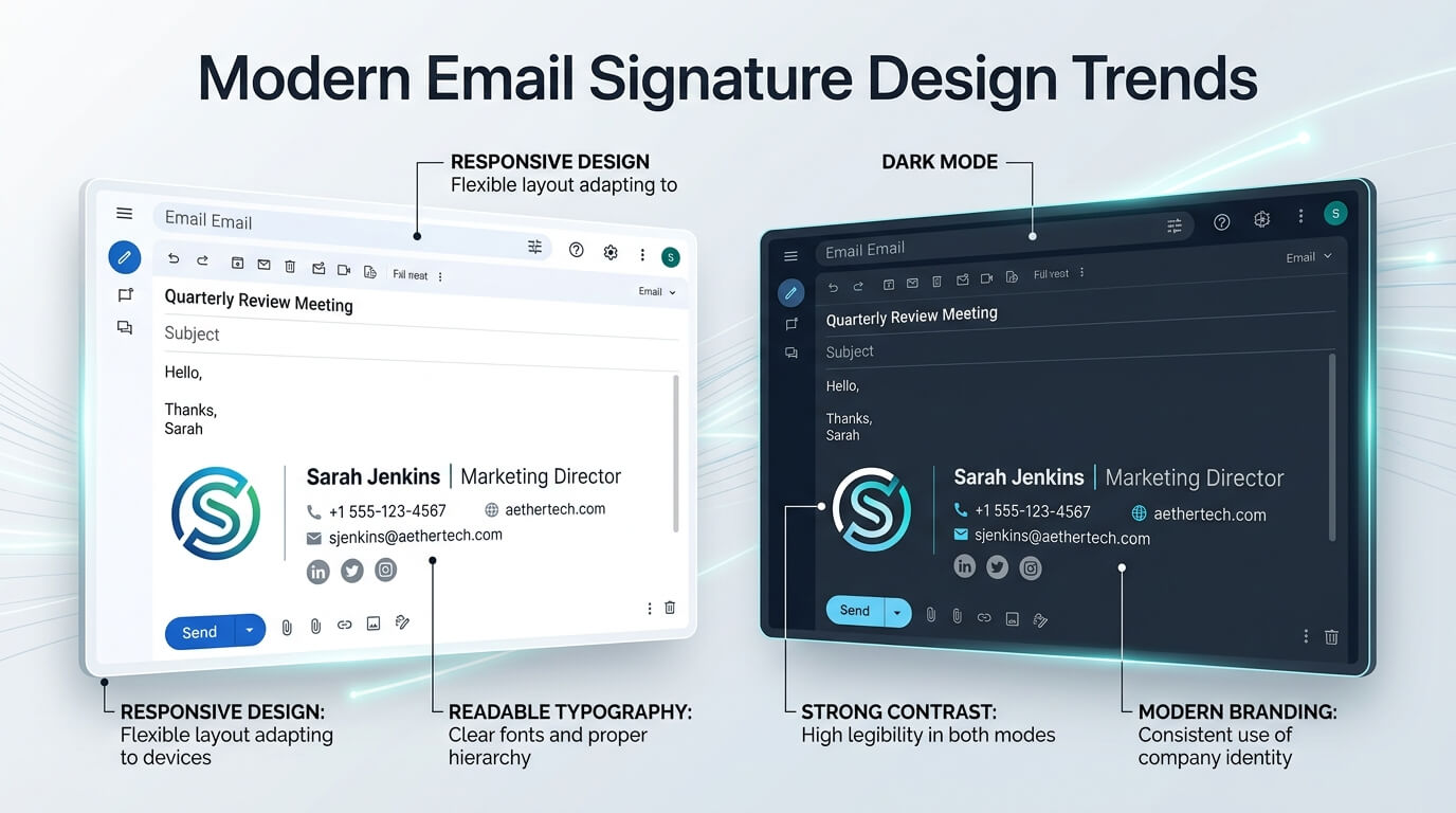
Email signatures have changed considerably over the past few years. What was once a simple block containing a name, job title, phone number, and company address has become a small but important part of digital communication. A modern email signature can reinforce a brand identity, make contact information easier to access, direct recipients toward a useful action, and create a consistent professional appearance across everyday correspondence.
The shift is also being driven by the way people read email. Messages are viewed on smartphones, laptops, tablets, and different email applications, often with light or dark interfaces. A signature that looks polished in one environment can become difficult to read or visually awkward in another. Current design practices therefore focus not only on appearance but also on usability, accessibility, performance, and compatibility.
In 2026, several trends are shaping modern email signature design. Minimal layouts, mobile-friendly structures, dark mode compatibility, restrained branding, accessible typography, subtle calls to action, and lightweight visuals are becoming increasingly important. At the same time, overly complicated signatures with excessive graphics, multiple fonts, large banners, and unnecessary information are losing their appeal.
The Shift Toward Minimal Email Signature Design
Minimalism continues to be one of the strongest trends in modern email signature design. Instead of trying to include every possible piece of information, designers are focusing on what the recipient actually needs. A typical contemporary signature may contain the person’s name, professional role, company name, one or two contact methods, and a carefully selected link or call to action.
This approach makes the signature easier to scan. When someone receives a business email, they usually want to identify who sent it and how to respond or contact that person. A crowded signature can make those basic details harder to find. A cleaner structure gives important information more visual weight and allows the recipient to understand the sender’s identity almost immediately.
Minimalism also has practical advantages. A simpler email signature generally contains fewer images and less complicated HTML, which can make it easier to maintain and more consistent across different email clients. Current email signature design guidance increasingly favors simple layouts, limited colors, generous spacing, and clear visual hierarchy.
Why White Space Matters
White space is another important part of minimalist email signature design. It does not necessarily mean the signature must have a white background. Instead, it refers to the visual breathing room between different elements.
When the name, job title, phone number, website, and social icons are packed together, the signature can feel cramped. A little additional spacing creates separation and makes each piece of information easier to recognize. The result often feels more professional without requiring additional decorative elements.
The goal is not to make the signature empty. The goal is to make every element easier to understand.
Mobile-First Email Signatures
Mobile-first design has become essential because email signatures must work on narrow screens as well as desktop displays. A signature that looks balanced on a large monitor may become difficult to read when squeezed onto a smartphone.
Modern designs therefore tend to favor vertical structures over complicated horizontal arrangements. Names, titles, contact details, and links can stack naturally instead of forcing several columns into a limited screen width. This reduces awkward line breaks and makes the signature easier to scan.
Typography is particularly important on mobile. Text should remain readable without requiring the recipient to zoom in. Links and icons also need enough space around them to make tapping easier. Contemporary email signature guidance commonly recommends readable type, touch-friendly links, and testing the finished design on actual mobile devices rather than relying only on desktop previews.
Designing for Small Screens First
A useful approach is to begin the design process with the smallest expected screen rather than the largest. If the signature remains clear and functional on a smartphone, it can usually be adapted more easily to larger displays.
This does not mean every signature needs to be extremely narrow or plain. A professional photograph, logo, or social media icons can still be included. The important consideration is how these elements behave when the available width becomes limited.
Responsive thinking should therefore influence the entire structure, from image dimensions and typography to spacing and link placement.
Dark Mode Is Now a Major Design Consideration
Dark mode has become one of the most important considerations in modern email signature design. Gmail, Outlook, Apple Mail, and mobile email applications can display messages against darker interfaces, but they do not all handle colors in exactly the same way. Some applications invert or modify colors, while others preserve portions of the original design.
This creates a challenge for designers. A logo that looks perfect against white may suddenly appear inside an unwanted white rectangle when viewed against a dark background. Dark text can also become difficult to see when the surrounding interface changes.
For this reason, dark mode should be considered during the initial design rather than treated as an afterthought.
Transparent Logos and Flexible Color Choices
Transparent PNG logos are often useful because they do not introduce an unwanted rectangular background around the brand mark. Designers should also examine whether the logo remains recognizable against both light and dark surroundings. In some cases, a simplified or alternate logo treatment may be appropriate.
Color selection matters as well. Extremely light or extremely dark colors can create problems when email clients modify the appearance of a message. A restrained palette with strong contrast can help maintain readability across different viewing conditions. Dark mode behavior still varies considerably between email clients, so testing remains important.
Stronger Visual Hierarchy Through Typography
Typography has become more deliberate in modern email signature design. Rather than using several typefaces to create visual interest, contemporary signatures generally rely on one primary font with variations in size, weight, and spacing.
The sender’s name is often the strongest typographic element. The professional title can be slightly smaller, while contact information can use a lighter visual treatment. This creates a hierarchy that guides the reader naturally from identity to supporting information.
Font compatibility is also important. Email applications do not necessarily render fonts in the same way as modern websites. Using dependable, widely supported typefaces can reduce inconsistencies between platforms. Current design guidance continues to recommend web-safe typography for signatures that need predictable rendering.
Using Brand Typography Carefully
A company’s brand may use a distinctive typeface across its website and marketing materials. However, that font may not be reliably available in every recipient’s email environment. A practical signature design therefore balances brand consistency with technical compatibility.
Brand personality can still be communicated through font weight, spacing, color, logo treatment, and overall layout. The signature does not need to reproduce every aspect of a website’s visual identity to feel connected to the brand.
Restrained Brand Colors Are Replacing Visual Overload
Modern email signatures are increasingly using a small number of brand colors. Instead of filling the entire signature with multiple shades, designers may use one primary brand color for the name, divider, icon, or link.
This creates a subtle connection between the email and the wider brand identity. It also prevents the signature from competing with the actual email message.
A restrained color system can be especially effective for professional industries where credibility and clarity are more important than decoration. The signature should feel like a natural extension of the company’s identity rather than a miniature advertisement.
Clear Calls to Action
Another emerging trend is the use of a single, purposeful call to action. Rather than adding several buttons and promotional links, modern signatures often direct the recipient toward one useful next step.
For example, a consultant might include a link to schedule a meeting, while a sales professional could link to a relevant product page. A creative professional might use a portfolio link. The key is relevance.
The call to action should not overwhelm the contact information. A short text link or modest button can be enough. Recent industry discussions around signature design show growing interest in scheduling links and other focused CTAs rather than multiple competing destinations.
One Action Is Often Better Than Many
When a signature contains a website, booking link, portfolio, newsletter, social media profiles, product announcement, promotional banner, and several buttons, the recipient has too many choices.
A modern signature can instead treat the CTA as a supporting element. The recipient should immediately understand the sender’s identity first and the requested action second.
This approach also makes the signature easier to maintain because the most important destination can be updated without redesigning the entire structure.
Social Media Icons Are Becoming More Selective
Social media links remain common, but modern email signatures are becoming more selective about which platforms they display. Including every social network a company has joined can create unnecessary visual clutter.
A better approach is to consider which platforms genuinely support the sender’s professional role. A designer may prioritize a portfolio platform, while a corporate communications professional may choose LinkedIn. The choice should support the recipient rather than simply advertise the company’s entire online presence.
Icons should also remain visually consistent. Using several unrelated icon styles can make the signature look unfinished. Small, recognizable icons with adequate spacing can provide a clean way to access professional profiles without dominating the signature.
Subtle Photography and Personal Branding
Professional photographs continue to have a place in certain email signatures, particularly for consultants, executives, real estate professionals, recruiters, and client-facing specialists. However, the trend is moving away from oversized portraits and toward smaller, carefully positioned images.
A photograph can add personality and make communication feel more personal, but it should not overpower the sender’s name and contact information. Image quality, cropping, and background treatment are all important.
The same principle applies to personal branding. A distinctive logo or monogram can be useful for freelancers and independent professionals, but excessive visual decoration can reduce clarity. Modern design favors personality within a controlled structure.
Lightweight Images and Faster Loading
Performance is becoming increasingly important in email signature design. Every additional image, large graphic, or unnecessary animation adds weight to the signature and can affect how quickly it loads.
Compressed images are therefore preferable to large, high-resolution files that provide little additional value at signature size. Designers should also avoid using images for information that could simply be written as text. A phone number, job title, or website address is usually more accessible and dependable as actual text.
Current signature design recommendations emphasize lightweight assets and simple HTML structures because email clients continue to have different rendering capabilities.
Accessibility Is Becoming Part of Professional Design
Accessibility is no longer something that should be considered only for websites. Email signatures can also create barriers when they rely heavily on images, poor color contrast, tiny text, or links that are difficult to identify.
Text should have sufficient contrast against its background. Important information should not exist only inside an image. Links should be recognizable and usable, while decorative elements should not interfere with the ability to understand the signature.
Accessibility also improves the general user experience. A signature that is easier to read for someone with a visual limitation is often simply easier to read for everyone.
Subtle Animation Instead of Distracting GIFs
Animated email signatures have not disappeared, but their role is changing. Large, flashy GIFs can make a professional email feel more like a promotional campaign than a personal conversation.
If animation is used, subtle movement is generally more appropriate. A small logo animation or restrained visual effect can add personality without dominating the message. It is also important to remember that not every email client handles animation identically. Some environments may show only the first frame.
The safest approach is to make sure the first frame communicates the intended message even if the animation never plays. Recent 2026 design commentary suggests that animation is being used more selectively, with greater emphasis on lightweight and purposeful movement.
Personalized Signatures for Different Roles
One universal signature may not always be suitable for an entire organization. A sales representative, customer support specialist, executive, recruiter, and designer may have different communication needs.
The core brand system can remain consistent while certain elements change. A sales team might emphasize scheduling, while a support team may prioritize help-center information. Executives may use a simpler signature, while creative departments may have more room for portfolio links.
This creates a useful balance between organizational consistency and individual relevance.
Modern Email Signature Design Trends at a Glance
| Design Trend | Modern Approach | Main Benefit |
| Minimalism | Essential information with generous spacing | Easier scanning |
| Mobile-first design | Vertical layouts and readable text | Better smartphone usability |
| Dark mode compatibility | Transparent images and adaptable colors | More consistent appearance |
| Restrained branding | One or two brand colors | Stronger visual consistency |
| Accessible typography | Clear fonts and strong contrast | Better readability |
| Focused CTA | One relevant action | Clearer user direction |
| Selective social icons | Only relevant professional platforms | Less visual clutter |
| Lightweight graphics | Compressed, optimized images | Faster loading |
| Subtle animation | Limited, purposeful movement | Added personality without distraction |
| Role-based signatures | Adapted links and information | Greater relevance |
Testing Across Email Clients
One of the most important modern email signature practices is testing. A signature should not be considered finished simply because it looks good in the designer’s preferred email application.
Gmail, Outlook, Apple Mail, and mobile applications can interpret HTML, images, spacing, and dark mode differently. A design that works perfectly in one environment can display differently somewhere else. Dark mode is particularly difficult because email clients may use different approaches to color adjustment.
Testing should include desktop and mobile versions as well as light and dark interfaces. Links should be checked, images should be inspected for unwanted backgrounds, and text should remain readable at smaller screen sizes.
For businesses with many employees, centralized signature management can also help maintain consistency. Without some form of standardization, employees may create different versions of the company signature, use outdated logos, or retain old contact information.
The Future of Email Signature Design
The future of email signature design is likely to focus less on adding visual effects and more on making every element useful. The signature has a small amount of space and a very specific purpose, so successful design depends on making careful decisions.
Minimalism, accessibility, mobile usability, dark mode compatibility, performance, and brand consistency are likely to remain important as email continues to evolve. The most effective signatures will not necessarily be the ones with the most impressive graphics. They will be the ones that remain clear, professional, recognizable, and functional wherever the recipient opens the message.
Conclusion
Modern email signature design is moving toward cleaner layouts, stronger readability, responsive structures, restrained branding, and purposeful functionality. Dark mode and mobile viewing have made technical compatibility just as important as visual appearance, while accessibility and performance are becoming central parts of professional design.
A well-designed signature does not need to be complicated. It needs to present the right information clearly, reflect the brand naturally, and work reliably across different devices and email clients. By focusing on simplicity, usability, consistency, and thoughtful visual hierarchy, businesses and professionals can create email signatures that feel current without depending on short-lived design gimmicks.
FAQ
Q. What is the biggest email signature design trend today?
Minimalism is one of the strongest trends. Modern signatures generally focus on essential contact information, clear hierarchy, limited branding, and enough white space to keep the design easy to scan.
Q. Should an email signature work in dark mode?
Yes. Dark mode is widely available across major email clients, but its rendering behavior varies. Designers should test logos, text, links, and backgrounds in both light and dark environments.
Q. How should an email signature be designed for mobile?
A mobile-friendly signature should use readable text, simple layouts, vertically stacked information where appropriate, and links that are easy to tap. Testing the signature on actual smartphones is also important.
Q. Are images still useful in email signatures?
Yes, but they should be used selectively. A company logo or professional photograph can strengthen the design, provided the image is properly sized, compressed, and tested across different email clients.
Q. How many calls to action should an email signature have?
For most professional signatures, one clear and relevant call to action is enough. Keeping the number of choices limited helps prevent visual clutter and makes the intended next step easier for the recipient to recognize.