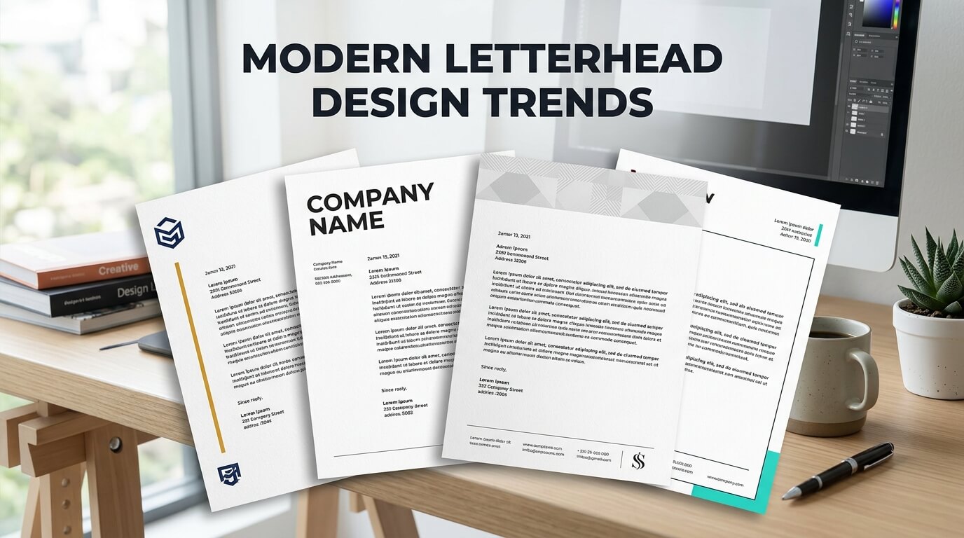
A letterhead may seem like a small part of a company’s overall branding, but it continues to play an important role in professional communication. Even as businesses rely heavily on email, websites, social media, and digital documents, formal letters, proposals, invoices, agreements, reports, and printed correspondence still need a professional visual identity. A well-designed letterhead can make these communications feel more credible, organized, and connected to the brand.
Modern letterhead design has moved far beyond simply placing a logo and contact information at the top of a page. Today, businesses are exploring cleaner layouts, sophisticated typography, subtle colors, creative spacing, digital-friendly formats, and brand-focused visual systems. The goal is not to make every page visually complicated. Instead, modern letterhead design focuses on creating a polished identity that communicates professionalism while keeping the actual document easy to read.
As branding continues to become more consistent across digital and physical platforms, letterheads are increasingly being designed as part of a complete visual identity. The colors used on a website, the typography found in marketing materials, the shape of a logo, and even the spacing of a brand’s social media graphics can influence the appearance of its stationery.
Why Modern Letterhead Design Matters for Businesses
A letterhead is often one of the first visual elements people notice when receiving an official business document. Before reading the content, the recipient may already form an impression based on the organization of the page, the quality of the typography, the placement of the logo, and the overall visual balance.
Modern businesses therefore treat letterhead as an extension of their brand identity rather than simply a decorative header. When stationery follows established brand guidelines, every communication feels connected. This consistency can make a company appear more organized and professional across different communication channels.
A strong letterhead also creates a sense of authenticity. When a formal document includes consistent branding, business details, and recognizable visual elements, it feels more intentional than a generic document created from a basic word-processing template. This is particularly important for professional correspondence, proposals, legal communications, corporate reports, and client-facing documents.
Another reason modern letterhead design matters is versatility. Today’s letterheads may be printed, attached as PDFs, shared through document-management platforms, or incorporated into digital correspondence. Designers must therefore think about how the design performs across different formats rather than creating something intended exclusively for physical paper.
Minimalist Letterhead Designs Continue to Grow
Minimalism remains one of the most influential trends in modern letterhead design. Instead of filling the page with decorative graphics, contemporary designs often use generous white space, carefully selected typography, and a limited number of visual elements.
The Power of White Space
White space gives a letterhead room to breathe. It prevents the branding elements from competing with the actual message and helps create a more sophisticated appearance. A clean margin around the logo, heading, address, and body text can make even a simple document feel carefully designed.
Modern minimalist letterheads may use a small logo in one corner, a thin line beneath the header, and subtle contact information in the footer. The rest of the page remains intentionally open for the document’s content.
This approach is especially useful for businesses that want to communicate professionalism without appearing overly formal or old-fashioned. Technology companies, consulting firms, creative agencies, law firms, financial businesses, and professional service providers can all benefit from a refined minimalist approach.
Simplified Visual Elements
Modern letterheads are also moving away from unnecessary borders, heavy patterns, and oversized logos. Instead, designers are choosing one or two recognizable brand elements and using them strategically.
A small geometric shape, a brand-colored line, or a subtle background detail can be enough to establish visual identity. This creates a professional document without distracting readers from the information.
Bold Typography as a Branding Tool
Typography has become an increasingly important part of letterhead design. Businesses are using carefully selected typefaces not only to make text readable but also to express personality.
Modern Sans Serif Typography
Sans serif fonts are frequently associated with clean, contemporary branding. Their simple shapes work particularly well for business documents because they remain readable across printed and digital formats.
A modern letterhead may combine a strong sans serif typeface for the company name with a lighter version for contact information. This creates hierarchy without requiring additional graphics.
Combining Different Font Weights
Rather than using several unrelated fonts, designers can create visual interest by using different weights and sizes within a carefully selected type family. A bold company name, medium-weight heading, and regular body text can establish a clear hierarchy while maintaining consistency.
Typography should always support readability. A visually attractive typeface is not effective if recipients struggle to read the document. Modern letterhead design therefore balances personality with practicality.
Strategic Use of Brand Colors
Color remains an important element of contemporary stationery, but modern design trends favor intentional color usage rather than excessive decoration.
A business may use its primary brand color for the logo and a secondary color for a thin line, footer, or small graphic detail. This creates recognition while allowing the majority of the document to remain clean.
Neutral Backgrounds With Accent Colors
White remains the most common background for professional letterheads because it offers excellent readability and works well for printing. However, subtle neutral shades such as soft gray, cream, or very light beige can create a more distinctive visual experience when used appropriately.
Accent colors can then be introduced through typography, lines, geometric elements, or footer details. This combination creates a contemporary appearance without overwhelming the page.
Color Consistency Across Branding
One of the most important considerations is consistency. The colors used on a letterhead should relate closely to those used on the company’s website, business cards, presentations, packaging, and other branded materials.
A consistent color system allows customers to recognize the company even when the logo is not immediately visible.
Creative Placement of Logos
Traditional letterheads commonly place the logo in the upper-left corner. While this remains a practical option, modern designs are experimenting with alternative placements.
Centered Logo Treatments
A centered logo can create a formal and balanced appearance. This style can work particularly well for professional correspondence, certificates, invitations, and organizations that want a more traditional presentation with a contemporary finish.
Side-Aligned Branding
Another approach is placing the logo along the left or right edge of the page. A vertical brand element can create a distinctive layout while preserving plenty of space for written content.
This style can be particularly effective for businesses with strong visual identities. A narrow colored strip combined with a logo can become a recognizable stationery signature.
Subtle Logo Watermarks
Some modern letterheads use the logo as a very light watermark. The logo may appear behind the text at low opacity, creating a sophisticated branded effect.
However, watermark treatments need careful testing. If the logo is too dark, it can interfere with readability and make the document look unnecessarily busy.
Geometric Shapes and Abstract Graphics
Geometric design has become another popular feature in modern stationery. Simple circles, lines, grids, curves, and abstract shapes can add personality without requiring large illustrations.
A technology company might use a series of connected lines, while a creative agency could incorporate curved shapes or abstract patterns. A financial company may prefer structured geometric elements that communicate precision and stability.
The key is moderation. Decorative graphics should reinforce the brand rather than become the main focus of the document.
Responsive and Digital-Friendly Letterhead Design
Modern letterheads are no longer designed exclusively for printing. Many businesses create digital letterhead templates that employees can use for PDFs, proposals, reports, and electronic correspondence.
Designing for PDF Documents
Digital documents require careful attention to spacing, file size, image quality, and readability. A letterhead that looks excellent when printed may not perform equally well on a laptop or mobile screen.
Designers should consider how the header appears when the document is viewed electronically. Large graphics can increase file size, while overly small text may become difficult to read on screens.
Editable Templates for Teams
Businesses with multiple employees often benefit from standardized digital letterhead templates. These templates allow employees to create official documents while maintaining the same visual identity.
A well-designed template can include designated areas for dates, recipient information, headings, body text, signatures, and contact information. This reduces formatting inconsistencies across departments.
Footer-Based Letterhead Designs
The footer is becoming more important in modern letterhead design. Instead of placing all contact details in the header, designers can move information such as phone numbers, email addresses, website addresses, and physical locations into the bottom section.
This creates a cleaner upper portion of the page and gives the document more room for its actual message.
A footer can also contain a thin brand-colored line, social media icons where appropriate, or a subtle graphic element. The result is a balanced page where branding appears at both the beginning and end without dominating the content.
Custom Illustrations and Brand Patterns
Some businesses are moving beyond traditional logos and colors by incorporating custom illustrations or brand-specific patterns into their stationery.
An architectural company, for example, could use a subtle line drawing inspired by buildings. A publishing business might use an abstract literary pattern. A design studio could incorporate a custom illustration that appears across its stationery system.
The advantage of this approach is differentiation. A carefully developed visual motif can make business documents immediately recognizable.
However, illustrations should be designed with long-term use in mind. Trends change, so overly fashionable graphics can make stationery look outdated within a short period.
Eco-Conscious Letterhead Design
Sustainability is also influencing stationery decisions. Businesses are increasingly considering paper selection, printing methods, ink coverage, and overall material consumption when developing letterhead systems.
Modern sustainable letterhead design often uses simpler layouts that require less ink. Minimal graphics can also work well with recycled or uncoated paper, depending on the desired appearance.
Paper choice itself can influence the personality of a letterhead. Recycled paper can create a natural and environmentally conscious impression, while premium textured paper can communicate a more traditional or luxury-oriented identity.
The important consideration is ensuring that sustainability choices remain consistent with the company’s broader brand message.
Letterhead Design Trends at a Glance
| Design Trend | Visual Approach | Main Benefit | Best Used For |
| Minimalism | Clean layouts and white space | Professional appearance | Corporate and professional services |
| Bold typography | Strong type hierarchy | Brand personality | Modern businesses and agencies |
| Accent colors | Limited strategic color | Brand recognition | Most business sectors |
| Geometric elements | Lines, shapes, grids | Contemporary identity | Technology and creative businesses |
| Footer branding | Contact details at the bottom | Cleaner header | Formal correspondence |
| Digital templates | Screen-friendly layouts | Consistency across teams | Remote and modern businesses |
| Watermarks | Subtle background logos | Sophisticated branding | Formal documents |
| Custom patterns | Repeated brand graphics | Distinctive identity | Creative and lifestyle brands |
| Sustainable design | Simple layouts and eco-conscious materials | Reduced visual and material excess | Environmentally focused businesses |
The Rise of Personalized Letterhead Systems
Another modern trend is creating flexible letterhead systems rather than one fixed design. Businesses may have different versions for proposals, invoices, legal documents, internal communications, executive correspondence, and marketing materials.
These variations should still belong to the same visual family. The logo, colors, typography, spacing, and other core elements can remain consistent while layouts are adapted to different document requirements.
This approach allows businesses to maintain brand consistency without forcing every type of communication into an identical template.
Designing Letterheads for Different Industries
There is no universal letterhead style that works equally well for every business. A modern design should reflect the expectations of its industry while maintaining the organization’s individual personality.
Corporate and Financial Businesses
Corporate organizations often benefit from restrained layouts, strong typography, structured spacing, and subtle branding. These choices can create an organized and formal appearance.
Creative Businesses
Design agencies, photographers, marketing companies, and creative studios have greater flexibility. They may experiment with unconventional layouts, illustrations, vibrant colors, or distinctive typography.
Legal and Professional Services
Legal and professional organizations typically need a balance between contemporary design and formality. Clear information hierarchy is especially important because documents may contain contracts, notices, agreements, or other detailed content.
Healthcare and Service Businesses
Healthcare and service-oriented businesses can benefit from clean typography and calming visual systems. The letterhead should remain easy to read while reinforcing the organization’s established brand identity.
How to Create a Future-Ready Letterhead
A modern letterhead should not simply follow a current trend. It should be designed to remain useful as the company grows and its communication needs change.
The first step is understanding the brand. Designers should examine the company’s logo, colors, typography, audience, industry, and overall communication style. This helps ensure that the letterhead feels like a natural part of the brand.
The next consideration is functionality. A beautiful letterhead is not successful if there is insufficient space for actual correspondence. The design must leave enough room for headings, paragraphs, signatures, dates, recipient information, and other necessary details.
Digital compatibility should also be considered from the beginning. The final design may need to work as a printed page, PDF template, editable document, and potentially an email attachment. Designing with these formats in mind can prevent problems later.
Finally, businesses should test the design. Printing a sample can reveal issues that are not obvious on a computer screen. Text may appear too small, colors may print differently, or decorative elements may interfere with margins. Reviewing both digital and physical versions helps create a more reliable final product.
The Importance of Consistency Across Business Stationery
Letterhead should not exist in isolation. It should coordinate with business cards, envelopes, invoices, presentation documents, email signatures, brochures, and other branded materials.
When these items share common typography, colors, spacing, and graphic elements, customers experience a consistent brand wherever they encounter the business.
This consistency does not mean every item needs to look identical. Instead, each piece should use the same underlying visual language. A business card may be compact and information-heavy, while a letterhead needs generous space for written content. The connection should come from shared design principles rather than repetition.
Final Thoughts
Modern letterhead design is increasingly focused on simplicity, consistency, functionality, and brand personality. Businesses are using clean layouts, strong typography, strategic color, subtle graphics, digital templates, and flexible design systems to create stationery that feels relevant to contemporary communication.
The most effective approach is not necessarily the most decorative one. A successful letterhead should make the business recognizable while allowing the document’s content to remain the primary focus. By combining thoughtful branding with practical design, businesses can create stationery that works equally well in printed and digital environments.
FAQ
Q. What is a modern letterhead design?
A modern letterhead design combines professional branding with clean layouts, readable typography, strategic color, white space, and contemporary visual elements. It is usually designed to work across both printed and digital documents.
Q. Should a modern letterhead include a logo?
Yes, a logo is commonly included because it helps establish brand recognition. However, its size and placement should be carefully considered so it does not dominate the document.
Q. What colors work best for modern letterheads?
There is no single color combination that works for every business. A good approach is to use the company’s established brand colors strategically while keeping the overall document easy to read.
Q. Can letterheads be used for digital documents?
Yes. Modern letterheads are frequently created as digital templates for PDFs, proposals, reports, and other electronic documents. The design should be tested on different screen sizes as well as in print.
Q. How can a letterhead look professional without being boring?
A professional letterhead can use typography, white space, subtle geometric elements, carefully selected colors, or a distinctive footer to create personality. The key is maintaining balance so that decorative elements support the content instead of distracting from it.