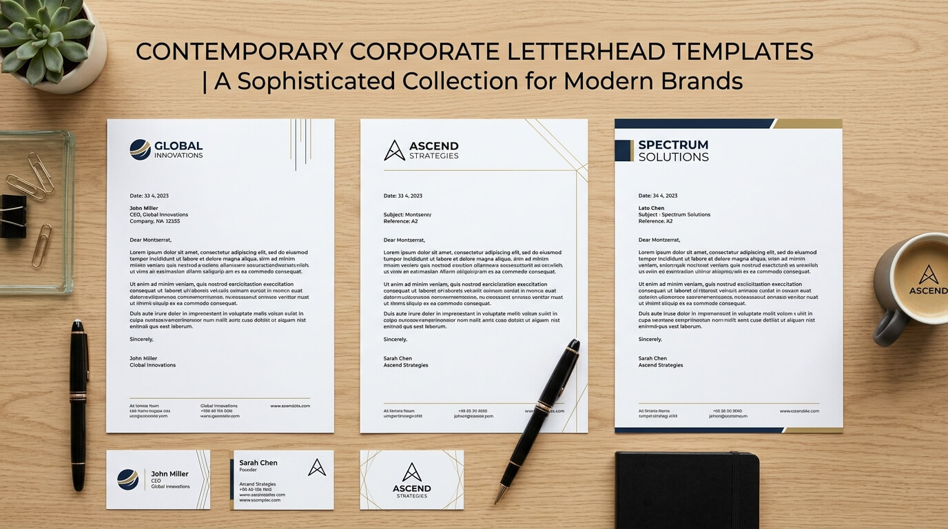
A letterhead may seem like a small part of a company’s visual identity, but it can have a surprisingly strong effect on how a business communicates. Whether it appears on a formal proposal, business letter, invoice, contract, client update, or printed document, a well-designed letterhead gives every page a sense of consistency and professionalism. Modern minimalist letterhead design takes this idea further by removing unnecessary decoration and focusing on the details that matter most.
Minimalism does not mean making a letterhead look empty or unfinished. Instead, it means making deliberate choices about typography, spacing, color, branding, and information. Every element has a purpose, and the overall design feels clean without becoming generic. For businesses that want a contemporary identity, minimalist letterhead can create a polished appearance while keeping the focus on the actual message.
As businesses increasingly communicate across both digital and print channels, letterhead design also needs to work in different formats. A design that looks attractive on a printed page should remain clear when converted into a PDF or shared electronically. This makes simplicity particularly useful because clean layouts tend to remain readable across screens, printers, and different document formats.
What Makes a Letterhead Modern and Minimalist?
Modern minimalist letterhead design is based on visual restraint. Instead of filling the page with logos, patterns, decorative borders, multiple colors, and extensive contact information, the design uses a small number of carefully selected elements. The logo might sit neatly at the top, while the company name and contact details are placed in a subtle area at the bottom or along one edge.
Typography is usually one of the most important parts of the design. A clean sans-serif typeface can create a contemporary appearance, while a refined serif can introduce a more traditional sense of sophistication. The important factor is consistency. Using several unrelated fonts can quickly make a minimalist design feel cluttered.
Whitespace is equally important. Empty space around the logo, headings, body text, and margins gives the document room to breathe. Rather than seeing whitespace as unused space, designers can treat it as an active part of the composition. It creates separation between elements and makes the written content easier to read.
Color is also handled carefully. A minimalist letterhead may rely primarily on black, white, gray, or a single brand color. A restrained color palette allows important elements to stand out without competing with the document’s content.
Use a Simple Header With Strong Typography
One of the easiest ways to create a modern letterhead is to keep the header extremely simple. The company logo can be positioned in the upper-left corner, while the company name or tagline sits beside it. Alternatively, the logo can be centered for a more formal presentation.
Typography can give this simple layout its personality. A company with a technology-focused identity might use a geometric sans-serif font, while a consulting firm or creative studio may prefer a combination of an elegant serif and a clean sans-serif.
The size of the company name should be carefully considered. Making it extremely large can dominate the page and reduce the space available for the actual message. A more restrained approach allows the brand to remain recognizable without becoming the primary focus of every document.
For a particularly modern effect, designers can use typography as the main visual element rather than relying heavily on graphic decoration. A carefully selected typeface, generous spacing, and subtle hierarchy can make a letterhead look sophisticated without requiring complicated artwork.
Create a Spacious Top-and-Bottom Layout
Another effective minimalist letterhead idea is to divide branding information between the top and bottom of the page. The header can contain the logo and company name, while the footer provides contact information, website details, address, or registration information.
This approach leaves most of the page open for written content. It is especially useful for businesses that regularly create formal letters, proposals, reports, and client documents because the central area remains flexible.
The footer can be separated from the main content with a thin line or a small amount of whitespace. There is no need for heavy borders or decorative graphics. A subtle horizontal rule in a brand color can be enough to create visual structure.
This arrangement also works well for digital documents. When a letterhead is converted into a PDF, the header and footer remain easy to recognize without interfering with the readability of the document.
Experiment With Asymmetrical Letterhead Designs
Minimalist design does not have to be perfectly symmetrical. An asymmetrical layout can make a letterhead feel more contemporary while still maintaining a professional appearance.
For example, the logo can be positioned in the upper-right corner while contact information sits vertically along the left edge. Another approach is to place the company name toward one side of the header and use a thin colored line to visually connect it with the rest of the page.
Asymmetry works particularly well for creative agencies, architecture firms, design studios, technology companies, and other businesses that want a distinctive identity. The key is to maintain visual balance even when the elements are not centered or evenly distributed.
A minimalist asymmetrical design should still have a clear hierarchy. The reader should immediately understand what the company is, where the document begins, and where the important contact information can be found.
Try a Vertical Accent Line
A thin vertical line is a simple way to introduce structure into a minimalist letterhead. Instead of using a large graphic or colorful banner, a narrow line can divide the branding area from the document content.
For instance, the company logo and contact details can sit along the left side of the page, while the main letter begins on the right. This creates a strong editorial appearance and gives the page a contemporary feel.
The line can use the company’s primary brand color, although neutral gray or black can work equally well. Its width should remain subtle. The purpose is to organize the layout, not become the main visual attraction.
This idea can be particularly effective when the company has a strong visual identity but wants to keep its formal documents understated.
Use a Monochrome Letterhead
A monochrome letterhead can be highly effective for businesses that want a refined and timeless appearance. Black, white, and shades of gray provide enough contrast to establish hierarchy without relying on multiple colors.
A monochrome design can also make a document feel more formal. Law firms, financial companies, consulting businesses, professional services, and corporate organizations can benefit from this approach.
The absence of color means that typography and spacing become even more important. Different font weights can distinguish the company name, contact details, headings, and body text. Light gray can be used for secondary information while darker text remains reserved for important content.
Monochrome designs also have a practical advantage when documents need to be printed in black and white. The letterhead remains recognizable without depending on color reproduction.
Introduce One Brand Color
For businesses that want a little more personality, using one brand color can create a strong minimalist letterhead. The color might appear in a thin line, logo detail, company name, footer, or small graphic element.
The most important part is restraint. If several colors are used throughout the page, the minimalist quality can quickly disappear. One carefully selected accent color is often enough to connect the document to the company’s broader brand identity.
The chosen color should also maintain sufficient contrast against the background. A very light color may look attractive on a screen but become difficult to see when printed. Designers should consider both digital and physical applications before finalizing the palette.
Make the Logo Part of the Layout
A common mistake in letterhead design is treating the logo as an object that can simply be placed anywhere on the page. In a minimalist layout, the logo should feel integrated into the overall composition.
The amount of space around the logo matters. A logo that is positioned too close to the page edge can look cramped, while one surrounded by appropriate whitespace can appear much more refined.
The logo does not always need to be large. A smaller logo can often communicate the brand more effectively because the surrounding whitespace gives it visual importance. This is especially useful for companies with recognizable logos or wordmarks.
Businesses can also explore alternative placements. The logo can appear at the top, bottom, in a corner, or as a very subtle watermark. Each option creates a different visual effect while maintaining the same basic minimalist principle.
Explore Subtle Geometric Elements
Minimalist letterhead designs can include geometric elements without becoming visually complicated. A small circle, square, line, or abstract shape can add character while preserving a clean appearance.
For example, a small geometric shape can be positioned near the company logo or repeated as a subtle footer detail. A thin rectangle can frame a small area of contact information. Simple diagonal lines can introduce movement into an otherwise static layout.
These elements should support the brand rather than distract from the document. Their size, color, and placement should be carefully controlled.
A geometric approach can be especially suitable for modern businesses in architecture, technology, engineering, interior design, marketing, and creative services.
Combine Serif and Sans-Serif Fonts
Typography can become a defining feature of a minimalist letterhead. One interesting approach is combining a serif font with a sans-serif font. The contrast creates hierarchy while keeping the design visually interesting.
For example, the company name can use a refined serif typeface while contact information and body text use a clean sans-serif. Alternatively, a bold sans-serif can establish the brand identity while a subtle serif is used for formal headings.
The combination should remain consistent. Using too many font styles can create unnecessary complexity. Two complementary typefaces are usually enough to create a clear visual system.
Font size should also be considered in relation to the physical document. Contact information that looks readable on a large monitor may appear too small when printed. Minimalism should always support usability rather than compromise it.
Design a Borderless Letterhead
Traditional letterheads often use boxes or borders to define the page. Modern minimalist designs can remove these elements completely.
A borderless letterhead allows the page margins, typography, logo placement, and whitespace to create the structure. The result can feel lighter and more contemporary.
Instead of drawing a line around the entire page, designers can use a small horizontal rule beneath the header or simply rely on spacing to separate the branding from the body content.
This approach is particularly effective for businesses that want their communications to feel modern rather than formal in a traditional sense.
Add a Subtle Watermark
A watermark can add visual depth without taking attention away from the written content. A company logo, monogram, or abstract brand symbol can be placed in a very light tone behind the main text.
The watermark should be subtle enough that it does not interfere with readability. If it is too dark or large, the page can quickly look busy.
A large, faint logo positioned toward one corner can create an elegant effect. Another possibility is placing an abstract brand shape in the background at low opacity.
Watermarks can work particularly well for certificates, formal correspondence, premium proposals, and documents where brand identity needs to remain visible without taking up valuable header space.
Keep Contact Information Organized
Minimalism should never mean removing useful information. A letterhead still needs to make it easy for recipients to identify and contact the business.
The challenge is presenting this information without creating visual clutter. A footer can contain the company address, telephone number, email address, website, and other essential details in a compact arrangement.
Icons can sometimes help organize information, but they should be used carefully. Text alone may actually produce a cleaner appearance, particularly for highly formal brands.
The information hierarchy should also be clear. The company name and logo should be visually stronger than secondary contact details. This prevents the footer from competing with the main document.
Minimalist Letterhead Ideas by Business Type
Different industries can interpret minimalism in different ways. A law firm might use a monochrome layout with elegant typography and generous spacing. A technology company may use a geometric sans-serif font, a strong accent color, and an asymmetrical structure.
A creative agency might use unusual typography or an abstract graphic while keeping the overall page spacious. A healthcare organization may prefer a calm palette, clear typography, and highly organized contact information.
A financial business may benefit from a conservative design that uses a small logo, dark typography, and a restrained footer. A fashion or luxury brand could explore sophisticated serif typography, oversized whitespace, and subtle branding.
The table below provides a simple comparison of approaches.
| Business Type | Suitable Minimalist Style | Key Design Elements | Color Approach |
| Law Firm | Formal and refined | Serif typography, spacious margins | Black, white, gray |
| Technology Company | Clean and contemporary | Sans-serif type, geometric details | One bold accent color |
| Creative Agency | Distinctive and flexible | Asymmetry, unique typography | Brand-led palette |
| Financial Firm | Professional and restrained | Structured header and footer | Navy, gray, black |
| Healthcare Business | Clear and approachable | Simple logo, readable typography | Soft brand color |
| Luxury Brand | Elegant and spacious | Serif typography, large whitespace | Neutral or muted tones |
| Architecture Studio | Editorial and modern | Grid layouts, fine lines | Monochrome or earthy tones |
Think About Digital and Printed Use
A modern letterhead should be designed with more than one environment in mind. Many businesses rarely print correspondence anymore, yet they still need documents that look professional when emailed as PDFs.
Digital letterheads should remain readable on laptops, tablets, and mobile devices. Text should not become too small, and important information should remain easy to locate.
Printed versions require another level of consideration. Colors may appear differently on paper, fine lines may become less visible, and certain fonts may reproduce differently depending on the printer.
For this reason, a successful minimalist letterhead should be tested in both digital and physical formats. A design that looks perfect on a screen should not be considered finished until it has also been reviewed as an actual printed page.
Use a Consistent Brand System
A letterhead should not exist separately from the rest of a company’s visual identity. Its logo, typography, colors, spacing, and graphic elements should relate to the company’s website, business cards, presentation templates, envelopes, email signatures, and other branded materials.
Consistency helps create recognition. When customers see similar visual details across different communication channels, the business feels more organized and established.
This does not mean every branded asset needs to look identical. Instead, the same underlying design language can be adapted to different formats. A letterhead may be more restrained than a social media graphic while still using the same typeface and color system.
Avoid Overdesigning a Minimalist Letterhead
The biggest challenge with minimalist design is knowing when to stop. Designers may start with a simple layout and gradually add icons, patterns, colors, borders, illustrations, and decorative elements until the original simplicity disappears.
Every element should answer a practical question: Does it improve communication, reinforce the brand, or help organize the page? If it does none of these things, it may not be necessary.
The goal is not to make a letterhead look empty. The goal is to create a page where every visible element feels intentional. Good minimalist design often looks simple because considerable thought has gone into what has been left out.
Conclusion
Modern minimalist letterhead design combines professional branding with simplicity, clarity, and thoughtful use of space. From monochrome layouts and single-color accents to asymmetrical compositions, refined typography, subtle watermarks, and clean headers, there are many ways to create a letterhead that feels contemporary without becoming distracting.
The strongest designs focus on usability as much as appearance. They make the company easy to identify, keep contact information accessible, provide enough space for the actual message, and work effectively across both printed and digital documents. By treating typography, whitespace, color, and branding as connected elements, businesses can create letterheads that remain professional, recognizable, and relevant for years.
Frequently Asked Questions
Q. What is a minimalist letterhead?
A minimalist letterhead is a business document design that uses a limited number of visual elements, restrained typography, simple colors, and generous whitespace. Its purpose is to communicate the brand clearly without unnecessary decoration.
Q. How many colors should a minimalist letterhead use?
A minimalist letterhead can work with one primary color and one accent color, although monochrome designs are also effective. The exact choice depends on the company’s existing brand identity.
Q. Should a minimalist letterhead include a company logo?
Yes. A logo is often one of the most important elements of a letterhead. However, it does not need to be large. A carefully positioned, appropriately sized logo can establish brand identity while preserving the clean appearance of the page.
Q. Can minimalist letterheads be used for digital documents?
Yes. Minimalist letterheads are particularly suitable for digital documents because their clean layouts generally remain readable when converted into PDFs or viewed on different screens.
Q. What is the most important element of minimalist letterhead design?
There is no single element that determines whether a letterhead works. Typography, spacing, branding, hierarchy, and usability all contribute to the result. The strongest designs balance these elements so the letterhead looks polished without distracting from the document’s content.