Introduction
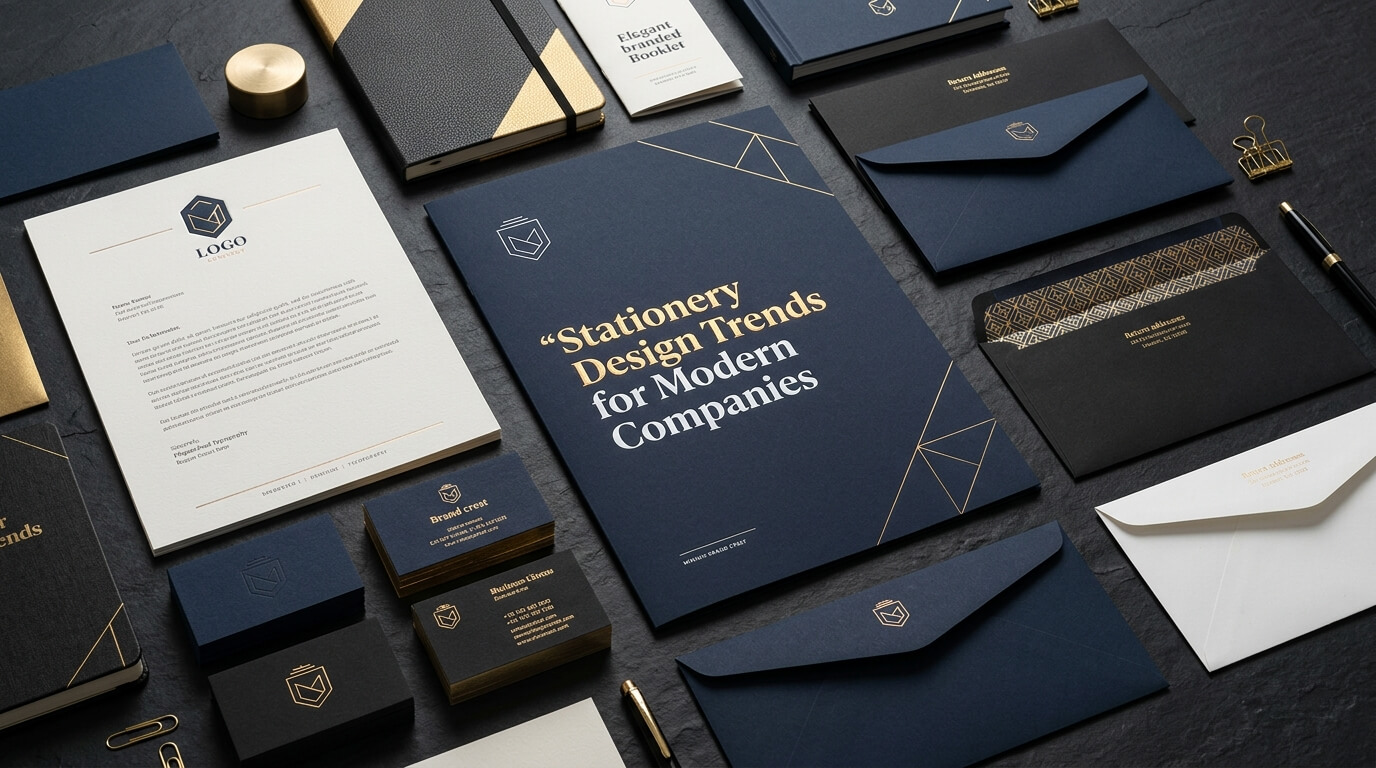
Business stationery remains an important part of a company’s visual identity, even as communication increasingly takes place through digital platforms. Letterheads, business cards, envelopes, presentation folders, notepads, and other printed materials help businesses communicate professionalism and maintain a consistent brand image. Although these materials may seem like small details, their design can influence how customers, employees, suppliers, and business partners perceive an organization. Modern companies are recognizing that stationery is not simply a collection of documents but an extension of their brand identity.
Stationery design has evolved considerably in recent years. Traditional layouts with basic logos and contact information are giving way to more thoughtful designs that combine simplicity, functionality, sustainability, and visual consistency. Businesses are paying greater attention to typography, paper quality, color combinations, printing techniques, and the overall experience of receiving a physical document. At the same time, digital stationery is becoming increasingly important as companies send proposals, invoices, contracts, and other business communications electronically.
The most effective stationery design trends balance contemporary aesthetics with practical business needs. A creative agency may prefer bold typography and expressive colors, while a financial consultancy might choose restrained layouts and premium paper finishes. Neither approach is universally better. The right design depends on the company’s audience, industry, brand personality, and communication goals. Understanding current trends can help businesses make informed decisions and create stationery that looks professional, feels relevant, and remains recognizable across different communication channels.
1. Minimalist Stationery Design
Minimalism continues to influence modern corporate stationery because it creates a clean, organized, and professional appearance. Instead of filling a page with decorative elements, multiple colors, and unnecessary graphics, minimalist design focuses on essential information and carefully selected visual details. A company logo, a restrained color palette, readable typography, and generous white space can create a polished impression without making the design feel empty.
This approach works particularly well for businesses that want their communications to appear confident and easy to understand. Consulting firms, technology companies, law offices, financial services providers, and professional agencies can benefit from stationery that prioritizes clarity. When clients receive a letterhead or business card, they should be able to identify the company and locate relevant information quickly. Minimalist layouts support this goal by reducing distractions and creating a clear visual hierarchy.
Using White Space Effectively
White space refers to the empty areas surrounding text, logos, and other design elements. It does not necessarily have to be white; it can be any unprinted or visually quiet area that gives the layout room to breathe. Effective white space improves readability and helps important details stand out. For example, placing a company logo in the upper-left corner of a letterhead while keeping contact information neatly aligned in the footer creates a balanced composition.
Minimalist stationery should still reflect the company’s personality. A technology startup might use geometric shapes and a contemporary sans-serif font, while a luxury consultancy could rely on elegant typography and subtle paper textures. The objective is not to remove all character but to express the brand through fewer, more deliberate design choices.
2. Sustainable and Eco-Friendly Materials
Environmental responsibility has become an important consideration for businesses choosing printed materials. Companies are increasingly exploring recycled paper, responsibly sourced materials, recyclable packaging, and printing processes designed to reduce waste. Sustainable stationery allows organizations to consider the environmental impact of everyday business communications while maintaining a professional appearance.
Recycled paper is one of the most accessible options. Depending on its composition and manufacturing process, it can offer a natural texture or a refined finish suitable for business cards, envelopes, and letterheads. Uncoated paper with subtle fibers can create an understated, organic appearance, while smoother recycled stocks may be better suited to businesses that need sharp text and consistent color reproduction.
Choosing Materials Without Compromising Quality
Sustainable stationery should be selected according to the intended use rather than appearance alone. A business card needs sufficient thickness to withstand regular handling, while a letterhead must support clear printing and remain suitable for office printers. Some heavily textured papers may look attractive but create difficulties when used with certain printers or when printed with small text.
Companies should also evaluate coatings, laminations, inks, and specialty finishes. A material described as recyclable may become more difficult to recycle when combined with certain plastic coatings or mixed materials. Asking suppliers about recycled content, sourcing certifications, and end-of-life disposal can help businesses make more informed choices. Sustainability is most effective when it influences the entire stationery process, from design and production quantities to material selection and waste reduction.
3. Bold and Distinctive Typography
Typography has become a powerful way for modern companies to establish visual identity. While traditional business stationery often relied on familiar fonts and predictable arrangements, contemporary designs increasingly use distinctive typefaces to communicate personality. Typography can make a brand appear innovative, approachable, authoritative, elegant, or creative before the recipient has read the full message.
Bold sans-serif fonts are popular in contemporary corporate design because they can create strong visual impact while remaining easy to read. Serif fonts also continue to play an important role, particularly for businesses that want to communicate tradition, expertise, or sophistication. Some brands combine both styles, using a serif typeface for headings and a clean sans-serif font for contact information and body text.
Maintaining Readability Across Materials
A visually striking typeface is only effective when people can read it comfortably. Business cards have limited space, so small text, overly decorative lettering, or tightly compressed characters can make contact information difficult to understand. Letterheads and formal documents require even greater attention to readability because they may contain long paragraphs, addresses, reference numbers, and other essential details.
Modern stationery design often uses typography to establish a clear hierarchy. The company name receives the strongest emphasis, supporting information appears at a smaller size, and contact details are positioned consistently. This hierarchy makes printed materials easier to navigate while ensuring the brand remains recognizable. Companies should also choose fonts that are available and compatible across their digital and print workflows, especially when stationery templates will be used by multiple departments.
4. Brand-Specific Color Palettes
Color remains one of the most recognizable elements of a company’s visual identity. Modern stationery design increasingly focuses on carefully developed color systems rather than choosing shades separately for each printed item. When letterheads, business cards, envelopes, folders, and digital documents use a consistent palette, the company presents a more unified image.
Some organizations prefer neutral colors such as white, charcoal, navy, beige, and soft gray because they suit a wide range of professional settings. Others use brighter colors to distinguish themselves in competitive markets. A creative business may incorporate energetic orange or vibrant blue, while a company focused on premium services may prefer deep green, burgundy, or muted metallic accents.
Creating Consistency Between Print and Digital Design
Colors can appear different on a computer screen and on printed paper. Digital screens use light to display colors, whereas printing relies on inks or other colorants applied to a physical surface. Paper whiteness, finish, ink coverage, and printing technology can all influence the final result. Therefore, companies should not assume that a color displayed on a monitor will reproduce identically on every stationery item.
Developing brand color specifications helps reduce inconsistencies. Designers can establish appropriate color values for digital use and print production, then test them on the selected paper stock. This is particularly important when the logo appears across different materials or when multiple suppliers produce the company’s stationery. A consistent palette does not mean every item must look identical; it means the materials should feel as though they belong to the same brand family.
5. Premium Paper and Tactile Finishes
Physical texture is another important stationery design trend. In a world where many business interactions take place through screens, printed materials can provide a more tangible brand experience. Thick business cards, textured letterheads, carefully finished folders, and high-quality envelopes can make ordinary business communication feel more considered.
Premium paper does not always mean expensive or elaborate paper. The right stock depends on the purpose of the item, the company’s budget, and the impression it wants to create. A professional services firm may choose a smooth, heavyweight paper for business cards, while a creative studio might use an uncoated stock that adds warmth and character. Both approaches can communicate quality when the material matches the brand identity.
Embossing, Debossing, and Foil Accents
Embossing raises selected areas of a design, while debossing presses them into the paper. Both techniques can add dimension without relying on additional colors. Foil stamping introduces a metallic or colored foil to selected details, creating contrast and drawing attention to a logo or company name. These finishes are particularly useful for premium business cards, invitation-style corporate communications, and presentation folders.
However, special finishes should be applied selectively. Using multiple decorative effects on every stationery item can make the design feel crowded and increase production costs. A small embossed logo on a clean business card may create more impact than a combination of several competing effects. Companies should consider the practical purpose of each material and reserve specialty finishes for items where they contribute meaningfully to the brand experience.
6. Geometric Patterns and Subtle Brand Graphics
Modern companies are increasingly incorporating graphic elements that extend beyond the main logo. Geometric patterns, abstract shapes, fine lines, and simplified illustrations can create a distinctive visual language across stationery. These elements help businesses establish a recognizable identity without requiring the logo to dominate every surface.
For example, a technology company might use a subtle grid pattern inspired by its digital products, while an architecture firm could incorporate linework that reflects structural forms. A marketing agency might use overlapping shapes or expressive patterns to communicate creativity. When these graphics are developed as part of a consistent design system, they can appear on letterheads, envelopes, folders, business cards, and presentation materials without making each item look unrelated.
Keeping Decorative Elements Functional
Patterns should support the brand rather than interfere with the information. Heavy graphics behind text can reduce readability, particularly on documents that contain long paragraphs or formal details. Subtle elements are often more effective on stationery because they add character while preserving the document’s primary purpose.
Designers should also consider how a graphic behaves at different sizes. A pattern that looks impressive on a large presentation folder may become cluttered on a small business card. Simplifying the artwork for smaller applications can preserve the overall visual identity while improving clarity. A flexible graphic system allows companies to maintain consistency without forcing every design element into every format.
7. Digital-First Stationery and Editable Templates
Business stationery is no longer limited to materials produced by a printing company. Digital letterheads, branded invoice templates, email signatures, proposal layouts, and electronic business cards are now important parts of corporate communication. These materials allow businesses to maintain a recognizable visual identity when communicating through email, document-sharing platforms, and online meetings.
Digital-first stationery is particularly useful for companies with remote employees, multiple offices, or frequent client interactions. Staff members can prepare documents using approved templates rather than creating individual layouts from scratch. This improves consistency and reduces the risk of outdated logos, incorrect contact details, or mismatched brand colors appearing in official communications.
Designing for Screens and Printers
A digital letterhead should work on a screen and remain practical when printed. Large background graphics, oversized logos, and decorative footers may look attractive in a PDF but can consume excessive ink or interfere with ordinary office printing. Keeping the layout simple and ensuring sufficient contrast helps the design function in both environments.
Editable templates should also be easy to use. Important brand elements can be locked into the layout where the software allows it, while staff members can update the date, recipient details, message, and signature. Companies should establish guidelines for file formats, approved fonts, logo placement, and document naming to prevent inconsistencies.
Digital stationery should not be confused with replacing all printed communication. Physical business cards, signed letters, and presentation folders can still be valuable in meetings, events, and situations where tangible materials support the relationship. A coordinated approach allows businesses to benefit from both print and digital channels.
8. Personalized and Industry-Specific Stationery
Personalization is influencing how businesses approach stationery. Rather than using exactly the same layout for every audience, companies are creating materials that reflect specific departments, services, customer groups, or business situations while preserving the main brand identity. This can make communication more relevant without sacrificing consistency.
For example, a company might use a standard letterhead for formal correspondence, a more visually expressive folder for creative presentations, and a restrained invoice template for financial transactions. Each item serves a different purpose, but the logo, typography, and core colors connect them to the same organization.
Designing for the Intended Audience
Industry context matters when choosing a stationery style. Legal firms, accounting practices, and financial consultants often benefit from restrained layouts that emphasize accuracy and professionalism. Creative agencies may have more freedom to experiment with unusual paper stocks, distinctive colors, and expressive graphics. Hospitality and lifestyle businesses can use visual details that reflect the experience they offer customers.
Personalization can also extend to names and roles on business cards, department-specific contact details, or tailored presentation materials for particular clients. The key is to avoid unnecessary variation. When every department creates its own unrelated stationery, the company can appear fragmented. A shared design system provides enough flexibility for personalization while keeping the overall brand recognizable.
9. QR Codes and Interactive Print Design
QR codes provide a practical connection between printed materials and digital resources. A business card can direct recipients to a professional profile, a company website, a digital portfolio, or a contact-saving page. A presentation folder can link to a product demonstration, while a printed brochure can provide access to more detailed information that would be impractical to include on paper.
This trend is particularly useful for companies that regularly update their services or maintain extensive online resources. Instead of printing every detail on a small card, businesses can include essential contact information and use a QR code to direct interested recipients to a relevant online destination. The printed material remains uncluttered while offering a convenient next step.
Making QR Codes Easy to Scan
QR codes need adequate size, contrast, and clear space around their edges. Placing a code over a photograph, using low-contrast colors, or reducing it excessively can make scanning difficult. Companies should test the code on the final printed material, not just on a design preview, and confirm that the destination works on common mobile devices.
The linked destination should also provide a useful experience. A QR code leading to an outdated website or a page that is difficult to navigate can undermine the purpose of the design. Businesses should review their links periodically and consider whether the destination is appropriate for the context in which the stationery will be distributed. Interactive print design works best when the digital feature adds genuine value rather than serving as a decorative extra.
10. Coordinated Stationery Systems Across All Channels
A growing priority for modern companies is creating a unified stationery system rather than designing individual items in isolation. Customers may encounter a brand through an email signature, receive a printed letter, exchange business cards with an employee, and later review a digital proposal. When these touchpoints share consistent visual characteristics, they reinforce recognition and create a more professional experience.
A coordinated system establishes rules for logo placement, typography, colors, margins, graphic elements, and contact information. These rules do not require every item to look the same. Instead, they establish a shared visual foundation that designers and employees can adapt to different communication formats.
Building a Flexible Design System
The most useful stationery systems account for both standard and occasional needs. Letterheads and business cards may be used frequently, while presentation folders, event stationery, or branded note cards may be required only in particular circumstances. Designing these materials together makes it easier to maintain visual consistency when new items are introduced.
Companies should also review their stationery periodically. Contact information can change, logos may be updated, and printing suppliers may introduce different paper options. A well-organized set of master files and design guidelines makes revisions easier and reduces the likelihood of outdated materials remaining in circulation. Consistent stationery is not simply the result of choosing attractive designs; it requires a process that keeps every application aligned with the brand.
Comparing Popular Stationery Design Trends
Different design trends serve different purposes. The following table compares common approaches and explains where they may be most useful.
| Design trend | Main characteristics | Best suited for | Important consideration |
| Minimalist design | Clean layouts, white space, limited colors | Professional services, technology, consulting | Preserve readability and personality |
| Sustainable materials | Recycled paper, responsible sourcing, reduced waste | Companies prioritizing environmental responsibility | Check durability and recycling requirements |
| Bold typography | Distinctive fonts and strong visual hierarchy | Creative agencies, startups, modern brands | Keep small text easy to read |
| Premium finishes | Textured paper, embossing, foil accents | Luxury brands, executive communications | Balance quality with production costs |
| Geometric graphics | Abstract patterns and structured visual elements | Technology, architecture, design firms | Avoid visual clutter |
| Digital templates | Editable letterheads, branded PDFs, email signatures | Remote teams and digitally active companies | Ensure consistency across software and devices |
| QR-enabled stationery | Scannable links to digital resources | Networking, sales, events, marketing | Test codes and maintain working destinations |
| Coordinated design systems | Shared colors, fonts, logos, and layout rules | Businesses of all sizes | Keep templates and brand files updated |
How Companies Can Choose the Right Stationery Trends
Following every new design trend is not necessary for building a strong brand identity. Companies should begin by understanding how their stationery will be used and what it needs to communicate. A business that frequently sends formal correspondence may prioritize readability, paper compatibility, and restrained design. A company that attends networking events may place greater emphasis on memorable business cards and presentation materials.
Budget is another important factor. A business can create attractive stationery using standard paper stocks, a carefully chosen typeface, and consistent colors without investing in elaborate finishes. More expensive techniques can be reserved for materials used in high-value client meetings or important presentations. This approach helps businesses allocate their design and printing budgets according to the value each item provides.
Practical testing should also be part of the process. Before ordering large quantities, companies can print samples, check the accuracy of colors, examine paper quality, and confirm that contact details remain readable. Digital templates should be tested across the software and devices employees commonly use. These checks help identify problems before they affect a full production run.
Finally, companies should assess whether their stationery supports the wider brand identity. A modern design should not feel disconnected from the organization’s website, marketing materials, packaging, or customer communications. When all these elements share a clear visual direction, the company can present a more consistent and recognizable image across different interactions.
Conclusion
Stationery design trends for modern companies reflect a balance between visual appeal, practical functionality, and brand consistency. Minimalist layouts, sustainable materials, distinctive typography, premium finishes, digital templates, and interactive features all offer opportunities to improve business communication. However, the most effective approach is not necessarily the most elaborate or fashionable one. It is the design that reflects the company’s identity, serves its audience, and works reliably across print and digital formats.
By selecting suitable materials, maintaining a consistent visual system, and reviewing stationery regularly, businesses can create professional communications that remain useful over time. Thoughtful stationery design helps every document, business card, and presentation reinforce the same brand identity.
Frequently Asked Questions
Q1. What are the most popular stationery design trends for modern companies?
Minimalist layouts, sustainable paper materials, bold typography, premium finishes, coordinated brand colors, digital templates, and QR-enabled business cards are among the prominent trends.
Q2. Why is stationery design important for a business?
Stationery supports brand recognition, presents information professionally, and helps create a consistent experience across customer, employee, and business-partner communications.
Q3. Is minimalist stationery suitable for every industry?
Minimalist stationery can work across many industries, but its typography, colors, and visual details should reflect the company’s personality and audience. Creative brands may need more expressive elements than businesses that prioritize a formal image.
Q4. How can a company make its stationery more sustainable?
A company can explore recycled or responsibly sourced paper, reduce unnecessary printing, order appropriate quantities, and evaluate inks, coatings, and finishes for their environmental impact.
Q5. Should businesses use the same design for printed and digital stationery?
Printed and digital stationery should share core brand elements, including logos, colors, and typography. However, each format may require adjustments to maintain readability, printing compatibility, and usability across different devices.