In the fast-paced world of corporate branding, few companies have managed to maintain a visual identity as consistent and emotionally resonant as Cracker Barrel Old Country Store. For decades, the brand has been synonymous with interstate travel, Southern hospitality, and a very specific type of nostalgic comfort. However, even the most traditional brands must adapt to the digital age. This deep dive into the Cracker Barrel New Logo History: Rebranding and Visual Changes Explained explores the subtle yet significant evolution of this iconic American brand, examining how it balances heritage with modern design necessities.
The Origins of an American Icon: 1969 to Present
![]()
To understand the weight of any visual changes Cracker Barrel makes, one must first understand the origins of the brand. Founded in 1969 by Dan Evins in Lebanon, Tennessee, Cracker Barrel was created with a specific utility in mind: to attract highway travelers. Evins, who was working in the family gasoline business, wanted to create a consistent, reliable stop for people driving along the expanding interstate highway system. The concept was simple but powerful: a restaurant and gift shop that evoked the atmosphere of an old country store.
From the very beginning, the visual identity was crafted to serve as a beacon of familiarity. The original logo was not just a corporate stamp; it was a promise of what lay inside. The design featured a man sitting in a rocking chair next to a kerosene barrel, a scene that immediately communicated “slow down” to drivers moving at 70 miles per hour. This imagery was rooted in the tradition of the “cracker barrel,” a literal barrel of soda crackers found in country stores where locals would gather to chat, trade news, and play checkers.
For over fifty years, this core imagery has remained remarkably stable. Unlike tech companies that change logos every few years, Cracker Barrel understood that their brand equity lay in permanence. The logo became a symbol of resistance against the sterile, plastic aesthetic of modern fast food. However, recent years have seen the brand navigate the tricky waters of modernization, leading to discussions and confusion regarding the “new” logo.
Deconstructing the Classic Visual Identity
Before analyzing the updates, we must dissect the elements that make the Cracker Barrel logo a masterclass in nostalgia marketing. The design is a composite of several distinct elements, each carrying psychological weight.
The Iconography: Uncle Herschel
The central figure in the logo—the man in the rocking chair—is often referred to as “Uncle Herschel.” He is based on Herschel W. Evans, a real relative of the founder who served as a brand ambassador in the early days. This figure is crucial to the brand’s identity. He represents the “host.” His posture is relaxed, leaning back, signaling that there is no rush here. In a logo design context, using a human figure creates a sense of approachability and personification that abstract shapes cannot achieve.
The Artifacts: The Barrel and the Chair
The rocking chair and the barrel are not merely props; they are historical signifiers. The barrel represents commerce and abundance—the idea of the general store where one could buy necessities. The rocking chair represents leisure and the front porch culture of the American South. Together, they create a visual narrative of “commerce meets comfort.” This narrative is so strong that the brand physically places rocking chairs on the front porch of every location, turning the 2D logo into a 3D experience.
The Typography
The typography used in the classic Cracker Barrel logo is a custom, hand-drawn serif style that mimics 19th-century woodblock printing or signage. The letters are slightly irregular, suggesting they were painted by a human hand rather than generated by a computer. The use of a curved baseline (where the text arches over the image) is a classic badge-style design technique that was popular in the early 20th century, further cementing the “old-time” feel.
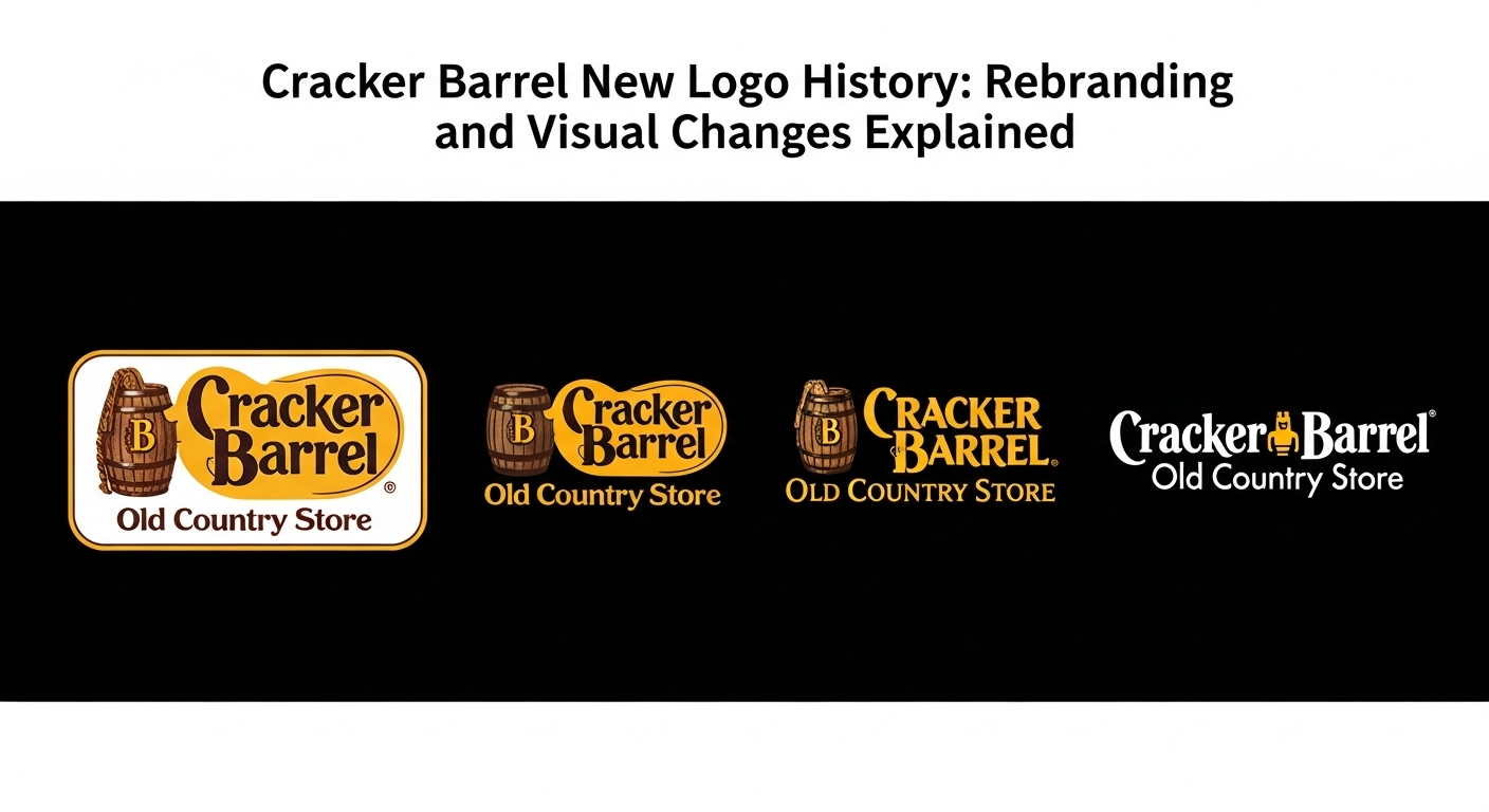
The “New” Logo Controversy: Digital Simplification vs. Rebranding
![]()
In recent years, internet rumors and social media discussions have surged regarding the Cracker Barrel New Logo History: Rebranding and Visual Changes Explained. Much of this conversation stems from a misunderstanding of the difference between a total rebrand and a digital asset optimization.
Around 2015 and continuing into the 2020s, Cracker Barrel began to quietly roll out a simplified version of their logo for digital platforms. This “new” logo stripped away the complex woodgrain textures, the intricate shading on Uncle Herschel’s vest, and the rustic borders. Instead, it presented a flat, solid-color vector image. To the design community, this was a logical step known as “debranding” or “flattening”—a trend adopted by companies like Burger King, Warner Bros., and Pringles to make logos legible on tiny smartphone screens.
However, when this flat logo began appearing on app icons and social media profile pictures, it sparked a wave of concern among loyal customers. Fans feared that the company was abandoning its rustic roots for a “hipster” minimalist aesthetic. This reaction highlights a critical challenge in legacy branding: when a brand is built on nostalgia, any attempt to modernize is viewed as a betrayal of history.
It is important to clarify that Cracker Barrel did not replace the physical signage at their restaurants with this simplified digital logo. The intricate, textured logo remains on the storefronts. The “new” logo is a functional adaptation for the digital ecosystem, proving that a brand can have a “responsive” visual identity that changes based on the medium (physical vs. digital) without losing its soul.
The Evolution of Color Palette and Texture
While the iconography has remained relatively static, the application of color and texture within the Cracker Barrel brand has shifted over the decades. Understanding these subtle shifts is key to the Cracker Barrel New Logo History: Rebranding and Visual Changes Explained.
The Shift from Gold to Earth Tones
In the earliest iterations (late 1960s and 1970s), the branding leaned heavily on a bright, almost yellow-gold paired with dark brown. This high-contrast look was necessary to catch the headlights of passing cars on the highway. As the brand matured and printing technology improved, the color palette softened.
Today, the brand utilizes a sophisticated palette of:
- Deep Sepia Brown: Represents the earth, wood, and reliability.
- Antique Gold/Mustard: Evokes the feeling of aged parchment and warmth.
- Warm Beige: Used as a background to reduce visual strain and mimic natural materials.
The most significant visual change in the modern era is the reduction of “skeuomorphism.” In the 1990s and 2000s, the logo often featured heavy drop shadows and embossed effects to look like a real wooden sign. The current primary logo retains the shape but has cleaned up the lines, reducing the visual noise while keeping the vintage spirit intact.
Typography Changes: The Golden Era vs. The Digital Age
Typography is often the unsung hero of logo design. For Cracker Barrel, the font is arguably as recognizable as the rocking chair icon. The brand uses a distinct serif typeface that is heavy, bracketed, and evokes the Western or Victorian era of American design.
In the “new” digital variations of the logo, the typography has been subtly refined. The kerning (the space between letters) has been opened up slightly to improve readability on mobile devices. In the older, more rustic versions, letters might touch or overlap to simulate hand-painted signage. In the digital version, the separation ensures that the words “Old Country Store” do not blur together when viewed as a 50-pixel icon.
Furthermore, the sub-text “Old Country Store” has occasionally been removed in strictly digital icons to reduce clutter. This is a common strategy in modern logo history: simplifying the wordmark to the core brand name to maximize impact in small spaces.
The Role of Nostalgia Marketing in Design Decisions
To fully grasp the Cracker Barrel New Logo History: Rebranding and Visual Changes Explained, one must look at the psychology of nostalgia. Cracker Barrel sells an experience that many Americans feel is disappearing—a slow, communal, disconnect-to-connect atmosphere.
Any visual change to the brand is weighed against this psychological anchor. If Cracker Barrel were to switch to a sans-serif, modern font (like Google or Airbnb), it would create cognitive dissonance. The visual language would contradict the physical experience of the restaurant (wooden floors, oil lamps, cast iron skillets).
Therefore, the “new” logo history of Cracker Barrel is actually a history of restraint. The design team deserves credit for knowing what not to change. They have managed to clean up the vector paths and standardize the color codes for the internet age without stripping the logo of its “Uncle Herschel” soul. This creates a sense of continuity that comforts the customer, reinforcing the idea that no matter how much the world changes, Cracker Barrel stays the same.
Comparison: Cracker Barrel vs. Other Heritage Brands
It is instructive to compare Cracker Barrel’s approach to visual changes with other heritage brands. Consider IHOP or Pizza Hut. Both of these chains have undergone massive, publicized rebrands, often reverting to “retro” logos later to recapture lost magic.
- Pizza Hut: Moved to a modern look, then reverted to their 1970s logo to tap into nostalgia.
- Burger King: Abandoned their shiny, blue-ringed logo of the 2000s to return to a flat, 70s-inspired aesthetic.
- Cracker Barrel: Never left the aesthetic. They simply refined it.
Cracker Barrel’s strategy is distinct because they never chased the “glossy 3D” trend of the early 2000s aggressively, nor did they chase the “ultra-minimalist” tech trend of the 2010s for their main signage. They stayed the course. The “new” changes are purely utilitarian adaptations for screens, rather than a philosophical shift in brand identity. This consistency builds immense trust with the consumer base.
Key Takeaways
When analyzing the trajectory of Cracker Barrel’s branding, several critical points emerge regarding their visual strategy:
- Digital Adaptation, Not Overhaul: The “new” logo seen on apps and social media is a simplified version designed for legibility, not a replacement for the physical store signage.
- Iconography is Sacred: The image of Uncle Herschel and the barrel remains the untouchable core of the brand, anchoring it in history.
- Function Over Trend: Changes to typography and color have been driven by the functional needs of digital screens rather than aesthetic trends.
- Psychological Consistency: The brand prioritizes the feeling of nostalgia, ensuring that visual updates do not alienate the core demographic who seek comfort.
- Responsive Branding: Cracker Barrel successfully utilizes a “responsive” logo system, where detailed versions exist for large physical signs and simplified versions exist for mobile devices.
Frequently Asked Questions (FAQ)
Did Cracker Barrel officially change their logo recently?
No, Cracker Barrel has not conducted a complete corporate rebranding that replaces their main signage. However, they have introduced a simplified, flat-design version of their logo specifically for digital use (apps, social media, website favicons) to improve legibility on small screens. This often leads to confusion that the entire brand has changed.
Who is the man in the Cracker Barrel logo?
The man in the logo is widely believed to be modeled after Uncle Herschel, a relative of the company’s founder, Dan Evins. He represents the traditional values of hospitality and the slow-paced, welcoming nature of the old country store.
Why does the digital logo look different from the store sign?
The physical store signs feature complex textures, wood grain effects, and intricate details that look great at a large scale. However, these details become blurry and unreadable when shrunk down to the size of a smartphone app icon. The digital logo removes the texture and simplifies the shapes to ensure the brand is recognizable even at 50 pixels wide.
What font is used in the Cracker Barrel logo?
The Cracker Barrel logo uses a custom-designed serif typeface inspired by 19th-century wood-type poster fonts. It is not a commercially available font, though it shares characteristics with Western-style typefaces like “Cooper Black” or “Goudy Heavyface,” modified to look hand-painted.
Why do people think Cracker Barrel is rebranding?
Rumors of rebranding often surface when the company updates its digital assets or marketing materials. Additionally, viral posts on social media sometimes mock “minimalist” redesigns of famous logos, occasionally including Cracker Barrel in hypothetical (but fake) rebrand scenarios, which confuses the public.
Conclusion
The story of the Cracker Barrel brand is one of resilience and careful stewardship. In exploring the Cracker Barrel New Logo History: Rebranding and Visual Changes Explained, we discover that the most effective design strategy for a heritage brand is often the subtle one. By resisting the urge to radically modernize their primary visual identity, Cracker Barrel has preserved the emotional connection millions of Americans have with the brand.
The “changes” that have occurred are masterclasses in technical adaptation—polishing the artifacts of the past so they shine clearly on the screens of the future. Whether viewed on a massive wooden sign off the interstate or a glowing icon on an iPhone, the man in the rocking chair remains a steadfast symbol of a slower, simpler time. For designers and marketers, Cracker Barrel serves as a reminder that while methods of communication change, the core story of a brand should remain timeless.