Introduction
In the ever-evolving landscape of brand identity, standing out in a crowded digital marketplace requires innovation, creativity, and a deep understanding of visual psychology. Over the last decade, we have witnessed a massive shift from stark, minimalist flat design to rich, vibrant, and dynamic visual identities. At the forefront of this design revolution is the gradient logo. If you are seeking A Beginner’S Guide To Creating Gradient Logos, you have arrived at the definitive resource. This comprehensive guide will walk you through the history, psychology, technical execution, and best practices of crafting a stunning gradient logo that captivates your target audience.
Gradients—also known as color transitions—blend one color into another seamlessly. When Instagram famously rebranded in 2016, moving from a skeuomorphic camera icon to a vibrant, warm-toned gradient, it set off a seismic shift in the design world. Today, tech giants, cutting-edge SaaS platforms, and innovative startups utilize gradients to convey motion, energy, and digital fluency. However, designing a high-quality gradient logo is not as simple as slapping two colors together in your design software. It requires a meticulous understanding of color theory, scalability, and print versus digital execution.
Whether you are a budding graphic designer, an entrepreneur looking to bootstrap your brand identity, or a marketing professional wanting to understand the mechanics of modern logo design, this authoritative guide will provide you with actionable insights and deep technical knowledge to master the art of gradient logos.
Key Takeaways
- Start in Black and White: A successful gradient logo must first work perfectly as a solid, single-color silhouette before any color transitions are applied.
- Understand Color Theory: Using analogous colors creates smooth, harmonious transitions, while blending complementary colors without a transitional hue can result in a “muddy” and unappealing look.
- Choose the Right Gradient Type: Linear, radial, angular, and mesh gradients each serve different structural and psychological purposes in design.
- Prioritize Scalability: Always design your logo in vector format (using tools like Adobe Illustrator) to ensure it scales flawlessly from a tiny favicon to a massive billboard.
- Consider Print Limitations: Gradients designed in RGB for screens do not always translate perfectly to CMYK for print. Plan for color banding and utilize dithering techniques when necessary.
What Are Gradient Logos?
The Evolution of Visual Transitions
To truly grasp the concepts in A Beginner’S Guide To Creating Gradient Logos, we must first define what a gradient is within the context of graphic design. A gradient is a gradual blending from one color to another. It can involve two colors, or it can incorporate multiple hues seamlessly transitioning across a shape. In the early 2000s, gradients were heavily used to create “skeuomorphism”—a design trend aimed at making digital elements look like real-world, tactile objects (think of the glossy, metallic app icons of early smartphones).
However, modern gradient logos have evolved past skeuomorphism. Today’s gradients are often referred to as “flat 2.0” or “semi-flat design.” They are used not to mimic reality, but to add a layer of depth, dimension, and visual interest to otherwise flat vector shapes. They bring a futuristic and ethereal quality to branding that solid colors simply cannot achieve.
Flat Design vs. Gradient Design
Flat design dominated the early 2010s. It was championed for its clean, clutter-free aesthetic and incredibly fast load times on early mobile web browsers. Flat logos rely on solid, distinct colors with no shading or highlights. While highly functional, flat design can sometimes feel rigid, cold, or overly simplistic.
Gradient design bridges the gap. By introducing subtle color transitions, a logo instantly gains movement and energy. A flat circle is just a shape; a circle with a radial gradient from deep crimson to vibrant orange becomes a glowing sun or an interactive button. Gradients allow brands to maintain the clean scalability of flat design while injecting a massive dose of personality and emotion.
Why Choose a Gradient Logo for Your Brand?
The Psychological Impact of Color Blends
Every color evokes a specific psychological response. Blue signifies trust and security, red evokes passion and urgency, and green represents growth and health. But what happens when you blend them? Gradients allow you to combine the psychological traits of multiple colors into a single, unified brand message.
For example, a gradient that transitions from a trustworthy corporate blue to a vibrant, energetic purple can communicate that a company is both highly reliable and relentlessly innovative. This nuanced emotional messaging is a powerful tool for lead generation and brand positioning. The human eye is naturally drawn to light and color variations. A gradient mimics the natural world—think of a sunset, the ocean, or the sky—making the logo feel more organic and alive.
Standing Out in a Digital-First World
Modern brands live on screens. From high-definition smartphone displays to massive 4K desktop monitors, the canvas for today’s logos is incredibly vibrant. Gradients are inherently digital; they thrive in the RGB color space where screens can render millions of luminous color combinations. If your business operates primarily online—such as an e-commerce store, a software application, or a digital agency—a gradient logo signals to your audience that you are a modern, forward-thinking entity optimized for the digital age.
A Beginner’S Guide To Creating Gradient Logos: Step-by-Step
Step 1: Conceptualization and Sketching
The most critical rule in logo design is that color should never be used as a crutch to save a poor design. Before you even think about gradients, your logo must be structurally sound. Start with a pencil and paper, or work purely in black and white on your digital canvas. Focus on the silhouette, the positive and negative space, and the overall balance of the icon and typography. If your logo is unrecognizable or lacks impact in black and white, adding a gradient will not fix it.
Step 2: Choosing the Right Color Palette
Once your structural design is finalized, it is time to select your colors. This is where many beginners stumble. The key to a beautiful gradient is harmony. Refer to the color wheel:
- Analogous Colors: These are colors that sit next to each other on the color wheel (e.g., blue and green, or red and orange). Blending analogous colors almost always results in a smooth, pleasing gradient.
- Monochromatic Colors: This involves blending different shades and tints of the exact same base color (e.g., dark navy blue transitioning to a light sky blue). This creates a sophisticated, 3D lighting effect.
- Triadic and Complementary Colors: These are trickier. Blending colors from opposite sides of the color wheel (like yellow and purple) can create a jarring, “muddy” brown or gray transition in the middle. If you must use complementary colors, you need to introduce a third, transitional color in the middle to keep the gradient vibrant.
Step 3: Selecting the Type of Gradient
The geometry of your logo will dictate the type of gradient you should use. Applying a linear gradient to a circular logo might make it feel off-balance, whereas a radial gradient would enhance its spherical nature. Carefully consider how the direction of the color transition affects the visual weight of the logo. Lighter colors draw the eye and simulate a light source, while darker colors ground the design and create shadows.
Step 4: Digital Execution (Using Vector Software)
Never design a primary logo in raster-based software like Adobe Photoshop. Raster graphics are made of pixels, and if you try to enlarge a pixelated logo, it will become blurry and unusable. Always use vector-based software like Adobe Illustrator, CorelDRAW, or Affinity Designer. Vector graphics use mathematical equations to plot shapes and colors, meaning your gradient logo will remain perfectly crisp whether it is printed on a business card or a skyscraper banner.
In Illustrator, utilizing the Gradient Tool allows you to click and drag across your vector shape to dictate the angle and spread of the color transition. You can adjust the color stops, change the midpoint, and fine-tune the opacity of each color to achieve the perfect blend.
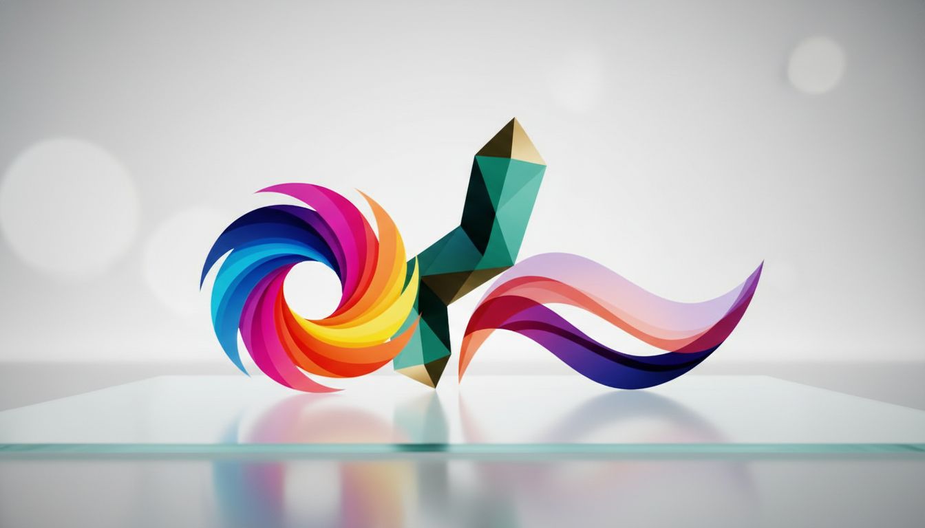
Types of Gradients in Logo Design
Linear Gradients
The linear gradient is the most common and straightforward type of color transition. It blends colors in a straight line—either horizontally, vertically, or diagonally. Linear gradients are excellent for typography, elongated icons, or conveying a sense of forward momentum. A left-to-right linear gradient that shifts from a darker hue to a lighter hue can subtly suggest progress, growth, and forward-thinking.
Radial Gradients
A radial gradient emanates from a central point and expands outward in a circular pattern, much like the ripples caused by dropping a stone in a pond. This type of gradient is perfect for circular badges, globe icons, or designs that require a central focal point. By placing a lighter color in the center and a darker color on the outer edges, you can create a highly effective 3D sphere or glowing effect.
Angular (Conic) Gradients
Angular gradients, sometimes called conic gradients, sweep color around a central point, similar to a radar screen or a color wheel. This creates a distinct, sharp transition line where the beginning and end colors meet (unless they are the exact same color). Angular gradients are less common in traditional logo design but are highly effective for brands in the tech, data, or analytical sectors, as they evoke a sense of rotation, cycles, and precision.
Freeform and Mesh Gradients
For those looking to push the boundaries of A Beginner’S Guide To Creating Gradient Logos, the freeform or mesh gradient is the ultimate tool. Introduced in more recent versions of vector software, the gradient mesh allows designers to place multiple color nodes anywhere within a shape. The colors then blend organically in multiple directions. This creates a highly fluid, liquid-like, and ethereal aesthetic that is incredibly popular in modern Web3, AI, and creative agency branding. It mimics the complexity of holographic foil or liquid metal.
Best Practices for Designing Gradient Logos
Ensure High Contrast and Readability
A common pitfall in gradient logo design is losing contrast. If your logo includes a gradient icon placed next to text, ensure the text remains highly legible. Furthermore, consider how your gradient will look against different backgrounds. A gradient that looks stunning on a dark mode website might completely vanish on a white background. Always create versatile variations of your logo, including a reversed-out white version and a solid dark version, to ensure optimal readability across all mediums.
Keep It Scalable and Print-Friendly
While gradients look breathtaking on an OLED screen emitting light in RGB, printing them in CMYK ink is a different story. The CMYK color gamut is much smaller than RGB, meaning highly saturated neon gradients will often look dull or muted when printed on paper, merchandise, or packaging.
Additionally, printing gradients can sometimes result in “banding”—visible, harsh lines between color transitions instead of a smooth blend. To combat banding, professional designers often add a very subtle noise or dither effect to the gradient. When designing a brand identity, always test print your gradient logo on professional printers to ensure the physical manifestation matches your digital vision.
Avoiding the “Muddy” Color Trap
As mentioned earlier in the color palette section, the muddy color trap is a beginner’s worst enemy. If you attempt to blend a highly saturated red with a highly saturated green, the mathematical midpoint of that transition is an ugly, desaturated brownish-gray. To avoid this, you must control the middle of the gradient. In your vector software, add a third color stop exactly in the middle. For a red-to-green gradient, you might add a vibrant yellow in the center. The transition will now flow seamlessly from red, to orange, to yellow, to green, maintaining maximum vibrancy and eliminating the muddy middle.
How Professional Agencies Elevate Gradient Design
While learning the mechanics of gradient design is highly rewarding, executing a flawless, market-ready brand identity requires a masterful touch. A DIY approach is great for conceptualization, but when it comes to trademarking, ensuring perfect CMYK print translation, and building a comprehensive brand guideline, partnering with experts is an invaluable investment.
Professional design agencies have the experience to balance trendy aesthetics with timeless structural integrity. For instance, partnering with an agency like London Logo Designs ensures that your gradient logo is not only visually arresting but also perfectly optimized for both digital and print applications. Expert designers understand the subtle nuances of visual hierarchy, vector manipulation, and brand psychology, ensuring your logo acts as a powerful lead-generation tool that builds immediate trust with your audience.
Frequently Asked Questions
1. Are gradient logos suitable for print marketing?
Yes, but they require careful planning. Gradients are natively designed in RGB for digital screens, which have a wider color gamut. When converting a gradient logo for print (CMYK), vibrant colors may become muted, and “banding” can occur. It is highly recommended to have a solid-color or simplified version of your logo specifically designated for certain print materials like embroidery or low-fidelity printing.
2. Can I trademark a logo that uses gradients?
Absolutely. You can trademark the specific design, shape, and typography of your logo regardless of the colors used. However, when filing for a trademark, it is often best practice to submit the black-and-white structural version of the logo. This provides the broadest legal protection, covering the shape and design regardless of what color or gradient you apply to it in the future.
3. Should I use RGB or CMYK when designing my gradient logo?
You should design your primary gradient logo in RGB, as the vast majority of modern brand interactions occur on digital screens (websites, apps, social media). However, you must simultaneously test and create a CMYK equivalent to ensure your brand retains its integrity when printed on business cards, brochures, and physical merchandise.
4. What happens if I blend complementary colors in a gradient?
Blending complementary colors (colors opposite each other on the color wheel, like blue and orange) often results in a desaturated, muddy brown or gray color in the middle transition. To prevent this, add a transitional third color stop in your software. For example, transition from blue to a vibrant purple, and then to orange, to maintain a clean and bright aesthetic.
5. Are gradient logos just a passing trend?
While the highly exaggerated, glassy skeuomorphic gradients of the 2000s were a trend that faded, modern semi-flat gradients are here to stay. They have become a foundational element of digital-first design. As screen technology continues to advance (with OLED and HDR displays), the ability to showcase rich, vibrant color transitions will only make gradient logos more impactful and relevant.
Conclusion
Mastering the concepts outlined in A Beginner’S Guide To Creating Gradient Logos is a transformative step in your graphic design journey. Gradients are far more than just a stylistic choice; they are powerful communicative tools that breathe life, energy, and dimension into a brand’s visual identity. By understanding the critical importance of a strong black-and-white foundation, mastering color wheel harmonies, and utilizing the correct vector software tools, you can craft a logo that resonates deeply with your target audience.
Remember that a great logo does more than just look pretty—it builds trust, establishes authority, and drives lead generation by making your brand instantly recognizable. Whether you choose a subtle linear transition to signify corporate growth, or a vibrant, freeform mesh gradient to showcase creative innovation, the principles of contrast, scalability, and balance remain your guiding lights. Take the time to experiment, respect the limitations of print media, and never hesitate to collaborate with professional design agencies when you are ready to scale your brand to the next level. Embrace the spectrum of possibilities, and let your brand’s true colors shine.