Few logos in the world evoke childhood nostalgia, imagination, and magic quite like the Disney logo. For nearly a century, The Walt Disney Company has mesmerized global audiences with stories, characters, and worlds that defy reality—and at the center of this enchanting empire stands its emblematic logo. From its humble beginnings with a hand-drawn script to the cinematic CGI castle we see today, the Disney logo has become a symbol of storytelling excellence and brand consistency.
This article explores the history, evolution, and popularity of the Disney logo, tracing its transformation from the 1920s to the digital age. We will delve into the logo design changes, the meaning behind its elements, and how the Disney logo continues to captivate audiences across generations.
1. The Birth of a Brand (1923–1937)

The roots of the Disney logo can be traced back to 1923 when Walt Disney and his brother Roy O. Disney founded the Disney Brothers Studio. In its earliest form, there wasn’t a formal logo—branding was rudimentary, and title cards often featured simple typography or variations of the studio’s name.
The earliest Disney “logo” often appeared as “Walt Disney presents” or “A Walt Disney Production,” typed in a standard font. There was no standardized wordmark, castle, or visual symbol at this stage. During this period, Disney was focused on producing animated shorts such as Oswald the Lucky Rabbit and later Steamboat Willie, which introduced the world to Mickey Mouse in 1928.
Though branding was minimal, the Disney name itself quickly became synonymous with innovative animation and whimsical storytelling.
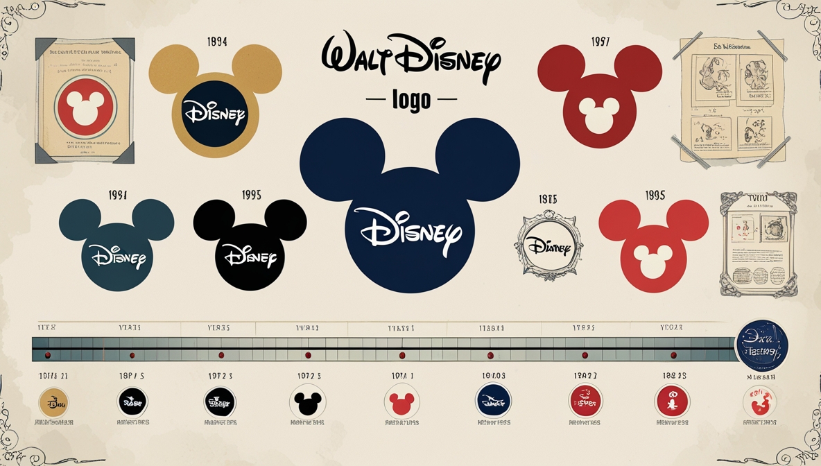
2. The Classic Script Logo Emerges (1937–1948)
![]()
The first major step toward a unified Disney brand identity came with the release of Snow White and the Seven Dwarfs in 1937, Disney’s first full-length animated feature film. Around this time, the now-iconic “Walt Disney” signature began appearing more consistently on posters, credits, and merchandise.
This stylized signature was based on Walt Disney’s real autograph, though stylized for branding purposes. The playful, cursive typeface reflected the imaginative spirit of the studio and became instantly recognizable.
Key Characteristics:
- Whimsical, handwritten-style font
- “Walt Disney” usually appeared alone or with “Productions”
- First steps toward a consistent brand image
This version of the logo remained in use for several decades and helped establish Disney’s identity as both a company and a cultural icon.
3. “Walt Disney Productions” to “The Walt Disney Company” (1948–1986)
![]()
From the late 1940s through the 1980s, the Disney logo remained relatively consistent. The script-style “Walt Disney” signature became a staple in opening credits, merchandise, and TV intros. However, it was often accompanied by the phrase “Productions”, which reinforced the company’s role as a film and television studio.
By the 1980s, the company began shifting from a production-only brand to a global entertainment conglomerate. In 1986, the name was officially changed from “Walt Disney Productions” to “The Walt Disney Company”.
This period saw minor adjustments to the logo, but the iconic script remained central to Disney’s identity. In some versions, only the word “Disney” was used, especially on merchandise and theme park signage, simplifying and modernizing the brand.
4. Introduction of the Castle Logo (1985–1995)
![]()
In 1985, with the release of The Black Cauldron, Disney introduced a cinematic castle logo in the opening of its animated films. This was the first time the brand included a visual symbol (the castle) along with the stylized “Walt Disney” signature.
Castle Logo Elements:
- Cinderella Castle-inspired silhouette
- Stylized arc/star shooting over the castle
- Accompanied by the “Walt Disney Pictures” wordmark
- Light orchestral fanfare
This iconic logo quickly became an emblem of magic and imagination. The castle design symbolized the fantasy worlds that Disney created, while the star arc represented the dreams and wishes Disney brought to life.
The logo was used consistently across all animated and live-action films, reinforcing brand identity through visual storytelling and emotional association.
5. Modernization and CGI Transformation (1995–2006)

In the mid-1990s, Disney updated the logo subtly to keep up with modern cinematic standards. Minor design tweaks included cleaner lines, updated colors, and sharper animation. The castle retained its silhouette, but the design was polished to look more symmetrical and refined.
As CGI and digital effects became mainstream in Hollywood, Disney realized it was time for a more dramatic change. The 2006 rebranding introduced a fully animated CGI castle logo, which first appeared in Pirates of the Caribbean: Dead Man’s Chest.
Features of the 2006 CGI Logo:
- A highly detailed, photorealistic 3D castle inspired by Disneyland and Cinderella Castle
- Panoramic camera movements showcasing flags, towers, and fireworks
- A glowing arc that transforms into a star above the castle
- Custom musical fanfare by composer Mark Mancina
- The wordmark “Walt Disney Pictures” in bold white script
This version of the logo emphasized cinematic grandeur, aligning with the increasing ambition of Disney’s live-action and animated productions.
6. Dropping “Walt” and Simplifying (2011–2019)
![]()
In 2011, Disney made a bold branding decision: the company dropped “Walt” and “Pictures” from the on-screen logo, opting for a simplified “Disney” wordmark alongside the CGI castle.
This change reflected a modern, global brand approach, making the logo more universal, sleek, and streamlined.
Key Changes:
- Shortened to “Disney” only
- CGI castle remains, but slightly more stylized and digital
- Used across films, merchandise, theme parks, and digital platforms
The simplified wordmark made the brand more adaptable for new ventures like Disney+, Marvel, and Star Wars properties. It also increased legibility across small screens and mobile devices—critical in the streaming era.
7. Disney+ and Logo Adaptations (2019–2023)
![]()
With the launch of Disney+ in 2019, the company reimagined its logo and identity once again. The streaming platform uses a blue-toned logo with a minimalist arc over the “Disney” wordmark—an evolution of the star arc used in film logos.
This branding was tailored for digital platforms:
- Optimized for apps, mobile screens, and web interfaces
- Simple, modern, and easily recognizable
- Retains nostalgic Disney elements while adapting to new viewing habits
The Disney+ logo is now one of the most widely viewed Disney logos globally, appearing on billions of devices and representing a new chapter in the company’s brand story.
8. The 100-Year Logo: Disney100 (2023–2024)

In 2023, Disney celebrated its 100th anniversary with the launch of the “Disney100” logo. This commemorative design was used across film intros, merchandise, theme parks, and global campaigns.
Features:
- Classic “Disney” wordmark
- Accompanied by the number 100 in silver or platinum tones
- In some cases, paired with “100 Years of Wonder” tagline
- A special Disney100 castle logo featured platinum hues, magical particles, and a grander musical score
This temporary branding honored Disney’s legacy, innovation, and cultural impact, reminding fans of its journey from hand-drawn shorts to streaming empires.
Why Is the Disney Logo So Popular?
The Disney logo is more than just a piece of graphic design. It’s a symbol of emotion, storytelling, and imagination. Its popularity can be attributed to several key factors:
1. Emotional Connection
Disney films are often associated with childhood memories, family moments, and milestones. The logo triggers powerful emotional responses that brands strive for.
2. Consistency with Evolution
While the logo has evolved, it has never abandoned its core identity—the signature and the castle. This balance of legacy and innovation keeps it relevant.
3. Cinematic Branding
The animated castle is a mini-movie in itself, setting the tone for the feature presentation. It draws audiences into the story before the first scene begins.
4. Global Reach
The logo is instantly recognized in virtually every country, transcending language barriers.
5. Cultural Influence
Disney’s presence in film, TV, theme parks, merchandise, and now streaming, gives the logo omnipresence. It’s not just a brand—it’s a cultural icon.
Conclusion
From its modest beginnings as a handwritten name on a title card to its current form as a cinematic, CGI masterpiece, the Disney logo has undergone a fascinating transformation. Yet, throughout its evolution, it has maintained the heart and soul of the brand—magic, imagination, and storytelling.
In a world where brands constantly reinvent themselves, Disney stands out as a model of how to evolve without losing your essence. The Disney logo, whether it’s the nostalgic script, the towering castle, or the clean Disney+ app icon, continues to symbolize a legacy of wonder that has captured hearts for over 100 years—and will continue to do so for generations to come.