Introduction
In the digital-first economy, a brand’s visual identity is its most valuable intangible asset. It serves as the primary bridge of trust between a company and its global audience. Over the past two decades, we have witnessed a monumental paradigm shift in corporate iconography. The tech industry has transitioned from the playful, skeuomorphic, and drop-shadow-heavy aesthetics of the early Web 2.0 era to highly refined, minimalist, and symbolically rich designs. This evolution is not merely cosmetic; it reflects a deeper strategic alignment with global scaling, cross-cultural accessibility, and the psychological dynamics of consumer trust.
Among the most significant and studied transformations in modern brand history is the evolution of the Airbnb logo. What began as a scrappy, literal interpretation of an “air bed and breakfast” by two cash-strapped design graduates has evolved into one of the most recognizable symbols of the sharing economy: the Bélo. This symbol transcends linguistic and cultural barriers, embodying a complex philosophy of belonging, community, and global citizenship.
This deep-dive analysis explores the comprehensive history of the Airbnb logo, examining its structural evolution, the semiotic and psychological mechanisms of the Bélo, the strategic rebrand of 2014 led by the agency DesignStudio, the controversies that followed its release, and the lessons it offers to modern designers and brand strategists. By analyzing this evolution, we gain valuable insights into how visual design drives business valuation and consumer behavior in a hyper-connected world.
The Genesis of Airbnb: The Web 2.0 Era (2008–2014)
The Genesis of Airbnb: The Web 2.0 Era (2008–2014)
To understand the depth of the Bélo, we must first examine the conditions of its predecessor. In 2007, roommates Brian Chesky and Joe Gebbia, both graduates of the Rhode Island School of Design (RISD), could not afford the rent for their San Francisco loft. When a major design conference came to town, filling up all local hotels, they saw an opportunity. They purchased three air mattresses, set up a simple website, and marketed “AirBed & Breakfast” to attendees. This practical, localized solution to an accommodation shortage laid the foundation for a multi-billion-dollar enterprise.
The Original Bubble Script Logo (2008)
The Original Bubble Script Logo (2008)
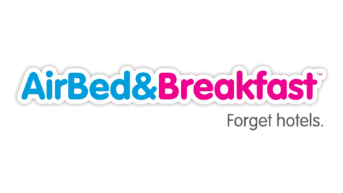
The earliest visual representation of the brand was created in-house by the founders. It was highly reflective of the late-2000s tech aesthetic. The original logo featured a thick, rounded, bubble-style typography. The words “AirBed” were rendered in a deep, saturated blue, while “& Breakfast” was presented in a vibrant, candy-pink hue. Both words were outlined in a thick white border with a drop shadow, a classic design convention of the Web 2.0 era.
From a functional standpoint, this logo served its immediate purpose: it was friendly, approachable, and highly legible on the CRT and early LCD screens of the time. The color palette of blue and pink was chosen to evoke a sense of playfulness and trust. However, the design lacked professional polish and scalability. The thick outlines and complex drop shadows made it difficult to reproduce at small scales, such as on mobile application icons or physical merchandise. Furthermore, the literal name “AirBed & Breakfast” was highly restrictive, anchoring the company to a specific product offering rather than a broader experiential vision.
The Transition to “Airbnb” (2009–2013)

The Transition to “Airbnb” (2009–2013)
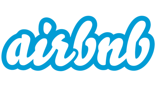
In 2009, as the company secured seed funding from Sequoia Capital and joined the Y Combinator accelerator program, the founders made the strategic decision to shorten the name to “Airbnb.” This linguistic simplification required a corresponding update to the visual identity. The company retained the bubble-script aesthetic but streamlined the design. The words were consolidated into a single, continuous script, and the color palette was shifted primarily to a soft, friendly blue with a white outline.
While this iteration was cleaner than the 2008 original, it remained fundamentally a product of its time. The rounded, bulbous letters conveyed a youthful, casual startup vibe. As Airbnb began to scale globally, expanding into thousands of cities and facilitating millions of bookings, this casual visual identity began to conflict with the brand’s operational reality. Airbnb was no longer just a platform for renting air mattresses on living room floors; it was a global marketplace facilitating real-estate transactions, high-end vacation rentals, and cross-border travel. The brand needed an identity that could command trust, represent safety, and appeal to a highly diverse, multigenerational demographic of hosts and guests.
The 2014 Rebrand: The Birth of the Bélo
The 2014 Rebrand: The Birth of the Bélo
By 2013, Airbnb’s leadership recognized that the existing visual identity had reached its operational limits. The brand was scaling rapidly, but its visual representation was holding it back from achieving mainstream, institutional trust. To address this, Airbnb partnered with DesignStudio, an international creative agency with offices in London and San Francisco. The goal was not merely to update the logo, but to execute a comprehensive, ground-up brand transformation that would define the company’s mission for the next decade.
The Creative Brief: “Belong Anywhere”
The rebrand began with an intensive research phase. Designers from DesignStudio did not just sit in their offices; they embedded themselves within the Airbnb community. They traveled to thirteen countries across four continents, staying with hosts, interviewing guests, and experiencing the service firsthand. Through this immersive process, the creative team identified a singular, universal human truth that united the diverse global community of Airbnb: the desire for belonging.
The creative brief was thus crystallized around the concept of “Belong Anywhere.” The new visual identity needed to move away from the transactional mechanics of travel (booking a room, finding a bed) and move toward the emotional promise of hospitality (feeling at home, experiencing local culture, and human connection). The challenge was to create a symbol that could represent this abstract concept of “belonging” in a simple, universally recognizable mark.
Unveiling the Bélo: A Symbol of Universal Belonging
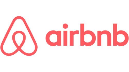
On July 16, 2014, Airbnb officially unveiled its new brand identity, centered around a custom-designed symbol named the “Bélo.” The name, derived from the word “belonging,” was designed to serve as a universal signifier of hospitality.
The Bélo was a radical departure from the previous bubble-script wordmark. It was a clean, minimalist, geometric icon that could be drawn by anyone, anywhere. This simplicity was intentional. The designers wanted a symbol that was so simple and intuitive that a child could draw it on a window, a host could sketch it on a welcome note, or a traveler could recognize it instantly on a signpost in an unfamiliar city.
Anatomy of the Bélo: Semiotic and Geometric Analysis
The brilliance of the Bélo lies in its multi-layered semiotic construction. While it appears to be a simple, continuous loop, it is actually a highly sophisticated synthesis of four distinct visual concepts. Each element of the symbol is designed to represent a core pillar of the Airbnb brand philosophy.
1. The People (The Head)
At the center of the Bélo is a loop that resembles a stylized human head and shoulders. This represents the people who make up the Airbnb community: the hosts who open their homes and the guests who travel. By placing the human figure at the core of the icon, the design emphasizes that Airbnb is, first and foremost, a peer-to-peer, human-centric platform. It highlights the personal connections, cultural exchanges, and mutual trust that underpin every transaction on the site.
2. The Places (The Map Pin)
The overall silhouette of the Bélo is an inverted teardrop shape, which is the universal digital icon for a location marker or map pin. This geometric reference grounds the symbol in the physical reality of travel and geography. It represents the millions of unique destinations, neighborhoods, and homes available on the platform. The map pin shape signals to the user that no matter where they are in the world, Airbnb can help them find a place to stay.
3. The Love (The Heart)
If you look at the lower loop of the Bélo, it forms an upside-down heart. The heart is the universal symbol of love, care, warmth, and hospitality. By integrating this shape into the icon, the designers sought to evoke the emotional warmth of home and the genuine care that hosts provide to their guests. It elevates the brand from a cold, transactional booking engine to a warm, community-driven platform built on mutual respect and empathy.
4. The Letter “A” (Airbnb)
Finally, the overall structure of the symbol forms the letter “A,” the initial letter of the company’s name. This ensures that the icon remains structurally linked to the brand name, providing a strong typographic anchor. The seamless integration of the letter “A” with the symbols for people, places, and love creates a cohesive, unified mark that tells the entire brand story in a single, continuous stroke.
The following table summarizes the semiotic components of the Bélo symbol:
| Visual Element | Representational Meaning | Brand Philosophy Alignment |
|---|---|---|
| Central Loop / Head | People | Human-centric, peer-to-peer trust, and community connection. |
| Inverted Teardrop | Places / Map Pin | Physical destinations, travel, exploration, and unique spaces. |
| Lower Loop (Upside-down) | Love / Heart | Hospitality, warmth, care, and the feeling of being at home. |
| Overall Silhouette | The Letter “A” | Typographic anchor linking the symbol directly to the name “Airbnb.” |
Gestalt Principles in the Bélo
From a psychological standpoint, the Bélo utilizes several key principles of Gestalt psychology to achieve its visual impact:
- Closure: The human brain naturally fills in the gaps to perceive a complete shape. In the Bélo, the continuous loop allows the viewer to transition seamlessly between seeing a heart, a map pin, a person, and the letter “A” without visual friction.
- Simplicity (Prägnanz): The brain prefers simple, symmetrical, and orderly shapes. The geometric balance of the Bélo makes it easy for the eye to process, memorize, and recall.
- Continuity: The single, unbroken line of the icon guides the viewer’s eye in a smooth, continuous path, reinforcing the concept of an uninterrupted journey and a seamless global community.
Color Psychology and Typography: The Supporting System
A great logo does not exist in a vacuum; it is supported by a comprehensive visual design system that includes color psychology and typography. The 2014 rebrand of Airbnb introduced a carefully curated palette and custom typography designed to reinforce the brand’s core values.
The Evolution of “Rausch” (The Signature Color)
The primary color of the Bélo is a bespoke, vibrant shade of coral-pink named “Rausch.” This color was named in honor of Rausch Street in San Francisco, the location of the apartment where Brian Chesky and Joe Gebbia first conceived the idea for AirBed & Breakfast.
From a psychological perspective, Rausch is a highly strategic choice:
- Warmth and Energy: Coral is a blend of red and orange. It carries the passion, energy, and excitement of red, combined with the warmth, friendliness, and accessibility of orange. It is a color that commands attention without being aggressive or institutional.
- Safety and Trust: Unlike cold corporate blues or sterile tech grays, the warm undertones of Rausch evoke a sense of domestic comfort, safety, and human warmth—essential qualities for a platform that asks strangers to sleep in each other’s homes.
- Global Distinction: In a landscape dominated by blue tech logos (Facebook, Twitter/X, LinkedIn, Skype), the vibrant coral color made Airbnb stand out instantly in app stores and on marketing materials.
The Typography: Custom Sans-Serif
Alongside the Bélo, Airbnb introduced a refined typographic system. The wordmark was set in a customized version of LL Circular, a geometric sans-serif typeface designed by Laurenz Brunner and released through the Lineto type foundry.
LL Circular is characterized by its clean, geometric forms, friendly proportions, and exceptional legibility across both digital and print mediums. The rounded characters and balanced kerning of the typeface mirror the friendly, approachable nature of the Bélo symbol. By pairing the highly symbolic icon with a clean, understated sans-serif wordmark, the brand achieved a perfect balance of emotional depth and professional authority.
The Role of Professional Logo Designs in Brand Valuation
The transformation of the Airbnb logo illustrates a fundamental truth in modern business: professional logo design is not an aesthetic luxury; it is a critical driver of brand equity and corporate valuation. When a company transitions from a localized startup to an enterprise-level global platform, its visual identity must scale accordingly. This requires a level of strategic rigor, market research, and design expertise that only professional design agencies can provide.
A professionally designed brand identity serves several key business functions:
- De-risking the Brand: For peer-to-peer platforms like Airbnb, the primary barrier to transaction is fear. A polished, cohesive, and professional logo signals operational maturity, security, and legitimacy, reducing the perceived risk for consumers.
- Global Scalability: Professional design agencies analyze how a symbol will perform across different cultures, languages, and mediums. A symbol like the Bélo is designed to be culturally neutral, avoiding symbols or colors that may have negative connotations in specific global regions.
- Intellectual Property Protection: A unique, professionally crafted logo is easier to trademark and defend legally on a global scale, protecting the company’s market share and brand equity.
Investing in professional brand identity design is a foundational step for any business aiming to establish long-term trust, command premium pricing, and build a lasting legacy in the minds of global consumers.
The Controversies and Public Reception of the 2014 Rebrand
Despite the strategic rigor and deep research that went into the creation of the Bélo, its public release in July 2014 was met with an immediate storm of public scrutiny, internet memes, and design controversies. This reaction offers a fascinating case study in how the public consumes and reacts to major corporate rebrands in the social media era.
The “Internet Backlash” and Anatomical Memes
Within hours of the launch, social media platforms—particularly Twitter (now X) and Tumblr—were flooded with parodies of the new logo. Many users pointed out that the abstract shapes of the Bélo bore a striking resemblance to various parts of the human anatomy, specifically male and female reproductive organs. A popular Tumblr blog was created solely to showcase user-submitted drawings of what people thought the logo looked like.
This initial reaction is a common phenomenon in major rebrands. When a highly abstract, minimalist symbol replaces a familiar, literal wordmark, the human brain’s natural pattern-recognition software attempts to map the new, unfamiliar shape onto known concepts. In the absence of immediate context, the internet defaulted to humor and anatomical comparisons.
The Accusation of Plagiarism
Adding to the social media mockery, design commentators quickly pointed out a striking resemblance between the Airbnb Bélo and the logo of Azuma, a Japanese drive-in restaurant designed by the legendary graphic designer Shin Matsunaga in 1975. The two logos were almost identical in their geometric construction, featuring the same continuous loop forming a stylized letter “A.”
This sparked an intense debate within the design community regarding plagiarism and intellectual property. However, both Airbnb and DesignStudio maintained that the similarity was a case of coincidental parallel evolution. In graphic design, when two creative teams attempt to simplify the same concepts (the letter “A,” a heart, a map pin) into their absolute simplest geometric forms, they will often arrive at the same visual solution. Shin Matsunaga himself did not pursue legal action, and the controversy eventually subsided as the public became accustomed to seeing the Bélo in its proper context.
How Airbnb Triumphed Over the Backlash
The way Airbnb and DesignStudio handled the initial backlash is a masterclass in brand resilience. Rather than panicking, issuing defensive statements, or reverting to the old logo, Airbnb’s leadership embraced the conversation. They maintained a calm, confident, and lighthearted attitude, recognizing that the initial shock would eventually give way to familiarity.
To actively engage the community, Airbnb launched an interactive microsite called “Create Airbnb.” This platform allowed users to customize the Bélo symbol, adding their own colors, patterns, and illustrations to represent their personal hosting style. By democratizing the logo and giving ownership of the symbol back to the community, Airbnb transformed a design controversy into a highly successful community engagement campaign. Within months, the anatomical jokes faded, and the Bélo became firmly established as the universal symbol of belonging that its creators intended.
Strategic Impact: How the Bélo Enabled Global Scaling
A decade after its introduction, the strategic success of the Bélo is undeniable. The logo played a pivotal role in transitioning Airbnb from a disruptive tech startup into a global cultural phenomenon and a publicly traded company valued at tens of billions of dollars.
Universal Recognition Across Cultural Barriers
One of the primary challenges of global expansion is overcoming language barriers. A text-heavy wordmark requires translation or transliteration, which can dilute brand recognition. The Bélo, as a pure icon, bypasses language entirely. Whether a user is in Tokyo, Paris, Nairobi, or New York, the symbol remains identical and carries the same emotional resonance. It functions similarly to the Nike Swoosh or the Apple apple—a non-verbal signifier that instantly communicates the brand’s presence and values.
The Symbol of Trust in the Sharing Economy
The sharing economy is built entirely on trust. To book an Airbnb, a guest must trust that the listing is real, the home is safe, and the host is welcoming. To list their home, a host must trust that the guest will respect their property. The Bélo serves as a visual stamp of this mutual trust. When displayed on a host’s front door, on a business card, or on a mobile screen, the symbol acts as a reassuring guarantee of safety, quality, and community standards.
A Unified Brand Architecture
As Airbnb expanded its product offerings—introducing Airbnb Experiences, Airbnb Luxe, and specialized hosting programs—the Bélo provided a highly flexible foundation for a unified brand architecture. The symbol can be easily adapted, recolored, or integrated into sub-brands without losing its core identity. This structural versatility has allowed Airbnb to scale its business into new verticals while maintaining a cohesive, recognizable brand presence across all touchpoints.
Frequently Asked Questions
What is the Airbnb logo called, and what does it mean?
The Airbnb logo is officially called the Bélo. It is a custom-designed symbol that represents the concept of “belonging.” Structurally, it is a continuous loop that combines four distinct visual meanings: a person (representing the community), a map pin (representing places and travel), a heart (representing love and hospitality), and the letter “A” (representing Airbnb).
Who designed the current Airbnb logo?
The current Airbnb logo was designed by the London and San Francisco-based creative agency DesignStudio. The rebrand was launched in July 2014 under the creative direction of James Greenfield and Paul Stafford, in close collaboration with Airbnb’s founders, Brian Chesky and Joe Gebbia.
Why did Airbnb change its logo in 2014?
Airbnb changed its logo because the original blue and pink bubble-script wordmark was no longer suited for a rapidly scaling, global enterprise. The company needed a professional, scalable, and emotionally resonant visual identity that could build deep trust, transcend language barriers, and align with their new brand mission: “Belong Anywhere.”
What color is the Airbnb logo, and what is its significance?
The primary color of the Airbnb logo is a custom shade of coral-pink called “Rausch.” It is named after Rausch Street in San Francisco, where the founders lived when they started the company. Psychologically, the color combines the energy of red with the warmth of orange, evoking feelings of safety, comfort, hospitality, and human connection.
What was the controversy surrounding the Airbnb logo launch?
Upon its launch in 2014, the logo faced immediate social media backlash, with users creating memes comparing its abstract shape to human sexual anatomy. Additionally, critics pointed out a strong resemblance to the 1975 logo for the Japanese drive-in restaurant Azuma, designed by Shin Matsunaga. Airbnb successfully overcame the controversy through community engagement and by standing firmly behind the design.
What font does Airbnb use in its branding?
Airbnb uses a customized version of the typeface LL Circular, a geometric sans-serif designed by Laurenz Brunner and published by the Lineto type foundry. It is known for its clean, friendly, and highly legible characteristics, which complement the geometric simplicity of the Bélo symbol.
Conclusion
The evolution of the Airbnb logo from a playful, Web 2.0 bubble font to the iconic Bélo is a testament to the transformative power of strategic brand design. The Bélo is not merely a corporate trademark; it is a masterclass in visual semiotics, color psychology, and global brand strategy. By distilling the complex, abstract concept of “belonging” into a simple, universally recognizable geometric mark, DesignStudio and Airbnb created a symbol that has defined a generation of digital-first hospitality.
Despite the initial wave of social media skepticism and controversy, the design has stood the test of time. It has proven its value as a powerful engine of trust, community, and global scalability, enabling Airbnb to build a seamless, cross-border marketplace of millions of hosts and guests. For designers, marketers, and business leaders worldwide, the story of the Airbnb logo serves as an enduring reminder that the most successful brands are those that build their visual identities not on transient design trends, but on deep, universal human truths.