Introduction
The visual identity of a global airline is far more than a mere corporate trademark. It is a highly complex, mobile ambassador of national identity, technological progress, and corporate strategy. In the high-stakes aviation industry, where consumer trust, safety, and operational excellence are paramount, a logo must communicate stability and forward-thinking innovation simultaneously. Few corporate emblems carry this weight as visibly as American Airlines. Over nearly a century of flight, the carrier has navigated economic turbulence, technological revolutions, mergers, and shifting design paradigms. The American Airlines Logo History: Every Logo Since 1930 offers a fascinating masterclass in how graphic design adapts to industrial realities, cultural shifts, and engineering limitations.
From the early days of commercial aviation—when mail routes, biplanes, and regional consolidations dominated the skies—to the modern era of carbon-fiber composite widebodies and global alliances, American Airlines has continually refined its visual footprint. The brand’s evolution mirrors broader movements in graphic design: transitioning from detailed, skeuomorphic illustrations in the 1930s, through mid-century modernism, into the minimalist swiss-style geometric perfection of the late 1960s, and finally to the digital-first, abstract gradients of the 21st century. This deep-dive analysis explores every major iteration of the American Airlines logo, examining the historical contexts, design philosophies, technical challenges, and corporate strategies that shaped one of the most recognized visual identities in the world.
The Pre-1930 Era: The Roots of American Airways
Before analyzing the official 1930 debut, it is essential to understand the fragmented landscape that birthed American Airlines. In the late 1920s, the American aviation sector was a chaotic patchwork of small, independent mail carriers, regional passenger services, and aviation holding companies. The primary catalyst for consolidation was the Aviation Corporation (AVCO), founded in 1929. AVCO began acquiring dozens of struggling or small-scale aviation enterprises, including Colonial Airways, Universal Aviation, Southern Air Transport, and Embry-Riddle.
During this pre-consolidation era, there was no singular visual identity. Each acquired subsidiary operated with its own localized branding, which often featured literal depictions of aircraft, wings, globes, and patriotic imagery. These early designs were highly complex, hand-drawn illustrations optimized for print media and early promotional posters rather than fuselage application. The lack of cohesive branding presented a significant challenge: to build public trust in a relatively new and inherently risky mode of transportation, AVCO needed to project a unified, professional, and nationwide image. This realization led directly to the formation of “American Airways” in 1930 and the creation of its first standardized corporate emblem.
The 1930 Debut: The First Official Logo
In January 1930, the consolidated entities under AVCO officially began operating as American Airways. With this unification came the requirement for a singular, authoritative visual mark that could be applied across ticket offices, timetables, uniforms, and the fabric-covered fuselages of early aircraft such as the Ford Trimotor and the Curtiss Condor.
Design Anatomy and Symbolic Elements
The 1930 logo was a complex, illustrative emblem that encapsulated the patriotic and global ambitions of the young carrier. The design featured a circular medallion containing several distinct graphic elements:
- The Eagle: At the center of the emblem was a highly detailed, realistic depiction of an American bald eagle in mid-flight. The eagle was positioned looking forward, symbolizing strength, vigilance, and national pride. Its wings were outstretched, wrapping around a stylized globe.
- The Globe: The background of the circular seal featured a map of the North American continent, explicitly emphasizing the airline’s domestic reach and its role in connecting the United States.
- Typography: The words “AMERICAN AIRWAYS” were set in a bold, sans-serif, slightly condensed uppercase typeface, arched along the top and bottom curves of the circular border. This framing created a self-contained stamp or seal of authority.
The Color Palette and Practical Application
The color scheme relied heavily on deep blue, gold, and white. This choice was deliberate; deep blue communicated reliability and professionalism, while gold accents conveyed premium quality and prestige. Applying this highly detailed logo to aircraft during the 1930s was a labor-intensive process. Because planes of this era were constructed of fabric, wood, and early corrugated metals, logos had to be hand-painted using stencils or applied via heavy decals. The complexity of the 1930 logo, while visually impressive on stationery, proved difficult to reproduce consistently at different scales, foreshadowing the need for a simplified design as the fleet expanded.
The 1934 Transition: From Airways to Airlines
The 1934 Transition: From Airways to Airlines
The year 1934 marked a pivotal turning point in American aviation history. Following the Air Mail scandal of 1934 and subsequent legislative changes, aviation holding companies were forced to split their manufacturing and airline operations. Under the leadership of legendary businessman E.L. Cord, AVCO’s airline division was reorganized. Cord appointed Cyrus Rowlett (C.R.) Smith as president of the newly christened American Airlines, Inc.
The Birth of the “AA” Monogram
With a new name and a clean slate, C.R. Smith sought a visual identity that was modern, clean, and highly memorable. The airline commissioned industrial designers and artists to rethink the brand. The result was the introduction of the iconic “AA” monogram, a design element that would remain the cornerstone of the airline’s identity for nearly eighty years.
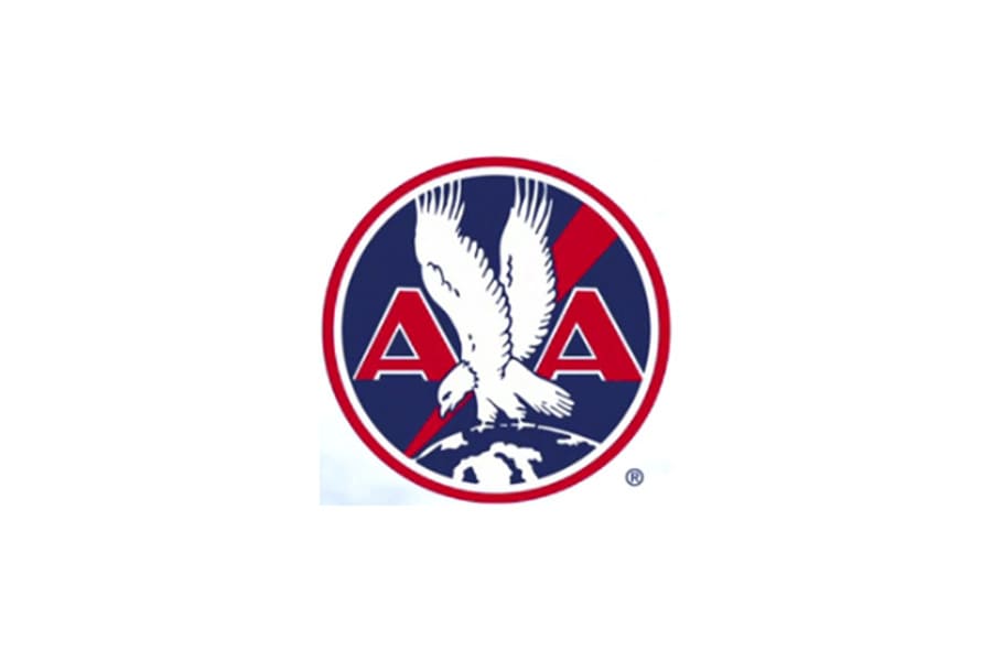
The 1934 logo stripped away the complex geographical map and the circular border of the 1930 design. Instead, it introduced a beautifully balanced, symmetrical composition:
- The Twin ‘A’s: Two large, bold, blocky sans-serif letters “A” stood side-by-side. The use of the double “A” was a powerful mnemonic device, instantly reinforcing the brand’s initials.
- The Perched Eagle: Positioned directly between the two “A”s was a stylized bald eagle. Unlike the flying eagle of 1930, this eagle was depicted in profile, perched atop a horizontal bar or globe-like arc, with its wings partially raised. The eagle’s gaze was directed to the left (heraldic dexter), representing a watchful, protective stance.
- The Color Shift: The color palette solidified into a patriotic triad of red, white, and blue. The letters were typically rendered in deep blue or red, depending on the background, while the eagle was picked out in contrasting tones.
Industrial Integration and the DC-3 Era
This logo coincided with American Airlines’ introduction of the Douglas DC-3 in 1936—an aircraft that C.R. Smith closely co-developed with Douglas. The DC-3 revolutionized commercial aviation by making passenger service profitable without government mail subsidies. The clean, geometric lines of the 1934 logo perfectly complemented the polished aluminum skin of the DC-3. It was during this era that American began branding its aircraft as “Flagships,” painting the “AA” logo proudly on the nose and tail of the silver planes, establishing a visual association between modern metal aircraft and the patriotic double-A emblem.
The 1945 Post-War Refinement
The 1945 Post-War Refinement
Following the conclusion of World War II, commercial aviation experienced an unprecedented boom. Military pilots returned to civilian life, radar and navigation technologies matured, and larger, pressurized aircraft like the Douglas DC-4 and DC-6 entered service. American Airlines expanded its routes internationally, establishing American Overseas Airlines (AOA) to fly to Europe.
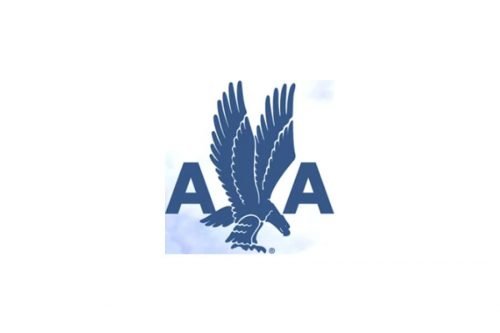
To reflect this global expansion and the modernization of its fleet, the airline introduced a refined version of the 1934 logo in 1945. The core structure—the twin “A”s flanking a central eagle—was preserved, but the execution was modernized to align with post-war graphic design trends.
Key Modifications and Visual Cleanup
The 1945 refinement focused on streamlining the shapes and improving legibility at a distance:
- Sharper Typography: The “AA” letters were given cleaner, more precise geometric angles. The thickness of the strokes was standardized, ensuring the letters did not bleed together when viewed from afar or when painted on the curved surfaces of larger aircraft fuselages.
- The Stylized Eagle: The eagle between the letters underwent a significant transformation. It became less illustrative and more graphic. The feathers were simplified into clean, diagonal blocks, and the overall silhouette was sharpened. The eagle was placed on a small, stylized globe, emphasizing the carrier’s expanding international route network.
- The “Flagship” Script: Often paired with the logo on the aircraft fuselage was a beautiful, flowing cursive script that read “Flagship” followed by the name of the state or city. This elegant typography contrasted beautifully with the rigid, masculine blockiness of the “AA” monogram.
This logo oversaw the transition of American Airlines into the early stages of the transatlantic travel era, gracing the noses of the Lockheed Constellation and the early Douglas DC-7s. It projected an image of American technological supremacy, safety, and efficiency during a golden age of travel.
The 1962 Modernization: The Henry Dreyfuss Touch
The 1962 Modernization: The Henry Dreyfuss Touch
By the late 1950s and early 1960s, the aviation industry had entered the Jet Age. The introduction of the Boeing 707 and the Convair 990 dramatically reduced travel times, increased passenger capacity, and brought a sleek, futuristic aesthetic to the skies. Propellers were replaced by turbojets, and the speed of travel was mirrored in the speed of corporate design.
American Airlines recognized that its post-war logo, while classic, felt too static and traditional for the dynamic Jet Age. In 1962, the airline collaborated with legendary industrial designer Henry Dreyfuss to overhaul its corporate identity and aircraft liveries.
The Dreyfuss Design Philosophy
Henry Dreyfuss was a pioneer of human factors engineering and industrial design, famous for his work on the Westclox Big Ben alarm clock, the Polaroid SX-70, and the Hudson locomotive. Dreyfuss believed that design should be highly functional, intuitive, and stripped of unnecessary ornamentation. He applied this philosophy directly to the American Airlines visual identity.
The 1962 logo redesign introduced several key changes:
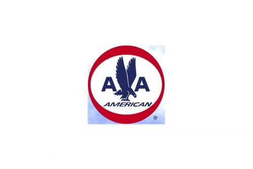
- The Circular Frame: Dreyfuss enclosed the classic “AA” monogram and eagle inside a thick, bold blue circle. This circular framing acted as a unifying seal, making the logo instantly recognizable on airport signage, baggage tags, and advertising print layouts.
- Minimalist Eagle: The eagle was simplified further, reducing it to a sleek, stylized silhouette. The intricate feather details were entirely removed, leaving a clean, powerful graphic representation of a bird in flight, perched between the letters.
- The Red, White, and Blue Cheatline: Along with the logo, Dreyfuss popularized the clean, triple-stripe “cheatline” (red, white, and blue) running horizontally along the windows of the aircraft fuselage. This line emphasized the length and speed of the jet aircraft, while the circular logo was proudly displayed on the vertical stabilizer (tail).
The 1962 design successfully bridged the gap between the historic, heritage-rich branding of C.R. Smith’s era and the sleek, high-speed requirements of the jet-powered 1960s. However, as the decade progressed, an even more radical design revolution was brewing—one that would define the airline’s visual identity for nearly half a century.
The 1968 Masterpiece: Massimo Vignelli’s Modernist Revolution
The 1968 Masterpiece: Massimo Vignelli’s Modernist Revolution
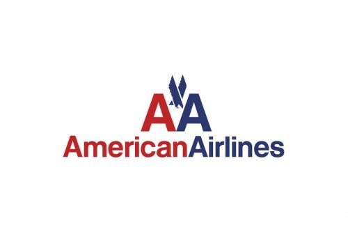
In 1967, American Airlines was preparing to enter the widebody era with the upcoming Boeing 747 and McDonnell Douglas DC-10. The airline’s management felt that the 1962 Dreyfuss design, while clean, was still too traditional and did not fully capture the spirit of a highly efficient, ultra-modern global transport system. They turned to Unimark International, a design firm co-founded by the legendary Italian modernist designer Massimo Vignelli.
What followed was one of the most famous, debated, and enduring corporate identity overhauls in graphic design history. Released in 1968, Vignelli’s design for American Airlines became an instant icon of corporate modernism.
To understand the genius of Vignelli’s work, we must examine his design choices across typography, color, and symbolism.

The Typography: Helvetica Medium
Vignelli was a fierce proponent of typographic discipline. He famously believed that a designer only needed a handful of typefaces, with Helvetica being his absolute favorite. For the American Airlines logo, Vignelli stripped away all custom lettering and set the brand name in Helvetica Medium.
The logo consisted of two simple, unadorned letters: a red A and a blue A. The kerning (the spacing between the letters) was incredibly tight, creating a singular, cohesive typographic unit. Below or beside the monogram, the words “American Airlines” were written in Helvetica, with “American” in red and “Airlines” in blue. There were no serifs, no gradients, and no decorative flourishes. It was pure, unadulterated Swiss modernist design.
The Controversy of the Eagle
One of the most famous anecdotes in design history surrounds the eagle in the 1968 logo. Massimo Vignelli, a strict modernist who favored absolute abstraction, strongly argued that the eagle was a cliché and should be completely omitted from the new logo. He believed the two bold, colored letters “AA” were more than sufficient to identify the airline.
However, American Airlines’ management and its employees revolted at the idea of losing their historic mascot. The eagle was a symbol of pride, safety, and American heritage. Yielding to this pressure, Vignelli agreed to include an eagle, but only on his own terms.
He designed a highly stylized, geometric eagle that was integrated between the two “A”s. The eagle was composed of just three simple, intersecting lines forming a sharp, abstract “V” shape at the center, representing wings. It was so abstract that it avoided any literal representation of feathers, eyes, or talons. Vignelli famously remarked that if they had to have an eagle, it should at least look like a modern, aerodynamic machine rather than a taxidermy specimen.
The Polished Aluminum Livery
A critical component of Vignelli’s design was how it interacted with the physical aircraft. Vignelli made the brilliant decision to leave the Boeing 707, 727, 747, and DC-10 fuselages unpainted. Instead of covering the planes in heavy white paint, the aluminum skin of the aircraft was polished to a mirror-like chrome finish.
This choice had massive practical and financial benefits:
- Weight Reduction: Painting a commercial jet adds several hundred pounds of dead weight. By leaving the fleet unpainted, American Airlines saved millions of dollars in fuel costs over the lifespan of each aircraft.
- Visual Contrast: The vibrant red and blue of the Vignelli logo and the triple-stripe cheatline popped spectacularly against the reflective, polished silver background. The “white” of the red, white, and blue color scheme was provided by the natural reflection of the sky on the metal fuselage.
For 45 years, from 1968 to 2013, this livery and logo remained virtually unchanged. It became a symbol of timeless design, surviving countless industry mergers, bankruptcies, and visual trends. It proved that a simple, mathematically sound design rooted in clear typographic principles could outlast any passing fad.
The 2013 Rebrand: Future Brand’s “Flight Symbol”
The 2013 Rebrand: Future Brand’s “Flight Symbol”
By the early 2010s, American Airlines was facing a series of existential challenges. The airline was navigating Chapter 11 bankruptcy reorganization and was in the process of finalizing a massive merger with US Airways, which would create the world’s largest airline. Simultaneously, the carrier was embarking on a historic fleet renewal program, ordering hundreds of state-of-the-art aircraft, including the Boeing 777-300ER, the Boeing 787 Dreamliner, and the Airbus A320neo family.
These new aircraft introduced a major technical hurdle that made the beloved 1968 Vignelli livery obsolete: **composite materials**.
The Technical Catalyst: Composite Fuselages
Unlike older generations of aircraft made entirely of aluminum, modern jets like the Boeing 787 Dreamliner and Airbus A350 are constructed largely of carbon-fiber reinforced polymers and other composite materials. Composites do not have a natural metallic shine; they are dull grey or white. Furthermore, they must be painted to protect the composite fibers from UV radiation and environmental degradation.
This meant that American Airlines could no longer maintain its signature polished aluminum look. If they painted the new planes silver, it would look like a cheap imitation of the classic polished metal. The airline needed a completely new visual identity designed specifically for painted fuselages. In 2012, American hired the global brand consultancy FutureBrand to execute this monumental task.

The “Flight Symbol” Anatomy
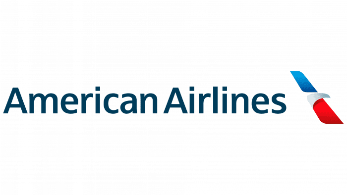
Unveiled in January 2013, the new logo represented a radical departure from the Vignelli era. FutureBrand introduced the “Flight Symbol” (sometimes referred to as the “Flight 3D” logo):
- The Abstract Fusion: The new logo merged three distinct concepts into a single, fluid graphic: the letter ‘A’, a soaring eagle, and a star (representing the airline’s status as a founding member of the oneworld alliance).
- The Diagonal Cut: The logo features a sharp, diagonal red and blue ribbon-like shape with a white negative space cutting through the center. The red portion represents the beak of the eagle or the first leg of the ‘A’, while the blue portion represents the wing of the eagle or the second leg of the ‘A’.
- The Gradient and Softness: Unlike the flat, solid colors of the 1968 logo, the 2013 Flight Symbol utilized subtle color gradients and curved edges, giving it a three-dimensional, dynamic feel optimized for digital screens and modern print media.
- New Custom Typography: The Helvetica typeface was replaced with a custom, proprietary sans-serif font called American Sans. This typeface featured rounded corners and a lighter, more open visual weight, projecting a friendly, approachable, and modern image.
The Bold Tail Livery and Public Reception
Along with the Flight Symbol, FutureBrand introduced a highly dramatic tail design for the aircraft livery. The vertical stabilizer was painted with an abstract, oversized representation of the American flag, featuring alternating red, white, and blue geometric bars. The fuselage was painted in a unique, pearlescent silver-grey paint formulated to mimic the metallic sheen of the historic polished aluminum fleet without the maintenance drawbacks.
The rebrand sparked intense debate within both the aviation and design communities:
- The Critique: Traditionalists and design purists—including Massimo Vignelli himself—heavily criticized the new look. Vignelli lamented that the logo lacked structural integrity and was subject to passing trends, stating that the “Flight Symbol” looked like a generic corporate logo that could belong to any service company.
- The Employee Vote: The controversy was so pronounced that when Doug Parker took over as CEO of the combined American-US Airways group shortly after the merger, he gave employees a choice. In late 2013, employees voted on whether to keep the new tail design or return to a variation of the classic Vignelli tail. By a narrow margin, employees voted to keep the new FutureBrand tail, solidifying the 2013 rebrand as the permanent face of the modern airline.
The Role of Professional Logo Designs in Corporate Identity Evolution
The history of American Airlines’ visual branding demonstrates a fundamental truth in the business world: professional brand identity design is not merely an artistic exercise; it is a critical driver of corporate authority, market positioning, and consumer trust. When a company undergoes a major transition—whether it is a merger, a technological shift, or a cultural realignment—its visual mark must communicate those changes clearly and effectively to the public.
Developing a timeless, functional logo requires a deep understanding of several complex variables:
- Industrial and Material Constraints: As seen in American’s transition from polished aluminum to composite materials, logo designers must understand the physical mediums where the brand will exist. A logo must work as beautifully on a mobile app icon as it does on a 200-foot aircraft fuselage or a brushed-steel corporate headquarters sign.
- Historical Equity vs. Modernization: One of the greatest challenges in brand design is deciding what to keep and what to discard. FutureBrand had to honor the historic “AA” monogram and the eagle motif while creating something entirely fresh for a digital-first audience. Balancing heritage with forward-looking innovation is a delicate art.
- Typographic and Color Psychology: The shift from heavy, serifed letters to geometric Helvetica, and finally to custom humanist sans-serifs, reflects changing cultural perceptions of authority. Modern brands must project accessibility and warmth without sacrificing their stature as industry leaders.
For businesses looking to build their own legacy, partnering with experienced design agencies is essential. Investing in strategic brand assets ensures that a company’s visual identity remains cohesive, scalable, and highly impactful across all physical and digital touchpoints, safeguarding its market presence for decades to come.
Comparative Analysis of Design Eras
To fully appreciate the evolution of the American Airlines visual identity, we can compare the key design attributes, technical drivers, and strategic goals of each major era in a structured format.
| Era | Key Designer / Agency | Typography Style | Core Symbolism | Primary Livery Surface | Business Driver |
|---|---|---|---|---|---|
| 1930 | Internal AVCO Artists | Arched, Bold Sans-Serif | Eagle, Globe, US Map | Fabric & Wood Fuselages | Consolidation of regional mail carriers into American Airways. |
| 1934 | Gordon Edwards / Internal | Blocky Geometric Monogram | Twin “AA” with perched Eagle | Polished Aluminum (DC-3) | Reorganization to American Airlines under C.R. Smith; passenger focus. |
| 1945 | Internal Design Team | Refined, high-contrast Monogram | Streamlined Eagle on small globe | Polished Aluminum (DC-6) | Post-WWII international route expansion and fleet modernization. |
| 1962 | Henry Dreyfuss | Enclosed Geometric “AA” | Silhouette Eagle inside blue circle | Polished Aluminum (Boeing 707) | Transition into the high-speed Jet Age; unified airport signage. |
| 1968 | Massimo Vignelli (Unimark) | Helvetica Medium (Red/Blue) | Abstract geometric 3-line Eagle | Polished Aluminum (B747, DC-10) | Widebody era; focus on extreme operational efficiency and Swiss Modernism. |
| 2013 | FutureBrand | Custom “American Sans” | Flight Symbol (Eagle/A/Star hybrid) | Painted Silver Composite (B787) | US Airways merger, bankruptcy exit, and shift to composite-fuselage aircraft. |
The Evolution of Key Visual Assets
To truly appreciate the design decisions made over the decades, we must dissect the evolution of individual graphic elements that have consistently defined the American Airlines brand: the Eagle, the Color Palette, and the Typography.
1. The Evolution of the Eagle
The bald eagle is the primary zoomorphic symbol of American Airlines, representing freedom, national pride, and flight. Its transformation over 90 years is a perfect case study in the transition from literal illustration to abstract symbolism:
- 1930 (Realistic Illustration): A highly detailed, anatomically correct eagle in active flight. Every feather, beak curve, and talon was visible. This style conveyed classical strength and trust in an era when aviation was a novel, somewhat frightening technology.
- 1934–1945 (The Heraldic Profile): The eagle was simplified into a heraldic silhouette, perched protectively between the “AA” letters. It shifted from an active, flying creature to a stable, reassuring monument.
- 1962 (The Minimalist Silhouette): Henry Dreyfuss stripped the eagle of all internal details, leaving a pure blue silhouette. The bird became a clean graphic icon, matching the streamlined look of early jet engines.
- 1968 (Geometric Abstraction): Massimo Vignelli reduced the eagle to three intersecting lines forming a sharp “V”. This was the ultimate abstraction—the eagle was no longer a biological bird, but a high-speed aerodynamic vector.
- 2013 (The Dynamic Gradient): FutureBrand reintroduced the physical profile of the eagle, but in a highly abstract, flowing format. The bird is depicted mid-soar, emerging from the negative space of a red-and-blue ribbon. It represents movement, speed, and digital-era fluid dynamics.
2. Color Theory: Red, White, and Blue
While many airlines use red, white, and blue, American Airlines has uniquely leveraged these colors to project national identity and corporate stability. However, the application of these colors has evolved:
- The Early Years (Pre-1968): The colors were used traditionally, often with blue as the dominant base color for text and logos, and red used as an accent. Gold was occasionally used in the 1930s to project luxury.
- The Vignelli Era (1968–2013): Vignelli established a strict color discipline. He utilized a highly saturated, vibrant red and a deep, royal blue. Crucially, Vignelli eliminated white paint from the brand’s primary color palette. The “white” was represented by the highly polished, reflective silver of the aircraft’s raw aluminum skin. This created an incredibly striking visual identity that felt organic to the machine itself.
- The Modern Era (2013–Present): Because modern composite planes must be painted, FutureBrand introduced a custom, pearlescent silver-grey paint for the fuselage. This paint reflects light dynamically, mimicking the historic polished metal. The red and blue colors in the “Flight Symbol” were updated with soft gradients, making the logo look three-dimensional and vibrant on backlit mobile and airport screens.
3. The Typography: From Serif to Sans-Serif
The choice of typeface reflects the cultural and technological zeitgeist of each era:
- 1930s (Gothic and Serif): Early typefaces were heavy, blocky, and authoritative, echoing the industrial and governmental stamps of the era. They were designed to look permanent and unshakeable.
- 1968 (Helvetica and Modernism): Helvetica Medium was chosen for its clean, neutral, and highly legible design. It was the face of the post-war corporate boom—rational, organized, and globally minded. It stripped away regional personality in favor of international standardization.
- 2013 (American Sans and Humanism): The custom American Sans typeface is a humanist sans-serif. It features softer, slightly curved terminals and a lighter weight. This typeface reflects a modern corporate trend toward looking approachable, customer-centric, and technologically friendly, moving away from the cold, imposing corporate structures of the late 20th century.
Frequently Asked Questions
Why did American Airlines change its logo in 2013?
The 2013 rebrand was driven by both technical and corporate factors. Technically, American was acquiring modern aircraft like the Boeing 787 Dreamliner, which are made of composite materials rather than aluminum. These planes must be painted, making the classic polished-metal livery impossible to maintain. Corporately, the airline was emerging from Chapter 11 bankruptcy and merging with US Airways, necessitating a fresh, modern visual identity to signal a new era of growth and modernization.
Who designed the famous 1968 American Airlines logo?
The 1968 logo was designed by the legendary Italian modernist designer Massimo Vignelli of Unimark International. It featured a red “A” and a blue “A” in Helvetica Medium, separated by a highly stylized, geometric three-line eagle. This logo remained the face of the airline for 45 years and is celebrated as a classic of modernist graphic design.
What does the 2013 American Airlines “Flight Symbol” represent?
The “Flight Symbol” designed by FutureBrand is an abstract fusion of three distinct visual concepts: the letter ‘A’, a soaring American bald eagle, and a star (which honors the airline’s patriotic heritage and its role as a founding member of the global oneworld alliance).
Why did older American Airlines planes have a polished silver look?
In 1968, designer Massimo Vignelli decided to leave the aircraft’s aluminum skin unpainted and polished to a mirror shine. This saved hundreds of pounds of paint weight per aircraft, resulting in millions of dollars in fuel savings over decades. It also created a striking, unique aesthetic where the “white” of the red, white, and blue livery was provided by the reflection of the sky.
Did employees really vote on the aircraft tail design?
Yes. Following the merger of American Airlines and US Airways in late 2013, the new CEO, Doug Parker, gave employees a choice. They voted on whether to keep the newly introduced FutureBrand abstract flag tail design or return to a variation of the classic Vignelli tail. The employees voted to keep the new FutureBrand design, which remains on the fleet today.
Conclusion
The American Airlines Logo History: Every Logo Since 1930 is a compelling testament to the power of strategic visual identity. Over nearly a century, the carrier’s branding has evolved from a complex, hand-drawn regional seal into a streamlined, globally recognized symbol of modern aviation. Each design transition was not merely a cosmetic update, but a calculated response to major industrial milestones: the commercial breakthrough of the DC-3 in the 1930s, the post-war international expansion of the 1940s, the high-speed technological leap of the Jet Age in the 1960s, and the composite-material engineering requirements of the 21st century.
The longevity of Massimo Vignelli’s 1968 modernist masterpiece proved that simple, mathematically structured design could withstand decades of changing trends. Meanwhile, the 2013 rebrand by FutureBrand demonstrated how a historic brand can honor its heritage—reimagining the classic eagle, the letter ‘A’, and the patriotic color palette—while adapting to the realities of modern materials and digital-first consumer touchpoints. As American Airlines continues to connect millions of passengers across the globe, its visual identity remains a powerful symbol of American industrial capability, design innovation, and enduring brand equity.