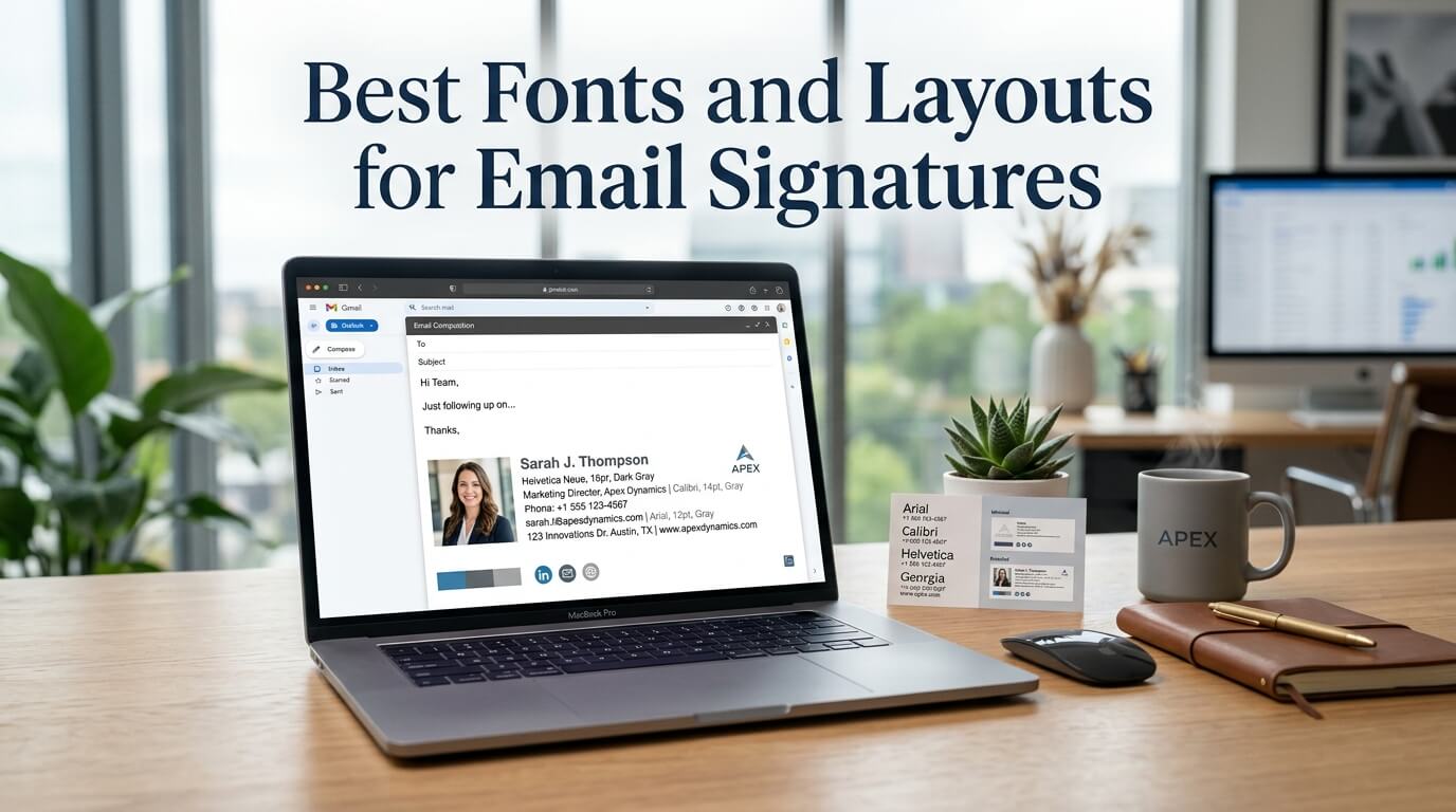
Email signatures may seem like a small detail, but they have a surprisingly large impact on professional communication. Every email you send is an opportunity to reinforce your personal or business brand, provide important contact information, and leave a lasting impression. Whether you’re a freelancer, entrepreneur, corporate professional, or business owner, a thoughtfully designed email signature creates consistency and credibility with every message.
One of the most important aspects of an effective email signature is its typography and layout. The right font improves readability across different devices and email clients, while a clean layout ensures recipients can quickly find your contact information without feeling overwhelmed. Poor font choices, cluttered formatting, or excessive graphics can make even the most professional email appear unpolished.
As businesses increasingly rely on digital communication, email signatures have evolved beyond simple names and phone numbers. Modern signatures often include company logos, social media links, website information, appointment scheduling links, legal disclaimers, and promotional banners. Despite these additions, successful signatures maintain simplicity, clarity, and visual balance.
This guide explores the best fonts and layouts for email signatures, explains why typography matters, discusses layout strategies that improve readability, and provides practical design recommendations that work across different industries and devices.
Why Email Signature Design Matters
Your email signature serves as your digital business card. It appears at the end of every email, making it one of the most frequently viewed branding elements in your communication. Unlike printed business cards that may be handed out occasionally, email signatures are displayed every time you correspond with clients, partners, colleagues, or prospects.
A professionally designed signature immediately communicates attention to detail. Recipients subconsciously associate organized design with professionalism and trustworthiness. On the other hand, signatures filled with colorful fonts, oversized images, or inconsistent formatting may create unnecessary distractions.
Good design also improves usability. Instead of forcing recipients to search for your phone number or company website, a structured signature presents all important information in a logical order. This convenience can increase response rates and encourage further engagement.
Perhaps most importantly, consistent signatures across an organization strengthen brand identity. When every employee uses the same fonts, colors, and layout, every email becomes an extension of the company’s branding.
Understanding Typography in Email Signatures
Typography refers to the selection and arrangement of fonts to improve readability and visual appeal. Unlike printed materials or websites, email signatures face unique technical challenges because different email clients support different fonts and formatting options.
Choosing a font isn’t only about aesthetics. It directly affects how easily recipients can read your information on desktop computers, tablets, and smartphones.
An ideal email signature font should be easy to read at small sizes, compatible with most email applications, visually professional, and consistent with your overall brand identity.
Decorative fonts, handwritten scripts, or overly stylized typography may look attractive in graphic design software but often become difficult to read when displayed inside email clients.
Why Web-Safe Fonts Are the Best Choice
Web-safe fonts are fonts that are installed on most operating systems and supported by nearly every email client. Because recipients already have these fonts available on their devices, your signature appears consistently without unexpected substitutions.
Using uncommon fonts may cause email programs to replace them with default alternatives, potentially disrupting spacing, alignment, and visual consistency.
Web-safe fonts offer reliability across platforms including Gmail, Outlook, Apple Mail, Yahoo Mail, and mobile email applications.
Best Fonts for Professional Email Signatures
Arial
Arial remains one of the safest and most widely used choices for email signatures. Its clean lines and balanced proportions make it highly readable even on small mobile screens.
Professionals across industries prefer Arial because it appears modern without feeling overly formal. It pairs well with corporate branding and works effectively in both simple and detailed signature layouts.
Arial is particularly suitable for finance, healthcare, education, consulting, and technology companies where clarity is essential.
Calibri
Calibri has been a default Microsoft Office font for many years, making it instantly familiar to business professionals. Its rounded design creates a friendly yet professional appearance that works well in email communication.
Because Outlook remains one of the most widely used email clients in business environments, Calibri offers excellent compatibility and readability.
Many organizations choose Calibri when creating standardized signatures for employees.
Verdana
Verdana was specifically designed for screen readability. Its generous letter spacing and larger character shapes make it exceptionally easy to read on digital displays.
If your audience frequently opens emails on smartphones or tablets, Verdana offers outstanding visibility without sacrificing professionalism.
Helvetica
Helvetica is often associated with premium branding because of its timeless simplicity. Although some Windows systems substitute Arial when Helvetica is unavailable, both fonts maintain a similar appearance.
Brands focused on modern minimalism often choose Helvetica for its sophisticated and clean visual style.
Tahoma
Tahoma provides excellent clarity at smaller font sizes. Its compact structure allows signatures to include multiple contact details while maintaining readability.
Businesses that require concise signatures with several communication channels often benefit from Tahoma’s efficient spacing.
Georgia
Not every email signature needs a sans-serif font. Georgia offers a professional serif alternative that adds a touch of elegance while remaining highly readable on digital screens.
Law firms, publishing companies, educational institutions, and consulting firms sometimes prefer Georgia because it conveys authority and tradition.
Font Sizes That Work Best
Selecting the right font size is equally important. Text that is too small becomes difficult to read, while oversized text dominates the email unnecessarily.
Most professional email signatures use font sizes between 10 and 12 points for contact information. The sender’s name can be slightly larger, usually between 12 and 14 points, helping establish a natural visual hierarchy.
Job titles generally appear in the same size as contact information or slightly smaller to maintain balance.
Maintaining consistent sizing throughout the signature prevents visual clutter and creates a polished appearance.
Font Colors That Improve Readability
Black remains the most reliable font color because it provides maximum contrast against white email backgrounds.
Dark gray has become increasingly popular because it appears softer while remaining highly readable.
Businesses frequently incorporate brand colors into names, job titles, or divider lines. However, these accent colors should complement rather than replace standard readable text.
Bright colors such as yellow, neon green, or light blue often reduce readability and should generally be avoided.
Similarly, using multiple colors throughout the signature creates unnecessary distractions.
The Importance of White Space
One of the most overlooked aspects of signature design is white space. Empty space between sections improves readability and prevents information from feeling crowded.
A signature containing the sender’s name, position, company, phone number, website, and social media icons can still appear clean if adequate spacing separates each element.
White space also improves scanning speed, allowing recipients to quickly locate the information they need.
Understanding Email Signature Layouts
Layout determines how information is organized within the available space. Even the best fonts lose effectiveness when presented in a confusing arrangement.
An effective layout guides the reader naturally from one piece of information to the next.
The sender’s name typically receives the greatest visual emphasis, followed by job title, company, contact details, and additional branding elements.
Logical organization reduces cognitive effort and improves professionalism.
Single-Column Layout
Why It Works
Single-column layouts remain the most common because they display consistently across virtually every email client.
Information appears vertically, allowing recipients to read naturally from top to bottom.
This format works especially well for freelancers, consultants, and professionals who prefer minimalist branding.
Best Use Cases
Single-column layouts are ideal for individual professionals, small businesses, startups, and organizations prioritizing simplicity.
They also adapt exceptionally well to mobile devices.
Two-Column Layout
Professional Visual Balance
Two-column layouts typically place a company logo or profile photo on one side while positioning contact information on the other.
This arrangement creates stronger visual branding without increasing the overall height of the signature.
When designed carefully, two-column layouts appear modern and organized.
Maintaining Compatibility
The layout should remain simple enough to adapt when viewed on smaller screens. Excessive complexity may cause alignment problems in some email applications.
Minimalist Layout
Minimalist signatures focus only on essential information.
The sender’s name, title, company, phone number, email address, and website often provide everything recipients need.
This design philosophy aligns with modern branding trends that emphasize clarity over decoration.
Minimalist layouts also load faster because they contain fewer images and formatting elements.
Corporate Branded Layout
Large organizations frequently use standardized branded layouts for every employee.
These signatures usually include company logos, approved brand colors, legal disclaimers, social media icons, and marketing banners.
While they contain more information than minimalist designs, strong spacing and typography prevent them from becoming overwhelming.
Centralized signature management helps maintain consistency across departments.
Personal Branding Layout
Freelancers, speakers, authors, coaches, designers, and consultants often prioritize personal branding over corporate identity.
These signatures may feature professional headshots alongside carefully selected typography that reflects their personality.
Even with creative freedom, readability should always remain the primary objective.
Recommended Email Signature Structure
| Element | Recommended Placement | Purpose |
| Full Name | First line | Primary identification |
| Job Title | Below name | Professional context |
| Company Name | Under title | Brand recognition |
| Phone Number | Contact section | Easy communication |
| Email Address | Contact section | Alternative contact |
| Website | Below contact details | Drive website traffic |
| Social Icons | Bottom section | Increase engagement |
| Legal Disclaimer | Final section | Compliance where required |
Using Logos Effectively
Company logos strengthen brand recognition, but oversized graphics can create several problems.
Large images increase email loading time and may appear blocked by certain email clients until recipients choose to display them.
A properly optimized logo maintains high quality while keeping file size low.
Positioning the logo beside contact information rather than above it usually produces a more balanced layout.
Social Media Icons
Social media icons provide recipients with additional ways to connect.
Professional networks such as LinkedIn are commonly included, while creative industries may also feature Instagram, Behance, or Dribbble.
Using recognizable icons instead of lengthy profile URLs keeps signatures visually clean.
Only include platforms that are actively maintained.
Mobile-Friendly Signature Design
A growing percentage of emails are opened on smartphones, making mobile optimization essential.
Responsive signatures maintain readability regardless of screen size.
Shorter line lengths, moderate font sizes, compressed logos, and sufficient spacing all contribute to better mobile experiences.
Testing signatures on both Android and iPhone devices helps identify formatting issues before deployment.
Common Email Signature Mistakes
Many professionals unintentionally reduce the effectiveness of their signatures through avoidable design decisions.
Using multiple fonts within a single signature creates inconsistency and distracts readers. Excessive font sizes can dominate the email, while tiny text becomes difficult to read.
Adding inspirational quotes, multiple promotional banners, or numerous social media icons often shifts attention away from essential contact information.
Similarly, brightly colored backgrounds or decorative borders rarely improve professionalism.
Keeping the signature clean, focused, and balanced almost always produces better results.
Accessibility Considerations
Accessibility ensures that everyone, including individuals with visual impairments, can read your signature comfortably.
High color contrast improves visibility, while readable font sizes reduce eye strain.
Avoid relying solely on color to communicate information, and include descriptive text for linked images whenever possible.
Accessible design benefits every recipient, not just those with disabilities.
Matching Fonts with Brand Identity
Your font selection should reflect your organization’s personality.
Technology companies often favor modern sans-serif fonts that communicate innovation.
Law firms may choose elegant serif fonts that project authority and trust.
Creative agencies sometimes incorporate more contemporary typography while still prioritizing readability.
Consistency between your website, marketing materials, business cards, and email signatures strengthens overall brand recognition.
Testing Across Email Clients
Even well-designed signatures should be tested before widespread use.
Different email applications render HTML differently, which can affect spacing, images, fonts, and alignment.
Testing across Gmail, Outlook, Apple Mail, Yahoo Mail, and mobile devices ensures consistent presentation.
Regular updates also help accommodate changing email client standards.
Future Trends in Email Signature Design
Email signatures continue evolving alongside digital communication trends. Minimalist aesthetics remain dominant, with clean typography, subtle brand colors, and responsive layouts becoming standard practice.
Interactive elements such as appointment scheduling buttons, promotional banners, event registrations, and customer review links are becoming increasingly common. However, successful implementations integrate these features without overwhelming recipients.
Artificial intelligence may also influence future signature management by automatically updating contact information, displaying personalized marketing content, or adapting layouts based on recipient devices.
Despite technological advancements, the fundamental principles of excellent email signature design will remain unchanged: readability, consistency, professionalism, and simplicity.
Conclusion
An email signature is far more than a simple closing line. It represents your professional identity, reinforces your brand, and provides recipients with convenient access to your contact information. By selecting reliable web-safe fonts such as Arial, Calibri, Verdana, Helvetica, Tahoma, or Georgia, you ensure consistent readability across devices and email clients. Pairing these fonts with a clean, well-structured layout creates an organized appearance that reflects professionalism and attention to detail.
Whether you choose a minimalist signature, a branded corporate layout, or a personal branding design, the goal should always be clarity over complexity. Appropriate spacing, balanced typography, optimized images, and logical organization work together to create a signature that leaves a positive impression without distracting from your message. Investing time in designing an effective email signature is a simple yet valuable way to strengthen every professional interaction you have through email.
Frequently Asked Questions
Q1. What is the best font for an email signature?
Arial, Calibri, Verdana, Helvetica, Tahoma, and Georgia are among the best choices because they are professional, highly readable, and widely supported across email clients.
Q2. What font size should an email signature use?
Most email signatures use 10–12 pt for contact details and 12–14 pt for the sender’s name to maintain readability and proper visual hierarchy.
Q3. Should I include my photo in an email signature?
A professional headshot can be beneficial for consultants, freelancers, and client-facing professionals, but it should be optimized for size and used consistently with your branding.
Q4. Are colorful fonts recommended for email signatures?
No. Neutral colors like black or dark gray with limited brand-color accents provide the best readability and maintain a professional appearance.
Q5. What is the most professional email signature layout?
A clean single-column or balanced two-column layout that clearly presents your name, job title, company, contact details, and website is generally considered the most professional.