
Introduction
In the global landscape of corporate branding, few symbols command as much instant recognition, prestige, and cultural authority as the circular emblem of Bayerische Motoren Werke AG—commonly known as the BMW roundel. For over a century, this simple yet sophisticated geometric design has adorned the hoods of some of the world’s most engineered machines, serving as a silent ambassador of German engineering, luxury, and driving dynamics. However, the visual identity of BMW is not merely a product of aesthetic fortuity; it is a carefully preserved historical artifact that has evolved alongside the shifts in global industrial design, typography, and corporate strategy.
Today’s branding landscape is undergoing a massive paradigm shift. As we transition deeper into the digital-first era, major automotive conglomerates are discarding their three-dimensional, skeuomorphic badges in favor of flat, minimalist, and transparent designs. This transition is driven by the demands of digital screens, mobile interfaces, and the rise of electric vehicles (EVs). In this climate of rapid visual transformation, studying the BMW Logo History: The Truth Behind the Iconic Roundel provides invaluable insights into how a brand can maintain its core identity while continuously adapting to modern consumer expectations. This comprehensive, deep-dive analysis will deconstruct the origins, design mechanics, historical myths, and strategic evolutions of the BMW logo, separating corporate folklore from documented historical reality.
The Genesis of BMW: From Rapp Motorenwerke to Bayerische Motoren Werke
To understand the origin of the BMW logo, one must first trace the industrial roots of the company itself. BMW did not begin its life as an automobile manufacturer. Instead, its lineage is directly linked to the rapid expansion of the German aviation industry in the early 20th century, a period characterized by intense engineering innovation and geopolitical tension leading up to World War I.
The Rapp Motorenwerke Foundation
In 1913, engineer Karl Rapp established Rapp Motorenwerke GmbH in Munich, Bavaria. The company specialized in designing and manufacturing aircraft engines. As the German military sought reliable domestic propulsion systems for its air fleet, Rapp Motorenwerke secured significant government contracts, despite facing initial engineering challenges regarding engine vibration and reliability.
The visual identity of Rapp Motorenwerke was highly traditional for its time. The company’s logo featured a black circular outer ring containing the company’s name, “RAPP MOTOR,” enclosed by two symmetrical star symbols. At the center of this circular frame was a silhouette of a black horse chess piece (a knight), which was a visual pun on Karl Rapp’s surname (as “Rappe” translates to “black steed” in German). This circular framing, characterized by a thick black border containing uppercase typography, established the structural blueprint that would directly influence the design of the first BMW logo.
The Reorganization and the Birth of BMW
By 1916, Karl Rapp’s operational control over the company began to wane due to health issues and disagreements with the military authorities regarding engine performance. In July 1917, Rapp resigned from the company. The firm was subsequently reorganized and renamed Bayerische Motoren Werke GmbH (Bavarian Motor Works). Shortly thereafter, in 1918, the company was converted into a stock corporation (Aktiengesellschaft), becoming BMW AG.
When Bayerische Motoren Werke was officially registered as a commercial entity in July 1917, the newly formed company initially possessed no official corporate logo. For the first few months of its existence, BMW utilized the existing stationery, advertising materials, and engine plates of Rapp Motorenwerke, simply overprinting or replacing the text where necessary. The company’s primary focus was fulfilling military orders for its highly acclaimed BMW IIIa inline-six aircraft engine, designed by the brilliant young engineer Max Friz. However, as the company grew, the necessity for a distinct, legally protected trademark became undeniable.
The Birth of the Roundel (October 1917)
On October 5, 1917, the newly formed Bayerische Motoren Werke officially registered its first corporate logo with the Imperial Patent Office (Kaiserliches Patentamt) in Berlin. This historic registration marked the official birth of the BMW roundel, a design that has remained structurally consistent for over a century.
Structural Design and Bavarian Identity
The first BMW logo directly inherited the circular geometry of the Rapp Motorenwerke emblem. It retained the thick black outer ring, but the chess piece was removed. In its place, the inner circle was divided into four equal quadrants. The typography was also updated: the letters “B M W” were inscribed in a clean, serif, gold-colored typeface along the top curve of the black outer ring.
The most defining characteristic of the new logo was the color scheme of the inner quadrants. The quadrants alternated between vibrant blue and pure white. This choice of colors was not arbitrary; it was a direct tribute to the Kingdom of Bavaria, the home state of the company. Blue and white are the official state colors of Bavaria, as represented in the traditional diamond pattern of the Wittelsbach dynasty, which ruled Bavaria for centuries.
The Legal Loophole of the Bavarian Colors
While the intent was to display the Bavarian national colors proudly, BMW faced a significant legal obstacle. At the time, German trademark protection laws strictly prohibited the use of national coats of arms, state seals, or sovereign symbols in commercial trademarks. To circumvent this legal restriction, the designers at BMW made a subtle but crucial modification: they reversed the order of the colors.
In the official Bavarian coat of arms and heraldic tradition, the sequence of colors is read clockwise, starting with white and followed by blue. In the registered BMW logo, the order was reversed to start with a blue quadrant in the upper-left position, followed by white. This simple geometric inversion satisfied the imperial patent authorities, allowing BMW to legally register its brand identity while still maintaining an unmistakable visual connection to its Bavarian heritage.
Debunking the Propeller Myth: The Origin of the Misconception
For decades, a persistent and widely accepted narrative has circulated within automotive journalism, popular culture, and even among BMW enthusiasts: that the BMW roundel represents a spinning airplane propeller against a blue sky. While this myth is incredibly romantic and aligns perfectly with BMW’s history as an aviation pioneer, historical documentation proves that the propeller explanation is a retrospective marketing creation rather than the original design brief.
The 1929 Advertisement: The Spark of the Myth
The origin of the propeller myth can be traced back to a specific marketing campaign launched in the autumn of 1929. Following the signing of the Treaty of Versailles in 1919, Germany was strictly forbidden from manufacturing aircraft and aircraft engines. BMW was forced to diversify, turning its attention to air brakes for railway cars, followed by motorcycles (such as the R32 in 1923), and eventually automobiles (with the purchase of the Dixi plant in Eisenach in 1928).
However, by the late 1920s, BMW had acquired a license to build radial aircraft engines from the American manufacturer Pratt & Whitney. To promote its return to aircraft engine production, BMW’s marketing department created an advertisement that was published in several major publications. The advertisement featured two airplanes flying in tandem, with the spinning propellers of both aircraft visually transforming into the letters “B M W” and the blue-and-white quadrants of the roundel.
This powerful visual metaphor was designed to emphasize the company’s aviation heritage and engineering prowess during a period of corporate expansion. It was an incredibly successful piece of graphic design, but it led the public to believe that the logo had been designed from day one to represent a spinning propeller.
The 1942 Publication: Solidifying the Legend
The myth was further solidified in 1942 by Wilhelm Farrenkopf, a writer for an internal BMW publication called “Flugmotoren-Nachrichten” (Aircraft Engine News). Farrenkopf wrote an article that explicitly described the BMW logo as a stylized representation of a rotating propeller. This narrative was embraced by the company, as it provided a highly evocative, heroic origin story that distracted from the more mundane reality of the logo’s evolution from the Rapp Motorenwerke horse emblem.
The Official Clarification by BMW Group Classic
In recent years, historians at BMW Group Classic, the division responsible for preserving the company’s heritage, have gone to great lengths to set the record straight. Fred Jakobs, the Archive Director of BMW Group Classic, has repeatedly clarified that the propeller explanation is indeed a myth.
“For a long time, BMW made little effort to correct the myth,” Jakobs explains. “This interpretation has been common for 90 years, so it has acquired a certain justification. But the truth is that the logo was never intended to represent a propeller. The blue and white quadrants simply represent the Bavarian state colors.”
While the propeller story remains a beloved piece of corporate folklore, the historical reality is clear: the roundel is a fusion of the Rapp Motorenwerke structural layout and the Bavarian national colors, modified to comply with early 20th-century trademark laws.
Chronological Evolution of the BMW Logo (1917–Present)
Over its century-long existence, the BMW logo has undergone several subtle yet highly strategic redesigns. Each iteration reflects the prevailing design philosophies of its era, the technological advancements in manufacturing (from enamel badges to digital displays), and the shifting strategic goals of the company.
1917–1933: The Original Gold-Bordered Emblem
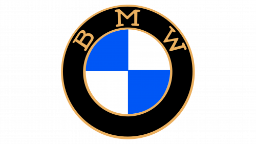
1917–1933: The Original Gold-Bordered Emblem
The first official iteration of the BMW logo, registered in 1917, was characterized by its warm, elegant, and classical aesthetic. Designed during the Art Nouveau and late Arts and Crafts movement, the logo featured:
- Gold Outlines: The inner and outer borders of the black ring, as well as the lines separating the blue and white quadrants, were rendered in a rich gold foil.
- Serif Typography: The letters “B M W” were executed in a heavy, hand-drawn serif typeface. The letters were spaced widely along the top curve of the ring, with the letter “M” being distinctly wider than the “B” and “W”.
- Materiality: When applied to physical products, such as the fuel tanks of early motorcycles like the 1923 BMW R32, the logo was produced as a heavy cloisonné enamel badge, giving it a tactile, three-dimensional quality.
1933–1953: Bold Lines and Modernized Serifs
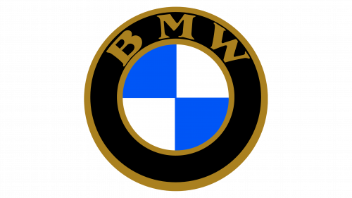
1933–1953: Bold Lines and Modernized Serifs
In 1933, as BMW expanded its automobile production with models like the elegant BMW 328, the logo underwent its first major standardization update. This redesign aimed to make the logo more legible and imposing on the grilles of modern vehicles.
- Thicker Gold Borders: The gold borders enclosing the black ring and the quadrants were made significantly thicker and more pronounced, giving the logo a stronger presence.
- Revised Typography: The serif typeface was modernized. The serifs on the letters “B M W” were sharpened and made more consistent. The letters were also brought closer together, creating a more unified and balanced typographic arc.
- Color Saturation: The blue used in the quadrants was darkened slightly, moving away from the pale sky-blue of the original design to a richer, more saturated medium blue.
1953–1963: The Silver and Light Blue Era
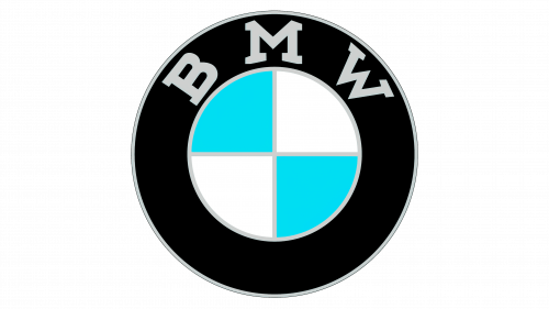
1953–1963: The Silver and Light Blue Era
The post-World War II era was a period of profound restructuring for BMW. Having lost its factory in Eisenach to the Soviet occupation zone, the company had to rebuild its automotive division from scratch in Munich. In 1953, BMW introduced a radical departure from the gold-dominated aesthetic of the pre-war years, embracing a cooler, more industrial look.
- Transition to Silver/White: All gold elements were completely phased out. The borders and typography were updated to a clean, bright silver or crisp white, reflecting the mid-century fascination with industrial metals and chrome.
- Light Blue Quadrants: The dark blue of the 1933 logo was replaced with a very pale, almost pastel light blue. This shade was highly reminiscent of the clear Bavarian skies and gave the emblem a fresh, optimistic appearance.
- Sans-Serif Typography: For the first time, the letters “B M W” began to lose their heavy serifs. The typeface transitioned toward a cleaner, semi-serif or slab-serif style, signaling a move toward modern graphic design principles.
1963–1997: The Modernist Dark Blue and Sans-Serif Era
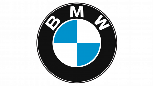
1963–1997: The Modernist Dark Blue and Sans-Serif Era
In the early 1960s, BMW launched its “Neue Klasse” (New Class) line of compact executive sedans, which saved the company from financial ruin and established its identity as a manufacturer of sporty, high-performance road cars. To match this modern, forward-looking automotive lineup, the logo was redesigned in 1963.
- Introduction of Helvetica-Style Typography: The classic serif letters were completely abandoned in favor of a bold, clean, and highly legible sans-serif typeface. This typeface was heavily influenced by the Swiss Style (International Typographic Style) which dominated the graphic design world at the time.
- Deep Navy Blue: The light, pastel blue of the 1950s was replaced with a deep, authoritative navy blue. This color shift conveyed a sense of premium quality, reliability, and corporate maturity.
- High Contrast: The contrast between the stark white typography, the deep black ring, the navy blue quadrants, and the sharp silver/white borders was maximized. This version of the logo became the most recognizable and longest-running emblem in the company’s history, defining the look of classic models like the E30 3 Series and the E24 6 Series.
1997–2020: The Skeuomorphic 3D Era
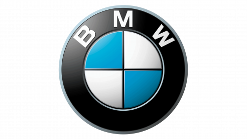
1997–2020: The Skeuomorphic 3D Era
With the rapid advancement of digital graphic design software in the late 1990s, the design world embraced “skeuomorphism”—a design trend where digital elements are made to mimic real-world textures, materials, and lighting effects. In 1997, BMW introduced a highly stylized, three-dimensional version of its classic roundel.
- Chrome Gradients and Highlights: The flat silver borders were replaced with complex gradients that simulated polished chrome, complete with artificial light reflections and shadows.
- Embossed Quadrants: The blue and white quadrants were given a curved, convex appearance, making them look like physical, domed enamel badges.
- Shadowing and Depth: Subtle drop shadows were applied to the typography and the outer edges of the ring to create a sense of physical weight and depth. This logo was designed to look identical to the physical, chrome-rimmed badges mounted on the hoods of BMW vehicles, creating a seamless connection between the physical car and digital marketing materials.
2020–Present: The Flat, Transparent Digital Rebrand
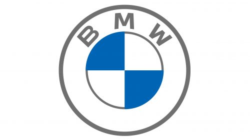
2020–Present: The Flat, Transparent Digital Rebrand
In March 2020, alongside the unveiling of the concept i4 electric vehicle, BMW shocked the design world by releasing its most radical logo redesign in over a century. This new design was built specifically for the digital age, addressing the challenges of displaying logos on low-resolution mobile screens, smartwatches, and digital interfaces.
- Removal of the Black Outer Ring: For the first time since 1917, the iconic black outer ring was completely removed. In its place, the ring was made entirely transparent.
- Flat 2D Aesthetic: All 3D chrome effects, gradients, embossing, and drop shadows were eliminated. The logo returned to a purely flat, two-dimensional graphic.
- Minimalist Typography and Borders: The letters “B M W” and the circular borders were rendered in a clean, minimalist white. The blue and white quadrants remained flat, with a vibrant, modern shade of blue.
- The Philosophy of Transparency: By making the outer ring transparent, the logo acts as a visual chameleon. When placed on a physical car, the paint color of the vehicle shines through the outer ring, integrating the logo directly into the car’s industrial design. In digital spaces, it allows for a more fluid, integrated user experience.
The Geometry, Typography, and Color Psychology of the Roundel
The enduring success of the BMW roundel is not merely a result of its historical longevity; it is a testament to the masterful application of fundamental design principles. By examining the geometry, typography, and color psychology of the logo, we can understand why this emblem continues to resonate so deeply with consumers across the globe.
The Power of Circular Geometry
From a geometric perspective, the circle is one of the most powerful and universally appealing shapes in human psychology. It represents unity, wholeness, infinity, and perfection. By framing its visual identity within a perfect circle, BMW establishes a sense of completeness and high-precision engineering.
Furthermore, the division of the inner circle into four equal quadrants creates a perfect symmetrical balance. This quadrant structure allows for a high degree of visual stability. No matter which angle the logo is viewed from, the alternating blue and white segments maintain a harmonious distribution of visual weight, preventing the design from ever feeling cluttered or off-balance.
Typographic Evolution: From Authority to Accessibility
The typography of the BMW logo has transitioned through three distinct phases, each reflecting the corporate positioning of the company during those eras:
- The Serif Era (1917–1953): Serif typefaces, with their decorative feet and varying line weights, are historically associated with tradition, authority, and craftsmanship. During this period, BMW was establishing its reputation as a premium manufacturer of high-end machinery. The gold, serif letters communicated prestige and elite status.
- The Sans-Serif Era (1963–2020): Sans-serif typefaces are clean, geometric, and highly legible. By adopting a bold, sans-serif font in 1963, BMW aligned itself with the modern, technological, and democratic ideals of the post-war reconstruction. It communicated that BMW was a forward-thinking, high-tech engineering company.
- The Minimalist Digital Era (2020–Present): The current typeface is a highly refined, geometric sans-serif with optimized spacing (kerning). The letters are designed to remain perfectly legible even when scaled down to a few pixels on a digital screen, prioritizing user experience and digital accessibility.
The Semiotics of Color
The color palette of the BMW logo plays a critical role in its psychological impact:
- Bavarian Blue (#0066B2): Blue is universally associated with trust, reliability, intelligence, and stability. In the context of BMW, it also carries the geographical DNA of Bavaria. It reassures the consumer of the vehicle’s safety and engineering integrity.
- Pure White: White represents purity, cleanliness, modernism, and efficiency. It provides a stark, high-contrast pairing with the blue, ensuring that the logo remains visually striking.
- The Black Ring (Historical): Black is the color of luxury, power, sophistication, and authority. The thick black ring that defined the logo for 103 years acted as a protective boundary, framing the Bavarian colors in an aura of exclusive luxury.
- Transparency (Modern): The transition to transparency in the 2020 logo shifts the psychological narrative from “exclusivity and power” to “openness, clarity, and sustainability”—aligning perfectly with the global automotive shift toward electric mobility and environmental consciousness.
Logo Designs: Applying BMW’s Branding Principles to Modern Identity Creation
For modern businesses, startup founders, and graphic designers, the century-long evolution of the BMW roundel serves as an ultimate masterclass in brand strategy. When developing contemporary brand assets, design agencies such as Logo Designs look to these historic lessons to craft visual identities that possess both immediate impact and long-term viability.
There are several core principles from the BMW logo history that modern brands can apply to their own visual identities:
1. Balance Heritage with Modernization
One of the greatest challenges in branding is updating a logo without alienating your existing customer base. BMW has masterfully achieved this by keeping the core structural elements of the roundel—the circular frame, the four quadrants, and the letters “B M W”—completely intact for over 100 years. Each redesign was not a complete reinvention, but a subtle refinement designed to adapt to new mediums. Modern brands must identify their “core visual equities” and protect them, even during major rebrands.
2. Design for the Medium of the Era
A logo does not exist in a vacuum; it exists on physical products, print media, television screens, and digital devices. BMW’s logo history shows a perfect alignment with the dominant mediums of each era:
- In the 1920s, the logo was a heavy enamel badge designed to withstand the heat and vibrations of motorcycle engines.
- In the 1990s, the logo was given 3D chrome gradients to match the digital rendering capabilities of early web design and high-definition television.
- Today, the logo is flat and transparent to ensure flawless rendering on mobile screens, app icons, and digital head-up displays in electric vehicles.
3. Leverage Geographic and Cultural Authenticity
BMW did not try to create a generic, placeless identity. By embedding the Bavarian state colors directly into the heart of its logo, the company anchored itself to a region world-renowned for its precision manufacturing and engineering excellence. Modern brands should look to their own unique origins, stories, and cultural contexts to find authentic design elements that cannot be easily replicated by competitors.
BMW’s Sub-Brands and Logo Variations
As BMW grew from a niche manufacturer into a global automotive powerhouse, the company diversified its product offerings. To cater to different market segments without diluting the core brand, BMW developed several highly successful sub-brands, each featuring its own unique variation of the iconic visual identity.
BMW M (Motorsport) Division: The Power of Three Stripes
Established in 1972, the BMW M division was created to facilitate BMW’s highly successful racing program. Over time, the “M” brand transitioned into a high-performance road car division, representing the absolute pinnacle of BMW’s engineering capabilities.
The visual identity of BMW M is characterized by the iconic “M” letter accompanied by three diagonal stripes: light blue, dark blue (or violet), and red. The history of these colors is a fascinating study in corporate partnership and strategic design:
- Light Blue: Represents the primary color of the BMW brand and its Bavarian heritage.
- Red: Represents Texaco, a major American oil company that was in negotiations to partner with BMW’s racing team in the early 1970s. Although the partnership ultimately fell through, the red color remained a permanent fixture of the design.
- Dark Blue/Violet: Serves as the physical and visual transition between the light blue of BMW and the red of Texaco, representing the fusion of the two entities.
The BMW M logo is always paired with the standard BMW roundel on the physical vehicles, creating a dual-branding strategy that instantly communicates track-focused performance and luxury.
BMW i Division: The Electric Future
In 2011, BMW launched its “BMW i” sub-brand, dedicated to developing sustainable, electric, and hybrid vehicles, such as the groundbreaking i3 and i8. To distinguish these vehicles from the traditional internal combustion engine lineup, BMW introduced a subtle yet highly effective visual modification to the roundel.
The physical badges on BMW i vehicles feature a thin, vibrant electric blue halo ring wrapping around the outer edge of the classic black roundel. This “electric blue” accent serves as a visual shorthand for clean energy, zero emissions, and futuristic technology. It allows the company to signal its commitment to sustainability while retaining the immense brand equity of the historic roundel.
BMW Motorrad: The Two-Wheeled Heritage
BMW’s motorcycle division, BMW Motorrad, has been in continuous operation since 1923—predating the company’s automobile production. The branding of BMW Motorrad has remained incredibly close to the parent brand, utilizing the standard roundel on fuel tanks and engine casings.
However, in marketing and corporate communications, the BMW Motorrad logo is often presented with a clean, rugged sans-serif typeface beneath the roundel, emphasizing adventure, freedom, and mechanical reliability. This subtle contextual branding ensures that the motorcycle division benefits from the premium reputation of the automotive division while maintaining its own passionate, lifestyle-oriented community.
The Role of the Roundel in Global Culture and Consumer Psychology
To fully appreciate the significance of the BMW logo, one must look beyond its physical design and examine its role as a cultural icon. The roundel has transcended its original function as a corporate trademark to become a powerful status symbol, a marker of identity, and a subject of intense consumer loyalty.
The Roundel as a Status Symbol
In the sociology of consumption, certain brands function as “positional goods”—products that establish the social standing, economic success, and taste of their owners. The BMW roundel is one of the most potent positional symbols in the world.
When a consumer purchases a BMW, they are not merely buying a mode of transportation; they are investing in the social capital associated with the emblem. The logo on the hood communicates a specific set of values: professional success, appreciation for high-performance engineering, and a desire for an active, dynamic lifestyle. This emotional connection is what marketers refer to as “brand equity,” and the roundel is the primary visual vessel for that equity.
The Semiotics of the “Ultimate Driving Machine”
In 1973, BMW introduced its legendary advertising slogan: “The Ultimate Driving Machine.” This tagline perfectly complemented the visual identity of the roundel. While the slogan articulated the physical experience of driving a BMW, the logo provided the visual proof of heritage and engineering integrity.
Together, the logo and the slogan created a powerful semiotic system. The clean, balanced geometry of the roundel suggested control, precision, and order, while the slogan promised excitement and performance. This perfect balance of intellect (the German engineering heritage) and emotion (the thrill of the drive) remains the cornerstone of BMW’s global brand appeal.
Frequently Asked Questions
Does the BMW logo actually represent a spinning airplane propeller?
No. The belief that the BMW logo represents a spinning propeller is a myth. The logo originated in 1917 as a combination of the circular layout of the Rapp Motorenwerke logo and the blue and white state colors of Bavaria. The propeller connection was created in 1929 by BMW’s marketing department for an advertisement promoting their aircraft engines, and the company chose to let the myth persist because it aligned with their engineering heritage.
Why did BMW make its logo transparent in 2020?
BMW introduced the transparent, flat logo in 2020 to optimize its brand identity for the digital era. The removal of the black outer ring and the 3D chrome effects allows the logo to render more cleanly on digital screens, mobile apps, and vehicle interfaces. Additionally, the transparency allows the logo to integrate seamlessly with different background colors and physical car paint finishes, symbolizing openness and a digital-first approach.
What do the colors blue and white signify in the BMW logo?
The blue and white colors represent the official state colors of Bavaria, Germany, where BMW was founded and is still headquartered. Because early 20th-century German trademark laws forbade the use of state symbols on commercial logos, the order of the colors was reversed in the BMW design, starting with blue instead of white.
What was the name of the company before it became BMW?
Before being renamed Bayerische Motoren Werke (BMW) in 1917, the company was known as Rapp Motorenwerke, an aircraft engine manufacturing firm founded by Karl Rapp in Munich in 1913.
How often has the BMW logo been completely redesigned?
The BMW logo has undergone six major updates in its history (1917, 1933, 1953, 1963, 1997, and 2020). However, the core structural elements—the circular shape, the letters “B M W”, and the four blue and white quadrants—have remained virtually unchanged, representing a remarkable display of brand consistency.
Are the gold elements in the original BMW logo still used today?
No. The gold borders and typography were phased out in 1953 in favor of silver and white elements. This change was made to reflect the post-war shift toward modern, industrial aesthetics, characterized by polished metals and chrome.
Conclusion
The history of the BMW logo is a masterclass in the power of visual storytelling, corporate adaptability, and brand preservation. By separating the romantic myth of the spinning propeller from the documented historical reality of its Bavarian origins, we gain a deeper appreciation for the strategic brilliance behind the roundel’s design.
For over a century, BMW has navigated world wars, economic collapses, rapid technological revolutions, and massive shifts in consumer behavior. Through it all, the iconic blue-and-white roundel has remained a constant anchor, evolving just enough to stay modern without ever losing its soul. As we move forward into an era dominated by electric mobility, autonomous driving, and digital interfaces, the transparent 2020 rebrand ensures that the BMW logo is fully equipped to guide the company through its next century of innovation.
Ultimately, the BMW roundel proves that a truly great logo is more than just a graphic mark on a product. It is a living historical document, a symbol of geographic pride, and an enduring promise of quality, performance, and engineering excellence that resonates across generations and borders alike.