Introduction
In the hyper-competitive landscape of global digital commerce, few brands have achieved the ubiquitous presence of Booking.com. As a cornerstone of the modern travel and hospitality sector, the platform processes millions of reservations daily, bridging the gap between global travelers and diverse accommodations. Behind this operational colossus lies a meticulously crafted brand identity designed to project trust, efficiency, accessibility, and seamless utility. The visual anchor of this identity is its logo.
Analyzing the Booking.com Logo History: Branding Evolution Explained offers a masterclass in how a digital-native company adapts its visual language to keep pace with rapid technological shifts, changing consumer behaviors, and global scaling demands. In the early days of the internet, logos were often designed as simple digital signs, built to be legible on low-resolution CRT monitors. Today, a global brand’s logo must function as a dynamic, responsive asset capable of scaling from a massive physical billboard in Times Square down to a 16×16 pixel favicon on a mobile web browser.
This comprehensive analysis explores the strategic decisions, design philosophies, typographic choices, and color psychology that have shaped the Booking.com visual identity from its humble origins in Amsterdam in 1996 to its current status as a global design benchmark. By examining this evolution, designers, marketers, and business leaders can gain actionable insights into how strategic visual branding directly supports corporate growth, internationalization, and user experience (UX) optimization.
The Genesis of Booking.com: Historical Context and the Early Digital Era
To fully appreciate the evolution of the Booking.com logo, one must understand the environment in which the company was born. Founded in 1996 by Dutch entrepreneur Geert-Jan Bruinsma under the name “Bookings.nl,” the startup operated within the pioneering, chaotic landscape of the early World Wide Web. During this period, the internet was a text-heavy, slow-loading medium characterized by basic HTML layouts, limited web-safe color palettes, and low-resolution displays.
The original visual identity of Bookings.nl was driven by utility rather than aesthetic sophistication. The primary goal of the brand’s early visual assets was simple: clearly communicate what the service did. In an era when consumers were highly skeptical of online transactions and entering credit card details on the internet was considered a massive risk, the logo had to establish immediate functional clarity.
The 1996-2000 Era: The Utilitarian Beginnings of Bookings.nl
The 1996-2000 Era: The Utilitarian Beginnings of Bookings.nl
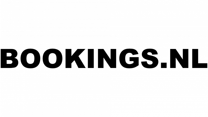
The earliest iteration of the logo was a product of its time. It featured a basic, unembellished layout that emphasized the “.nl” country code top-level domain (ccTLD). This was a deliberate strategic choice. In the late 1990s, establishing local relevance was critical for building trust among Dutch consumers who were new to the concept of online hotel reservations.
The typography of this era relied heavily on standard, system-default sans-serif typefaces such as Arial or Helvetica. These fonts were selected not for their unique artistic character, but because they rendered reliably across all operating systems and web browsers without slowing down page load times. The color palette was rudimentary, often utilizing basic primary and secondary colors that could easily display on 8-bit color monitors. The design lacked the cohesive brand architecture we see today, serving instead as a functional digital signpost.
The 2000 Mergers and the Shift to “Bookings.org”
As the company expanded its operations beyond the borders of the Netherlands, the localized “.nl” domain became a limiting factor. In 2000, Bookings.nl merged with Bookings Online, another early pioneer in the digital travel space. This merger prompted a temporary shift in the brand’s online address and visual identity to “Bookings.org” and eventually “Bookings.com.”
During this transitional phase, the logo underwent minor typographic adjustments to reflect the new domain extensions. However, the core design philosophy remained strictly utilitarian. The logo’s primary function was to act as a hyperlink anchor in the minds of early internet users, reinforcing the web address they needed to type into their browsers to access the service. It was during this period that the foundation for the brand’s signature blue color palette began to take shape, signaling a move toward a more professional, corporate aesthetic.
The Corporate Standardization Era (2005-2012)
The Corporate Standardization Era (2005-2012)
The year 2005 marked a massive turning point in the company’s history. The Priceline Group (now Booking Holdings) acquired Bookings.com for $133 million and subsequently merged it with Active Hotels, a European online hotel reservation service acquired a year prior. This strategic consolidation laid the groundwork for Booking.com to become the dominant force in global travel distribution.
With massive corporate backing and a rapidly expanding global footprint, the brand required a unified, professional, and highly scalable visual identity. The casual, startup-style aesthetics of the early 2000s were no longer sufficient. The logo needed to transition from a simple web address signpost into a robust corporate trademark capable of commanding trust on a global scale.
The Introduction of the Classic Lowercase Identity
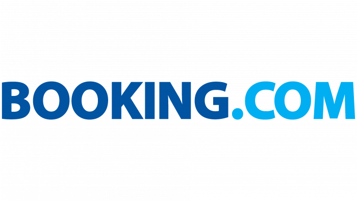
During this period of corporate integration, the design team made a pivotal decision that would define the brand’s visual identity for more than a decade: the transition to an all-lowercase typographic execution. The choice to write “booking.com” entirely in lowercase letters was a highly calculated branding move.
- Accessibility and Friendliness: Lowercase typography is psychologically perceived as more approachable, friendly, and democratic than uppercase lettering. It stripped away the cold, imposing nature of traditional corporate giants, positioning Booking.com as an accessible, user-friendly tool for everyday travelers.
- Digital-First Orientation: In the mid-2000s, web URLs were typed exclusively in lowercase. By presenting the brand name in lowercase, the logo mirrored the actual behavior of users navigating the web, reinforcing the digital-native identity of the platform.
- Visual Balance and Symmetry: Lowercase letters offer a more consistent x-height (the height of lowercase letters like “o”, “i”, “n”, “g”). This created a balanced, horizontal visual flow that was highly pleasing to the eye and easy to scan quickly on a webpage.
Typographic Refinement and the Double “o” Geometry
The typography chosen for this era was a clean, geometric sans-serif typeface. The design team paid meticulous attention to the kerning (the spacing between individual characters) and the geometry of the letters. A key focal point of the design was the consecutive double “o” in the word “booking.”
The perfectly circular counters (the negative space inside the “o”s) created a rhythmic, visual anchor in the center of the logo. Designers and brand strategists have often noted that these double “o”s subtly mimic binoculars, eyes searching the horizon, or the wheels of travel luggage—unconscious visual metaphors that align perfectly with exploration, discovery, and travel. This subtle geometric play elevated the logo from a simple wordmark to a highly memorable piece of graphic design.
The Modernization and Flat Design Era (2012-Present)
The Modernization and Flat Design Era (2012-Present)
As the digital landscape shifted from desktop computers to mobile smartphones, the requirements for effective logo design underwent a massive revolution. The rise of high-density Retina displays, mobile application icons, and responsive web design meant that logos had to be simplified to their absolute essence. Complex gradients, drop shadows, and multi-colored elements were abandoned in favor of “flat design”—a design philosophy prioritizing simplicity, clean lines, and solid colors.
Booking.com embraced this shift with a series of subtle yet highly impactful updates to its visual identity. The goal was to optimize the logo for maximum performance across an infinite variety of digital and physical touchpoints without losing the massive brand equity built up over the previous decade.
The Transition to a Monochromatic Palette
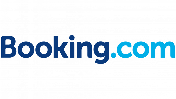
Prior to this era, the Booking.com logo occasionally utilized multiple shades of blue or combined blue with secondary accent colors to distinguish the “booking” portion from the “.com” portion. In the modernization phase, the brand transitioned to a unified, monochromatic execution.
By rendering the entire wordmark in a single, solid shade of deep blue, the logo achieved a much higher level of visual sophistication and punch. This monochromatic approach eliminated visual clutter, allowing the viewer’s brain to process the brand name as a single, cohesive unit rather than two separate elements joined together. It also vastly simplified the logo’s reproduction across different media, ensuring perfect color consistency whether printed on a physical receipt, embroidered on a staff uniform, or displayed on a low-end mobile screen in an emerging market.
The Birth of “Booking Sans”: Custom Typography for Global Scale
As Booking.com expanded to support over 40 languages and serve users in almost every country on Earth, licensing third-party fonts for global digital applications became both a massive financial expense and a technical challenge. To solve this, the company commissioned the creation of its own custom typeface: Booking Sans.
The development of Booking Sans was a landmark moment in the company’s branding evolution. The custom typeface was engineered specifically to meet the unique functional demands of the Booking.com platform:
- High Legibility at Small Sizes: On mobile screens, user interface (UI) text must remain perfectly legible even at tiny font sizes. Booking Sans features open counters, a generous x-height, and clean terminals to ensure that characters do not blur together on low-resolution or small-format displays.
- Global Character Support: The typeface was designed from the ground up to support multiple alphabets and character sets, ensuring a consistent visual voice across English, Cyrillic, Greek, and other global scripts.
- Visual Integration with the Logo: The geometric properties of Booking Sans are directly derived from the geometry of the primary logo. This creates a seamless visual harmony across the entire user experience—from the logo in the header of the website to the body copy in the checkout funnel.
Anatomy of the Logo: Typography, Geometry, and Color
To understand why the Booking.com logo is so successful, we must dissect its individual design components. Every aspect of the logo’s anatomy has been engineered with clinical precision to optimize legibility, psychological impact, and technical performance.
The Psychology of “Booking Blue”
Color is the most immediate and powerful visual communicator in branding. The choice of blue as the primary brand color for Booking.com is not accidental; it is rooted deeply in color psychology and industry standards.
The specific shade of deep blue used by Booking.com (often referred to in design circles as “Booking Blue”) carries several critical psychological associations:
- Trust and Security: Blue is universally recognized as the color of trust, reliability, and stability. In the travel industry, where consumers are booking expensive flights, hotels, and experiences far in advance, establishing a sense of financial and operational security is paramount.
- Professionalism and Authority: Deep blue conveys a high level of corporate maturity and professional competence. It reassures users that they are dealing with an industry leader capable of handling their travel plans flawlessly.
- Calmness and Clarity: Travel planning can be a highly stressful, high-friction activity. The soothing properties of blue help to reduce anxiety, creating a more relaxed, pleasant user experience during the search and booking process.
Furthermore, from a technical perspective, blue is highly accessible. It offers excellent contrast against white backgrounds, meeting the strict requirements of the Web Content Accessibility Guidelines (WCAG 2.1 AA). This ensures that the logo and associated brand assets remain clearly visible to users with visual impairments.
The Geometry of the Wordmark
The Booking.com logo is a pure wordmark, relying entirely on typography rather than an accompanying abstract symbol or icon. This design choice places immense pressure on the geometry of the letters themselves to convey the brand’s identity.
The logo’s structure is defined by a series of repeating geometric patterns. The circular shapes of the “o”s, the “g”, and the “c” create a visual rhythm that guides the viewer’s eye smoothly from left to right. The vertical stems of the “b”, “k”, and “i” provide strong, upright anchors that give the wordmark a sense of structural integrity and strength.
The spacing between the letters (kerning) is exceptionally tight but carefully managed. This tight kerning creates a compact, cohesive visual unit that functions as a single graphic stamp rather than a loose collection of individual letters. This compactness is a massive asset in digital design, where horizontal screen space is often highly limited.
The Role of the Dot
The dot (“.”) in the Booking.com logo is more than just a punctuation mark; it is a vital structural and conceptual anchor. Positioned between “booking” and “com,” the dot acts as a visual fulcrum, balancing the two halves of the wordmark.
Conceptually, the dot serves as a permanent reminder of the brand’s digital-first heritage. It anchors the company firmly in the digital space, reminding users that the entire world of travel is accessible through a simple web domain. In a world where many legacy brands have dropped their “.com” suffixes from their logos, Booking.com has retained theirs, turning what was once a technical necessity into a core element of their global brand equity.
UX/UI Integration and Responsive Branding
In the modern digital economy, a logo does not exist in isolation. It is a working component of a complex user interface. The success of the Booking.com logo lies in its ability to integrate seamlessly into a highly optimized, conversion-driven digital product.
Designing for the App Icon
One of the greatest challenges of modern branding is translating a long, horizontal wordmark into a square or circular mobile application icon. A wordmark like “Booking.com” simply cannot be scaled down to fit inside an app icon on a smartphone home screen; the text would become completely illegible.
To solve this, Booking.com developed a highly successful shorthand version of its visual identity. The app icon features a bold, uppercase white letter “B” set against a solid background of “Booking Blue,” accompanied by a subtle, smaller blue dot or presented as a clean, minimalist lettermark. This solution preserves the brand’s core color and typographic feel while optimizing the asset for the unique spatial constraints of mobile operating systems (iOS and Android).
This “B” icon has become a powerful secondary brand asset in its own right. It is used as a social media profile picture, a browser favicon, and a design element in marketing campaigns, demonstrating the incredible flexibility of the brand’s visual system.
Micro-Interactions and Digital Consistency
On the Booking.com website and mobile app, the logo is not static. It is integrated into the user’s journey through micro-interactions. For example, when a user scrolls down a search results page, the logo may smoothly transition or scale down to free up valuable screen space for hotel listings, while still maintaining its presence in the sticky header.
This level of responsive integration requires a logo with clean, simple outlines that can render instantly without causing layout shifts or performance lag. The flat, vector-based design of the modern Booking.com logo is perfectly suited for these high-performance digital environments, ensuring a smooth, friction-free user experience that directly supports the platform’s high conversion rates.
A/B Testing the Visual Identity: Logo Design in a High-Conversion Environment
Booking.com is legendary in the tech industry for its relentless, data-driven culture. Almost every pixel, button color, font size, and layout choice on the platform is subjected to continuous A/B testing. Millions of users are constantly split-tested to see which design variations yield the highest conversion rates and user satisfaction scores.
This data-driven approach extends directly to the brand’s visual identity. Unlike traditional creative agencies that rely purely on artistic intuition, the design decisions behind the Booking.com logo and brand system are backed by massive datasets.
How Data Shapes Design
When the brand refines its logo or updates its custom typeface, these changes are not rolled out globally overnight. Instead, they are carefully tested against the existing designs to ensure they do not negatively impact user behavior.
- Cognitive Load Reduction: A/B testing helps determine if a typographic change reduces the time it takes for a user to recognize the brand. A logo that is easier to process cognitively helps lower user anxiety and streamline the booking path.
- Trust Optimization: By testing different shades of blue and typographic weights, the brand can measure which variations yield the highest level of user trust, directly translating into higher booking completions and lower cart abandonment rates.
- Cross-Cultural Performance: Because Booking.com operates globally, design changes are tested across different regions to ensure that a visual update that performs well in Europe does not have an unintended negative impact in Asia or South America.
This scientific approach to design ensures that the Booking.com logo is not just an artistic statement, but a highly optimized business tool engineered to drive global commerce.
The Role of Professional Logo Designs in Brand Longevity
The evolutionary journey of the Booking.com logo highlights a fundamental truth in the business world: a brand’s visual identity must grow alongside its operational scale. For businesses aiming to build lasting market authority, partnering with experts who understand the delicate balance between artistic design and strategic commercial utility is essential.
The Role of Professional Logo Designs in Brand Longevity
Creating a logo capable of scaling from a local startup to an international market leader requires deep expertise in typography, color theory, and digital scalability. Professional design agencies, such as Logo Designs, play a critical role in helping businesses navigate these complex branding challenges. By analyzing market trends, user psychology, and technical performance requirements, professional designers craft visual identities that not only capture a brand’s core values but also remain highly functional across all modern digital and physical touchpoints.
Just as Booking.com refined its visual identity to transition from a Dutch regional service to a global travel powerhouse, growing businesses must invest in professional design strategies to ensure their visual assets project the credibility, trust, and authority required to capture market share in highly competitive industries.
Comparative Analysis: Booking.com vs. Competitors
To fully understand the strategic value of the Booking.com visual identity, it is highly instructive to compare it with the branding strategies of its major global competitors: Airbnb, Expedia, and TripAdvisor.
| Brand | Primary Logo Style | Primary Color | Key Visual Metaphor | Brand Personality |
|---|---|---|---|---|
| Booking.com | Geometric Wordmark | Deep Blue | Double “o” (binoculars/wheels) | Reliable, Efficient, Utilitarian |
| Airbnb | Combination Mark (Symbol + Wordmark) | Rausch (Coral/Pink) | The “Bélo” (People, Places, Love) | Community-driven, Warm, Experiential |
| Expedia | Combination Mark (Icon + Wordmark) | Blue and Yellow | Airplane circling a globe | Traditional, Adventure-focused, Corporate |
| TripAdvisor | Combination Mark (Icon + Wordmark) | Green and Black | Ollie the Owl (wisdom/search) | Community-led, Informative, Friendly |
Strategic Divergence: Booking.com vs. Airbnb
The contrast between Booking.com and Airbnb represents two fundamentally different philosophies in modern travel branding.
Airbnb’s brand identity, anchored by its custom symbol, the “Bélo,” is highly emotional, experiential, and community-focused. The brand uses a warm, vibrant coral color palette designed to evoke feelings of belonging, creativity, and human connection. This aligns perfectly with Airbnb’s business model, which centers on unique, host-led home shares and local experiences.
In contrast, Booking.com eschews emotional sentimentality in favor of clinical efficiency, reliability, and massive choice. The deep blue, geometric wordmark projects a sense of absolute dependability and professional scale. It does not try to tell a complex story about “belonging”; instead, it delivers a clear, powerful message: We have the largest inventory of accommodations on Earth, and you can book them quickly, safely, and at the best price. This utilitarian focus has been a key driver of Booking.com’s massive operational success.
Key Milestones in the Visual History of Booking.com
To summarize the historical journey of the brand’s visual assets, let us look at the key evolutionary milestones that have defined the Booking.com brand identity over the past quarter-century:
- 1996: Geert-Jan Bruinsma launches Bookings.nl in Amsterdam. The original logo is a simple, text-based HTML asset designed for basic web-safe environments, focusing heavily on local market trust.
- 2000: The merger with Bookings Online prompts the transition to Bookings.org and Bookings.com, initiating a shift toward a broader, international visual strategy and laying the groundwork for the brand’s signature blue color palette.
- 2005: The Priceline Group acquires Booking.com. The brand undergoes a major corporate standardization, introducing the iconic all-lowercase geometric wordmark that established a friendly, highly accessible digital presence.
- 2012: The brand embraces flat design principles, removing gradients and shadows to optimize the logo for the rapidly growing mobile app and responsive web ecosystem. The color palette is streamlined into a solid, high-contrast monochromatic blue.
- 2018: The parent company, Priceline Group, renames itself Booking Holdings, solidifying Booking.com as the flagship brand of the entire global travel portfolio. This corporate shift reinforces the authority of the Booking.com visual identity worldwide.
- Present: The deployment of the custom “Booking Sans” typeface across all global digital platforms ensures absolute brand consistency, high-performance legibility, and a unified visual voice in every market.
Frequently Asked Questions
Why does the Booking.com logo use only lowercase letters?
The lowercase design was introduced during the 2005 corporate standardization to make the brand appear more approachable, friendly, and accessible. Psychologically, lowercase letters reduce the imposing, cold nature of large corporate entities. Additionally, it reflects the digital-first nature of the brand, as web URLs are traditionally typed in lowercase.
What is the exact color of the Booking.com logo?
The primary color of the Booking.com logo is a deep, solid shade of blue, often referred to as “Booking Blue.” From a design perspective, this color is selected for its strong psychological associations with trust, security, and reliability—critical factors for consumers booking travel online. It also meets strict WCAG 2.1 AA digital accessibility standards.
Does the Booking.com logo have a hidden meaning?
While the logo is a clean, geometric wordmark without an official abstract symbol, designers often point to the geometry of the double “o” in “booking.” The circular, repeating shapes subtly mimic binoculars, eyes searching for deals, or the wheels of travel luggage, which aligns perfectly with the brand’s core focus on travel and exploration.
How does Booking.com handle its logo on mobile apps?
Because the full “Booking.com” wordmark cannot scale legibly into a small, square mobile app icon, the brand uses a responsive shorthand version. The app icon features a bold, uppercase white letter “B” set against a solid “Booking Blue” background, maintaining brand recognition while optimizing for mobile screen constraints.
What is “Booking Sans” and why was it created?
Booking Sans is a custom-designed typeface commissioned by Booking.com. It was created to provide high legibility at small sizes on mobile screens, support global character sets across multiple languages, and eliminate the massive licensing fees associated with using third-party commercial fonts across a global digital platform.
Conclusion
The journey of the Booking.com logo is a compelling testament to the power of evolutionary, data-driven design. Rather than engaging in radical, disruptive rebrands that risk alienating users and erasing valuable brand equity, Booking.com has opted for a path of continuous, meticulous refinement. Every update to its typography, color palette, and digital presentation has been made with a clear purpose: to optimize user experience, project absolute trust, and ensure flawless performance across an ever-changing landscape of digital devices.
By maintaining a clean, geometric, and highly accessible visual identity, the logo has successfully transitioned from a simple late-90s web address into a globally recognized symbol of travel, convenience, and reliability. For modern businesses, the Booking.com logo history serves as an invaluable blueprint for how to build, maintain, and scale a powerful corporate brand in a digital-first world.