
Introduction
In the global aviation industry, a corporate logo is far more than a simple trademark; it is a beacon of national identity, an engineering statement, and a visual promise of safety, luxury, and reliability. Among the world’s legacy carriers, few visual identities carry as much historical weight, political significance, and design prestige as British Airways (BA). The British Airways Logo History: From Speedbird to Modern Branding represents a masterclass in corporate evolution, tracing the journey of British civil aviation from its pioneering post-World War I roots to the hyper-connected, digital-first landscape of the twenty-first century.
The evolution of the British Airways visual identity mirrors the broader shifts in graphic design, industrial aesthetics, and corporate communication over the past century. From the avant-garde minimalism of the 1930s Speedbird to the stately, aristocratic corporate heraldry of the 1980s, and finally to the fluid, three-dimensional “Speedmarque” of the modern era, each iteration of the airline’s logo has responded to changing geopolitical realities, technological advancements, and marketing philosophies. In an era where airlines must navigate intense global competition, digital screen optimization, and shifting consumer expectations, studying the design choices of British Airways offers invaluable insights into the power of semiotics, brand equity, and visual heritage.
This comprehensive deep-dive explores the historical timeline, design mechanics, ideological battles, and strategic rebranding campaigns that have shaped the British Airways logo. By analyzing the work of legendary design agencies such as Negus & Negus, Landor Associates, and Newell & Sorrell, we will uncover how a single visual identity can capture the spirit of a nation while projecting a forward-looking, global corporate vision.
The Predecessors: Laying the Foundations of British Aviation Branding
To fully understand the modern visual identity of British Airways, one must first examine the rich design heritage of its predecessor airlines. British Airways was formed in 1974 through the merger of four state-owned entities: British Overseas Airways Corporation (BOAC), British European Airways (BEA), and two regional carriers, Cambrian Airways and Northeast Airlines. Each of these organizations brought a distinct design philosophy, operational culture, and visual vocabulary to the table.
Imperial Airways and the Birth of the Speedbird (1924–1939)
The story of British civil aviation branding truly begins with Imperial Airways, created in 1924 to link the far-flung territories of the British Empire. In its early years, Imperial Airways relied on traditional, literal representations of flight—such as winged shields and heraldic lions—to project stability and imperial authority. However, as aircraft technology advanced in the 1930s, the company sought a more modern, aerodynamic symbol that could convey speed, efficiency, and technological progress.
In 1932, Imperial Airways commissioned the renowned poster artist and industrial designer Theyre Lee-Elliott to create a new emblem. The result was the “Speedbird”—an extraordinarily elegant, highly stylized, avant-garde silhouette of a bird in flight. Characterized by its sharp, dynamic angles and minimalist form, the Speedbird was a triumph of Art Deco design. It captured the essence of aerodynamic lift and forward momentum without relying on literal depictions of feathers or mechanical propellers.
The Speedbird was not merely a decorative graphic; it was a highly functional design asset. It was painted on the noses of Imperial Airways’ flying boats and biplanes, embossed on corporate stationery, woven into cabin crew uniforms, and featured prominently on travel posters. The emblem became so synonymous with British civil aviation that it transcended the company itself, serving as a visual shorthand for the romance, luxury, and adventure of early commercial flight. The Speedbird established a visual benchmark for simplicity and motion that would influence aviation logo design for decades to come.
BOAC: Globalizing the Speedbird (1939–1974)
In 1939, Imperial Airways was merged with the original British Airways Ltd (a private airline formed in 1935) to create the state-owned British Overseas Airways Corporation (BOAC). As the flagship carrier operating long-haul international routes, BOAC inherited the Speedbird emblem and elevated it to global prominence.
Under BOAC, the Speedbird underwent subtle refinements to improve its legibility and adaptability. It was frequently rendered in metallic gold, set against deep navy blue backgrounds, creating a color palette that exuded prestige, reliability, and imperial luxury. The Speedbird was integrated into the famous “Speedbird House” corporate headquarters and became the official radio call sign for BOAC flights—a tradition that British Airways proudly maintains to this day.
The visual identity of BOAC was characterized by a classic, authoritative aesthetic. The typography was typically a clean, high-contrast serif or a structured sans-serif, reflecting the post-war British establishment’s preference for order, tradition, and quiet confidence. The Speedbird was positioned as a symbol of British engineering prowess and diplomatic reach, flying on the noses of iconic aircraft like the De Havilland Comet (the world’s first commercial jetliner) and the Vickers VC10.
BEA: Modernism and the Red Square (1946–1974)
While BOAC managed long-haul global routes, British European Airways (BEA) was established in 1946 to handle short- and medium-haul flights across the UK and Europe. Operating in a highly competitive regional market, BEA adopted a radically different branding strategy than its long-haul sibling. Instead of traditional imperial prestige, BEA embraced continental European modernism, Swiss typography, and bold geometric forms.
In the 1950s and 1960s, BEA introduced its iconic “Red Square” visual identity, designed by the influential graphic designer F.H.K. Henrion. The logo featured a bold, solid red square containing the letters “BEA” in a clean, white, custom sans-serif typeface. This design was highly striking, memorable, and visible from great distances on airport tarmacs.
BEA’s corporate identity was characterized by its strict adherence to modernist design principles. Every touchpoint, from aircraft liveries and timetables to baggage tags and ticket jackets, was meticulously coordinated using a grid system, consistent typography, and a limited color palette of red, white, and black. This clean, functionalist approach positioned BEA as a progressive, efficient, and thoroughly modern European airline, contrasting sharply with BOAC’s traditional, heritage-driven aesthetic. The tension between these two design philosophies—modernist minimalism versus traditional prestige—would become the central challenge when the two airlines merged in the 1974.
The 1974 Merger: Unifying an Identity under Negus & Negus
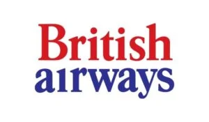
The 1974 Merger: Unifying an Identity under Negus & Negus
On April 1, 1974, BOAC and BEA were officially dissolved, and British Airways was born. The merger created one of the largest airlines in the world, but it also presented a monumental branding challenge. The new airline had to unify two highly distinct corporate cultures, operational systems, and visual identities into a single, cohesive brand that could project national pride and global competitiveness.
The Design Brief and the Selection of Negus & Negus
The British Airways Board recognized that a patchwork corporate identity would undermine public confidence and hinder operational integration. They required a comprehensive, unified visual identity system that could be applied across a massive fleet of aircraft, ground support equipment, ticket offices, uniforms, and digital communications. The design brief demanded an identity that was distinctly British, highly professional, forward-looking, and capable of bridging the gap between BOAC’s global prestige and BEA’s regional efficiency.
The board selected the London-based design agency Negus & Negus, led by the talented design partners Dick Negus and Philip Sharland. Negus & Negus was highly regarded for their systematic, highly structured approach to corporate identity, making them the ideal choice to navigate the complex logistics of a multi-fleet airline merger.
Deconstructing the 1974 Visual Identity
The visual identity developed by Negus & Negus was a brilliant compromise that paid homage to the heritage of both predecessor airlines while introducing a bold, contemporary aesthetic. The design was built around three core visual elements:
- The Quartered Union Jack Tailfin: To project a powerful sense of national identity, Negus & Negus designed a striking, abstract representation of the British Union Flag for the aircraft tailfins. Rather than displaying the entire flag, they cropped and enlarged a section of the Union Jack, showcasing the intersecting red and white crosses against a deep royal blue background. This cropped, asymmetric design was highly dynamic, modern, and instantly recognizable on airport runways worldwide.
- The Lowercase Typography: In a departure from the traditional, authoritative uppercase typography of BOAC and BEA, Negus & Negus introduced a clean, friendly, yet professional lowercase sans-serif typeface for the wordmark “british airways”. The use of lowercase letters reflected the egalitarian, progressive design trends of the 1970s, making the national carrier appear more accessible, approachable, and customer-centric.
- The Redesigned Speedbird: Negus & Negus recognized the immense brand equity of Theyre Lee-Elliott’s Speedbird. They retained the emblem but modernized its form, rendering it in a bold, solid red and positioning it as a sleek, aerodynamic accent mark pointing forward next to the lowercase wordmark. This ensured a direct visual link to the pioneering days of BOAC and Imperial Airways.
The Livery: A Study in Balance and Proportion
The aircraft livery designed by Negus & Negus was clean, balanced, and highly professional. The upper two-thirds of the fuselage were painted in a brilliant, clean white, while the lower third was finished in a solid, dark royal blue, separated by a thin, crisp red cheatline that ran the length of the aircraft. The lowercase “british airways” wordmark was positioned on the white upper fuselage, directly above the passenger windows, while the red Speedbird sat proudly on the nose.
This livery achieved an exceptional balance of white space and bold color. It successfully projected a sense of British reliability, institutional stability, and modern efficiency. The Negus & Negus identity served British Airways well during its formative first decade, guiding the airline through the introduction of the supersonic Concorde and establishing BA as a dominant force in international aviation.
The 1984 Privatization: Landor Associates and the “To Fly. To Serve.” Era
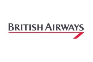
The 1984 Privatization: Landor Associates and the “To Fly. To Serve.” Era
By the early 1980s, British Airways was preparing for one of the most significant milestones in its history: privatization. Under the Conservative government of Prime Minister Margaret Thatcher, the state-owned national carrier was slated to be sold to private investors. To ensure a successful public offering, the airline needed to shed its image as a bureaucratic, state-subsidized utility and reposition itself as a highly profitable, premium, world-class global enterprise.
The Strategic Imperative for Rebranding
Under the leadership of Chairman Lord King and Chief Executive Colin Marshall, British Airways underwent a massive operational restructuring, focusing heavily on customer service, operational efficiency, and financial profitability. To signal this dramatic internal transformation to the financial markets and the traveling public, the airline commissioned a complete overhaul of its visual identity.
In 1984, British Airways bypassed British design firms and hired Landor Associates, the world-renowned, San Francisco-based corporate identity and branding consultancy founded by Walter Landor. Landor was chosen for its unparalleled expertise in global brand strategy, consumer research, and large-scale corporate transformations. The assignment was one of the most expensive and high-profile rebranding campaigns of the 1984, reflecting the high stakes of the upcoming privatization.
The Landor Design Philosophy: Stately, Aristocratic, and Premium
Landor Associates conducted extensive global market research and concluded that the 1974 Negus & Negus identity, while highly visible, was perceived as too casual, flat, and representative of a state-owned monopoly. To attract high-yield business travelers and institutional investors, British Airways needed an identity that projected prestige, heritage, impeccable service, and undisputed global leadership.
The visual identity developed by Landor was a masterpiece of corporate aristocracy. It combined classical British heritage with sleek, modern corporate design. The key elements of the Landor identity included:
- The Pearl Grey and Midnight Blue Palette: Landor replaced the bright white and royal blue of the Negus livery with a highly sophisticated, premium color palette. The upper fuselage was painted in a subtle, metallic “Pearl Grey,” which reduced glare and gave the aircraft a luxurious, silk-like finish. The lower fuselage was finished in a deep, commanding “Midnight Blue,” conveying absolute stability, safety, and corporate authority.
- The Classical Serif Typography: To project institutional authority and timeless elegance, Landor abandoned the lowercase sans-serif typography of the 1970s. They introduced a custom, high-contrast serif typeface derived from classical Roman letterforms, rendered in a striking combination of midnight blue and silver. The wordmark “BRITISH AIRWAYS” was displayed in all-capital letters, commanding respect and projecting a sense of established heritage.
- The British Airways Coat of Arms: In a brilliant move to leverage British heritage, Landor integrated the airline’s official Coat of Arms into the visual identity. Granted by the College of Arms, the crest featured a shield with the Union Flag, supported by a lion and a pegasus, topped with the motto “To Fly. To Serve.” (originally the motto of the RAF and BOAC). The crest was applied to the aircraft tailfin and used extensively on premium cabin menus, boarding passes, and airport lounge signage, reinforcing the airline’s connection to the British crown and high-society prestige.
- The Red Speedwing: Landor retired the traditional, three-dimensional red Speedbird from the fuselage, replacing it with a sleek, highly abstract red ribbon known as the “Speedwing.” The Speedwing was a sharp, dynamic, red slash that ran along the lower edge of the midnight blue fuselage, terminating in a sharp point near the nose. It was a highly modern, aerodynamic interpretation of the Speedbird, representing speed, precision, and technological advancement.
The Landor Tailfin: A Masterclass in Flag Design
The tailfin designed by Landor was a highly refined, dignified evolution of the Negus & Negus Union Jack. The cropped Union Flag was rendered in deep midnight blue, brilliant white, and a rich, deep red. The colors were deeper and more saturated than those used in 1974, giving the tailfin a highly prestigious, flag-like appearance. The British Airways Coat of Arms was positioned in the upper left corner of the tailfin, adding an extra layer of aristocratic detail and institutional authority.
The Landor livery remains one of the most iconic and highly regarded visual identities in aviation history. It perfectly captured the spirit of 1980s corporate ambition, projecting an image of unrivaled luxury, operational excellence, and British prestige. The branding played a crucial role in the highly successful privatization of British Airways in 1987, helping the airline earn the title of “The World’s Favourite Airline.”
The Controversial 1997 “Project Utopia”: Newell & Sorrell
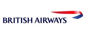
The Controversial 1997 “Project Utopia”: Newell & Sorrell
By the mid-1990s, the geopolitical and economic landscape of the aviation industry had shifted dramatically. The Cold War had ended, globalization was accelerating, and a new generation of travelers was entering the market. Under the leadership of Chief Executive Bob Ayling, British Airways sought to transition from being a “British airline that flew globally” to a “global airline that happened to be headquartered in Britain.”
The Strategic Vision: “World Images”
To reflect this new globalist philosophy, British Airways launched a massive, highly ambitious rebranding campaign in 1997, codenamed “Project Utopia.” The airline commissioned the prominent London-based design consultancy Newell & Sorrell, led by John Sorrell and Frances Newell, to develop a visual identity that could celebrate global diversity, multiculturalism, and international partnership.
Newell & Sorrell argued that the stately, aristocratic Landor identity was perceived in many international markets as stuffy, neo-colonial, and overly nationalistic. They proposed a radical, highly creative concept: replace the traditional Union Jack tailfins with a diverse gallery of contemporary, traditional, and ethnic art commissioned from artists all over the world. This initiative, known as “World Images” (or “World Tails”), aimed to position British Airways as a welcoming, inclusive, and culturally sensitive global citizen.
The Diverse Gallery of World Tails
British Airways commissioned over 50 distinct designs from international artists, representing a vast array of cultures, artistic traditions, and geographic regions. Some of the most famous and striking World Tails included:
- “Delftblue Daybreak” (Netherlands): A beautiful, traditional blue-and-white ceramic pattern designed by Dutch artist Hugo Kaagman, applied to the tailfins of European regional aircraft.
- “Koguty Lowickie” (Poland): A vibrant, colorful paper-cut design featuring traditional Polish roosters, celebrating Eastern European folk art.
- “Wunala Dreaming” (Australia): An extraordinary, highly complex Aboriginal design created by Balarinji Design Studio, featuring stylized kangaroos and spirit tracks. This design was applied to an entire Boeing 747-400, creating one of the most famous and recognizable flying canvases in aviation history.
- “Chelsea Rose” (United Kingdom): A soft, romantic, abstract depiction of a classic English rose, designed by British artist Jane Harvey, representing the airline’s home market.
- “Benyhone” (Scotland): A vibrant, abstract tartan design created by Scottish weaver Sally Hampson, celebrating Celtic heritage.
Each aircraft in the BA fleet was to be painted with a different world image, transforming airport tarmacs into dynamic, multicultural art galleries. The rebranding was accompanied by a major advertising campaign and a complete redesign of the airline’s corporate typography and core logo.
The Birth of the Speedmarque
While the World Tails received the majority of public attention, Newell & Sorrell also made a fundamental change to the core British Airways logo. They retired the Landor serif wordmark and the red Speedwing, introducing a brand-new corporate emblem: the “Speedmarque.”
The Speedmarque was a fluid, three-dimensional, ribbon-like graphic that elegantly curved around the British Airways wordmark. Rendered in a soft, gradient-filled combination of dark blue and vibrant red, the Speedmarque was a highly sophisticated, modern evolution of the Speedbird concept. It suggested a ribbon floating on the wind, capturing the elegance, smoothness, and effortless grace of modern flight.
The typography was also modernized, transitioning to a clean, elegant, custom sans-serif typeface in all-capital letters. The new wordmark was rendered in a softer, friendlier shade of blue, balancing corporate professionalism with contemporary accessibility. Unlike the controversial World Tails, the Speedmarque and the new typography were widely praised by design critics for their fluid grace, digital adaptability, and elegant execution.
The Backlash and the Return to British Heritage
While “Project Utopia” was conceived as a progressive, forward-looking celebration of global diversity, it quickly became one of the most controversial and highly criticized rebranding campaigns in corporate history. The initiative faced an immediate, fierce backlash from the British public, the media, and key political figures, who viewed the removal of the Union Jack as a betrayal of national identity and a dilution of the airline’s prestigious British heritage.
The “Handkerchief” Incident and Public Outrage
The public relations disaster reached its peak during the 1997 Conservative Party Conference. Former Prime Minister Margaret Thatcher, who had successfully privatized the airline a decade earlier, was shown a model of a British Airways Boeing 747 painted with one of the new World Tails. In a highly publicized, dramatic gesture, Thatcher covered the tail of the model plane with a white silk handkerchief, declaring: “We fly the British flag, not these awful things!”
The British media, led by patriotic tabloid newspapers, launched a relentless campaign against the “un-British” rebranding. They argued that the national carrier should proudly display the national colors, and that the diverse, abstract art designs made the aircraft look disorganized, confusing, and lacking in corporate cohesion.
The situation was further complicated by the airline’s chief rival, Virgin Atlantic. Led by the media-savvy entrepreneur Richard Branson, Virgin Atlantic quickly capitalized on BA’s branding misstep. Branson announced that Virgin aircraft would proudly fly the Union Flag on their noses, accompanied by the slogan “No Way BA / Fly the Flag.” This brilliant counter-branding campaign positioned Virgin Atlantic as the true champion of British national pride, inflicting significant damage on British Airways’ market share and corporate reputation.
The Chatham Dockyard Compromise
The operational reality of the World Tails also proved highly challenging. Air traffic controllers complained that the lack of a consistent tailfin design made it difficult to visually identify British Airways aircraft on crowded airport taxiways. Furthermore, the high cost of painting and maintaining dozens of complex, multi-colored artistic designs became a significant financial burden during an industry downturn in the late 1990s.
Recognizing the severe damage to corporate morale and brand equity, British Airways began a strategic retreat. In 1999, the airline announced that all newly delivered long-haul aircraft would be painted exclusively with the “Chatham Dockyard” Union Flag design. Originally created by Newell & Sorrell for the Concorde fleet, the Chatham Dockyard design was a highly stylized, elegant, and dynamic representation of the British Union Flag, based on the historic flag flown at the Chatham Royal Dockyard in 1700.
In 2001, following the resignation of Bob Ayling and the appointment of Rod Eddington as Chief Executive, British Airways officially ended the World Tails program. Eddington announced that the entire fleet would be standardized under the Chatham Dockyard livery, bringing a decisive end to the Project Utopia controversy. The Chatham Dockyard design successfully restored national pride and visual consistency to the fleet, while retaining the elegant Speedmarque ribbon and modern sans-serif typography as the core corporate logo.
The Modern Era: Flat Design, Digital Adaptation, and the Centenary

The Modern Era: Flat Design, Digital Adaptation, and the Centenary
In the two decades following the resolution of the Project Utopia controversy, the British Airways visual identity has entered a period of mature, highly successful stability. The core branding elements established in 2001—the Chatham Dockyard tailfin, the Speedmarque ribbon, and the clean corporate typography—have proven to be remarkably resilient, adaptable, and timeless.
The Evolution of the Chatham Dockyard Livery
The modern British Airways aircraft livery is a masterclass in clean, balanced, and prestigious aviation branding. The fuselage is painted in a brilliant, high-gloss white, showcasing the clean, dark blue “BRITISH AIRWAYS” wordmark positioned prominently above the passenger windows. The red-and-blue Speedmarque ribbon sits elegantly next to the wordmark, serving as a dynamic, aerodynamic accent.
The Chatham Dockyard Union Flag dominates the massive tailfin, wrapping around the rear of the fuselage in a bold, sweeping curve. The flag’s deep red and navy blue tones are balanced by crisp white lines, creating a visual identity that is instantly recognizable from miles away. This livery successfully projects a sense of modern British prestige, engineering excellence, and global authority, striking the perfect balance between national heritage and contemporary design.
Designing for the Digital Screen
As the aviation industry transitioned into the digital age, British Airways had to adapt its visual identity to perform flawlessly across a vast array of digital touchpoints, including mobile applications, responsive websites, airport self-service kiosks, smartwatch screens, and social media profiles.
The three-dimensional, gradient-filled Speedmarque ribbon designed in 1997 presented significant legibility challenges on low-resolution digital screens and small mobile app icons. To address this, British Airways embraced the industry-wide shift toward “flat design.” The airline developed simplified, flat, two-dimensional vector versions of the Speedmarque, removing the complex gradients, shadows, and highlights.
In digital environments, the Speedmarque is frequently rendered as a solid white silhouette against a deep navy blue background, or as a clean, two-tone red and blue graphic. This flat design optimization ensures exceptional legibility, fast loading times, and sharp rendering on screens of all sizes, demonstrating the inherent versatility and strength of the Speedmarque’s core silhouette.
The 2019 Centenary: Celebrating Heritage with Retro Liveries
In 2019, British Airways celebrated its centenary, marking 100 years of pioneering civil aviation heritage (tracing its roots back to the founding of Aircraft Transport and Travel Limited in 1919). To commemorate this historic milestone, the airline launched a highly acclaimed, nostalgia-driven campaign that celebrated its rich visual history.
The highlight of the centenary celebrations was the repainting of four modern, active aircraft in iconic heritage liveries from the airline’s past. These “retrojets” included:
- The BOAC Boeing 747-400: Painted in the classic gold, navy, and white BOAC livery from the 1960s, complete with the legendary golden Speedbird on the tailfin and nose.
- The BEA Airbus A319: Finished in the striking, modernist “Red Square” livery from the 1960s, featuring the bold red wings and the geometric BEA logo.
- The Negus Boeing 747-400: Repainted in the clean, lowercase 1974 British Airways livery, showcasing the cropped Union Jack tailfin and the red Speedbird.
- The Landor Boeing 747-400: Finished in the prestigious, aristocratic 1984 livery, complete with the midnight blue lower fuselage, the silver-and-blue serif wordmark, and the British Airways Coat of Arms.
The retrojets generated immense excitement among aviation enthusiasts, employees, and the general public, demonstrating the profound emotional connection and cultural value embedded in British Airways’ historical design choices. The campaign highlighted how a legacy brand can successfully leverage its visual heritage to build trust, foster brand loyalty, and celebrate its enduring contribution to global aviation.
The Evolution of British Aviation Branding and Professional Logo Designs
The rich, century-long history of British Airways’ visual identity underscores a fundamental truth in corporate branding: a great logo is not merely an aesthetic decoration; it is a highly strategic business asset. Designing a visual identity for a global, high-stakes organization—whether it is a multinational airline, a financial institution, or a fast-growing local business—requires a deep understanding of semiotics, cultural context, scalability, and long-term brand equity.
For modern businesses looking to navigate their own branding journeys, partnering with experienced design professionals is essential. Specialized agencies, such as those providing bespoke Logo Designs, bring the strategic insight, artistic craftsmanship, and technical expertise required to translate a company’s core values into a timeless, highly impactful visual mark. Just as British Airways carefully balanced national heritage with modern digital requirements, professional designers help contemporary brands build visual identities that are memorable, highly functional, and built to last.
Whether a brand requires the stately prestige of a classical serif wordmark or the fluid, digital-first agility of a modern flat emblem, the principles of successful logo design remain unchanged: simplicity, legibility, conceptual depth, and emotional resonance. By investing in professional design services, businesses can ensure that their visual identity serves as a powerful engine for growth, building trust and recognition in an increasingly crowded global marketplace.
British Airways Logo Evolution: A Historical Comparison
To summarize the dramatic visual transformations that have shaped the British Airways brand over the past century, the following table provides a comparative overview of the core design elements, agencies, and strategic motivations behind each major era:
| Era / Years | Core Emblem | Typography Style | Dominant Colors | Design Agency | Strategic Motivation |
|---|---|---|---|---|---|
| Imperial Airways (1932–1939) | Original Speedbird (Art Deco silhouette) | Classical Serif / Custom Hand-lettering | Gold, Navy Blue, Cream | Theyre Lee-Elliott | Convey speed, aerodynamic efficiency, and modern luxury. |
| BOAC (1939–1974) | Refined Golden Speedbird | Authoritative, High-Contrast Serif | Royal Navy Blue, Metallic Gold | In-house / Various | Project British engineering excellence and global imperial reach. |
| BEA (1946–1974) | The “Red Square” Geometric Emblem | Modernist, Swiss-style Sans-Serif | Signal Red, White, Charcoal Black | F.H.K. Henrion | Embrace continental European modernism and regional efficiency. |
| British Airways (1974–1984) | Red Speedbird + Cropped Union Jack Tailfin | Friendly, Lowercase Sans-Serif | Bright White, Royal Blue, Signal Red | Negus & Negus | Unify BOAC and BEA into a cohesive, national state-owned carrier. |
| British Airways (1984–1997) | Red Speedwing + BA Coat of Arms | Stately, Uppercase Serif (Roman-derived) | Midnight Blue, Pearl Grey, Brilliant Red | Landor Associates | Reposition the airline as a premium, private, world-class enterprise. |
| British Airways (1997–Present) | The 3D/Flat Speedmarque Ribbon | Elegant, Custom Sans-Serif (All-Caps) | Chatham Navy Blue, Signal Red, White | Newell & Sorrell | Project a global, multicultural identity (later refined for heritage). |
Frequently Asked Questions
1. Who designed the original British Airways Speedbird logo?
The original Speedbird logo was designed in 1932 by the renowned British poster artist and industrial designer Theyre Lee-Elliott. It was initially created for Imperial Airways, a predecessor of British Airways, to convey a modern, aerodynamic sense of speed and flight. The emblem was later inherited by BOAC and subsequently integrated into the first British Airways visual identity in 1974.
2. What was the controversy surrounding the 1997 “World Tails” rebranding?
In 1997, British Airways launched “Project Utopia,” which replaced the traditional Union Jack tailfins with diverse, multicultural art designs commissioned from artists around the world. The campaign faced an immediate and intense backlash from the British public, the media, and political figures (including Margaret Thatcher), who felt the removal of the national flag was a betrayal of the airline’s British heritage. The airline eventually reverted to a unified Union Jack design across the entire fleet in 2001.
3. What is the “Speedmarque” and how does it differ from the “Speedbird”?
The Speedbird is the original, sharp, bird-like silhouette designed in 1932. The Speedmarque is the modern, fluid, ribbon-like graphic introduced in 1997 by the design agency Newell & Sorrell. While the Speedmarque is a highly abstract, contemporary evolution of the Speedbird concept, it represents a ribbon floating on the wind rather than a literal bird, capturing the smooth, graceful motion of modern jet travel.
4. Why does British Airways use the motto “To Fly. To Serve.”?
“To Fly. To Serve.” is the official heraldic motto of British Airways, featured on the airline’s official Coat of Arms. The motto was originally used by the Royal Air Force (RAF) and BOAC. It was integrated into the core corporate identity by Landor Associates in 1984 to project a powerful sense of traditional British heritage, premium customer service, and institutional authority.
5. How has the British Airways logo adapted to modern digital platforms?
To perform effectively on modern digital screens, mobile apps, and social media platforms, British Airways transitioned its visual identity toward “flat design.” The complex, three-dimensional gradients, shadows, and highlights of the 1997 Speedmarque ribbon were simplified into clean, flat, two-dimensional vector graphics. This optimization ensures maximum legibility, fast loading times, and sharp rendering on screens of all sizes.
6. What is the “Chatham Dockyard” tailfin design?
The Chatham Dockyard design is the stylized Union Flag pattern currently painted on all British Airways aircraft tailfins. Originally created by Newell & Sorrell in 1997 for the Concorde fleet, it is based on the historic Union Flag flown at the Chatham Royal Dockyard in 1700. Following the World Tails controversy, this design was adopted as the standardized fleet-wide tailfin in 2001 to restore national pride and visual consistency.
Conclusion
The British Airways Logo History: From Speedbird to Modern Branding is a compelling testament to the power, complexity, and strategic importance of corporate visual identity. Over the course of nearly a century, the airline’s branding has evolved from a simple, pioneering Art Deco silhouette into a highly sophisticated, multi-layered visual system that balances deep national heritage with forward-looking global ambition.
The transitions from the avant-garde Speedbird of the 1930s to the clean, modernist merger identity of the 1970s, the stately corporate aristocracy of the 1980s, and the fluid, digital-first Speedmarque of the modern era demonstrate how a logo must constantly adapt to survive. Each redesign was not merely an aesthetic change, but a direct response to monumental shifts in technology, politics, ownership, and consumer expectations. The dramatic rise, fall, and eventual compromise of the “World Tails” campaign serves as an enduring cautionary tale for brand managers, highlighting the critical importance of understanding and respecting a brand’s cultural heritage and emotional equity.
Today, British Airways stands as a global icon of travel, its visual identity recognized in every corner of the world. By maintaining a clean, balanced, and highly professional design language that proudly flies the national flag while embracing modern digital efficiency, the airline continues to project trust, safety, and premium service. As commercial aviation continues to evolve in the face of environmental, technological, and economic challenges, the enduring strength of the British Airways visual identity ensures that the spirit of “To Fly. To Serve.” will continue to soar for generations to come.