Introduction
In the highly competitive landscape of the global fast-food industry, a brand’s visual identity serves as its primary ambassador. It is the silent communicator that conveys taste, heritage, reliability, and value in a fraction of a second. Among the pantheon of global fast-food giants, few brands have navigated the shifting tides of consumer culture, technological advancements, and design paradigms as dynamically as Burger King. The history of the Burger King logo is not merely a chronicle of changing graphics; it is a masterclass in corporate adaptation, consumer psychology, and strategic rebranding.
As we analyze the Burger King Logo History: From Vintage to Modern Branding, we uncover a narrative that mirrors the evolution of graphic design itself. From the ornate, character-driven illustrations of the mid-20th century to the sleek, digital-first minimalism of the 21st century, Burger King has consistently recalibrated its visual asset portfolio to resonate with contemporary audiences. Today, as brands grapple with the demands of Generative Engine Optimization (GEO), Artificial Intelligence Optimization (AIO), and Answer Engine Optimization (AEO), the clarity, scalability, and semantic richness of a logo have never been more critical.
This comprehensive deep-dive explores the historical trajectory of Burger King’s branding, dissecting the design decisions, cultural catalysts, and strategic imperatives that shaped each era. Whether you are a graphic designer, a brand strategist, or a business owner seeking to understand the power of visual identity, this analysis provides actionable insights into how a global powerhouse maintains brand equity while executing radical visual transformations.
The Genesis of Insta-Burger King (1953–1954)

The Genesis of Insta-Burger King (1953–1954)
The Technological Roots of the Brand
To understand the origin of the Burger King logo, one must travel back to 1953 in Jacksonville, Florida. Founded by Keith J. Kramer and his wife’s uncle, Matthew Burns, the company was initially christened “Insta-Burger King.” The prefix “Insta” was not a mere stylistic choice; it was a direct reference to the “Insta-Broiler,” a revolutionary piece of cooking technology that could cook up to 400 burgers an hour. The early branding was entirely centered around this technological marvel, reflecting a post-World War II America obsessed with industrial efficiency, speed, and automation.
The Original Typographic Identity
The very first logo of Insta-Burger King was remarkably simple, almost utilitarian. It featured a clean, minimalist, sans-serif typeface that emphasized the word “Insta” in a smaller font size, positioned directly above a bold, capitalized “BURGER KING.” This design was entirely monochromatic, typically rendered in black or dark blue, depending on the print medium.
From a design perspective, this initial iteration lacked the warmth and appetizing qualities we associate with modern food branding. It was a product of its time—focused on clarity, legibility, and industrial modernity. There were no buns, no crowns, and no kings. The logo functioned primarily as a signpost rather than a cohesive brand identity, a common characteristic of early franchise businesses before the discipline of corporate identity design matured in the late 1950s and 1960s.
The Acquisition and the First “King” Mascot (1954–1957)

The Acquisition and the First “King” Mascot (1954–1957)
The Shift in Ownership and Vision
In 1954, the struggling Insta-Burger King franchise was purchased by two Miami-based franchisees, James McLamore and David R. Edgerton. McLamore and Edgerton immediately set out to revitalize the brand. They dropped the “Insta” prefix, renaming the enterprise simply “Burger King.” They also replaced the temperamental Insta-Broiler with a new, proprietary gas grill called the “flame-broiler,” which would become the cornerstone of the brand’s culinary identity for decades to come.
Introducing the Character-Driven Logo
With a new name and a refined cooking process, the founders recognized the need for a more engaging visual identity. In 1957, they introduced the first character-driven logo. This emblem featured a cheerful, cartoonish king character sitting atop a massive hamburger. The king held a large cup of soda, wore a crown, and sported a royal robe, projecting an image of abundance, fun, and indulgence.
This design choice was highly aligned with the marketing trends of the 1950s. During this era, television was emerging as the dominant advertising medium, and character mascots were highly effective at capturing the attention of children and families. The “King on a Burger” logo was illustrative, detailed, and narrative-driven. However, from a modern design standpoint, it suffered from several limitations:
- Complexity: The high level of detail made the logo difficult to reproduce clearly at small scales or on low-resolution print mediums.
- Lack of Scalability: The fine lines of the character’s face, the crown, and the drink cup would bleed or disappear when scaled down, making it impractical for modern digital applications.
- Color Limitations: The logo relied on a complex palette that was expensive to print consistently across multiple franchise locations.
Despite these technical drawbacks, this logo successfully established the “King” archetype as a core brand asset, setting the stage for future iterations that would refine this concept into a more streamlined corporate symbol.
The Emergence of the “Bun Halves” Concept (1969–1994)
The Emergence of the “Bun Halves” Concept (1969–1994)
The Shift to Modern Corporate Identity
By the late 1960s, the fast-food landscape had become highly competitive. McDonald’s was expanding rapidly with its iconic Golden Arches, and Burger King needed a sophisticated, highly recognizable, and easily reproducible visual identity to compete on a national and international scale. In 1969, the brand underwent its first major modern redesign, introducing a concept that would define its visual identity for the next half-century: the “Bun Halves” logo.
Deconstructing the 1969 Design
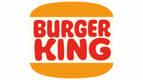
The 1969 logo was a revolutionary departure from the illustrative mascot of the 1950s. Designed to be clean, geometric, and highly memorable, the logo consisted of three primary elements:
- The Bun Halves: Two minimalist, semi-circular shapes colored in a warm, golden yellow, representing the top and bottom of a hamburger bun.
- The Typography: The words “BURGER KING” were stacked in two lines, rendered in a bold, friendly, sans-serif typeface. The letters were colored in a vibrant, rich red.
- The “Sandwich” Composition: The red text was placed directly between the two yellow bun halves, visually creating a literal hamburger out of the brand name itself.
This design was a masterpiece of semantic branding. It was self-explanatory, instantly communicating what the business sold without requiring a single illustrative detail. The use of warm colors—red and yellow—was not accidental. Color psychology indicates that red stimulates appetite and urgency, while yellow evokes feelings of happiness, warmth, and friendliness. Together, they formed the classic fast-food color palette that remains highly effective to this day.
The 1994 Refinement: Polishing the Classic
The 1969 logo served the brand exceptionally well for over two decades. However, by the mid-1990s, graphic design standards had evolved, and the logo began to look slightly dated. In 1994, Burger King introduced a subtle but significant refinement to the classic “Bun Halves” design.
The 1994 update modernized the typography, opting for a custom, more rounded, and heavier sans-serif font that filled the space between the bun halves more completely. The colors were also saturated, making the red deeper and the yellow more vibrant. This update retained 100% of the brand equity of the 1969 design while ensuring the logo looked crisp and professional on the high-definition signage and packaging of the 1990s.
The “Blue Swish” Era: The Trend Toward Modernity (1999–2020)
The “Blue Swish” Era: The Trend Toward Modernity (1999–2020)
The Y2K Aesthetic and the Drive for Dynamism
As the millennium approached, the graphic design world was swept by a wave of high-tech optimism, often referred to as the “Y2K aesthetic.” Brands across all industries were eager to look futuristic, dynamic, and digitally savvy. In 1999, Burger King commissioned the prominent global brand agency Sterling Brands to execute a complete visual overhaul.
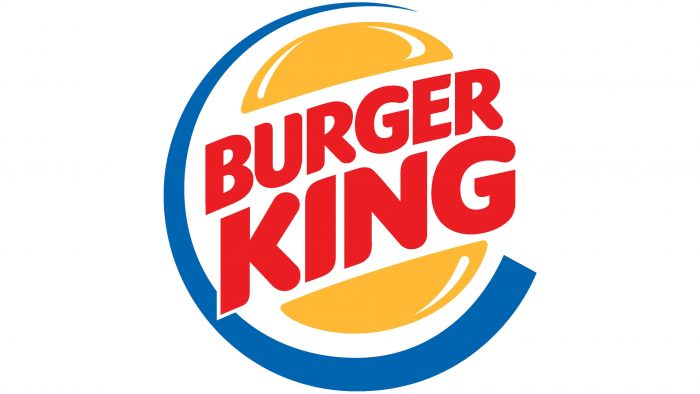
The resulting logo was a dramatic departure from the flat, geometric simplicity of the previous thirty years. It introduced several new design elements intended to project energy, speed, and modernity:
- The Tilted Axis: The entire “Bun Halves” structure was tilted at an angle of approximately 45 degrees, suggesting movement, dynamism, and forward progress.
- The Blue Crescent (Swish): A bright blue, circular swish was wrapped around the left and bottom sides of the hamburger motif. This element was designed to frame the logo, draw the eye inward, and add a sense of cosmic energy.
- Gloss and Highlights: The yellow bun halves were updated with subtle white highlights to give them a three-dimensional, glossy, and metallic appearance.
- Modernized Typography: The red font was made sleeker, with slightly sharper edges and a more stylized layout that fit within the tilted buns.
The Strategic Intent Behind the Blue Swish
The addition of blue to the color palette was a highly calculated move. Blue is traditionally associated with trust, cleanliness, and professionalism. By introducing blue, Burger King sought to balance the high-energy, appetite-stimulating properties of red and yellow with a sense of corporate stability and modern cleanliness. Furthermore, the blue swish helped the logo stand out against the cluttered, warm-toned visual environments of busy highways and commercial strips.
Critiques of the 1999 Logo
While the 1999 logo was highly successful and became the face of the brand during its period of massive global expansion, it eventually drew criticism from design purists as the years went on. The primary critiques included:
- Over-Complexity: The inclusion of highlights, gradients, multiple colors, and a tilted axis made the logo complex to reproduce across different materials, particularly in embroidery, monochrome printing, and small-screen digital displays.
- The “Blue” Paradox: Blue is famously known as an appetite suppressant in color psychology because blue foods rarely occur in nature. Critics argued that wrapping a hamburger in a blue streak was counterintuitive for a food brand.
- Aging Poorly: As the design world shifted away from the skeuomorphism (3D realism) of the early 2000s toward flat, minimalist design, the glossy highlights and dynamic swooshes of the 1999 logo began to look increasingly dated, artificial, and corporate.
The Masterclass of Retro-Modernism: The 2021 Rebrand
The Masterclass of Retro-Modernism: The 2021 Rebrand
The Catalyst for Change: A Digital-First World
By 2020, the consumer landscape had changed dramatically. The rise of mobile ordering apps, third-party delivery services, social media, and digital menu boards meant that a logo had to perform flawlessly at tiny scales—such as a smartphone app icon or a favicon. The 1999 logo, with its complex gradients and blue swish, was poorly suited for this digital-first environment.
Furthermore, consumer preferences had shifted. Modern diners were increasingly skeptical of highly processed, artificial foods. They craved authenticity, real ingredients, and sustainability. A logo that looked like a shiny, metallic badge did not align with a brand promise of “real food, flame-broiled.”
The Collaboration with Jones Knowles Ritchie (JKR)
To address these challenges, Burger King partnered with the renowned creative agency Jones Knowles Ritchie (JKR) to execute the brand’s first complete visual overhaul in over 20 years. Launched in January 2021, the rebrand was met with near-universal acclaim from both the design community and the general public. It remains one of the most successful examples of “retro-modernism” in branding history.
Deconstructing the 2021 Logo
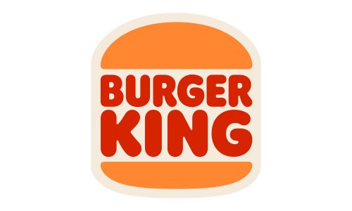
The 2021 rebrand was a bold act of creative subtraction. JKR stripped away the blue swish, the glossy highlights, the 3D gradients, and the tilted axis. In their place, they resurrected the classic 1969/1994 “Bun Halves” concept, refining it for the modern era.
The new logo features:
- Flat, Two-Dimensional Design: By eliminating all gradients and shadows, the logo became highly scalable, instantly recognizable, and easy to render on any digital screen or physical material.
- Warm, Organic Color Palette: The colors were carefully calibrated to reflect real, natural food. The yellow was replaced with a warm, rich orange-yellow (representing toasted buns), the red was deepened to a warm, savory tone, and a rich, warm brown was introduced as a primary brand color.
- The Custom Typeface: “Flame Sans”: To accompany the new visual identity, JKR designed a bespoke, proprietary typeface called “Flame Sans.” Inspired by the shapes of food—plump, round, organic, and delicious—the font features soft, flowing curves that mimic the natural irregularities of flame-broiled ingredients.
The Philosophy of Nostalgia and Authenticity
The 2021 logo succeeded because it tapped into deep-seated consumer nostalgia while remaining resolutely modern. By returning to the “Bun Halves” design, Burger King paid homage to its heritage and its golden era of growth. However, by executing this return with clean vectors, optimized geometry, and a digital-first color palette, they created an identity that feels fresh, progressive, and highly authentic.
The rebrand extended far beyond the logo itself. It influenced packaging, which now featured bold, minimalist illustrations of ingredients and playful typography; employee uniforms, which adopted a warm, retro aesthetic; and restaurant interior design, which incorporated natural wood, warm lighting, and historical brand imagery.
Comparative Analysis: Burger King vs. Competitors
To fully appreciate the strategic brilliance of Burger King’s logo evolution, it is highly valuable to compare its trajectory with those of its primary competitors: McDonald’s, Wendy’s, and Subway.
Burger King vs. McDonald’s
McDonald’s has taken a path of extreme consistency. The “Golden Arches,” first introduced in the early 1960s, have remained virtually unchanged in their core geometry. McDonald’s has modernized its branding not by changing the logo itself, but by simplifying its application—often presenting the arches in isolation, without the brand name. While McDonald’s relies on unwavering consistency, Burger King has been more willing to undergo radical, periodic transformations (such as the 1999 shift to blue and the 2021 return to retro) to reposition itself in the market.
Burger King vs. Wendy’s
Wendy’s has historically relied on a highly detailed, illustrative portrait of its mascot, Wendy. In 2012, Wendy’s modernized its logo by simplifying the illustration, updating the typography to a casual, handwritten style, and removing the rigid frame. Like Burger King’s 2021 rebrand, Wendy’s sought to project a sense of fresh, high-quality, “honest” food. However, Burger King’s logo remains more abstract and geometric than Wendy’s, making it slightly more versatile across minimalist digital interfaces.
Burger King vs. Subway
Subway’s logo history is defined by the consistent use of arrows on the “S” and “Y,” symbolizing entry and exit (speed and convenience). In 2016, Subway executed a major rebrand that simplified its logo, removing the heavy dark outlines and adopting a flat, clean green-and-yellow color scheme. This move closely mirrored the industry-wide trend toward flat design that Burger King would masterfully execute five years later in 2021.
Design Lessons from Burger King’s Brand Journey
The history of the Burger King logo offers invaluable lessons for graphic designers, brand strategists, and business owners alike. By analyzing these shifts, we can extract several core principles of successful brand management:
1. Prioritize Scalability and Digital Utility
A modern logo must perform across an incredibly diverse array of mediums—from massive highway billboards to tiny favicons on mobile web browsers. The failure of the 1999 logo in digital spaces, and the subsequent success of the 2021 flat design, underscores the critical importance of scalability. When designing a logo, always test how it looks at 16×16 pixels and in monochrome formats.
2. Align Visual Aesthetics with Brand Promise
Your logo should visually represent your core product and brand values. The 1999 logo, with its metallic highlights and artificial blue swish, conflicted with the growing consumer demand for fresh, natural, flame-broiled ingredients. The 2021 redesign corrected this mismatch by utilizing warm, organic colors and a plump, food-inspired typeface, aligning the visual identity perfectly with the product offering.
3. Don’t Fear Creative Subtraction
Often, the best way to modernize a brand is not to add new elements, but to strip away the unnecessary noise. The 2021 rebrand succeeded because it had the courage to remove the blue swish and the 3D effects, proving that simplicity often yields the highest levels of brand recognition and emotional resonance.
4. Leverage the Power of Nostalgia
Heritage is a powerful competitive advantage that new startups cannot replicate. By reaching back into its design history and reviving the “Bun Halves” concept, Burger King re-established a sense of trust, familiarity, and authenticity that resonated deeply with consumers who grew up with the brand.
Elevating Your Brand with Professional Logo Designs
The complex journey of Burger King’s visual identity demonstrates that logo design is not a one-time task, but an ongoing strategic process. As consumer preferences shift, technologies evolve, and new marketing channels emerge, your visual identity must adapt to remain relevant and effective.
For businesses looking to build a lasting legacy, partnering with a professional design agency is essential. Professional Logo Designs can help you navigate these complex design decisions, ensuring your brand identity is scalable, memorable, and perfectly aligned with your business values. Whether you are launching a new venture or planning a comprehensive rebrand, investing in expert design services ensures your brand is built on a foundation of strategic clarity and artistic excellence, much like the timeless principles that guided Burger King’s historic 2021 transformation.
Detailed Timeline of Burger King Logo Evolution
To provide a clear, chronological overview of the brand’s visual journey, the following table summarizes the key eras, design characteristics, and strategic goals of each major logo iteration:
| Year Range | Logo Era | Key Design Characteristics | Strategic/Marketing Goal |
|---|---|---|---|
| 1953 – 1954 | Insta-Burger King | Monochromatic, clean sans-serif typography, minimalist layout. | Emphasize speed, industrial efficiency, and the “Insta-Broiler” technology. |
| 1954 – 1957 | The First “King” Mascot | Illustrative character sitting on a hamburger, holding a drink cup. | Humanize the brand, appeal to families and children via television advertising. |
| 1969 – 1994 | The Original Bun Halves | Red stacked text sandwiched between two flat, yellow-ochre bun halves. | Establish a highly recognizable, scalable, and standardized franchise identity. |
| 1994 – 1999 | The Refined Bun Halves | Saturated colors, heavier custom rounded font, tighter spacing. | Modernize the classic layout for high-definition print and outdoor signage. |
| 1999 – 2020 | The Blue Swish Era | Tilted axis, blue crescent frame, 3D glossy highlights on yellow buns. | Project energy, dynamism, cleanliness, and modernity for the digital Y2K era. |
| 2021 – Present | The Retro-Modern Rebrand | Flat 2D design, organic warm colors, bespoke “Flame Sans” typography. | Optimize for digital interfaces, project food authenticity, and leverage nostalgia. |
Frequently Asked Questions
Why did Burger King change its logo in 2021?
Burger King changed its logo in 2021 to optimize its visual identity for digital platforms (such as mobile apps and digital screens) and to better align its brand image with modern consumer values. The new flat, retro-modern design removed complex gradients and the blue swish, replacing them with warm, organic colors that represent real, natural, flame-broiled food.
What does the blue swish in the 1999 Burger King logo represent?
The blue swish in the 1999 logo was introduced to add a sense of movement, speed, and modern dynamism to the brand. Blue is also associated with trust and cleanliness in corporate branding. However, it was eventually removed because it made the logo too complex for digital screens and acted as an appetite suppressant, which is counterintuitive for a food brand.
What font is used in the modern Burger King logo?
The modern Burger King logo features a proprietary, custom-designed typeface called “Flame Sans.” Created by the agency Jones Knowles Ritchie, the font is inspired by the organic, plump, and round shapes of food, reflecting the natural qualities of the brand’s flame-broiled ingredients.
Who designed the 2021 Burger King rebrand?
The highly acclaimed 2021 Burger King rebrand was designed by the global creative agency Jones Knowles Ritchie (JKR). The rebrand was a comprehensive effort that transformed not only the logo but also the packaging, uniforms, digital interfaces, and restaurant interior design.
Why are red and yellow so common in fast-food logos?
Red and yellow are widely used in fast-food branding due to color psychology. Red is known to stimulate the appetite, increase heart rate, and create a sense of urgency (encouraging quick dining). Yellow evokes feelings of warmth, happiness, and friendliness, making the brand feel accessible and welcoming.
Conclusion
The journey of the Burger King logo—from its humble typographic beginnings in Jacksonville to the brilliant retro-modernism of its current identity—is a testament to the power of strategic graphic design. Each iteration of the logo was not merely a reaction to aesthetic trends, but a calculated business decision designed to position the brand effectively within a rapidly evolving marketplace.
By studying the Burger King Logo History: From Vintage to Modern Branding, we see a clear cyclical pattern: a progression from simplicity to complexity, followed by a powerful return to refined simplicity. In today’s digital-first, authenticity-driven market, the 2021 rebrand stands as a gold standard. It proves that by honoring your heritage, embracing flat design principles, and prioritizing scalability, a brand can build a visual identity that is both deeply nostalgic and resolutely future-proof.
For any business seeking to carve out its own space in the market, the lesson is clear: your logo is the gateway to your brand story. Ensuring it is crafted with care, strategic intent, and professional expertise is one of the most critical investments you will ever make.