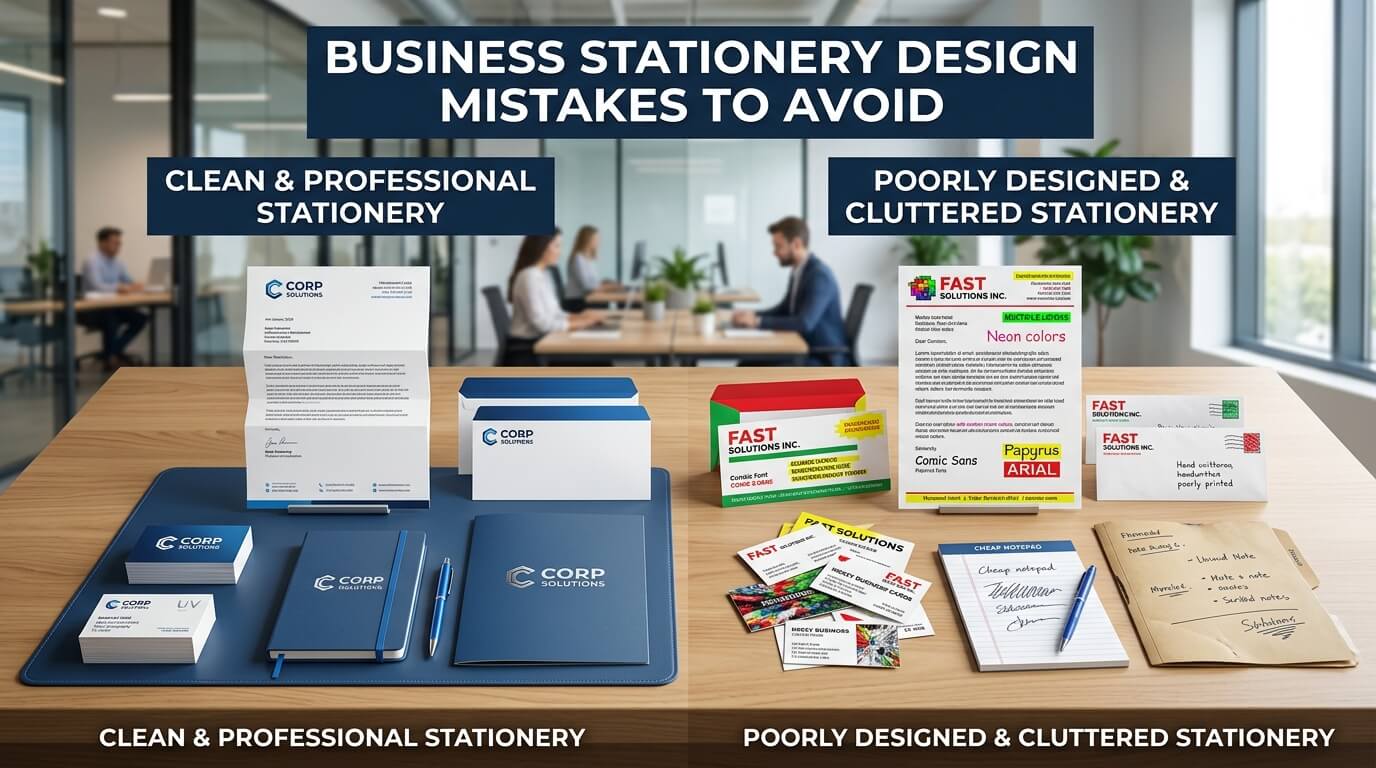
Business stationery may seem like a small part of a company’s branding, but it has a surprisingly large impact on how customers, clients, and partners perceive a business. Every letterhead, business card, envelope, invoice, notepad, presentation folder, and thank-you card represents the company. These materials travel beyond office walls, often becoming the first physical interaction someone has with a brand. A thoughtfully designed stationery set communicates professionalism, attention to detail, and credibility. Poorly designed stationery, however, can send the opposite message.
Many businesses invest significant time and money into building a website, creating social media campaigns, or designing product packaging while overlooking their stationery. As a result, they unintentionally weaken their overall brand identity. A business card with cluttered information, a letterhead that looks outdated, or inconsistent colors across different materials can leave a lasting negative impression.
Designing effective business stationery isn’t just about making something attractive. It requires balancing aesthetics, readability, functionality, consistency, and branding. Small mistakes that seem insignificant during the design process can create confusion, reduce trust, and even affect customer relationships.
This guide explores the most common business stationery design mistakes to avoid while explaining why each one matters. Whether you’re creating stationery for a startup, small business, or established organization, avoiding these pitfalls will help ensure your printed materials reinforce your professional image instead of damaging it.
Why Business Stationery Still Matters in a Digital World
Although digital communication dominates modern business, printed stationery continues to hold considerable value. Contracts are still signed on company letterheads, business cards remain popular at networking events, invoices are often printed, and branded folders continue to accompany proposals and presentations.
Physical materials create a sense of permanence that digital communications often lack. When someone receives a beautifully designed business card or professionally printed thank-you note, they subconsciously associate that quality with the business itself.
Well-designed stationery also strengthens brand recognition. Consistent use of colors, typography, logos, and layouts across every printed piece reinforces familiarity. Customers begin recognizing the business instantly because every communication looks connected.
Poor stationery design disrupts this consistency. Instead of strengthening trust, it creates uncertainty about professionalism and reliability.
The Cost of Poor Business Stationery Design
Design mistakes may appear harmless initially, but they often produce long-term consequences. Customers form impressions within seconds, and printed materials contribute significantly to those judgments.
Poorly designed stationery can make a business appear outdated, disorganized, or inexperienced. Employees may also find confusing layouts difficult to use, while clients may struggle to locate important contact information.
The financial cost extends beyond printing. Reprinting thousands of incorrect business cards or letterheads because of overlooked design errors wastes time, money, and resources. Investing in proper design from the beginning usually proves far more cost-effective.
Common Business Stationery Design Mistakes
| Design Mistake | Potential Impact | Better Approach |
| Inconsistent branding | Weak brand recognition | Maintain identical branding across all stationery |
| Overcrowded layouts | Difficult to read | Use adequate white space |
| Low-resolution logos | Unprofessional appearance | Use vector graphics for printing |
| Poor typography | Reduced readability | Choose clean professional fonts |
| Incorrect print settings | Blurry or faded printing | Design using CMYK and print-safe settings |
| Ignoring paper quality | Cheap brand perception | Select paper that reflects brand value |
| Missing contact details | Lost business opportunities | Double-check all business information |
| Overusing decorative elements | Distracting design | Keep layouts clean and purposeful |
Ignoring Brand Consistency
Every Stationery Item Should Feel Connected
One of the biggest mistakes businesses make is treating each stationery item as an independent project. The business card looks modern, the letterhead feels corporate, the envelopes use different fonts, and presentation folders introduce completely different colors.
This inconsistency weakens brand identity.
Successful businesses ensure every piece of stationery shares the same visual language. Logos remain identical, typography stays consistent, colors match precisely, and spacing follows similar principles.
When every item looks like part of the same family, customers develop stronger recognition and greater confidence in the brand.
Using Too Many Fonts
Typography influences both readability and personality. Unfortunately, many businesses attempt to make their stationery more interesting by mixing numerous font styles.
Combining script fonts, decorative fonts, serif fonts, and modern sans-serif fonts often creates visual chaos instead of sophistication.
Professional stationery generally performs best with two complementary typefaces—one for headings and another for body content. This creates enough variety while maintaining consistency.
Simple typography also improves readability, especially when contact information must be found quickly.
Prioritize Readability Over Decoration
Fonts should support communication rather than compete for attention.
Highly decorative fonts may look artistic, but they become difficult to read at small sizes. Since business stationery often contains addresses, phone numbers, emails, and legal information, clarity should always take priority.
Choosing the Wrong Colors
Color plays a major role in branding, yet many businesses make poor color choices for printed materials. Bright neon colors may appear exciting on a computer screen but often print differently. Similarly, colors with insufficient contrast make text difficult to read.
Businesses should select colors that align with their branding while remaining practical for print production. Dark text against a light background generally offers the highest readability, while brand colors should be used strategically to create emphasis rather than overwhelm the page.
Overcrowding the Layout
A common misconception is that every available space should contain information. This results in stationery packed with logos, icons, addresses, taglines, certifications, social media handles, QR codes, promotional messages, and decorative graphics.
Instead of appearing informative, the design becomes overwhelming.
White space is one of the most valuable design elements. It gives the eye room to rest and allows important information to stand out naturally.
Professional stationery often appears elegant because it isn’t overcrowded.
Less Often Communicates More
Minimalist layouts typically appear more premium than cluttered ones.
Removing unnecessary decorative elements allows the logo, contact details, and key information to receive appropriate attention.
Using Low-Resolution Images
Nothing damages professional appearance faster than blurry logos or pixelated graphics.
Businesses sometimes download logos from websites or social media profiles and use them for printing. Since these images are designed for screens rather than print, they often appear fuzzy when enlarged.
Professional printing requires vector artwork whenever possible. Vector graphics remain perfectly sharp regardless of size, ensuring every printed item looks polished.
Ignoring Print Requirements
Designing for digital viewing differs significantly from designing for print. Many beginners create stationery using RGB color settings, which are intended for screens. Commercial printers typically require CMYK color mode.
Similarly, failing to include bleed margins or safe zones can cause important design elements to be trimmed unexpectedly during production. Understanding print specifications before beginning the design process prevents expensive printing errors.
Poor Logo Placement
A company logo should attract attention naturally without dominating every piece of stationery.
Some businesses enlarge their logo excessively, making it overshadow the actual content. Others place it awkwardly, disrupting balance and alignment.
Effective logo placement depends on the type of stationery. Business cards may emphasize the logo more heavily, while invoices and letterheads should prioritize functionality alongside branding.
Balanced positioning creates a more refined appearance.
Forgetting Contact Information
A surprisingly common mistake is incomplete or outdated contact information. Businesses sometimes redesign stationery while forgetting to update phone numbers, office addresses, websites, or email addresses.
Even small errors can create significant problems if potential customers cannot reach the business. Every stationery design should undergo careful proofreading before printing begins.
Verify Every Detail Before Production
Double-checking information may seem repetitive, but it prevents costly reprints.
Businesses should verify spelling, postal codes, email addresses, website URLs, department names, and employee titles before approving final artwork.
Using Cheap Paper Stock
Design extends beyond visual appearance. The physical paper contributes significantly to customer perception.
Thin, flimsy paper often makes even attractive designs feel inexpensive.
Premium paper stocks add weight, texture, durability, and sophistication. While they cost slightly more, they often improve perceived brand value far beyond the additional expense.
The paper should match the company’s identity. Luxury brands may choose textured finishes, while technology companies may prefer smooth minimalist stock.
Neglecting White Space
Many designers focus exclusively on visible elements while forgetting the importance of empty areas.White space improves readability by separating sections naturally.
Rather than making the page appear unfinished, thoughtful spacing creates elegance and organization. Successful stationery rarely feels crowded because every element has room to breathe.
Overusing Graphics
Decorative patterns, illustrations, gradients, and background images can enhance stationery when used carefully.
However, excessive graphics distract from essential information.
Business stationery primarily serves communication purposes. Customers should immediately identify the sender and locate important details without visual distractions.
Graphics should support branding rather than become the focal point.
Forgetting Practical Functionality
Beautiful stationery still needs to perform practical tasks.
A business card with tiny text may look stylish but becomes useless if recipients cannot read the contact details.
Similarly, heavily decorated letterheads may leave insufficient space for actual correspondence.
Every design decision should balance aesthetics with usability.
Design for Everyday Use
Employees interact with stationery daily.
Invoices require room for billing details.
Letterheads need writing space.
Notepads should remain functional.
Presentation folders should hold documents securely.
Considering practical usage during design leads to better long-term results.
Inconsistent Margins and Alignment
Alignment is one of the simplest yet most overlooked aspects of professional design.
Uneven margins, randomly positioned text, and inconsistent spacing create visual discomfort.
Grid systems help designers maintain consistency throughout every stationery item.
Aligned elements naturally appear more organized and easier to read.
Ignoring Accessibility
Accessibility is increasingly important across all forms of communication, including printed materials. Tiny fonts, poor color contrast, and complicated typography make reading difficult for many people.
Choosing readable font sizes and maintaining strong contrast benefits everyone while creating a more inclusive brand experience. Accessible design also appears cleaner and more professional.
Printing Without Proofreading
Proofreading extends beyond grammar. Businesses should examine layout, spacing, alignment, image quality, color consistency, contact information, and print specifications before approving production.
A single spelling error on thousands of printed business cards can become an expensive lesson. Many printing companies provide digital or physical proofs. Reviewing these carefully reduces costly mistakes.
Ignoring Future Scalability
Businesses grow over time.
New employees join, departments expand, addresses change, and services evolve.
Stationery should be designed with flexibility in mind.
Templates that allow future modifications save both time and redesign costs.
Scalable designs also maintain consistency as the company grows.
Following Trends Too Closely
Design trends change constantly.
Today’s fashionable gradients, oversized typography, or unusual layouts may appear outdated within a few years.
Business stationery typically remains in use much longer than social media graphics.
Timeless design principles generally outperform trend-driven aesthetics for long-term branding.
Classic Design Ages Better
Simple layouts, professional typography, balanced spacing, and restrained color palettes remain effective regardless of changing design trends.
Choosing timeless elements helps businesses avoid frequent redesigns.
Forgetting Digital Integration
Modern stationery increasingly connects physical and digital experiences. QR codes, website addresses, social media handles, and appointment booking links can enhance convenience.
However, these elements should integrate naturally rather than dominate the layout. Well-placed digital touchpoints encourage continued customer engagement while maintaining a clean design.
Using Generic Templates Without Customization
Templates provide excellent starting points, but relying on them without personalization creates generic branding. Businesses should adapt templates to reflect their own identity.
Unique color palettes, photography, typography, messaging, and layout adjustments help distinguish the company from competitors using similar template designs. Customization transforms ordinary stationery into memorable brand assets.
Not Considering Different Printing Methods
Different printing techniques produce different visual results. Digital printing, offset printing, embossing, foil stamping, spot UV coating, and letterpress each influence how the final product appears.
Designers should understand which printing process will be used before finalizing artwork. This knowledge affects color choices, line thickness, texture, and special finishes.
Forgetting Employee Experience
Employees represent the brand every day. Providing well-designed stationery boosts confidence during meetings, networking events, client presentations, and correspondence.
High-quality business cards, folders, and letterheads create a sense of pride while reinforcing professionalism internally as well as externally. Investing in thoughtful stationery therefore benefits both customers and employees.
Building Business Stationery That Lasts
Effective stationery design balances creativity with consistency, beauty with practicality, and branding with usability. Rather than chasing visual complexity, successful businesses focus on clarity, professionalism, and memorable identity.
Every design decision should answer one simple question: Does this strengthen trust in the brand? When businesses avoid common design mistakes, their stationery becomes more than printed paper—it becomes a powerful extension of their reputation.
Conclusion
Business stationery continues to play an important role in creating strong first impressions and reinforcing a company’s identity. While digital communication dominates everyday interactions, professionally designed printed materials still communicate credibility, reliability, and attention to detail. Avoiding common mistakes such as inconsistent branding, overcrowded layouts, poor typography, low-quality printing, and outdated information helps ensure every piece of stationery reflects the professionalism of the business. By combining thoughtful design with practical functionality and maintaining consistency across every printed item, businesses can create stationery that supports long-term brand recognition and leaves a positive impression on every recipient.
Frequently Asked Questions
Q1. Why is business stationery important for branding?
Business stationery creates a consistent professional image that strengthens brand recognition and builds customer trust.
Q2. What fonts work best for business stationery?
Clean, readable fonts with consistent typography usually provide the most professional appearance.
Q3. How often should business stationery be updated?
It should be updated whenever branding, contact information, or company details change, or when the design becomes outdated.
Q4. Does paper quality really matter?
Yes. Premium paper enhances perceived quality and reflects positively on the company’s professionalism.
Q5. What is the biggest business stationery design mistake?
Inconsistent branding across different stationery items is one of the most damaging mistakes because it weakens brand recognition and credibility.