Introduction
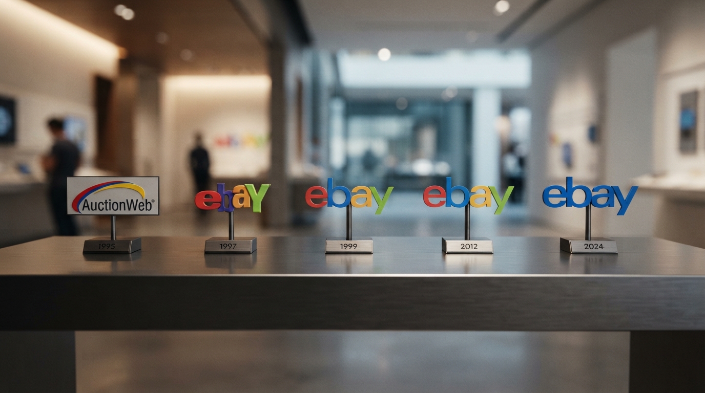
The landscape of global e-commerce has undergone a massive transformation over the last three decades, evolving from experimental online forums into a multi-trillion-dollar industry. At the forefront of this digital revolution sits eBay, a pioneering marketplace that redefined how humanity trades. To understand the visual journey of this retail giant, we must delve deep into the eBay Logo History: Every Logo Since Launch. A logo is not merely an aesthetic ornament; it is a visual contract of trust between a platform and its users. As consumer behaviors shifted from desktop-centric browsing to mobile-first purchasing, eBay’s visual identity adapted accordingly. This comprehensive analysis explores every iteration of the eBay logo, dissecting the design philosophies, color psychology, and strategic rebrandings that helped shape one of the most recognizable corporate identities in the world.
The Birth of AuctionWeb (1995–1997)
The Birth of AuctionWeb (1995–1997)
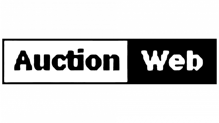
Before eBay became a household name, it was a modest side project created by software developer Pierre Omidyar in September 1995. Originally dubbed “AuctionWeb,” the site was designed to facilitate a peer-to-peer marketplace where anyone could list items for auction. The original visual identity of AuctionWeb was a reflection of the early internet era—functional, unpolished, and highly technical. The logo featured the name “AuctionWeb” in a standard, bold black sans-serif typeface, set against an iconic grey bar graphic that resembled a digital plaque. This design lacked the sophisticated branding strategies we see today, as the primary goal of the logo was simply to declare the site’s utility. During this period, the internet was a novelty, and visual branding was secondary to functional code. However, as the platform rapidly gained traction, Omidyar realized that the brand needed a more professional, scalable identity to attract a mainstream audience.
The Transition to eBay (1997–1999)

The Transition to eBay (1997–1999)
In September 1997, Pierre Omidyar officially renamed the platform to eBay, short for Echo Bay Technology Group. This renaming marked a pivotal moment in the company’s history, transitioning it from a niche hobbyist site into a serious commercial enterprise. The first official eBay logo was incredibly simple, almost acting as a placeholder during a period of rapid organizational restructuring. It consisted of the word “eBay” written in a plain, black, bold sans-serif font. The only distinctive feature was the capitalization of the letter “Y,” which emphasized the “Bay” portion of the name. This logo was a stark contrast to the colorful, playful brand identity that would follow. It was a utilitarian design that served its purpose during a transitional phase, but as the company prepared for its initial public offering (IPO) in 1998, executives knew they needed a visual identity that captured the vibrant, chaotic, and community-driven spirit of their rapidly growing user base.
The Iconic Overlapping Logo (1999–2012)

The Iconic Overlapping Logo (1999–2012)
In 1999, eBay introduced the logo that would define the company during its golden age of global expansion. Designed by Elissa Davis of the CKS Group, this logo became one of the most recognizable symbols of the Web 2.0 era. Davis created a design that was intentionally quirky, vibrant, and unconventional. The logo featured the letters “e,” “b,” “a,” and “y” in a playful, overlapping arrangement, with each letter set at a slightly different baseline. The letter “Y” remained capitalized, standing taller than the other lowercase letters, creating a dynamic visual rhythm. The overlapping design was a brilliant metaphorical representation of the eBay community—diverse people from all walks of life coming together, interacting, and transacting in a shared digital space. The transparency of the overlapping colors symbolized openness and trust, two critical elements for a platform built on peer-to-peer transactions. The color scheme was a brilliant mix of primary and secondary colors: a red “e,” a blue “b,” a yellow “a,” and a green “Y.” This palette conveyed a sense of fun, energy, and endless possibilities, mirroring the excitement of bidding on and winning unique treasures.
The Strategic Power of Professional Logo Designs in E-Commerce
As digital marketplaces matured, the role of visual branding became increasingly critical. A company’s logo is often the first touchpoint for a consumer, serving as a visual shorthand for its core values, reliability, and professionalism. In the highly competitive e-commerce sector, professional Logo Designs are essential for establishing immediate credibility and building long-term brand equity. A well-crafted logo must be versatile enough to maintain its visual integrity across a multitude of mediums, from tiny smartphone app icons to massive corporate billboards. When businesses invest in professional visual identities, they are not just buying a graphic; they are investing in a strategic asset that communicates trust, security, and market authority. eBay’s subsequent redesigns demonstrate a profound understanding of this principle, illustrating how a brand must evolve its visual assets to align with changing market dynamics, technological advancements, and consumer expectations.
The Modern Minimalist Era: The 2012 Redesign

The Modern Minimalist Era: The 2012 Redesign
By 2012, the landscape of the internet had changed dramatically. The playful, chaotic energy of the early Web 2.0 era had given way to a clean, structured, and mobile-centric digital ecosystem. eBay was no longer just an online garage sale for used goods; it had evolved into a massive retail platform where the majority of items sold were brand new, fixed-price products from professional merchants. To reflect this shift from a quirky auction site to a reliable, modern retail giant, eBay partnered with the global brand agency Lippincott to redesign its logo in September 2012. The result was a dramatic shift toward minimalism. The irregular, overlapping letters of the 1999 logo were replaced with a clean, streamlined wordmark set in a modified version of the Univers Extended typeface. The letters were perfectly aligned on a single, stable baseline, and the capitalization of the “Y” was dropped in favor of a clean, lowercase “y.” While the letters no longer overlapped, they still touched slightly, maintaining a subtle nod to the connected community that defines the platform. The iconic color sequence of red, blue, yellow, and green was preserved, ensuring that the brand remained instantly recognizable to its hundreds of millions of users worldwide.
Deconstructing the 2012 Typography and Alignment
The transition from the custom, irregular letters of the 1999 logo to the geometric precision of the 2012 logo was a masterclass in modern corporate rebranding. The choice of a modified Univers Extended typeface was highly strategic. Univers is a classic sans-serif font known for its clarity, neutrality, and exceptional legibility across digital screens of all sizes. By aligning all four letters on a single baseline, the designers at Lippincott brought a sense of order, stability, and professionalism to the brand. This structural alignment was crucial for building trust with modern consumers who demand seamless, secure, and highly efficient online shopping experiences. The subtle touching of the characters serves as a design bridge between the old and the new, ensuring that the logo did not lose its human touch amidst the push for corporate modernization.
The Power of Color Psychology in eBay’s Branding
Throughout the eBay Logo History: Every Logo Since Launch, the color palette has remained the most consistent and powerful element of the brand’s visual identity. The combination of red, blue, yellow, and green is not accidental; it is rooted in deep psychological principles. Red stimulates excitement, energy, and urgency, perfectly capturing the thrill of a last-second auction bid. Blue represents trust, security, and reliability, reassuring users that their financial transactions are safe. Yellow injects a sense of optimism, warmth, and friendliness, making the platform feel accessible and welcoming. Green symbolizes growth, prosperity, and the endless variety of products available on the marketplace. By maintaining this exact color sequence across different redesigns, eBay successfully preserved its massive brand equity while modernizing its overall aesthetic.
Comparing eBay’s Evolution with Other Tech Giants
To fully appreciate eBay’s visual journey, it is helpful to compare its logo evolution with other major technology and e-commerce giants. Companies like Google, Microsoft, and Apple have all undergone similar transitions from complex, colorful, or quirky designs to ultra-sleek, flat, and minimalist aesthetics. Google, for example, shares a very similar color palette with eBay, but its logo evolution has focused on refining its custom geometric sans-serif typeface while maintaining its vibrant colors. Microsoft transitioned from its stylized, italicized wordmarks to a clean, flat Segoe font accompanied by a multi-colored symbol. This industry-wide trend toward “flat design” and minimalism is driven by practical necessity: modern logos must be highly scalable and legible on everything from high-resolution desktop monitors to the smallest smartwatch screens. eBay’s 2012 redesign positioned the company perfectly within this modern design paradigm, ensuring its brand identity remains functional and impactful in a mobile-first world.
Frequently Asked Questions
Who designed the original eBay logo?
The iconic overlapping, colorful eBay logo introduced in 1999 was designed by Elissa Davis of the CKS Group. The modern, minimalist logo introduced in 2012 was designed by the global branding agency Lippincott.
Why did eBay change its logo in 2012?
eBay redesigned its logo in 2012 to reflect its evolution from a quirky, peer-to-peer auction site into a modern, professional, and reliable global e-commerce platform where the majority of transactions are for brand-new, fixed-price items.
What do the colors of the eBay logo represent?
The colors represent the diverse and vibrant nature of the eBay community. Red symbolizes excitement and energy; blue represents trust and security; yellow represents optimism and accessibility; and green represents growth and endless variety.
Why are the letters in the modern eBay logo touching but not overlapping?
The touching letters in the 2012 logo serve as a design bridge to the past. While the overlapping was removed to create a cleaner, more professional look, the subtle touching of the letters preserves the concept of a connected, collaborative global community.
Is the modern eBay logo easier to display on mobile devices?
Yes, the 2012 minimalist redesign was specifically optimized for the mobile-first era. The clean, geometric sans-serif typeface and aligned baseline ensure maximum legibility and visual consistency across all digital screens and mobile applications.
Conclusion
The journey of the eBay logo is a testament to the power of strategic visual branding in the digital age. From the simplistic, utility-first design of AuctionWeb to the playful, chaotic energy of the 1999 overlapping wordmark, and finally to the sleek, corporate precision of the 2012 minimalist logo, eBay has consistently adapted its visual identity to mirror its corporate evolution and the changing expectations of global consumers. By maintaining its iconic color palette while refining its typography and alignment, eBay successfully balanced heritage with modernization. This evolution serves as an invaluable blueprint for businesses looking to navigate the complex world of brand design, demonstrating that a great logo must not only capture the spirit of its time but also pave the way for future growth.