Introduction
In the highly competitive world of global aviation, a brand’s visual identity acts as its ambassador in the skies and across international airports. A logo is not merely a corporate mark; it is a visual shorthand for the airline’s values, safety standards, hospitality, and national heritage. Among the world’s elite carriers, Emirates stands as a towering example of how strategic brand positioning can transform a regional startup into a global symbol of luxury travel. The airline’s visual identity has played an indispensable role in this meteoric rise. This comprehensive analysis explores the Emirates Logo History: Evolution of a Global Airline Brand, tracing its design journey from its inception in 1985 to its status today as an iconic emblem of luxury, prestige, and cultural pride.
Since its first flight from Dubai to Karachi in October 1985, Emirates has utilized its branding to bridge the gap between traditional Middle Eastern hospitality and cutting-edge global modernity. While many airlines frequently overhaul their visual identities to keep up with changing design trends, Emirates has maintained a remarkably consistent visual core. By examining the subtle refinements made to its typography, color palette, and aircraft livery over the decades, we gain deep insights into how the airline has navigated the delicate balance between preserving heritage and projecting a modern, forward-looking global image.
The Genesis of an Aviation Giant (1985)
To understand the origin of the Emirates logo, one must look back to the geopolitical and economic landscape of Dubai in the mid-1980s. Prior to the establishment of Emirates, the primary carrier in the Gulf region was Gulf Air, which was jointly owned by Bahrain, Qatar, Abu Dhabi, and Oman. When Gulf Air began reducing its services to Dubai, the royal family of Dubai, led by Sheikh Mohammed bin Rashid Al Maktoum, made the strategic decision to establish an independent airline. With a seed capital of $10 million and two leased aircraft from Pakistan International Airlines, Emirates was born.
Such an ambitious venture required a brand identity that could command respect on the international stage while proudly declaring its roots. The airline commissioned Negus & Negus, a highly respected British design agency, to create the brand’s visual identity. The brief was clear: the design had to represent the pride, ambition, and cultural heritage of the United Arab Emirates, while remaining sophisticated enough to appeal to international travelers who might be unfamiliar with the Middle East.
The creative team at Negus & Negus recognized that the Arabic script itself holds a sacred and highly aesthetic place in Middle Eastern culture. They decided that the brand’s name should be presented in both classical Arabic calligraphy and clean, legible English typography. This dual-language approach became the cornerstone of the brand’s visual identity, symbolizing a bridge between the East and the West.
The Original Emirates Logo (1985 – 1999)
The Original Emirates Logo (1985 – 1999)
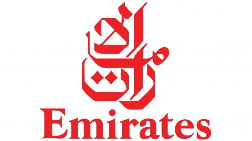
The original logo introduced in 1985 set the standard for luxury aviation branding. It featured a complex yet elegant composition divided into two distinct linguistic elements, unified by a striking color palette of red, white, and gold, alongside the national colors of the UAE flag featured on the aircraft tailfin.
The Arabic Calligraphy
At the top of the logo sat the Arabic calligraphy, which translates directly to “Al-Imarat” (The Emirates). Written in a highly stylized, flowing script reminiscent of traditional Thuluth calligraphy, the letters were crafted to evoke a sense of movement, grace, and wind. The calligraphic element was not just a linguistic translation; it was a piece of art that conveyed the rich historical and artistic legacy of the Arab world. By placing the Arabic script prominently, the airline asserted its identity as a proud representative of the United Arab Emirates.
The English Typography
Directly beneath the Arabic calligraphy was the word “Emirates” written in a custom, elegant serif typeface. The choice of a serif font was highly deliberate. In the mid-1980s, serif typography was synonymous with prestige, tradition, and high-end luxury, reminiscent of heritage fashion houses and luxury hotels. The letters were spaced generously, creating an air of sophistication, stability, and premium service. This contrast between the fluid, organic curves of the Arabic script and the structured, geometric elegance of the English serif typeface created a balanced and globally appealing visual dynamic.
The Color Psychology of the Original Brand
The color palette chosen for the original branding was deeply rooted in regional pride and psychological signaling:
- Red: Symbolizing passion, energy, leadership, and the courage of a young nation entering the global aviation arena. Red also served as a highly visible, attention-grabbing color on the tarmac.
- White: Representing purity, peace, and clean modernism.
- Gold: Used in promotional materials and premium cabins to represent luxury, wealth, and the warm hospitality of the Arabian desert sands.
The 1999 Redesign: A Subtle Shift to Modernity
The 1999 Redesign: A Subtle Shift to Modernity
By the late 1990s, Emirates had transformed from a regional carrier into a major player on the international aviation stage, expanding its route network to Europe, Asia, and Africa. To reflect this mature status, the airline underwent a brand refresh in 1999. Rather than executing a radical redesign that could alienate its loyal customer base, Emirates opted for an evolutionary refinement of its iconic logo.
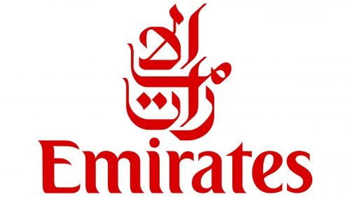
The 1999 redesign, which remains the core of the airline’s identity today, focused on streamlining the elements for better legibility and digital adaptability. The primary updates included:
- Refining the Arabic Calligraphy: The lines of the Arabic script were cleaned up and made slightly bolder. This adjustment ensured that the calligraphy remained legible even when scaled down to smaller sizes, such as on mobile screens, boarding passes, and corporate stationery.
- Modifying the English Font: The serif typeface for “Emirates” was subtly modernized. The serifs were sharpened, and the letterforms were given a more balanced weight, enhancing readability from a distance and giving the brand a sleeker, more contemporary feel.
- Simplifying the Color Contrast: The relationship between the red background blocks and the white lettering was optimized to ensure maximum contrast and visual impact across all marketing channels.
This careful evolution demonstrated the airline’s commitment to its heritage while acknowledging the practical demands of a rapidly digitizing global market. It proved that a well-designed logo does not need to be abandoned, but rather polished to maintain its relevance over decades.
Decoding the Core Design Elements
The enduring success of the Emirates logo lies in its meticulous design theory. Every curve, color choice, and typographic detail is engineered to project a specific brand message. Let us dissect these core elements in detail.
The Art of Arabic Calligraphy in Corporate Identity
In Western corporate design, logos are often geometric and abstract. In contrast, the Emirates logo embraces the organic, fluid nature of Arabic calligraphy. This script is inherently dynamic, mimicking the natural flow of wind and water. For an airline, this association with fluid movement and flight is incredibly powerful. The calligraphy acts as a visual metaphor for a magic carpet or a bird in flight, seamlessly connecting the ancient art of writing with the modern marvel of aviation.
The Power of the Red and White Palette
The bold red background of the Emirates logo serves a dual purpose. In the busy environment of an airport, where hundreds of brands vie for a traveler’s attention, the vibrant red of the Emirates logo stands out instantly. Psychologically, red stimulates excitement, passion, and a sense of urgency, while the crisp white lettering provides a stark, clean contrast that denotes safety, cleanliness, and premium organization. This color combination has become so synonymous with the airline that the specific shade of “Emirates Red” is now a valuable intellectual property asset.
The Custom Serif Typography
While many modern brands have migrated toward minimalist, sans-serif fonts (such as Helvetica or Futura) to appear “tech-forward,” Emirates has steadfastly maintained its serif typography. This decision keeps the brand anchored in the realm of timeless luxury. Sans-serif fonts can sometimes feel cold, industrial, or temporary. The serif typeface of Emirates, with its elegant brackets and varying stroke weights, communicates heritage, craftsmanship, and a commitment to personalized, high-touch customer service.
The Aircraft Livery: A Flying Canvas
A logo does not exist in a vacuum; for an airline, its primary canvas is the fuselage of its aircraft. The application of the Emirates logo and visual branding onto its fleet of Airbus A380s and Boeing 777s is a masterclass in large-scale corporate livery design.
The Iconic Tailfin Flag
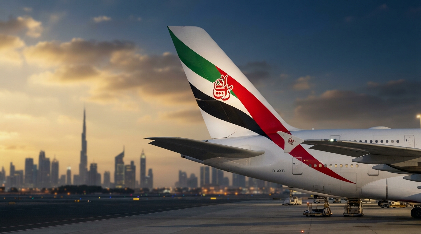
Perhaps the most recognizable aspect of the Emirates aircraft is the flowing United Arab Emirates flag painted on the tailfin. Introduced in 1985, this design uses the red, green, white, and black colors of the national flag, arranged in a dynamic, waving pattern. It gives the illusion that the flag is fluttering in the wind as the aircraft cruises at 35,000 feet. This design element acts as a powerful statement of national pride and sovereignty, transforming every Emirates aircraft into a flying embassy for the UAE.
The Fuselage Branding
On the body of the aircraft, the word “Emirates” is painted in massive, bold gold or red letters across the fuselage. In the original 1985 livery, the name was accompanied by the Arabic calligraphy. In the 1999 update, the English name was enlarged significantly, stretching across a major portion of the cabin windows to ensure instant brand recognition from the ground or from airport terminal gates. Underneath the aircraft, the brand’s name is painted in giant red letters, visible to people on the ground as the plane flies overhead—a brilliant touch of ambient marketing.
The 2023 Livery Refresh
In March 2023, Emirates unveiled a subtle yet impactful refresh of its signature livery. This update, only the third in the airline’s history, introduced several key changes:
- 3D Tailfin Flag: The UAE flag on the tailfin was given a dynamic, 3D effect with curved flowing lines, making it appear more lifelike and modern.
- Larger Lettering: The English “Emirates” lettering on the fuselage was increased in size by 32.5%, creating a bolder and more confident stance.
- Removal of the Website URL: The “emirates.com” branding was removed from the engines, cleaning up the overall aesthetic and focusing purely on the core brand name.
- Red Wingtips: The interior of the wingtips was painted red, featuring the Arabic calligraphy in white, providing an elegant surprise for passengers looking out of the cabin windows.
The Role of Professional Logo Designs in Global Branding
The evolution of the Emirates brand highlights a crucial lesson for businesses worldwide: the immense value of professional, strategically planned corporate identities. Designing a logo for an international audience requires a profound understanding of cultural semiotics, color psychology, and scalability across diverse media. Whether a business is a local startup or a multinational conglomerate, investing in professional Logo Designs ensures that the brand’s visual identity is built on a foundation of longevity, adaptability, and clear communication.
As demonstrated by Emirates, a great logo does not merely follow fleeting design trends. Instead, it captures the core essence of the brand and refines it over time to meet the demands of new technologies and markets. Professional design agencies possess the expertise to balance these complex variables, creating visual identities that can withstand the test of time and become iconic symbols of industry leadership.
Cultural Significance and Global Appeal
One of the most remarkable achievements of the Emirates logo is its ability to be deeply nationalistic yet universally appealing. Often, brands that heavily feature national symbols or localized scripts struggle to gain traction in foreign markets, as they can be perceived as insular. Emirates bypassed this challenge through flawless design execution.
By pairing the exotic, artistic beauty of Arabic calligraphy with the familiar, high-status elegance of Western serif typography, Emirates created a harmonious visual dialogue. The logo does not hide its Middle Eastern origins; rather, it celebrates them as a premium attribute. In the global travel industry, the Middle East is historically associated with the Silk Road, trade, spice routes, and legendary hospitality. The Emirates logo leverages these positive cultural associations, presenting Dubai not as a remote desert outpost, but as the modern crossroads of the world.
Frequently Asked Questions
What does the Arabic writing in the Emirates logo mean?
The Arabic calligraphy at the top of the Emirates logo reads “Al-Imarat” (الامارات), which translates directly to “The Emirates” in English. It is written in an elegant, customized calligraphic script that represents the heritage and artistic traditions of the United Arab Emirates.
Who designed the original Emirates logo?
The original Emirates logo and brand identity were designed in 1985 by the renowned British design agency Negus & Negus. The agency was tasked with creating a brand that projected both UAE national pride and international luxury appeal.
Why does the Emirates logo use red and gold?
The color red was chosen for its high visibility, energy, passion, and leadership qualities, while white represents purity and safety. Gold is used across the airline’s premium branding, lounges, and cabin interiors to symbolize luxury, prestige, and the warm sands of the Arabian desert.
How often has Emirates changed its logo?
Emirates has only updated its core logo once, in 1999. The update was an evolutionary refinement rather than a complete redesign, sharpening the serif font and cleaning up the Arabic calligraphy for better modern legibility. A subtle livery refresh was also introduced in 2023, modernizing how the logo and flag are applied to the aircraft.
What makes the Emirates tailfin design unique?
The tailfin of Emirates aircraft features a stylized, waving representation of the United Arab Emirates flag (red, green, white, and black). The dynamic, flowing design is engineered to look as though the flag is fluttering in the wind during flight, serving as a highly visible symbol of national pride worldwide.
Conclusion
The history of the Emirates logo is a testament to the power of consistent, culturally rich, and highly strategic branding. From its inception in 1985, the visual identity of Emirates was designed to be much more than a corporate trademark; it was crafted as a symbol of national ambition, luxury, and global connectivity. By maintaining a steadfast commitment to its core design elements—the artistic Arabic calligraphy, the timeless serif typography, and the vibrant red palette—Emirates has built one of the most recognizable and trusted brands in the aviation industry.
In an era where many corporations rush to adopt minimalist, homogenized designs, Emirates’ dedication to its unique cultural heritage serves as an inspiring blueprint for brand longevity. The subtle evolutions of its logo and aircraft livery over the years demonstrate that true brand power lies not in constant reinvention, but in the deliberate, elegant refinement of an already exceptional identity. As Emirates continues to expand its global footprint and pioneer new standards of air travel, its iconic logo remains a shining beacon of quality, welcoming travelers from all corners of the globe to experience the very best the skies have to offer.