Introduction
The global video game industry has evolved from a niche, technophilic pastime into a multi-billion-dollar cultural juggernaut that surpasses both the film and music industries combined. At the absolute vanguard of this transformation is Epic Games. Known today as the creator of Fortnite, the architect of the industry-standard Unreal Engine, and the operator of a major digital storefront, Epic Games has spent over three decades redefining interactive entertainment. However, a company’s visual identity must evolve alongside its technology and market reach. The Epic Games Logo History: The Evolution of a Gaming Giant is not merely a chronicle of changing graphic design trends; it is a visual representation of a company shifting from a one-man shareware operation in a Maryland basement to an international entertainment powerhouse.
In the contemporary digital landscape, where Generative Engine Optimization (GEO) and Answer Engine Optimization (AEO) dictate how consumers discover brands, understanding the semiotics of iconic logos is more critical than ever. A logo must communicate trust, technical prowess, and cultural relevance instantaneously. By analyzing the Epic Games logo history, we gain profound insights into how strategic visual branding aligns with corporate pivots, technological breakthroughs, and shifting consumer demographics. This deep-dive analysis explores every major era of Epic’s visual brand, dissecting the design choices, typography, color psychology, and market forces that shaped one of the most recognizable logos in interactive media.
The Genesis: Potomac Computer Systems (1991)

The Genesis: Potomac Computer Systems (1991)
Before there was an “Epic” brand, there was a young computer science student named Tim Sweeney operating out of his parents’ home in Potomac, Maryland. In 1991, Sweeney founded Potomac Computer Systems to release his first commercial game, a text-based action-adventure puzzle game called ZZT. At this foundational stage, branding was purely utilitarian. The company did not possess a stylized emblem or a complex visual identity system.
The original “logo” was simply the company name rendered in a basic, clean, sans-serif typeface. It was designed to fit within the technical limitations of early MS-DOS screens and simple printed manuals. There were no graphic design teams, no brand strategy sessions, and no considerations for cross-platform scalability. The primary goal was to establish legal and operational legitimacy. However, the success of ZZT quickly made it apparent that the business had potential far beyond a localized consulting or shareware venture. Sweeney realized that to compete with rising industry stars like id Software and Apogee Software, he needed a name and a visual identity that sounded grander, more ambitious, and infinitely more professional.
The Shareware Revolution: Epic MegaGames (1992–1999)
In 1992, Tim Sweeney rebranded the company as Epic MegaGames. The name was a deliberate, tongue-in-cheek exaggeration designed to make the small startup sound like a massive, established conglomerate. Along with this ambitious new moniker came the company’s first true wave of stylized logo designs, reflecting the vibrant, pixelated, and energetic aesthetic of the 1990s shareware scene.
The 1992 Gradient Wordmark
The first official Epic MegaGames logo featured a bold, stylized wordmark that captured the kinetic energy of early 90s PC gaming. The word “EPIC” was rendered in a heavy, italicized, sans-serif font with a dramatic yellow-to-orange gradient fill. This color choice was highly strategic; yellow and orange evoke feelings of excitement, energy, and optimism—emotions directly tied to the thrill of interactive entertainment. Underneath, the word “MEGAGAMES” was written in a simpler, high-contrast black typeface, often accompanied by a thin horizontal dividing line. This logo was designed to pop on low-resolution CRT monitors and stand out in the crowded pages of shareware catalogs.
The 1995 Dimensional Shift
As PC graphics capabilities advanced from simple 2D sprites to early 3D rendering, Epic’s visual identity shifted accordingly. Around 1995, the logo underwent a transformation to project a more modern, high-tech image. The flat gradient was replaced with a three-dimensional, extruded design. The letters of “EPIC” were given depth, casting shadows that suggested physical presence and weight. The color palette transitioned to cool blues, purples, and metallic greys, mirroring the industry’s fascination with cyberspace, virtual reality, and futuristic technology. This logo accompanied classic titles like Jazz Jackrabbit and Jill of the Jungle, cementing Epic’s reputation as a premier provider of high-quality, visually impressive PC games.
The 1997 Custom Typeface and the Circle Motif
By 1997, Epic MegaGames was preparing for its biggest technological leap yet: the development of the Unreal Engine and the sci-fi first-person shooter Unreal. To signal this transition from quirky shareware developer to cutting-edge technology pioneer, the company introduced a highly stylized, custom-designed logo. This iteration featured a customized, sharp-angled typeface for the word “EPIC,” where the letters were interconnected and featured aggressive, blade-like serifs. The word “MEGAGAMES” was enclosed within a solid black capsule or pill shape beneath the main text. This logo was often placed inside a circular emblem with metallic textures, reflecting the industrial, gritty, and sci-fi themes of the late 90s gaming landscape. It was a visual declaration that the company was no longer just making whimsical platformers; they were building the future of 3D gaming.
The Dawn of the Modern Era: Epic Games (1999–2014)
The Dawn of the Modern Era: Epic Games (1999–2014)
The year 1999 was a watershed moment for the company. With the massive success of Unreal and the upcoming release of Unreal Tournament, the studio consolidated its operations and relocated to Cary, North Carolina. Tim Sweeney and partner Mark Rein decided to simplify the company’s name, dropping the “Mega” to officially become Epic Games. This structural change necessitated a complete visual overhaul, resulting in one of the most iconic and long-lasting logos in gaming history.
The Industrial Gear and Shield (2001–2014)
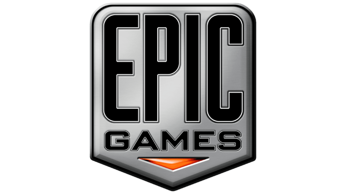
Introduced in 2001, the “Gear and Shield” logo became synonymous with the golden age of Xbox 360 gaming, the rise of the Gears of War franchise, and the widespread licensing of Unreal Engine 3. This logo was a masterpiece of early 2000s skeuomorphic design, characterized by realistic textures, metallic gradients, 3D depth, and industrial imagery.
The logo consisted of several key visual components:
- The Outer Shield: A classic heraldic shield shape that communicated protection, prestige, heritage, and strength. It framed the inner elements, giving the logo a unified, authoritative structure.
- The Industrial Gear: Inside the shield sat a heavy, multi-toothed gear. This was a direct nod to the mechanical, technological, and engine-driven nature of the company’s business. It symbolized the Unreal Engine—the literal machinery powering hundreds of games across the industry.
- The Custom Typography: The word “epic” was rendered in a custom, lowercase, high-contrast typeface. The letters featured sharp, stylized cuts, particularly on the “e” and the “p,” giving the text a futuristic, aggressive edge. The word “GAMES” was placed in a clean, uppercase sans-serif font directly below.
- Skeuomorphic Texturing: The entire emblem was rendered to look as if it were forged from brushed steel or iron. It featured realistic highlights, drop shadows, and metallic reflections, perfectly matching the gritty, militaristic, and industrial aesthetic of early-to-mid 2000s action games.
This logo was highly versatile, appearing in various color schemes depending on the context. In the loading screens of Gears of War, it would often appear crimson red or distressed with blood and rust. In professional corporate presentations for the Unreal Engine, it appeared in sleek, polished silver or monochrome black and white. For over a decade, this emblem stood as a gold standard of quality, technical excellence, and premium interactive experiences.
The Minimalist Revolution: Flat Design and Global Dominance (2014–Present)
By 2014, the technological and cultural landscape had shifted dramatically. The rise of smartphones, high-definition mobile screens, responsive web design, and digital storefronts made complex, highly detailed 3D logos obsolete. Skeuomorphism gave way to minimalism and flat design. Brands needed logos that could scale seamlessly from a massive outdoor billboard to a tiny app icon on a mobile screen. At the same time, Epic Games was undergoing a massive internal pivot, transitioning from a traditional console game developer to a service-based, multi-platform ecosystem provider.
The Current Minimalist Shield
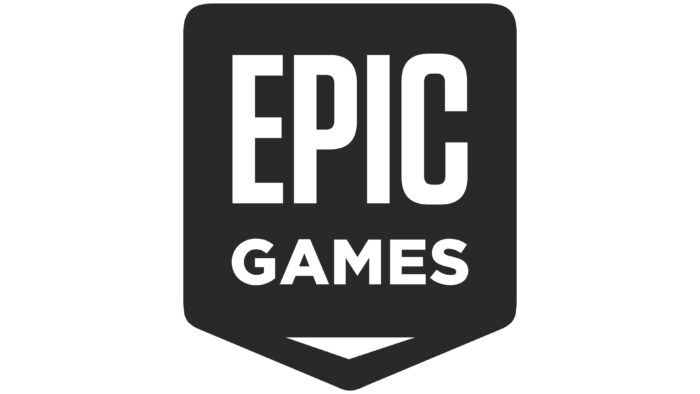
In 2014, Epic Games unveiled its current, highly streamlined visual identity. The company stripped away the industrial gear, the metallic textures, the 3D gradients, and the complex shadows. What remained was a pure, flat, high-contrast vector design that perfectly aligned with contemporary digital branding standards.
This modern logo features a simplified shield outline. Inside the shield, the word “EPIC” is written in a bold, customized, uppercase sans-serif typeface. The letters are clean, balanced, and optimized for maximum legibility at any scale. The word “GAMES” is completely omitted from the primary emblem, reflecting a broader branding trend where globally recognized giants (like Nike, Apple, or Starbucks) simplify their wordmarks as their cultural ubiquity grows. The primary color palette was restricted to solid black and pure white, offering the ultimate in design versatility.
This minimalist iteration proved to be incredibly prescient. When Fortnite launched in 2017 and exploded into a global cultural phenomenon, the clean, black-and-white shield logo was perfectly suited to accompany it. It looked just as natural on a mobile phone screen as it did on a PlayStation 5 startup sequence, a retail toy package, a competitive esports broadcast, or the digital interface of the Epic Games Store. The current logo represents a company that is no longer just about the “machinery” of game engines, but about providing a safe, expansive, and premium digital ecosystem for creators and players alike.
How Epic’s Journey Inspires Modern Logo Designs
When examining the trajectory of Epic Games, it becomes clear that successful branding requires a balance between historical heritage and forward-looking adaptability. For businesses looking to establish a similarly powerful visual identity, collaborating with professional agencies like Logo Designs is essential to translate complex brand values into clean, scalable, and impactful visual assets. Whether a startup is looking to launch its first product or an established enterprise is seeking a comprehensive rebranding strategy, understanding the core principles of design evolution—as demonstrated by Epic Games—is the key to longevity.
Epic’s transition from a highly complex, skeuomorphic gear-and-shield logo to a flat, minimalist emblem highlights a universal truth in modern graphic design: simplicity is the ultimate sophistication. A great logo must be memorable, versatile, and enduring. It must perform flawlessly across diverse mediums, from high-resolution digital displays to physical merchandise, embroidery, and print. By studying how industry giants navigate these transitions, design professionals can better craft visual identities that not only capture the current cultural zeitgeist but are also built to withstand the test of time.
Anatomy of the Epic Games Logo: Design Elements Analyzed
To truly understand the success of the Epic Games visual identity, we must break down its core design components and analyze them through the lenses of color psychology, shape theory, and typography.
1. Shape Psychology: The Power of the Shield
Throughout its history, Epic has consistently returned to the shield shape. In visual psychology, the shield is a powerful archetype. It communicates:
- Protection and Security: Crucial for a company that now hosts millions of user accounts, processes digital transactions, and provides a secure publishing platform for developers.
- Heritage and Authority: The shield evokes classical heraldry, suggesting a brand with deep roots, stability, and industry-leading authority.
- Community: A shield represents a collective front, aligning with Epic’s goal of building a unified ecosystem for gamers and creators.
2. Typography: From Playful to Authoritative
The typography of the Epic Games logo has mirrored the company’s maturity:
- The Shareware Era (Italicized & Friendly): The early yellow-to-orange fonts were italicized, slanting forward to represent speed, progress, and playful energy.
- The Gear Era (Custom & Industrial): The lowercase “epic” with sharp, angular cuts communicated technical precision, cutting-edge software development, and a slightly rebellious, hardcore gaming attitude.
- The Modern Era (Clean & Geometric): The current uppercase, geometric sans-serif typeface communicates stability, global reach, professionalism, and accessibility. It is a font designed to be read clearly by a seven-year-old playing Fortnite or an investor reading an annual financial report.
3. Color Palette: The Versatility of Monochrome
While the early 90s logos utilized bright, high-contrast primary and secondary colors to capture attention in print media, the modern Epic Games brand relies almost exclusively on a monochrome palette of black and white. This choice offers several distinct advantages:
- Neutrality: A black-and-white logo does not clash with the vibrant, colorful artwork of the games it represents (e.g., the bright, neon aesthetics of Fortnite).
- Premium Positioning: In luxury and high-tech branding, monochrome signifies sophistication, premium quality, and timelessness.
- Adaptability: A solid black or white vector logo can be easily overlaid onto any background, video stream, or physical product without losing its visual integrity.
Comparative Analysis of Epic Games Logo Eras
To provide a clear, structured overview of this brand’s physical and conceptual evolution, the table below outlines the key characteristics of each major design era.
This visual and conceptual evolution demonstrates how Epic Games has continually aligned its public-facing identity with its broader corporate goals, transitioning from a software provider to an industry-defining platform.
Frequently Asked Questions
Why did Epic Games change its name from Epic MegaGames?
In 1999, Epic simplified its name to “Epic Games” to coincide with its relocation to North Carolina and the massive success of the Unreal Engine. The original name, Epic MegaGames, was a humorous exaggeration from its shareware days when it was a small startup. Dropping “Mega” reflected a more mature, professional, and serious corporate identity as they became a major player in the global gaming market.
What does the shield represent in the Epic Games logo?
The shield is a symbol of strength, security, authority, and heritage. It frames the brand name, providing a sense of stability and institutional trust. For Epic, it also symbolizes their ecosystem as a safe, protective space for both players and developers, particularly through their secure digital storefront and publishing tools.
Why did Epic Games remove the industrial gear from its logo in 2014?
The gear was removed as part of a transition from skeuomorphic (realistic, textured) design to flat, minimalist design. The highly detailed gear was difficult to scale down clearly on mobile screens, app icons, and digital interfaces. Removing it created a cleaner, more versatile, and modern vector logo that performs perfectly across all digital and physical mediums.
Who designed the original Epic Games logos?
The early Epic MegaGames logos were designed by internal artists and collaborators within the shareware community, often utilizing early digital design software. As the company grew, they partnered with professional branding agencies and graphic designers to refine the “Gear and Shield” logo in 2001 and eventually craft the ultra-minimalist shield logo used today.
Is the Unreal Engine logo related to the Epic Games logo?
Yes, they are closely related but maintain distinct visual identities. While the Epic Games logo uses a shield, the Unreal Engine logo prominently features a stylized, circular “U” symbol enclosed in a metallic ring. Both logos share a history of metallic, high-tech aesthetics, but the Unreal Engine logo remains focused on representing the technical software, whereas the Epic Games logo represents the parent corporate entity.
Conclusion
The Epic Games Logo History: The Evolution of a Gaming Giant is a masterclass in strategic brand management. From the humble, text-only beginnings of Potomac Computer Systems to the vibrant, energetic gradients of Epic MegaGames, and finally to the metallic grit of the gear-and-shield era and the sleek minimalism of today, Epic has always understood that a logo must reflect the current state of its business and the broader cultural landscape. By stripping away complexity in favor of timeless, scalable, and high-contrast design, Epic Games has created an emblem that is instantly recognizable across the globe. As the company continues to push the boundaries of virtual reality, digital commerce, and interactive entertainment, its minimalist shield will remain an enduring symbol of quality, innovation, and technological leadership in the digital age.