Introduction
The global aviation industry is one of the most highly competitive and visually saturated markets in the world. For international airlines, a visual identity is not merely a corporate mark; it is a diplomat, a cultural ambassador, and a promise of safety, luxury, and hospitality. In the realm of premium aviation, the “Big Three” Gulf carriers—Etihad Airways, Emirates, and Qatar Airways—have spent the last two decades redefining global travel standards. Among them, Etihad Airways, the national carrier of the United Arab Emirates (UAE), stands out for its meteoric rise and its highly sophisticated approach to brand management.
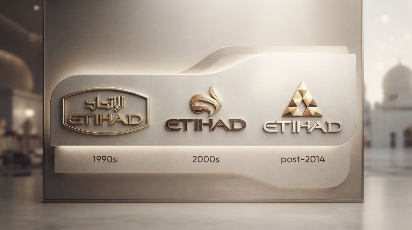
To fully comprehend the airline’s ascent, one must study the Etihad Airways Logo History: Design Evolution Explained. From its inception in 2003 to its radical, award-winning transformation in 2014, Etihad’s visual branding has mirrored its broader business strategy: moving away from traditional, localized state symbolism toward a global, high-fashion, luxury lifestyle brand. This deep-dive analysis explores the historical context, cultural semiotics, geometric principles, and strategic business decisions that shaped one of the most iconic corporate identities in modern aviation history.
The Birth of Etihad Airways (2003): Launching a Sovereign Brand
To understand the initial visual identity of Etihad Airways, we must first understand the historical and geopolitical context of its creation. Established by Royal (Amiri) Decree in July 2003 by Sheikh Khalifa bin Zayed Al Nahyan, then the Crown Prince of Abu Dhabi, Etihad Airways was envisioned as the official national airline of the UAE, headquartered in the capital city of Abu Dhabi. The airline commenced commercial operations in November 2003 with a ceremonial flight to Al Ain.
At the turn of the millennium, Abu Dhabi was embarking on an ambitious economic diversification strategy to transition from an oil-reliant economy into a global hub for tourism, culture, finance, and logistics. The launch of Etihad Airways was a critical pillar of this “Abu Dhabi Vision.” Consequently, the airline’s original brand identity had to perform immense political and cultural heavy lifting. It needed to instantly project sovereign authority, national pride, and deep-seated Emirati heritage to an international audience that, at the time, was largely unfamiliar with Abu Dhabi as a distinct global destination.
The original brand strategy was centered on the concept of warm Arabian hospitality combined with the prestige of a sovereign state. This required a visual language that was traditional, formal, and unmistakably representative of the United Arab Emirates’ national symbols.
The Original Logo (2003–2014): Traditional Heritage & Sovereign Authority
The Original Logo (2003–2014): Traditional Heritage & Sovereign Authority
The first chapter of the Etihad Airways Logo History: Design Evolution Explained begins with the emblem that adorned the airline’s fleet for its first eleven years of operation. Designed to establish immediate trust and legitimacy, the original logo was a classic heraldic crest that combined national iconography with elegant calligraphy.
The Central Symbol: The Falcon (Al-Saqr)
At the heart of the original 2003 logo was a golden falcon, known locally as Al-Saqr. In the UAE and across the Arabian Peninsula, falconry is not merely a sport; it is an ancient cultural heritage symbol representing courage, strength, speed, and noble character. The falcon is also the central element of the UAE National Emblem (the coat of arms of the United Arab Emirates). By adopting the falcon as its primary visual anchor, Etihad established a direct, undeniable link to the sovereign identity of the UAE.
The falcon in the original logo was rendered in a semi-realistic, heraldic style. It held a stylized shield on its chest, which featured the national flag of the United Arab Emirates (consisting of red, green, white, and black bands). This integration of the national flag ensured that wherever an Etihad aircraft landed, it was immediately recognized as an official representative of its home nation.
The Symbolic Color Palette
The color palette of the 2003 visual identity was deeply rooted in traditional pan-Arab colors and expressions of luxury:
- Gold: Used extensively to outline the falcon, the shield, and the typography. Gold symbolized the wealth of the nation, the luxury of the travel experience, and the warm sands of the Arabian desert.
- Red, Green, White, and Black: Drawn directly from the UAE flag, these colors carried immense historical and cultural weight, representing unity, fertility, peace, and strength.
- Deep Crimson/Burgundy: Often used as a primary corporate color on ground collateral and in-flight materials, evoking a sense of royal prestige and premium hospitality.
Typography and Bilingual Calligraphy
The original wordmark featured a dual-language presentation, reflecting the bilingual nature of international commerce in the Middle East. The English word “ETIHAD” was set in a bold, authoritative, serif-adjacent typeface that projected stability and classical luxury. The letters were widely spaced (tracked), a common typographic technique used by luxury brands to convey elegance and breathing room.
Directly beneath or alongside the English text was the Arabic translation: الاتحاد (Al-Ittihad), which translates literally to “The Union.” The Arabic script was executed in a refined, traditional calligraphic style. This bilingual harmony was crucial; it respected local heritage while ensuring global legibility and commercial viability across international routes.
The 2014 Rebranding: A Paradigm Shift to “Facets of Abu Dhabi”
The 2014 Rebranding: A Paradigm Shift to “Facets of Abu Dhabi”
By 2014, Etihad Airways was no longer a regional start-up fighting for recognition. It had grown into a global aviation powerhouse, boasting a fleet of over 100 aircraft, a vast international network, and highly publicized partnerships and sponsorships worldwide. The airline was preparing to receive its revolutionary Airbus A380 and Boeing 787 Dreamliner aircraft, which would feature the ultra-luxurious, multi-room cabin concept known as “The Residence.”
The traditional heraldic logo, while successful in establishing the airline’s initial authority, began to feel increasingly conservative, heavy, and out of step with Abu Dhabi’s rapid transformation into a global cultural capital (exemplified by the development of Saadiyat Island, the Louvre Abu Dhabi, and the Guggenheim Abu Dhabi). The airline needed a visual identity that matched its forward-thinking, luxury-lifestyle positioning. This set the stage for one of the most comprehensive and celebrated rebrands in aviation history.
The Strategic Catalyst: Landor Associates
To execute this monumental transition, Etihad partnered with Landor Associates, a world-renowned brand consulting and design agency. The brief was highly ambitious: create an identity that moved away from literal national symbols (flags and realistic falcons) and instead captured the abstract essence, light, and architectural geometry of modern Abu Dhabi.
The resulting design concept was named “Facets of Abu Dhabi.” It represented a complete departure from traditional airline branding, drawing inspiration from the geometric patterns found in traditional Islamic architecture, the natural topography of the Emirati desert, and the modern, avant-garde skyscrapers rising along the Abu Dhabi Corniche.
Deconstructing the Geometric Masterpiece: Design Analysis
The 2014 redesign, which remains Etihad’s visual identity today, is a masterclass in modern corporate design. Let us deconstruct the core visual elements that make this logo and brand pattern so successful.
The Modernized, Geometric Falcon
While the traditional coat-of-arms falcon was retired, the falcon itself was not abandoned. Instead, Landor’s designers abstracted the bird of prey into a sleek, minimalist, geometric emblem. By using clean lines and precise angles, the new falcon emblem resembles a modern sculptural piece or a high-fashion monogram.
This abstraction was brilliant from a branding perspective: it preserved the essential cultural DNA of the airline (the falcon) while shedding the localized, political weight of the national flag and coat of arms. The new emblem was no longer just a government seal; it was a global luxury trademark.
Tessellation and Islamic Geometry
The defining feature of the 2014 brand identity is its use of tessellation—a repeating pattern of polygons that fit together perfectly without gaps or overlaps. This technique is deeply rooted in Islamic art and architecture, historically used to decorate mosques, palaces, and manuscripts (often referred to as Girih or Mashrabiya patterns).
By utilizing a grid system built on triangles and quadrilaterals, the design team created a dynamic pattern that represents the shifting sands of the Liwa Desert and the spectacular play of light on Abu Dhabi’s modern glass facades. The patterns are not static; they appear to shift, catch the light, and change color depending on the angle of view, creating a highly tactile and premium aesthetic.
The “Desert Gold” Color Palette
The traditional red, green, and black of the original logo were replaced by a highly sophisticated, tonal color palette inspired by the natural landscape of the UAE. Known as the “Desert Gold” palette, it features:
- Dark Amber and Ochre: Representing the deep, rich sands of the southern deserts, particularly the famous dunes of Liwa.
- Warm Sand and Beige: Representing the lighter, coastal sands of the Abu Dhabi islands.
- Metallic Gold and Bronze: Reflecting the luxury, premium service, and modern architectural achievements of the Emirate.
By utilizing varying shades of these earth tones, the visual identity achieves a sense of warmth, premium quality, and organic beauty that stands out dramatically against the stark blues and reds commonly used by Western and Asian airlines.
Analyzing the Typography and Arabic Calligraphy
A crucial component of any global brand identity is its typographic system. In the 2014 rebrand, Etihad introduced a custom-designed typeface family that bridged the gap between Latin and Arabic scripts with unprecedented fluidity.
The Custom “Etihad” Typeface
Rather than relying on off-the-shelf fonts, Etihad commissioned a bespoke typeface family. The Latin wordmark “ETIHAD” was redesigned using a clean, modern, geometric sans-serif font. The letters feature sharp, precise angles that echo the triangular facets of the broader geometric brand pattern. The tracking (spacing between letters) remained wide, preserving the luxurious, premium feel of the original identity but with a vastly more contemporary and aerodynamic execution.
Contemporary Arabic Calligraphy
The Arabic calligraphy was also completely modernized. Working with master calligraphers, the design team created a simplified, elegant script that matches the weight, stroke, and geometric precision of the Latin typeface. This resulted in a highly balanced, bilingual wordmark where neither script overpowers the other. The two languages sit side-by-side as equal design partners, perfectly embodying Etihad’s role as a bridge between the East and the West.
Implementing the Identity: Livery, Cabins, and Digital Touchpoints
A logo does not exist in a vacuum; its success is measured by how effectively it translates across physical and digital environments. The 2014 “Facets of Abu Dhabi” identity was designed with a holistic, 360-degree application in mind, most notably on the aircraft livery.
The Revolutionary Aircraft Livery
Prior to 2014, Etihad’s aircraft wore a standard white fuselage with the traditional logo on the tail and a cheatline along the windows. The new livery completely shattered this conventional mold.
The geometric pattern of “Desert Gold” facets wraps around the entire rear fuselage and vertical stabilizer (tailfin) of the aircraft. The rest of the fuselage is painted in a warm, pearlescent sand color rather than stark white. The corporate wordmark “ETIHAD” is displayed prominently in a massive scale across the main body of the aircraft and on the underbelly, ensuring instant brand recognition from the ground.
This livery design is widely regarded as one of the most beautiful and distinct in modern aviation, turning every Etihad aircraft into a flying work of abstract art.
In-Cabin Integration and Sensory Branding
The geometric identity extends far beyond the exterior of the plane. It is deeply integrated into the physical cabin interiors, creating a cohesive, immersive passenger experience:
- Lighting: The onboard LED mood lighting system on the A380 and Boeing 787 is programmed to project geometric patterns of light and shadow onto the cabin walls, mimicking the way sunlight filters through a traditional Arabian Mashrabiya screen.
- Textiles and Materials: The upholstery, blankets, pillows, and carpets in First, Business, and Economy classes feature subtle iterations of the geometric tessellation.
- Tableware and Amenity Kits: From the fine bone china designed for First Class dining to the luxury amenity kits, every physical object bears the hallmark of the “Facets of Abu Dhabi” design language.
Through this meticulous attention to detail, Etihad transformed its logo from a flat graphic mark into a multi-sensory, three-dimensional environment.
Modern Corporate Identity and the Role of Professional Logo Designs in Global Branding
The dramatic evolution of Etihad Airways’ visual identity offers invaluable lessons for modern businesses and brand strategists. It demonstrates that a logo is not a static piece of artwork, but a dynamic business asset that must adapt to the changing lifecycle, ambitions, and cultural positioning of an enterprise.
In today’s hyper-saturated digital landscape, whether you are a global airline or a fast-growing regional business, having a cohesive brand identity is critical. Investing in professional, custom-crafted Logo Designs is the primary vehicle through which a company can establish credibility, communicate its core values, and differentiate itself from competitors. As seen in the case of Etihad Airways, a truly great logo design does not simply follow industry trends; it captures the unique cultural and structural narrative of the brand, translating complex corporate values into an elegant, memorable, and scalable visual language.
Key Takeaways: Etihad Airways Logo History
To summarize the remarkable journey of Etihad’s visual branding, we can isolate several key strategic and artistic takeaways:
- Sovereign Heritage to Global Luxury: The transition from the 2003 logo to the 2014 logo represents a strategic shift from literal, nationalistic symbolism (flags and heraldry) to abstract, high-fashion luxury branding.
- Cultural Authenticity through Abstraction: Rather than abandoning its Emirati roots, the 2014 rebrand reinterpreted them. The falcon and Islamic architecture were modernized through geometric abstraction and tessellation.
- The Power of a Custom Typeface: Developing a bespoke bilingual typeface ensured perfect visual harmony between Latin and Arabic scripts, enhancing brand consistency across global markets.
- Holistic 360-Degree Brand Application: The “Facets of Abu Dhabi” concept was designed to live beyond the page, seamlessly integrating into aircraft livery, interior cabin lighting, digital interfaces, and physical textiles.
- Strategic Differentiation: By choosing a unique “Desert Gold” palette of warm sand, bronze, and amber tones, Etihad successfully broke away from the crowded blue-and-red color schemes of global competitors.
Frequently Asked Questions
Why did Etihad Airways change its logo in 2014?
Etihad Airways changed its logo in 2014 to align its visual identity with its evolution into a premium, global luxury lifestyle brand. The original 2003 logo was highly traditional and nationalistic. The new “Facets of Abu Dhabi” identity, designed by Landor Associates, offered a highly modern, abstract, and sophisticated aesthetic that matched the airline’s cutting-edge fleet and global ambitions.
Who designed the current Etihad Airways logo?
The current Etihad Airways logo and “Facets of Abu Dhabi” brand identity were designed by Landor Associates, a leading global brand consulting and design agency. The project involved deep cultural research into Abu Dhabi’s landscape, architecture, and artistic heritage.
What does the geometric pattern in the Etihad logo represent?
The geometric pattern represents the “Facets of Abu Dhabi.” It draws inspiration from the traditional geometric patterns of Islamic art and architecture (such as tessellation and Mashrabiya screens), the natural contours and shifting colors of the Liwa desert dunes, and the modern, light-reflecting glass skyscrapers of contemporary Abu Dhabi.
Is the falcon still part of the Etihad Airways logo?
Yes, the falcon remains a core part of the Etihad identity, but it was heavily modernized. The original, realistic heraldic falcon was redesigned into a sleek, minimalist, geometric emblem composed of clean lines and sharp angles, reflecting modern sculptural design.
What are the official colors of the Etihad Airways logo?
The official color palette of Etihad’s visual identity is known as “Desert Gold.” It consists of varying tones of dark amber, warm sand, gold, bronze, and ochre, directly inspired by the changing colors of the desert landscape and the coastal sands of the United Arab Emirates.
What is the meaning of the word “Etihad”?
The word “Etihad” (الاتحاد) is the Arabic word for “Union.” It was chosen to reflect the unification of the seven emirates that form the United Arab Emirates (UAE), symbolizing unity, collaboration, and national pride.
Conclusion
The Etihad Airways Logo History: Design Evolution Explained reveals a masterfully executed brand journey that mirrors the rapid modernization of Abu Dhabi itself. By transitioning from a highly traditional, state-centric coat of arms in 2003 to a sophisticated, geometric masterpiece in 2014, Etihad Airways successfully redefined what an airline brand can be.
The current “Facets of Abu Dhabi” identity is a triumph of design, demonstrating that deep cultural authenticity does not require literal representation. Through the clever use of Islamic geometric principles, a warm, native color palette, and bespoke typography, Etihad created a visual language that is simultaneously deeply rooted in Emirati heritage and perfectly at home in the world’s fashion and cultural capitals. It stands as a powerful testament to the impact of strategic, professional branding in elevating a regional business to the absolute pinnacle of the global luxury market.