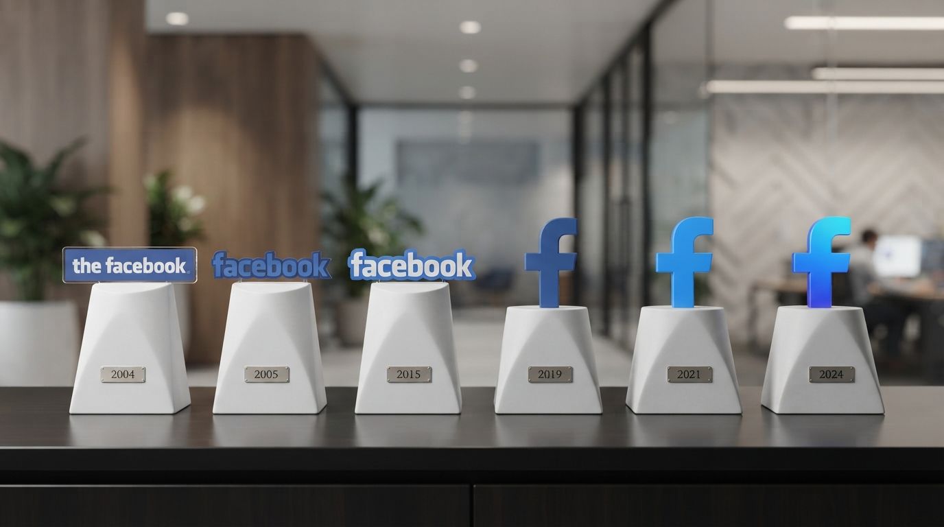
Introduction: The Visual Evolution of a Digital Empire
In the digital age, a corporate logo is far more than a simple graphic mark. It serves as the primary visual ambassador of a brand, encapsulating its core philosophy, cultural relevance, and technological adaptation. Few logos in human history have achieved the near-universal recognition of the lowercase white “f” set against a blue background. This emblem, representing the social media giant Facebook, has been rendered on billions of screens across every continent. Understanding the Facebook Logo History: How the Icon Changed Over Time provides a fascinating window into the evolution of Web 2.0, the mobile application revolution, and the transition of a collegiate directory into a multi-trillion-dollar conglomerate known as Meta Platforms, Inc.
As user behaviors shifted from desktop web browsers to high-definition mobile screens, and eventually toward spatial computing, Facebook’s visual identity had to evolve concurrently. Every minor adjustment—whether a subtle change in typography, a shift in color saturation, or the removal of a background container—was the result of thousands of hours of research, user testing, and strategic design alignment. In this comprehensive analysis, we will dissect the chronological milestones of Facebook’s visual branding, exploring the design philosophies, color psychology, typographic choices, and corporate strategies that guided these transformations.
The Pre-Facebook Era: Facemash and Thefacebook (2003–2004)

The Pre-Facebook Era: Facemash and Thefacebook (2003–2004)
Before the polished, multi-billion-user platform we know today, the foundations of Facebook were laid in a Harvard University dormitory. To fully appreciate the Facebook Logo History: How the Icon Changed Over Time, we must return to the very beginning, where the design was amateurish, utilitarian, and deeply reflective of early-2000s internet aesthetics.
Facemash (2003): The Infamous Precursor
In October 2003, Mark Zuckerberg created “Facemash,” a website that compared photos of Harvard students side-by-side, allowing users to rate who was more attractive. The visual identity of Facemash was hastily assembled, featuring a rudimentary logo with the name “FACEMASH” in bold, red, all-caps block letters. The font was a generic sans-serif, likely Arial or Helvetica, styled with basic HTML and CSS. The aggressive red color scheme and unrefined layout reflected the temporary, rebellious nature of the project, which was shut down by Harvard administrators within days. Despite its short lifespan, Facemash demonstrated the viral potential of social utility platforms and set the stage for Zuckerberg’s next venture.
Thefacebook (2004): Brackets and the Mystery Man
On February 4, 2004, Zuckerberg launched “Thefacebook.” The platform was designed as an online directory to connect students across Harvard, and its initial logo was a product of the limited design resources available at the time. The logo featured the text “thefacebook” written in a light blue, lowercase sans-serif typeface, enclosed within square brackets: [thefacebook].
The design was heavily influenced by the prevailing “Web 1.0” aesthetic. It utilized a dark blue background header with a pixelated, blue-tinted image of a man’s face in the top-left corner. This mysterious figure, often dubbed the “Facebook Guy,” was actually a digital manipulation of a photo of the famous actor Al Pacino. The image was created by Andrew McCollum, Zuckerberg’s classmate and co-founder, who used a series of binary code lines overlaying the actor’s face to convey a high-tech, digital-first atmosphere. This quirky, complex graphic was a far cry from the minimalist, streamlined icons that would define the platform’s future branding.
The Cuban Council Redesign: Simplifying to ‘Facebook’ (2005–2012)
The Cuban Council Redesign: Simplifying to ‘Facebook’ (2005–2012)
By 2005, the social network had expanded rapidly beyond Harvard, encompassing hundreds of universities, high schools, and eventually, the general public. To reflect its transition into a mainstream, global platform, the company underwent its first major, professional rebranding initiative, marking a critical chapter in the Facebook Logo History: How the Icon Changed Over Time.
Dropping ‘The’ and Hiring Cuban Council
Under the advisory of Silicon Valley entrepreneur Sean Parker, the company purchased the domain facebook.com for $200,000 in August 2005. Dropping the definite article “The” was a vital strategic move; it simplified the brand name, making it cleaner, more memorable, and punchier. To create a visual identity that matched this new corporate maturity, Facebook hired Cuban Council, a highly regarded San Francisco-based design agency co-founded by Mike Buzzard.
The design team was tasked with creating a logo that was simple, scalable, and timeless. Mike Buzzard, along with designers Joe Kral and Peter Markatos, set out to develop a clean wordmark. Instead of building a typeface from scratch, they chose to modify an existing font that possessed the structural integrity they desired: Klavika, a geometric, humanist sans-serif typeface designed by Eric Olson of the Process Type Foundry.
The Customization of Klavika
The Cuban Council team made several critical modifications to the Klavika font to optimize it for the Facebook wordmark:
- The Letter ‘f’: The crossbar of the ‘f’ was aligned to create a seamless, horizontal flow with the adjacent ‘a’.
- The Letter ‘a’: The double-story ‘a’ was simplified and streamlined, reducing visual clutter.
- The Letter ‘e’: The counters (the enclosed negative spaces) of the ‘e’ were opened up slightly to improve legibility at smaller resolutions.
- Kerning and Tracking: The spacing between the letters was carefully adjusted to ensure the wordmark felt cohesive and unified as a single visual unit.
The Choice of Blue: Color Psychology and Accessibility
One of the most persistent questions in the Facebook Logo History: How the Icon Changed Over Time is: Why blue? While color psychologists often associate blue with trust, security, reliability, and intellectual communication, the initial choice of Facebook’s color palette had a much more pragmatic, human origin.
Mark Zuckerberg has deuteranopia, a form of red-green color blindness. In a 2010 interview, Zuckerberg famously explained his choice: “Blue is the richest color for me; I can see all of blue.” The specific shade chosen for the 2005 logo was a deep, saturated navy blue (HEX: #3B5998), paired with white lettering. This combination provided an exceptionally high contrast ratio, which not only suited Zuckerberg’s vision but also met strict web accessibility standards, making the platform easy to navigate for users with various visual impairments.
The Birth of the Lowercase ‘f’ Favicon
As the web transitioned toward interactive Web 2.0 applications, websites required small, highly recognizable icons to sit in browser tabs (favicons) and navigation bars. To meet this need, the lowercase “f” from the wordmark was isolated and placed inside a solid blue square. To add depth, designers introduced a subtle, light-blue horizontal bar at the bottom of the square, which the stem of the white “f” rested upon. This square icon would become the foundation of Facebook’s mobile app identity in the decade to follow.
The Transition to Flat Design (2013–2015)
The Transition to Flat Design (2013–2015)
The early 2010s marked a monumental shift in graphic design paradigms. The era of “skeuomorphism”—a design trend where digital elements mimic real-world textures, shadows, and three-dimensional bevels (pioneered by early versions of Apple’s iOS)—was rapidly replaced by “flat design.” Flat design emphasized minimalism, clean open spaces, crisp edges, and two-dimensional illustrations, optimizing loading times and readability on mobile screens. Facebook’s visual identity underwent crucial updates to align with this modern aesthetic.
The 2013 Icon Refinement: Stripping the Accents
In April 2013, Facebook quietly updated its iconic square “f” logo. The redesign was spearheaded by Facebook’s in-house design team in collaboration with designer-typographer Eric Olson. The changes, though subtle to the casual user, were highly significant to design purists:
- Removal of the Light Blue Bar: The pale blue horizontal bar at the bottom of the square icon was completely removed.
- Extending the Stem: The vertical stem of the lowercase “f” was extended downwards so that it merged seamlessly with the bottom edge of the container.
- Softening the Corners: The corners of the blue square container were given a slightly softer, more rounded radius, making the icon feel more approachable and less rigid.
- Flattening the Gradient: The subtle gradient that ran from a lighter blue at the top of the container to a darker blue at the bottom was minimized, moving the icon closer to a solid, flat color field.
The 2015 Wordmark Overhaul: Prioritizing Mobile Screens
While the icon was updated in 2013, the primary Facebook wordmark remained virtually unchanged since 2005. However, by 2015, mobile traffic had surpassed desktop traffic globally. The condensed, technical nature of the customized Klavika font, while excellent for desktop headers, struggled with legibility on low-resolution mobile devices and smaller smartphone screens.
In July 2015, Facebook unveiled its first major wordmark update in a decade. The company bypassed external agencies and worked directly with Eric Olson to design a custom, proprietary typeface that would replace the Klavika-based letters. The goal was to modernize the wordmark, making it friendlier, more organic, and highly legible at any size.
Comparing the 2005 and 2015 wordmarks reveals a dramatic shift in typographic philosophy:
| Design Element | 2005 Wordmark (Klavika-based) | 2015 Wordmark (Custom Typeface) |
|---|---|---|
| The Letter ‘a’ | Double-story, structured, and technical. | Single-story, circular, and highly simplified. |
| The Letter ‘f’ | Slightly narrower with a shorter, angled crossbar. | Wider, with a perfectly horizontal, elongated crossbar. |
| The Letter ‘o’ | Oval-shaped, slightly condensed. | Perfectly circular, geometric, and spacious. |
| The Letter ‘b’ | Flat-sided stem base, matching Klavika’s style. | Rounded, fluid transition from the stem to the bowl. |
| Overall Feel | Corporate, structured, and authoritative. | Friendly, approachable, modern, and legible. |
The 2015 redesign was a masterclass in subtle brand evolution. By maintaining the blue and white color scheme and the lowercase configuration, Facebook preserved its immense brand equity while dramatically improving its technical performance across digital devices.
The Mobile-First Era and the 2019 Vibrant Refresh

The Mobile-First Era and the 2019 Vibrant Refresh
By 2019, Facebook was no longer just a single social networking website; it had evolved into a massive ecosystem of apps, including Instagram, WhatsApp, and Messenger. The brand needed to differentiate the core “Facebook app” from the parent company, whilst modernizing the app’s visual language to appeal to a younger, highly connected demographic that had grown accustomed to the vibrant, gradient-heavy aesthetics of modern app stores.
The Shift from Square to Circle
In April 2019, during its annual F8 developer conference, Facebook introduced a major design overhaul of its desktop and mobile user interfaces, internally referred to as “FB5.” Along with this interface redesign came a striking update to the iconic “f” logo.
The traditional square container with rounded corners, which had defined the Facebook app icon for over a decade, was retired in favor of a perfect circle. The circular format was chosen because it integrated seamlessly into modern mobile operating systems (like iOS and Android), which heavily utilized circular avatars, profile pictures, and interface elements. The circle represented unity, global connection, and a more modern, fluid digital experience.
The Brightening of the Blue
Perhaps the most shocking change in the Facebook Logo History: How the Icon Changed Over Time was the dramatic shift in the color palette. The historic navy blue (#3B5998), which had been a staple of the platform since 2005, was replaced with a highly saturated, electric blue (HEX: #1877F2).
This new “FB Blue” was designed to be energetic, vibrant, and optimized for high-definition OLED and Retina displays. The electric blue popped on mobile screens, standing out among a sea of competitor apps. Additionally, the lowercase “f” was shifted slightly to the center of the circle, creating a more balanced, symmetrical visual weight, although it remained slightly off-center to preserve the dynamic, forward-leaning motion of the letter’s crossbar.
The Strategic Importance of Professional Logo Designs in Corporate Evolution
The evolution of the Facebook logo highlights a universal truth in the business world: a company’s visual identity must adapt to its technological and cultural environment to survive. In the competitive digital landscape, a poorly designed or outdated logo can signal a lack of innovation, leading to a loss of consumer trust and market share.
This is why global enterprises and ambitious startups alike invest heavily in professional Logo Designs. A professional design agency does not merely draw shapes or select trendy colors; they conduct deep market research, perform rigorous cross-platform legibility testing, and apply advanced principles of color psychology and typography. Just as Facebook transitioned from a customized Klavika font to a custom geometric typeface to ensure legibility on mobile screens, modern businesses must ensure their visual branding is optimized for a multi-device world—from high-definition desktop monitors and mobile apps to physical merchandise and outdoor signage.
By partnering with expert brand strategists, companies can create timeless, scalable visual assets that communicate authority, build emotional connections with target audiences, and maintain brand equity over decades of growth and market disruption.
Meta Platforms, Inc.: Decoupling the App from the Parent Company (2019–Present)
As the decade drew to a close, Facebook faced unprecedented challenges, including intense regulatory scrutiny, privacy debates, and the need to diversify its technological offerings into virtual reality (VR), augmented reality (AR), and the conceptual “metaverse.” This strategic shift necessitated the most radical corporate rebranding in the company’s history.
The 2019 All-Caps Corporate Moniker
In late 2019, before the official name change to Meta, the company introduced a new corporate logo to distinguish the parent company from the specific Facebook social media app. The corporate logo was a minimalist, all-caps wordmark: “FACEBOOK”.
The typography was clean, highly spaced (monospaced tracking), and utilized a dynamic color-changing system. Instead of being locked into “Facebook Blue,” the corporate logo shifted colors depending on the product it was representing: green for WhatsApp, a magenta/orange/purple gradient for Instagram, and blue for the core Facebook platform. This was a clear signal to consumers and regulators that the parent company was a diverse conglomerate holding many distinct brands.
The 2021 Rebrand to Meta
On October 28, 2021, Mark Zuckerberg announced that the parent company, Facebook, Inc., would rename itself to Meta Platforms, Inc. (commonly known as Meta). This rebrand officially decoupled the corporate identity from the Facebook social media application, allowing the latter to exist purely as one of the company’s “family of apps” alongside Instagram and WhatsApp.
The design of the Meta logo was a bold leap into the future of spatial computing:
-
- The Symbol: The Meta symbol is a continuous loop, designed to resemble both an infinity sign and the letter “M.” It was created using a single, unbroken line that exists in three-dimensional space.
- The 3D Design Philosophy: Unlike traditional flat logos, the Meta loop was designed to be viewed from multiple angles. In virtual reality environments, users can walk around the logo, watch it twist, loop, and morph, changing its shape depending on the viewer’s perspective. It represents the endless horizons of the metaverse.
The Typography:
- The word “Meta” was paired with a clean, simple, geometric sans-serif typeface, rendered in a deep black or white, ensuring that the infinity loop remained the primary visual focus.
The 2023 Subtle Facebook App Refresh
Even after the parent company transitioned to Meta, the core Facebook app remained the world’s most populated social network. In September 2023, Meta’s design team rolled out a subtle, yet highly calculated refresh of the Facebook app’s visual identity, proving that the Facebook Logo History: How the Icon Changed Over Time is an ongoing process of refinement.
The 2023 update featured three key modifications:
- A Deeper, High-Contrast Blue: The electric blue of 2019 was darkened slightly to a deeper, more saturated shade (HEX:
#0866FF). This change was made to improve visual contrast, making the icon more accessible to visually impaired users and aligning with WCAG 2.1 accessibility standards. - Redesigning the Lowercase ‘f’: The physical geometry of the white “f” was subtly altered. The horizontal crossbar was widened, the top curve was made more pronounced, and the vertical stem was thickened. These structural changes ensured the letter stood out more crisply against the dark blue circular background.
- A Unified Custom Font (Facebook Sans): The company expanded the use of its proprietary typeface, “Facebook Sans,” across the entire app interface, creating a unified typographical experience that improved loading speeds and visual cohesion.
Design Analysis: Decoding the Psychology of the Facebook Icon
To fully comprehend the genius of Facebook’s visual branding, we must look beyond chronological history and analyze the design mechanics, optical illusions, and human psychology that make the logo so incredibly effective.
The Lowercase Typographic Choice: Friendliness and Humility
In corporate branding, typography carries immense psychological weight. Uppercase letters (like the logos of SONY, SAMSUNG, or IBM) project authority, power, institutional strength, and established tradition. They demand respect and command attention.
Conversely, lowercase letters (like the logos of amazon, flickr, and facebook) project friendliness, accessibility, humility, and casual conversation. By choosing a lowercase “f” and keeping the wordmark entirely lowercase, Facebook framed itself not as an imposing, corporate database, but as a friendly, community-driven utility. It invited users to share their personal moments, photos, and thoughts in an informal, safe space.
The Off-Center ‘f’: An Optical Masterclass
One of the most intriguing design choices in the Facebook icon is the positioning of the lowercase “f” within its circular or square container. If you draw a vertical line directly down the center of the Facebook icon, you will notice that the vertical stem of the “f” does not sit in the exact mathematical center; it is shifted to the right.
This off-center alignment is a deliberate choice called optical alignment. In graphic design, mathematical centering can often look visually unbalanced to the human eye due to asymmetrical shapes. Because the crossbar of the lowercase “f” extends exclusively to the right, placing the stem in the dead center would make the left side of the icon feel empty and the right side feel overcrowded. By shifting the stem to the right, the negative space is perfectly balanced. Furthermore, this right-ward shift guides the viewer’s eye forward, symbolizing progression, connection, and future-oriented thinking.
Key Takeaways: The Evolution of Facebook’s Visual Identity
- Simplification is Key: Facebook’s journey from the cluttered, bracketed
[thefacebook]with an Al Pacino avatar to a clean circular “f” shows that removing unnecessary design elements increases brand recognition and scalability. - Technology Dictates Design: The transitions from the technical Klavika font (2005) to a custom geometric sans-serif (2015) and the 2019 electric blue circular icon were driven by the need for legibility and aesthetic appeal on high-definition mobile screens.
- Accessibility Drives Trust: Mark Zuckerberg’s color blindness led to the selection of a high-contrast blue and white palette. Modern updates, such as the 2023 color deep-dive, continue to prioritize accessibility (WCAG compliance) to ensure the platform remains usable for all.
- Decoupling Corporate and Product Brands: The creation of the “Meta” brand in 2021 allowed the parent company to explore spatial computing and the metaverse while protecting the established brand equity of its individual applications, like the Facebook app.
- Subtle Tweaks Prevent Brand Fatigue: Facebook rarely changes its logo drastically. Instead, it utilizes micro-adjustments—widening a crossbar, flattening a gradient, or darkening a hex code—to keep the brand modern without alienating its massive, global user base.
Frequently Asked Questions
1. Why is the Facebook logo blue?
The primary reason is that Facebook’s co-founder, Mark Zuckerberg, is red-green color blind (deuteranopia). Blue is the color he can see most clearly and richly. Additionally, in color psychology, blue represents trust, security, and open communication, making it an ideal choice for a global social network.
2. Who designed the original Facebook logo in 2005?
The original “Facebook” wordmark was designed by the San Francisco-based design agency Cuban Council, in collaboration with designer-typographer Mike Buzzard. They customized the existing font “Klavika” to create the iconic, clean wordmark.
3. What font does the current Facebook logo use?
The current Facebook logo does not use a commercially available font. It uses a proprietary, custom-designed geometric sans-serif typeface developed by Facebook’s in-house design team in collaboration with typographer Eric Olson, often referred to as a variation of “Facebook Sans.”
4. Why did Facebook change its name and logo to Meta?
In October 2021, the parent company rebranded to Meta Platforms, Inc. to reflect its strategic focus on building the “metaverse” (virtual reality, augmented reality, and spatial computing) and to clearly distinguish the parent company from the specific Facebook social media application.
5. Why is the ‘f’ in the Facebook icon off-center?
The lowercase ‘f’ is shifted to the right to achieve optical balance. Because the horizontal crossbar of the ‘f’ only extends to the right, placing the stem in the mathematical center would make the logo look unbalanced and heavy on the right side. Shifting it balances the negative space within the circular container.
6. What was the “mystery face” on the original 2004 Thefacebook website?
The pixelated face in the header of the 2004 website was a digital manipulation of a photograph of the acclaimed actor Al Pacino. It was created by Mark Zuckerberg’s classmate and co-founder, Andrew McCollum, using binary code overlays.
Conclusion: A Legacy of Adaptability and Brand Resilience
The journey of the Facebook logo—from a crude Harvard dormitory project to a sleek, globally recognized icon—is a testament to the power of adaptive design. By analyzing the Facebook Logo History: How the Icon Changed Over Time, we see a brand that has masterfully navigated the tumultuous shifts of the digital age. It transitioned from Web 1.0 desktop directories to the Web 2.0 social explosion, conquered the mobile application revolution, and has now positioned itself at the forefront of the immersive metaverse.
Through every phase of its evolution, Facebook’s design teams have adhered to the core principles of simplicity, utility, and accessibility. They recognized that a logo must be a living, breathing entity—capable of undergoing subtle refinements to meet new technological demands while remaining instantly recognizable to the billions of people who rely on it for daily connection. As Meta continues to pioneer new virtual frontiers, its visual identity will undoubtedly continue to evolve, setting new benchmarks for the global design industry and continuing its remarkable legacy of brand resilience.