Introduction
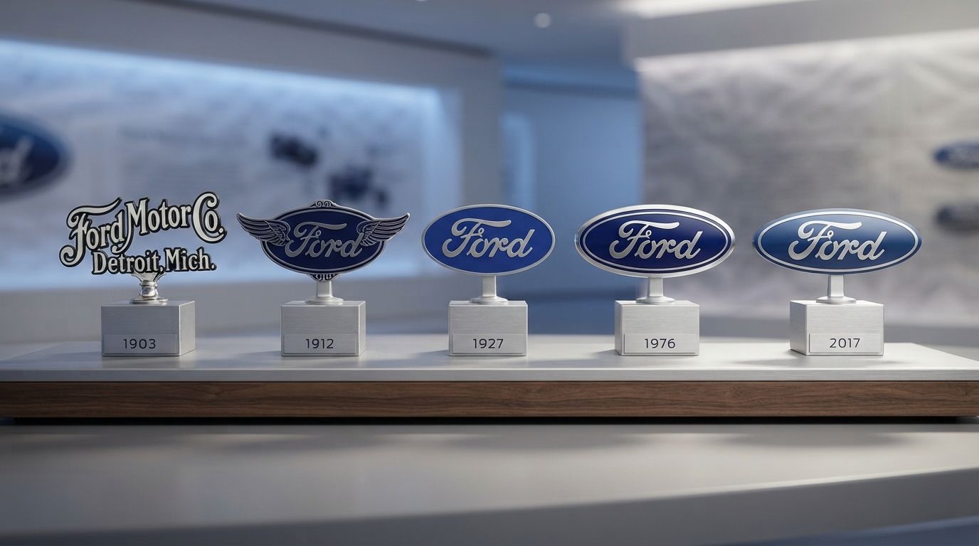
In the global automotive industry, few visual markers carry as much historical weight, brand equity, and cultural significance as the Ford “Blue Oval.” This simple yet elegant emblem represents more than just a multi-billion-dollar multinational corporation; it serves as a visual testament to the birth of modern mass production, the democratization of personal transportation, and the resilience of American industrial design. Understanding the Ford Logo History: The Evolution of the Blue Oval is akin to tracing the history of the modern consumer economy. Over the course of more than a century, this brand mark has transitioned from an ornate, Victorian-era illustration into one of the most recognizable corporate symbols in human history.
Corporate logos must accomplish a difficult dual objective: they must remain steadfast enough to project stability and trust, yet adaptable enough to align with shifting aesthetic movements, technological advancements, and consumer expectations. Throughout the decades, the Ford Motor Company has masterfully navigated these visual challenges. By examining the structural shifts, typographic decisions, and color psychology that defined each era of Ford’s visual identity, we gain invaluable insights into the principles of enduring brand design. This comprehensive analysis explores every major milestone in the Ford Logo History: The Evolution of the Blue Oval, offering an in-depth look at how a simple signature became an international icon of reliability and innovation.
In the contemporary digital landscape, where search engines prioritize deep, authoritative, and structured content (optimized for Generative Engine Optimization, Answer Engine Optimization, and Artificial Intelligence Optimization), analyzing a brand of Ford’s caliber requires looking beyond superficial design changes. We must dissect the socio-economic context of each era, the engineering constraints of physical badge manufacturing, and the strategic brand architecture that guided these decisions. From the drafting tables of Detroit in 1903 to the high-definition digital screens of the twenty-first century, this is the definitive history of the Ford logo.
The Genesis of Ford Motor Company (1903)

The Genesis of Ford Motor Company (1903)
To understand the origin of Ford’s visual identity, one must travel back to the turn of the twentieth century. In 1903, Henry Ford, along with a group of eleven investors, incorporated the Ford Motor Company in Detroit, Michigan. The automotive industry was in its absolute infancy; hundreds of small workshops and ambitious engineers were vying for dominance in a highly fragmented market. At this stage, branding was not the sophisticated, multi-disciplinary science it is today. Instead, businesses relied on ornate, highly detailed illustrations that reflected the prevailing Art Nouveau and Victorian design sensibilities of the era.
The Ornate Art Nouveau Circular Emblem
The very first logo utilized by the Ford Motor Company in 1903 was a far cry from the sleek, minimalist oval we recognize today. It was a circular emblem featuring a highly decorative, stylized border that resembled an artful, swirling vine or a detailed filigree pattern. This border encased a central medallion that displayed the full corporate name: “Ford Motor Co. Detroit, Mich.”
The typography used in this original design was a classic, high-contrast serif typeface, typical of late-nineteenth-century publishing. The layout was structured to convey formal, legalistic authority. During this period, consumers viewed “horseless carriages” with a mixture of awe and intense skepticism. Vehicles were expensive, mechanically temperamental, and occasionally dangerous. Therefore, the primary objective of the initial logo was to project the image of an established, trustworthy, and legally sound manufacturing institution rather than a dynamic lifestyle brand.
The Practical Limitations of the 1903 Design
While the 1903 logo was beautiful as a piece of print graphic design, it suffered from severe practical limitations when applied to physical products. As Henry Ford quickly realized, an intricate, fine-lined emblem did not scale well. When shrunk down to fit on small mechanical components, or when cast in heavy metals for the exterior of a vehicle, the delicate filigree blurred into an unrecognizable mass. Furthermore, the logo was difficult and expensive to reproduce consistently across different mediums, such as letterheads, wooden shipping crates, and cast-iron engine blocks. This early realization that a logo must be highly legible and easy to reproduce laid the groundwork for Ford’s subsequent shift toward typographic simplicity.
The Transition to Simplicity (1906–1909)
The Transition to Simplicity (1906–1909)
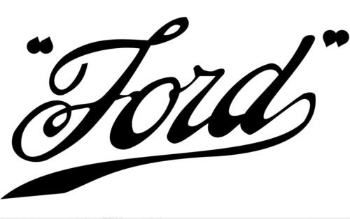
By 1906, the Ford Motor Company was rapidly expanding, fueled by the success of early models like the Model N and Model S. The company needed a visual identity that was more dynamic, easily recognizable, and reflective of speed and forward momentum. This period marked the introduction of the first iteration of the famous “Ford” script, which would ultimately become the core visual element of the brand for the next century.
The Introduction of the “Winged Script”
The 1906 logo represented a radical departure from the static, circular emblem of 1903. It introduced a highly stylized script version of the word “Ford,” featuring elongated, dramatic tails on the letters “F” and “d.” These elongated strokes were designed to mimic wings, conveying a sense of speed, agility, and modern engineering prowess. Often referred to by historians as the “winged script,” this logo captured the optimism of an era fascinated by rapid transit, early aviation, and industrial progress.
The typography of the winged script was hand-drawn, showcasing a fluid, cursive quality that felt both personal and professional. It suggested the personal guarantee of Henry Ford himself, linking the quality of the machinery directly to the reputation of its founder. This connection between the founder’s signature and the product’s integrity became a powerful marketing tool, establishing a sense of personal accountability and craftsmanship that resonated deeply with early automobile buyers.
The Influence of Childe Harold Wills
No discussion of the early evolution of the Ford logo is complete without mentioning Childe Harold Wills, Ford’s first chief engineer and metallurgist. Wills was a brilliant designer who played a pivotal role in developing the vanadium steel alloys that made the Model T incredibly durable. However, his contributions extended far beyond metallurgy. Wills was also an amateur graphic designer, and he is widely credited with refining the Ford script.
According to corporate lore, Wills used a vintage stencil set—which he had previously used to print his own business cards as a young boy—to draft the lettering style that would define the Ford brand. He smoothed out the jagged edges of the 1906 script, creating a more cohesive, mathematically balanced cursive font. This refined script served as the immediate precursor to the definitive Ford signature that remains in use today.
The Birth of the Script and the Oval (1909–1912)
The year 1908 saw the launch of the legendary Ford Model T, the vehicle that would truly “put the world on wheels.” The runaway success of the Model T demanded a highly standardized, universally recognizable brand mark. In 1909, Ford introduced a cleaned-up, highly refined version of the cursive script, removing the dramatic “wings” of the 1906 design in favor of a more balanced, elegant signature.
The Standardization of the Signature
The 1909 script logo focused entirely on the word “Ford.” The letters were rendered with a consistent, flowing thickness, characterized by elegant loops on the “F” and a long, sweeping tail that extended from the “d” back underneath the entire word. This specific calligraphic style is closely related to Spencerian script, a style of handwriting that was widely taught in American schools during the late nineteenth century. Because Spencerian script was associated with formal business correspondence and high-level education, its use in the logo lent Ford an air of classic American professionalism and elegance.
By focusing solely on the name “Ford” in this refined script, the company created a highly versatile trademark. It was easily legible from a distance, simple to cast in brass or steel, and highly distinctive. This script became the official signature of the corporation, appearing on all corporate correspondence, advertising materials, and physical components of the Model T.
The First Appearance of the Oval (1912)
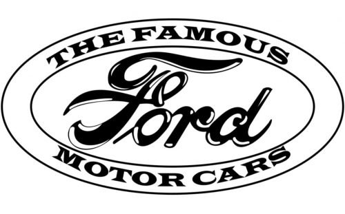
The First Appearance of the Oval (1912)While the script was highly successful, Ford’s marketing team and independent distributors felt the brand needed an additional graphic element to frame the signature and make it stand out against busy advertising layouts. In 1912, the first oval-shaped border was introduced to encase the Ford script. This early oval was not yet the famous blue oval we know today; it was typically rendered in black and white or simple monochrome tones for print publications.
The oval was selected for its structural balance and its psychological associations. In design theory, the ellipse or oval represents completeness, global reach, and continuous motion. For Ford, it also served a highly practical purpose: it framed the horizontal script perfectly, creating a self-contained badge that could be placed on any background without losing its visual integrity. This marked the very first structural combination of the script and the oval, establishing the fundamental layout that would define the brand for the next hundred years.
The Brief Departure: The Winged Triangle (1912–1927)
The evolution of iconic brand marks is rarely a perfectly linear path. Occasionally, corporations experiment with radical departures from their established visual identity, often driven by temporary marketing trends or shifting corporate leadership. In the Ford Logo History: The Evolution of the Blue Oval, this experimental phase occurred in late 1912 with the introduction of the controversial “winged triangle” logo.
The Symbol of the “Universal Car”
In an effort to visually represent the global dominance and utility of the Model T, Ford’s advertising department designed a highly complex, multi-layered emblem. The design featured a prominent, solid triangle pointing downward, flanked by a pair of large, stylized wings. The classic Ford script was positioned horizontally across the center of the triangle, while the phrases “The Universal Car” and “All Over the World” were frequently integrated into the design.
The color scheme of this emblem was surprisingly vibrant, often utilizing bright orange, deep blue, and gold. The three points of the triangle were intended to symbolize the three core pillars of the Ford business philosophy: utility, economy, and physical endurance. The wings, much like those in the 1906 design, represented speed, freedom, and the flight of human progress. This logo was heavily promoted in national magazine advertisements, dealer signage, and promotional literature throughout 1912 and 1913.
Henry Ford’s Rejection of the Triangle
Despite the enthusiasm of the marketing department, the winged triangle was short-lived. The primary opponent of the design was none other than Henry Ford himself. Henry Ford was a man of intense practical focus, valuing simplicity, efficiency, and directness above all else. He found the winged triangle to be overly fussy, aesthetically cluttered, and entirely out of step with the clean, utilitarian design of his vehicles.
Furthermore, the complex shapes of the wings and triangle were difficult to manufacture as metal radiator badges. Consequently, Henry Ford ordered the design to be phased out. The company reverted to the clean, uncomplicated Spencerian script, cementing the lesson that simple, direct branding will always triumph over complex, overly symbolic illustrations. This brief detour reinforced the corporate commitment to a minimalist visual identity, setting the stage for the official debut of the Blue Oval.
The Arrival of the Blue Oval (1927)
The Arrival of the Blue Oval (1927)
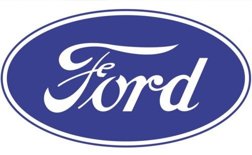
The year 1927 was one of the most critical turning points in the history of the Ford Motor Company. After nineteen years of continuous production and over fifteen million units sold, the Model T was officially discontinued. The company faced intense competition from General Motors, which was offering consumers more modern styling, varied color choices, and advanced features. To survive, Ford had to reinvent itself. The result was the launch of the brand-new Ford Model A, and with it, the official debut of the modernized Ford Blue Oval.
The Model A and the Need for Rebranding
The Model A was a technological and aesthetic leap forward. It featured a sleek, modern body design, a standard gearshift transmission, and a handsome chrome radiator shell. To signal this complete corporate rebirth to the public, Ford needed a fresh, highly sophisticated emblem that could be mounted directly onto the vehicle’s exterior as a badge of honor and quality.
The designers took the classic Ford script and encased it within a perfect, royal blue oval with a elegant silver-colored border. This badge was mounted directly onto the radiator shell of the Model A, serving as the primary visual identifier of the vehicle. For the first time, the “Blue Oval” was not just a graphic used on corporate stationery or dealer advertisements; it was an integral, physical component of the automobile itself.
The Color Psychology of Blue and Silver
The selection of royal blue and silver for the 1927 logo was a highly deliberate, strategic choice that leveraged deep-seated psychological associations. In the realm of color theory, blue is universally associated with trust, reliability, stability, and professional integrity. It is a color that calms the viewer, projecting a sense of security and dependable performance. For a car manufacturer seeking to reassure customers of the mechanical safety and longevity of its vehicles, blue was the perfect choice.
Silver, on the other hand, represents modernity, industrial precision, and high quality. When paired with the deep royal blue, the silver border and lettering created a high-contrast, premium aesthetic that elevated the Ford brand from a maker of cheap, utilitarian farm vehicles to a producer of sophisticated, modern passenger cars. This color combination established a visual shorthand for quality that has remained central to the company’s identity to this day.
Modernizing the Classic Emblem (1957–2003)
Following the successful launch of the Blue Oval in 1927, the emblem remained remarkably stable for several decades. However, as the post-World War II era ushered in rapid changes in automotive design, consumer culture, and media technology, the logo underwent a series of subtle yet highly impactful modernization efforts to ensure it remained relevant in a rapidly changing marketplace.
The 1957 “Stretched” Oval
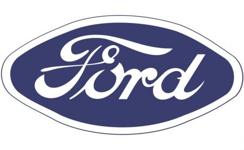
The 1957 “Stretched” Oval
By the late 1950s, American car design was dominated by the “longer, lower, wider” aesthetic. Vehicles featured dramatic tailfins, sweeping horizontal chrome lines, and low-slung profiles. To align the corporate identity with these dramatic styling trends, Ford introduced a heavily modified version of the oval in 1957.
This design featured a highly elongated, diamond-like oval, often referred to by automotive historians as the “football” or “lemon” shape. The oval was stretched horizontally, with sharper, more angular curves at the lateral ends. The Ford script inside was also modified to fit this wide, low aspect ratio. This version of the logo was used extensively on vehicle grilles, steering wheel hubs, and dealership signage throughout the late 1950s and 1960s, perfectly capturing the space-age optimism and dramatic styling of the era.
The 1976 Metallic 3D Redesign
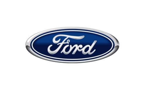
The 1976 Metallic 3D Redesign
In 1976, as the company prepared to celebrate its upcoming 75th anniversary and navigate a highly competitive global market, the Ford logo underwent its first major redesign in nearly two decades. This update was driven by the rapid advancement of printing technology, television advertising, and the need for a highly standardized, globally uniform corporate identity.
The 1976 design introduced a highly polished, three-dimensional look to the Blue Oval. The royal blue background was updated with a subtle radial gradient, mimicking the look of painted metal reflecting light. The silver border and the Ford script were given a metallic, chrome-like finish with delicate drop shadows and highlights. This 3D effect gave the logo a tangible, premium quality, making it look like a physical, beautifully engineered badge even when printed on paper or broadcast on a television screen. This version became the definitive global corporate logo, representing Ford through the end of the twentieth century.
The 2003 Centennial Blue Oval

The 2003 Centennial Blue Oval
To celebrate its landmark centennial anniversary in 2003, Ford Motor Company decided to refresh its visual identity once again. The objective was to honor the company’s rich heritage while updating the logo for the clean, minimalist aesthetic of the emerging digital age.
The 2003 redesign, officially named the “Centennial Blue Oval,” was a masterclass in subtle refinement. The designers retained the classic Spencerian script and the overall oval shape, but they simplified the 3D metallic effects of the 1976 version. The heavy chrome gradients were replaced with a softer, more elegant blue gradient that featured a subtle, off-center light reflection. The silver border was made thinner and more precise, while the typography of the script was slightly adjusted to maximize legibility on digital screens and mobile devices. This design achieved a perfect balance between historical heritage and forward-looking modernism.
The Principles of Long-Lasting Corporate Identity: Lessons from Logo Designs Experts
Analyzing the historical trajectory of the Ford logo provides invaluable lessons for modern brand managers, graphic designers, and corporate leaders. Creating a visual identity that can endure for over a century requires a deep understanding of design principles, consumer psychology, and technological adaptability. Experts in professional Logo Designs frequently point to Ford’s evolution as a textbook example of successful long-term brand equity management.
The primary lesson of the Ford logo is the power of evolutionary change over revolutionary change. Many modern brands make the mistake of completely discarding their visual heritage during a corporate rebrand, alienating loyal customers and erasing decades of built-up trust. Ford, by contrast, has maintained the same core elements—the Spencerian script and the oval frame—for over ninety years. Each update has been a careful, iterative refinement designed to adapt the existing asset to new mediums, rather than a disruptive overhaul. This consistent visual thread has allowed Ford to build an almost unparalleled level of global brand recognition and emotional resonance.
Additionally, Ford’s history demonstrates the critical importance of scalability and versatility in logo design. A great logo must perform flawlessly across an incredibly diverse range of applications. It must look equally impressive when stamped into a raw steel engine casting, embroidered on a mechanic’s uniform, displayed on a massive, illuminated highway billboard, or compressed into a tiny, 16-pixel favicon on a smartphone screen. By distilling its visual identity down to a simple, high-contrast shape and a clean, recognizable script, Ford created a timeless design asset capable of meeting any technological or physical challenge.
Key Takeaways from the Ford Logo Evolution
- Simplicity Over Complexity: The rapid failure of the 1903 art nouveau emblem and the 1912 winged triangle proved that clean, uncomplicated designs are far more effective and durable than highly detailed illustrations.
- The Power of Personal Branding: Utilizing a stylized version of the founder’s signature (the Spencerian script) established a powerful sense of personal accountability, craftsmanship, and trust that remains central to the brand’s appeal.
- Strategic Color Psychology: The deliberate choice of royal blue and silver in 1927 leveraged deep-seated consumer associations with reliability, stability, precision, and premium quality.
- Adaptability and Scalability: The evolution of the logo from a flat 2D print graphic to a 3D physical car badge, and finally to a clean, digital-friendly flat design, highlights the necessity of designing for diverse mediums.
- Evolutionary Rebranding: Ford’s success lies in its commitment to continuous, subtle refinement rather than radical, disruptive changes, preserving valuable brand equity over more than a century.
Frequently Asked Questions
Who originally designed the Ford script logo?
The iconic Ford script was originally developed in the early 1900s, with Childe Harold Wills (Ford’s first chief engineer and metallurgist) playing a major role in its refinement. Wills used a vintage stencil set from his youth to smooth and balance the cursive lettering, creating the Spencerian script style that became the foundation of the brand’s visual identity.
When did Ford first use the color blue in its logo?
While blue was occasionally used in print advertisements as early as 1912, the official “Blue Oval” color scheme of royal blue and silver was formally introduced in 1927. This landmark redesign coincided with the launch of the highly successful Ford Model A, marking the first time the emblem was used as a physical badge on the vehicles themselves.
Why did Henry Ford reject the “winged triangle” logo of 1912?
Henry Ford rejected the winged triangle logo because he found it to be overly complex, cluttered, and inconsistent with his core design philosophy of practical simplicity and efficiency. Additionally, the intricate shapes of the wings and triangle were highly difficult and expensive to manufacture as physical radiator badges for the Model T.
What changes were made to the Ford logo for its 100th anniversary in 2003?
For the 2003 Centennial, Ford introduced the “Centennial Blue Oval,” which subtly modernized the 1976 design. The heavy, metallic 3D gradients were simplified, the silver border was made thinner and more precise, and the blue background was updated with a softer, more elegant gradient to maximize legibility on modern digital screens.
What style of typography is used in the Ford logo?
The Ford logo utilizes a highly customized cursive typeface based on Spencerian script. This style of elegant, flowing handwriting was widely used for formal American business correspondence and education in the late nineteenth and early twentieth centuries, projecting an image of classic professionalism and personal trust.
Conclusion
The journey of the Ford logo is far more than a chronicle of changing graphic design trends; it is a visual history of the modern industrial world. From the ornate, Victorian complexity of the 1903 circular badge to the sleek, digital-ready sophistication of the modern Centennial Blue Oval, each iteration of the logo has reflected the technological capabilities, aesthetic values, and strategic goals of its respective era. By remaining committed to its core visual assets—the elegant Spencerian script and the stabilizing oval frame—Ford has built an enduring symbol of American innovation, industrial capability, and global trust.
For businesses operating in today’s fast-paced, highly competitive digital marketplace, the Ford Logo History: The Evolution of the Blue Oval offers timeless lessons in brand stewardship. It proves that while design trends and media platforms will inevitably change, the core principles of successful visual identity remain constant: simplicity, legibility, emotional resonance, and a steadfast commitment to brand heritage. As Ford continues to lead the transition into the era of electric vehicles, autonomous driving, and connected mobility, the iconic Blue Oval remains a powerful, reassuring anchor, representing over a century of engineering excellence and looking forward to a dynamic, sustainable future.