Introduction
In the modern digital landscape, few visual markers are as instantly recognizable as the Google logo. Serving as the gateway to the world’s information for billions of users daily, this simple combination of colored letters has undergone a fascinating transformation since its inception in the late 1990s. The story of Google’s visual identity is not merely a tale of changing aesthetics; it is a reflection of the evolution of the internet itself, transitioning from the chaotic, experimental days of Web 1.0 to the highly streamlined, mobile-first, and AI-driven ecosystem of today.
Understanding the Google Logo History: The Complete Evolution Timeline requires looking beyond the surface level of graphic design. It demands an exploration of technological constraints, user experience (UX) paradigms, corporate restructuring, and global brand positioning. As web interfaces evolved from low-resolution desktop monitors to high-definition smartphone screens, smartwatches, and smart home displays, Google’s logo had to adapt. It evolved from a clunky, drop-shadowed wordmark into a highly sophisticated, dynamic design system that functions seamlessly across infinite digital touchpoints.
This comprehensive guide offers an exhaustive, step-by-step journey through Google’s visual identity from 1996 to the present day. We will analyze the typography, the color theory, the technical challenges, and the cultural shifts that influenced every major design decision. Whether you are a graphic designer, a brand strategist, or a technology enthusiast, this deep dive will provide invaluable insights into how a global tech giant maintains visual relevance in an ever-changing digital world.
The Pre-Google Era: The BackRub Origins (1996 – 1997)
Before Google became a household name and a verb in the Oxford English Dictionary, it began as a research project at Stanford University. Founded by doctoral students Larry Page and Sergey Brin in 1996, the search engine was initially named “BackRub.” The name was a literal reference to the system’s core functionality: analyzing the web’s “backlinks” to estimate the importance and relevance of individual web pages.
The Anatomy of the BackRub Logo
The visual identity of BackRub was far from the clean, minimalist aesthetic we associate with Google today. The original “logo” was a raw, scanned image of Larry Page’s hand resting on a flatbed scanner, superimposed with the word “BackRub” in a bold, red, sans-serif font. The image was dark, literal, and highly indicative of the amateurish web design standards of the mid-1990s.
From a design perspective, the BackRub logo was never meant to be a permanent corporate trademark. It was a placeholder created by engineers for engineers. However, it serves as a critical starting point in the Google Logo History: The Complete Evolution Timeline. It highlights the humble, academic origins of the company and underscores a time when search engines were viewed as complex technical utilities rather than user-friendly consumer portals.
The Transition from BackRub to Google
By 1997, Page and Brin realized that their search technology was too powerful to remain confined to academic servers. They also recognized that the name “BackRub” was not highly marketable for a mainstream audience. They decided to rename the search engine “Google”—a play on the mathematical term “googol,” which refers to the number 1 followed by 100 zeros. This new name symbolized their immense mission to organize the seemingly infinite amount of information on the World Wide Web. With a new name came the need for a completely new visual identity.
The Dawn of Google: The GIMP and Exclamation Era (1997 – 1999)
The initial transition to the name Google brought about the first official iterations of the Google wordmark. This period was characterized by rapid experimentation, limited design resources, and the clear influence of other early internet pioneers.
The 1997 Beta Logo
In late 1997, the very first logo bearing the name “Google” appeared on the Stanford University servers. Created using the open-source image editor GIMP (GNU Image Manipulation Program), this design was a far cry from professional branding standards. It featured a highly stylized, three-dimensional look with a heavy drop shadow and a distinctively uneven color distribution. The letters were bulbous, brightly colored, and lacked a unified typographic baseline. This logo reflected the wild-west nature of the early internet, where bright colors and simulated 3D textures were highly popular.
The 1998 Logo and the Influence of Yahoo!
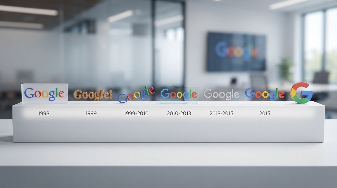
In 1998, as Google officially incorporated as a private company, Sergey Brin created a more refined version of the wordmark, again utilizing GIMP. This version introduced a cleaner, more readable typeface: Baskerville Bold. The colors were rearranged, and a prominent drop shadow was added to make the logo pop against the stark white background of the search homepage.
Crucially, this 1998 version also featured an exclamation point at the end of the wordmark (Google!). This was not a random design choice; it was a direct nod to—and competition with—Yahoo!, which was the dominant web portal and search directory of the era. The exclamation point was a common trend among early internet startups, used to convey excitement, novelty, and energy. However, as Google began to establish its own unique identity based on speed, simplicity, and technological superiority, the need to mimic competitors quickly faded.
The Ruth Kedar Masterpiece: Defining the Corporate Identity (1999 – 2010)
As Google secured significant venture capital funding in 1999, the founders realized that their amateur, GIMP-designed logos would no longer suffice for a rapidly growing corporation. They sought the expertise of Ruth Kedar, an assistant professor of design at Stanford University. Kedar was tasked with creating a logo that conveyed Google’s disruptive technological power while remaining highly approachable, playful, and simple.
The Design Iterations of Ruth Kedar
Kedar did not arrive at the final design instantly. She presented Larry Page and Sergey Brin with a series of highly distinct prototypes, each exploring different aspects of Google’s brand personality:
- Iteration 1 (The Adobe Garamond Concept): This design used the classic Adobe Garamond typeface. It was entirely black and featured an icon in the center consisting of two interlocking colored circles. This design was highly academic and corporate, but the founders felt it was too cold and lacked playfulness.
- Iteration 2 (The Target Concept): Kedar modified the typeface and introduced a target icon over the ‘o’s to represent accuracy and search precision. While it communicated the concept of “finding information,” it felt overly aggressive and industrial.
- Iteration 3 (The Magnifying Glass Concept): This version incorporated a magnifying glass, a literal representation of search. While clear, the founders felt that a magnifying glass was too cliché and limited the scope of what Google could eventually become.
- Iteration 4 (The Playful Interlocking Concept): Kedar began experimenting with color, interlocking the letters and adding a small, smiling face or eyes to the ‘o’s. This was deemed a bit too juvenile for a company seeking institutional trust.
The Final Selection: The Catull Typeface and Color Theory
Ultimately, Kedar stripped away the literal search icons and focused entirely on typography and color. The design that was officially adopted in May 1999 utilized the Catull typeface, a beautiful serif font designed by Gustav Jaeger in 1982. Catull possessed a unique blend of traditional calligraphic elegance and modern geometric precision. The serifs were sharp, and the letters had a distinct diagonal stress, giving the wordmark a sense of forward momentum.
The color palette chosen for the Kedar logo became the cornerstone of Google’s visual brand. Kedar selected the primary colors: blue, red, and yellow. However, instead of sticking to a strict mathematical pattern, she intentionally broke the sequence by making the letter ‘l’ green—a secondary color.
This subtle design choice carried profound psychological weight. It signaled to the world that Google was not a rigid, conformist corporation. It was a company that “didn’t follow the rules,” prioritizing creativity, innovation, and user-centric playfulness over corporate monotony. The Kedar logo, featuring a gentle drop shadow and a subtle 3D bevel, would remain the face of Google for more than a decade, anchoring the brand through its initial public offering (IPO) and its rise to global dominance.
The Flat Design Revolution and Mobile Optimization (2010 – 2015)
By the turn of the decade, the landscape of consumer technology was undergoing a monumental shift. The launch of the iPhone in 2007 and the rapid rise of the Android operating system marked the transition from the desktop computing era to the mobile internet era. Web design aesthetics were shifting away from skeuomorphism—the practice of designing digital elements to mimic real-world textures, shadows, and materials—toward “flat design,” which emphasized clean lines, solid colors, and two-dimensional minimalism.
The 2010 Refinement: Shedding the Shadows
In May 2010, Google introduced its first major update to the Kedar logo in eleven years. While the Catull typeface and the color sequence remained identical, the execution was modernized. The heavy, dark drop shadow was significantly reduced, and the 3D beveling was flattened. Additionally, the colors were brightened, with the yellow ‘o’ shifting toward a more vibrant orange-yellow. This update was designed to improve readability on the increasingly diverse range of LCD screens and early mobile displays entering the market.
The 2013 Flat Design Transition
In September 2013, Google took the modernization process a step further by completely eliminating all remaining traces of 3D rendering, bevels, and shadows. The logo became entirely flat. The color palette was also subtly adjusted; the tones were softened and pastelized to reduce eye strain and to align with the flatter, cleaner interface of modern web applications.
This change was highly functional. Skeuomorphic elements like shadows and gradients require complex rendering and larger file sizes, which could slow down page load times on slow mobile network connections. By flattening the logo, Google ensured that its visual identity was optimized for speed, performance, and cross-platform consistency. It was a clear signal that Google was prioritizing mobile-first design principles.
The Product Sans Era: A Unified Visual System (2015 – Present)
On August 10, 2015, Google shocked the business and technology worlds by announcing a massive corporate restructuring. A new holding company, Alphabet Inc., was created to oversee Google and its various ambitious subsidiaries (such as Waymo, Verily, and DeepMind). Just a few weeks later, on September 1, 2015, Google unveiled the most radical redesign of its logo in its history.
This update was not just a cosmetic refresh; it was a complete overhaul of Google’s visual architecture, designed to reflect the company’s transition from a simple desktop search engine into a highly integrated ecosystem of smart devices, applications, and artificial intelligence services.
The Creation of Product Sans
The most dramatic change in the 2015 redesign was the abandonment of the Catull serif typeface, which had defined the brand for 16 years. In its place, Google’s in-house design team created a custom, geometric sans-serif typeface called Product Sans.
Product Sans was designed specifically for high legibility on digital screens of any size, from a tiny smartwatch face to a massive smart TV. It featured clean, circular shapes and precise geometric lines. The signature playfulness of the brand was preserved through a rotated ‘e’ at the end of the wordmark, which retained a whimsical “smile” angle, referencing the creative spirit of the original Kedar design.
The Multi-State Dynamic Identity
The 2015 rebrand introduced a dynamic, multi-state logo system that adapted to different user interactions and processing states. Instead of a single static image, the Google logo was designed to exist in three distinct states:
- The Full Wordmark: The classic “Google” name, rendered in the clean Product Sans typeface with the iconic blue-red-yellow-blue-green-red color sequence. This is used when there is ample space to display the full brand name.
- The Google Dots: A sequence of four dynamic, colored dots (blue, red, yellow, green) that come to life during interactive moments. When a user initiates a voice search, the dots morph into equalizer waves, spin, or bounce, communicating that the system is actively listening, thinking, or processing information. This was a massive leap forward in AIO (Artificial Intelligence Optimization) and conversational UI design.
- The Compact ‘G’ Monogram: A bold, circular ‘G’ colored in all four primary brand colors. This compact icon is used in tight spaces, such as mobile app icons, browser favicons, and smart device interfaces where the full wordmark would be illegible.
The Technical Brilliance: Vector Optimization
Beyond aesthetics, the 2015 logo was a masterpiece of technical optimization. The old Catull-based logo, with its complex curves and serif details, relied on heavy image files or complex vector paths. The 2015 sans-serif logo was so geometrically simple that it could be rendered using basic vector shapes.
The file size of the new logo was reduced from approximately 14,000 bytes (14 KB) to a mere 305 bytes. This reduction was a massive technical achievement. It meant that the logo could load instantaneously even on the slowest 2G and 3G mobile networks in developing countries, ensuring a consistent and professional brand experience for every user on Earth, regardless of their internet speed.
The Psychology and Color Theory Behind Google’s Branding
To fully appreciate the Google Logo History: The Complete Evolution Timeline, one must understand the deep psychological principles undergirding its design. Google’s brand success is heavily tied to how its visual identity makes users feel: secure, curious, and empowered.
The Strategic Use of Color
Color psychology plays a vital role in consumer trust and brand recognition. Let’s break down the psychological impact of the colors selected by Ruth Kedar and maintained through the Product Sans era:
- Blue (The ‘G’ and ‘g’): Blue is universally associated with trust, security, stability, and intelligence. By starting the logo with blue, Google establishes itself as a reliable and authoritative source of truth.
- Red (The first ‘o’ and the ‘e’): Red evokes feelings of excitement, energy, passion, and urgency. It draws the eye and injects a sense of dynamic vitality into the logo.
- Yellow (The second ‘o’): Yellow represents warmth, optimism, clarity, and friendliness. It balances the corporate authority of blue and the intensity of red, making the search engine feel highly accessible.
- Green (The ‘l’): Green is associated with growth, freshness, health, and harmony. As the only secondary color in the sequence, its placement on the ‘l’ is the ultimate symbol of Google’s non-conformist, innovative philosophy.
The Balance of Authority and Accessibility
The shift from the serif Catull font to the sans-serif Product Sans also carries psychological implications. Serif fonts are traditionally associated with history, literature, journalism, and academic rigor. This was perfect for Google’s early years when it needed to prove the validity and academic accuracy of its search algorithms.
However, as technology became deeply integrated into daily life, serif fonts began to feel overly formal, cold, and antiquated. Sans-serif fonts represent modernity, simplicity, friendliness, and transparency. By transitioning to Product Sans, Google positioned itself not as a distant, complex computer database, but as a friendly, helpful companion that seamlessly assists users throughout their day.
Google Doodles: The Pioneer of Dynamic Branding
In traditional corporate branding, the rules of logo usage are incredibly strict. Brand guidelines typically dictate that a logo must never be altered, stretched, recolored, or obstructed. Google, however, pioneered the concept of the “dynamic brand” through the invention of Google Doodles.
The First Doodle: Burning Man (1998)
The very first Google Doodle was created before the company was even officially incorporated. In August 1998, Larry Page and Sergey Brin attended the Burning Man festival in Nevada. To notify users that the founders would be out of the office and unable to fix technical server issues, they placed a simple stick-figure drawing of the “Burning Man” behind the second ‘o’ in the Google logo. It was a playful “out of office” message that resonated deeply with the early web community.
The Evolution into an Art Form and Interactive Experience
What began as a simple inside joke quickly evolved into a global cultural phenomenon. In 2000, Page and Brin asked Dennis Hwang, then an intern, to design a doodle for Bastille Day. The response from users was so overwhelmingly positive that Hwang was appointed Google’s official Chief Doodler.
Today, a dedicated team of illustrators, graphic designers, and engineers—known as “Doodlers”—have created thousands of unique Doodles celebrating historical figures, scientific breakthroughs, national holidays, and global cultural events. These Doodles have evolved from static drawings into highly complex interactive games, animated short films, and virtual reality experiences (such as the interactive Doodle honoring French filmmaker Georges Méliès).
By allowing its logo to be constantly modified, Google achieved something unique in corporate history: it humanized its brand. It proved that a multi-billion-dollar technology conglomerate could remain playful, culturally aware, and deeply connected to the daily lives and histories of its global user base.
Applying Global Brand Lessons to Your Own Logo Designs
The remarkable journey of Google’s visual identity offers invaluable lessons for modern businesses looking to establish their own brand presence. In an era dominated by digital interfaces, voice search, and AI-driven platforms, a logo can no longer exist as a static, rigid graphic. It must be designed as an adaptable, scalable, and responsive system.
Key Branding Lessons from Google’s Evolution
When developing professional corporate identities, branding agencies must prioritize three core principles that Google has mastered over the past two decades:
- Scalability and Responsiveness: A great logo must look identical in quality whether rendered on a high-definition 4K monitor or compressed onto a tiny mobile screen. Stripping away unnecessary shadows, gradients, and intricate serifs ensures that your visual assets remain crisp and legible across all digital formats.
- Technical Optimization: Modern web design demands speed. Highly complex vector graphics can slow down your site’s performance, negatively impacting user experience and SEO rankings. Optimizing logo files to their smallest possible size without sacrificing clarity is a critical aspect of modern digital branding.
- Brand Personality and Consistency: Color and typography must work together to tell a cohesive story. Whether you choose to project corporate authority, artistic playfulness, or cutting-edge innovation, every design choice should align with your company’s core values and mission.
For businesses looking to craft a timeless, impactful brand identity, studying the evolution of global leaders like Google is the perfect starting point. By working with experienced design professionals, you can translate these high-level corporate strategies into unique, memorable visual identities tailored specifically to your target audience.
Key Takeaways: The Evolution Timeline at a Glance
To synthesize the rich history of Google’s visual branding, let us review the critical milestones that have defined its evolution over the past quarter-century:
- 1996 (BackRub): The pre-Google era featured a literal, scanned image of Larry Page’s hand on a flatbed scanner, reflecting the raw, academic beginnings of the search engine.
- 1997 (The Beta Logo): The first logo bearing the name “Google” was created using GIMP, featuring a highly stylized, uneven 3D design that mirrored early internet design trends.
- 1998 (The Exclamation Point): Baskerville Bold was introduced, along with an exclamation mark inspired by Yahoo!, showcasing Google’s early competitive positioning in the web portal market.
- 1999 – 2010 (The Ruth Kedar Era): The introduction of the elegant Catull serif typeface and the iconic primary-plus-secondary color palette, establishing Google’s core brand philosophy of “not following the rules.”
- 2010 (The Shadow Reduction): A subtle refinement that brightened the colors and reduced the heavy drop shadows to improve readability on early LCD and mobile screens.
- 2013 (The Flat Design Shift): All 3D bevels and shadows were completely removed, aligning Google with the modern flat design movement and optimizing logo rendering on mobile devices.
- 2015 (The Product Sans Rebrand): The massive transition to a custom geometric sans-serif typeface, introducing a dynamic, multi-state logo system (Wordmark, Dots, and ‘G’ Monogram) optimized for a multi-platform, AI-driven world.
Frequently Asked Questions
Why did Google change its logo font from a serif to a sans-serif in 2015?
Google transitioned from the serif Catull font to the custom sans-serif Product Sans typeface to improve legibility on digital screens of all sizes, especially mobile devices and smartwatches. Sans-serif fonts are cleaner, more modern, and highly scalable. Additionally, the geometric simplicity of Product Sans reduced the logo’s file size to just 305 bytes, allowing it to load instantly on slow mobile networks.
Who designed the iconic Google logo color scheme?
The iconic color scheme was designed by Stanford University assistant professor Ruth Kedar in 1999. She selected the primary colors (blue, red, yellow) but intentionally broke the pattern by making the letter ‘l’ green (a secondary color) to symbolize that Google is a creative, non-conformist company that does not follow rigid rules.
What was Google’s original name and logo?
Google’s original name was “BackRub,” founded as a research project at Stanford University in 1996. Its original logo was a scanned image of Larry Page’s hand on a flatbed scanner, with the name “BackRub” superimposed in a bold, red sans-serif font. The name was changed to Google in 1997 to represent the mathematical term “googol” (1 followed by 100 zeros).
What do the four colored Google Dots represent?
The four colored Google Dots (blue, red, yellow, green) are a dynamic, interactive state of the Google logo. Introduced in 2015, they are used during voice search, processing, or assistive interactions. The dots morph, bounce, and wave to communicate to the user that the system is actively listening, thinking, or responding, creating a highly conversational user experience.
Why does Google change its logo for holidays and events?
Google modifies its logo through “Google Doodles” to celebrate historical figures, cultural events, holidays, and scientific achievements. This concept began in 1998 with a simple stick figure representing the Burning Man festival. Google Doodles have since become a signature aspect of the brand, humanizing the company and connecting it directly to global culture.
Conclusion
The Google Logo History: The Complete Evolution Timeline is a masterclass in modern brand management and design psychology. Over the span of nearly three decades, Google successfully navigated the transition from a niche academic research project to an indispensable global utility. Its visual identity evolved in lockstep with technological progress, proving that a brand must be flexible, functional, and deeply attuned to user experience to maintain global dominance.
By shedding the complex, skeuomorphic textures of the early web and embracing the clean, responsive, and lightweight geometric shapes of Product Sans, Google ensured its brand remains vibrant and legible on any screen on Earth. Yet, despite these radical structural and typographic changes, the core spirit of the brand—represented by its iconic color sequence and playful defiance of design norms—has remained wonderfully intact.
As we march further into an era of artificial intelligence, ambient computing, and voice-activated technology, Google’s visual identity will undoubtedly continue to adapt. However, the foundational lessons of its design journey—simplicity, scalability, playfulness, and technical optimization—will remain a guiding light for designers and brands for decades to come.