Introduction
In the global automotive and motorcycle industries, few symbols carry as much weight, trust, and historical significance as the emblems of Honda Motor Co. From humble beginnings in post-war Japan to becoming a dominant global powerhouse in mobility, Honda’s visual identity has undergone a fascinating evolution. The journey of Honda’s brand mark is not merely a story of aesthetic updates; it is a visual record of technological breakthroughs, shifting market dynamics, and a philosophical commitment to human mobility. This comprehensive guide explores the complete Honda Logo History: Every Logo Change Since the Beginning, analyzing how the brand transitioned from intricate, narrative illustrations to ultra-minimalist icons designed for the digital and electric vehicle (EV) eras.
Understanding the visual identity of Honda requires looking at two distinct pathways: the iconic wing emblem that defines its world-leading motorcycle division, and the famous “H” mark that adorns its passenger cars, SUVs, and commercial vehicles. By examining both trajectories, we gain deep insights into how a global brand maintains consistency while continuously reinventing itself. Today, as Honda embarks on its most radical transformation yet—shifting entirely to zero-emission electric vehicles—its logo is once again evolving. This article provides an exhaustive, era-by-era analysis of these changes, offering valuable insights for brand strategists, history enthusiasts, and automotive designers alike.
The Genesis of Honda: Soichiro Honda’s Vision and the First Marks (1946–1953)
To fully appreciate the Honda Logo History: Every Logo Change Since the Beginning, one must understand the socio-economic context of late 1940s Japan. Following the devastation of World War II, the nation desperately needed cheap, reliable transportation. In 1946, a brilliant and eccentric engineer named Soichiro Honda established the Honda Technical Research Institute in Hamamatsu, Japan. His initial business model was simple yet ingenious: reclaiming surplus military generator engines and retrofitting them onto standard bicycles.
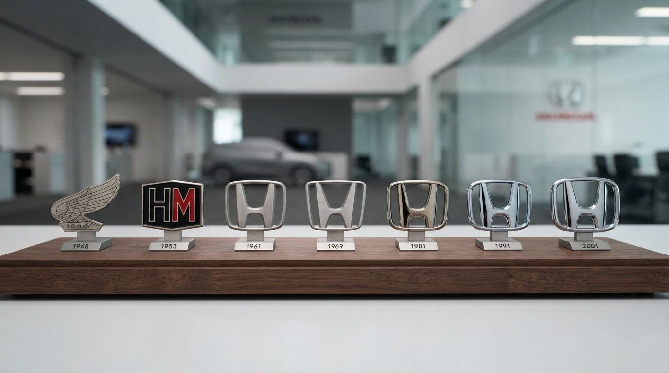
In 1948, Honda Motor Co. was officially incorporated. The early vehicles produced during this foundational period did not feature the standardized, sleek “H” we recognize today. Instead, they bore intricate, hand-applied decals that reflected the pride of craftsmanship and the mechanical complexity of the era. The very first product to bear a distinctive mark was the 1949 Honda Dream D-Type, the company’s first fully manufactured motorcycle. The tank of the Dream D-Type featured a stylized emblem depicting a pair of wings emerging from a central engine cylinder, flanked by the words “Dream” and “Honda Motor.” This design was heavily influenced by classical mythology, specifically Nike, the Greek goddess of victory. Soichiro Honda chose this motif to symbolize speed, triumph, and the limitless potential of human engineering.
The Evolution of the Honda Motorcycle Wing Logo
While the automotive “H” logo is more common in urban environments, the motorcycle wing logo is arguably the most widely produced emblem in the history of two-wheeled transportation. Honda’s motorcycle division has maintained a distinct visual identity that pays homage to Soichiro Honda’s original vision of flight and freedom. Below is a detailed chronological breakdown of how the motorcycle wing logo transformed over the decades.
1953 to 1968: The Formative Wings of Nike
As Honda’s manufacturing capabilities expanded in the 1950s, the motorcycle emblem underwent its first major refinement. The 1953 Benly motorcycle introduced a cleaner, more stylized version of the original wing emblem. Instead of a highly detailed, industrial rendering of an engine cylinder, the logo was simplified to show a single, swept-back wing. This design was highly dynamic, conveying a sense of forward motion and aerodynamic efficiency. By the late 1950s and early 1960s, as Honda entered international racing competitions like the Isle of Man TT, the wing became synonymous with reliability and high-performance engineering.
1968 to 2001: The “HM” Classic Wing Era
In 1968, Honda introduced a major modification to the motorcycle logo to create a cohesive global brand identity. The wing design was simplified into a bold, graphic silhouette, and the letters “HM” (representing Honda Motor) were integrated directly beneath the wing. This logo featured a distinct, tri-feathered wing design that was highly recognizable even at high speeds. This era marked Honda’s massive expansion into the North American and European markets, driven by legendary models like the CB750 and the trial-blazing Super Cub. The “HM” wing logo became a badge of honor for millions of riders worldwide, symbolizing an era of unparalleled reliability and engineering dominance.
2001 to Present: The Red Modern Wing
At the turn of the millennium, Honda decided to modernize its motorcycle division’s visual identity to align with contemporary digital design standards. The company removed the “HM” lettering, replacing it with the full name “HONDA” rendered in a clean, bold, red sans-serif typeface. The wing itself was redesigned with a sleeker, more aerodynamic profile, featuring clean horizontal cuts that suggest speed and high-tech precision. The entire emblem was unified under a vibrant red color palette, symbolizing passion, energy, and the brand’s enduring racing spirit. This logo remains the standard for Honda’s global motorcycle, ATV, and power equipment divisions today.
The Automotive ‘H’ Logo: Chronological Breakdown (1963–Present)
The story of Honda’s entry into the automotive market is one of bold defiance against regulatory hurdles. In the early 1960s, the Japanese government attempted to restrict new manufacturers from entering the car market. Undeterred, Soichiro Honda pushed forward with the development of the T360 mini-truck and the S500 sports car, both debuting in 1963. This landmark year marked the birth of the automotive “H” emblem, initiating a rich history of design iterations.
1963 to 1969: The Broad, Flared “H”
The original automotive logo, introduced in 1963, was radically different from the emblem we know today. Designed specifically for the hood of the S500 sports car and the T360 truck, this logo featured a highly stylized “H” that was exceptionally wide at the top and narrow at the base, creating a dramatic, top-heavy silhouette. The logo was encased in a dark, vertical rectangular frame that was narrower at the bottom than the top, mirroring the trapezoidal flare of the “H” itself. In many early applications, this emblem was cast in high-relief metal or finished in a striking red background, particularly on sports models, paying tribute to Japan’s national colors and Honda’s racing heritage.
1969 to 1981: The Vertical, Slender Frame
As Honda began exporting its passenger cars globally, particularly with the introduction of the N360 and the revolutionary first-generation Civic in 1972, the logo underwent a significant structural change. The wide, flared “H” of the 1960s was replaced by a highly vertical, slender design. The “H” was elongated, and the outer frame was tightened into a tall, narrow rectangle. This modification was driven by practical manufacturing and design considerations: the narrow emblem fit perfectly on the slim, chrome-rimmed grilles of 1970s compact cars. This logo represented Honda during its critical breakthrough years in Western markets, where the fuel-efficient CVCC engine established Honda as a leader in environmentally conscious engineering.
1981 to 2000: The Standardized, Rounded Square
The year 1981 marked a monumental shift in the Honda Logo History: Every Logo Change Since the Beginning. Recognizing the need for a unified global brand identity across all international markets, Honda introduced a standardized emblem that would serve as the foundation for its modern visual identity. The tall, narrow rectangle was replaced by a square frame with soft, rounded corners. Inside this frame, the “H” was redesigned with a subtle, elegant flare—wider at the top than at the bottom, symbolizing arms reaching toward the sky or the brand’s aspiration for continuous growth. This emblem was clean, balanced, and highly legible, making it perfect for print media, television advertisements, and physical vehicle badges. This logo adorned legendary models such as the Accord, Prelude, and the high-performance NSX, cementing Honda’s reputation for premium quality and technological innovation.
2000 to 2024: The 3D Chrome Dimension
With the advent of the 21st century and rapid advancements in materials science and digital rendering, Honda modernized its emblem to reflect a futuristic, high-tech aesthetic. While the core geometry of the 1981 logo was preserved, the emblem was transformed from a flat, two-dimensional line drawing into a striking, three-dimensional chrome sculpture. The lines of the “H” and its surrounding frame were given soft, beveled edges, reflecting light in a way that conveyed luxury, durability, and mechanical precision. This metallic emblem became a hallmark of Honda’s global lineup, representing the brand’s leadership in hybrid technology (with the Insight and Civic Hybrid) and its commitment to safety and family utility.
2024 to Present: The Minimalist Electric Future (The “0 Series” H)
At the Consumer Electronics Show (CES) in January 2024, Honda shocked the automotive world by unveiling a radical new logo designed specifically for its next-generation electric vehicles, known as the “Honda 0 Series.” This new logo represents the most significant departure from the traditional automotive emblem since 1981. The outer, rounded-square frame that had enclosed the “H” for over four decades was completely removed. The “H” itself was redesigned with ultra-thin, minimalist lines that flare outward dramatically at the top, bearing a striking resemblance to the original 1963 design. According to Honda, this open, frameless design represents “two outstretched hands,” symbolizing the brand’s commitment to expanding the possibilities of mobility and sincerely addressing the needs of users in the zero-emission era. This flat, digital-friendly design is optimized for illuminated vehicle grilles and high-resolution screen interfaces, positioning Honda at the cutting edge of the software-defined vehicle revolution.
Analyzing Corporate Visual Identity with Logo Designs
When analyzing the evolutionary trajectory of global brands, elite agencies specializing in corporate identity and Logo Designs often look to Honda as a masterclass in brand preservation. A common pitfall for expanding companies is the tendency to completely abandon historical brand equity during major corporate transitions. Honda, however, has consistently managed to reinvent its visual identity while retaining the core semantic meaning of its founding symbols.
From a professional design standpoint, Honda’s logos succeed because of their geometric purity and high adaptability. Whether rendered as a tiny chrome badge on a key fob, a massive illuminated sign on a dealership facade, or a flat vector graphic on a mobile app, the structural integrity of the “H” and the motorcycle wing remains intact. For businesses looking to establish their own visual legacy, studying the progression of Honda’s marks reveals that great design is not about constant disruption, but about the thoughtful calibration of heritage, technology, and consumer psychology. A successful brand mark must be elastic enough to stretch into the future without snapping its connection to the past.
Anatomy and Design Elements of the Honda Emblem
To fully comprehend the success of Honda’s visual branding, it is helpful to dissect the specific design elements, typography, and color psychology that have defined the brand throughout its history.
The Geometry of the “H”
The Honda “H” is not merely a standard typographic character; it is a carefully engineered geometric shape. In its most enduring forms (from 1981 to the present), the vertical pillars of the “H” are not parallel. Instead, they tilt slightly outward as they ascend, creating a trapezoidal silhouette. This subtle design choice serves multiple purposes:
- Visual Stability: A perfectly vertical “H” inside a rounded square can often appear top-heavy or static to the human eye. The flared top creates a dynamic sense of balance and upward lift.
- Aspirational Symbolism: The widening top of the emblem is designed to evoke a pair of arms raised toward the heavens, reflecting Soichiro Honda’s personal philosophy of chasing dreams (“The Power of Dreams”).
- Mechanical Integrity: The thicker top and tapered bottom of the lines give the emblem a structural solidity reminiscent of architectural columns, conveying safety, reliability, and engineering excellence.
Color Psychology in Honda’s Branding
Color plays a critical role in how consumers perceive a brand, and Honda has utilized a highly disciplined color palette to communicate its core values:
- Red: Primarily used in Honda’s motorcycle division, racing teams (Honda Racing Corporation – HRC), and the iconic “Type R” high-performance car badges. Red symbolizes passion, energy, speed, and the revolutionary spirit of the company’s founder. It also pays homage to the red sun of the Japanese national flag.
- Silver/Chrome: The standard color for passenger car badges. Silver represents sophistication, modern technology, precision engineering, and high-quality manufacturing. It reflects light dynamically, giving the physical vehicle a premium, polished appearance.
- Black: Frequently used in corporate typography and digital interfaces. Black provides a stark, high-contrast anchor that conveys authority, elegance, and timelessness.
- Blue: Introduced in recent years to designate Honda’s hybrid and electric vehicle technologies (e:HEV and e:Technology). Blue represents clean energy, environmental stewardship, intelligence, and a sustainable future.
The Custom Typography
Beneath the physical emblem, the Honda wordmark is instantly recognizable. The custom typeface features a heavy, slab-serif Roman font characterized by bold, horizontal serifs and thick, block-like letters. This custom typeface exudes stability, strength, and trust. It stands in stark contrast to the modern trend of ultra-thin, rounded sans-serif fonts, ensuring that the Honda brand name remains distinctive and highly legible from great distances.
Key Takeaways: Honda Logo History
- Philosophical Roots: The original motorcycle logos were inspired by Nike, the Greek goddess of victory, symbolizing Soichiro Honda’s dream of global achievement, speed, and engineering triumph.
- Dual Identity: Honda successfully maintains two distinct global visual identities: the aerodynamic “Wing” for its motorcycle division and the iconic “H” for its automotive lineup.
- Geometric Evolution: The automotive “H” transitioned from a wide, flared shape in 1963, to a tall and narrow rectangle in 1969, to a standardized rounded square in 1981, and finally to a 3D chrome emblem in 2000.
- The 2024 EV Revolution: The new Honda “0 Series” logo represents a bold shift to minimalism, removing the traditional outer frame to create an open, flat “H” that symbolizes outstretched hands and limitless future mobility.
- Brand Consistency: Despite major technological transitions—from air-cooled motorcycle engines to advanced hybrid systems and full electrification—Honda has preserved its core brand equity through disciplined, evolutionary design updates.
Frequently Asked Questions
Why does Honda use two different logos for its cars and motorcycles?
Honda began as a motorcycle manufacturer, and the wing logo was designed to represent speed, flight, and the company’s aspirations for global success. When Honda entered the automobile market in 1963, the company wanted to establish a distinct identity for its passenger vehicles that emphasized structural safety, reliability, and interior space. Using the “H” for cars and the “Wing” for motorcycles allows each division to target its respective market with tailored psychological cues while maintaining the shared parent brand name.
What does the new 2024 Honda logo mean?
The new frameless, flat “H” logo introduced in 2024 is designed specifically for Honda’s next-generation electric vehicles (the Honda 0 Series). The removal of the outer border represents freedom, openness, and a departure from traditional internal combustion engine design constraints. The dramatic outward flare of the “H” resembles two outstretched hands, symbolizing Honda’s commitment to human-centric design, user connection, and expanding the possibilities of mobility in a sustainable world.
What is the connection between the Honda and Acura logos?
Acura is the luxury vehicle division of Honda, launched in 1986. The Acura logo features a stylized letter “A,” but it was intentionally designed as a dual-purpose symbol. It represents a caliper—a precise measuring tool used by engineers—to highlight the brand’s commitment to precision and luxury craftsmanship. Crucially, the caliper is stylized in a way that closely resembles the classic Honda “H,” creating a subtle visual link between the luxury subsidiary and its parent company.
Why are some Honda logos red?
Red Honda logos are traditionally reserved for high-performance and racing models, most notably the “Type R” lineup (such as the Civic Type R) and Honda’s factory racing motorcycles. The red background pays homage to Soichiro Honda’s personal passion for motorsports, Japan’s national flag, and the brand’s competitive spirit. It serves as an instant visual indicator to enthusiasts that the vehicle possesses track-focused engineering and performance.
Who designed the original Honda logo?
The original conceptual designs for Honda’s early marks were heavily directed by Soichiro Honda himself, alongside his close business partner Takeo Fujisawa. As the company grew, professional Japanese industrial designers and international branding agencies refined these initial concepts. The landmark 1981 standardization was executed by Honda’s internal design team in Tokyo to ensure absolute geometric precision across global markets.
Conclusion
The comprehensive journey of the Honda Logo History: Every Logo Change Since the Beginning serves as a compelling narrative of corporate resilience, engineering brilliance, and design discipline. From the intricate, hand-drawn wings on the fuel tank of the 1949 Dream D-Type to the sleek, borderless, and futuristic “H” of the 2024 electric vehicle lineup, Honda has demonstrated that a truly great logo is an living asset. It must adapt to survive, but it must never lose its soul.
As the automotive industry undergoes its most significant disruption in a century—transitioning away from fossil fuels toward autonomous, electric, and software-driven transportation—Honda’s visual identity is once again leading the charge. By stripping away the protective outer frame of its classic logo, Honda is signaling to the world that it is open to new ideas, new technologies, and a sustainable future, all while remaining deeply rooted in the visionary spirit of Soichiro Honda. For consumers and designers alike, the Honda emblem remains a universal symbol of quality, reliability, and the unstoppable power of dreams.