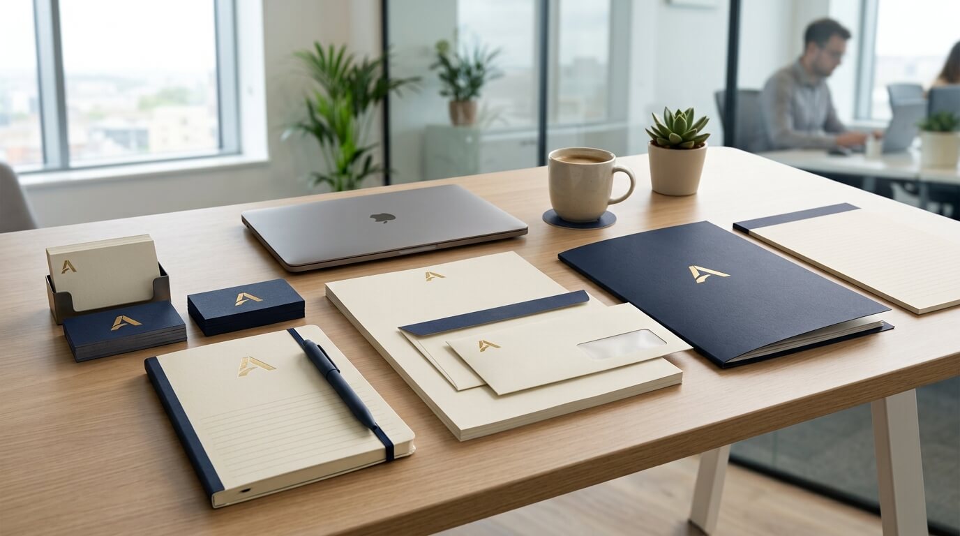
In a world where businesses communicate through websites, social media, email, video calls, and digital advertisements, it is easy to assume that printed stationery has lost its importance. Yet branded stationery remains a valuable part of a company’s visual identity. A professionally designed letterhead, business card, envelope, notepad, invoice, folder, or presentation document can turn an ordinary business interaction into a recognizable brand experience. Every time a customer, prospect, supplier, employee, or business partner encounters these materials, they are exposed to visual elements that can strengthen their memory of the company.
Brand recognition does not happen because someone sees a logo once. It develops through repeated exposure to consistent visual cues. Research and industry guidance on consistent visual identity emphasize that repeating elements such as colors, typography, logos, layouts, and imagery helps audiences connect different communications to the same organization. Branded stationery provides another physical and digital touchpoint through which those cues can be repeated.
The real value of branded stationery therefore goes beyond making documents look attractive. It helps establish a consistent identity, communicate professionalism, reinforce familiarity, differentiate a business, and create memorable experiences. When stationery is designed strategically, even a simple business card or letterhead can become part of a much larger brand recognition strategy.
Understanding the Relationship Between Stationery and Brand Recognition
Brand recognition refers to the ability of people to identify a company when they encounter its visual or verbal characteristics. A person may recognize a business from its logo, colors, typography, packaging, advertising style, or even the overall appearance of its communications. The stronger these associations become, the easier it is for customers to identify the company without needing to read its name first.
Branded stationery contributes to this process by putting recognizable brand elements into everyday business communication. A customer receiving a proposal with a familiar logo, distinctive color palette, and consistent typography is not simply receiving information. They are experiencing the company’s identity through another medium.
This becomes especially important because customers encounter brands in many different environments. A person might first discover a company through Google, later see its social media page, receive an email from its sales team, and eventually receive a printed proposal or business card. If all of these interactions share a recognizable visual language, they reinforce one another. If they look unrelated, the brand becomes harder to remember.
Business stationery can therefore act as a bridge between different parts of the customer experience. It brings the same identity used online into physical documents and professional interactions.
Why Consistency Makes Stationery More Memorable
Repetition Creates Familiarity
One of the most important ways branded stationery supports recognition is through repetition. When the same logo, colors, fonts, and design principles appear repeatedly, people become increasingly familiar with them. Industry guidance on printed brand assets similarly identifies repeated and consistent visual cues as important contributors to recognition and recall.
Imagine a company that uses dark blue, white, and a particular typeface across its website and marketing materials. When that same combination appears on its business cards, letterheads, envelopes, invoices, and folders, the customer begins to associate those elements with the company. Eventually, the visual combination can become recognizable even when the company name is not immediately visible.
The key is not simply using the logo everywhere. Effective recognition comes from developing a coherent visual system. The logo, typography, colors, spacing, imagery, and overall composition should work together so that each piece of stationery feels like part of the same brand.
Consistency Reduces Confusion
Inconsistent stationery can weaken recognition. If a company uses one logo on its business cards, different colors on invoices, another font on letters, and an unrelated design on presentation folders, customers may have difficulty connecting these materials to the same organization.
This does not mean every document needs to look identical. A business card and an invoice have different purposes and naturally require different layouts. What matters is that they share recognizable design characteristics. Consistency across stationery, websites, signage, and other marketing materials is also recommended by business guidance because it creates a more unified company image.
A consistent stationery system gives customers a visual shortcut. They do not have to consciously analyze every document. Familiar colors, typography, logo placement, and design patterns can immediately signal where the communication came from.
The Role of Logo Design in Branded Stationery
The logo is often the most recognizable element of a company’s visual identity. When used correctly on stationery, it gives customers an immediate visual connection to the organization.
However, effective logo placement requires balance. A logo that is too small may become difficult to notice, while one that dominates the entire page can make the document feel promotional rather than professional. The logo should have enough surrounding space to remain clear and identifiable.
Its placement should also be consistent. A business might position the logo in the upper-left corner of letterheads while using a centered version on certificates or presentation folders. Although the exact placement can vary according to the format, the logo should retain its recognizable proportions, colors, and visual integrity.
This consistency helps create what can be thought of as a visual signature. Every piece of communication carries a recognizable marker that connects it to the company.
Brand Colors Make Stationery Easier to Recognize
Creating a Distinctive Color Association
Color is another powerful component of branded stationery. A carefully selected color palette can make printed materials instantly distinguishable from generic business documents.
Consider receiving two letters. One is printed on plain white paper using a standard black font with no distinctive design. The other uses a recognizable company color in the header, a consistent accent line, and the company’s established typography. The second document has more visual information that can connect it to a specific organization.
This does not mean businesses should cover every piece of stationery in brand colors. In fact, excessive use can reduce readability and make documents look cluttered. Instead, colors should be applied strategically to headers, borders, icons, typography, envelopes, business cards, or subtle design elements.
Research into logo color also illustrates how color choices can influence perceptions of a brand and its status, demonstrating that visual details can contribute to broader brand impressions.
Maintaining Color Consistency Across Materials
Color consistency is particularly important when a company uses stationery across different printing formats. A brand’s colors should be carefully defined so that designers and printers know how they should appear.
A company that consistently uses the same visual palette makes its materials easier to associate with one another. Over time, those colors can become part of the brand’s recognizable visual language.
Typography Gives the Brand a Personality
Typography is sometimes overlooked when businesses think about stationery, but the choice of fonts can significantly influence how a company communicates.
A financial institution might use clean, restrained typography to communicate stability and professionalism. A creative agency might use a more distinctive typeface to communicate imagination. A luxury business may choose refined typography to create an elegant impression.
The important consideration is consistency. When the same typefaces are applied across stationery and other branded communications, they become part of the company’s identity. Customers begin to recognize not only the logo and colors but also the overall visual character of the communication.
Typography should also remain functional. A beautiful font that is difficult to read will ultimately weaken the document’s effectiveness. Strong stationery design combines brand personality with readability.
Branded Stationery Strengthens Professional Perception
Brand recognition and professional perception often work together. When customers repeatedly encounter a company that presents itself consistently, they may perceive it as more organized and established.
Business guidance from the UK government’s business information service notes that high-quality stationery and attention to detail can contribute positively to a company’s image, while inconsistent or poor-quality materials can detract from it.
A branded letterhead can make a formal letter feel more official. A professionally designed business card can make a networking interaction feel more polished. A branded folder can make a proposal presentation feel more organized. These individual experiences may appear small, but collectively they influence how people perceive the business.
This is particularly important for smaller companies. A new business may not yet have the market recognition of a large corporation, but professional stationery can help it present a clear and established identity from the beginning.
How Different Stationery Items Support Brand Recognition
Different stationery items create different opportunities for brand exposure. When these materials follow a unified design system, they strengthen recognition from multiple directions.
| Stationery Item | Brand Recognition Opportunity | Key Brand Elements |
| Business Cards | Reinforces identity during networking and meetings | Logo, colors, typography, contact details |
| Letterheads | Connects formal communication with the company | Logo, layout, colors, typography |
| Envelopes | Creates recognition before the document is opened | Logo, colors, address placement |
| Notepads | Keeps the brand visible during meetings and everyday use | Logo, color palette, design pattern |
| Folders | Creates a branded presentation for proposals and documents | Logo, imagery, colors, company message |
| Invoices | Extends branding into routine business interactions | Logo, typography, layout, contact information |
| Compliment Slips | Adds a personal branded touch to communication | Logo, colors, concise design |
The advantage of using several stationery formats is that the brand does not depend on a single interaction. Customers encounter the same identity in different situations, increasing the number of opportunities for recognition.
Branded Business Cards Create Lasting Physical Reminders
Business cards remain particularly useful because they can continue representing a company after a meeting has ended. A customer may put a business card in a wallet, desk drawer, notebook, or card holder and encounter it days or weeks later.
A generic card may be quickly forgotten. A distinctive branded card, however, can create a stronger association because its visual design reminds the recipient who the company is and what it represents.
The most effective business cards balance information and design. The company name, logo, individual’s name, role, contact information, and website should be easy to find. At the same time, colors, typography, paper quality, and layout should reflect the broader brand identity.
A memorable business card does not necessarily need to be complicated. In many cases, a simple but distinctive design is easier to remember than one filled with excessive graphics.
Letterheads Turn Everyday Communication Into Brand Exposure
Letterheads are another powerful stationery tool because they can be used repeatedly. Companies often send proposals, contracts, notices, official letters, quotations, and other documents using letterhead.
Each communication becomes another opportunity to reinforce the company’s identity.
A consistent letterhead can also help connect printed documents with digital documents. Modern companies frequently create digital PDFs that follow the same design principles as their printed materials. This means the visual identity can remain consistent whether a customer receives a document by email or physically.
This consistency is increasingly relevant because professional communications frequently move between digital and physical environments. Contemporary stationery design guidance notes that branding standards should remain consistent regardless of whether documents are printed or delivered electronically.
Quality Materials Can Strengthen the Brand Experience
Paper Is Part of the Message
Brand recognition is not only visual. Physical qualities can also influence how people experience a brand.
The weight, texture, finish, and overall quality of paper can contribute to the impression created by stationery. A premium business card may feel substantial and carefully produced, while a thin or poorly printed card may create a different impression.
This does not mean every business needs expensive paper. The material should match the company’s positioning. A sustainable brand may prefer recycled stock. A luxury business may choose a refined textured material. A modern technology company may prefer a clean, minimalist finish.
The important point is alignment. The physical experience should support the brand’s personality rather than contradict it.
Stationery Helps Small Businesses Compete With Larger Brands
Small businesses often face the challenge of being recognized in markets filled with established competitors. Branded stationery can help create a more cohesive and professional identity without requiring the enormous marketing budgets associated with major corporations.
A small consulting firm, for example, can use the same logo, colors, typography, and design language across its website, proposal documents, business cards, invoices, folders, and correspondence. Although the company may have a relatively small physical presence, its communications can still feel unified and professional.
This is especially valuable during direct interactions. When a potential client receives a proposal and business card that clearly belong to the same visual system, the business appears more organized. The stationery becomes part of the company’s credibility rather than simply a functional document.
Branded Stationery Supports Customer Recall
Recognition is useful because it makes future interactions easier. If a customer remembers a company’s visual identity, they may be more likely to recognize its email, advertisement, website, packaging, or social media content later.
Stationery can contribute to this recall because it provides physical exposure that digital advertising cannot always replicate. Printed documents may remain on desks, in folders, in offices, or inside files. Unlike a digital advertisement that disappears from the screen, a physical piece of stationery can remain visible.
This creates an opportunity for passive brand exposure. The customer may not actively think about the company, but the visual identity remains present in their environment.
Branded Stationery Differentiates a Business
In competitive markets, differentiation is essential. Companies often compete on similar products, services, prices, and features. A recognizable visual identity can give customers another way to distinguish one company from another.
A carefully designed stationery system can communicate whether a company is modern, traditional, creative, professional, premium, approachable, sustainable, or innovative.
The design should therefore be connected to the company’s positioning. A children’s education company might use friendly colors and playful illustrations, while a law firm may choose a more restrained visual system. Both approaches can be effective because they communicate different identities to different audiences.
The goal is not to make stationery visually impressive for its own sake. The goal is to make it meaningful and recognizable.
How to Build an Effective Branded Stationery System
Start With a Clear Brand Identity
Before designing stationery, a company should understand its existing brand identity. This includes the logo, color palette, typography, imagery, tone, and overall personality.
Brand guidelines can help ensure that these elements remain consistent. Such guidelines can define approved logo versions, fonts, color specifications, spacing requirements, and examples of how the identity should be applied to different materials. Consistent stationery systems benefit from these rules because they reduce visual inconsistency across communications.
Design for Both Recognition and Function
Stationery must still perform its practical purpose. An invoice needs clear financial information. A letterhead needs readable text. A business card needs accessible contact details. A folder needs enough space to accommodate documents.
Good design combines functionality with branding rather than sacrificing one for the other.
Avoid Overdesigning
More branding does not automatically mean stronger recognition. A page filled with logos, colors, graphics, and slogans may actually make information harder to process.
Strong stationery often uses restraint. A recognizable logo, carefully selected colors, clear typography, and sufficient whitespace can create a professional appearance while allowing the content to remain the focus.
Integrating Branded Stationery With Digital Branding
The strongest stationery strategies do not operate separately from digital marketing. They extend the company’s existing identity into physical materials.
A customer should ideally be able to move from a company’s website to a business card, from an email to a proposal, or from a printed invoice to a social media profile without feeling that they are dealing with different organizations.
This unified experience strengthens brand recognition because customers encounter the same visual signals across multiple channels. Studies and industry research on visual consistency similarly associate consistent design elements with faster recognition, clearer communication, and stronger perceptions of professionalism and trust.
In this way, stationery becomes part of a complete brand ecosystem rather than an isolated printing exercise.
The Long-Term Value of Consistent Stationery
The impact of branded stationery may not always be immediately measurable. A customer rarely says, “I chose this company because I liked its letterhead.” Branding generally works through a collection of impressions rather than a single obvious event.
Over time, however, repeated exposure can make a company feel familiar. Familiarity can make communications easier to recognize and can contribute to perceptions of professionalism and consistency.
That is why stationery should be viewed as a long-term branding investment rather than a one-time design task. Once a strong visual system is created, it can be applied across years of correspondence, networking, proposals, invoices, packaging, and internal communications.
The result is a business identity that becomes increasingly recognizable through everyday use.
Conclusion
Branded stationery may seem like a small component of a company’s marketing strategy, but its contribution to brand recognition can be significant. Business cards, letterheads, envelopes, folders, notepads, invoices, and other printed materials create repeated opportunities to present the same visual identity.
When logos, colors, typography, layouts, and physical materials are used consistently, stationery helps build familiarity and connect different customer interactions to the same business. It can also strengthen professional perception, differentiate a company, improve recall, and bring digital and physical branding together.
The most effective approach is not simply to put a logo on every document. Instead, businesses should create a coherent stationery system that reflects their personality, communicates their values, remains functional, and consistently reinforces recognizable visual cues. In a crowded marketplace, those repeated details can help turn a company from something customers have merely seen into a brand they can recognize and remember.
Frequently Asked Questions
Q1. What is branded stationery?
Branded stationery refers to business communication materials designed around a company’s visual identity. It can include letterheads, business cards, envelopes, notepads, invoices, folders, compliment slips, and other printed or digital documents.
Q2. How does branded stationery improve brand recognition?
Branded stationery repeatedly exposes customers to recognizable elements such as logos, colors, typography, and design patterns. Consistent repetition helps customers associate those visual elements with a particular company.
Q3. Is branded stationery still useful in a digital-first business environment?
Yes. Digital communication has reduced some traditional uses of paper, but stationery still provides valuable physical and digital branding touchpoints. Digital proposals, invoices, and PDFs can also use stationery-inspired design systems to maintain consistency.
Q4. What should be included in branded stationery?
The exact elements depend on the stationery type, but common elements include the company logo, approved colors, typography, business name, contact information, website, address, and other relevant details. The design should remain consistent with the company’s wider brand identity.
Q5. Does expensive stationery create better brand recognition?
Not necessarily. Quality can influence professional perception, but recognition primarily depends on having distinctive and consistent visual elements. A well-designed, appropriately produced stationery system can be more effective than expensive materials with inconsistent branding.