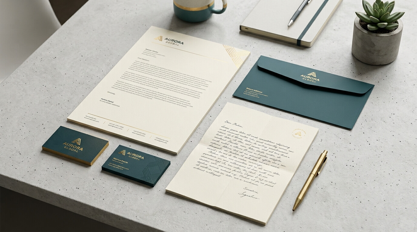
Business cards and letterheads are often treated as separate pieces of business stationery. A business card is something handed to a potential customer during a meeting, while a letterhead is used for formal correspondence, proposals, invoices, or official documents. Although they serve different practical purposes, they work best when they are designed as parts of the same visual identity.
When business cards and letterheads share the same branding elements, they create a consistent experience every time someone interacts with a company. The logo, colors, typography, spacing, imagery, and overall design language can connect a small card exchanged during a conversation with a formal document received later. This consistency helps a business appear organized, credible, and recognizable. Research and industry guidance on corporate stationery consistently emphasizes that coordinated colors, fonts, logo treatment, and layouts help create a unified brand presentation.
The relationship between these two stationery items is particularly important because they often appear at different stages of a customer relationship. A business card may create the initial introduction, while a letterhead may support the follow-up communication. When both materials look like they belong to the same company, the connection between those interactions becomes stronger.
Understanding the Role of Business Cards and Letterheads
What a Business Card Represents
A business card is one of the smallest pieces of branded material a company produces, but its role can be surprisingly significant. It usually introduces a person and gives a prospect a simple way to remember and contact them. Unlike a website or social media profile, a business card is a physical object that can remain in a wallet, on a desk, inside a notebook, or among other contact information.
The design therefore has to communicate a considerable amount in a very limited space. A business card typically includes a company logo, person’s name, professional title, telephone number, email address, website, and sometimes social media information or a QR code. However, its purpose is not simply to display contact information. It also communicates the personality and positioning of the business.
A premium consulting firm, for example, might use restrained typography, generous white space, and refined printing finishes. A creative agency might use more expressive graphics or an unconventional layout. A technology company may choose a clean and modern visual system. The card becomes a compact representation of the broader brand.
What a Letterhead Represents
A letterhead has a different job. It provides a branded framework for formal business communication. It can appear on proposals, agreements, official letters, invoices, reports, notices, and other documents. Because it provides considerably more space than a business card, it must balance branding with functionality.
A good letterhead makes important documents immediately identifiable without competing with the information being communicated. The logo and company details establish the identity of the sender, while the main body of the page remains sufficiently open for professional content.
This makes the letterhead more than decorative paper. It becomes a recurring visual signature attached to the company’s official communications. Every time a customer receives a document using the same letterhead, another brand interaction takes place.
Why Business Cards and Letterheads Should Share a Design Language
Consistency Creates Recognition
One of the strongest reasons to coordinate business cards and letterheads is simple recognition. People rarely remember every detail of a brand after seeing it once. Recognition develops through repeated exposure to familiar visual signals.
When the same logo, colors, typography, and design characteristics appear on a business card and later on a letterhead, the customer has another opportunity to connect those elements with the company. Over time, this repeated visual experience can make the brand easier to recognize.
The two items do not need to look identical. In fact, forcing an identical design onto different formats can make the stationery feel awkward. Instead, they should feel related. A business card can be more compact and visually expressive, while a letterhead can be simpler because it needs space for substantial written content. The important point is that both should clearly belong to the same visual system.
Professionalism Becomes Easier to Communicate
Professionalism is not communicated only through words. Customers also form impressions based on how organized and consistent a business appears. When a person receives a business card with one logo treatment and later receives a document using completely different fonts and colors, the brand can appear inconsistent.
By contrast, coordinated stationery suggests that the company pays attention to detail. This does not automatically mean that the business provides better services, but it creates a polished first impression that supports credibility.
This is especially relevant for professional service businesses where trust plays a major role. Lawyers, consultants, accountants, architects, agencies, financial professionals, real estate companies, and B2B service providers often communicate through formal documents. A coordinated business card and letterhead can make those interactions feel more deliberate and established.
The Visual Elements That Connect Both
Logo Placement and Treatment
The logo is usually the most recognizable visual element of a business identity. Its treatment should therefore remain consistent across the business card and letterhead.
This does not necessarily mean placing the logo in exactly the same location. A business card might place the logo prominently on one side, while a letterhead might position it in the upper-left corner. What matters is maintaining the same logo version, proportions, colors, and surrounding space.
Using different versions of a logo across stationery can create unnecessary confusion. A simplified logo may work well in certain situations, but it should be an intentional part of the brand system rather than an accidental variation.
Color Palette
Color is another powerful connection between business cards and letterheads. When the same brand colors appear across both, the relationship becomes immediately visible.
A company with a deep blue and white identity, for example, might use blue as the dominant accent on its business card and use a much lighter application of the same blue on its letterhead. The result does not need to be visually heavy. Even a thin line, small logo detail, or footer accent can connect the two pieces.
Print production also matters. Colors displayed on a computer screen can behave differently when reproduced physically. Professional stationery systems therefore need careful attention to print color specifications and consistency between materials.
Typography
Typography provides another subtle but important connection. A company should generally establish a consistent typographic personality across its stationery.
If a business card uses a modern sans-serif typeface while its letterhead suddenly uses an unrelated decorative font, the materials may feel disconnected. A coordinated system might instead use the same primary typeface throughout while changing font sizes and weights according to the format.
The business card needs compact, readable typography because space is limited. The letterhead can use larger text areas and more flexible hierarchy. The underlying typeface and typographic personality, however, can remain consistent.
Graphic Details
Small graphic elements can also help connect stationery. These may include lines, geometric shapes, patterns, icons, borders, or subtle background elements.
The key is restraint. A design feature that looks attractive on a business card may become distracting when repeated across a full page. Instead of copying every element exactly, designers can adapt the visual feature to the size and function of each item.
This creates a family resemblance rather than a collection of identical objects.
How Business Cards and Letterheads Support Different Stages of Communication
The real strength of using these items together becomes clearer when considering the customer journey.
Imagine meeting a potential client at a networking event. The conversation ends and you hand over your business card. The client now has your name and contact information, but the physical card also creates a visual memory of your company.
A few days later, you send a proposal. If the proposal arrives on a letterhead that uses the same logo, typography, and color system, the client can immediately connect the document with the person they met.
The business card created the initial association. The letterhead reinforces it.
This creates continuity between personal networking and formal business communication. Instead of each interaction appearing independent, they become connected parts of one brand experience.
Designing Business Cards and Letterheads as One Stationery System
Start With the Brand Identity
The best stationery design begins before the business card or letterhead is created. A company should first establish its fundamental visual identity.
This includes the primary logo, color palette, typography, imagery style, spacing principles, and overall personality. Once those decisions are established, they can be translated into different stationery formats.
Trying to design a business card and letterhead independently often leads to inconsistencies. Designing them as components of one system makes it easier to maintain a recognizable identity.
Adapt Rather Than Copy
A common mistake is assuming that matching stationery means making everything look exactly the same. Effective brand systems work differently.
A business card has a compact canvas and usually contains limited information. A letterhead has an entire page to accommodate substantial text. Their layouts therefore need to respond to their individual functions.
The connection should come from shared design principles rather than identical arrangements. The logo, colors, typography, and visual personality can remain consistent while the composition changes according to the format.
Consider the Physical Experience
Design is not only about what stationery looks like on a screen. Paper, texture, thickness, printing quality, and finishing can influence how the materials are perceived.
A business card printed on a substantial stock can create a very different impression from a thin card. Similarly, letterhead printed on quality paper can give formal communications a more considered physical presence.
When the materials feel related as well as looking related, the stationery system becomes stronger. Some printing providers specifically emphasize matching paper feel, color, and logo placement across stationery as part of maintaining a consistent business identity.
Business Cards and Letterheads Across Different Industries
Different industries may use coordinated stationery in different ways.
A law firm may favor conservative typography, restrained colors, and a highly structured letterhead because its documents need to communicate authority and professionalism. Its business cards can follow the same visual language while providing a more compact presentation of individual attorneys and their contact information.
A creative agency may take a more expressive approach. Its business cards could use unusual typography, bold imagery, or distinctive finishes, while its letterhead could incorporate the same visual characteristics more subtly.
A construction company may use strong colors, straightforward typography, and a recognizable logo. Its business card might emphasize phone numbers and service information, while its letterhead could provide a professional format for quotations, project correspondence, and contracts.
A healthcare business may need a particularly clean and readable system. Its letterhead could prioritize clear contact information and professional credentials, while the business card maintains the same calming visual identity.
In every case, the specific design can change, but the underlying principle remains the same: both materials should communicate the same brand.
Comparing the Roles of Business Cards and Letterheads
| Feature | Business Card | Letterhead | How They Work Together |
| Primary purpose | Personal introduction and contact sharing | Formal business communication | Connects initial contact with follow-up communication |
| Typical content | Name, title, phone, email, website | Company details and document content | Reinforces the same company identity |
| Design space | Very limited | Much larger | Requires adaptable but consistent layouts |
| Main branding role | Creates quick visual recognition | Reinforces brand during longer interactions | Builds repeated recognition |
| Typography | Compact and highly readable | Functional and document-friendly | Shares the same typographic personality |
| Logo usage | Often prominent | Usually structured into header or footer | Maintains recognizable identity |
| Color usage | Can be more noticeable | Usually more restrained | Creates a unified visual system |
| Physical impact | Card stock and finish matter | Paper quality and print quality matter | Creates consistency in the physical brand experience |
The Importance of Contact Information
Although branding is central to coordinated stationery, functionality should never be overlooked.
A business card needs accurate and readable contact information. A letterhead needs correct company details so that customers can easily identify and contact the organization. Incorrect phone numbers, outdated websites, old addresses, or former employee details can undermine an otherwise polished stationery system.
This is one reason businesses should review their stationery regularly. A redesign may be necessary after a company changes its address, telephone number, website, ownership, or brand identity.
Accuracy is part of professionalism.
Connecting Printed Stationery With Digital Branding
Business cards and letterheads no longer exist independently from digital branding. Customers may move between physical and digital channels several times during a single relationship.
Someone might receive a business card, visit the company’s website, receive a PDF proposal, follow the company’s social media account, and later receive a printed letter. If the same visual identity appears throughout these experiences, the brand feels more cohesive.
Digital templates can therefore borrow visual principles from printed stationery. A proposal PDF might use the same typography and colors as the letterhead. An email signature might use a simplified version of the business card’s contact structure. A QR code on the card can connect the physical introduction to the company’s website.
The goal is not to make every platform look identical. It is to make every platform recognizable as part of the same brand.
Common Mistakes to Avoid
Designing Each Item Separately
One of the biggest problems occurs when business cards and letterheads are designed at different times without reference to a shared brand system. The resulting materials may each look attractive but fail to feel connected.
Creating a stationery guide before production can prevent this problem.
Using Too Many Fonts
Multiple typefaces can make stationery appear inconsistent. A carefully selected primary typeface with a supporting font, when necessary, is usually easier to manage across different materials.
Overloading the Letterhead
A letterhead should leave room for communication. Too many graphics, large logos, decorative elements, or excessive contact information can reduce the usable writing area.
Prioritizing Appearance Over Readability
A business card needs to look distinctive, but contact information must remain easy to read. Similarly, a letterhead should support the document rather than compete with it.
The strongest stationery designs balance visual recognition with practical usability.
How a Coordinated Stationery System Builds Long-Term Brand Value
Brand recognition does not usually come from one dramatic interaction. It develops through repeated exposure. Business cards and letterheads contribute to that process by placing consistent visual signals into everyday business communication.
A customer may see a business card once and forget it. But if that same customer later receives an invoice, proposal, letter, or contract featuring the same recognizable design, the original impression can become easier to retrieve.
Over time, these repeated interactions can contribute to familiarity. Familiarity matters because customers generally feel more comfortable with businesses they can recognize and understand.
This is why stationery should be viewed as part of a larger brand strategy rather than simply an office expense. Every printed communication can reinforce the identity that a company is trying to build.
Conclusion
Business cards and letterheads serve different purposes, but their greatest value comes from working together. The business card creates a compact and memorable introduction, while the letterhead extends that identity into formal business communication. When they share the same logo treatment, colors, typography, design principles, and overall personality, they create a consistent experience that can strengthen professionalism and recognition.
The goal is not to make every piece of stationery identical. Instead, businesses should create a flexible visual system in which each item has its own function while still looking unmistakably connected to the same brand. When business cards and letterheads are designed as parts of one coordinated identity, even ordinary business interactions can become opportunities to reinforce credibility, familiarity, and brand recognition.
Frequently Asked Questions
Q1. Should business cards and letterheads have exactly the same design?
No. They should share the same visual identity but adapt to their different functions. A business card needs a compact layout, while a letterhead needs enough open space for documents.
Q2. What elements should match between a business card and letterhead?
The logo, primary colors, typography, general visual style, and design personality should usually remain consistent. These elements create the visual connection between the two materials.
Q3. Can small businesses benefit from matching stationery?
Yes. Consistent stationery can help even a small business appear organized and professional. It also gives customers repeated exposure to the same brand identity.
Q4. Should the letterhead include all the information found on a business card?
Not necessarily. A letterhead generally needs company information relevant to formal communication, while a business card focuses more heavily on an individual’s contact details.
Q5. How often should business stationery be updated?
Stationery should be reviewed whenever important business information or branding changes. Companies should also check periodically for outdated contact details, old logos, or design elements that no longer represent the brand.