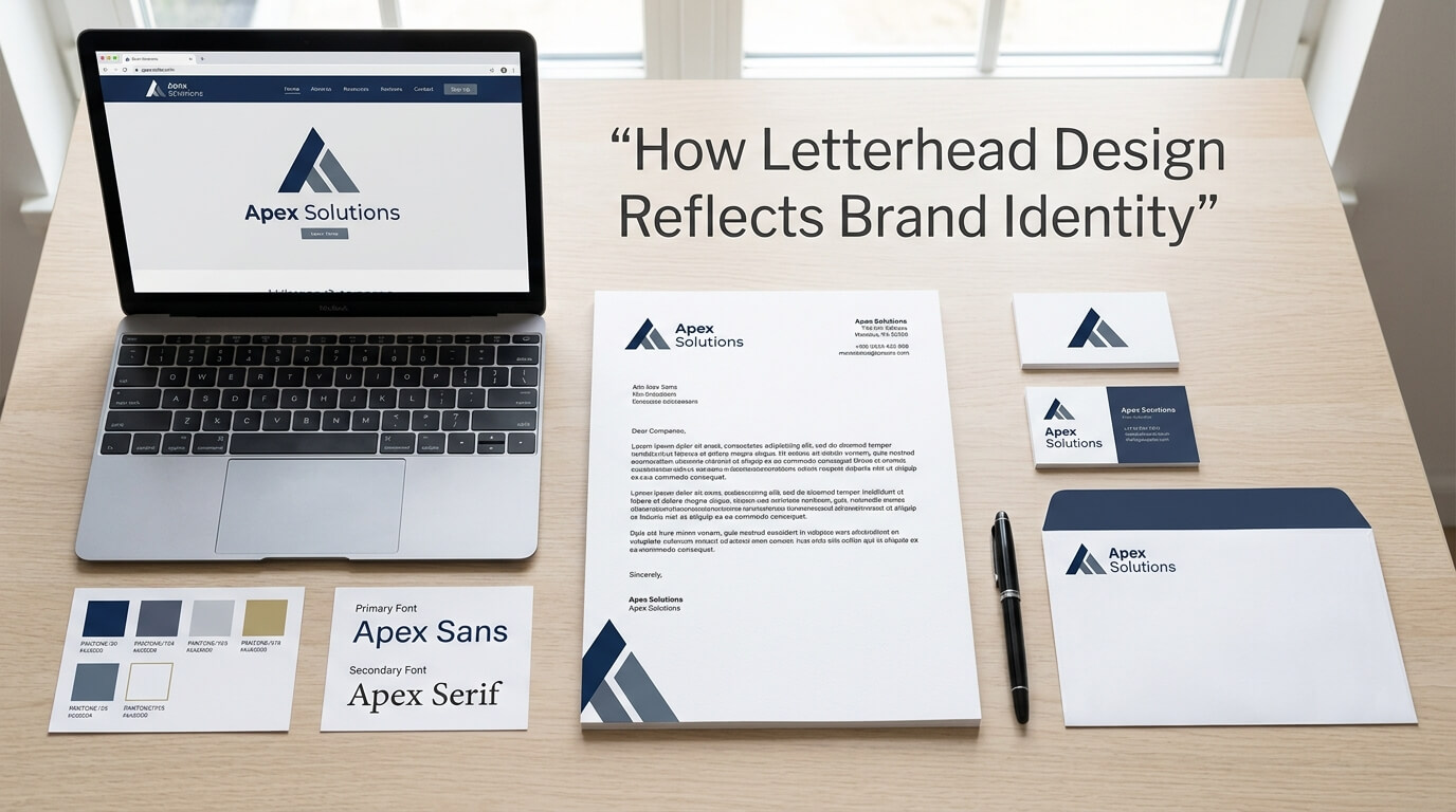
In a business environment where websites, social media profiles, emails, and digital advertisements often receive most of the attention, letterhead can seem like a small and traditional branding element. Yet a well-designed letterhead remains an important part of a company’s visual identity. Whether it appears on a formal business letter, proposal, invoice, contract, certificate, report, or printed communication, letterhead gives the document an immediate connection to the organization behind it. It transforms an ordinary page into a recognizable business communication.
Letterhead design is not simply about placing a logo at the top of a page. It is about translating the personality, values, and visual language of a brand into a practical document format. Logo placement, typography, color, spacing, imagery, page structure, and even the amount of white space can influence how a business is perceived. When these elements work together, the letterhead becomes an extension of the brand rather than an isolated piece of stationery. Professional design guidance consistently emphasizes that letterhead should use the same logo, colors, typography, and visual principles found throughout a company’s broader brand identity.
For businesses that want to appear established, trustworthy, organized, and memorable, this consistency matters. A customer may interact with a company through a website one day and receive an official document the next. If both materials look as though they belong to the same organization, the brand feels deliberate and dependable. If they look completely different, the company can appear inconsistent or poorly managed.
Letterhead Is an Extension of Brand Identity
Brand identity encompasses the visual and verbal elements that communicate who a business is and what it represents. A logo may be the most recognizable part of that identity, but it is only one component. Colors, typography, layouts, imagery, tone, and design principles collectively create the visual experience associated with a business.
Letterhead provides an opportunity to apply these elements in a real business context. Instead of existing only on a website or advertisement, the brand becomes part of formal communication. This can make even a simple letter feel more official and connected to the organization.
A letterhead should therefore be treated as part of the same identity system as business cards, envelopes, presentations, invoices, email signatures, and websites. Modern brand identity packages commonly include letterhead alongside typography, color palettes, business cards, and other stationery precisely because these elements need to work together visually.
Turning a Logo Into a Complete Visual Language
A common mistake is to think that branding a letterhead means adding a logo to an otherwise generic document. While the logo is important, effective letterhead design goes further. The colors surrounding the logo, the font used for company information, the alignment of the content, and the overall spacing should support the same personality expressed by the logo.
For example, a technology company may use a minimalist layout, modern sans-serif typography, and restrained geometric details. A law firm may prefer a more traditional arrangement with sophisticated typography and conservative colors. A creative agency may have more freedom to incorporate distinctive shapes, unusual alignment, or carefully controlled visual accents.
The important point is that the letterhead should feel like the brand. The design does not need to reproduce every element of the company’s visual identity, but the selected elements should clearly belong to the same design system.
How Color Communicates Brand Personality
Color is one of the strongest visual tools in branding because people often associate particular colors with specific moods and qualities. A letterhead can use color subtly to reinforce these associations without overwhelming the document.
A company with a blue-centered identity might use blue in its logo, header line, footer, or small graphic accent. The color can create continuity between the letterhead and other branded materials. A business using green may incorporate the color to support an identity associated with nature, sustainability, health, or growth. A luxury-oriented company might rely on restrained neutral tones and a carefully selected accent color to communicate sophistication.
The key is not simply choosing an attractive color. The colors need to be consistent with the established brand palette and suitable for printing. Brand systems often define color values for different applications because colors can appear differently across screens and physical materials.
Consistency Matters More Than Decoration
A letterhead does not need to be covered in brand colors to communicate identity. In fact, excessive use of color can reduce professionalism and interfere with readability. Strong letterhead design usually uses color strategically.
A small colored line beneath a logo, a restrained footer, or a subtle accent around contact information may be enough. The objective is to make the page recognizable while preserving enough space for the actual communication.
This balance is particularly important for businesses that send formal documents. A letterhead is a functional document first and a branding tool second. Its design should support the message instead of competing with it.
Typography Gives the Letterhead a Distinct Voice
Typography plays a major role in how a brand feels. Fonts can communicate modernity, tradition, elegance, friendliness, authority, or creativity before the reader has processed the actual words.
This makes typography particularly important in letterhead design. If a company’s website uses a clean, contemporary sans-serif typeface but its letterhead uses an unrelated decorative font, the organization may appear visually inconsistent. The same applies when different documents use different typefaces without a clear reason.
A strong letterhead typically follows the brand’s established typography system. The logo may have its own type treatment, while headings, contact information, and body text use complementary fonts that remain easy to read. Brand identity systems commonly establish typography alongside colors and logos to ensure that these choices remain consistent across business materials.
Choosing Typography That Matches the Brand
A traditional organization might use a serif typeface to create a sense of authority and heritage. A contemporary technology company may choose a clean sans-serif font to communicate simplicity and innovation. A creative business might introduce a distinctive typeface for headings while keeping the body text highly readable.
The important consideration is hierarchy. The company name, document title, date, recipient information, body copy, and footer details should not all compete for attention. Different sizes, weights, and spacing can establish a clear visual order.
Good typography therefore does more than make the letterhead attractive. It improves usability while reinforcing personality.
Logo Placement Strengthens Recognition
The logo is often the most immediate visual identifier on a letterhead. Its placement, size, and surrounding space can influence the entire composition.
A conventional layout may position the logo in the upper-left corner, while other businesses may center it or use a more distinctive arrangement. There is no universal placement that works for every brand. The correct choice depends on the identity system and the desired impression.
However, the logo should remain recognizable and should not be crowded by other information. Giving it enough breathing room can make it appear more professional. Distorting the logo, using inconsistent versions, or placing it against unsuitable backgrounds can weaken brand recognition.
Professional letterhead guidance generally recommends using the same logo treatment established in the company’s broader identity system.
White Space Makes Branding Look More Professional
White space is sometimes misunderstood as unused space. In reality, it is an important design tool. Empty areas around a logo, heading, paragraph, or footer allow individual elements to breathe and make the page easier to read.
A crowded letterhead can communicate the wrong message. If the header contains the logo, company name, address, phone number, email, website, social media information, decorative graphics, and multiple slogans all at once, there may be little room left for the actual letter.
A carefully designed letterhead establishes a hierarchy between brand information and document content. This restraint often makes the brand feel more confident because it does not need to fill every available space to make itself noticed.
Layout Reflects How a Business Operates
The overall structure of a letterhead can also communicate something about the organization. A carefully aligned, balanced layout suggests attention to detail and organization. A chaotic or poorly spaced document can create an impression of carelessness.
Layout includes the positioning of the logo, contact details, margins, headings, body text, page numbers, and footer information. When these components are aligned according to a consistent grid, the document becomes easier to navigate.
A professional letterhead should provide enough space for the main communication while keeping brand elements visible. Design guidance commonly recommends a clear header, readable body area, and organized footer rather than allowing branding elements to interfere with the document itself.
Creating a Consistent Structure Across Documents
Brand identity becomes stronger when the same layout principles are applied to different business materials. A letterhead, invoice, proposal, and business card do not have to look identical, but they should feel related.
For example, all materials may use the same logo position, color palette, typography, alignment style, and visual accents. This creates a recognizable family of documents. Customers do not necessarily analyze these similarities consciously, but repeated visual patterns can make a brand easier to recognize.
The Role of Contact Information
Contact information is a practical requirement, but it also contributes to brand identity. The way an organization displays its address, telephone number, email, website, and other relevant information can influence the overall appearance of the page.
Poorly arranged contact details can make a sophisticated brand look unprofessional. On the other hand, carefully organized information can reinforce the sense of structure established by the rest of the design.
The information should be easy to locate without dominating the page. A footer is often useful for this purpose because it separates practical details from the primary communication area while keeping the information accessible.
The exact information required will vary by organization and jurisdiction. Some businesses may also need registration or legal details on formal documents. Whatever information is included, it should follow the same typographic and spacing rules as the rest of the brand.
Letterhead Design and Customer Perception
Customers form impressions from many small interactions with a business. A letterhead is one of those interactions. It may appear after a customer has already visited a website, spoken with a representative, or received an email. When the document reinforces the same visual identity, it confirms that the company is consistent.
A professionally designed letterhead can make formal communication feel more credible and intentional. This is particularly relevant when the document contains important information such as a proposal, agreement, quotation, recommendation, business announcement, or official correspondence.
Adobe describes custom letterhead as a way to strengthen brand recognition and notes that communications should remain aligned with the broader brand identity across both printed and digital formats.
Building Trust Through Consistency
Trust is rarely created by one design element alone. Instead, it develops through repeated experiences. If a company’s website looks polished, its email signature is consistent, its business card is professional, and its documents follow the same visual identity, the customer encounters a coherent brand at every stage.
Letterhead contributes to this consistency by ensuring that formal documents do not feel disconnected from the rest of the business.
The effect becomes particularly important for professional services. Consultants, financial firms, legal practices, agencies, healthcare organizations, architects, and other service providers often depend heavily on credibility. Their documents can become part of the customer’s perception of expertise and reliability.
How Letterhead Design Differs Across Industries
Different industries have different expectations, and letterhead design should reflect those expectations without becoming generic.
| Industry | Typical Brand Personality | Suitable Letterhead Approach | Key Design Priority |
| Law and Legal Services | Authoritative and traditional | Structured layout, restrained colors, classic typography | Credibility |
| Technology | Modern and innovative | Minimal layout, clean typography, subtle graphic elements | Simplicity |
| Creative Agencies | Expressive and distinctive | Flexible layouts, creative accents, strong visual identity | Originality |
| Finance | Professional and dependable | Conservative palette, precise alignment, clear hierarchy | Trust |
| Healthcare | Clean and reassuring | Spacious layout, readable typography, calm colors | Clarity |
| Luxury Brands | Elegant and refined | Minimal design, premium typography, restrained details | Sophistication |
| Education | Approachable and established | Clear structure with recognizable institutional elements | Recognition |
These differences demonstrate why copying a generic letterhead template can be limiting. A design that works for a creative studio may not communicate the same qualities when used by a financial institution. Effective stationery should be designed around the identity and expectations of the specific organization.
Digital Letterhead Is Equally Important
Letterhead is no longer limited to printed pages. Businesses frequently create digital documents using Word templates, PDFs, electronic proposals, invoices, and other online formats.
This makes digital consistency increasingly important. A letterhead should remain recognizable when viewed on a computer or mobile device and should reproduce correctly when printed by the recipient.
The digital version should therefore preserve the same basic identity as the physical version. Logo placement, colors, typography, spacing, and contact information should remain consistent while the file format is optimized for practical use.
Designing for Both Print and Screen
Print and digital environments have different technical requirements. Colors may appear differently on a monitor than they do on paper, while fonts and file formats can behave differently depending on the software used.
For this reason, businesses should test letterhead templates in the formats their teams actually use. A design that looks excellent as a static PDF may become problematic when employees edit a Word document or create a multi-page report.
The best letterhead system considers both appearance and usability from the beginning.
Why Custom Letterhead Is Better Than Generic Templates
Generic templates can provide a quick starting point, but they rarely communicate a distinctive brand identity. They are designed to work for many businesses rather than one specific organization.
A custom letterhead can be built around the exact characteristics of a brand. The designer can determine the appropriate proportions, typography, spacing, color use, logo treatment, and supporting elements. This creates a document that feels intentional rather than borrowed.
Custom design also makes it easier to create a unified stationery system. The letterhead can be developed alongside business cards, envelopes, invoices, folders, presentation documents, and digital templates so that each item belongs to the same visual family.
This approach helps prevent one of the most common branding problems: different materials slowly developing different versions of the same identity.
Common Letterhead Design Mistakes
One of the most common mistakes is overcrowding. Businesses sometimes try to place every possible piece of information on the page, leaving little room for the actual correspondence. Another issue is inconsistent typography, especially when fonts are selected without reference to existing brand guidelines.
Low-resolution logos can also create problems, particularly in professional printing. Inconsistent colors are another concern because the same brand color may appear noticeably different across different documents.
Some businesses also overuse decorative elements. Lines, patterns, icons, background graphics, and large colored areas can make a letterhead visually interesting but may reduce readability. The goal should be to strengthen the identity, not distract from the message.
Finally, businesses sometimes design letterhead without considering how employees will use it. A beautiful static design may be inconvenient if staff members need to create letters, proposals, and multi-page documents regularly. A successful letterhead needs to balance aesthetics with everyday functionality.
Building Letterhead Into a Complete Brand System
The strongest results come when letterhead is not treated as a separate design project. It should be developed as part of a broader brand identity system.
Before designing the letterhead, businesses should establish the core visual elements that will remain consistent across their communications. These may include the primary logo, secondary logo variations, color palette, typography, spacing rules, graphic elements, imagery style, and document hierarchy.
Once these elements are defined, the letterhead becomes an application of the identity rather than an experiment. This approach makes future materials easier to create because designers and employees have a clear reference point.
Brand guidelines can be especially useful when multiple employees, designers, printers, or suppliers work with the company’s materials. A documented system helps ensure that the correct colors, fonts, logo versions, and layouts are used consistently.
Making the Brand Recognizable Without Overbranding
Good letterhead does not need to shout the company’s name. In many cases, subtle branding is more effective.
A familiar logo, consistent color accent, distinctive typography, and recognizable layout may be enough for an existing customer to identify the organization immediately. This approach allows the document to remain professional while still carrying a strong visual connection to the brand.
The objective is not to turn every document into an advertisement. Instead, letterhead should create a consistent environment in which business communication takes place.
The Long-Term Value of Strong Letterhead Design
A letterhead may appear to be a small part of a company’s marketing strategy, but its value becomes more apparent through repeated use. Every formal document becomes another opportunity to reinforce the organization’s identity.
Over time, these repeated visual experiences can make the business appear more established and recognizable. When customers see the same design principles across documents, websites, business cards, presentations, and digital communications, the brand begins to feel unified.
This is especially valuable for growing businesses. As a company expands, more people may create documents on its behalf. Without a clear identity system, materials can quickly become inconsistent. A professionally designed letterhead template provides a controlled foundation that employees can use without redesigning the page each time.
Conclusion
Letterhead design is much more than a decorative header placed on business documents. It is a practical expression of brand identity that combines logo usage, color, typography, layout, spacing, and functionality. When these elements are carefully coordinated, letterhead can reinforce professionalism, recognition, credibility, and consistency.
The most effective letterhead does not overwhelm the reader with branding. Instead, it integrates the brand naturally into the document. It provides a clear visual signature while leaving enough room for the message itself. When designed as part of a broader identity system, letterhead helps ensure that every formal communication feels like it comes from the same organization.
For businesses seeking a consistent and professional image, investing in thoughtful letterhead design can turn an ordinary document into another meaningful brand touchpoint.
FAQ
Q1. Why is letterhead important for brand identity?
Letterhead applies a company’s logo, colors, typography, and visual style to formal communication, helping create a consistent and recognizable brand experience.
Q2. What should a professional letterhead include?
A professional letterhead generally includes the company logo, business name, relevant contact information, and a layout that follows the organization’s established brand identity.
Q3. Should letterhead use the same colors as the company website?
Yes. Using the established brand color palette helps maintain visual consistency between digital and printed communications.
Q4. Can letterhead improve a company’s professional image?
A well-designed letterhead can contribute to a more polished and credible impression by presenting business communication in a consistent and organized format.
Q5. Should businesses use custom letterhead instead of templates?
Custom letterhead can provide a more distinctive and brand-specific result because its layout, typography, colors, and graphic elements can be developed around the company’s individual identity.