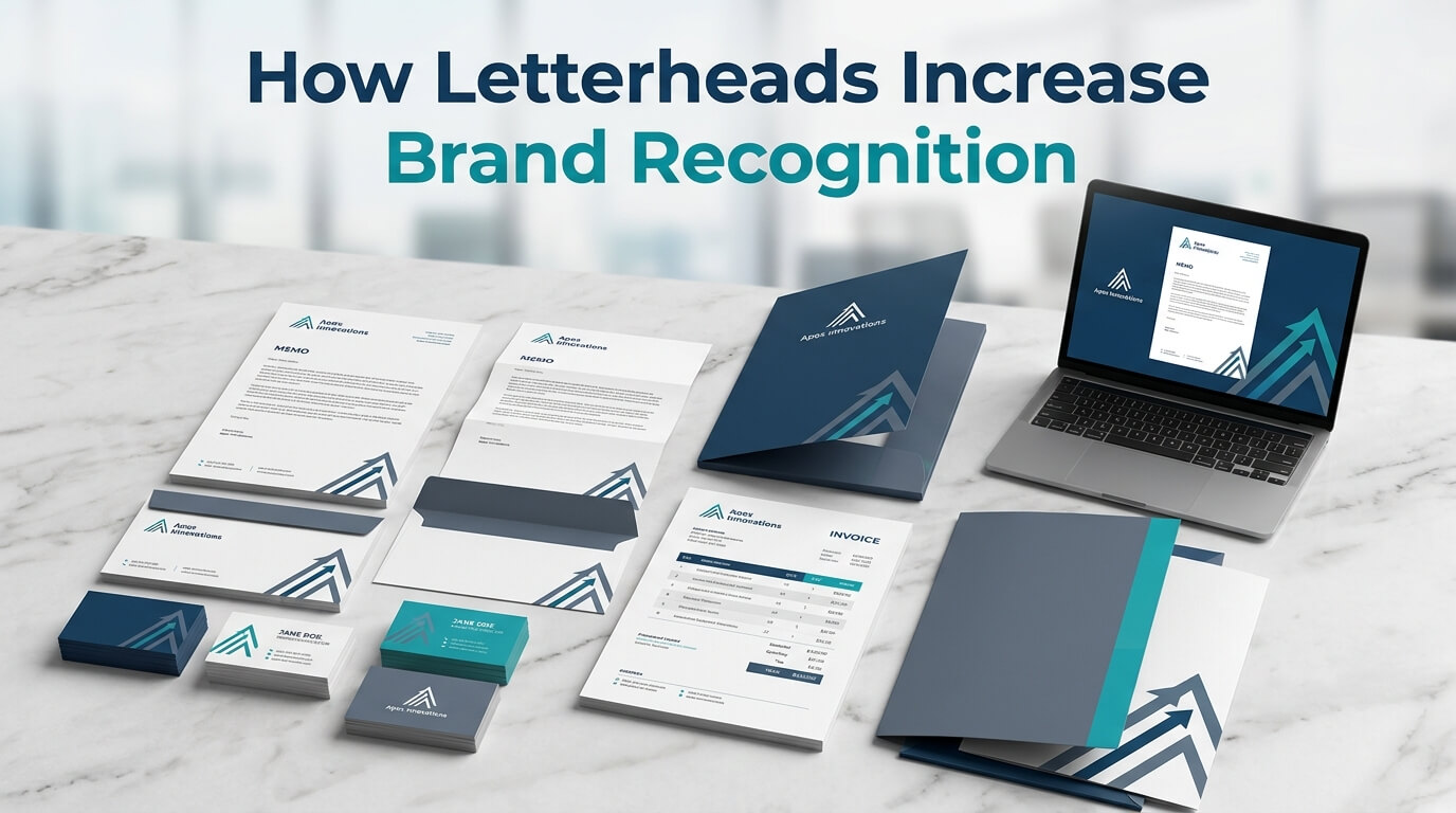
In a business world dominated by emails, websites, social media, and digital advertisements, printed communication can sometimes seem less important than it once was. Yet a well-designed letterhead continues to play a valuable role in building a recognizable and professional brand. Whenever a company sends a formal letter, proposal, invoice, thank-you note, agreement, or business document, its letterhead provides another opportunity to put its identity in front of customers and business partners.
A letterhead is much more than a decorative header placed at the top of a page. It is a visual representation of a company. A carefully designed letterhead can communicate the brand’s colors, typography, logo, personality, professionalism, and attention to detail before the recipient even begins reading the message. When these elements are used consistently, they help people become familiar with the business and make it easier for them to recognize the company in future interactions.
Brand recognition is built through repeated exposure and consistent visual signals. A customer may see a company’s logo on its website one day, receive an email the next day, and later encounter a printed proposal carrying the same colors and typography. Each interaction strengthens familiarity. Letterheads therefore become one part of a larger branding system that keeps the company’s identity visible across different communication channels. Consistent stationery design has increasingly been recognized as an important part of maintaining a cohesive visual identity.
Understanding the Connection Between Letterheads and Brand Recognition
Brand recognition refers to the ability of customers to identify a business when they encounter its visual or verbal characteristics. A logo, color palette, typography, packaging style, tagline, or distinctive design can all contribute to this recognition. The more consistently these elements are presented, the easier it becomes for customers to associate them with a particular company.
A letterhead contributes to this process by placing the brand directly into everyday business communication. Unlike an advertisement that a customer may intentionally ignore, a letterhead is attached to a message that the recipient has a reason to read. This gives branding a natural context. The recipient may be reviewing a proposal, responding to a quotation, reading an official announcement, or checking an invoice, while simultaneously seeing the company’s visual identity.
Modern letterhead guidance also emphasizes that branded documents can turn ordinary correspondence into professional communication while reinforcing brand identity.
The effect becomes stronger when letterhead design matches other brand materials. If a company’s website uses navy blue, a specific typeface, and a minimalist logo, but its printed documents use unrelated colors and decorative graphics, the brand can appear inconsistent. When the same visual language is carried across the website, business cards, envelopes, invoices, presentations, and letterheads, every interaction reinforces the same identity.
How Letterheads Create Repeated Brand Exposure
Repetition Makes a Brand More Familiar
One of the simplest ways letterheads support recognition is through repetition. A single document may not make a brand memorable, but repeated exposure to the same logo, colors, typography, and layout can gradually create familiarity.
Imagine a company that regularly sends proposals to its clients. Every proposal arrives with the same logo in the same position, the same brand colors, and the same professional typography. After several interactions, the client may recognize the company before reading the sender’s name. That immediate visual association is one of the practical benefits of consistent branding.
The same principle applies to printed letters, invoices, contracts, certificates, thank-you notes, and other documents. Each piece of communication becomes another opportunity for the customer to encounter the brand.
Letterheads Keep the Brand Visible
Digital communication disappears quickly among crowded inboxes and social feeds. A printed document can have a different kind of visibility. A client may leave a proposal on a desk, place a contract in a folder, or keep an important letter in a filing cabinet. During that time, the company’s visual identity remains physically present.
This makes a letterhead particularly useful for businesses that rely on professional relationships and formal communication. The document may continue representing the company even after the original conversation has ended.
A thoughtfully designed letterhead can therefore function as a quiet branding tool. It does not need to make a sales pitch. Its presence alone keeps the company’s identity connected to the information being communicated.
Consistent Letterhead Design Strengthens Brand Identity
Logo Placement Creates a Familiar Visual Cue
The logo is usually one of the strongest elements of a company’s identity. Placing it consistently on letterheads creates a recognizable visual cue that customers can associate with the business.
The goal is not necessarily to make the logo extremely large. In fact, effective letterhead design often uses the logo carefully so that it identifies the company without overwhelming the actual document. Consistent positioning, appropriate sizing, and sufficient surrounding space can make the logo easier to recognize.
When the same logo treatment appears across letterheads, business cards, envelopes, presentations, and digital materials, customers begin to associate the visual mark with a single organization.
Brand Colors Reinforce Recognition
Color is another powerful component of visual identity. A distinctive brand color can help customers identify a company quickly, particularly when it is used consistently across different materials.
For example, a business might use dark green and gold throughout its branding. When those colors appear on its website, business cards, packaging, social media graphics, and letterheads, they become part of the company’s visual signature.
This does not mean every letterhead needs to be covered in brand colors. Subtle use can often be more effective. A colored line, logo, footer, or small design accent may be enough to connect the document to the wider brand identity.
Typography Adds Personality
Fonts also influence how a brand is perceived. A modern technology company may prefer a clean sans-serif typeface, while a traditional legal or financial firm may use a more conservative typographic style.
Using the same typography across company materials creates continuity. When a recipient sees the same font style on a website and later receives a printed letter, the connection between the two experiences becomes stronger.
Typography should also remain practical. A letterhead needs to support readability, not compete with the document’s message. Professional guidance recommends limiting letterhead typography and maintaining clear hierarchy so the branding remains recognizable without overwhelming the content.
Letterheads Make Business Communication More Memorable
A brand becomes easier to remember when its identity appears in meaningful contexts. Letterheads help achieve this because they are connected to real business interactions rather than existing independently as advertisements.
Consider a customer receiving a handwritten thank-you letter from a company after completing an important purchase. If the letter is printed on carefully designed stationery, the customer receives both the personal message and the company’s visual identity at the same time. That combination can make the interaction more memorable.
The same applies to proposals and formal correspondence. A client evaluating several service providers may encounter many similar documents. A professional, distinctive letterhead can help one company’s communication feel more recognizable and organized.
This is particularly valuable for smaller businesses. Larger companies may already have significant brand awareness, but small and growing businesses need every appropriate opportunity to establish familiarity. Branded stationery gives them another way to communicate who they are.
Letterheads Build Professional Credibility Alongside Recognition
Brand recognition and professionalism often work together. Customers may recognize a company but still question whether it is reliable. A polished letterhead can contribute to a more credible overall presentation by showing that the business pays attention to its communication materials.
A professionally designed letterhead signals that the document is official and intentional. This can be particularly useful for proposals, contracts, financial correspondence, certificates, and other documents where presentation matters.
Current design guidance describes professional letterheads as branding tools that can help establish trust and credibility while making formal communications appear more polished.
This does not mean attractive stationery automatically makes a business trustworthy. The quality of the product or service remains far more important. However, professional presentation can influence the initial perception of a business and support the credibility created through other customer experiences.
Letterheads Create Consistency Across Business Materials
A Unified Brand Looks More Established
Customers encounter brands through many different channels. They may visit a website, receive an email, see a social media post, receive a business card, download a PDF, or open a printed letter.
If every touchpoint looks different, customers may struggle to connect these experiences to the same company. A consistent letterhead helps bridge the gap between physical and digital branding.
A unified stationery system can include letterheads, envelopes, business cards, presentation folders, invoices, and other printed materials. When these pieces share the same design language, the company appears more organized and cohesive. Industry design guidance similarly emphasizes maintaining consistent colors, fonts, logos, and visual treatment across stationery.
Consistency Reduces Brand Confusion
Inconsistent branding can weaken recognition. If a company changes its logo placement, colors, fonts, and overall style every time it creates a document, customers have fewer stable visual cues to remember.
For this reason, businesses should establish clear brand guidelines for letterhead usage. These guidelines can specify logo placement, approved colors, typography, margins, spacing, and acceptable variations.
The objective is not to make every document look identical. Instead, the objective is to make every document feel like it belongs to the same brand.
How Different Letterhead Elements Contribute to Recognition
| Letterhead Element | Role in Brand Recognition | Recommended Approach |
| Logo | Provides an immediate visual identifier | Keep placement and proportions consistent |
| Brand Colors | Creates a recognizable color association | Use approved brand colors consistently |
| Typography | Communicates personality and supports familiarity | Use the same brand typefaces or approved alternatives |
| Layout | Creates a recognizable visual structure | Maintain consistent spacing, margins, and hierarchy |
| Contact Information | Connects the identity to the business | Present details clearly and consistently |
| Tagline | Reinforces brand messaging | Use only when it supports the overall identity |
| Paper Quality | Adds a tactile dimension to brand perception | Choose stock that reflects the brand’s positioning |
| Footer or Accent Elements | Provides additional visual cues | Keep them subtle and consistent |
Quality Printing Can Strengthen the Brand Experience
Design is only one part of effective letterhead. The physical quality of the finished product can also influence how customers perceive the company.
Paper weight, texture, print sharpness, alignment, and color accuracy all affect the final result. A sophisticated design printed poorly may fail to communicate the intended level of professionalism. Conversely, a clean design printed carefully on appropriate stock can create a polished experience.
High-quality printing can also make brand colors more consistent. When colors appear differently across business cards, envelopes, and letterheads, the overall identity can feel disconnected. Consistent printing specifications help maintain a unified appearance.
Some brands may choose premium paper or subtle finishes to reflect their positioning. A luxury company may use textured stock, while a modern professional service may prefer a clean, smooth finish. The choice should support the brand rather than simply add decoration.
Letterheads Turn Routine Documents Into Branding Opportunities
One of the biggest advantages of letterheads is that they do not require a separate advertising campaign. They work through communication the business is already producing.
A company may already need to send quotations, invoices, announcements, proposals, contracts, or thank-you letters. Adding consistent branding to these documents turns routine communication into another opportunity for brand exposure.
This is particularly useful because the branding is connected to useful information. The customer is not simply being shown an advertisement. They are receiving something relevant, with the company’s identity naturally attached to it.
Over time, these repeated interactions can help create stronger familiarity. The letterhead becomes part of the company’s communication habits rather than an isolated marketing asset.
Digital Letterheads Are Equally Important
Although printed letterheads remain useful, businesses should also consider digital letterhead templates. Many formal documents are now created and shared electronically as PDFs.
A digital letterhead should preserve the same visual identity as the printed version. The logo, colors, typography, spacing, and general structure should remain consistent so that customers receive the same brand experience regardless of whether the document arrives by mail or email.
Digital consistency is especially important for businesses that rarely print documents. A company may create a proposal digitally and send it as a PDF, but the recipient should still immediately understand which organization produced it.
Designing both print and digital versions together can prevent inconsistencies and make the brand system easier for employees to use. Proper usage guidelines can also reduce the risk of different departments creating unrelated versions of the same letterhead.
Designing a Letterhead That Supports Recognition
Keep the Design Distinctive but Simple
A letterhead should be recognizable without becoming distracting. Too many graphics, colors, decorative elements, or oversized logos can reduce readability and make the document feel more like an advertisement.
A clean design gives the brand enough presence while leaving the main content easy to read. Strong hierarchy, generous whitespace, and balanced placement can make the document feel professional.
Make the Letterhead Match the Brand
The letterhead should never exist as an isolated design. It should reflect the company’s existing brand identity.
If the business already has established colors, fonts, logo guidelines, and graphic elements, the letterhead should incorporate them. If the company is developing its identity from scratch, the letterhead can become one component of a broader stationery system.
Avoid Frequent Unnecessary Changes
Businesses sometimes redesign stationery simply because they want something new. However, constant visual changes can make it harder for customers to establish recognition.
When a brand identity is working effectively, maintaining consistency can be more valuable than frequently introducing new styles. A redesign may be appropriate after a major rebranding exercise, but everyday communication should generally follow the established system.
Letterheads Help Small Businesses Compete With Larger Brands
Small businesses often need to establish credibility quickly. They may not have the advertising budgets, physical locations, or widespread recognition of larger competitors. Professional letterhead can help them create a more established visual presence.
A small consultancy sending a proposal on carefully designed letterhead can communicate its identity with confidence. A local professional service can use consistent stationery to create familiarity among customers. A startup can establish its visual language from the beginning and carry it across every customer interaction.
This does not require an expensive or complicated design. The most important factors are consistency, clarity, relevance, and quality.
When a small business uses the same branding across its website, social media, business cards, letterheads, invoices, and proposals, customers receive a unified impression. Consistent stationery has been described as a way to reinforce recognition, professionalism, and trust across business interactions.
Common Letterhead Mistakes That Can Weaken Recognition
A letterhead can only support brand recognition when it is designed and used correctly. One common mistake is changing brand colors between documents. Another is using outdated logos or multiple versions of the company identity without a clear reason.
Poor typography can also create problems. Decorative fonts that are difficult to read may distract from the message. Similarly, overcrowding the header with unnecessary information can reduce the visual impact of the actual brand elements.
Another issue is inconsistency between printed and digital documents. If the printed letterhead looks completely different from the PDF version, customers may perceive the materials as belonging to different brands.
Businesses should also avoid making the letterhead too promotional. A letterhead’s job is to establish identity and provide a professional framework for communication. It should support the message rather than compete with it.
The Long-Term Value of Branded Letterheads
Brand recognition is rarely created through one major interaction. It usually develops through many smaller experiences. A customer sees a logo, encounters a familiar color, receives a branded document, visits the website, and later notices the same identity on another communication.
Letterheads contribute to this long-term process because they provide repeated exposure during legitimate business interactions. Each document reinforces the company’s visual identity.
The value may be difficult to measure in isolation because a letterhead does not typically generate a sale on its own. Its value lies in strengthening the broader brand system. It helps make the company look consistent, recognizable, and intentional across communication channels.
This is why letterhead should be viewed as part of a larger branding strategy rather than simply an office supply.
Conclusion
A well-designed letterhead can make a surprisingly meaningful contribution to brand recognition. Through consistent use of logos, colors, typography, layouts, and other visual elements, it gives customers repeated opportunities to encounter and remember a company’s identity. At the same time, professional stationery can strengthen credibility and create a more cohesive experience across printed and digital communication.
The most effective letterheads are not necessarily the most elaborate. They are the ones that clearly represent the brand, remain easy to read, and work consistently across different documents. When integrated with business cards, envelopes, websites, proposals, invoices, and other branded materials, letterheads become an important part of a unified identity.
In a crowded marketplace, recognition matters. Every professional interaction can contribute to how customers remember a business, and a thoughtfully designed letterhead ensures that even routine communication can reinforce that memory.
Frequently Asked Questions
Q1. How does a letterhead increase brand recognition?
A letterhead repeatedly exposes customers to important brand elements such as the logo, colors, typography, and visual style, helping create familiarity over time.
Q2. Should a letterhead match the company website?
Yes. Matching the letterhead with the website and other brand materials creates a consistent visual identity and makes the business easier to recognize.
Q3. Can small businesses benefit from branded letterheads?
Absolutely. Professional letterheads can help small businesses establish a consistent identity and create a polished impression during formal communications.
Q4. What should a professional letterhead include?
A professional letterhead commonly includes the company logo, business name, relevant contact information, brand colors, appropriate typography, and a clean layout.
Q5. Are digital letterheads useful for branding?
Yes. Digital letterheads allow businesses to maintain the same recognizable identity in PDFs, proposals, invoices, and other electronic documents as they use in printed communication.