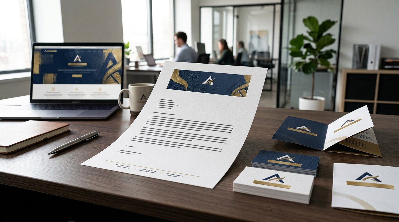
A strong brand is built through repetition. Customers may encounter a business through its website, social media pages, advertisements, packaging, email campaigns, business cards, proposals, invoices, and formal correspondence. While each of these channels serves a different purpose, they should still feel as though they come from the same organization. This is where marketing consistency becomes important. When visual elements, messaging, typography, colors, and overall presentation remain aligned across different touchpoints, customers can recognize a business more easily and develop a stronger sense of familiarity with it.
Letterheads are sometimes viewed as a traditional business stationery item, but they continue to have an important place in modern brand communication. A professional letterhead places recognizable brand elements directly onto formal documents, including letters, proposals, notices, agreements, quotations, reports, and other business materials. This means that even a document created for an administrative or professional purpose can contribute to the company’s marketing presence. Business communication guidelines from organizations such as A.T. Still University emphasize that stationery systems communicate a brand and that consistent execution can strengthen how an organization is perceived.
A letterhead does not replace advertising, digital marketing, or social media. Instead, it complements these channels by extending the same visual identity into everyday communication. When designed carefully and used consistently, it can help a business maintain a recognizable appearance, reinforce brand standards, support professionalism, and create a more unified customer experience.
Understanding the Connection Between Letterheads and Marketing Consistency
Marketing consistency means presenting a recognizable identity regardless of where customers interact with a business. A company’s website might use a particular logo, color palette, typography system, tone, and layout style. Ideally, those same characteristics should appear in other customer-facing materials. A letterhead becomes one more place where those visual decisions can be reinforced.
The importance of this connection becomes clearer when considering how many different people may communicate on behalf of a business. A sales representative may send a proposal, an executive may issue a formal letter, a customer service employee may send a response, and an accounts department may issue documentation. Without standardized templates, each person may make different choices about logos, colors, fonts, spacing, or contact information. Over time, these small differences can make the organization appear less coordinated.
A standardized letterhead gives employees a predefined visual framework. Official brand guidelines from organizations such as the College of the Mainland specifically recommend maintaining consistent fonts, font sizes, colors, and content placement in official communications to protect brand integrity. This demonstrates that letterhead consistency is not simply a design preference. It can be part of a broader brand management system.
Letterheads Turn Routine Documents Into Brand Touchpoints
Marketing does not happen only when a company publishes an advertisement. Every interaction with an existing or potential customer can influence how that customer perceives the brand. A formal letter delivered on branded stationery, for example, can reinforce the identity that a customer has already encountered on a website or business card.
The same principle applies to digital letterheads. A branded PDF proposal or formal document can carry the company’s visual identity even when no physical paper is involved. Modern letterhead systems therefore need to work across both print and digital communication.
This makes letterhead especially useful for businesses that regularly send documents outside their organization. Each document becomes another opportunity to create familiarity with the company’s identity without making the communication feel like an advertisement.
Letterheads Reinforce Visual Brand Identity
One of the most important ways letterheads support marketing consistency is by repeating the visual elements that define a brand. These may include the logo, colors, typography, spacing, graphic details, contact information, and sometimes a tagline or other identifying feature.
When these elements are applied consistently, the recipient begins to associate the visual appearance with the organization. A letterhead can therefore function as a visual signature. Even before someone reads the full document, the layout and branding can communicate where the document came from.
Consistent Logo Placement Builds Recognition
The logo is often the most recognizable visual component of a company’s identity. Letterhead design gives businesses an opportunity to establish a predictable position and size for the logo. When employees use the same approved template, the logo is less likely to appear stretched, recolored, oversized, or placed inconsistently.
For example, Johns Hopkins Medicine specifies consistent positioning and sizing of its brandmark and address block on official letterhead. Its brand guidance also explains that stationery contributes to a consistent organizational image.
Consistency in logo placement may appear like a small detail, but repeated details contribute to a larger impression. A logo that looks identical across documents, presentations, website pages, and other materials makes the organization easier to identify.
Brand Colors Connect Letterheads With Other Marketing Materials
Colors are another important part of marketing consistency. Customers often associate specific colors with particular brands because those colors are repeatedly used across different communication channels.
A letterhead should therefore use the company’s approved color palette rather than introducing unrelated colors. If the website uses a restrained combination of navy and white, for example, a letterhead covered in bright orange and green would feel disconnected from the established identity.
The goal is not necessarily to fill the page with brand colors. Effective letterhead design often uses color selectively so that the document remains readable and professional. Adobe recommends drawing letterhead design from established brand elements such as the logo, color palette, fonts, website, business cards, and other marketing materials.
Letterheads Create a Unified Customer Experience
Customers rarely experience a brand through one channel alone. Someone might discover a company through Google, visit its website, receive an email, speak to a sales representative, download a proposal, and eventually receive a printed document. Each interaction contributes to the overall customer experience.
If every touchpoint looks unrelated, the customer may have difficulty connecting them. Consistent letterhead helps bridge the gap between formal communication and other marketing channels.
Connecting Offline and Online Branding
Modern marketing is heavily digital, but physical documents still have value in many industries. Businesses may send contracts, welcome letters, legal notices, certificates, quotations, reports, or printed proposals. A letterhead allows these physical materials to carry the same identity found online.
The reverse is equally important. Digital versions of letterhead can be used in PDFs and electronic correspondence. Organizations such as UTMB provide both digital and print-ready stationery options while emphasizing approved templates and consistent branding.
This creates continuity. Whether a customer receives a printed letter or opens a PDF attachment, the document can still feel like part of the same brand system.
Supporting Recognition Across Multiple Touchpoints
Repeated exposure helps customers become familiar with a company’s identity. A letterhead may not generate recognition by itself, but it contributes to the cumulative effect of consistent branding.
Consider a customer who has already seen a company’s logo and colors on its website. Later, the same customer receives a proposal using identical visual elements. The document feels familiar rather than unrelated. That familiarity can make the communication experience smoother and reinforce the company’s established identity.
Letterheads Strengthen Professional Brand Presentation
Marketing consistency is not only about recognition. It is also about perception. The way a company presents information can influence how customers interpret its professionalism, organization, and attention to detail.
A carefully designed letterhead signals that the company has established standards for communication. A poorly formatted document, on the other hand, can create the impression that the organization lacks attention to detail.
Professionalism Becomes Part of the Brand
Every company communicates a personality. Some brands appear formal and established, while others are modern, approachable, creative, or highly technical. Letterhead design should support that personality.
A law firm might use a restrained, traditional layout with conservative typography. A creative agency may incorporate more expressive design elements. A technology company may prefer a minimal and contemporary appearance. The important point is that the letterhead should fit the broader identity rather than operate as an independent design project.
This is why brand guidelines are valuable. Clemson University, for example, describes its stationery standards as serving the goals of brand consistency and streamlined implementation of brand colors and typography.
Consistency Shows Organizational Discipline
When a customer sees consistent design across documents, it can suggest that the business has organized processes behind its communication. This perception may be particularly valuable for companies operating in professional services, finance, healthcare, consulting, legal services, technology, and other industries where trust and reliability matter.
The letterhead does not create credibility on its own. However, it can support the overall professional impression created by the company’s products, services, customer support, website, and other marketing materials.
Letterheads Help Employees Follow Brand Guidelines
One of the practical advantages of a standardized letterhead is that it reduces the amount of design decision-making required from individual employees. Instead of recreating a document every time, employees can start with an approved template.
This matters because marketing consistency can become difficult as a company grows. A small business may initially have one person handling most communications. As departments and locations expand, more people begin producing documents. Without a shared system, visual inconsistencies can quickly appear.
Templates Reduce Unnecessary Variations
An approved letterhead template establishes the position of the logo, contact information, margins, fonts, colors, and other visual components. Employees only need to focus on the actual message.
This approach also reduces the risk of accidental brand changes. UTMB’s stationery guidance, for example, instructs users to work from approved letterhead files rather than recreating or modifying branded elements.
The result is a more controlled brand experience without requiring every employee to understand graphic design.
Standardization Saves Time
Consistency can also improve workflow efficiency. Employees do not have to repeatedly search for logos, determine appropriate colors, or decide where contact details should appear. A ready-to-use template handles those decisions.
This is particularly useful when organizations have multiple teams producing customer-facing documents. A standardized system allows employees to create professional materials more quickly while giving marketing teams greater control over the brand.
Letterheads Support Consistency in Important Business Documents
A letterhead can be used across many forms of formal communication. While the exact applications depend on the organization, the same visual system can often extend to proposals, quotations, reports, announcements, correspondence, and other documents.
The more consistently the system is applied, the stronger the connection between these communications becomes.
| Business Material | How Letterhead Supports Consistency | Marketing Value |
| Formal letters | Maintains approved logo, typography, colors, and contact details | Reinforces brand recognition |
| Proposals | Connects sales materials with the wider brand identity | Creates a cohesive customer experience |
| Reports | Gives professional documents a recognizable visual structure | Strengthens perceived professionalism |
| Quotations | Makes commercial communication visually consistent | Supports trust and recognition |
| Digital PDFs | Extends branding into electronic communication | Connects online and offline touchpoints |
| Company notices | Provides an official visual identity | Reinforces organizational credibility |
The purpose is not to put the same design on every document without consideration. Instead, letterhead should form part of a broader visual system where different materials share recognizable characteristics while still being appropriate for their individual purposes.
Letterheads Make Brand Messages More Recognizable
Marketing consistency extends beyond colors and logos. It also involves how a business communicates its identity and values. Letterhead contributes to this process by establishing a consistent visual environment in which the company’s messages are delivered.
For example, a business that positions itself as premium may use high-quality stationery, generous whitespace, refined typography, and a restrained layout. A company that emphasizes simplicity may use a minimalist design. A community-focused organization may use warmer visual elements.
The design does not need to explain the brand directly. Instead, it should reinforce the impression created by other marketing materials.
Consistency Helps Avoid Brand Confusion
Imagine receiving three documents from the same company, each using a different logo, font, color palette, and contact arrangement. Even if the information is accurate, the materials may feel disconnected.
A standardized letterhead reduces this problem. It establishes a recognizable foundation that different employees and departments can use.
This is especially important when businesses operate under multiple departments, subsidiaries, or locations. Variations may sometimes be necessary, but they should be controlled and clearly connected to the master brand.
Digital Letterheads Extend Marketing Consistency
The modern letterhead is no longer limited to printed paper. Digital communication has made electronic letterhead an increasingly important part of brand consistency.
A company may send proposals as PDFs, formal notices as attachments, or documents through online portals. If these files contain no branding, the recipient may have difficulty identifying them later. A well-designed digital letterhead keeps the company’s identity visible.
Designing for Both Print and Digital Use
Digital letterhead should not simply be a scanned image of printed stationery. It should be designed with readability, accessibility, file size, and screen viewing in mind.
Text should remain clear, contact details should be easy to locate, and the layout should remain professional when converted to PDF. The design should also work across different screen sizes and printing conditions.
Organizations such as the College of the Mainland distinguish between print and digital letterhead versions and provide specific usage guidance for each.
This approach helps businesses maintain one recognizable identity while adapting the technical format to different communication environments.
Avoiding Common Letterhead Mistakes
A letterhead can support marketing consistency only when it is properly managed. One of the most common mistakes is allowing employees to modify the template. Someone may change the logo size, replace a brand font, adjust colors, or move contact information because they prefer a different layout.
These changes may seem harmless individually, but repeated alterations can gradually weaken the consistency of the brand.
Another problem is outdated information. A letterhead containing an old address, phone number, website, or email address can create confusion and make the company appear careless. Templates should therefore be reviewed whenever important business information changes.
Overdesign is another concern. A letterhead is primarily a communication tool. Excessive graphics, decorative elements, or large logos can compete with the actual message. A strong design should make the document recognizable without overwhelming its content.
Maintaining an Approved Letterhead System
The most effective approach is to treat letterhead as part of the company’s broader brand asset library. Marketing or brand teams should maintain an approved master template and make sure employees know where to access the current version.
When a company rebrands, changes its address, updates its logo, or modifies its visual identity, letterhead templates should be updated as well. Old versions should be removed from shared folders whenever possible so employees do not accidentally continue using them.
This simple management process can prevent many inconsistencies.
How Businesses Can Make Letterheads Part of Their Marketing Strategy
The first step is to establish the company’s core visual identity. The letterhead should use the same approved logo, colors, typography, spacing principles, and overall design language found in other marketing materials.
The second step is to create both print and digital versions where appropriate. This ensures that employees have suitable formats for different communication situations.
The third step is to establish clear internal usage rules. Employees should know which template to use and which elements should not be changed. The process does not need to be complicated. The goal is simply to make the correct version easy to find and use.
The final step is regular review. Brands evolve, and letterheads need to evolve with them. A template that was appropriate several years ago may no longer reflect the company’s current identity. Reviewing stationery alongside other brand assets helps maintain consistency over time.
Why Letterhead Still Matters in Modern Marketing
The continued value of letterhead comes from its ability to combine practical communication with visual branding. It does not compete with social media, websites, email marketing, search advertising, or content marketing. Instead, it strengthens the identity established through those channels.
Marketing consistency is ultimately about creating a recognizable experience. When customers encounter the same visual language repeatedly, the brand becomes easier to identify. Letterhead contributes to that experience by ensuring that important documents do not feel disconnected from the company’s wider identity.
Even a simple formal letter can therefore become a small but meaningful brand touchpoint. When the logo, typography, colors, spacing, and contact information are aligned with the broader brand system, the document communicates more than its written message. It also communicates that the organization has a clear identity and pays attention to how that identity is presented.
Conclusion
Letterheads support marketing consistency by extending a company’s visual identity into formal and everyday business communication. Through consistent logos, colors, typography, layouts, and contact information, they help connect letters, proposals, reports, quotations, and digital documents with the broader brand experience. They also give employees a reliable framework for creating professional communications without repeatedly designing documents from scratch.
A letterhead should not be treated as an isolated stationery item. It is part of a wider brand system. When it matches the company’s website, business cards, presentations, digital documents, and other marketing materials, it helps create a unified identity that customers can recognize and remember. In a competitive marketplace where every interaction can shape perception, that consistency can make even routine communication more meaningful.
Frequently Asked Questions
Q1. How does a letterhead support marketing consistency?
A letterhead repeats important brand elements such as the logo, colors, typography, and contact information. Using these elements consistently helps ensure that formal documents feel connected to the company’s broader marketing identity.
Q2. Can digital letterheads support brand consistency?
Yes. Digital letterheads can be incorporated into PDFs, proposals, reports, and other electronic documents. They extend the company’s visual identity beyond printed stationery and help create consistency across online and offline communication.
Q3. Should letterhead match a company’s website?
Ideally, yes. The letterhead should use the same core visual identity as the website, including approved colors, typography, logo treatment, and overall design language. This makes different customer touchpoints feel like part of the same brand.
Q4. Why should businesses use an approved letterhead template?
An approved template prevents employees from creating different versions of the company’s stationery. It helps control logo placement, typography, colors, contact details, and formatting, making business communication more consistent.
Q5. How often should a company update its letterhead?
A letterhead should be reviewed whenever the company’s branding, contact information, legal details, address, or organizational structure changes. It is also useful to review it periodically to ensure that it still reflects the current brand identity.