
In the vast and competitive landscape of modern business, a logo is far more than just a decorative element. It is the visual cornerstone of your brand’s identity, a powerful symbol that communicates your values, mission, and personality at a glance. Think of the iconic swoosh of Nike, the simple yet elegant Apple of Apple Inc., or the vibrant, multi-colored letters of Google. These aren’t just pictures; they are badges of trust, promises of quality, and a silent conversation with their audience.
A well-designed logo can build instant recognition, foster an emotional connection with customers, and serve as a constant reminder of what your brand represents. It’s the first thing people see and the last thing they remember. Conversely, a poorly designed logo can lead to confusion, look unprofessional, and erode the credibility you’ve worked so hard to build. Choosing the right logo is one of the most critical decisions you will make for your business, and it is an investment that will pay dividends for years to come. This in-depth guide will walk you through a thoughtful, strategic, and meticulous process for choosing the perfect logo, ensuring it becomes a powerful and lasting asset.
Deeply Understanding Your Brand’s Identity
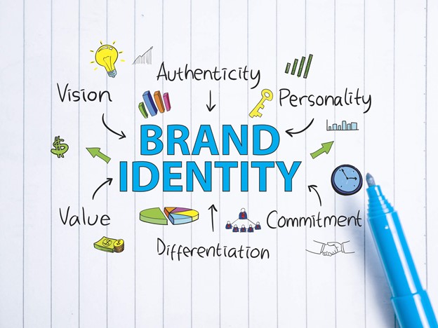
Before a single line is drawn or a color is chosen, the most important work in logo design is internal. A logo cannot be effective if it doesn’t have a clear foundation to represent. You must first define the very essence of your brand.
1. Define Your Brand’s Core: Mission, Values, and Personality
A logo is a visual metaphor for your brand’s story. To tell that story effectively, you need to know it inside and out.
- Mission, Vision, and Values: Start with the basics. What is your company’s purpose? What problem are you solving? Your mission statement should be the guiding star. Your core values are the principles that dictate how you operate—honesty, innovation, sustainability, community. A logo should subtly reflect these foundational elements.
- Brand Archetypes: Consider defining your brand’s personality using the concept of brand archetypes. Developed by Carl Jung, these twelve archetypes—such as The Hero, The Sage, The Innocent, or The Rebel—provide a framework for understanding and communicating your brand’s character. For example, a brand that identifies as “The Hero” (like Nike) will use a logo that feels empowering and dynamic. A brand as “The Sage” (like Google) might use a logo that feels intelligent and accessible. Aligning your logo with a specific archetype ensures a consistent and emotionally resonant message.
- The Story Behind Your Business: People connect with stories. Your logo can be a small part of a bigger narrative. Was your company founded on a personal struggle? Was it inspired by a a cultural movement? Incorporating a subtle nod to your brand’s unique history can add a layer of meaning and authenticity to the design.
2. Know Your Target Audience: The Customer Persona
You aren’t designing a logo for yourself; you are designing it for your customers. To create a logo that resonates, you need to understand who they are.
- Demographics and Psychographics: Go beyond simple demographics like age and gender. Create a detailed “customer persona.” What are their interests, values, pain points, and aspirations? Where do they live, work, and spend their time online? A logo for a financial services app targeting millennials will have a sleek, modern, and trustworthy feel, while a logo for a classic car parts retailer for hobbyists might use a vintage, hand-drawn aesthetic.
- Emotional Connection: What emotional response do you want your logo to evoke? Do you want people to feel safe, excited, inspired, or cared for? The choices you make in color, shape, and typography will directly influence this emotional connection. A circular, soft logo might feel nurturing, while a sharp, angular logo might feel powerful and precise.
3. Research the Competition: Differentiating Your Brand
Your logo must stand out, not blend in. A thorough competitive analysis is essential to ensure your logo is unique and memorable.
- Analyze Existing Logos: Look at the logos of your top 5-10 competitors. What design trends are common in your industry? Are most logos blue and corporate? Is there an over-reliance on a specific symbol? By identifying these patterns, you can strategically create a logo that breaks the mold. If everyone else is using a generic “house” icon, a more stylized, abstract symbol might be the perfect way to differentiate your real estate business.
- Find Your Unique Angle: Your logo should visually communicate what makes your business special. Is your company faster, more personal, more innovative, or more sustainable than the competition? Your logo should be a visual shortcut to that key differentiator.
The Fundamental Principles of a Great Logo
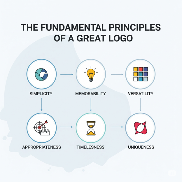
A truly effective logo isn’t just a matter of taste; it’s built on a foundation of proven design principles. These are the benchmarks against which you should measure every potential design.
1. Simplicity: The Golden Rule
The most effective logos are disarmingly simple. A simple logo is easy to read, instantly recognizable, and highly scalable. The “KISS” (Keep It Simple, Stupid) principle is a mantra in logo design for a reason. A logo with too many details, intricate gradients, or complex shapes will lose its impact when scaled down for a mobile app icon or a website favicon. It can also look cluttered and unprofessional. The goal is to convey a big idea with a minimal amount of visual information. Think of the simple “M” of McDonald’s or the iconic Shell emblem—both are simple, powerful, and instantly recognizable.
2. Memorability: Creating a Lasting Impression
In a world saturated with visual noise, a memorable logo is a priceless asset. Memorability is closely tied to simplicity; the simpler the design, the easier it is for our brains to process and store it. The goal is to create a visual that people can recall after seeing it for just a few seconds. A unique, yet simple, design creates a strong “visual fluency,” allowing customers to connect with your brand effortlessly without conscious thought. For example, the Amazon logo’s arrow, which also looks like a smile, is both simple and memorable, and it subtly hints at the idea that they sell everything from A to Z.
3. Versatility: A Logo for All Surfaces
Your logo will appear on dozens, if not hundreds, of different surfaces. A great logo must be versatile enough to work everywhere.
- Vector Format: Your final logo files must be in a vector format (e.g., SVG, AI, EPS). Unlike pixel-based images (JPEG, PNG), vector files are created with mathematical equations, allowing them to be scaled to any size without losing quality. This is non-negotiable for professional use.
- Sizes and Layouts: A versatile logo should look great in a variety of sizes and layouts. It should be legible as a small icon on a phone screen and still impactful on a large banner. You should have a primary logo, a secondary (horizontal) logo, and a logo mark for use in tight spaces.
- Color Variations: A truly versatile logo works in black and white, in a single color, and in full color. This is critical for things like faxes, letterheads, screen printing, or engraving. A design that relies on color or gradients to be effective is not a versatile design.
4. Timelessness: Avoiding Fleeting Trends
Trends come and go. A logo that is a slave to a current fad—like a particular color palette or a style of illustration—will quickly look dated. While it can be tempting to follow the latest design trend, a timeless logo is a long-term investment. Think about logos that have endured for decades, like Coca-Cola or Ford. They have been slightly refined over time, but their core identity remains the same. Focus on creating a logo that is classic and enduring, rather than trendy and temporary.
5. Appropriateness: The Right Message
Your logo’s style must be appropriate for your industry and the message you want to convey. A fun, whimsical logo is perfect for a children’s bakery, but it would be completely out of place for a funeral home. Similarly, a minimalist, geometric logo would suit a technology company, while a rustic, hand-drawn design might be better for a small-batch coffee roaster. The logo’s aesthetic should align with customer expectations for your industry, while still allowing for a unique touch.
The Logo Design Process
Creating a logo is a creative journey that requires a structured process to be successful.
1. Brainstorming & Sketching: From Concept to Paper
This is the phase where all the groundwork you did in Part 1 comes to life.
- Mood Board: Create a digital or physical mood board. Gather images, fonts, colors, and other logos that evoke the feeling and personality you want for your brand. This visual collection will serve as a source of inspiration and a clear reference point for your design.
- Word Association & Mind Mapping: Write down a list of words associated with your brand (e.g., trust, speed, growth, health). Then, use mind mapping to branch out from those words, creating a web of related concepts. Look for symbols and metaphors within these maps that could be visually represented.
- Sketching: Don’t skip this step! Grab a pencil and paper and just start drawing. The goal here is quantity over quality. Explore different shapes, symbols, and typographic layouts. Don’t worry about drawing a perfect logo; you’re just trying to get ideas out of your head and onto the page.
2. Choose a Design Direction: The Seven Types of Logos
Every logo falls into one of seven categories. Understanding these types will help you choose the right style for your brand.
- Wordmark (Logotype): This is a purely typographic logo, using only the company name. Examples: Google, FedEx, Coca-Cola. A wordmark is a great choice if your company name is unique and memorable. It puts your name front and center, ensuring brand recognition.
- Lettermark (Monogram): A typographic logo using initials, like IBM, HBO, or NASA. Lettermarks work well for companies with long names that are difficult to fit into a logo. They create a clean, minimalist identity.
- Pictorial Mark (Logo Symbol): A graphic icon or symbol that represents the company, such as Apple’s apple, or the Twitter bird. This is a powerful choice for building brand association. It requires a strong, simple symbol that can stand on its own.
- Abstract Mark: An abstract, geometric symbol that has no direct resemblance to a physical object. The Nike swoosh or the BP logo are famous examples. Abstract marks are unique and can be used to convey a specific feeling or idea without being literal.
- Mascot: An illustrated character that represents the brand, such as the Kool-Aid Man, Wendy’s, or the Michelin Man. Mascots are great for brands that want to build a friendly, personable identity and appeal to families or children.
- Combination Mark: A logo that combines both a symbol and a wordmark. This is arguably the most common and versatile type of logo. Burger King, Lacoste, and Dove use combination marks, which allow for both immediate recognition of the symbol and clarity of the company name.
- Emblem: An emblem places the company name inside a symbol or icon, like the Starbucks logo or the Harley-Davidson emblem. These logos have a traditional, established, and often “badge-like” feel.
3. Color Psychology and Typography: The Emotional and Verbal Language of Your Logo
The colors and fonts you choose are just as important as the design itself. They are the emotional and verbal language of your brand.
- Color Psychology: Colors are not just aesthetic; they are psychological. Blue often signifies trust, stability, and intelligence (popular with tech and finance). Red evokes passion, energy, and urgency. Green suggests growth, nature, and health. Yellow is associated with optimism and warmth. It’s important to choose a color palette that aligns with your brand’s personality and the emotions you want to inspire. Stick to 1-3 primary colors for a clean and cohesive look.
- Typography: The font you choose speaks volumes about your brand. Serif fonts (like Times New Roman or Georgia) have small lines at the end of the strokes and are often associated with tradition, authority, and trustworthiness. Sans-serif fonts (like Helvetica or Arial) are clean, modern, and easy to read on screens. The choice between a serif and a sans-serif should align with your brand’s personality. Beyond the font family, pay attention to kerning (the spacing between letters) and leading (the spacing between lines). Poor spacing can make a great font look unprofessional.
4. Feedback and Refinement: The Final Polish
Once you have a few strong logo options, you need to get external feedback.
- Structured Feedback: Show your designs to people who represent your target audience. Ask them specific questions: “What does this logo make you feel?” “What kind of company do you think this logo belongs to?” “Can you describe it from memory?” Avoid asking vague questions like “Do you like it?”
- Creating Mockups: To get the best feedback, show your logo in action. Create mockups of it on a website, on a business card, on a t-shirt, and on social media profiles. This will help you and your focus group visualize its versatility and impact in real-world scenarios.
Working with Designers vs. DIY Tools
The final step is to decide how you will bring your logo to life.
1. Hiring a Professional Designer: The Investment in Quality
Hiring a professional is the best way to get a high-quality, unique, and effective logo.
- The Benefits of Professional Design: A professional designer brings a wealth of experience, technical skill, and creative expertise. They understand the principles of design, color theory, and typography on a deep level. They will not only create a beautiful logo but also ensure it is versatile, scalable, and provided in the correct file formats for all your needs. A custom logo is an investment in your brand’s unique identity.
- How to Hire: Start by creating a detailed creative brief. This document should outline your brand’s mission, target audience, competitive landscape, and your design preferences. Use this brief to find designers on platforms like Dribbble, Behance, or through a design agency. Review their portfolios, read testimonials, and schedule a consultation to discuss your project.
2. Using Online Logo Makers: The Budget-Friendly Option
If you have a very limited budget, online logo makers can be a viable starting point.
- Pros and Cons: The main advantages are speed and cost. You can get a logo in minutes for a fraction of the cost of hiring a professional. However, the downside is a lack of originality. These tools use pre-made templates and stock icons, so your logo may look similar to many others, which can hinder your ability to stand out.
- Making it Work: If you use a logo maker, try to customize it as much as possible. Don’t just use the default options. Change the colors, experiment with different fonts, and adjust the layout to give it a more unique feel. While it may not be a perfect solution, it can be a good placeholder while you save up for a custom design.
Conclusion
Choosing the right logo is a profound journey of self-discovery for your brand. It starts with understanding who you are and who you serve, follows a path of applying time-tested design principles, and culminates in a careful and thoughtful execution. Your logo is the most visible representation of your business, and it carries the weight of your promises, your values, and your ambition. By approaching this process with care, you can create a symbol that not only looks great but also becomes a powerful and lasting asset that resonates with your audience and stands the test of time.