A website is often the first meaningful interaction a customer has with a business. Before someone speaks to a sales representative, visits a physical location, or contacts customer support, they may explore several pages of a website to understand what a company offers and whether it can meet their needs. While visual design, branding, and content all contribute to this experience, website navigation plays a particularly important role in guiding customers through the decision-making process.
Website navigation refers to the system that helps visitors move from one page or section to another. Menus, category links, buttons, search functions, breadcrumbs, calls to action, and internal links all contribute to navigation. When these elements are organized logically, visitors can find information without unnecessary effort. When navigation is confusing, overloaded, or difficult to use, even interested visitors may leave before completing an important action.
Good navigation does more than help people move around a website. It shapes how customers understand a business, how quickly they find answers, how much confidence they develop, and whether they continue toward a purchase, inquiry, booking, or signup. In this way, navigation can influence customer decisions at almost every stage of the online journey.
Why Website Navigation Matters to Customer Behavior
Visitors usually arrive on a website with a purpose. They may want to learn about a service, compare products, check pricing, read reviews, understand a company’s expertise, or contact the business. If the website makes these tasks easy, visitors can move naturally from one stage of consideration to another.
Navigation creates the structure that makes this possible. A well-organized navigation system gives users a clear understanding of what information is available and where they can find it. Instead of forcing visitors to guess which page contains an answer, it provides recognizable pathways.
This becomes especially important when customers are making decisions that require research. A visitor considering a professional service, for example, may want to explore the company’s services, review its portfolio, learn about its process, read testimonials, and eventually request a consultation. If these pages are connected logically, the visitor can build confidence gradually.
Poor navigation creates the opposite experience. A visitor may become frustrated after repeatedly searching for pricing, contact information, product details, or service descriptions. Even if the company offers exactly what the visitor needs, the website may fail to communicate that effectively.
How Navigation Reduces Customer Friction
Making Important Information Easier to Find
Customer friction refers to anything that makes an online task more difficult than it needs to be. Navigation is one of the most direct ways a website can reduce this friction.
When visitors can immediately identify categories such as Services, Products, About, Resources, Pricing, or Contact, they have a clear starting point. They do not need to explore unrelated pages simply to discover where useful information is located.
This matters because online visitors are often impatient. They may be comparing several companies at the same time, browsing from a mobile device, or trying to solve a specific problem quickly. A website that respects their time creates a smoother experience.
Clear navigation also helps customers feel that the business understands their needs. If the website structure reflects common customer questions and priorities, visitors can move through it more confidently.
Preventing Decision Fatigue
Too many choices can make decision-making harder. A navigation menu containing dozens of unrelated links can overwhelm visitors and make the website appear complicated.
Effective navigation focuses on the most important destinations. Secondary information can still be available through internal links, footer navigation, search functionality, or contextual links within content.
The goal is not necessarily to provide fewer pages. The goal is to organize those pages in a way that makes the website easier to understand.
The Relationship Between Navigation and Trust
Customers often judge a company based on their website before they ever communicate with someone directly. Navigation contributes to that first impression.
A website with consistent menus, logical page organization, working links, and predictable layouts can appear more professional. Visitors may perceive that the business has invested time in creating a thoughtful customer experience.
Consistency Builds Confidence
Consistency is particularly important. If the navigation menu changes dramatically between pages, visitors may wonder whether they have moved to a different section of the website or whether something has gone wrong.
Keeping primary navigation in a predictable location allows visitors to develop familiarity with the site. Once they understand how the website works, they can move around more efficiently.
Consistent navigation also reinforces brand credibility. The website feels deliberate rather than improvised, which can influence how customers perceive the organization behind it.
Easy Access to Trust-Building Information
Customers frequently need reassurance before making a decision. They may want to see testimonials, case studies, certifications, guarantees, company information, policies, or examples of previous work.
Navigation can make these trust signals easy to discover. For example, a visitor researching a service may naturally want to move from a service page to a portfolio or testimonials page. When those destinations are clearly accessible, the website supports the customer’s research process.
How Navigation Guides Customers Through the Buying Journey
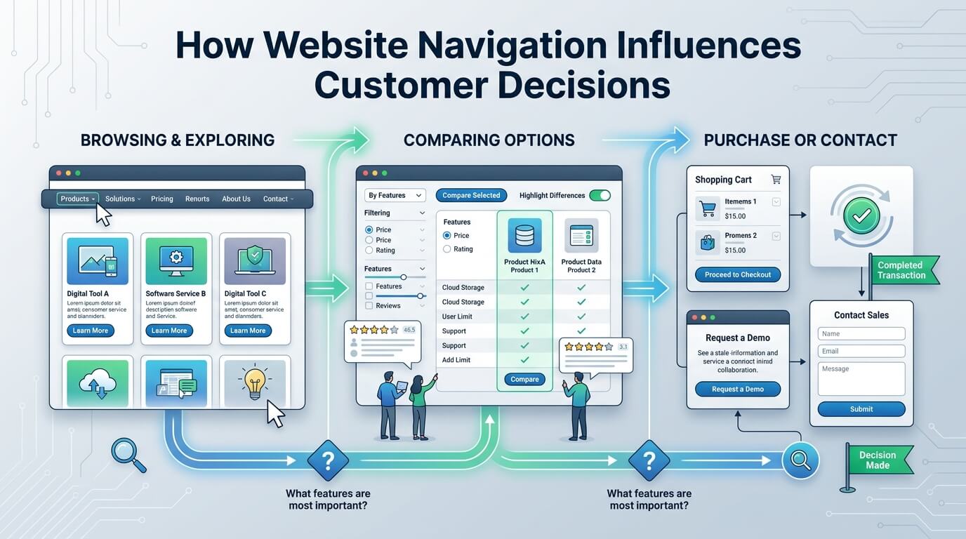
Customer decisions rarely happen in a single step. Most visitors move through several stages, from awareness and research to consideration and action. Website navigation can support each stage by connecting relevant information.
Awareness and Exploration
At the awareness stage, visitors may not fully understand what they need. They may arrive through a search engine, social media post, advertisement, or referral.
At this point, navigation helps them explore the business. Clear categories allow visitors to understand the range of products, services, or resources available.
For example, someone visiting a web design company for the first time may discover website design, e-commerce development, website redesign, maintenance, and related services through the main navigation. This can help the visitor recognize solutions they had not initially considered.
Research and Evaluation
Once visitors understand their options, they usually begin comparing details. They may want to know how a service works, what is included, how long a project takes, and what results they can reasonably expect.
Navigation should make related information easy to access. Internal links between service pages, educational articles, case studies, and frequently asked questions can help visitors continue researching without starting over.
Decision and Conversion
Eventually, the visitor may be ready to take action. This could involve purchasing a product, requesting a quote, scheduling an appointment, filling out a form, or contacting the company.
At this stage, navigation should make the next step obvious. A prominent Contact or Get Started option can reduce hesitation and help visitors transition from research to action.
How Navigation Influences Perceived Value
Website navigation does not only affect usability. It can influence how customers perceive the value of an offering.
Imagine a company provides several related services. If the website organizes those services clearly and explains how they connect, visitors may develop a better understanding of the company’s capabilities.
A confusing structure can hide that value. Customers may only see the first service they encounter and never discover other relevant offerings.
Organizing Services Around Customer Needs
Businesses can structure navigation around the way customers think rather than the way the company is internally organized.
For example, a company might organize its website according to technical departments, using labels that make sense to employees but not customers. A customer-centered structure instead focuses on recognizable services, problems, industries, or outcomes.
This distinction can significantly improve the browsing experience. Customers should not need specialized knowledge to understand where to click.
Navigation and Mobile Customer Decisions
Mobile browsing has made navigation even more important. Smaller screens provide less space for menus and page elements, which means businesses must prioritize usability.
A desktop navigation system that works well may become difficult to use on a smartphone if menu items are too small, crowded, or complicated.
Mobile Menus Should Be Simple
Mobile navigation should allow visitors to quickly access the most important areas of the website. Menus should be easy to open, close, and understand. Links should have sufficient spacing so users can tap them without accidentally selecting another option.
Important conversion actions should also remain accessible. If a customer has to navigate through several layers just to find a contact form or product category, the additional effort can interrupt the decision-making process.
Navigation Should Support Different Devices
Responsive website design ensures that navigation adapts to different screen sizes. However, responsiveness alone is not enough. Businesses should consider how users actually interact with the menu on each device.
A good mobile experience minimizes unnecessary steps while preserving access to important information.
The Role of Calls to Action in Navigation
Calls to action are another important part of navigation. Buttons such as Buy Now, Request a Quote, Book a Consultation, Learn More, or Contact Us provide direction.
A call to action becomes more effective when it appears at the right point in the customer’s journey.
For example, a visitor reading an introductory article may not be ready to purchase immediately. A Learn More link may be more appropriate. On a detailed service page, however, Request a Quote or Get Started may provide a logical next step.
This means navigation should not simply move visitors between pages. It should help them understand what they can do next.
How Search Functionality Supports Customer Decisions
Large websites often contain more information than visitors can reasonably browse through menus. Internal search can therefore become an important navigation tool.
Customers may search for a specific product, service, topic, or question rather than navigating through several categories.
An effective search function can shorten the path between a customer’s question and the information they need. This is particularly useful for e-commerce websites, knowledge bases, blogs, documentation platforms, and websites with large service catalogs.
Search should complement rather than replace clear navigation. Visitors should have both options available, depending on how they prefer to explore.
Website Navigation and SEO Can Work Together
Navigation also has an important relationship with search engine visibility. A well-structured website helps search engines understand how pages relate to one another.
Internal linking can distribute relevance across related pages and help search engines discover important content. Clear page hierarchies can also make the overall website structure easier to understand.
From a customer perspective, this creates another benefit. Better-organized websites tend to provide clearer pathways between related information.
Navigation therefore sits at the intersection of usability, content organization, and search visibility. Businesses should consider all three when developing their website structure.
Key Navigation Elements and Their Customer Impact
| Navigation Element | Customer Benefit | Potential Impact on Decisions |
| Main menu | Provides clear access to major sections | Helps visitors understand available options |
| Dropdown menus | Organizes related pages | Makes larger websites easier to explore |
| Breadcrumbs | Shows the visitor’s location | Makes returning to broader categories easier |
| Internal links | Connects related information | Supports research and comparison |
| Search function | Helps users find specific information | Reduces time spent searching |
| Calls to action | Provides a clear next step | Encourages inquiries, purchases, or signups |
| Footer navigation | Provides secondary pathways | Helps visitors find important supporting pages |
| Mobile menu | Simplifies navigation on small screens | Reduces mobile browsing friction |
How Poor Navigation Can Cause Lost Customers
Even a strong product or service can struggle if customers cannot find the information needed to evaluate it.
One common problem is overly complicated navigation. A menu may contain too many categories, technical terms, or nested dropdowns. Visitors can become uncertain about which option applies to them.
Another issue is inconsistent labeling. If one page calls a service “Solutions” while another refers to it as “Services,” visitors may have difficulty understanding whether these terms refer to the same thing.
Broken links create another source of friction. A visitor who clicks an important navigation option and reaches an error page may lose confidence in the website.
Hidden information can also affect decisions. If pricing, contact information, policies, or service details are buried deep within the website, customers may assume the information is unavailable or may simply leave.
Creating Navigation Around Real Customer Questions
One of the most effective approaches to website navigation is to start with customer behavior rather than internal business structure.
Businesses can examine the questions customers commonly ask before purchasing. These questions may include what the company offers, how the service works, how much it costs, whether the business has relevant experience, how long delivery takes, and how to get started.
The website structure can then make these answers easy to access.
Use Familiar Language
Navigation labels should generally be understandable without explanation. Simple terms are often more effective than clever or highly creative labels.
For example, “Contact” is immediately recognizable. A creative phrase such as “Let’s Talk Business” may sound engaging but could make the destination less obvious to someone scanning the menu.
Clarity should come before creativity when labeling essential navigation elements.
Build Logical Page Relationships
Related pages should be connected naturally. A product page can link to specifications, related products, FAQs, reviews, and purchasing information. A service page can connect to case studies, process information, pricing guidance, and contact options.
These relationships allow visitors to continue their research without repeatedly returning to the main menu.
Measuring Whether Navigation Is Working
Website navigation should not be treated as something that is designed once and forgotten. Businesses can use website analytics and user behavior data to identify areas that may need improvement.
Metrics such as engagement, exit rates, page paths, search activity, conversion rates, and device-specific behavior can provide useful clues.
For example, if many visitors reach a service page but rarely move toward the contact page, the business may investigate whether the next step is clearly presented. If mobile visitors frequently leave after opening the menu, the mobile navigation experience may deserve closer attention.
User testing can provide another perspective. Watching real users attempt common tasks can reveal confusion that may not be obvious to the website owner or designer.
Improving Navigation Without Redesigning the Entire Website
A navigation problem does not always require a complete website redesign. Small improvements can sometimes make a meaningful difference.
Businesses can begin by reviewing the primary menu and removing unnecessary complexity. Important pages can be brought closer to the main navigation. Similar pages can be grouped together, and unclear labels can be replaced with familiar terms.
Internal links can also be added to important content. Calls to action can be made more visible where customers naturally reach decision points.
The key is to make changes based on actual customer behavior rather than assumptions. Analytics, customer feedback, usability testing, and conversion data can help identify which navigation problems deserve attention first.
The Long-Term Business Value of Better Navigation
Good navigation creates value beyond individual website sessions. When customers can consistently find information, the business can create a more reliable digital experience.
Visitors may spend more time exploring relevant pages, return to the website when they need additional information, and approach sales conversations with a better understanding of the company’s offerings.
Navigation can also reduce pressure on customer support teams. If customers can easily locate answers to common questions, fewer basic inquiries may need to be handled manually.
For businesses selling complex products or services, this can be particularly valuable. The website becomes more than an online brochure. It becomes part of the customer’s research and decision-making process.
Conclusion
Website navigation has a direct influence on how customers explore information, evaluate options, develop trust, and move toward action. Clear navigation reduces friction, improves usability, supports mobile visitors, strengthens content relationships, and creates a more predictable customer journey.
The most effective navigation systems are built around the visitor’s needs. They use familiar labels, logical categories, meaningful internal links, accessible calls to action, and a structure that makes important information easy to discover. When navigation is treated as an essential part of the customer experience rather than a simple menu, a website can guide visitors more naturally from their first question toward a confident next step.
Frequently Asked Questions
Q1. Why is website navigation important for customers?
Website navigation helps customers find information quickly and understand how different pages and offerings are connected. Clear navigation reduces confusion and makes it easier for visitors to continue researching or take action.
Q2. Can website navigation affect conversions?
Yes. When visitors can easily find product information, service details, pricing guidance, contact options, and relevant calls to action, there are fewer obstacles between their initial interest and a conversion.
Q3. What makes website navigation user-friendly?
User-friendly navigation is generally clear, consistent, logically organized, responsive across devices, and based on familiar terminology. It should help visitors understand where they are and where they can go next.
Q4. Should a website have a search function?
For websites with large amounts of content, products, services, or resources, internal search can be very useful. It gives visitors another way to find specific information without navigating through multiple menus.
Q5. How often should website navigation be reviewed?
Navigation should be reviewed periodically, especially after adding new products, services, content, or major website sections. Analytics and user feedback can also indicate when navigation improvements may be needed.