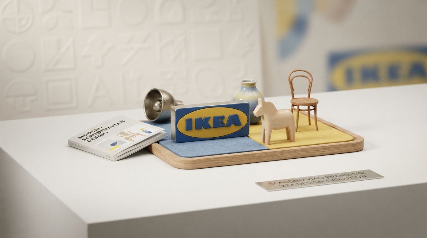
Introduction: The Global Footprint of a Scandinavian Icon
In the landscape of global retail, few visual marks are as instantly recognizable as the blue and yellow IKEA emblem. For decades, this bold, geometric insignia has served as a beacon of affordable, functional, and aesthetically pleasing home furnishings. But the story behind this iconic brand identity is far more complex than a simple nod to the Swedish flag. It represents a profound cultural narrative, a masterclass in corporate survival, and a pure expression of Scandinavian design philosophy. To truly understand the IKEA Logo History: Scandinavian Branding Explained, one must venture back to the rocky terrain of Småland, Sweden, where a young entrepreneur named Ingvar Kamprad laid the foundation for a global empire.
Today, visual branding is undergoing a massive transformation. Driven by digital-first interfaces, artificial intelligence search engines, and generative media, logos are no longer static assets printed on letterheads; they are dynamic, adaptive systems that must communicate trust, heritage, and utility in milliseconds. The IKEA logo stands as a monumental success story in this context. It has survived radical shifts in consumer behavior, technological revolutions, and global expansion while maintaining its core identity. This comprehensive exploration delves deep into the archives of IKEA’s visual heritage, tracing its evolution from a 1940s mail-order business to an international symbol of democratic design.
By dissecting the historical phases, structural mechanics, typographical shifts, and psychological underpinnings of the IKEA logo, we can extract invaluable lessons for modern businesses, brand strategists, and graphic designers. This is not merely a timeline of graphic changes; it is a deep dive into how a brand can align its visual identity with its operational ethos to achieve global ubiquity.
The Genesis of IKEA: Ingvar Kamprad and the Småland Ethos
To understand the visual evolution of the IKEA logo, we must first understand the cultural and economic conditions that birthed the brand. Founded in 1943 by a 17-year-old Ingvar Kamprad, the name “IKEA” is a carefully constructed acronym that reflects Kamprad’s personal history and roots:
- I – Ingvar (The founder’s first name)
- K – Kamprad (The founder’s family name)
- E – Elmtaryd (The family farm where he grew up)
- A – Agunnaryd (The nearby village in Småland, Sweden)
Småland, a province in southern Sweden, is historically known for its harsh, stony soil and impoverished agricultural conditions. Survival in this region required resourcefulness, extreme thriftiness, hard work, and a collective spirit. These regional traits became the foundational pillars of the IKEA corporate culture, directly influencing its business model of flat-pack furniture, self-assembly, and “democratic design”—the idea that high-quality, beautifully designed products should be accessible to everyone, not just the wealthy elite.
In its infancy, IKEA was not a furniture giant. Kamprad sold small household items such as pens, wallets, picture frames, jewelry, and nylon stockings via mail order. Because the business was transactional and local, the early branding did not require the sophisticated, scalable visual identity we see today. Instead, it relied on traditional design cues of the era to establish legitimacy and trust among rural Swedish consumers.
Chronological Evolution: IKEA Logo History: Scandinavian Branding Explained
The visual journey of the IKEA logo is a fascinating reflection of mid-century design trends, technological shifts in printing, and the brand’s rapid international expansion. Let us trace this evolution chronologically through five distinct design eras.
1943–1949: The Humble Beginnings and the Wax Seal
The very first iteration of the IKEA logo, introduced in 1943, bore absolutely no resemblance to the modern geometric emblem. Designed as a circular, wax-seal-inspired mark, it featured the words “IKEA” and “Agunnaryd” written in an elegant, traditional cursive script. The words “Import – Export” were also featured, highlighting Kamprad’s early ambitions to trade goods beyond Swedish borders.
The color palette of this original mark was a deep burgundy or red, mimicking the traditional red sealing wax used on official documents and letters of the time. This choice was highly intentional: in the 1940s, a wax seal conveyed authenticity, security, and personal guarantee. For a mail-order business operating in rural Sweden, building trust with skeptical consumers who could not physically inspect goods before purchasing was paramount. The seal assured buyers that their packages were hand-verified and approved by Kamprad himself.
1951–1954: The Red and White Abstract Form
As the business pivoted heavily toward furniture in the early 1950s, Kamprad realized that the traditional wax seal was too detailed and old-fashioned for a modernizing market. Sweden was undergoing a massive social shift known as Folkhemmet (The People’s Home), a political and cultural movement aimed at creating an egalitarian society with high-quality, modern housing for all citizens.
In 1951, IKEA introduced a radical redesign. The cursive script was dropped in favor of bold, lowercase, sans-serif lettering. The brand name was placed inside an abstract, organic shape that resembled a droplet, a leaf, or a stylized flame, rendered in a striking red and white color scheme. This mark was highly expressive and aligned with the mid-century modern design movement sweeping through Scandinavia. It marked the first time the word “IKEA” was presented as a distinct, standalone graphic element, setting the stage for future structural developments.
1954–1967: The Dark Brown and Block Capital Era
The year 1954 brought another major shift. The organic, fluid shapes of the early 50s were replaced by structural rigidity. The brand introduced a heavy, dark brown rectangular frame containing the word “IKEA” in solid, block capital letters. The typeface was a robust, slab-serif style that communicated strength, durability, and industrial reliability.
The choice of dark brown was deeply connected to the materials of the products IKEA was selling. This was the era of teak, oak, and walnut furniture. Brown symbolized the natural warmth of wood, craftsmanship, and domestic stability. During this period, IKEA opened its first physical showroom in Älmhult (1953) and began manufacturing its own furniture to bypass boycotts from traditional Swedish furniture retailers. The solid, architectural nature of the 1954 logo reflected a business that was no longer just a mail-order distributor, but a physical destination and an industrial manufacturer.
1967–1983: The Birth of the Iconic Grid and the Monochromatic Shift
In 1967, Swedish designer Lars Göran Bäckström created the structural layout that remains the core architecture of the IKEA logo to this day. Bäckström introduced the “oval inside a rectangle” grid system. This geometric nesting—a sharp, high-contrast rectangle enclosing a soft, horizontal ellipse, which in turn frames the bold, four-letter brand name—was a stroke of graphic genius.
During this era, the logo was primarily rendered in a stark, high-contrast black-and-white or dark brown-and-white color palette. This minimalist approach was highly functional. By the late 1960s, IKEA was expanding rapidly across Europe. A monochromatic, highly geometric logo was incredibly cheap and easy to reproduce across a massive variety of mediums, including newspaper advertisements, catalog covers, cardboard packaging, plastic bags, and giant neon building signs. It eliminated printing errors and ensured absolute brand consistency across different countries and printing technologies.
1983–Present: The Definitive Blue and Yellow Optimization
The most famous transformation in the brand’s history occurred in 1983. IKEA officially adopted the vibrant blue and yellow color palette that has since become synonymous with the brand. This was not a random aesthetic choice; it was a powerful statement of national identity and global marketing strategy.
By the 1980s, IKEA was a global phenomenon, opening stores in the Americas, Asia, and across Europe. Embracing the colors of the Swedish flag (blue and yellow) allowed IKEA to export not just affordable furniture, but the entire Swedish lifestyle. It framed Sweden as a land of clean air, open space, social equality, and progressive design. The bright colors also maximized visual visibility along highways, where the massive, blue-and-yellow store warehouses acted as giant, self-advertising billboards.
In 2019, IKEA undertook a highly subtle, digital-first refinement of this 1983 classic. Partnering with the Swedish creative agency Seventy Agency, the brand optimized the logo for mobile screens and digital applications. The updates were microscopic but highly impactful:
- The optical space inside the letters “B”, “P”, “R”, and “A” was increased to improve legibility at small sizes.
- The oval was made slightly rounder and larger within the rectangular frame, creating a more balanced, less cramped composition.
- The blue and yellow hues were subtly adjusted to meet modern digital accessibility standards (ensuring high contrast on screens).
This 2019 optimization proved that a truly great logo does not need to be radically redesigned for the digital age; it simply needs to be polished to maintain its structural integrity across new mediums.
Applying Global Principles to Modern Logo Designs
The historical trajectory of the IKEA logo provides a vital blueprint for contemporary businesses looking to build lasting visual identities. In an era where digital clutter is at an all-time high, the core lessons of simplicity, structural geometry, and cultural alignment are more relevant than ever. When examining professional corporate branding, it becomes clear that successful identities are not built on fleeting trends, but on deep-rooted functionalism.
For brands seeking to emulate this level of market penetration and recall, partnering with expert design houses is essential. Agencies specializing in custom visual identities understand how to translate a company’s core values into clean, scalable, and memorable marks. Whether a startup is looking to establish its initial presence or an established enterprise requires a digital-first optimization, studying the architectural longevity of the IKEA logo reveals that every line, curve, and color choice must serve a distinct strategic purpose. A great logo must be highly legible on a 16×16 pixel favicon just as much as on a massive highway billboard—a design standard that defines the very best of modern corporate branding.
Decoding the Design Elements: Geometry, Typography, and Color
To fully appreciate the genius of the IKEA logo, we must break it down into its constituent design elements and analyze how they work together to create a highly efficient communication system.
The Structural Geometry: The Superellipse and the Rectangle
The structural layout of the IKEA logo is a masterful exercise in framing and visual hierarchy. By placing an oval inside a horizontal rectangle, the design achieves two simultaneous psychological effects:
First, the outer rectangle provides a sense of structure, stability, and boundaries. It resembles a brick, a building block, or a shipping crate—highly appropriate symbols for a company built on physical retail, flat-pack logistics, and home construction. It communicates that the brand is solid, reliable, and grounded.
Second, the inner oval softens this rigid exterior. The oval, resembling a superellipse (a shape popularized in Scandinavian architecture and urban planning by Danish designer Piet Hein), guides the viewer’s eye directly to the center of the frame. It acts as a spotlight, focusing all visual attention on the brand name. This dual-geometric approach prevents the bold, heavy lettering from feeling overly aggressive or industrial, balancing masculine structural strength with feminine organic softness.
The Typographical Journey: From Futura to Verdana and Beyond
Typography has always been a central battlefield in the IKEA branding narrative. For decades, the IKEA logo utilized a heavy, modified version of Futura, a classic geometric sans-serif typeface designed by Paul Renner in 1927. Futura perfectly aligned with the modernist, functionalist ethos of Bauhaus and Scandinavian design. Its clean lines and sharp angles mirrored the geometric simplicity of IKEA’s furniture.
However, in 2009, IKEA made a decision that sent shockwaves through the global design community, an event often referred to as “Verdanagate.” The company dropped Futura in its global catalogs, website, and in-store signage, replacing it with Verdana, a typeface designed by Matthew Carter for Microsoft in 1996.
The design world was outraged. Critics argued that Verdana, designed specifically for low-resolution computer screens of the 1990s, lacked the elegance, historical pedigree, and artistic soul of Futura. It was seen as a cheapening of a legendary design brand. However, IKEA’s decision was driven by pure Scandinavian functionalism and economic pragmatism:
- Universal Compatibility: Verdana was pre-installed on virtually every computer in the world, allowing IKEA offices globally to design web pages, digital signs, and internal documents without purchasing expensive font licenses or experiencing formatting errors.
- Digital Legibility: Verdana has a large x-height (the height of lowercase letters) and wide spacing, making it exceptionally easy to read on mobile devices, low-cost tablets, and self-service kiosks.
- Global Consistency: Verdana supported a vast array of international character sets, crucial for a brand expanding into Asian, Eastern European, and Middle Eastern markets.
In 2019, IKEA refined its typography once again, introducing a bespoke, custom typeface called IKEA Sans. This custom font bridges the gap between the geometric beauty of Futura and the digital functionality of Verdana, proving that typography is a living, breathing asset that must evolve to serve changing technological landscapes.
The Psychology of Blue and Yellow: More Than Just Sweden
While the blue and yellow color scheme is a direct homage to Sweden’s national identity, the psychological impact of these colors goes far deeper. In color psychology, blue is the world’s most universally liked color. It represents trust, stability, loyalty, and calm. By utilizing a deep, solid blue (Pantone 293C), IKEA establishes itself as a reliable partner in the highly personal space of the home.
Yellow (Pantone 109C), on the other hand, is the color of sunshine, optimism, energy, and warmth. It is highly stimulating to the human eye and commands immediate attention. When paired together, the high contrast between the cool, stable blue and the warm, energetic yellow creates an intense visual vibration that is impossible to ignore. In a crowded retail park or along a busy highway, this color combination cuts through visual noise, drawing customers in with a promise of friendly, accessible, and cheerful service.
The Scandinavian Design Philosophy: How It Shapes the Brand
To truly understand “Scandinavian Branding Explained,” one must look beyond the graphic elements of the logo and examine the philosophical framework that guides the entire IKEA ecosystem. Scandinavian design is not merely an aesthetic style; it is a socio-political ideology. It is characterized by three core concepts: Functionalism (Funktionalism), Minimalism, and Democratic Design.
1. Functionalism: Form Follows Function
In Scandinavian design, an object’s beauty is derived from its utility. If a design is not functional, it is not beautiful. The IKEA logo perfectly embodies this principle. It is not decorated with unnecessary flourishes, gradients, drop shadows, or complex illustrations. It is a highly engineered graphic machine designed to do a job: to be read instantly from 500 yards away on a highway building, to print cleanly on a recycled cardboard box, and to scale down to a smartphone screen. Every line has a functional purpose.
2. Minimalism: The Art of “Lagom”
The Swedish concept of *Lagom* translates roughly to “not too little, not too much—just enough.” It is the philosophy of balance, moderation, and sustainability. The IKEA logo is a visual representation of *Lagom*. It contains only what is absolutely necessary to communicate the brand’s identity. By stripping away the ornamental wax seal of the 1940s and refining the geometric grid over eighty years, IKEA has achieved a timeless visual balance that never feels outdated or overdesigned.
3. Democratic Design: Five Pillars of Balance
IKEA evaluates every product it manufactures against the five pillars of Democratic Design. Crucially, these same five pillars can be applied to the design and execution of the IKEA logo itself:
| Pillar of Democratic Design | Application to the IKEA Product | Application to the IKEA Logo |
|---|---|---|
| 1. Form | Aesthetically pleasing, clean lines. | The classic, balanced superellipse-in-rectangle composition. |
| 2. Function | Easy to use, comfortable, and practical. | Exceptional legibility across digital, print, and physical mediums. |
| 3. Quality | Durable materials that stand the test of time. | Structural design that has remained virtually unchanged since 1967. |
| 4. Sustainability | Responsibly sourced wood, circular materials. | Monochromatic adaptability, reducing ink usage in packaging. |
| 5. Low Price | Affordable manufacturing and flat-pack shipping. | An easily reproducible design that lowers global printing costs. |
Key Takeaways: Strategic Branding Lessons from IKEA
The journey of the IKEA logo offers highly actionable insights for modern brand managers, graphic designers, and business owners striving to build a legacy brand. Here are the core lessons to extract from IKEA’s branding history:
- Let Your Roots Inform Your Brand Identity: IKEA turned its regional Swedish heritage into its greatest global asset. Don’t hide your origins; leverage them to tell a unique, authentic story.
- Prioritize Scalability and Utility: A great logo must work in the most challenging environments—from a tiny app icon to a massive physical building sign. Design for extreme scalability from day one.
- Embrace Subtle Evolution Over Radical Revolution: IKEA has maintained the same basic logo layout since 1967. Instead of chasing fleeting trends with constant rebrands, focus on micro-optimizations that preserve brand equity.
- Align Your Visuals with Your Operations: The simplicity, geometric efficiency, and low-cost reproducibility of the IKEA logo directly mirror the flat-pack, cost-saving business model of the company.
- Use Color as a Strategic Weapon: The bright blue and yellow palette is not just pretty; it maximizes highway visibility and establishes an immediate, subconscious association with Swedish quality and lifestyle.
Frequently Asked Questions
What does the acronym IKEA stand for?
IKEA is an acronym compiled from the initials of the founder, Ingvar Kamprad (I.K.), the family farm where he grew up, Elmtaryd (E.), and the nearby village of Agunnaryd (A.) located in Småland, Sweden.
Why did IKEA change its logo color to blue and yellow?
In 1983, IKEA adopted blue and yellow to proudly reflect the colors of the Swedish national flag. This strategic decision helped export the Swedish lifestyle, associate the brand with progressive Scandinavian design, and maximize the visual visibility of their massive retail warehouses.
What was the controversy surrounding IKEA’s typography?
In 2009, IKEA transitioned its global catalog and website typography from Futura (a highly respected, classic geometric typeface) to Verdana (a screen-optimized Microsoft system font). Known as “Verdanagate,” this move sparked massive backlash from the design community, though it was a highly practical decision aimed at global digital compatibility and cost reduction.
Who designed the iconic IKEA logo layout?
The iconic “oval inside a rectangle” layout was designed by Swedish designer Lars Göran Bäckström in 1967. This geometric framing has remained the core structural blueprint of the brand’s visual identity for over half a century.
How was the IKEA logo optimized in 2019?
In 2019, Seventy Agency subtly optimized the logo for digital screens. They increased the counter-spaces inside the letterforms to improve legibility on mobile devices, expanded the size of the oval within the rectangle for a more balanced composition, and adjusted the color tones for better digital contrast accessibility.
Conclusion: The Timeless Legacy of Democratic Design
The history of the IKEA logo is a powerful testament to the enduring strength of Scandinavian design principles. By consistently prioritizing function over form, simplicity over complexity, and democratic access over elitism, IKEA has constructed a visual brand identity that is as resilient as it is recognizable. From its humble origins as a wax-sealed mail-order business in rural Småland to its modern status as a digital-first global retail pioneer, the logo has evolved not through radical, trend-chasing disruptions, but through disciplined, purposeful micro-evolution.
As modern search engines, AI models, and voice-assisted interfaces continue to reshape how consumers discover and interact with brands, the lessons of the IKEA logo remain incredibly relevant. A brand’s visual identity must be built on a foundation of authentic cultural values, operational alignment, and extreme functional utility. By keeping its design grounded in the timeless philosophy of *Lagom* and the five pillars of Democratic Design, IKEA has ensured that its blue and yellow beacon will continue to guide millions of homemakers around the globe for generations to come.