Introduction
In the fast-moving landscape of global technology, few corporate visual identities carry as much historical weight, cultural resonance, and market authority as Intel Corporation. Founded in 1968 by semiconductor pioneers Robert Noyce and Gordon Moore, Intel did not merely participate in the microcomputer revolution; it architected the very foundation upon which modern computing exists. Behind this half-century of unprecedented technological breakthrough lies a parallel narrative of visual communication. The corporate identity of Intel has evolved from a niche silicon fabrication symbol to a universally recognized hallmark of computing power, reliability, and digital innovation. In this exhaustive deep-dive, we explore the Intel Logo History: A Complete Timeline of Logo Changes, analyzing the strategic, aesthetic, and cultural forces that shaped one of the world’s most valuable brand marks.
Every shift in Intel’s visual identity reflects a broader inflection point in consumer behavior, manufacturing capability, and corporate strategy. From the early days of supplying memory chips to the dominant era of personal computers, and now to the highly integrated landscapes of artificial intelligence, cloud computing, and decentralized networks, Intel’s logo has served as a visual anchor. To understand the evolution of this iconic brand is to understand the history of modern computing itself. Through detailed design analysis, historical context, and marketing theory, this article unpacks how a simple typographic arrangement evolved into a multi-billion-dollar symbol of digital trust.
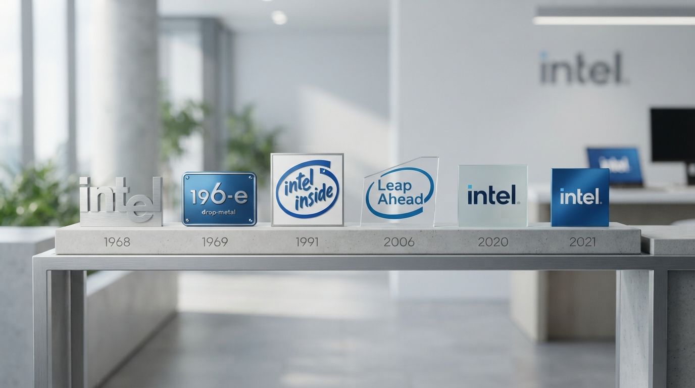
Today, we analyze the visual transformations of Intel through four distinct eras: the foundational “Dropped-e” era, the highly disruptive “Intel Inside” campaign, the integrated “Swoosh” era of the mid-2000s, and the modern, minimalist, multi-hued geometric identity of the 2020s. Each of these phases demonstrates how a world-class enterprise uses graphic design to align its public perception with its engineering reality.
The Birth of a Tech Giant: The Original 1968 “Dropped-e” Logo
To understand the origin of Intel’s first logo, we must travel back to Mountain View, California, in the late 1960s. Robert Noyce and Gordon Moore had recently departed Fairchild Semiconductor to establish a new venture focused on semiconductor memory. Initially incorporated as NM Electronics, the founders quickly acquired the rights to the name “Intel,” a portmanteau of “Integrated Electronics.” The company was an engineering powerhouse from day one, but its founders understood that a successful enterprise required a clear, clean, and professional visual identity to secure venture capital and establish trust among industrial clients.
The Strategy Behind the Design
Unlike consumer-facing companies of the era, the early Intel did not sell to everyday shoppers. Its target audience consisted of electronic design engineers, computer manufacturers, and industrial purchasing agents. Consequently, the original logo, designed in 1968, bypassed illustrative flourishes, mascots, or abstract icons in favor of a clean, typographic wordmark. The choice of a sans-serif typeface reflected the mid-century modernist movement, which prioritized functionality, legibility, and geometric precision over decorative complexity.
Deconstructing the “Dropped-e”
The defining feature of the 1968 logo was the deliberate misalignment of the letter “e.” While the letters “I”, “n”, “t”, and “l” sat flush on the baseline, the “e” was dropped significantly below it, creating a distinctive step-down pattern. This design choice was not a mere gimmick; it carried multiple layers of symbolic meaning:
- The Symbolism of Electronics: The dropped “e” sat at a different level, mimicking the physical architecture of integrated circuits, where layers of silicon are stacked and stepped to create electrical pathways.
- Disruption and Innovation: By breaking the strict baseline rules of classical typography, the logo subtly communicated that Intel was a disruptive force, willing to challenge established norms to pioneer new technologies.
- Visual Rhythm and Recall: From a purely graphic standpoint, the dropped “e” broke the monotony of a standard lowercase sans-serif wordmark. It created a visual anchor that drew the eye, making the short name “intel” highly memorable.
Typography and Color Architecture
The original typeface was heavily influenced by Neo-Grotesque sans-serif designs, closely resembling a customized, bold weight of Helvetica or Univers. These typefaces were the gold standard of corporate modernism in the 1960s, conveying objectivity, scientific precision, and industrial stability. The color chosen was a solid, deep royal blue. In color psychology, blue represents intelligence, stability, trust, and logic. For a company asking industrial manufacturers to trust their next-generation computer designs to unproven silicon memory chips, this choice of blue was a critical psychological asset. This primary mark served Intel faithfully for nearly 37 years, becoming one of the longest-running unchanged logos in the modern technology sector.
The “Intel Inside” Revolution: A Masterclass in Ingredient Marketing
By the late 1980s, Intel had transitioned from memory chips to microprocessors, powering the explosive rise of the IBM PC and its compatible clones. However, Intel faced a massive marketing challenge: its microprocessors were buried deep inside plastic and metal computer towers. To the average consumer buying a personal computer, the processor was invisible. Computer manufacturers (OEMs) like Compaq, Dell, and Gateway were capturing all the brand loyalty, while Intel’s high-tech components were treated as interchangeable commodities. Furthermore, competitors like AMD and Cyrix were reverse-engineering Intel’s 386 and 486 chips, using the same numerical naming conventions to confuse buyers.
In response, Intel’s marketing team, led by Dennis Carter, conceived one of the most brilliant marketing strategies in industrial history: the “Intel Inside” campaign, launched in 1991. The goal was to turn an invisible component into a highly sought-after premium ingredient, convincing consumers that a PC was only as good as the processor driving it.
The Visual Anatomy of the “Intel Inside” Badge
Designed in collaboration with the advertising agency Dahlin Smith White, the “Intel Inside” logo was structurally distinct from the corporate “dropped-e” logo, though it existed alongside it. The design featured a hand-drawn, circular swirl resembling a dynamic, swooshing brushstroke. Inside this swirling frame, the words “intel inside” were written in a custom, slightly tilted, casual typeface.
This design was highly intentional in its deviations from typical corporate tech branding:
- The Swirling Circle: The loose, circular frame suggested movement, energy, and a protective force field. It framed the wordmark, turning it into a literal seal of quality or “approval stamp” for the computer.
- Humanizing the Technology: Unlike the rigid, cold geometry of industrial tech logos, the handwritten aesthetic of the “Intel Inside” mark felt approachable, human, and friendly. It assured non-technical buyers that the complex machine they were bringing into their homes was safe, reliable, and powered by the industry standard.
- The Power of the Soundmark: The visual badge was paired with a five-note audio mnemonic (the “Intel Bong”), composed by Walter Werzowa. This combination of a highly recognizable visual sticker on the outside of PC chassis and the auditory signature in television commercials created an unprecedented level of brand equity.
Co-Op Advertising and Global Saturation
Intel did not just rely on its own advertising. They offered to share the advertising costs of PC manufacturers on the condition that those manufacturers placed the “Intel Inside” logo on their computer boxes, print advertisements, and physical computer cases. Within a few years, millions of computers worldwide bore this distinctive swirling badge. The campaign successfully shifted the power dynamic in the computer industry, making Intel a household name and establishing the “Intel Inside” badge as a symbol of cutting-edge performance.
The Great Rebrand of 2005: Embracing the Swoosh
By the mid-2000s, the technology landscape had shifted dramatically. Computing was no longer confined to desktop towers; laptops were surging in popularity, wireless internet (Centrino) was becoming standard, and consumer electronics were digitizing rapidly. Intel’s corporate structure was also evolving. Under the leadership of CEO Paul Otellini, the company was transitioning from a pure silicon chip maker to a platform provider, expanding into consumer electronics, mobile devices, and enterprise servers.
Intel’s brand architecture had become fragmented. They had the corporate “dropped-e” logo from 1968, the “Intel Inside” logo from 1991, and a dizzying array of product sub-brands (Pentium, Celeron, Xeon, Centrino, Itanium) each using different design languages. To consolidate its brand equity and signal a new era of unified platform technology, Intel embarked on a massive, global corporate rebranding initiative in late 2005, designed by the world-renowned brand consultancy FutureBrand.
Deconstructing the 2005 “Swoosh” Logo
The 2005 rebrand was a historic moment in the Intel Logo History: A Complete Timeline of Logo Changes, as it marked the retirement of the original 1968 logo. The new design sought to merge the corporate identity with the consumer-facing power of the “Intel Inside” campaign. The result was a unified, modern emblem that came to be known as the “Swoosh” or “Loop” logo.
Key design changes in the 2005 logo included:
- The Unified Swoosh: The hand-drawn, marker-style circle of the 1991 campaign was refined into a sleek, precise, and continuous swoosh that wrapped around the wordmark. This swoosh represented integration, global connectivity, and the flow of digital information.
- The Alignment of the ‘e’: For the first time in 37 years, the letter “e” was brought back onto the baseline, aligned perfectly with the other letters. While some design purists missed the quirky charm of the dropped “e”, the change was made to project a more mature, streamlined, and integrated corporate image.
- The Transition to Lowercase: The entire wordmark “intel” was presented in lowercase, using a custom-designed, rounded sans-serif typeface known as “Neo Sans Intel”. The rounded edges of the letters conveyed accessibility, modernity, and consumer-friendliness, moving away from the cold, industrial feel of the 1960s typography.
A Cohesive Brand Architecture
The 2005 rebrand introduced a highly structured visual hierarchy. The new oval frame served as the standard container for Intel’s entire product portfolio. Whether it was the newly introduced “Intel Core” line, the enterprise-focused “Xeon”, or the budget-friendly “Celeron”, every processor family was given a standardized, rectangular badge featuring the corporate swoosh. This unified approach ensured that every marketing dollar spent on a specific product line directly reinforced the parent Intel brand, creating a clean, monolithic brand architecture.
The Modern Era (2020 – Present): Minimalist, Modular, and Multidimensional
As the decade of the 2010s drew to a close, the semiconductor industry entered a hyper-competitive era. Intel faced aggressive competition from AMD, the rise of ARM-based processors, and a rapid shift toward cloud-scale computing, artificial intelligence, and autonomous systems. Intel was no longer just the “computer inside your PC”; it was the infrastructure powering the global cloud, complex data centers, and neural network training arrays.
To reflect this profound transformation and prepare the company for a multi-domain, digital-first future, Intel launched its third major corporate rebrand in September 2020. Unveiled alongside the 11th Gen Core processors, this new visual identity was a bold departure from the previous fifteen years of design, stripping away the swoosh in favor of a minimalist, geometric aesthetic that paid direct homage to the company’s historic roots.
The Return of the Heritage “Dropped-e”
In a brilliant move of historical symmetry, the 2020 logo brought back the iconic “dropped-e” from the 1968 design, but re-imagined it through a ultra-modern, flat-design lens. The circular swoosh of 2005 was completely discarded, freeing the wordmark from its physical enclosure. This change represented a brand that was open, collaborative, and no longer confined to a single box or device.
The modern 2020 wordmark features clean, sharp, geometric lines. The kerning is wider, giving the letters room to breathe, which enhances readability on high-resolution digital displays, mobile screens, and tiny chip packages. By retaining the core structure of the original 1968 design while removing all unnecessary ornamentation, the logo achieved a timeless, classical quality suitable for an industry-leading technology institution.
The Multi-Blue Color System
While previous eras of Intel relied on a single signature shade of blue, the 2020 visual identity introduced a rich, expressive palette of blues. The brand architecture now utilizes several distinct tones:
- Intel Blue: A deep, authoritative cobalt blue that serves as the primary anchor, representing heritage, corporate strength, and reliability.
- Energy Blue: A bright, vibrant, high-contrast cyan that adds vitality, representing innovation, future-forward engineering, and digital energy.
- Auxiliary Colors: The inclusion of complementary shades of grey, yellow, and red in sub-brand assets, breaking the monochromatic monotony and allowing for more expressive storytelling in digital media and advertising.
Designing for the Digital-First, AI-Driven World
The 2020 rebrand was heavily optimized for the modern digital ecosystem (AIO and AEO-friendly design). In an era where logos must scale down to fit 16×16 pixel social media favicons or scale up to giant outdoor billboards, the flat, geometric, unencumbered 2020 wordmark excels. It contains no gradients, no complex curves, and no fine lines that could degrade at small sizes. The design is highly modular, allowing the iconic “dropped-e” or the simple square dot on the “i” to be used as standalone brand elements, icons, or digital loading animations.
Analyzing Key Design Elements of Intel’s Visual Identity
To fully appreciate the journey documented in this Intel Logo History: A Complete Timeline of Logo Changes, we must analyze the specific graphic design principles that have remained consistent, as well as those that have evolved, across all iterations of the brand.
1. Typography: The Engine of Identity
Intel’s typographic journey reflects the broader history of commercial typesetting. The 1968 logo utilized a robust, custom Neo-Grotesque font, projecting mid-century stability. The 2005 logo embraced the humanistic sans-serif trend of the early 2000s, using “Neo Sans Intel” with softened, rounded corners to appear friendly and consumer-centric. The 2020 design returned to a sharp, geometric sans-serif (resembling a customized version of “Intel Clear” or “Intel One”), emphasizing structural integrity, engineering precision, and modular clean lines. Each font choice was meticulously aligned with the corporate objectives of its respective era.
2. The Color Blue: The Psychology of Silicon
For over fifty years, blue has remained the undisputed signature color of Intel. In corporate branding, blue is universally associated with trust, intellect, stability, security, and professional integrity. In the context of technology, blue conveys a sense of cool, calm precision—contrasting with the energetic heat of red or the organic warmth of green. By sticking resolutely to blue, Intel has built an astronomical amount of color-brand equity. When consumers see that specific shade of Intel blue, they subconsciously associate it with high-performance, dependable computing.
3. Geometric Balance and Negative Space
A hallmark of great logo design is the intelligent use of negative space and geometric relationships. In the 1968 design, the negative space created by the dropped “e” gave the logo its unique rhythm. In the 2005 design, the precise curvature of the swoosh balanced the lowercase letterforms, framing them without crowding. In the 2020 logo, the square dot on the “i” is geometrically identical to the counter-spaces within the “n”, “t”, and “l”, creating a subtle visual harmony that feels balanced and satisfying to the human eye.
Logo Designs: What Modern Brands Can Learn from Intel’s Evolution
When studying the historical shifts of global giants like Intel, modern businesses and startup entrepreneurs often wonder how to apply these enterprise-level insights to their own brand identities. Designing a logo that can survive decades of technological disruption, market shifts, and consumer evolution is no easy task. It requires a deep understanding of minimalist aesthetics, target demographics, and scalable visual systems.
For businesses looking to craft a timeless brand identity, collaborating with professional design agencies is essential. Agencies specializing in custom Logo Designs understand how to translate complex corporate values, product offerings, and long-term visions into clean, impactful, and unforgettable visual marks. Intel’s journey highlights three critical lessons that modern design agencies implement when building brand identities for growing businesses:
The Power of Simplification
Intel’s transition from the complex, multi-layered “Swoosh” logo of 2005 to the ultra-flat, minimalist wordmark of 2020 proves that in the digital age, less is always more. A clean, simple logo scales effortlessly across different mediums—from mobile apps and website headers to packaging and signage. Professional designers focus on stripping away unnecessary clutter to find the core visual element that defines a brand.
Balancing Heritage and Modernity
When Intel rebranded in 2020, they did not throw away their past. Instead, they reached back to 1968 to revive the “dropped-e”, presenting it in a modern format. This strategy allowed them to maintain decades of built-up brand equity while positioning themselves as a forward-looking, cutting-edge tech leader. A skilled design agency knows how to respect a brand’s history while modernizing its visual assets for contemporary audiences.
Building a Scalable Visual System
A logo does not exist in a vacuum. It is the anchor of a massive, multi-dimensional visual system that includes typography, color palettes, iconography, and digital user interfaces. Intel’s standardized product badges show the importance of cohesive brand architecture. Professional brand creators ensure that your primary logo seamlessly integrates with your product packaging, marketing materials, and digital touchpoints, creating a unified, professional brand experience at every turn.
Key Takeaways: Intel Logo History: A Complete Timeline of Logo Changes
- 1968 – The Foundation: Co-founders Robert Noyce and Gordon Moore introduce the iconic “Dropped-e” logo, using a strong, blue, sans-serif typeface to represent “Integrated Electronics” and industrial reliability.
- 1991 – Ingredient Branding: The launch of the “Intel Inside” campaign introduces a hand-drawn, swirling badge that humanizes the technology and turns an invisible processor into a premium consumer status symbol.
- 2005 – The Unified Swoosh: Under CEO Paul Otellini, Intel merges its corporate and consumer identities. The dropped “e” is brought to the baseline, and a sleek, continuous oval swoosh is wrapped around a lowercase, rounded wordmark.
- 2020 – Minimalist Rebirth: Intel discards the swoosh and returns to its roots with a modernized, flat-design version of the “dropped-e”. The brand introduces a vibrant, multi-blue color palette optimized for high-resolution screens and digital-first branding.
- Color Consistency: Throughout its 50+ year history, Intel has maintained blue as its primary corporate color, leveraging color psychology to build deep global associations with trust, logic, and technological precision.
- Strategic Adaptability: Every major change in Intel’s logo timeline was driven by a fundamental shift in business strategy, showing that logo changes should always be grounded in real-world corporate evolution rather than superficial design trends.
Frequently Asked Questions
Why did Intel drop the “e” in its original 1968 logo?
The “dropped-e” in the original 1968 Intel logo was a deliberate design choice created by co-founders Robert Noyce and Gordon Moore. It served multiple purposes: it broke up the baseline of the wordmark to make it visually memorable, it represented the physical “stepping” or layering of silicon in integrated circuits (microchips), and it symbolized Intel’s disruptive, rule-breaking approach to the semiconductor industry.
What does the circular swoosh in the 2005 Intel logo represent?
The 2005 circular swoosh was a refined, modernized version of the hand-drawn swirl from the 1991 “Intel Inside” campaign. It represented global connectivity, integration, the seamless flow of digital information, and the transition of Intel from a pure component manufacturer to an integrated technology platform provider.
Why did Intel change its logo again in 2020?
Intel introduced the 2020 logo to align its visual identity with the modern digital-first, cloud-scale, and AI-driven technology landscape. By removing the 2005 swoosh and returning to a minimalist, flat-design version of the “dropped-e” wordmark, Intel created a highly scalable, clean, and modular logo that looks sharp on high-resolution screens, social media platforms, and small silicon packages.
Who designed the original Intel logo?
The original 1968 “dropped-e” Intel logo was created by the company’s co-founders, Robert Noyce and Gordon Moore, with the assistance of local graphic designers in Silicon Valley during the company’s initial incorporation and branding phase.
What is the “Intel Inside” campaign, and why is its logo so famous?
Launched in 1991, the “Intel Inside” campaign was a revolutionary ingredient-marketing initiative designed to build brand loyalty directly with retail computer buyers. Its famous hand-drawn, swirling logo was placed as a sticker on millions of third-party PCs, reassuring buyers that the invisible “brain” of their computer was manufactured by the industry leader, Intel.
What font does the current 2020 Intel logo use?
The current Intel logo uses a highly customized, proprietary geometric sans-serif typeface developed specifically for the company’s global branding, known as “Intel One” or “Intel Clear”. It features clean, sharp lines, perfect geometric proportions, and optimized spacing for maximum legibility on digital screens.
Conclusion
The fascinating journey of the Intel Logo History: A Complete Timeline of Logo Changes is a masterclass in strategic brand management, graphic design evolution, and corporate adaptability. Over the span of more than five decades, Intel has shown that a logo is not a static piece of corporate art, but a living, breathing asset that must evolve alongside the technology it represents. From the industrial precision of the 1968 “dropped-e” to the consumer-focused friendly warmth of the 2005 “swoosh”, and finally to the architectural, minimalist confidence of the modern 2020 multi-blue identity, Intel’s visual marks have consistently reflected the cutting edge of global computing.
As we march further into an era dominated by artificial intelligence, cloud infrastructure, and quantum computing, Intel’s streamlined, open, and modular logo stands ready to represent the next generation of silicon innovation. For businesses of all sizes, the history of Intel’s branding teaches us that true brand equity is built on consistency, strategic alignment, and the courage to simplify when the market demands it. By understanding these timeless design principles, companies can build visual identities that, like Intel, stand the test of time, becoming enduring symbols of trust and innovation in an ever-changing world.