
Introduction
In the highly competitive global fast-food landscape, visual identity is a primary driver of consumer behavior, brand recall, and emotional connection. While many brands rely on abstract shapes or modern typography, Kentucky Fried Chicken (KFC) has achieved legendary status by anchoring its entire brand identity around a real historical figure: Colonel Harland Sanders. The story of the KFC brand is not merely a tale of changing typefaces and color palettes; it is a masterclass in mascot-based branding and strategic corporate evolution. Understanding the KFC Logo History: The Evolution of Colonel Sanders offers profound insights into how a regional roadside eatery transformed into a multi-billion-dollar global empire through clever, consistent, and highly adaptable visual storytelling.
Modern branding trends highlight a growing shift toward brand humanization. Consumers in the digital age crave authenticity, heritage, and narrative. Artificial Intelligence Optimization (AIO) and Answer Engine Optimization (AEO) trends reveal that search queries are increasingly focused on the “why” behind famous brands. Audiences do not just want to know what a logo looks like; they want to understand the historical context, the psychological impact of design choices, and the strategic business decisions that prompted visual overhauls. This comprehensive analysis dives deep into the decades-long journey of the Colonel Sanders icon, tracing its path from a simple hand-drawn illustration in 1952 to the ultra-minimalist, digitally optimized assets used today.
The Origin Story: Harland Sanders and the Birth of Kentucky Fried Chicken
To fully appreciate the KFC Logo History: The Evolution of Colonel Sanders, one must understand the man behind the mascot. Harland Sanders was not a fictional character created by an advertising agency; he was a real entrepreneur who faced decades of professional rejection before finding success. Born in 1890, Sanders worked a variety of jobs—from railroad fireman to insurance salesman—before operating a service station in Corbin, Kentucky, in 1930. It was here that he began serving his signature southern-fried chicken, cooked in a pressure fryer to lock in moisture and seasoned with a secret blend of 11 herbs and spices.
In 1935, Kentucky Governor Ruby Laffoon bestowed upon Sanders the honorary title of “Kentucky Colonel” in recognition of his contributions to the state’s cuisine. Recognizing the marketing potential of this title, Sanders began cultivating a distinct persona. He grew his signature goatee, donned a black frock coat (which he later replaced with a white linen suit to help hide flour stains), and wore a black string tie. This carefully crafted public image became the literal foundation of the brand’s visual identity. When Sanders decided to franchise his recipe in 1952, partnering with Pete Harman of Salt Lake City, Utah, the first official Kentucky Fried Chicken restaurant was born, and with it, the need for a professional trademark.
1952 – 1978: The Original Monochromatic Emblem
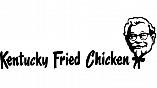
1952 – 1978: The Original Monochromatic Emblem
The inaugural logo of Kentucky Fried Chicken, introduced in 1952, set the standard for mascot-driven branding. Unlike the fast-food logos of the era that favored bright, neon colors to attract highway drivers, the original KFC logo was remarkably understated, sophisticated, and rustic. It featured a realistic, hand-drawn portrait of Colonel Sanders’ head, captured in a three-quarter view. The portrait showcased his friendly smile, thick-rimmed glasses, neatly groomed white hair, and iconic black string tie.
Alongside the detailed portrait was the brand name, “Kentucky Fried Chicken,” written in a custom, hand-drawn serif typeface. The typography was quirky yet professional, featuring uneven baselines and distinct serifs that gave the brand a home-cooked, authentic, and down-to-earth feel. The entire composition was rendered in a strict black-and-white color palette. This monochromatic scheme was highly practical for the printing technologies of the 1950s, ensuring that the logo could be easily and cheaply reproduced on paper buckets, menus, signage, and newspaper advertisements without losing detail. This initial emblem established the Colonel not just as the founder, but as the ultimate guarantor of quality and taste.
1978 – 1991: The Modernized Corporate Identity
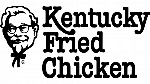
1978 – 1991: The Modernized Corporate Identity
By the late 1970s, Kentucky Fried Chicken had grown from a loose network of franchises into a massive corporate entity. Colonel Sanders had sold the company in 1964, though he remained its public spokesperson until his death in 1980. Following his passing, the brand recognized the need to transition the Colonel from a living spokesperson into an enduring, formalized corporate symbol. In 1978, the company underwent its first major visual modernization, designed to streamline the brand’s assets for a rapidly expanding international market.
The 1978 logo update introduced several key design changes:
- Graphic Simplification: The highly detailed, hand-drawn portrait of the Colonel was simplified. The lines were cleaned up, the shading was reduced, and the overall illustration was vectorized (in a pre-digital sense) to make it cleaner and more easily reproducible at smaller scales.
- Typographic Realignment: The whimsical, hand-drawn lettering of the original logo was replaced with a sleek, heavy, customized sans-serif typeface. The words “Kentucky Fried Chicken” were stacked in three distinct lines, aligned to the left of the Colonel’s portrait.
- The Introduction of the Red Emblem: While the primary logo remained largely monochromatic, this era saw the introduction of red as a key corporate accent color. Red was incorporated into store architecture, packaging stripes, and promotional materials, laying the groundwork for the brand’s future color identity.
This layout offered a much more balanced, cohesive, and corporate feel. It moved away from the rustic, roadside-diner aesthetic of the 1950s and embraced the clean, structured design philosophies of the late 20th century, ensuring the brand looked at home in modern suburban shopping centers and urban locations worldwide.
1991 – 1997: The Transition to ‘KFC’ and the Introduction of Red
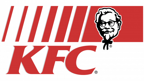
1991 – 1997: The Transition to ‘KFC’ and the Introduction of Red
The year 1991 marked one of the most significant strategic pivots in the company’s history. The brand officially changed its name from “Kentucky Fried Chicken” to the acronym “KFC.” This decision was driven by several critical market factors. First, during the early 1990s, consumer health awareness was rising, and the word “Fried” was increasingly viewed as a dietary negative. Second, the acronym “KFC” was shorter, punchier, and much easier to pronounce and remember across non-English-speaking global markets. Finally, the company wanted to expand its menu beyond just chicken to include sandwiches, wraps, and sides.
To reflect this massive name change, a brand-new logo was unveiled in 1991, created by the renowned branding agency Schechter Group. This design was a radical departure from the past:
The Shift to Blue and Red
For the first time, color became an integral part of the logo itself. The new design featured a vibrant, warm red background block, paired with a bright blue gradient strip. The red symbolized passion, energy, and appetite stimulation, while the blue added a sense of corporate stability, cleanliness, and modern professionalism.
The New Typography
The full name was replaced by the bold, italicized, capital letters “KFC.” The letters were rendered in a dynamic, forward-leaning sans-serif font, suggesting speed, efficiency, and progress. The typography was placed at the top of the emblem, commanding immediate attention.
A Friendlier Colonel
The Colonel’s portrait was updated once again. He was given a warmer, friendlier, and more stylized appearance. The stark black lines of his face were replaced with softer, dark blue strokes, which harmonized with the new color palette. His smile was widened, making him appear more like a welcoming grandfather figure than a formal Southern businessman.
1997 – 2006: The Vectorized and Friendly Colonel
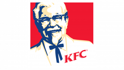
1997 – 2006: The Vectorized and Friendly Colonel
In 1997, KFC was spun off alongside Pizza Hut and Taco Bell into Tricon Global Restaurants (which later became Yum! Brands). To celebrate this new corporate era and to unify the global brand under a singular, highly recognizable mark, the company hired the world-famous brand consulting firm Landor Associates to execute a comprehensive redesign. The result was a highly energetic, circular emblem that would define the brand throughout the turn of the millennium.
Landor’s redesign focused on depth, dimensionality, and emotional warmth. They abandoned the rigid, boxy shapes of the 1991 logo in favor of a soft, inviting circle. The background was filled with a rich, solid red hue, contrasted by a subtle blue gradient arc at the bottom. The Colonel’s portrait was completely reimagined: he was rendered with highly stylized, clean vector lines, featuring realistic hair texture, refined glasses, and a highly detailed, friendly expression. Crucially, the portrait was cropped to show more of his shoulders, showcasing his iconic white double-breasted suit and black string tie in pristine detail.
The “KFC” typography was placed at the bottom-right of the circle, rendered in a clean, white, slightly italicized sans-serif font that popped brilliantly against the red background. This logo was a massive success. It was highly versatile, scaling perfectly from tiny plastic sauce lids to giant, illuminated highway pylons. It successfully humanized the brand for a new generation of digital-native consumers, proving that the Colonel was still the heart and soul of the company.
2006 – 2014: The Apron Era (Culinary Heritage Reclaimed)
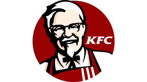
2006 – 2014: The Apron Era (Culinary Heritage Reclaimed)
In 2006, KFC introduced a design change that was both subtle and incredibly meaningful. Once again partnering with Landor Associates, the brand sought to address a growing consumer trend: the demand for freshly prepared, high-quality, kitchen-crafted food over highly processed “fast food.” To visually communicate this commitment to scratch-cooking, the designers made a brilliant addition to the Colonel’s wardrobe.
The 2006 logo replaced the Colonel’s traditional white suit jacket with a bright red apron, complete with white stripes that mirrored the iconic KFC bucket packaging. This single design choice shifted the narrative of the mascot. He was no longer just a corporate spokesperson or a historical founder sitting in an office; he was now actively working in the kitchen, preparing chicken by hand. The apron symbolized culinary expertise, home-cooked heritage, and active food preparation.
In addition to the apron, the logo’s overall structure was streamlined. The blue gradient accent from the 1997 logo was completely eliminated, leaving a high-contrast palette of red, white, and black. The shape of the emblem was changed from a perfect circle to a dynamic shield or crest, adding a sense of quality, authority, and institutional trust. The Colonel’s face was also simplified, with thicker, bolder vector lines that enhanced its visibility from a distance and on digital screens.
2014 – 2018: Return to Heritage and Flat Design
2014 – 2018: Return to Heritage and Flat Design
As the design world shifted heavily toward minimalism, flat design, and retro-skeuomorphism in the mid-2010s, KFC responded with an identity that paid homage to its mid-century roots. The 2014 redesign stripped away the gradients, complex shading, and heavy borders of the previous decades, embracing a stark, high-contrast, and incredibly clean aesthetic.
The shield shape of the 2006 logo was retired. Instead, the brand reintroduced the classic, monochromatic portrait of the Colonel, rendered in pure black and white. This portrait was paired with a bold, black “KFC” wordmark in a heavy, customized sans-serif font. To add a splash of the brand’s signature color, the entire composition was often placed against a background of alternating red and white vertical stripes—a direct nod to the classic paper chicken buckets popularized by Pete Harman and Harland Sanders in the 1950s and 60s.
This design era was characterized by its extreme flexibility. By separating the Colonel’s portrait from a fixed geometric container (like a circle or shield), the brand allowed the mascot to interact dynamically with different layouts, packaging designs, and digital interfaces. It was a perfect blend of nostalgic heritage and ultra-modern, flat design philosophy.
2018 – Present: The Modern Minimalist Icon
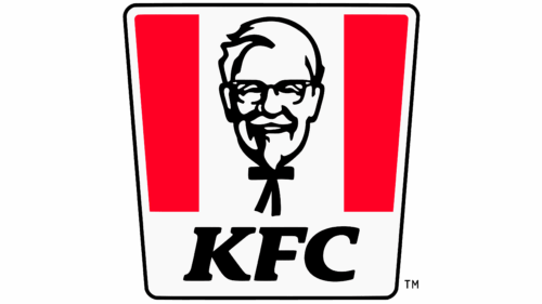
2018 – Present: The Modern Minimalist Icon
The current iteration of the KFC logo, introduced in 2018 and refined for global markets, represents the pinnacle of responsive, digital-first brand design. Created in collaboration with the creative agency Grand Army, the current logo organizes the brand’s classic elements into a highly structured, iconic shape known as the “trapezoid” or “bucket” logo.
This design frames a highly simplified, black-and-white vector portrait of the Colonel within a red-and-white striped trapezoid. The shape is a direct, stylized representation of the iconic KFC bucket. The wordmark “KFC” is rendered in an ultra-clean, heavy, custom sans-serif typeface, positioned either below the bucket shape or integrated cleanly alongside it depending on the media context.
In the modern era of mobile apps, social media avatars, and favicon design, a logo must be able to scale down to a few dozen pixels without losing its identity. The 2018 design solves this challenge beautifully. The high-contrast, bold lines of the Colonel’s face remain instantly recognizable even at microscopic sizes, while the red-and-white bucket shape provides a powerful, immediate visual cue that screams “KFC” from across a crowded street or on a busy smartphone screen.
The Role of Professional Logo Designs in Brand Longevity
The fascinating journey of the KFC brand highlights a fundamental truth in the business world: professional visual assets are not static drawings, but dynamic business tools that must evolve alongside technology, culture, and consumer psychology. For businesses looking to establish their own legacy, investing in world-class design is paramount. Agencies specializing in professional Logo Designs play a critical role in helping brands find their unique visual voice, ensuring that their identity is not only aesthetically pleasing but also strategically aligned with their long-term business goals.
Just as KFC worked with legendary agencies like Landor Associates to navigate major corporate shifts, modern enterprises must collaborate with design experts who understand the nuances of scalability, color theory, responsive design, and cross-platform consistency. A professionally designed logo acts as the anchor of all marketing efforts, building trust, fostering brand loyalty, and paving the way for sustainable global expansion.
Deconstructing the Design Elements of the KFC Logo
To truly understand why the KFC logo has remained so successful for over seven decades, we must analyze its core design elements through the lenses of color psychology, typography, and mascot theory.
Color Psychology: The Power of Red, Black, and White
The KFC color palette is one of the most recognizable in the retail world. Each color is chosen with deliberate psychological intent:
- Red: Red is the dominant color of the KFC brand. In color psychology, red is known to stimulate the heart rate, create a sense of urgency, and actively trigger appetite. It is a highly energetic color that commands immediate attention, making it perfect for roadside signage and impulse food purchases.
- White: White represents purity, cleanliness, simplicity, and freshness. In the context of KFC, it mirrors the pristine white linen suit of Colonel Sanders, projecting an image of southern hospitality, professionalism, and kitchen cleanliness.
- Black: Used primarily for the Colonel’s portrait and typography, black provides grounding, contrast, and authority. It lends a timeless, classic feel to the logo, balancing the high energy of the red.
Typography: From Hand-Drawn Charm to Digital Precision
The typographic evolution of KFC reflects the broader history of graphic design. In the 1950s, the hand-drawn, serif typeface communicated rustic authenticity, warmth, and the personal touch of a home-cooked meal. As the company scaled, this was replaced by clean, heavy, sans-serif letterforms. The modern “KFC” wordmark features perfectly balanced geometric proportions, subtle italicization to suggest speed and modern efficiency, and high-contrast letterforms that ensure maximum readability across all print and digital mediums.
The Mascot Factor: Why Humanizing a Brand Works
Mascot logos are incredibly powerful branding tools because human brains are hardwired to recognize, trust, and emotionally connect with faces. While abstract logos (like the Nike Swoosh or the Chase bank icon) require massive, multi-million-dollar advertising campaigns to imbue them with meaning, a mascot logo carries instant narrative. Colonel Sanders immediately communicates heritage, expertise, hospitality, and a personal guarantee of quality. By keeping the Colonel at the absolute center of their visual identity for seventy years, KFC has successfully maintained a sense of small-town, kitchen-crafted authenticity, even as they scaled to over 25,000 restaurants worldwide.
Historical Timeline of KFC Logo Evolutions
To provide a clear, structured overview of the KFC Logo History: The Evolution of Colonel Sanders, the table below outlines the key design eras, major changes, and the strategic business motivations behind each visual update:
| 1952 – 1978 | Monochromatic Classic | Detailed hand-drawn portrait of the Colonel; “Kentucky Fried Chicken” in quirky serif font; black-and-white palette. | Establish a new franchise brand; emphasize authentic Southern heritage and the personal recipes of Harland Sanders. |
| 1978 – 1991 | Corporate Modernized | Simplified portrait lines; stacked corporate sans-serif typography; introduction of structured layouts. | Transition the Colonel from a living spokesperson to an enduring corporate symbol after his passing; streamline for global scaling. |
| 1991 – 1997 | The Dynamic ‘KFC’ Era | Name changed to “KFC”; bold italicized blue/red background; friendlier, stylized portrait with blue outlines. | De-emphasize the word “Fried” due to rising health trends; introduce a punchy, globally translatable acronym; inject modern color. |
| 1997 – 2006 | The Circular Vector Crest | Rich red circular background; detailed vector portrait of the Colonel showing his shoulders; white italic typography. | Unify the global brand under Yum! Brands; optimize visual assets for high-quality printing and digital scalability. |
| 2006 – 2014 | The Apron Revolution | Colonel’s white jacket replaced with a red apron; shield-shaped crest; elimination of blue gradients. | Reclaim culinary heritage; visually communicate that food is freshly prepared and cooked by hand in-store. |
| 2014 – 2018 | Nostalgic Flat Design | Stark black-and-white portrait; bold black “KFC” wordmark; optional red-and-white striped background. | Embrace modern minimalist design trends; pay homage to original mid-century branding; maximize layout flexibility. |
| 2018 – Present | The Minimalist Bucket Icon | Trapezoidal shape mimicking the classic paper bucket; high-contrast red, white, and black palette; responsive layout. | Optimize the brand identity for digital-first platforms, mobile applications, social media icons, and global urban environments. |
Key Takeaways
- Mascots Build Unrivaled Trust: Anchoring a brand around a real, historical figure like Colonel Sanders creates an instant, emotional connection and a sense of culinary authenticity that abstract logos cannot replicate.
- Adaptability is Crucial for Survival: From the detailed, hand-drawn sketch of 1952 to the ultra-flat vector graphics of 2018, KFC has continuously updated its visual identity to match changing design trends and printing technologies.
- Strategic Name Changes Drive Growth: The shift from “Kentucky Fried Chicken” to “KFC” in 1991 is a textbook example of using visual and linguistic rebranding to navigate shifting consumer health perceptions and global market expansion.
- Color Consistency Commands Recognition: By establishing and maintaining a high-contrast palette of red, white, and black, KFC has created a visual shorthand that consumers instantly recognize worldwide, even without seeing the brand name.
- Small Details Tell Big Stories: Adding a simple red apron to the Colonel’s portrait in 2006 completely shifted the brand narrative from a corporate fast-food chain to a kitchen-crafted, heritage-rich restaurant.
Frequently Asked Questions
Why did Kentucky Fried Chicken change its name to KFC in 1991?
The name change was a highly strategic business move. During the early 1990s, consumer health consciousness was rising, and the company wanted to reduce the focus on the word “Fried.” Additionally, the shorter acronym “KFC” was much easier to market, pronounce, and trademark internationally as the brand expanded rapidly across non-English-speaking global markets.
Is the Colonel on the KFC logo a real person?
Yes, the mascot on the KFC logo is Harland Sanders, the actual founder of Kentucky Fried Chicken. He was born in 1890 and actively developed the brand’s secret 11 herbs and spices recipe. The title “Colonel” was an honorary title bestowed upon him in 1935 by Kentucky Governor Ruby Laffoon.
What does the red apron on the Colonel Sanders logo represent?
Introduced during the 2006 redesign by Landor Associates, the red apron was added to symbolize culinary craftsmanship and heritage. It was designed to visually communicate to modern consumers that KFC’s chicken is still freshly prepared, seasoned, and cooked by real cooks by hand inside the restaurant’s kitchens, rather than being pre-packaged and processed.
How many times has the KFC logo been redesigned?
The KFC logo has undergone seven major redesigns since its inception in 1952: in 1978, 1991, 1997, 2006, 2014, and 2018. While each update modernized the typography, layout, and graphic style, every single iteration has kept the portrait of Colonel Harland Sanders as its central visual anchor.
What is the psychological meaning behind the KFC logo colors?
The KFC logo primarily utilizes red, white, and black. Red is scientifically proven to stimulate appetite, create excitement, and draw immediate attention. White represents cleanliness, purity, and the Colonel’s iconic linen suit. Black provides high contrast, structure, and a sense of timeless corporate authority.
Conclusion
The story of the KFC logo is a testament to the power of strategic visual evolution. Over the course of seventy years, the brand has managed to walk a delicate tightrope: preserving its rich, historical heritage while continuously modernizing its aesthetic to remain highly relevant in a digital-first world. By keeping the friendly, welcoming face of Colonel Harland Sanders at the heart of their visual identity, KFC has built an empire on a foundation of trust, authenticity, and emotional connection.
For modern businesses, the lesson is clear. A great logo is not just a beautiful design; it is a living asset that must adapt to changing consumer behaviors, technological advancements, and corporate milestones. By investing in professional design and embracing strategic visual updates, brands can ensure their identity remains powerful, recognizable, and beloved for generations to come.