
Introduction
In the pantheon of luxury automotive engineering, few emblems evoke the same raw emotion, visceral power, and unyielding prestige as the charging bull of Automobili Lamborghini. A masterpiece of visual identity, the emblem is not merely a decorative badge affixed to the hood of some of the world’s fastest machines; it is a profound declaration of defiance, heritage, and mechanical superiority. Understanding the Lamborghini Logo History: The Bull That Built a Brand requires a journey through post-war Italian industrialism, personal rivalries, astrological alignments, and the changing paradigms of global graphic design.
In today’s highly competitive luxury market, branding has shifted from mere identification to complex storytelling. Modern consumers do not just purchase a product; they align themselves with a brand’s narrative, philosophy, and cultural equity. This article provides an exhaustive exploration of the Lamborghini emblem, dissecting its origin stories, its design iterations over six decades, the psychological underpinnings of its aesthetic choices, and how it continues to shape the landscape of contemporary corporate identity.
The Genesis of a Legend: Ferruccio Lamborghini and the Ferrari Feud
To fully comprehend the origin of the Lamborghini logo, one must first understand the man behind the name: Ferruccio Lamborghini. Born in 1916 to grape farmers in the Emilia-Romagna region of Italy, Ferruccio possessed an innate, almost supernatural understanding of mechanics. After serving as a mechanic in the Italian Royal Air Force during World War II, he capitalized on the post-war agricultural boom by purchasing surplus military machines and reconfiguring them into highly reliable agricultural tractors. His venture, Lamborghini Trattori, quickly grew into one of the leading tractor manufacturers in a rebuilding Italy.
Ferruccio’s commercial success brought immense wealth, allowing him to indulge his passion for high-performance sports cars. His personal garage boasted some of the finest machinery of the era, including Maseratis, Alfa Romeos, and several Ferraris. However, Ferruccio was consistently unsatisfied with the refinement of his sports cars, particularly his Ferrari 250 GT. He found the clutches to be fragile, the noise levels unacceptable, and the ride quality too harsh for a grand tourer.
The Confrontation That Changed Automotive History
As legend dictates, Ferruccio decided to address these mechanical shortcomings directly with Enzo Ferrari, the autocratic founder of Scuderia Ferrari. Ferruccio pointed out that the clutches used in Ferrari’s road cars were identical to the inferior clutches he utilized in his tractors, leading to frequent failures under high load. Enzo Ferrari, famously proud and famously dismissive of his clientele, reportedly retorted: “You are a tractor driver, you are a farmer. You do not know how to drive a Ferrari. Do not complain about my cars.”
This insult was the catalyst for the birth of Automobili Lamborghini. Insulted and determined to prove his engineering prowess, Ferruccio resolved to build the perfect grand tourer—a car that would surpass Ferrari in performance, luxury, refinement, and reliability. To symbolize this monumental challenge, he needed an emblem that would stand as a direct counterweight to Ferrari’s famous Prancing Horse (the Cavallino Rampante). This rivalry is the foundation upon which the Lamborghini Logo History: The Bull That Built a Brand was constructed.
The Symbolism of the Charging Bull
When Ferruccio Lamborghini established his automobile company in Sant’Agata Bolognese in 1963, he bypassed traditional heraldic crests, family coats of arms, and abstract geometric shapes. Instead, he chose a singular, powerful beast: a charging bull. This decision was influenced by two main factors: Ferruccio’s personal astrology and his deep fascination with Spanish bullfighting culture.
The Astrological Link: Taurus
Ferruccio Lamborghini was born on April 28, 1916, under the zodiac sign of Taurus. In astrology, the bull is characterized by determination, strength, resilience, and a stubborn refusal to back down from a challenge. These traits mirrored Ferruccio’s own personality. He was a self-made industrialist who had built an empire from scrap metal, and his determination to challenge the established order of the automotive world required an almost stubborn level of confidence. By placing his zodiac animal on the crest of his cars, Ferruccio infused the brand with his personal identity and character traits.
The Influence of Spanish Corrida
In 1962, a year before the official founding of his car company, Ferruccio visited the Seville ranch of Don Eduardo Miura, a world-renowned breeder of Spanish fighting bulls. Ferruccio was profoundly moved by the majestic presence, raw muscularity, and fearless nature of these animals. He saw the fighting bull as the ultimate representation of power, speed, and lethal elegance—qualities he wanted his sports cars to possess.
This visit did not just inspire the logo; it dictated the naming convention of almost every Lamborghini model to follow. The connection between the logo and the cars’ names created a cohesive brand universe:
- Miura: Named directly after the Miura bull ranch, this mid-engine supercar revolutionized the automotive world in 1966.
- Islero: Named after the Miura bull that killed the legendary bullfighter Manolete in 1947.
- Espada: Named after the Spanish word for sword, a direct reference to the weapon used by the matador.
- Murciélago: Named after a famous fighting bull whose life was spared by the matador in 1879 due to its extraordinary courage.
- Gallardo: Named after one of the five historic breed lines of the Spanish fighting bull.
- Aventador: Named after a particularly brave bull that fought in Zaragoza in 1993, earning the Trofeo al de la Peña La Madroñera for its courage.
Chronological Evolution of the Lamborghini Logo
While the core concept of the charging bull has remained consistent throughout the brand’s history, the visual execution of the logo has undergone several key transformations. These changes reflect shifts in ownership, design trends, and technological progress, showing how a heritage brand can modernize without losing its core identity.
1953 – 1963: The Pre-Automobile Tractor Era
1953 – 1963: The Pre-Automobile Tractor Era
Before the sleek sports cars emerged, the Lamborghini name was associated with agricultural machinery. The early logos used by Lamborghini Trattori were highly industrial and utilitarian. They often featured a simple triangle divided into three sectors, containing the letters “F”, “L”, and “G” (standing for Ferruccio Lamborghini Group), or simple, bold sans-serif representations of the family name. There was no bull, no gold crest, and no luxury association—only a commitment to agricultural utility.
1963 – 1972: The Sports Car Shield
1963 – 1972: The Sports Car Shield
With the incorporation of Automobili Lamborghini in 1963, Ferruccio commissioned the Italian designer Paolo Rambaldi to create a professional corporate identity. Rambaldi designed a logo that would immediately establish the brand’s premium positioning. The original design featured a black, three-sided shield outlined in gold. Inside the shield was a highly detailed, golden rendering of a bull in a dynamic, charging posture. The bull was depicted with realistic muscle definition, a raised tail, and lowered horns, ready to strike.
Above the bull, inside the shield, the word “Lamborghini” was written in a clean, elegant, uppercase sans-serif font. The color palette of gold and black was chosen specifically to convey luxury, exclusivity, and athletic power. This original design set the standard for all future iterations of the emblem.
1972 – 1974: The Minimalist Monochromatic Shift
1972 – 1974: The Minimalist Monochromatic Shift
The early 1970s was a period of global economic instability, marked by the oil crisis which heavily impacted high-performance sports car manufacturers. During this turbulent period, Lamborghini experimented briefly with a simplified, monochromatic version of its logo. The complex gold gradients were replaced with flat yellow, black, and white elements. The typography was occasionally moved outside the shield or stylized in a more futuristic, block-like font to match the wedge-shaped design language of the newly released Lamborghini Countach.
1974 – 1998: Corporate Transition and Visual Refinement
1974 – 1998: Corporate Transition and Visual Refinement
Following Ferruccio’s sale of the company in 1974 due to financial difficulties, Lamborghini passed through several hands, including the Mimran group and Chrysler Corporation. Despite the corporate instability, the logo remained largely consistent, acting as an anchor for the brand’s identity. During the Chrysler era (1987–1994), the logo was refined for better reproduction on modern materials and digital media. The bull was given cleaner lines, and the gold color was adjusted to a warmer, more metallic bronze-gold hue. The shield’s proportions were also subtly adjusted to make it appear wider and more planted, reflecting the aggressive stance of the Diablo supercar.
1998 – 2024: The Audi Acquisition and Three-Dimensional Realism
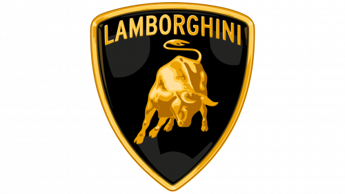
1998 – 2024: The Audi Acquisition and Three-Dimensional Realism
In 1998, Lamborghini was acquired by the Volkswagen Group and placed under the stewardship of Audi AG. This marked the beginning of an era of unprecedented financial stability, engineering precision, and global commercial success. To signal this new, high-tech chapter, German design agency Landor was tasked with modernizing the logo.
The 1998 redesign embraced the “skeuomorphic” design trend of the late 1990s and early 2000s. The logo was given a three-dimensional, metallic appearance. The black background of the shield was given a subtle gradient to mimic a curved, glossy surface. The gold elements—the border, the typography, and the bull—were rendered with realistic highlights and shadows, making them look as if they were cast in solid, polished gold. The bull itself was redesigned with enhanced anatomical accuracy, emphasizing its powerful shoulders, sharp horns, and tense muscles. This version of the logo became globally recognized, gracing the hoods of legendary cars like the Murciélago, Gallardo, Aventador, and Huracán.
2024 – Present: The Flat Design and Digital-First Evolution
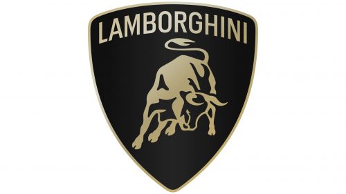
2024 – Present: The Flat Design and Digital-First Evolution
In early 2024, keeping pace with contemporary graphic design trends and the automotive shift toward electrification, Lamborghini unveiled its first major logo redesign in over two decades. The new emblem embraces flat design, removing the three-dimensional chrome gradients and glossy reflections in favor of a clean, minimalist, two-dimensional aesthetic.
The new logo features a broader, more prominent custom typeface for the “Lamborghini” wordmark. The color palette has been simplified to a refined black and white, with gold used as an accent color rather than a dominant metallic texture. For the first time, in digital applications and corporate communications, the charging bull is occasionally presented on its own, liberated from the confines of the shield. This change reflects the brand’s forward-looking philosophy, designed to ensure high legibility on digital screens, mobile interfaces, and the instrument clusters of future hybrid and electric supercars, such as the Revuelto and the Lanzador concept.
Anatomy of Design: Deconstructing the Visual Elements
The enduring success of the Lamborghini emblem lies in its masterful balance of various design elements. Each component of the logo works in harmony to project a cohesive message of power, luxury, and athletic performance.
The Shield Geometry
The three-sided shield is a classic design element associated with coat of arms, heraldry, and military protection. By placing the charging bull inside a shield, Lamborghini establishes a sense of historical authority and premium heritage. The downward-pointing apex of the shield creates a dynamic downward force, drawing the viewer’s eye toward the center of the emblem and mimicking the aggressive, low-slung nose cone of Lamborghini’s supercars.
The Dynamic Posture of the Bull
Unlike many automotive logos that feature static animals in profile (such as the Jaguar leaper or the Peugeot lion), the Lamborghini bull is captured in a moment of explosive action. The bull’s head is lowered, its horns are pointed forward, its front legs are planted, and its hindquarters are raised as if it is about to charge out of the shield. This dynamic posture suggests forward momentum, speed, and raw power—even when the car is stationary.
Color Psychology: Gold and Black
The color theory behind the Lamborghini logo is simple yet highly effective:
- Black: Universally associated with sophistication, power, elegance, mystery, and luxury. It serves as the perfect high-contrast canvas for the gold elements, allowing them to stand out with maximum visual impact.
- Gold: Symbolizes wealth, success, high-quality craftsmanship, prestige, and intellectual triumph. Unlike silver or chrome, which convey cold, industrial precision, gold conveys warmth, rarity, and emotional luxury.
The Duel of Icons: Lamborghini’s Bull vs. Ferrari’s Horse
No analysis of the Lamborghini Logo History: The Bull That Built a Brand is complete without comparing it to its eternal rival, Ferrari. The contrast between these two visual identities perfectly captures the cultural and philosophical differences between the two legendary manufacturers.
| Feature | Lamborghini (The Charging Bull) | Ferrari (The Prancing Horse) |
|---|---|---|
| Core Animal | Taurus / Fighting Bull (Power, Strength, Defiance) | Prancing Horse / Cavallino Rampante (Speed, Agility, Grace) |
| Origin Story | Inspired by Ferruccio’s zodiac sign and Spanish bullfighting. | Adopted from the WWI fighter plane of Italian ace Francesco Baracca. |
| Visual Stance | Grounded, muscular, charging forward with head lowered. | Rearing up on hind legs, elegant, airborne, and light. |
| Color Palette | Gold and Black (Prestige, Luxury, Sophistication). | Canary Yellow background (representing Modena) with Red, White, and Green. |
| Brand Philosophy | Defiance of tradition, extreme design, and futuristic engineering. | Deep racing heritage, motorsport dominance, and classic elegance. |
While Ferrari’s horse represents speed, agility, and a rich motorsport heritage, Lamborghini’s bull represents raw physical power, muscular presence, and a bold defiance of established norms. Ferrari’s logo looks back to patriotic history and military heroism; Lamborghini’s logo looks forward, driven by the personal ambition of its founder.
How Lamborghini’s Brand Architecture Inspires Modern Logo Designs
The evolution of the Lamborghini emblem offers valuable lessons for contemporary graphic designers, brand strategists, and businesses looking to create lasting visual identities. In an era dominated by rapid technological change, the principles that have kept the Lamborghini bull relevant for over sixty years remain highly applicable to modern logo designs.
First and foremost, the Lamborghini logo demonstrates the power of a strong narrative. A logo should not just be a pretty graphic; it should be rooted in a compelling story. Whether it is Ferruccio’s zodiac sign, his passion for Spanish bullfighting, or his legendary rivalry with Enzo Ferrari, every element of the Lamborghini brand architecture is tied to a deeper meaning. When modern agencies create logo designs, they must look beyond aesthetics and dig deep into the client’s history, values, and competitive landscape to find that unique narrative spark.
Secondly, Lamborghini’s recent transition to a flat, digital-first emblem highlights the importance of adaptability. As consumer attention shifts from physical billboards and print media to high-resolution screens, mobile apps, and digital interfaces, logos must be designed to scale seamlessly across different platforms. By simplifying the textures and allowing the bull to stand independent of the shield, Lamborghini has future-proofed its brand for the digital age while preserving its heritage. Modern logo designs must find this balance—retaining the core elements that customers recognize while simplifying the form factor for optimal performance on digital screens.
Key Takeaways
- A Symbol of Defiance: The charging bull was chosen by Ferruccio Lamborghini as a direct, powerful counterweight to Ferrari’s Prancing Horse, sparked by a personal clash between Ferruccio and Enzo Ferrari.
- Astrological and Cultural Roots: The bull represents Ferruccio’s zodiac sign (Taurus) and his deep admiration for the bravery and physical power of Spanish fighting bulls.
- Cohesive Brand Naming: The bull theme extends far beyond the logo, with almost every iconic Lamborghini model (Miura, Diablo, Murciélago, Aventador) named after famous Spanish fighting bulls or historic breed lines.
- Sustained Visual Core: Despite numerous corporate ownership changes over sixty years, the core elements of the logo—the shield, the charging posture of the bull, and the premium color palette—have remained remarkably consistent.
- Digital-First Modernization: The 2024 redesign embraces flat design principles, simplifying the logo for modern digital screens and the brand’s shift toward electric and hybrid supercars.
Frequently Asked Questions
Why did Ferruccio Lamborghini choose a bull for the logo?
Ferruccio Lamborghini chose the bull because it was his zodiac sign (Taurus, born April 28, 1916) and because he was deeply inspired by the strength and courage of Spanish fighting bulls, which he observed during a visit to a famous breeding ranch in Spain in 1962.
Who designed the original Lamborghini logo?
The original Lamborghini logo, featuring the gold charging bull on a black shield, was designed by Italian graphic designer Paolo Rambaldi in 1963, shortly after the company was founded.
Are all Lamborghini cars named after bulls?
While the vast majority of Lamborghini models are named after famous Spanish fighting bulls or bullfighting terms, there are a few exceptions. The most notable is the Countach, which is an exclamation of surprise or astonishment in the local Piedmontese dialect, and the Silhouette, named after a popular racing category of the era.
What do the colors of the Lamborghini logo represent?
The black and gold color palette represents luxury, sophistication, wealth, power, and prestige. Black provides a high-contrast background that projects elegance, while gold signifies rare quality, success, and mechanical excellence.
Why did Lamborghini change its logo in 2024?
Lamborghini updated its logo in 2024 to embrace a flat, minimalist design. This change improves visual clarity on digital screens, aligns with modern graphic design trends, and signals the brand’s transition toward an electrified and sustainable future.
Conclusion
The Lamborghini Logo History: The Bull That Built a Brand is a testament to the power of purposeful branding. What began as a personal quest for engineering vindication by a tractor manufacturer has evolved into one of the most recognized and respected symbols of luxury, speed, and design innovation in the world. The charging bull is more than just a corporate trademark; it is an emotional touchstone that captures the raw power and rebellious spirit of the cars that bear its name.
As Automobili Lamborghini enters a new era of hybridization and electrification, the emblem continues to serve as an anchor for its identity. By modernizing its visual language while preserving its core elements, Lamborghini demonstrates how a heritage brand can evolve without losing its soul. The bull remains unyielding, poised, and forever ready to charge into the future.