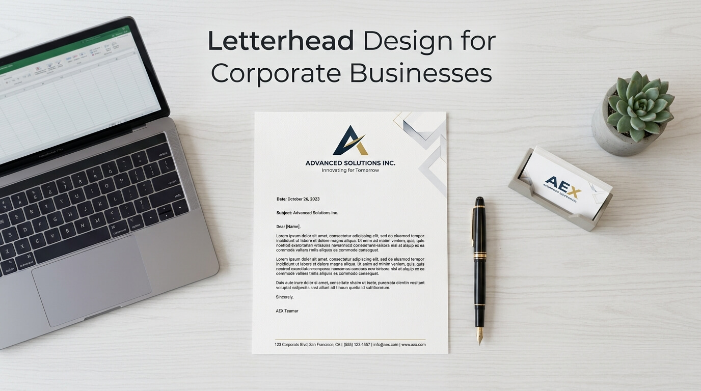
A corporate letterhead is more than a page with a company logo at the top. It is one of the simplest ways a business can present itself as established, organized, and professional. Whenever a company sends a proposal, agreement, official notice, invoice-related correspondence, business letter, or printed document, its letterhead becomes part of the communication. Because of this, letterhead design plays a role in how customers, partners, employees, and other stakeholders perceive the organization.
In a digital-first business environment, it may seem that traditional stationery has lost its importance. However, corporate documents still need a consistent visual identity. A well-designed letterhead can make an ordinary business document feel official and connected to the broader brand. It also creates consistency between printed materials and digital communications, particularly when the same design principles are applied across PDFs, formal emails, reports, and other business documents.
Designing corporate letterhead requires more than placing a logo on a blank page. The layout needs to balance branding, readability, information, and practicality. Every element, from typography and spacing to color and contact details, should have a clear purpose. When these elements work together, the letterhead becomes a useful extension of the company’s identity rather than unnecessary decoration.
Why Letterhead Matters for Corporate Businesses
Corporate businesses communicate with many different audiences, and formal communication often needs to feel more official than an ordinary email or document. A letterhead provides that visual distinction. It immediately identifies the organization behind the document and gives the communication a consistent appearance.
A professional letterhead can also reinforce brand recognition. When customers repeatedly see the same logo, typography, colors, and layout across different materials, those visual elements become associated with the business. This consistency can be especially valuable for companies that regularly produce formal documentation.
The value of letterhead is not limited to appearance. A properly structured design can make important information easier to find. Company details, addresses, telephone numbers, email addresses, and website information can be positioned in a predictable location without interfering with the main message. This creates a document that looks professional while remaining practical.
For larger corporations, consistency becomes even more important. Different departments may produce hundreds of documents, and without a defined letterhead system, each document can look slightly different. A standardized template gives employees a reliable format and helps maintain visual consistency throughout the organization.
Understanding the Corporate Brand Before Designing
Start With Existing Brand Guidelines
Letterhead design should normally begin with the company’s existing brand identity. If the organization already has brand guidelines, the designer should understand its approved logo variations, colors, typography, spacing rules, and visual treatments before creating the stationery.
This prevents the letterhead from becoming disconnected from other corporate materials. For example, if a company’s website uses a particular typeface and restrained color palette, introducing unrelated fonts or bright decorative elements on its letterhead could make the document appear inconsistent.
A letterhead does not need to use every element of a brand identity. In fact, corporate stationery often benefits from restraint. The goal is to translate the most recognizable aspects of the brand into a document format that remains functional.
Consider the Company’s Industry
Industry context also influences corporate stationery. A financial institution may require a conservative and highly structured design, while a technology company might have more freedom to use contemporary layouts. A creative agency may use stronger visual elements, whereas a legal or professional-services firm may prefer a quieter approach.
This does not mean every company in an industry needs the same style. Rather, the design should reflect the company’s personality while maintaining the level of professionalism expected by its audience.
Choosing the Right Letterhead Layout
The basic structure of a letterhead determines how information is distributed across the page. Traditional designs often place the logo and company information at the top, leaving the majority of the page open for the letter itself. Other corporate designs use a header combined with a footer, while some use a narrow vertical element along one side.
The most important consideration is available writing space. A letterhead may look attractive when viewed as a standalone design, but if the header consumes too much of the page, employees may struggle to fit formal correspondence comfortably.
A good corporate layout creates a clear visual hierarchy. The company identity should be noticeable without competing with the document’s actual content. The reader should be able to distinguish between the organization’s information and the message being communicated.
Header-Based Designs
A header is one of the most familiar approaches to corporate letterhead design. The logo is usually positioned prominently, with essential company details placed nearby. This format works well for formal correspondence because it immediately establishes the source of the document.
The header should remain relatively compact. Excessive graphics, oversized logos, or multiple decorative lines can reduce the amount of usable space and make the page feel crowded.
Header and Footer Designs
A header-and-footer format provides more flexibility. The header can focus primarily on the logo and company identity, while the footer can contain the address, telephone number, email, website, registration information, or other necessary details.
This arrangement can create a clean and balanced page. It also allows the main content area to remain visually uncluttered.
Minimalist Corporate Designs
Minimalism is particularly effective for businesses that want a modern and sophisticated appearance. A minimalist letterhead may contain only a logo, company name, essential contact information, and subtle brand elements.
The strength of this approach comes from spacing and alignment rather than decoration. Empty space is treated as part of the design, allowing the important elements to stand out.
Typography and Readability
Typography is one of the most important aspects of a corporate letterhead because the document needs to support substantial written content. A decorative typeface may work well for a logo or marketing campaign, but it can become distracting when used throughout a formal business document.
Corporate letterhead generally benefits from readable typefaces with clear letterforms. The typography should also be consistent with the organization’s broader visual identity where practical.
Font size matters as well. Company information can be slightly smaller than the body copy, but it should remain readable in both printed and digital formats. Extremely small contact details may look neat on screen but become difficult to read when printed.
Hierarchy can be established through differences in size, weight, and spacing. The company name may receive greater visual emphasis, while secondary information can be more subtle. The body text should remain the dominant reading area once the recipient begins engaging with the actual message.
Using Color Effectively
Corporate colors can make a letterhead immediately recognizable, but color should be used carefully. Too many colors can make a formal document feel more like a promotional flyer than professional correspondence.
A practical approach is to use one or two primary brand colors for key elements such as the logo, lines, headings, or small accents. The rest of the page can remain predominantly white or neutral, allowing the written content to remain easy to read.
Color also needs to work in different printing conditions. A design that depends heavily on large areas of saturated color may become expensive to reproduce and can look different when printed on different printers. Corporate letterhead should therefore be tested in its intended production environment.
| Design Element | Corporate Best Practice | Common Problem |
| Logo | Use an approved, appropriately sized version | Oversized or low-resolution logo |
| Typography | Prioritize readable, consistent fonts | Too many typefaces |
| Color | Use restrained brand colors | Excessive or distracting colors |
| Contact Details | Include essential information clearly | Tiny or crowded text |
| Spacing | Maintain generous margins and clear areas | Content feels cramped |
| Footer | Keep secondary information organized | Too much legal or contact text |
| Page Layout | Preserve sufficient writing space | Decorative elements dominate |
| Digital Version | Optimize for PDF and screen viewing | Print-only design assumptions |
Getting the Logo Placement Right
The logo is often the most recognizable element on a corporate letterhead, but bigger does not necessarily mean better. An oversized logo can dominate the page and reduce the visual importance of the communication itself.
Placement should be consistent across every version of the template. The top-left position is familiar and works well for many organizations, while centered or top-right placements can create a more distinctive appearance.
The logo should also have enough clear space around it. Crowding the logo against other information can make even a high-quality design look poorly organized. Following the company’s existing logo spacing requirements is particularly important.
For digital documents, the logo should be supplied at an appropriate resolution and in a format that remains sharp when viewed on different screens. For professional printing, the production file should also meet the printer’s technical requirements.
Including Essential Corporate Information
A letterhead should provide enough information to identify and contact the business without becoming overloaded. Depending on the organization’s requirements, this can include the legal company name, physical address, telephone number, email address, website, and other relevant corporate information.
Not every detail needs to appear in the most prominent position. Primary information can be placed near the logo, while secondary details can be organized in the footer.
Companies with registration numbers, licensing information, or regulatory requirements may need to include specific details on formal stationery. These requirements can vary depending on jurisdiction and industry, so the design should accommodate them without compromising readability.
The objective is simple: someone receiving the document should be able to understand who sent it and how to contact the organization without searching through the body of the letter.
Designing for Digital and Print Use
Modern corporate letterhead needs to work across multiple formats. Many documents that once would have been printed are now created as PDFs and shared electronically. This means designers need to consider both physical and digital presentation.
A digital letterhead should look clear on desktop screens, laptops, tablets, and other common devices. Text should remain readable when the document is viewed at different zoom levels, while logos and graphics should remain sharp.
Print considerations are equally important. Margins, bleed requirements, paper size, ink coverage, and color reproduction can all affect the final result. A design intended for professional printing should be prepared according to the printer’s specifications.
Many companies also benefit from having editable templates for employees and a final PDF version for official distribution. These formats serve different purposes, so the design system should accommodate both.
Creating a Consistent Multi-Page System
Corporate documents are not always limited to a single page. Reports, proposals, contracts, policy documents, and formal notices may extend across several pages. A professional letterhead system should therefore consider what happens after page one.
The first page can contain the primary corporate identity, while subsequent pages may use a simpler header or a reduced branding treatment. This prevents repeated visual elements from overwhelming longer documents.
Page numbering can also be integrated into the system where necessary. The design should make it easy for readers to understand that multiple pages belong to the same document.
Consistency is particularly valuable when documents are produced by different employees or departments. A well-developed template reduces the likelihood of inconsistent logos, fonts, margins, and contact information appearing in official communications.
Common Letterhead Design Mistakes
One of the most common mistakes is trying to include too much information. Businesses sometimes treat letterhead as a place to display every possible contact detail, social media account, certification, slogan, and service. The result can be visually crowded and difficult to use.
Another problem is poor spacing. Even attractive elements can look unprofessional when they are positioned too close together. Adequate margins and clear space help create structure.
Low-quality logos are another concern, especially when a letterhead is prepared from an image copied from a website. A professional design should use appropriate source files so that the logo remains clear in print and digital formats.
Inconsistent typography can also weaken the overall appearance. Using several unrelated fonts often creates visual noise. A small, deliberate type system is generally more effective.
Finally, some designs prioritize appearance so heavily that they become difficult to edit. Corporate stationery should be attractive, but it must also function as a practical document template for everyday business use.
Accessibility and Practical Usability
Corporate documents should be designed with different readers and viewing conditions in mind. Sufficient contrast between text and background is essential for readability. Small text, overly light typography, and complex backgrounds can create unnecessary barriers.
Digital documents should also maintain a logical structure where possible. When letterhead is converted into a PDF, important information should remain selectable and readable rather than being embedded entirely into a single image.
Practical usability extends to employees as well. If a template is difficult to edit, people may recreate it themselves, leading to inconsistent versions. Clear instructions, editable fields, and standardized templates can help maintain consistency across the organization.
How Professional Letterhead Supports Brand Consistency
Corporate branding is built through repeated interactions rather than a single logo placement. Every formal document provides another opportunity to reinforce the company’s visual identity.
When the letterhead aligns with business cards, presentations, reports, packaging, websites, and other materials, customers encounter a more consistent brand experience. This does not mean every item should look identical. Instead, recurring design elements should create a recognizable connection between different forms of communication.
A letterhead is particularly useful because it appears in contexts where professionalism and clarity matter. A well-designed document can make communication feel more organized while helping recipients quickly identify the company behind it.
The Role of Professional Letterhead Design Services
Creating a simple letterhead may seem straightforward, but corporate stationery often requires careful attention to typography, layout, branding, print preparation, and digital usability. Professional design support can help businesses turn their existing identity into a practical stationery system.
A designer can also prepare multiple versions for different purposes, such as official correspondence, internal communication, proposals, invoices, and digital documents. This can be especially useful for larger businesses where several teams need consistent templates.
The best result is not necessarily the most visually elaborate design. It is the design that remains recognizable, readable, functional, and consistent every time the company uses it.
Conclusion
Letterhead design for corporate businesses combines branding with everyday functionality. A successful letterhead identifies the organization, presents essential information clearly, supports written communication, and maintains consistency across print and digital formats. The most effective designs usually rely on thoughtful typography, controlled color, balanced spacing, appropriate logo placement, and a clear visual hierarchy.
Rather than treating letterhead as a decorative page, businesses should consider it part of their broader communication system. When designed carefully, corporate stationery can provide a professional foundation for everything from routine correspondence to important reports and formal business documents.
Frequently Asked Questions
Q1. What should a corporate letterhead include?
A corporate letterhead commonly includes the company logo, legal or trading name, address, telephone number, email address, and website. Additional information may be required depending on the company’s industry or legal obligations.
Q2. Should corporate letterhead be colorful?
Corporate letterhead can use brand colors, but they should be applied carefully. A restrained color palette generally keeps the document professional and ensures that the written content remains the primary focus.
Q3. What size should a corporate letterhead be?
Letterhead should normally match the standard paper size used by the business, such as A4 or US Letter. The exact dimensions should be selected according to the company’s geographic market and document requirements.
Q4. Can the same letterhead be used digitally?
Yes. A corporate letterhead can be adapted for digital documents such as PDFs and editable templates. The design should be tested on screens as well as in print to ensure readability and consistent presentation.
Q5. How can a company keep letterhead consistent across departments?
A company can provide standardized templates, approved logo files, defined typography, brand colors, and clear usage guidelines. Centralized templates can help employees create documents without altering important brand elements.