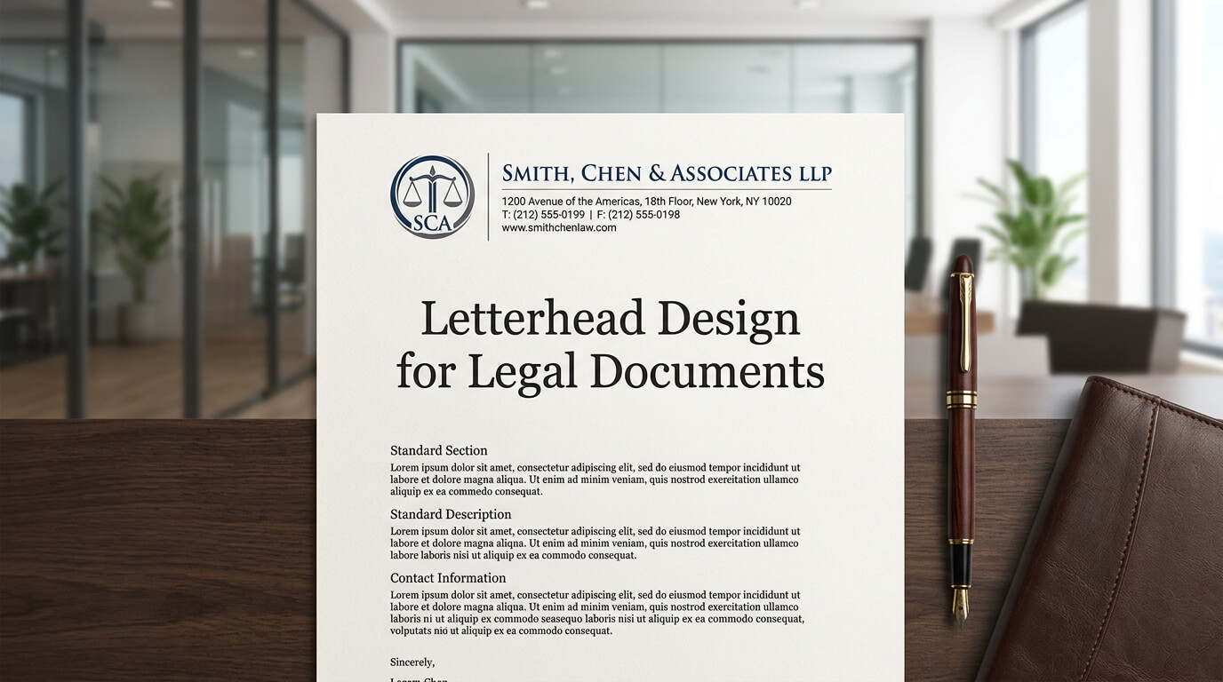
In the legal profession, documents are expected to communicate more than information. They need to project professionalism, establish authenticity, and present important details in a clear and organized manner. Whether it is a formal legal notice, attorney correspondence, court-related communication, client letter, agreement cover page, or official law firm communication, the letterhead plays an important role in how the document is perceived.
A well-designed legal letterhead creates a professional framework around the information it contains. It identifies the law firm, attorney, or legal organization while providing essential contact information and maintaining a consistent visual identity. At the same time, legal documents often have practical requirements that make letterhead design different from ordinary business stationery. There may be lengthy paragraphs, case references, confidentiality notices, signatures, dates, addresses, and other details that need to remain readable and properly positioned.
Good legal letterhead design therefore requires a balance between branding and functionality. It should look professional without becoming distracting, and it should provide necessary information without taking valuable space away from the legal content. When thoughtfully designed, letterhead can support credibility while making official documents easier to read, identify, organize, and share.
Why Letterhead Matters for Legal Documents
Creating a Professional First Impression
Legal documents frequently represent serious matters, and presentation can influence how recipients perceive the organization behind the communication. A carefully designed letterhead immediately identifies the sender and gives the document a structured appearance.
For a law firm, the letterhead may include the firm’s name, attorneys’ names, professional titles, office address, telephone number, email address, and website. The information should be presented in a way that feels organized rather than crowded. A recipient should be able to identify the sender within seconds without searching through the body of the document.
This becomes particularly important when legal correspondence is sent to clients, opposing counsel, courts, government agencies, financial institutions, or other professional organizations. A consistent letterhead reinforces the impression that the document comes from an established professional source.
Establishing a Consistent Legal Brand
Law firms often communicate with clients through dozens of documents throughout a case or legal relationship. If every document uses different colors, fonts, logos, and layouts, the firm’s identity can appear inconsistent.
A standardized letterhead creates visual continuity. A client who receives an engagement letter, follow-up correspondence, invoice cover letter, or formal notice should be able to recognize that these materials originate from the same organization.
Consistency does not mean that every document needs to look elaborate. In legal communication, consistency is often achieved through restrained design choices, such as the same typography, logo placement, spacing, and contact-information structure.
Essential Elements of Legal Letterhead Design
Law Firm or Attorney Name
The most prominent identifying element is normally the name of the law firm, attorney, legal practice, or organization issuing the document. It should be easy to recognize but should not dominate the entire page.
If several attorneys are associated with a practice, the design can accommodate their names and professional titles without creating visual clutter. The hierarchy should make it immediately clear whether the document represents an individual attorney, a partnership, or a larger firm.
Logo and Brand Identity
A logo can give legal letterhead a recognizable visual identity. However, legal stationery generally benefits from restraint. A large decorative logo can consume space that would otherwise be available for important legal content.
The logo should be reproduced clearly in both digital and printed formats. If documents may be photocopied or scanned, the design should remain recognizable even when color is removed.
Contact Information
Contact details are another important part of legal letterhead. Depending on the firm’s needs, this information may include the office address, telephone number, email address, website, fax number, and other relevant communication details.
The contact information should be positioned consistently, often in the header or footer. It should be readable without competing with the document’s main content.
Professional Credentials
Some legal professionals include professional titles, jurisdictions, bar information, or other credentials on their stationery. Whether such information belongs on the letterhead depends on the organization’s professional requirements and the purpose of the document.
The key consideration is clarity. Credentials should support identification and professionalism rather than overwhelm the page.
Designing Letterhead for Readability
Choosing Appropriate Typography
Typography is especially important in legal documents because readers may need to review substantial amounts of text. A decorative typeface that might work for a creative business can make legal correspondence difficult to read.
A professional letterhead should generally use clear, highly legible typography. The firm’s name can have distinctive styling, while the main document text should prioritize readability.
Font size, line spacing, margins, and paragraph spacing should all work together. Even an attractive letterhead can become ineffective if the header takes up too much vertical space and forces the legal content into a cramped area.
Using White Space Effectively
White space is not wasted space. In legal documents, it helps separate information and makes dense content easier to process.
A well-designed letterhead should leave sufficient room between the header and the body of the document. The margins should also provide enough breathing room around paragraphs and other elements.
This becomes particularly important for legal correspondence that may extend across several pages. A restrained header can help maintain a professional appearance without unnecessarily reducing the usable writing area.
Maintaining a Clear Visual Hierarchy
Visual hierarchy helps readers understand which information deserves attention first. The law firm’s name may be more prominent than the office address, while the body of the legal communication should remain the primary focus of the page.
A good hierarchy can be created through differences in font size, weight, spacing, alignment, and placement. It does not require excessive colors or decorative elements.
Letterhead Layout for Different Legal Documents
Different types of legal documents may require different stationery approaches. A letterhead designed for short correspondence may not be suitable for a lengthy legal memorandum or multi-page agreement.
| Legal Document | Important Letterhead Considerations | Design Priority |
| Attorney Letter | Firm identity and contact information | Professional clarity |
| Legal Notice | Sender details and document identification | Formal structure |
| Legal Memorandum | Maximum writing space and readability | Content visibility |
| Client Correspondence | Branding and accessible contact information | Trust and clarity |
| Agreement Cover Letter | Formal identity and document context | Organization |
| Court-Related Correspondence | Clear sender identification and restrained design | Accuracy and professionalism |
The design should always support the purpose of the document. A formal legal notice may need stronger identification of the sender, while a long memorandum may benefit from a minimal header that preserves as much writing space as possible.
Designing Multi-Page Legal Documents
Keeping the Header Consistent
Legal documents can extend across multiple pages, and inconsistent headers can make the document appear poorly assembled. A professional stationery system should establish how the first page differs from subsequent pages.
The first page may feature a larger logo and complete contact information, while following pages may use a smaller header. This allows the document to retain its identity without consuming excessive space.
Using Page Numbers Properly
Page numbers become particularly important when legal correspondence contains several pages. They help readers keep documents organized and make it easier to identify missing or incorrectly arranged pages.
The page-number position should remain consistent. It can typically appear in the footer or another unobtrusive location that does not interfere with the legal text.
Maintaining Margins
Legal documents often contain detailed information that needs sufficient room for annotations, printing, scanning, and filing. The letterhead should therefore work within practical page margins rather than pushing text toward the edges.
Consistent margins also make printed documents look more organized and professional.
Color Choices for Legal Letterhead
Why Conservative Colors Often Work
Legal branding often benefits from restrained colors. Black, white, dark gray, navy, deep green, and similar professional tones can create a formal appearance without distracting from the content.
The choice of color should reflect the firm’s existing brand while remaining appropriate for official documents. A highly colorful design may work for certain modern legal practices, but the key is ensuring that the design does not undermine readability or formality.
Designing for Black-and-White Printing
Even when a firm’s official letterhead uses color, the document should remain functional when printed in grayscale. Legal documents may be photocopied, scanned, faxed, or printed using basic office equipment.
Text should not rely on subtle color differences to communicate important information. Contrast should remain strong enough that the document is readable under different printing conditions.
Digital Letterhead for Modern Legal Communication
Creating Professional PDF Documents
Modern legal communication frequently takes place electronically. A properly designed digital letterhead can be incorporated into PDF documents so that electronic correspondence retains the same professional appearance as printed documents.
Digital files should be tested on different screens and at different zoom levels. Small contact information that appears readable on a large desktop monitor may become difficult to read on smaller displays.
Word Processing Templates
Many law firms use document templates for routine correspondence. A well-built template can standardize the placement of the firm’s identity, address, date, recipient information, subject line, body text, and signature.
Templates also reduce formatting inconsistencies between employees and attorneys. Instead of recreating letterhead for every document, staff can work from an approved structure.
Email and Electronic Attachments
When legal correspondence is sent by email, letterhead often appears inside the attached document rather than the email itself. This makes it important for the digital letterhead to stand on its own.
The recipient should be able to identify the sender and understand the document’s context even if the attachment is downloaded separately from the original email.
Confidentiality and Legal Notices
Many legal communications include confidentiality statements or other notices. These can be placed in the footer or another designated area of the document.
The design should ensure that such notices remain readable without competing with the primary legal content. Very small text can technically fit more information onto a page, but it can also make important notices difficult to read.
The exact wording and placement of legal disclaimers should be determined by the firm’s legal and professional requirements rather than by the graphic designer alone.
Letterhead Design and Document Security
Protecting the Firm’s Identity
Legal stationery can also serve as a visual identifier. Consistent branding makes it easier for recipients to recognize documents that genuinely originate from a particular organization.
However, letterhead itself should not be treated as a complete security mechanism. Digital documents can be copied or altered, so firms may use additional measures when appropriate.
Avoiding Excessive Personal Information
Letterhead should contain information that is useful for professional identification and communication. Including unnecessary personal details can make the document visually crowded and may create privacy concerns.
The firm’s design team should distinguish between information that recipients genuinely need and information that simply takes up space.
Common Mistakes in Legal Letterhead Design
Overly Decorative Designs
One of the most common problems is treating legal letterhead like promotional advertising. Large graphics, dramatic backgrounds, excessive color, and decorative typography can distract from the document’s purpose.
Legal communication generally benefits from a design that supports the written material instead of competing with it.
Crowded Headers
A header containing the logo, multiple attorney names, several phone numbers, social media icons, addresses, and other information can quickly become overwhelming.
The solution is not necessarily to remove useful information, but to organize it carefully. Typography and spacing can create structure without requiring additional graphic elements.
Poor Contrast
Light gray text or low-contrast branding may look elegant on screen but become difficult to read when printed. Strong contrast is particularly important for legal documents because readers may review them repeatedly or under less-than-ideal conditions.
Inconsistent Formatting
Using one letterhead for one attorney and a completely different version for another can weaken a firm’s visual identity. A centralized template system can help ensure that documents follow the same standards.
How to Create an Effective Legal Letterhead
The process should begin with understanding the firm’s identity and the types of documents it produces. A designer should consider whether the stationery will primarily be printed, distributed digitally, or used in both formats.
The next stage is establishing a clear information hierarchy. The firm’s name, logo, attorney information, address, and contact details should have defined positions and visual relationships.
After creating the initial layout, the design should be tested using actual legal content. Placeholder text can make a layout appear balanced, but real legal paragraphs may reveal problems with spacing and page breaks.
The stationery should then be tested in several formats, including standard office printing, grayscale printing, PDF export, scanning, and different screen sizes. Multi-page documents should receive particular attention because the first-page design may need to differ from subsequent pages.
Finally, the completed template should be standardized across the organization. Staff members should have access to approved versions so that official documents maintain consistent formatting.
The Role of Professional Letterhead in Legal Communication
A legal letterhead is ultimately a communication tool. Its purpose is not simply to make a document look attractive. It establishes identity, supports organization, reinforces professionalism, and creates a consistent framework for important information.
When the design is carefully considered, the stationery becomes almost invisible in the best possible sense. The recipient notices the professionalism and clarity of the document rather than being distracted by its design.
This is especially valuable in legal environments where the written content carries the greatest importance. A good letterhead creates an appropriate visual setting for that content without competing with it.
Conclusion
Letterhead design for legal documents requires a careful balance between professional branding, readability, practicality, and consistency. The strongest designs typically use clear typography, restrained visual elements, appropriate spacing, recognizable branding, and well-organized contact information.
Whether used for attorney correspondence, legal notices, client communications, memoranda, or digital PDFs, effective letterhead should make documents easier to identify and easier to read. A thoughtful design also creates consistency across an entire firm’s communications, helping establish a professional visual identity without allowing branding to overshadow the substance of legal work.
Frequently Asked Questions
Q1. What should legal letterhead include?
Legal letterhead commonly includes the law firm’s or attorney’s name, logo, office address, telephone number, email address, website, and relevant professional information. The exact content depends on the firm’s needs and applicable professional requirements.
Q2. What font is appropriate for legal letterhead?
A clear and professional typeface is generally appropriate. The most important consideration is readability, particularly when the letterhead is used alongside lengthy legal documents.
Q3. Should legal letterhead use color?
Color can be used, but it should remain restrained and professional. The design should also remain clear when printed in black and white or grayscale.
Q4. Can legal letterhead be used for digital documents?
Yes. Legal letterhead can be incorporated into Word templates and PDF documents for electronic communication. Digital versions should be tested for readability on different screens and devices.
Q5. Should every page of a legal document have the same letterhead?
Not necessarily. Many professional document systems use a more detailed first-page header and a smaller header on subsequent pages. This maintains branding while preserving valuable space for legal content