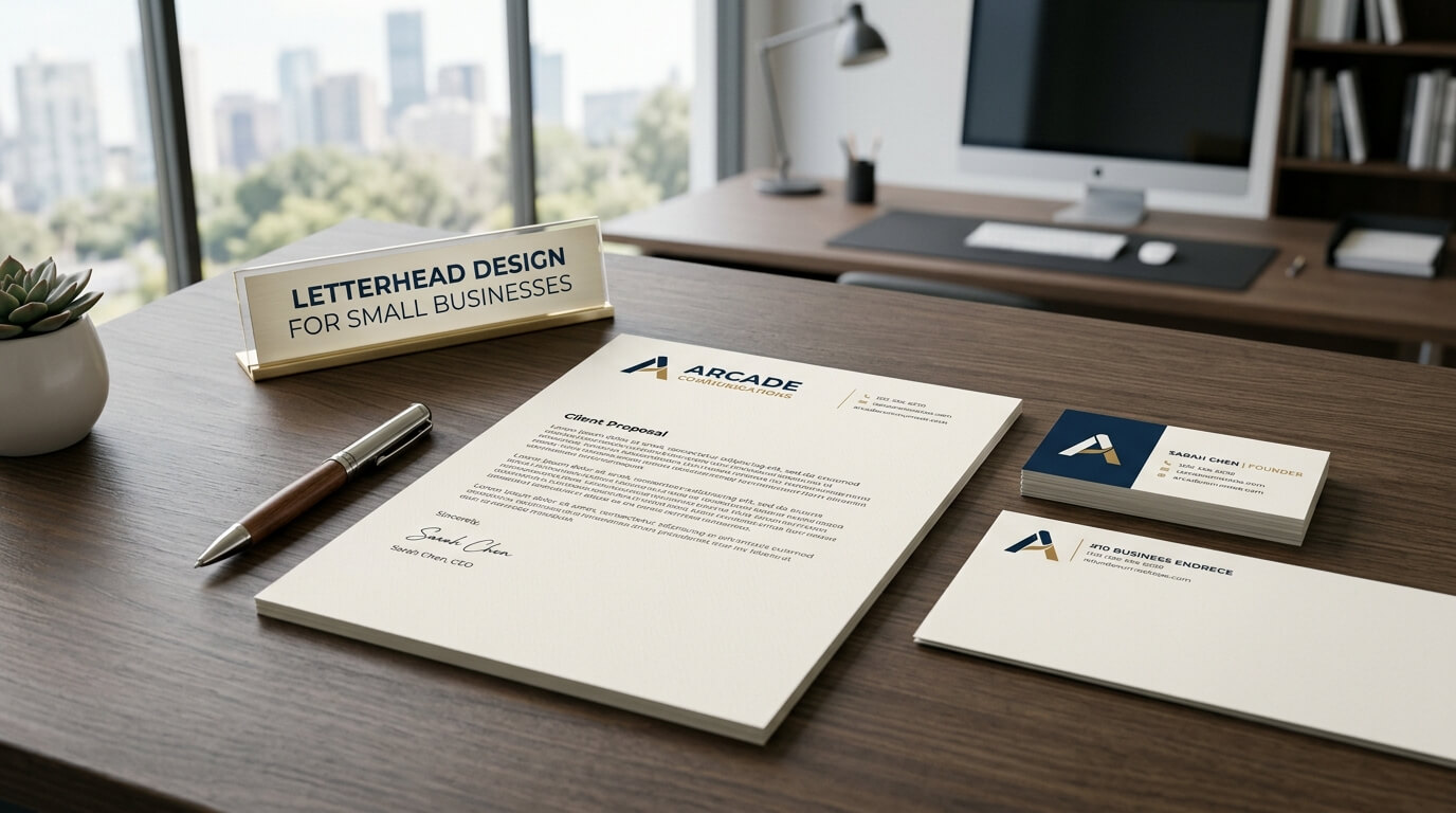
For a small business, every piece of communication contributes to how customers, clients, partners, and suppliers perceive the company. While digital communication has become the standard for many everyday conversations, printed documents still have an important place in professional business communication. Invoices, proposals, contracts, official letters, quotations, reports, and other documents can all benefit from a well-designed letterhead. A thoughtfully created letterhead gives ordinary business correspondence a recognizable identity and makes the company appear organized, established, and professional.
Letterhead design for small businesses is not simply about placing a logo at the top of a page. It involves creating a visual structure that represents the company’s identity while keeping important information easy to find. The best letterheads balance branding with practicality. They provide enough space for the actual message while incorporating elements such as the business name, logo, contact information, website, and other relevant details.
For small businesses working with limited marketing budgets, letterhead can also become a useful branding tool. A consistent design can reinforce the company’s identity every time a document reaches a customer or business partner. Whether the document is printed or converted into a digital PDF, professional letterhead can help create consistency across business communications.
Why Letterhead Matters for Small Businesses
Small businesses often have to establish credibility quickly. Unlike large companies with widely recognized names, small organizations may need to work harder to create a professional impression. A well-designed letterhead can contribute to that impression by giving official documents a consistent and recognizable appearance.
When a customer receives a proposal, agreement, business letter, or quotation, the design of the document can influence how seriously the communication is taken. A document that looks carefully prepared suggests that the business pays attention to details. On the other hand, a document with inconsistent fonts, poor spacing, outdated contact information, or an unclear logo can make the company appear less organized.
Letterhead also helps create a consistent visual identity. If a business uses the same logo, colors, typography, and information structure across its documents, customers begin to associate those elements with the company. This consistency can be particularly valuable for small businesses that are still developing their brand recognition.
The Role of Branding in Letterhead Design
Connecting the Letterhead With the Brand
A business letterhead should feel like part of the company’s overall brand rather than a separate design. If a company already has established brand colors, fonts, imagery, and logo guidelines, those elements should influence the letterhead. Using unrelated design choices can make business materials look disconnected from the rest of the company’s identity.
For example, a technology company may use a clean, minimal design with modern typography, while a creative studio may have more flexibility with color and visual elements. A law firm or financial consultancy may benefit from a more restrained design that communicates professionalism and reliability. The design should reflect the nature of the business without becoming unnecessarily complicated.
Creating Visual Consistency
Consistency is one of the most important principles of business branding. A company may use its letterhead alongside business cards, envelopes, invoices, presentations, brochures, email signatures, and other materials. When these items share recognizable visual elements, the business develops a more cohesive identity.
Small businesses do not necessarily need elaborate designs to achieve consistency. A simple logo placement, carefully selected typeface, brand color, and structured footer can be enough. The goal is to create a recognizable system that can be repeated across different types of communication.
Essential Elements of a Small Business Letterhead
A letterhead needs to contain practical information as well as branding elements. However, including every possible piece of information can make the design crowded. Small businesses should carefully decide what information customers actually need when communicating with the company.
The business name and logo are usually among the most important elements. The logo provides visual recognition, while the business name ensures that the recipient immediately knows who sent the document. Contact details can include the business address, phone number, email address, and website. Depending on the nature of the company, social media information may also be included, although it should only be added when relevant.
Some businesses may also include registration details, professional credentials, tax information, or other legally relevant information. The exact requirements can vary depending on the business structure and jurisdiction, so companies should make sure that any required information is included accurately.
| Letterhead Element | Purpose | Design Consideration |
| Business logo | Provides visual recognition | Keep it clear and appropriately sized |
| Business name | Identifies the company | Make it easy to read |
| Contact information | Helps recipients reach the business | Keep details accurate and concise |
| Website | Provides an online destination | Use a readable format |
| Address | Establishes business location | Include only relevant details |
| Brand colors | Reinforces visual identity | Use consistently and sparingly |
| Typography | Creates visual personality | Prioritize readability |
| Footer information | Provides additional details | Avoid overcrowding |
| Document space | Allows room for communication | Protect the main writing area |
Choosing the Right Letterhead Layout
Traditional Header Layout
The traditional letterhead places the logo and company information across the top of the page. This approach is familiar and works well for many industries. It allows recipients to identify the business immediately while leaving most of the page available for the message.
A traditional header can be centered, aligned to the left, or arranged horizontally. The best choice depends on the company’s visual identity and the amount of information that needs to appear at the top.
Modern Minimal Layout
Minimal letterhead designs are particularly useful for businesses that want a contemporary appearance. Instead of filling the header with multiple decorative elements, a minimal layout may use a small logo, a simple business name, and carefully arranged contact details.
Minimalism does not mean removing all personality from the design. It means using fewer elements and giving each one enough space to remain visually effective. White space becomes an important part of the composition, helping the document look clean and professional.
Header and Footer Combination
Another common approach is to place the main branding elements in the header and supporting information in the footer. The header can contain the logo and business name, while the footer provides contact information, website details, registration information, or a short brand statement.
This arrangement can keep the upper portion of the page uncluttered and create a professional visual balance. It can also work well for official correspondence where the written content needs to remain the main focus.
Selecting Fonts for Business Letterhead
Typography can have a surprisingly strong influence on how a letterhead feels. The wrong typeface can make an otherwise professional design appear informal or difficult to read. For business documents, readability should generally take priority over decorative styling.
A letterhead may use one primary font or combine two complementary typefaces. The business name can have slightly stronger visual emphasis, while the body of the document should use a highly readable font. Font size, spacing, and hierarchy should also be considered carefully.
Using too many fonts can make the design feel inconsistent. Small businesses should generally establish a simple typographic system that can also be used across other business documents. This makes the letterhead easier to maintain and helps reinforce brand consistency.
Using Colors Effectively
Color can make a letterhead more recognizable, but excessive color can distract from the document’s purpose. A small business should ideally use colors that already belong to its brand identity.
One or two primary brand colors may be enough for most designs. A colored line, logo detail, heading, or footer can provide visual interest without overwhelming the page. Businesses that work in conservative industries may prefer restrained colors, while creative businesses may have more freedom to experiment.
The practical side of color should also be considered. If the letterhead will frequently be printed, a design that depends heavily on large areas of color may increase printing costs. A design that remains attractive in both color and grayscale can provide greater flexibility.
Balancing Branding With Usability
One of the biggest mistakes in letterhead design is allowing branding to take over the page. A letterhead exists to support communication, not compete with it. The recipient should be able to read the actual document comfortably.
The header should therefore occupy an appropriate amount of space. If it is too large, the document may have less room for the message. If it is too small, the branding may lose its visual impact. Margins, line spacing, and content placement should all be considered as part of the overall layout.
White space is particularly important. Empty space is not wasted space in a professional document. It creates breathing room between the branding and the written content, making the page easier to scan and giving the design a more polished appearance.
Designing Letterhead for Digital and Print Use
Printable Letterhead
Printed letterhead should be designed with paper size, margins, ink usage, and printing quality in mind. Businesses should consider how the design will appear on the type of paper they normally use.
High-quality printing can make colors and logos appear sharper, but the design should not depend entirely on expensive printing techniques. A well-structured design should still look professional when printed on standard office equipment.
Digital Letterhead
Many small businesses now send documents electronically. This makes digital letterhead just as important as printed stationery. A company may use a letterhead template when creating PDFs, proposals, agreements, or formal correspondence.
Digital documents also require attention to file quality. Logos should remain sharp, text should be selectable when appropriate, and the overall document should be easy to view on different screens. A design that looks excellent in print but becomes distorted or difficult to read digitally may not serve the business effectively.
Common Letterhead Design Mistakes
Overloading the Page
Adding too many logos, icons, colors, contact details, social media accounts, decorative patterns, and other elements can make a letterhead difficult to use. The design should have a clear hierarchy that tells the reader where to look first.
Using Low-Quality Logos
A blurry or pixelated logo can make even a sophisticated letterhead appear unprofessional. Businesses should use high-resolution or vector versions of their logos whenever possible.
Ignoring Alignment
Alignment creates structure. When the logo, company name, contact details, and other elements do not line up properly, the page can feel unfinished. Consistent alignment helps create a cleaner visual experience.
Choosing Decorative Fonts
Highly decorative fonts may look interesting in branding projects but can reduce readability on formal documents. The business name may use distinctive typography, but important information should remain easy to read.
Forgetting Future Use
A letterhead should not be designed for only one document. Small businesses may use the same template for different types of correspondence. The layout should therefore provide enough flexibility for short letters, longer documents, proposals, and other communications.
How Small Businesses Can Keep Letterhead Professional on a Budget
Professional design does not necessarily require an expensive or elaborate solution. The strongest letterheads often rely on basic design principles such as hierarchy, alignment, spacing, consistency, and readability.
Small businesses can begin with their existing brand identity. Instead of creating an entirely new visual system, they can adapt their current logo, colors, and typography into a letterhead format. This saves time and helps ensure that business communications remain consistent.
It is also useful to create a reusable template rather than designing each document separately. A properly prepared template allows employees to produce professional documents without rebuilding the design every time. The template can include fixed branding elements while leaving editable areas for dates, recipient information, document titles, and body text.
Letterhead as Part of a Broader Brand Identity
A letterhead works best when it is connected to a larger branding strategy. Customers should be able to see similarities between a company’s website, business card, social media presence, invoices, packaging, and official documents.
For a small business, this consistency can make the brand appear more established. It also reduces confusion because customers encounter the same visual language across different communication channels.
As the business grows, the letterhead can become part of a broader brand guideline. These guidelines can define logo placement, colors, typography, spacing, and other visual rules. Having these standards makes it easier for different team members or designers to produce materials that look like they belong to the same company.
The Importance of Updating Business Letterhead
A letterhead should be reviewed whenever important business information changes. An outdated phone number, old address, incorrect website, or obsolete logo can create unnecessary confusion.
Businesses should also review their letterhead when their brand identity changes. A redesign of the logo or visual identity may require corresponding updates to stationery and document templates.
Regularly checking these details is a simple but valuable part of maintaining professional communication. Even a beautiful letterhead loses its effectiveness if the information printed on it is no longer accurate.
Final Thoughts on Letterhead Design for Small Businesses
Letterhead design gives small businesses an opportunity to bring professionalism and consistency to everyday communication. A strong design does not need to be complicated. It needs to represent the brand clearly, organize important information, support readability, and provide enough space for the document’s main message.
The most effective approach is usually one that combines practical requirements with thoughtful visual design. A recognizable logo, appropriate typography, restrained use of color, balanced spacing, and accurate contact information can create a letterhead that works across both printed and digital documents.
For small businesses, the value of letterhead comes from repeated use. Each proposal, formal letter, agreement, quotation, or report becomes another opportunity to reinforce the company’s identity. When the design is consistent and easy to use, letterhead becomes more than stationery. It becomes a practical part of the business’s overall communication system.
Conclusion
A professional letterhead can help a small business communicate credibility, consistency, and attention to detail. By combining recognizable branding with a clean and functional layout, businesses can create documents that look professional without becoming unnecessarily complicated. The key is to focus on readability, accurate information, appropriate branding, and flexible design. Whether used in print or digital communication, a well-designed letterhead can become a lasting part of a small business’s visual identity.
FAQ
Q1. What should a small business include on its letterhead?
A small business letterhead commonly includes the business name, logo, contact information, website, and address. Additional details can be included when they are relevant or legally required.
Q2. Should a small business use color on its letterhead?
Yes, but color should be used thoughtfully. Brand colors can strengthen recognition, while excessive color may distract from the document’s written content or increase printing costs.
Q3. Is a digital letterhead useful for small businesses?
Yes. Digital letterhead can be used for PDFs, proposals, quotations, reports, contracts, and formal emails or documents. It helps maintain brand consistency even when communication takes place electronically.
Q4. How much information should appear on a letterhead?
Only information that is useful to the recipient should normally be included. Too much information can make the header or footer crowded and reduce the space available for the main document.
Q5. Can a small business create a letterhead without redesigning its brand?
Yes. An existing logo, brand colors, typography, and visual identity can usually be adapted into a letterhead. Using existing branding can also help maintain consistency across business materials.