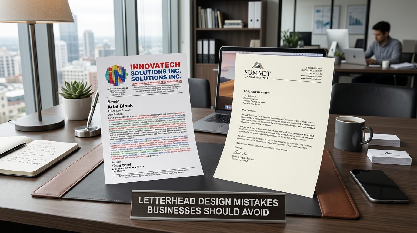
A business letterhead is more than a decorative header placed at the top of a document. It is a visual representation of a company and often becomes one of the first details a client, customer, partner, or professional contact notices. Whether it appears on a proposal, invoice, official letter, agreement, report, or printed correspondence, a well-designed letterhead can make communication feel organized, credible, and consistent. On the other hand, a poorly designed letterhead can make even well-written business communication appear careless or outdated.
Many businesses assume that creating a letterhead simply means adding a logo, company name, phone number, email address, and website to a page. While these details are important, effective letterhead design requires much more consideration. Typography, spacing, color, hierarchy, alignment, printing requirements, branding, and usability all influence the final result. A letterhead may look attractive on a computer screen but become difficult to read when printed. It may contain all the necessary information but feel overcrowded because there is no visual breathing room.
Understanding common letterhead design mistakes can help businesses create stationery that supports their professional identity rather than weakening it. The goal is not to make every letterhead highly decorative. Instead, the most effective designs balance brand identity with clarity, functionality, and professionalism.
Why Letterhead Design Matters for Businesses
Letterhead design contributes to how a business presents itself in formal communication. When customers receive a document with a consistent and professional visual identity, the company can appear more established and organized. This is particularly important when documents are being sent to new clients, potential business partners, suppliers, investors, or professional organizations.
A letterhead also provides an opportunity to reinforce brand recognition. The same logo, typography, colors, and visual language used across a company’s website, business cards, presentations, packaging, and other marketing materials can create a consistent identity. Over time, these repeated visual elements can make the business easier to recognize.
However, professional appearance does not necessarily mean complicated design. In many cases, a clean and restrained letterhead communicates more effectively than one filled with decorative elements. Businesses should therefore approach letterhead design as a communication tool rather than simply treating it as a piece of artwork.
Mistake 1: Overloading the Letterhead With Information
One of the most common letterhead mistakes is trying to include too much information. Businesses sometimes place every possible contact detail, social media account, office address, registration number, slogan, service description, and promotional message on the page.
Although providing useful contact information is important, excessive content can make the letterhead feel crowded. The reader should be able to identify the business and its essential contact information without searching through a collection of unrelated details.
A professional letterhead generally benefits from prioritization. The company name and logo should have clear visibility, while essential contact details should remain readable without competing with the main body of the document. Secondary information can often be placed in a footer or omitted entirely when it does not serve the purpose of the document.
Focus on Essential Information
Before finalizing a design, businesses should determine which details recipients genuinely need. A physical address may be important for a law firm, consulting company, or local office, while a digital business may prioritize an email address and website. The right information depends on the organization’s communication needs.
The objective should be clarity rather than completeness. A letterhead does not need to function as a full company profile.
Mistake 2: Using Too Many Fonts
Typography has a major influence on the professionalism of business stationery. Using several unrelated fonts can make a letterhead look inconsistent and distracting. Some businesses combine different decorative fonts for the logo, company name, contact details, headings, and footer without considering how the typefaces interact.
A stronger approach is to establish a simple typographic hierarchy. One font family can often be used throughout the design, with different weights and sizes creating distinction. Alternatively, two complementary typefaces can be combined carefully.
Prioritize Readability
A letterhead must remain easy to read in both digital and printed formats. Extremely decorative fonts may look interesting in a design preview but become difficult to interpret at smaller sizes. Thin typefaces can also lose clarity during printing, particularly on lower-quality printers.
Typography should therefore support communication instead of competing with it. The company name can receive greater visual emphasis, while contact information should remain legible and understated.
Mistake 3: Making the Logo Too Large
The logo is an important part of corporate identity, but making it dominate the entire page can reduce the usefulness of the letterhead. A very large logo takes up valuable space and can push the actual document content downward.
A letterhead should establish brand identity without making every page feel like an advertisement. The logo needs to be recognizable, appropriately positioned, and proportionate to the rest of the design.
Create Visual Balance
The size of the logo should be considered in relation to the page margins, company name, contact information, and body area. A balanced logo placement can make the page feel polished while leaving enough room for business correspondence.
The appropriate size also depends on the brand. A large established brand may use a stronger visual presence, while a professional service business may benefit from a more understated treatment.
Mistake 4: Ignoring White Space
White space is one of the most important elements of professional design, yet it is frequently misunderstood. Empty space is sometimes viewed as wasted space, leading businesses to fill every available area with text, lines, logos, icons, or decorative graphics.
In reality, white space helps separate elements and gives the page room to breathe. It allows the reader’s attention to move naturally from the brand identity to the document content.
A well-spaced letterhead can also make the business appear more organized. When the page feels visually calm, the actual message becomes easier to focus on.
Leave Enough Room for the Main Content
Letterhead design should always account for the documents that will use it. If the header and footer consume too much vertical space, employees may struggle to fit letters, reports, proposals, or other documents onto the page.
The design should therefore reserve sufficient space for the body copy. The letterhead is supporting the communication, not replacing it.
Mistake 5: Choosing Colors Without Considering the Brand
Color can strengthen brand recognition, but using too many colors or choosing colors that do not match the company’s identity can create inconsistency. A letterhead should feel connected to the organization’s broader visual system.
For example, if a company consistently uses a particular color palette across its website and marketing materials, suddenly introducing unrelated colors in its letterhead may make the brand feel fragmented.
Consider Professional and Practical Color Use
Color selection should also account for printing. Very light colors may become difficult to see on paper, while heavy use of saturated colors can increase printing costs and dominate the page.
Businesses should think about how their colors will appear on office printers, professional printing presses, photocopies, and digital PDFs. A color that looks excellent on a bright monitor may not reproduce exactly the same way on paper.
Mistake 6: Poor Alignment
Alignment problems can make a letterhead look unfinished even when all the individual elements are attractive. A logo that sits slightly off-center, contact information that does not line up correctly, or inconsistent margins can create visual instability.
Good alignment creates structure. Elements should relate to one another through consistent margins, grids, or positioning systems.
Use a Clear Layout Structure
Professional designers often use grids to maintain consistency. A simple grid can help determine where the logo, company name, contact details, footer, and document area should sit.
The exact arrangement can vary, but the underlying principle remains the same: elements should appear intentionally positioned rather than randomly placed.
Mistake 7: Using Low-Quality Images or Logo Files
A low-resolution logo can significantly damage the appearance of a letterhead. When an image is enlarged beyond its original quality, edges may become blurry or pixelated. This problem becomes particularly noticeable in printed documents.
Businesses should ideally maintain high-quality versions of their logos in appropriate formats. Vector files are especially useful for professional printing because they can generally be scaled without the same loss of sharpness associated with raster images.
Think Beyond the Screen
A letterhead should be tested in its actual intended formats. If the stationery will be printed, it should be printed and inspected. If it will be distributed electronically, it should also be reviewed as a PDF on different screens.
Testing helps reveal problems that may not be obvious in the original design file.
Mistake 8: Forgetting the Printing Process
A letterhead can look excellent digitally and still perform poorly when printed. Incorrect margins, colors, image quality, paper size, and bleed settings can all affect the finished result.
Some businesses design their stationery without considering the capabilities of their office printer. Elements placed too close to the edges may be cut off or affected by printer limitations.
Design for the Final Medium
The design should be created according to the actual printing requirements. Standard page dimensions, safe margins, image resolution, and color considerations should be established before finalizing the design.
Businesses that use professional printing services should also communicate with the printer about file specifications. This reduces the risk of unexpected results during production.
Mistake 9: Making the Design Too Trendy
Design trends can be useful sources of inspiration, but a business letterhead needs to remain practical for longer than a social media graphic or temporary marketing campaign. A design that depends heavily on a short-lived trend may quickly begin to look dated.
Businesses should consider whether the design will still represent them effectively several years from now. A timeless design can often be refreshed gradually without requiring a complete redesign.
Balance Modern Style With Longevity
Modern does not have to mean experimental. Clean typography, balanced spacing, restrained color use, and a strong visual hierarchy can create a contemporary appearance without depending on temporary trends.
This is especially important for industries where trust, reliability, and professionalism are central to communication.
Mistake 10: Ignoring Digital Letterhead Requirements
Modern businesses frequently send letters and documents electronically rather than printing everything. As a result, letterhead design should work effectively in digital formats as well as physical ones.
A PDF letterhead should remain sharp when viewed on different screen sizes. Contact information should be readable, links may need to remain functional, and the file should not become unnecessarily large because of oversized images.
Make Digital Documents Functional
Digital letterheads can include clickable website and email elements where appropriate. However, functionality should remain subtle and professional. The design should not become cluttered simply because digital capabilities are available.
Businesses should also ensure that their letterhead template works correctly with the software employees use to create documents. Compatibility problems can cause formatting issues and undermine consistency.
Mistake 11: Failing to Match the Brand Identity
A letterhead should look like it belongs to the same organization as the company’s other materials. If the website has a modern minimalist identity but the letterhead uses ornate typography and unrelated colors, the business may appear visually inconsistent.
Brand consistency is especially important when a company communicates across multiple channels. Customers should recognize a relationship between the letterhead, business card, website, presentation, email signature, and other branded materials.
Build a Consistent Visual System
A strong letterhead generally draws from established brand elements rather than creating a completely separate visual identity. Logo proportions, colors, typography, spacing, and graphic elements should work together across different communication formats.
Consistency does not mean every marketing material must look identical. Instead, the same underlying visual language should connect them.
Mistake 12: Forgetting the Audience
Letterhead design should reflect the context in which it will be used. A creative agency may have more flexibility with visual experimentation than a professional firm handling highly formal correspondence. A healthcare organization, educational institution, construction company, and technology startup may all have different communication expectations.
Understanding the audience helps businesses determine how formal, expressive, minimalist, or traditional the letterhead should be.
The objective is not simply to create something the business owner personally likes. The design should communicate appropriately to the people who will receive and use the documents.
Common Letterhead Mistakes and Their Effects
| Letterhead Mistake | Common Effect | Better Approach |
| Too much information | Creates visual clutter | Include essential business details |
| Too many fonts | Reduces consistency | Use one or two complementary typefaces |
| Oversized logo | Reduces usable document space | Keep the logo prominent but proportional |
| Insufficient white space | Makes the page feel crowded | Create comfortable margins and spacing |
| Weak color choices | Can reduce readability | Use brand colors strategically |
| Poor alignment | Makes the design look unfinished | Use a consistent grid |
| Low-resolution logo | Produces blurry printing | Use high-quality or vector artwork |
| Ignoring printing requirements | Can cause production problems | Test the design in its final medium |
| Excessive trends | Can make the design age quickly | Favor a balanced, lasting style |
| Digital incompatibility | Creates formatting problems | Test PDF and editable templates |
| Inconsistent branding | Weakens visual recognition | Match the broader brand identity |
| Ignoring the audience | Can create an inappropriate tone | Design around the communication context |
How to Create a More Effective Business Letterhead
Avoiding mistakes is only one part of the process. Businesses should also establish a clear purpose for their letterhead before beginning the design. Consider where the stationery will be used, who will receive it, which information needs to appear, and whether the documents will be printed, emailed, or both.
The next step is to establish a hierarchy. The reader should immediately recognize the company, understand where the document begins, and locate contact information when necessary. These priorities can guide decisions about logo size, typography, spacing, and placement.
It is also useful to create a standardized template. A professional letterhead becomes more valuable when employees can use it consistently without recreating the design for every document. Templates can reduce formatting inconsistencies and help maintain the company’s visual identity across departments.
Test Before Finalizing
Testing should be treated as part of the design process rather than an afterthought. Print several sample pages containing different amounts of text. Try short letters, long letters, reports, and documents with headings. Review the design on desktop and mobile screens if it will be distributed digitally.
Look closely at margins, readability, logo quality, spacing, footer placement, and the amount of usable writing space. Feedback from people who regularly prepare or receive business documents can also reveal practical problems that designers may overlook.
The Role of Professional Letterhead Design
Professional letterhead design is not simply about making a page attractive. It involves understanding typography, branding, hierarchy, usability, print production, and digital communication. A professional designer can bring these considerations together into a system that looks polished while remaining practical.
For businesses that send formal correspondence regularly, investing time in the design process can help create consistency across everyday communication. The result should be a letterhead that supports the company’s identity without distracting from the message itself.
A successful design is often the one that feels natural. Recipients should be able to read the document easily, identify the organization quickly, and focus on the information being communicated. When branding, usability, and visual balance work together, the letterhead becomes a useful extension of the business rather than simply a decorative page element.
Conclusion
Letterhead design mistakes can affect more than appearance. Overcrowding, poor typography, weak alignment, low-quality graphics, inconsistent branding, and inadequate printing preparation can all reduce the professionalism and usability of business documents. Fortunately, most of these problems can be prevented through thoughtful planning and testing.
The strongest business letterheads usually combine clear branding with practical design. They provide enough information without overwhelming the page, use typography that remains readable, leave sufficient space for correspondence, and work effectively in both printed and digital formats. By treating letterhead as an important part of business communication rather than an afterthought, companies can create stationery that remains professional, recognizable, and useful across everyday interactions.
FAQ
Q1. What is the most common letterhead design mistake?
One of the most common mistakes is overcrowding the page with too much information and too many visual elements. A letterhead should prioritize essential branding and contact information while leaving enough space for the main document.
Q2. How many fonts should a business letterhead use?
Most professional letterheads can work effectively with one or two complementary typefaces. The important consideration is consistency and readability rather than the exact number of fonts.
Q3. Should a logo take up most of the letterhead?
No. The logo should be clearly visible but proportionate to the page. Making it excessively large can reduce the amount of space available for the actual business communication.
Q4. Should letterhead work for both print and digital documents?
Yes. Modern businesses often use both printed and electronic documents, so letterhead should be tested in both formats. Digital versions should remain clear and functional, while printed versions should reproduce colors, images, and spacing accurately.
Q5. How can a business make its letterhead look more professional?
Start with a clear brand identity, strong typography, balanced spacing, appropriate colors, high-quality logo artwork, and consistent alignment. Most importantly, keep the design focused on supporting the business communication rather than competing with it.