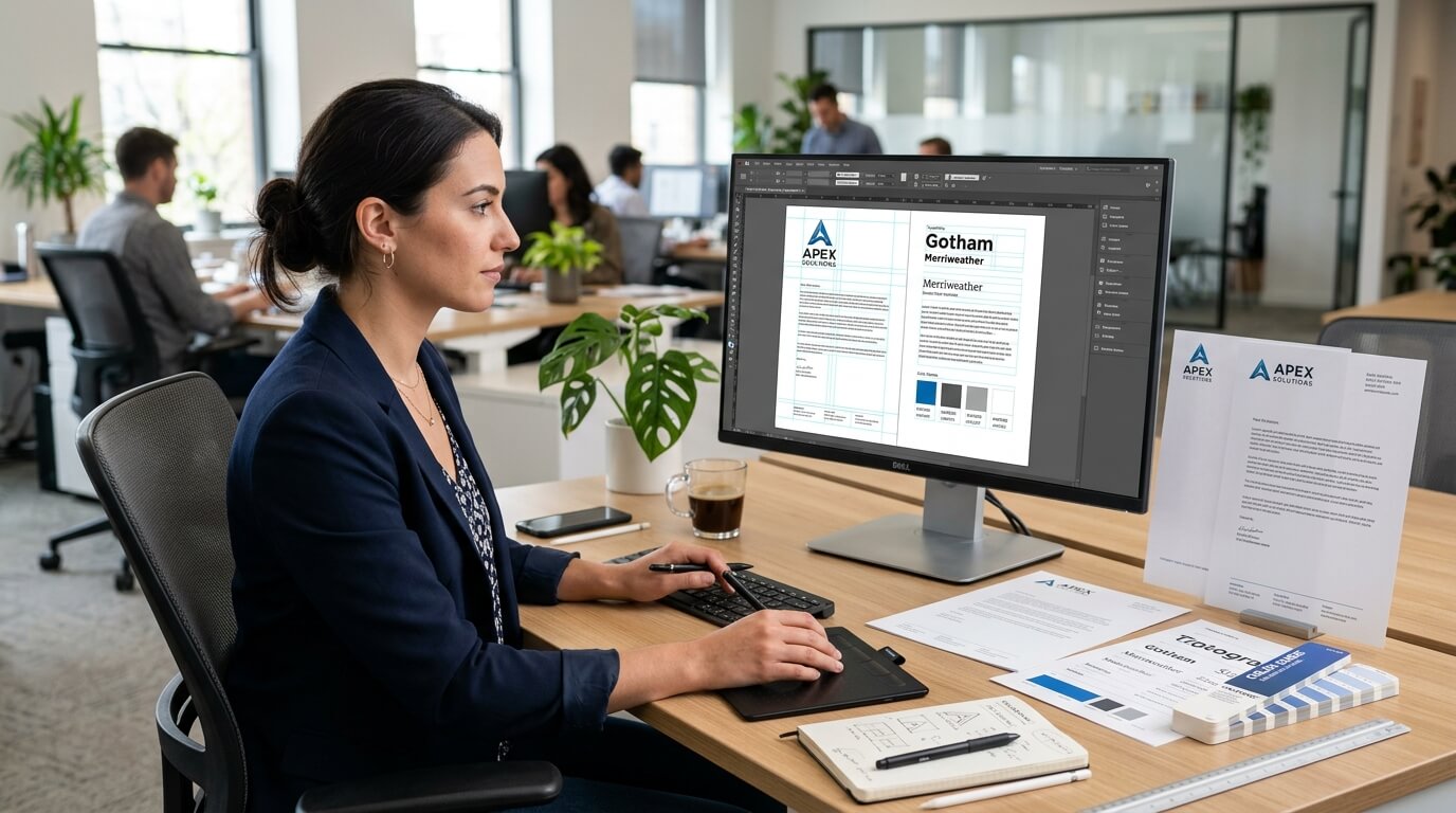
As a company grows, the way it presents itself becomes increasingly important. A business may begin with a simple logo, a basic email address, and a standard document template, but as it takes on new clients, employees, partners, and opportunities, those small details start shaping how people perceive the brand. Letterhead is one of those details. It may seem like a traditional business stationery item, yet a well-designed letterhead can support brand consistency, improve professional communication, and create a recognizable identity across printed and digital documents.
For growing companies, letterhead design deserves particular attention because business communication becomes more frequent and more varied as the organization expands. Contracts, proposals, invoices, formal notices, client correspondence, internal documents, certificates, and official letters may all need a consistent visual identity. When every document looks different, the company can appear disorganized. When documents follow a thoughtful letterhead system, even routine communication can feel intentional and professional.
A strong letterhead is not simply a page with a logo placed at the top. It combines typography, spacing, color, branding, contact information, hierarchy, and practical considerations into one usable design. The goal is to make important information easy to recognize while keeping the document comfortable to read. For a growing business, the design should also be flexible enough to work across different departments, document types, and communication channels.
Why Letterhead Design Matters for Growing Companies
Creating a Consistent Brand Identity
Growth often introduces complexity. A company may have several teams creating documents at the same time, each using different fonts, colors, logos, or layouts. Without a defined letterhead design, that variety can gradually weaken brand consistency.
A standardized letterhead provides a visual foundation for official communication. Whether a document comes from sales, finance, human resources, management, or customer support, the branding can remain recognizable. This consistency helps clients and business partners associate the document with the company even before they read the content.
Brand consistency also becomes more important when companies expand into new markets. A growing organization may communicate with customers who have never visited its website or interacted with its social media profiles. A professional document gives the recipient another recognizable representation of the business.
Strengthening Professional Communication
A letterhead can influence how formal communication is perceived. A carefully designed document suggests that the company pays attention to details and takes its communications seriously. This does not mean that an elaborate design automatically makes a business more credible. In many cases, a clean and restrained layout creates a stronger impression than excessive decoration.
For example, a consulting firm may benefit from a minimalist letterhead with clear typography and restrained branding, while a creative studio may use more distinctive visual elements. The important factor is alignment between the design and the company’s identity.
Supporting Business Growth
Growing companies frequently need to communicate with new customers, suppliers, investors, employees, and professional partners. Each interaction is an opportunity to reinforce the brand. Letterhead can help create a unified experience across these touchpoints.
It can also make internal processes easier. When employees have access to an approved letterhead template, they do not need to create their own versions. This reduces inconsistencies and makes it easier for the company to maintain its visual standards as the team expands.
Start With a Clear Brand Foundation
Use the Existing Brand Identity
Letterhead design should not exist separately from the rest of the company’s branding. Before designing the page, consider the organization’s existing logo, brand colors, typography, imagery, and overall visual style.
If the company already has brand guidelines, the letterhead should follow them. Using a completely different font or color scheme can make the stationery feel disconnected from the website, business cards, presentations, and other marketing materials.
For companies that are still developing their visual identity, the letterhead can be an opportunity to establish some basic standards. Selecting a dependable typeface, defining appropriate colors, and determining how the logo should be positioned can help create a more consistent foundation for future materials.
Avoid Overdesigning the Page
One of the most common letterhead mistakes is trying to include too many visual elements. Companies sometimes place large logos, multiple decorative shapes, several colors, social media icons, slogans, and extensive contact information on a single page.
The result can be visually crowded and can compete with the actual message.
A letterhead should provide a framework for communication rather than become the communication itself. The recipient should immediately understand who sent the document without being distracted from its contents.
Choose the Right Letterhead Layout
Give the Logo a Logical Position
The logo is usually one of the most recognizable elements on company stationery. It should be visible without overwhelming the page. The top-left position remains a common choice because readers naturally begin scanning from that area, but centered and right-aligned logos can also work depending on the brand.
The most important consideration is consistency. Once a company selects a logo position, it should generally use the same placement across its primary letterhead templates.
Create a Strong Information Hierarchy
A good letterhead makes information easy to scan. The company name and logo should establish the identity, while supporting information should remain secondary.
Contact details can appear in the header or footer depending on the layout. The main body should have enough visual separation from the branding so that the letter remains easy to read.
Spacing plays a major role here. Instead of adding decorative elements to create structure, designers can often achieve a more sophisticated result through margins, alignment, font sizes, and white space.
Use White Space Intentionally
White space is one of the most useful tools in letterhead design. It gives the document room to breathe and prevents the branding from competing with the written content.
A growing company may send documents ranging from short letters to several-page proposals. The letterhead should therefore leave enough usable space for different types of communication.
A design that consumes a large portion of the first page may look attractive in isolation but become inconvenient when employees need to write a detailed letter. Practical usability should always be considered alongside appearance.
Select Typography Carefully
Choose Professional and Readable Fonts
Typography has a major effect on how a business document feels. A letterhead should generally use a typeface that remains clear in both print and digital formats.
Sans-serif fonts can create a clean and contemporary appearance, while serif fonts can offer a more traditional or established character. Either approach can work when the typeface fits the company’s identity and remains readable.
Using too many fonts can make the design feel inconsistent. A company can usually achieve a polished result with one primary typeface and, where necessary, a complementary secondary typeface.
Establish Consistent Font Sizes
The company name, contact information, document title, date, recipient information, and body text should have distinct but harmonious sizes. There should be a clear visual hierarchy rather than random differences in font size.
Body text deserves particular attention because letterhead is ultimately a communication tool. Even a visually attractive template loses its effectiveness if the content becomes difficult to read.
Select Colors With Purpose
Connect Colors to the Brand
Color can make a letterhead immediately recognizable, especially when the company already has established brand colors. However, using brand colors does not mean covering the page with them.
A small colored line, logo treatment, footer, or accent can often be enough. The choice should also account for printing costs and reproduction quality. A design that depends heavily on multiple bright colors may look different when printed on an office printer.
Consider Black-and-White Printing
Growing companies should not assume every document will be printed professionally. Employees may print letters using standard office printers, and clients may receive documents in grayscale.
A strong letterhead should remain recognizable even when color is removed. This is why contrast, typography, spacing, and logo clarity matter just as much as the color palette.
Include Essential Business Information
A professional letterhead should provide enough information to identify and contact the company without turning the page into a directory.
Depending on the company’s requirements, this can include the business name, physical address, phone number, email address, website, and other relevant details. Legal or registration information may also be appropriate for certain businesses and jurisdictions.
However, every piece of information should have a reason for being there. Adding unnecessary details can make the letterhead harder to scan.
| Letterhead Element | Purpose | Design Consideration |
| Company logo | Establishes brand recognition | Keep it clear and appropriately sized |
| Company name | Identifies the business | Use consistent typography |
| Address | Provides location information | Keep it readable but secondary |
| Phone and email | Enables direct contact | Group information logically |
| Website | Supports digital discovery | Use a clean presentation |
| Brand colors | Reinforces visual identity | Use selectively |
| Footer details | Provides secondary information | Avoid overcrowding |
| Document space | Allows communication | Preserve generous margins |
Design for Both Print and Digital Use
Create a Digital-Friendly Version
Modern companies often send letterhead as PDF documents rather than physical letters. This means the design needs to function well on screens as well as paper.
Small text can become difficult to read on laptops and mobile devices. Fine decorative lines may disappear at lower resolutions, while low-contrast elements may become almost invisible.
A digital letterhead should therefore be designed with screen readability in mind. The PDF should also preserve the correct layout, fonts, logo quality, and spacing when opened on different devices.
Prepare Print-Ready Artwork
Print requirements should be considered during the design process rather than after the design is finished. Correct page dimensions, margins, image resolution, and color settings can affect the final result.
For professional printing, companies should also discuss paper type and finish with the printer. A design that looks excellent on standard office paper may have a different appearance on premium stationery.
Make Letterhead Scalable as the Company Grows
Build a Flexible Template System
A growing organization may eventually require several variations of its stationery. There may be corporate letterhead, departmental letterhead, executive letterhead, internal documents, and specialized templates.
Instead of designing each version from scratch, it is more efficient to establish a flexible visual system. The same basic logo treatment, typography, color palette, and spacing can then be adapted for different uses.
This approach keeps the brand unified while allowing individual departments to meet their specific communication needs.
Think Beyond the First Page
Long documents require special attention. A decorative header that works beautifully on the first page may become distracting if repeated across every page of a lengthy document.
Companies can create a first-page letterhead with stronger branding and subsequent-page headers with more restrained elements. This maintains continuity without consuming unnecessary space.
Keep the Design Aligned With the Industry
Match the Company’s Personality
Letterhead should reflect the character of the organization. A law firm may prefer a restrained and formal design, while a technology company might use a more contemporary layout. A design agency may have more room for experimentation.
There is no universal letterhead style that works for every growing company. The right design is one that communicates the company’s identity while remaining practical for everyday use.
Consider the Audience
The people receiving the documents also matter. A letterhead used for investor correspondence may require a different level of formality than stationery used for internal creative projects.
Understanding who will see the document helps determine the appropriate balance between personality and professionalism.
Avoid Common Letterhead Design Mistakes
A successful letterhead is often defined as much by what it avoids as by what it includes. Poor alignment, excessive decoration, weak contrast, inconsistent fonts, oversized logos, and crowded contact information can all reduce usability.
Another common problem is designing a template that looks impressive in a presentation but is difficult for employees to use. If the editable version requires complicated adjustments every time someone writes a letter, employees may eventually abandon it.
The solution is to test the design with real content. Insert short letters, long letters, different names, dates, addresses, and multi-page documents. This reveals practical problems that may not be visible when viewing an empty template.
Test the Letterhead Before Finalizing It
Review Different Content Lengths
Testing is particularly important for growing companies because documents will vary considerably. A short announcement and a detailed formal letter should both fit comfortably within the template.
Reviewing different examples can expose problems with margins, text wrapping, footer placement, and spacing.
Check Multiple Devices and Printers
Digital documents should be opened on different screens, while printed versions should be reviewed on common office printers and, when appropriate, professional printing equipment.
This process can reveal differences in color, font rendering, and alignment. A small amount of testing can prevent a company from distributing a template that creates problems across the organization.
Keep the Design Consistent Across Business Materials
Letterhead works best when it belongs to a larger visual system. The same typography, colors, logo treatment, and spacing principles can appear across business cards, presentations, email signatures, brochures, invoices, packaging, and digital documents.
This does not mean every piece needs to look identical. Instead, the materials should feel like they belong to the same organization.
For a growing company, this consistency becomes increasingly valuable. As more employees communicate on behalf of the business, a shared design language helps prevent every person or department from creating a completely different visual identity.
Conclusion
Letterhead design can play a small but meaningful role in how a growing company presents itself. A successful design balances brand identity with everyday usability, giving employees a professional template without taking attention away from the actual message. Clear typography, thoughtful spacing, restrained color use, appropriate contact information, and a flexible layout can create stationery that remains useful as the organization expands.
The strongest letterhead is not necessarily the most elaborate. It is the one that works consistently across different documents, departments, printers, screens, and audiences while remaining unmistakably connected to the company’s brand. By treating letterhead as part of a broader brand system rather than an isolated design project, growing companies can create communication materials that remain professional and practical over time.
FAQ
Q. What should a company letterhead include?
A company letterhead commonly includes the business logo, company name, contact information, address, website, and selected brand elements. Additional legal or registration information can be included when relevant to the company’s requirements.
Q. What makes a letterhead look professional?
A professional letterhead generally uses clear typography, balanced spacing, consistent branding, readable contact information, and a layout that leaves sufficient room for the actual document content.
Q. Should a letterhead have a large logo?
Not necessarily. The logo should be noticeable and recognizable, but making it excessively large can reduce usable writing space and distract from the document’s message.
Q. Can the same letterhead be used for digital documents?
Yes. Letterhead can be designed for both printed and digital communication. Digital versions should prioritize screen readability and should be tested as PDFs across different devices.
Q. How often should a company update its letterhead?
A company does not need to redesign its letterhead frequently. It should generally be updated when the brand identity, logo, contact information, legal details, or overall visual system changes.